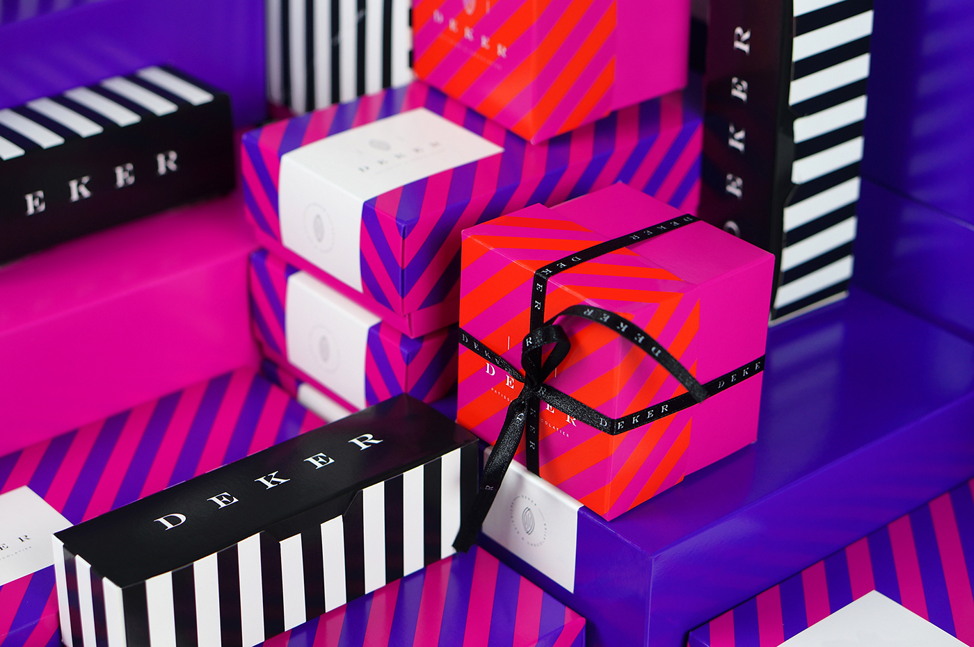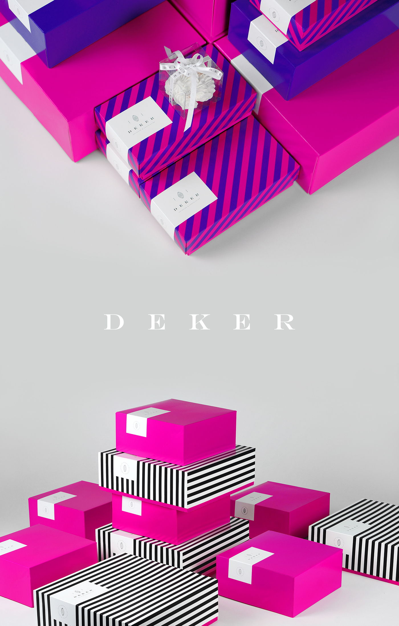
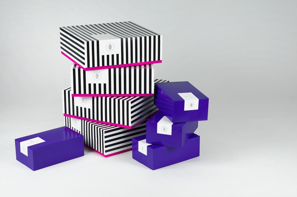
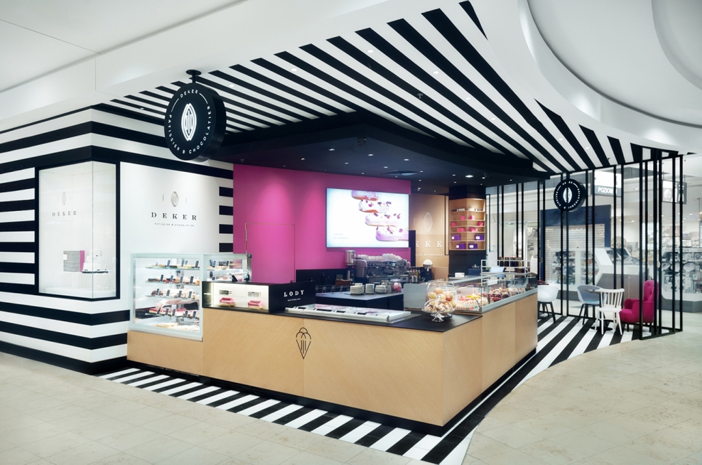

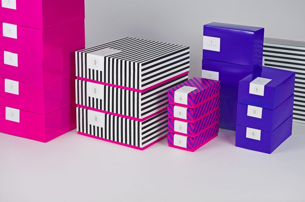
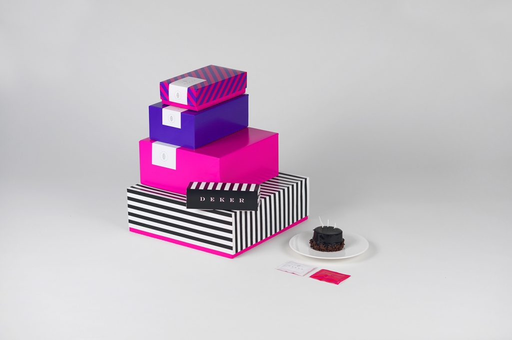
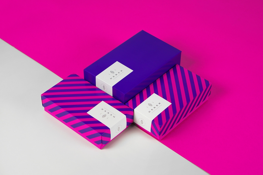
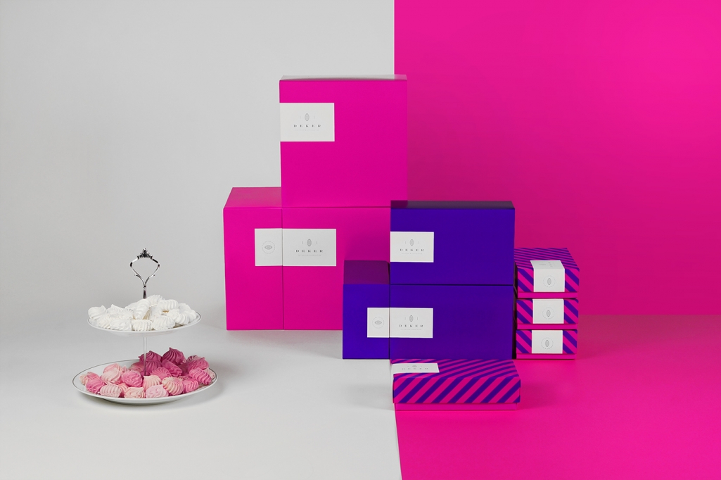
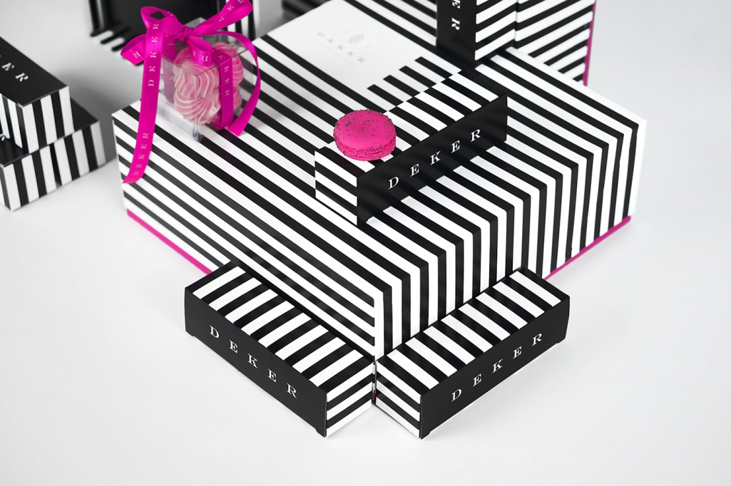
Design and branding studio less. is making waves and turning heads regardless of their young age. With every new client and project their uniquely minimal and strong take on brand identity and packaging is helping them climb higher on the Polish design ladder. Run by three young designers – Gosia Perkowska, Anna Okrassa and Martyna Wędzicka – each bringing their special talent and take to the table, they together work on projects ranging from editorial and web design to packaging and branding. Their recent re-branding for Polish patissier & chocolatier Deker is a perfect example of the bold and fierceness approach Less. has for it’s clients.
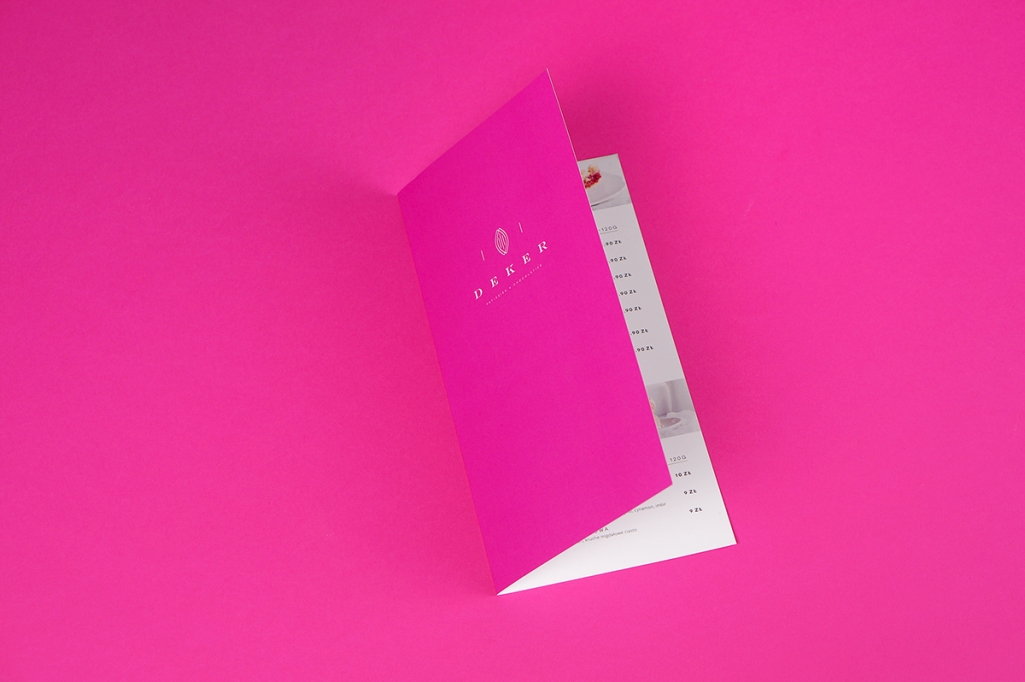
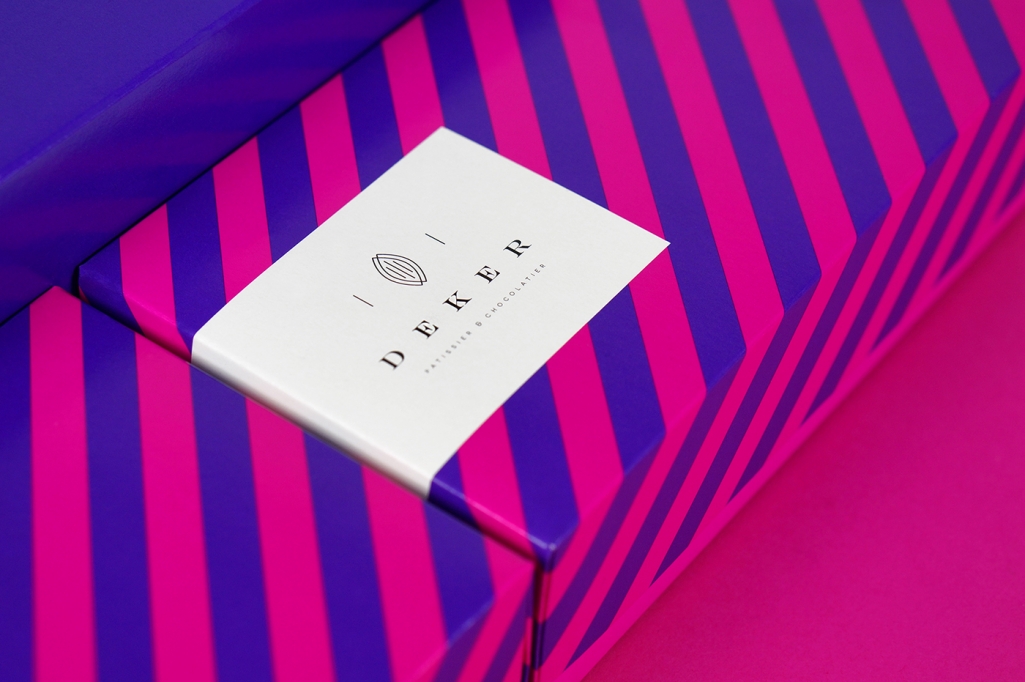
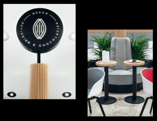
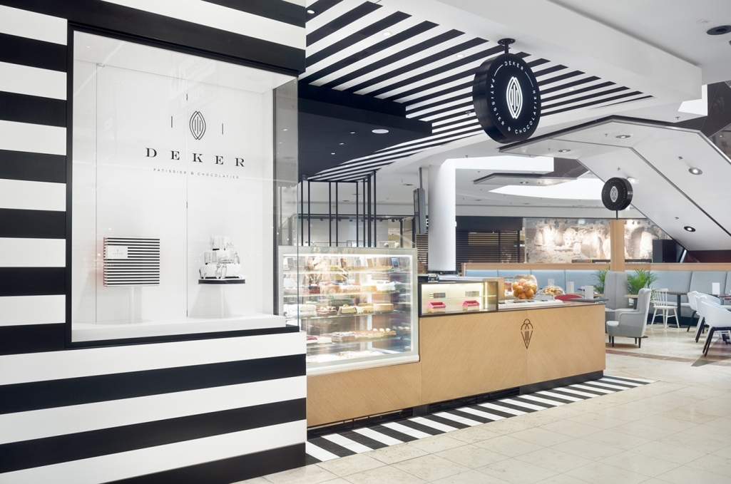
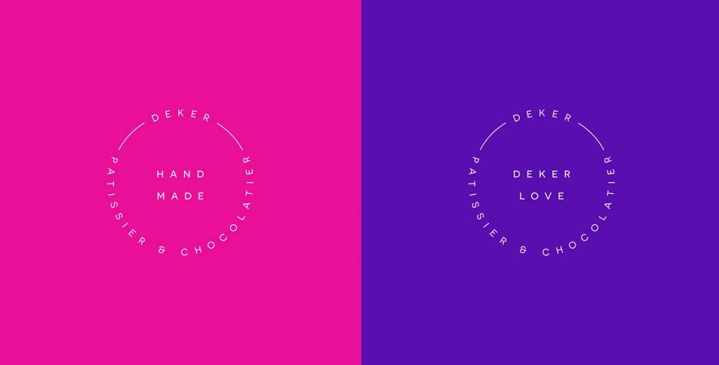
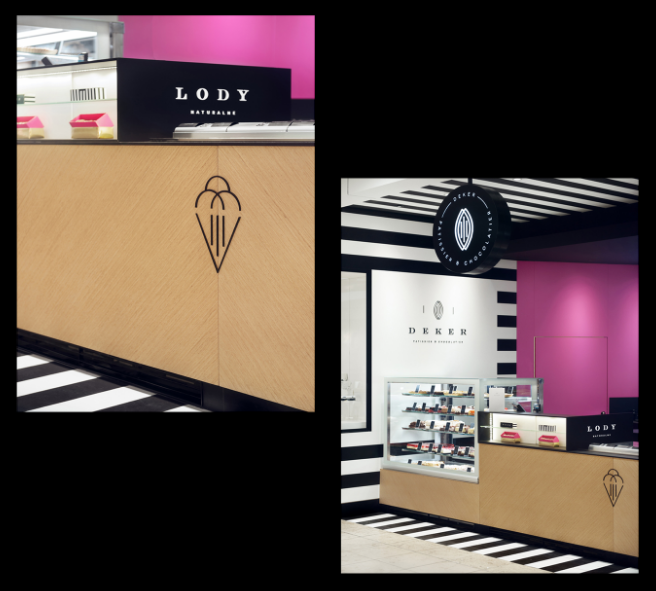
By combining classic black & white stripe with striking pink, purple and orange, the play of pattern and color blocking becomes the heart of the identity. An idea carried through-out the stationery, packaging as well as the interior of the store, done by Studio Potorska. Alternating between line-style iconography and sans-serif type typography on signs and stamps, a more traditional serif font is used as the main logo that shows the coco bean as only visual reference to the craft.
©
art direction &packaging design: less.
interior design: Studio Potorska
interior photoshoot: Tom Kurek

