BEAUTY is a personal interpretation of Naomi Wolf’s novel “The Beauty Myth” and its chapter called Religion, by Romanian graphic designer Sixtine M. It’s an artist’s book, or a book-like object, which focuses on the cultural myth of feminine beauty. With the main purpose to educate the reader, to redefine their view of the relationship between beauty and female identity, not only by the linguistic content but also by the use of different visual elements and materials. The interplay of text, images, and different materials allows for many exciting interactions, creating new meanings and visuals.
Imperfection over perfection, breaking the rules of beauty propagated by Western culture
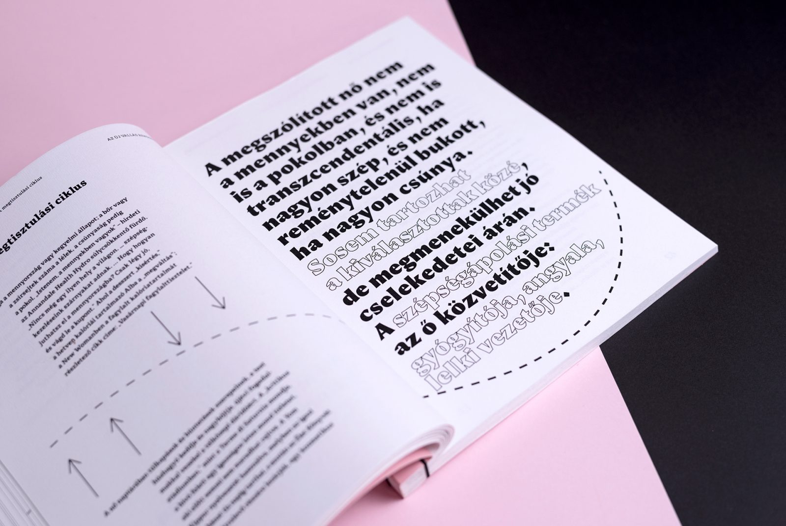
The book wants to emphasize imperfection rather than perfection. The concept of the layout was inspired by different definitions of beauty: the relationship between symmetry and beauty, the proportion of the perfect female body, the various well-defined, but often changing rules of beauty generated by Western culture, etc. In the books design process, Sixtine M. broke all the above-mentioned rules, one by one.
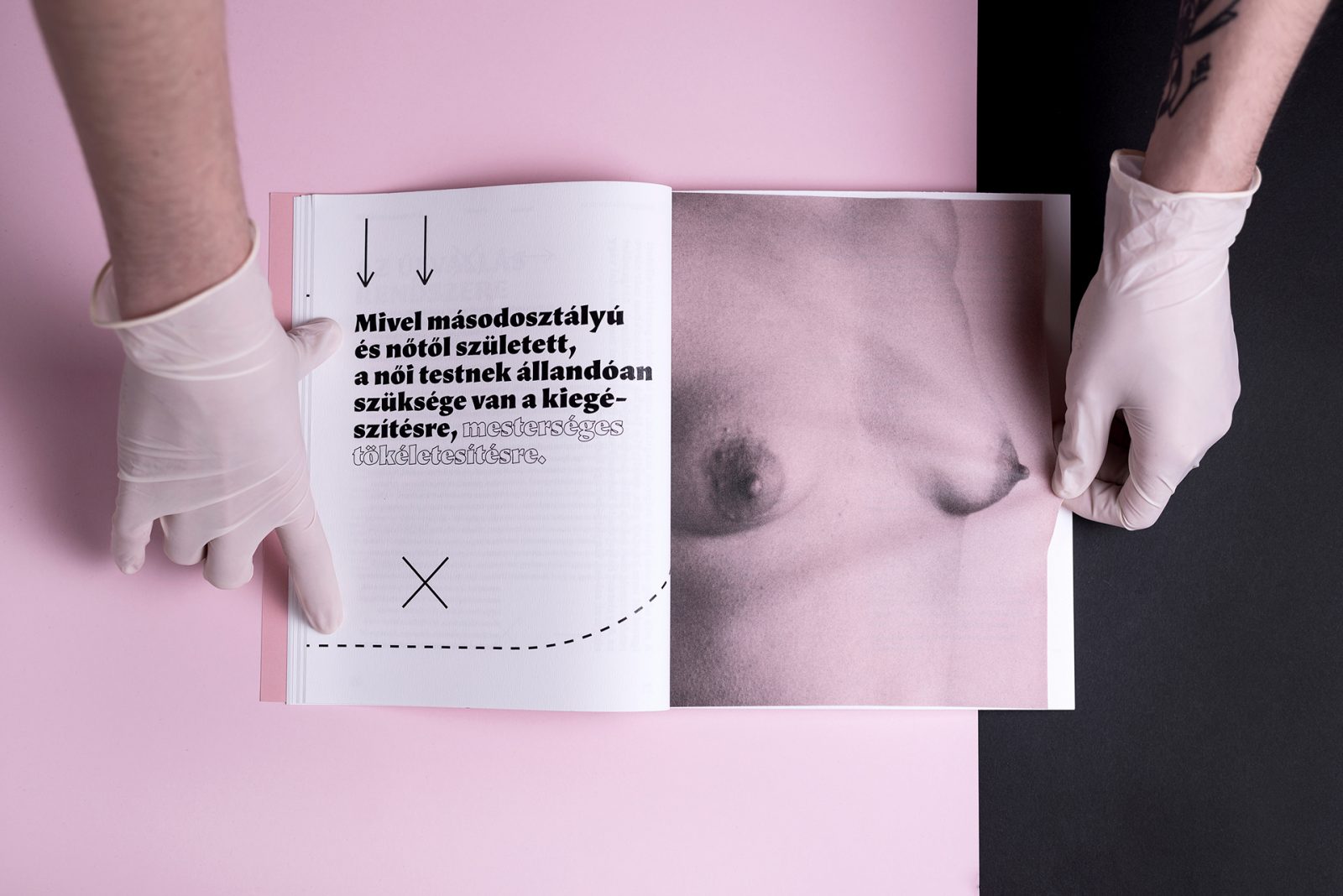
The arrows, dashed lines and crosses are enhancing the dynamics of the layout. graphic elements are inspired by the surgical marks and symbols of explanatory illustrations in the beauty and make-up section in women’s magazines.
Beauty is depicted as an object and is treated as one, thus women are identifying themselves as objects in their own body, ultimately as a foreign item of use, which has a continuous compulsion to conform and it is something to be governed by rules and norms

.
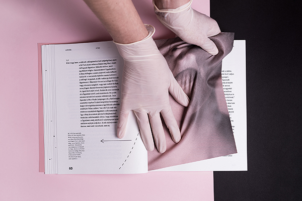
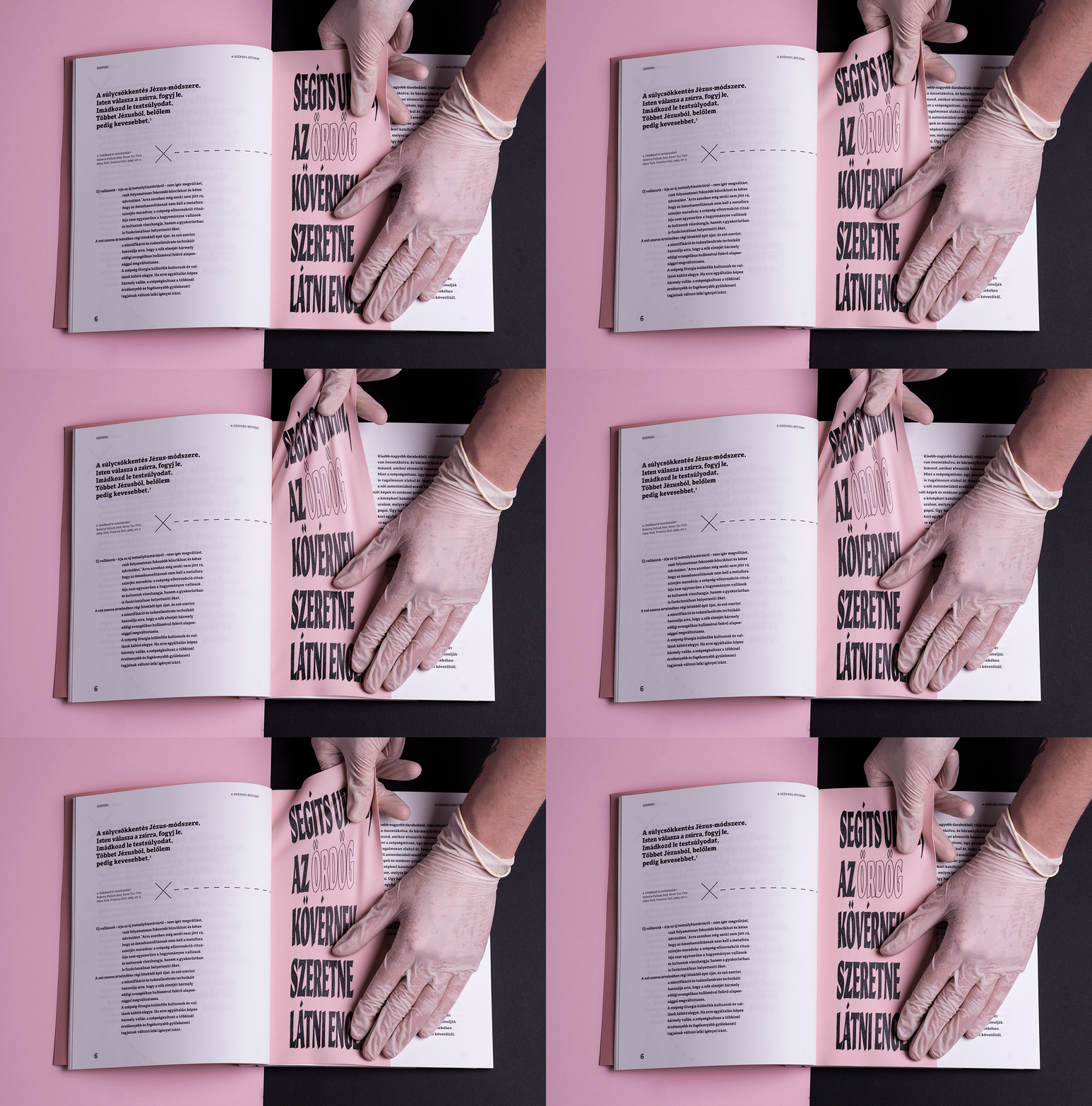
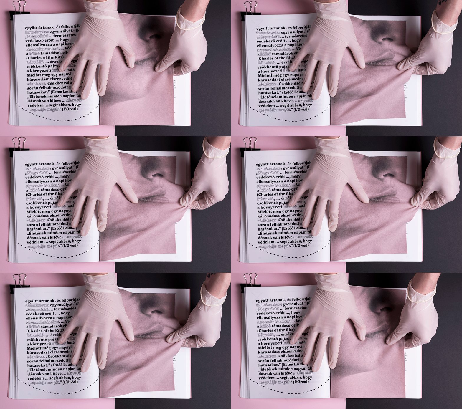
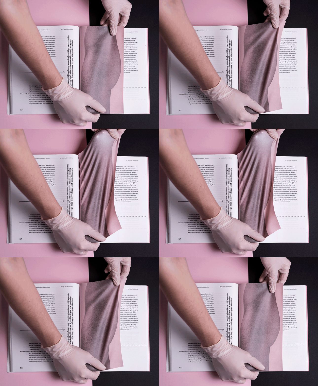
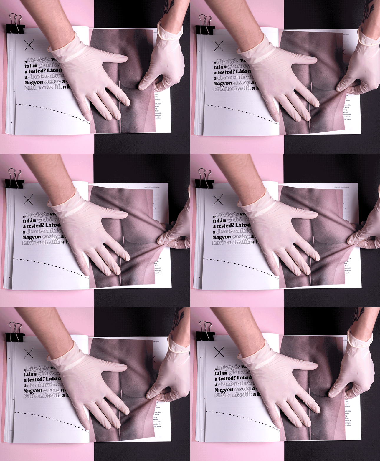
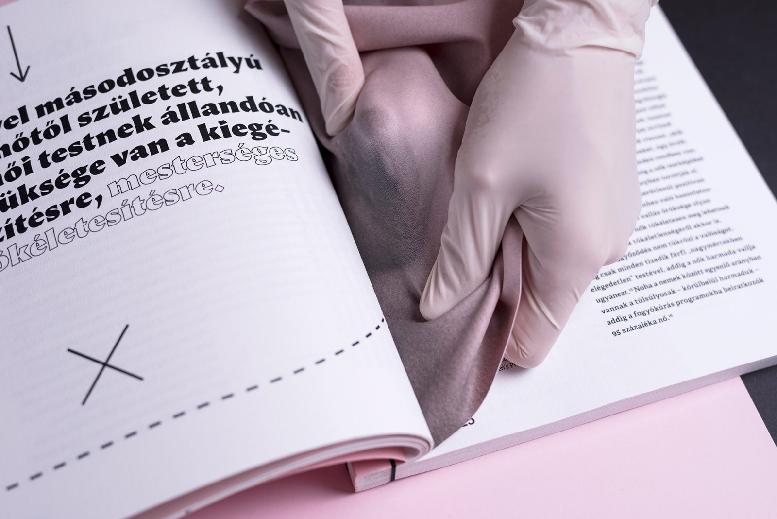
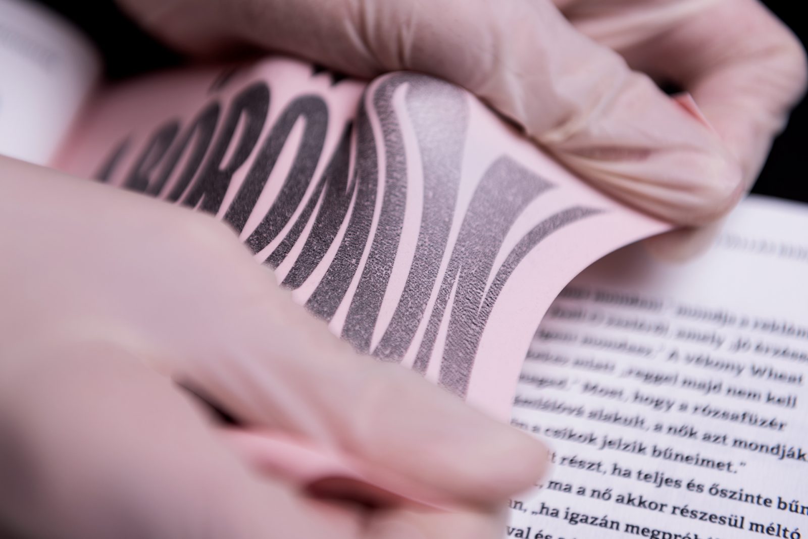
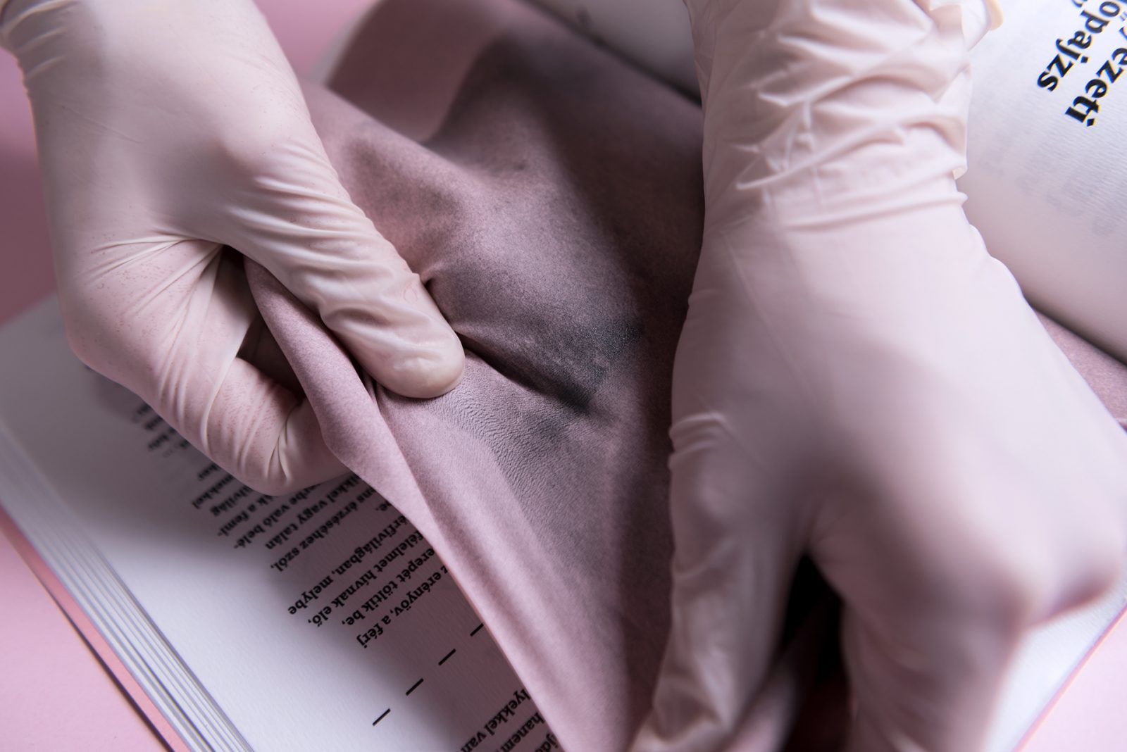
Latex pages representing the fragility of human skin, showcase the aftermath of superficial manipulation
The material and images are the expressive means of the distortion that women are going through every day. The interactive nature of the book is provided by the latex, which shows images of different body parts. The color, softness, and elasticity of latex are intended to refer to the human skin which is in great contrast with the whiteness and texture of the paper.
The photographs on the elastic pages depict parts of the body where surgeries or digital manipulations are performed generally (breast, thighs, hips, calves, lips, nose). The manipulation of the latex comes with the ruption of the picture, which also refers to the vulnerability of human skin; after every intervention, the skin is broken, stretched, and eventually scarred.
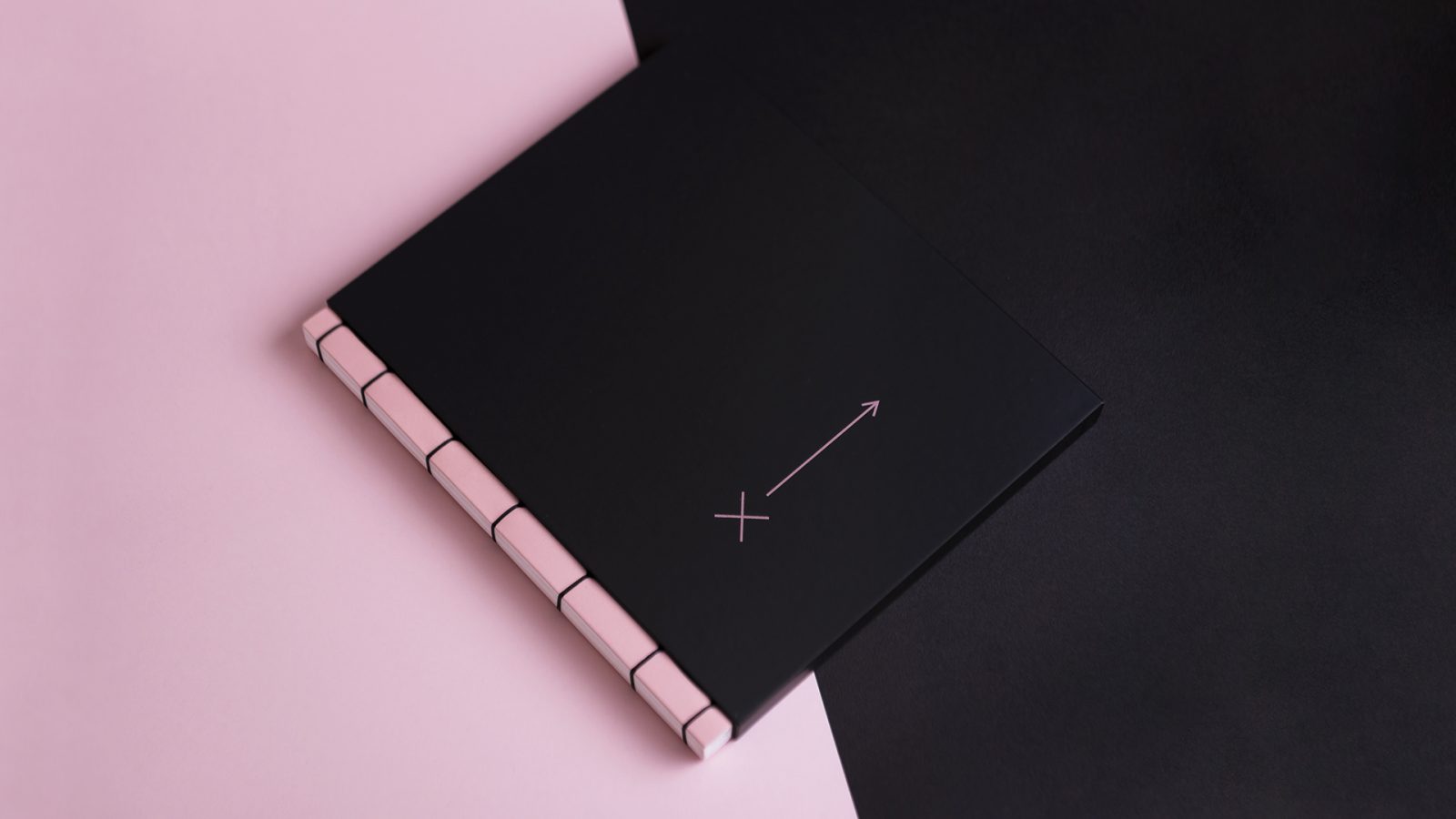
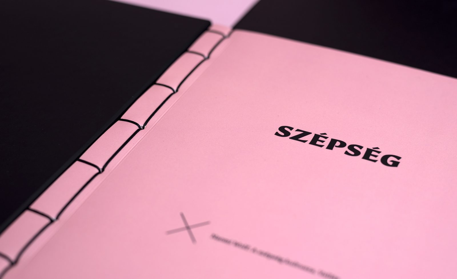
The binding of the book was inspired by Yotsume Toji Japanese binding method. When making the book it was important that the binding would be tight and durable, and it wouldn’t need any gluing since the materials wouldn’t allow it. The aesthetics of the visible thread can refer to the stitches, the motif of the plastic surgeries, which is also harshly criticized in the book.
Images © Sixtine M.

