Kelli Anderson has created some of the most interesting and original typography designs we’ve seen in a while. She has a totally original approach to the subject by manipulating and playing with paper. While speaking at last months Typo San Francisco, she presented some of her latest designs, blowing us all away with her creativity!
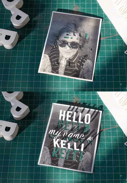
Kelli Anderson, a New York-based artist and designer, who pushes the limits of ordinary materials and formats by seeking out hidden possibilities in the physical and digital world. She is best known for making a paper record player, among other improbable designs. She is very well known in the graphic and paper world, always being on the cutting edge, as well as being a trendsetter in typography and graphic & web design.
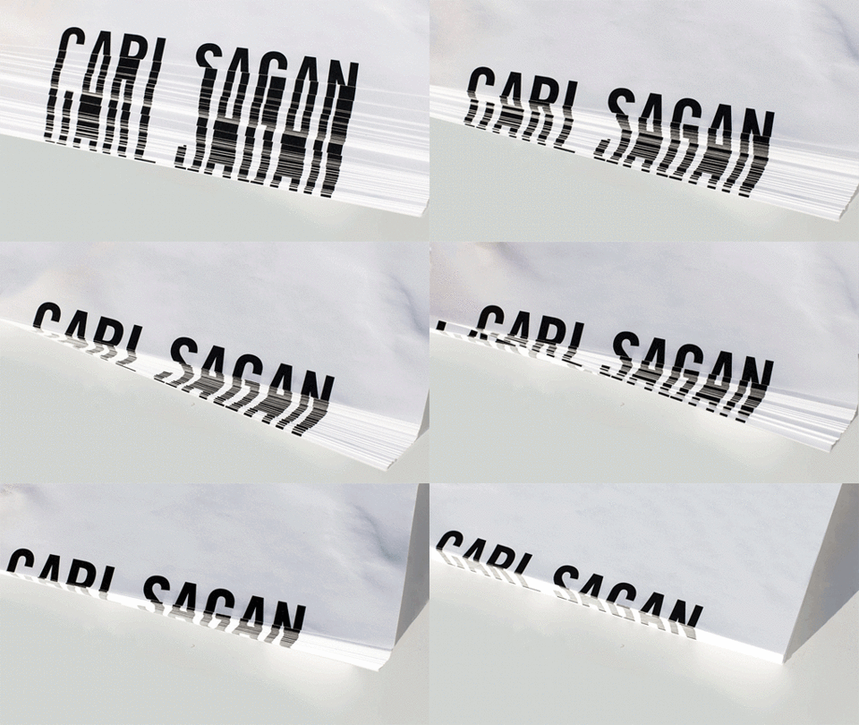
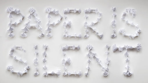
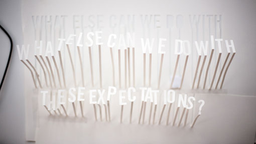
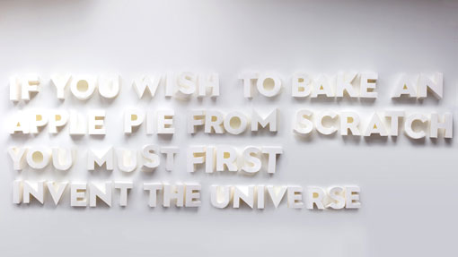
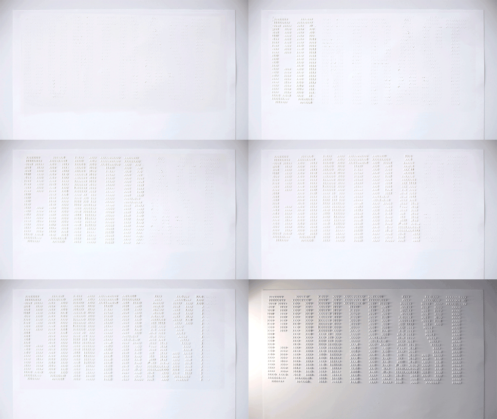
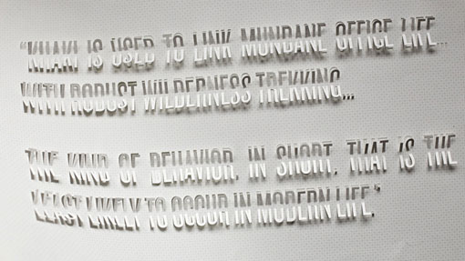
These typography designs she came up with for her speech at this year’s Typo San Francisco. It gave her an excuse to try something that she had always intended to play with – paper. For each slide in her presentation, she came up with a different, semi-legible strategy for making a different type of paper lettering. All the designs (except for one) are white on white, made only with paper. Using techniques as simple as cutting, shaping and folding, she managed to create an array of incredible paper type experiments.
The time and patience she must have put into these designs is in comprehensible. So needless to say, we are very much impressed!
 Images © Kelli Anderson

