The F100 construction project “Green Oasis” in Penzing, Vienna’s 14th district, is an urban property development with a special focus on sustainability. At the property, traditional craftsmanship of woodwork is combined with new technologies and innovative processing techniques. This way, while building space for people that is worth living, F100 also creates additional value for the society through sustainable construction.
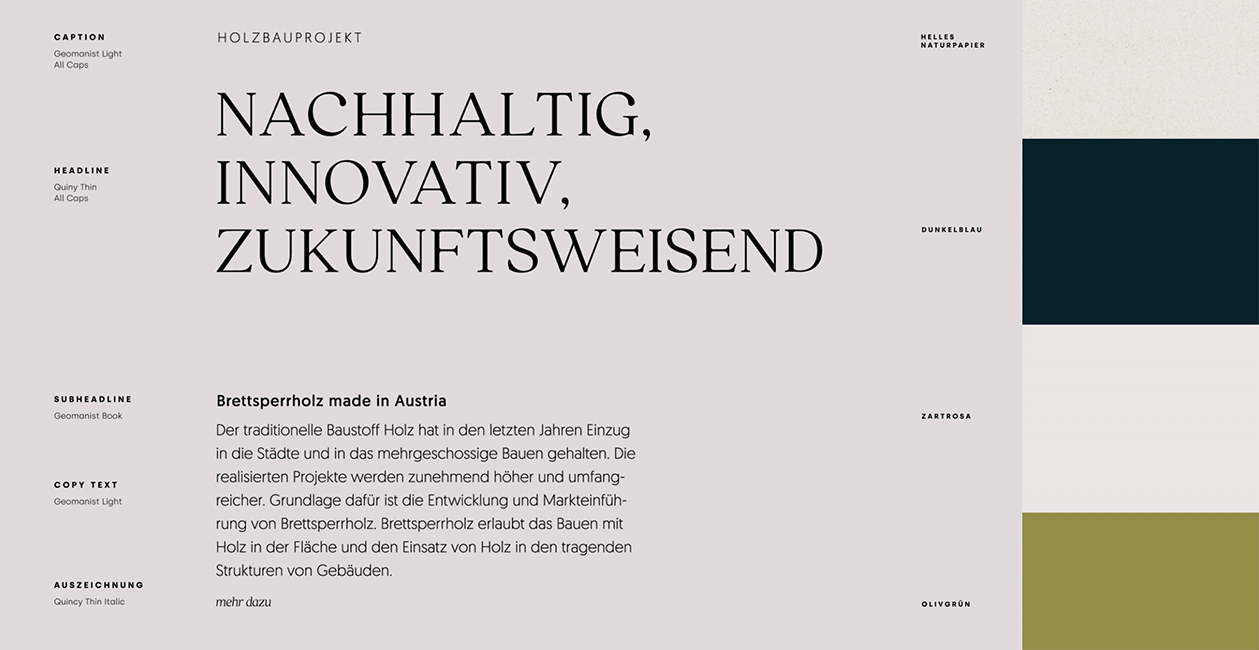
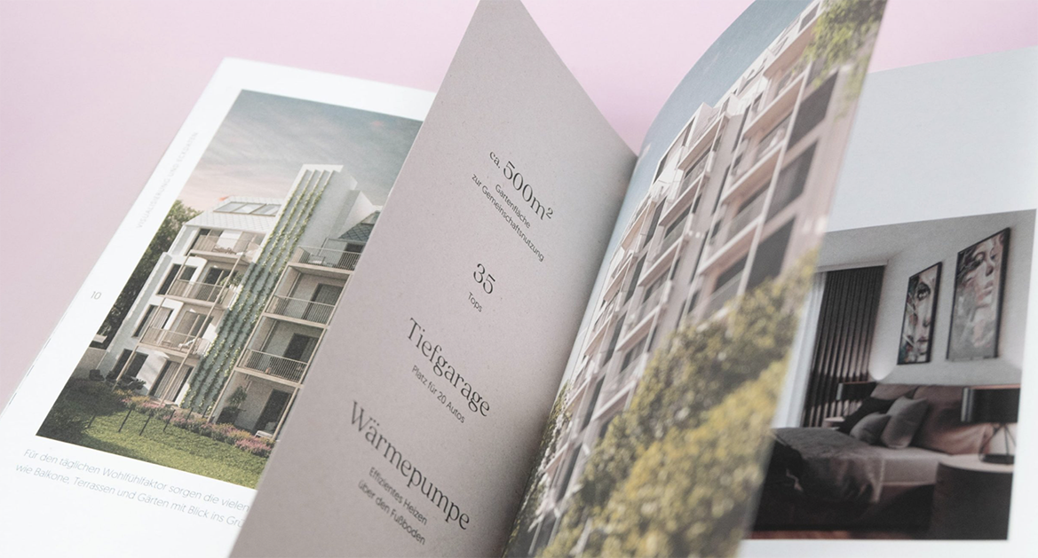
Dotsandlines, a young Viennese digital agency supported the F100 Green Oasis real estate project with the development of their branding, as well as the editorial design of an advertising brochure titled Eigentumswohnungen im Holzbau, “Condos in Timber Construction” in eng.
Dotsandlines’ client portfolio is impressively colorful, creative, and full of challenging projects. The agency serves large corporates in their digital product landscapes, bringing a bit of professional craziness to companies and accompany startups and their products on their way into new markets. “Our core disciplines include web development, conceptual design, user experience design, user interface design, animation design and brand design”, Dotsandlines writes.
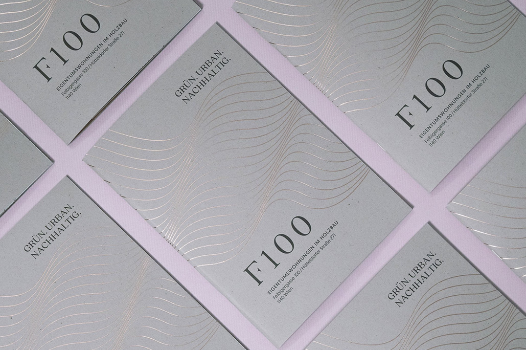
Choosing ecological Remake Smoke & Nautilus Superwhite design papers and special printing techniques to communicate the projects green and high quality goals
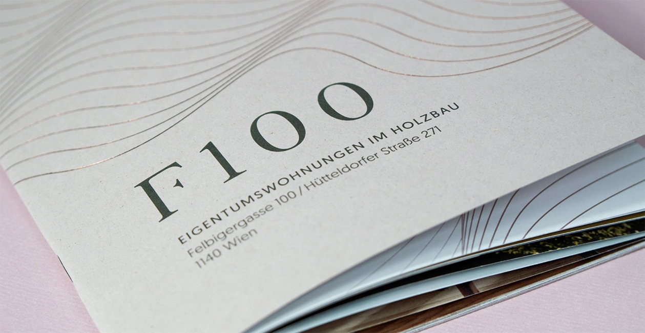
For the cover, we chose Remake 250g/m2 in the color Smoke. The rough, grainy surface perfectly reflects the core of the residential building project the brochure is about: ecological woodwork. Remake, is an innovative up-cycling material that contains 25% of leather and leather processing residues to replace tree cellulose. Moreover, it’s produced with 40% recycled cellulose, in full respect of the environment.
The rough, grainy surface perfectly reflects the core of the residential building project the brochure is about: ecological woodwork.
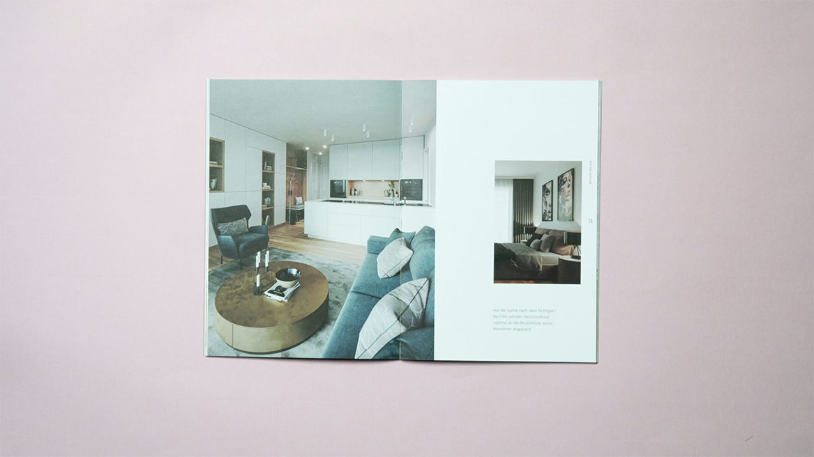
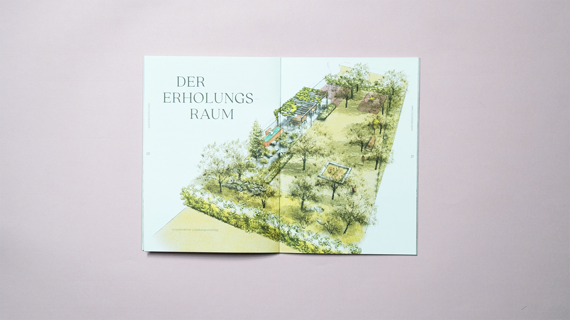
The core pages of the brochure are printed on Nautilus Superwhite 120g/m2. It is a 100% recyclable, uncoated paper with excellent whiteness that holds many environmental certifications, such as Blue Angel, FSC™ or EU Ecolabel. The use of Nautilus sends a clear message of an environmental commitment with every application and allows designers to take care of nature without compromising on quality.
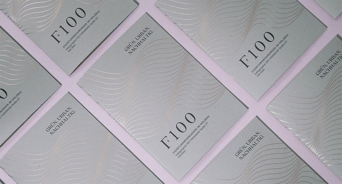
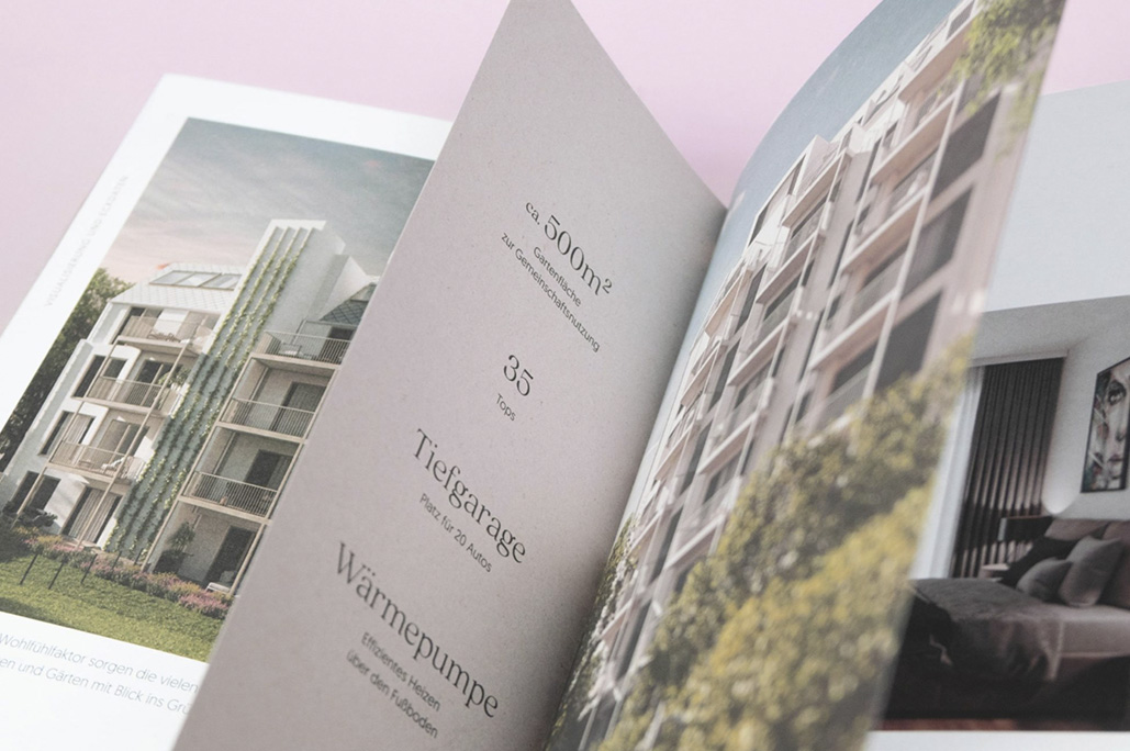
The bronze metallic lines on the cover were printed with a hot-foil stamping process. It symbolizes the wood structure in a very abstract way. “On the inside there are two shortened pages that contain additional information about the project. For these, the same paper as the cover was used but in a lesser weight. It connects the inside with the outside”, Dotsandlines writes.
