To kick off 2022 with creative energy and inspiration – we’ve hand-selected five amazingly stylish contemporary typefaces you can use and take your design work into the new year. TwentyTwentyTwo comes with new winds and new trends, and we predict this year we’ll see a rising in the way vintage and retro typefaces are being utilized. Retro fonts, simple scripts, rustic serif fonts, and especially quirky display fonts will bring that touch of warmth, friendliness, and optimism to your design projects. Typography is definitely having a moment right now and we’re loving it. Stay tuned for more 2022 Trend topics in the upcoming months!
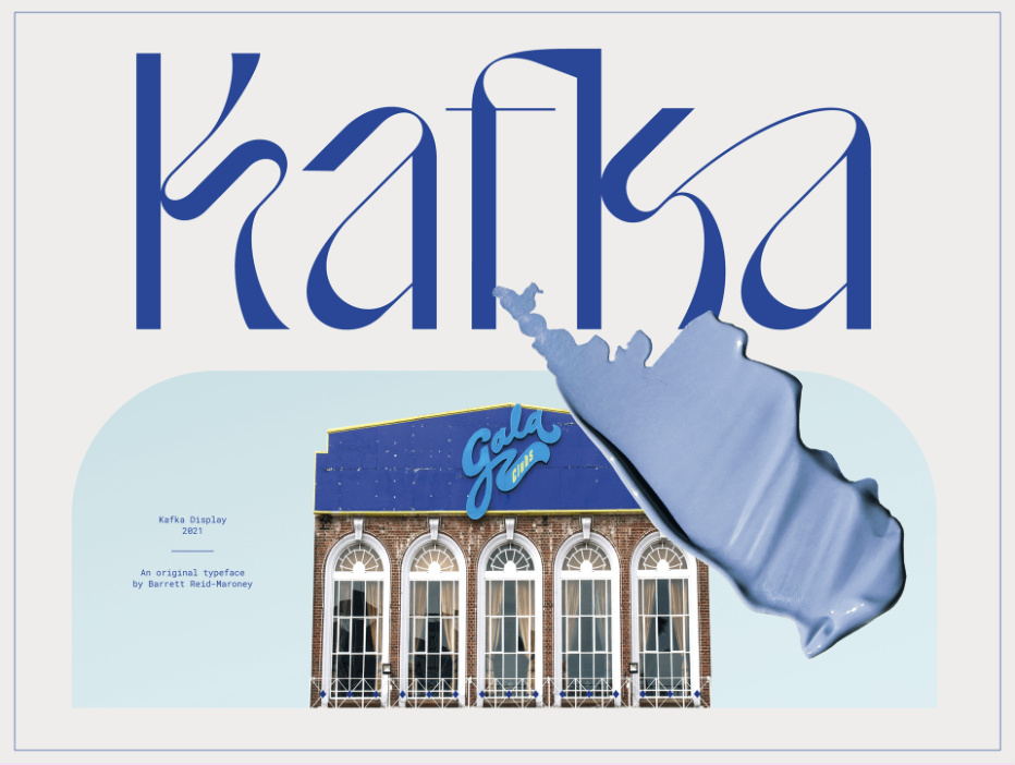
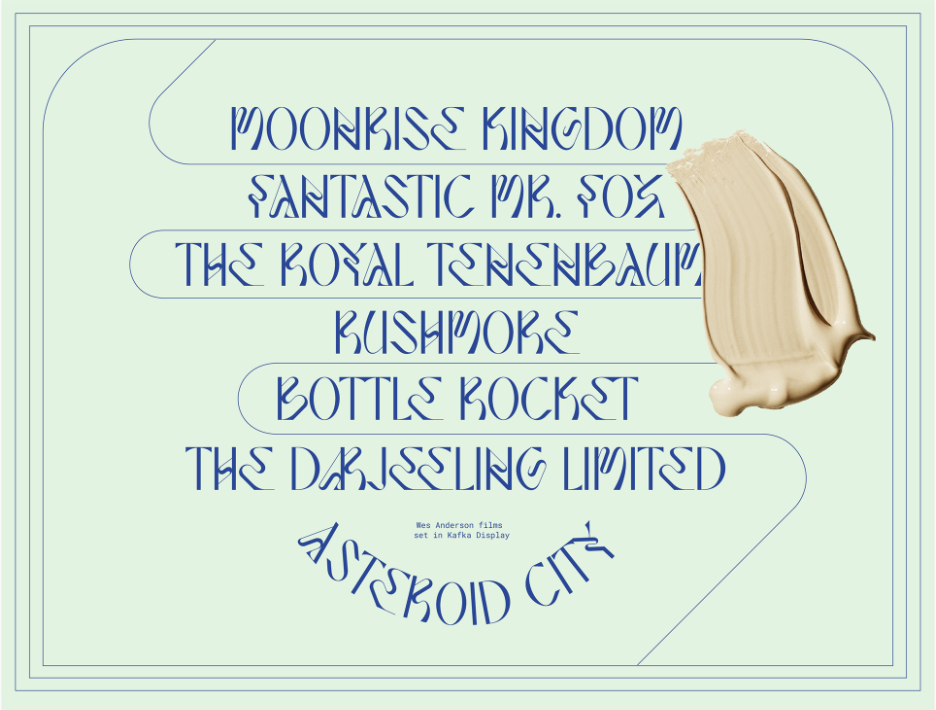
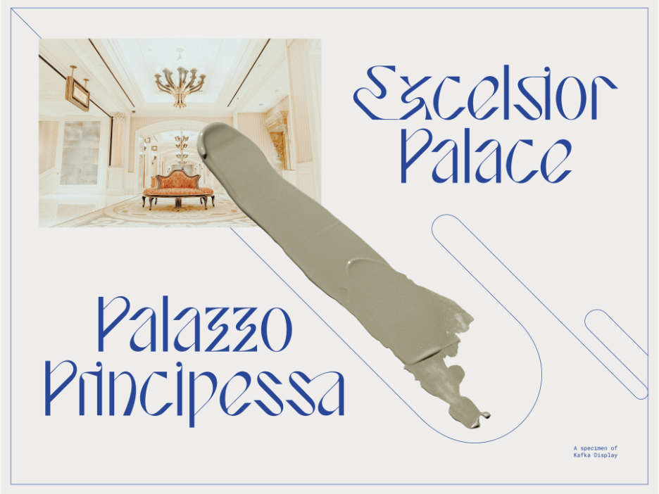
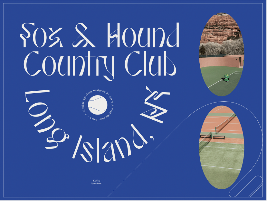
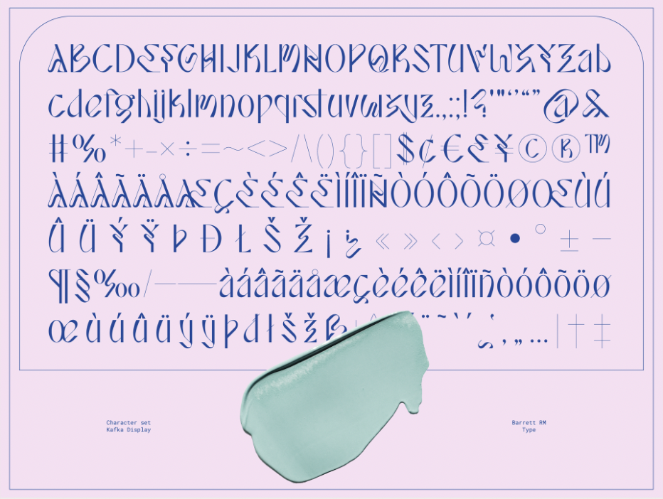
Kafka – Display Typeface by Barrett Reid-Maroney
Kafka display typeface is an elegant, artistic display typeface designed by Barrett Reid-Maroney. The typeface draws its primary influence from the films of Wes Anderson, a visionary filmmaker known for creating intricate, aesthetically pleasing, and idiosyncratic cinematic worlds. Like Anderson’s films, Kafka display strives to present viewers with moments of visual delight. The typeface features several alternate characters, a plethora of creative ligatures, and a whimsical visual style that gives vibrancy and life to text.
Available here.
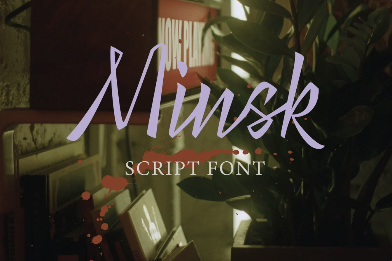
Minsk Script Typeface by Vera Spartera
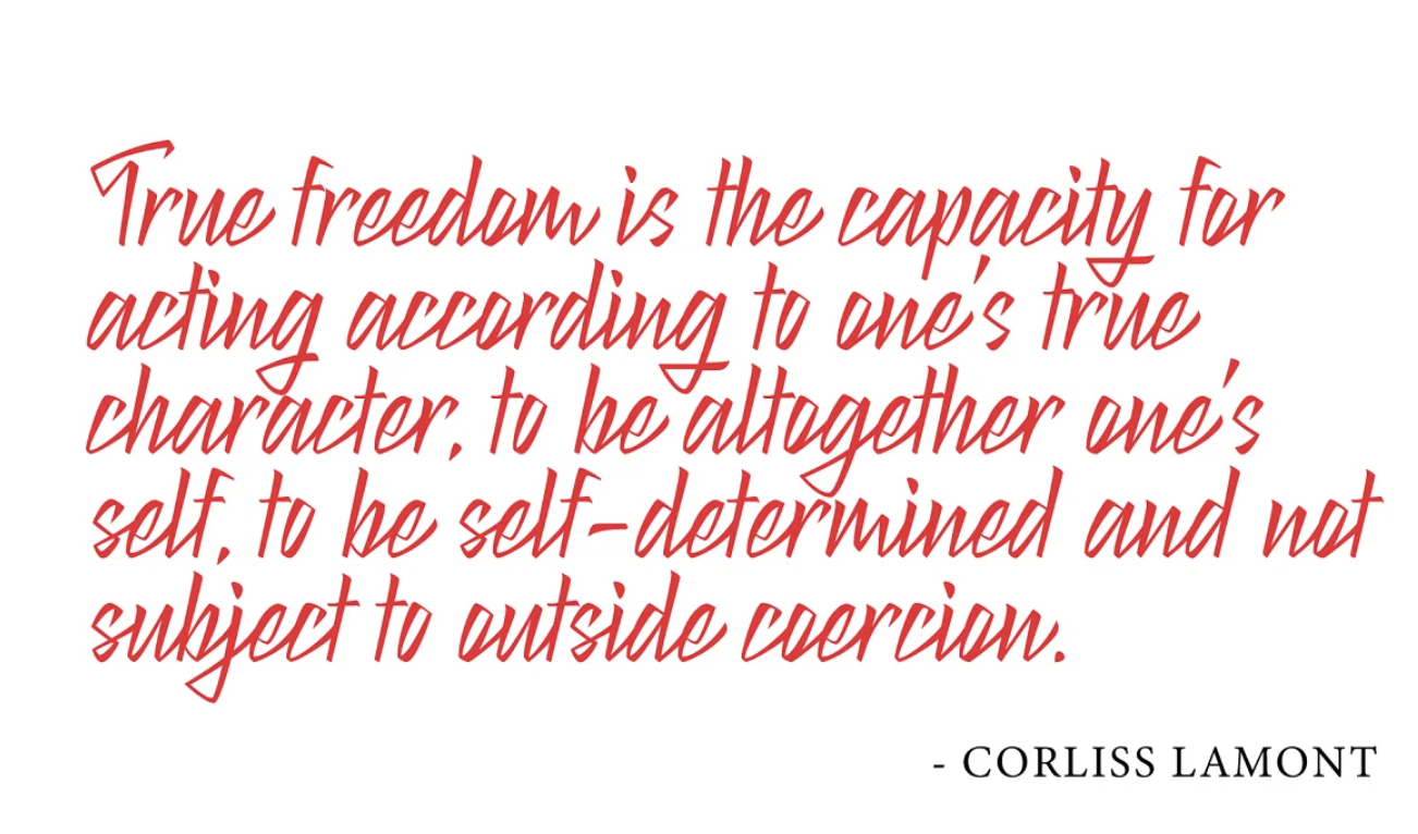
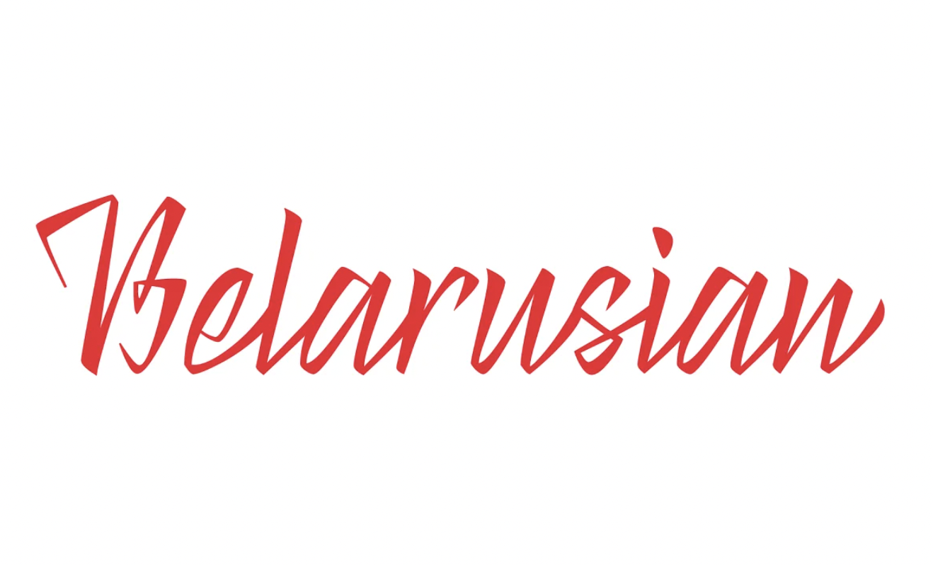
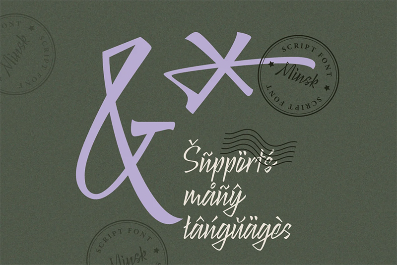
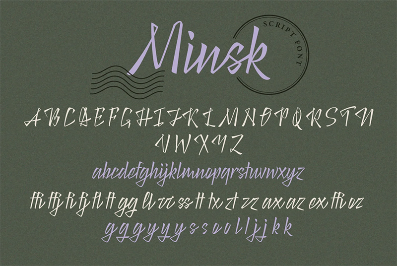
Minsk Script has a sharp and bold character. In it, Spartera wanted to reflect the mood in which she lived in the last year: the struggle for freedom, for civil rights, and for the freedom to express personal views. “I believe in the versatility of my values, and I want my font to manifest them everywhere”, Spartera writes.
Available here.
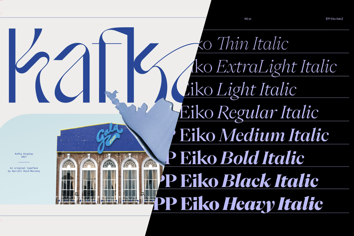
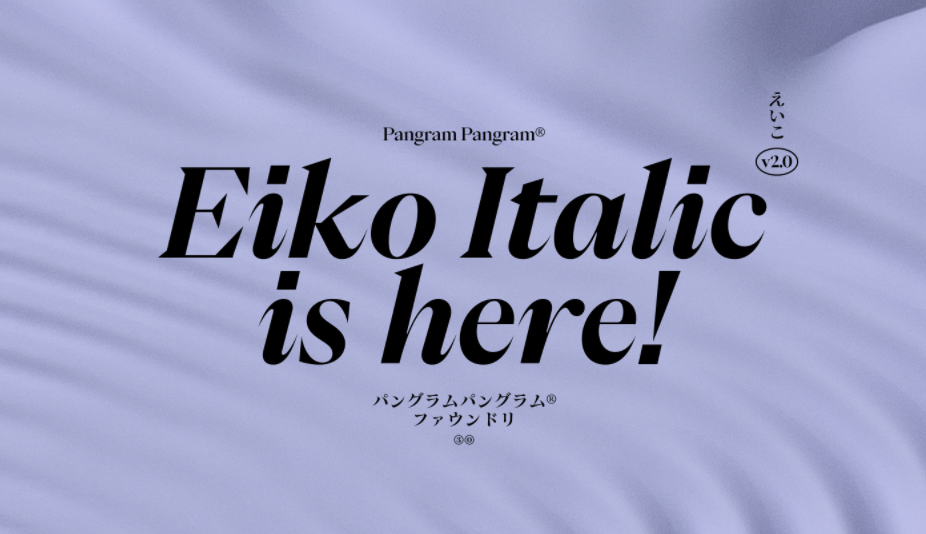
Eiko v2.0 by Pangram Pangram
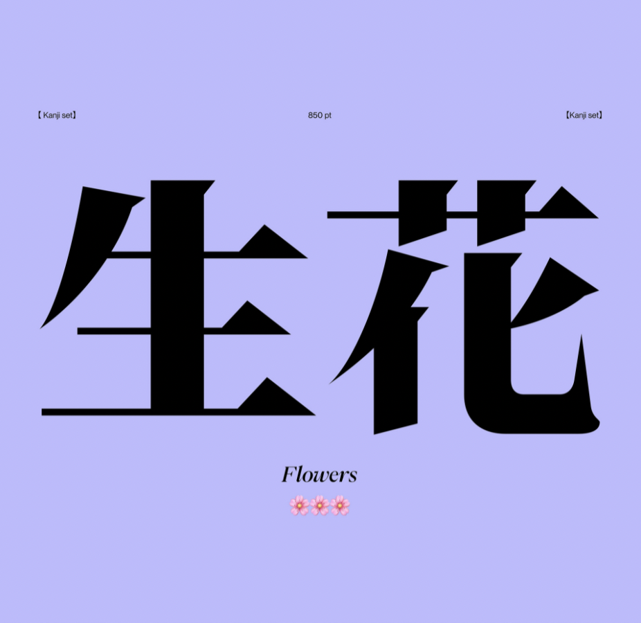
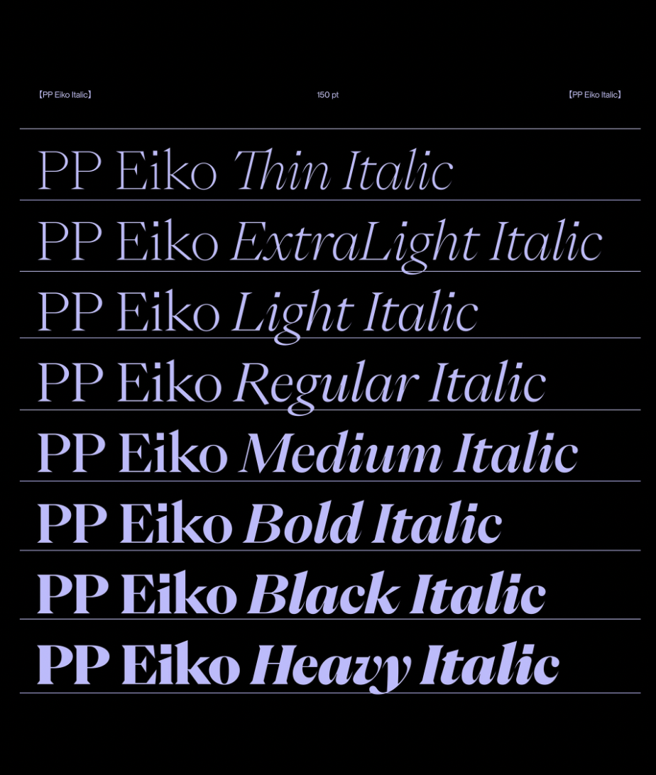
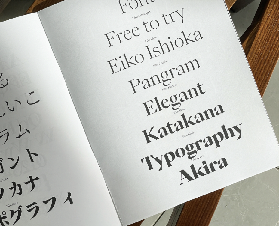
Eiko is inspired by the work of Eiko Ishioka, a multitalented Japanise artist, this typeface seeks to convey the same aspect of her work in these typographic explorations. It is an original serif font with high contrast, including the syllable alphabet kana, hirigana + katakana, it si ideal to pair with other kanji fonts of the Japanese mincho style.
Available here (including a free version).
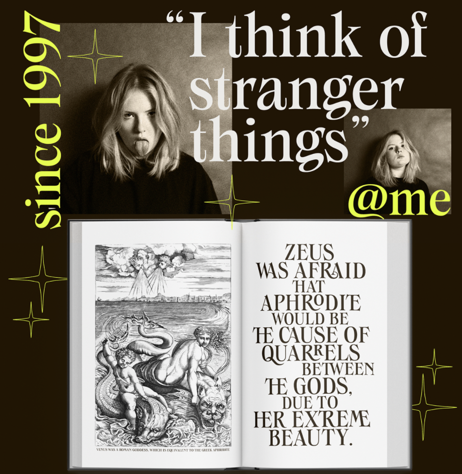
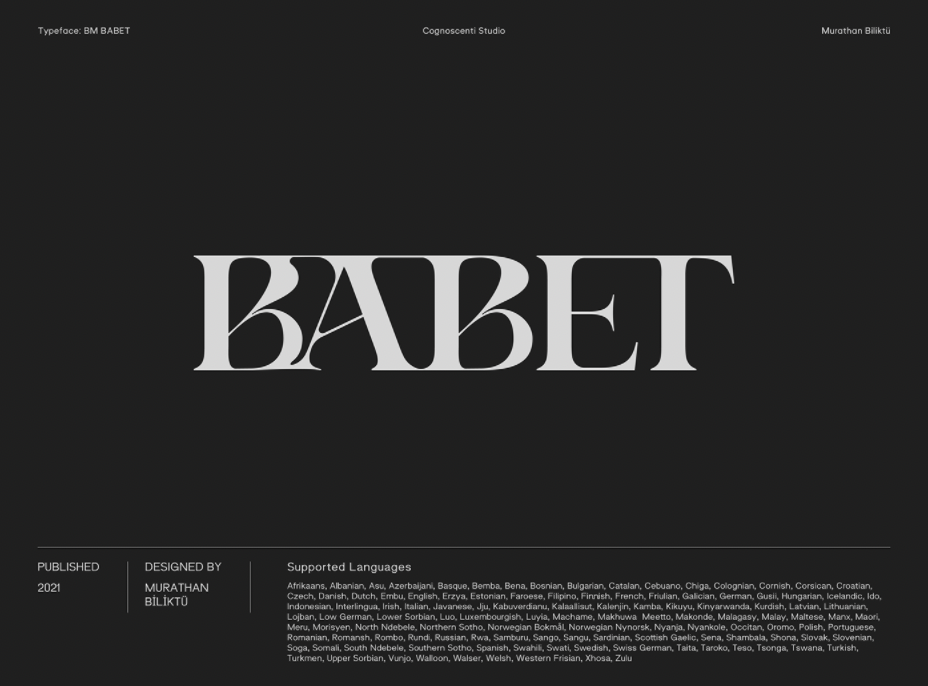
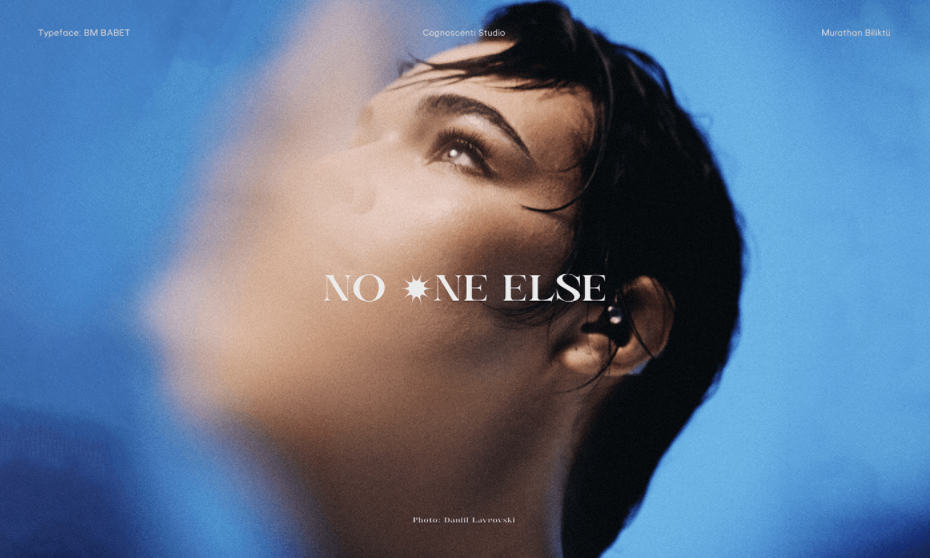
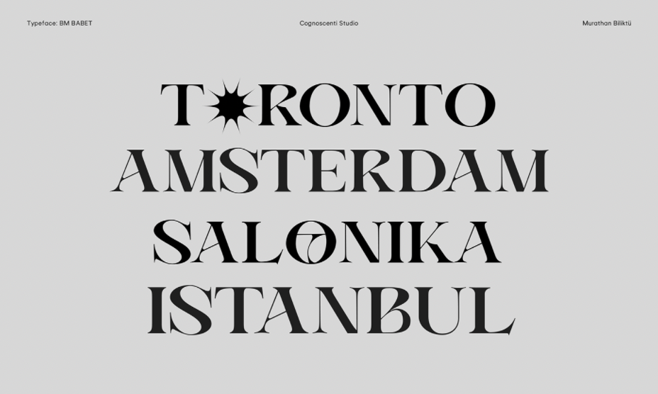
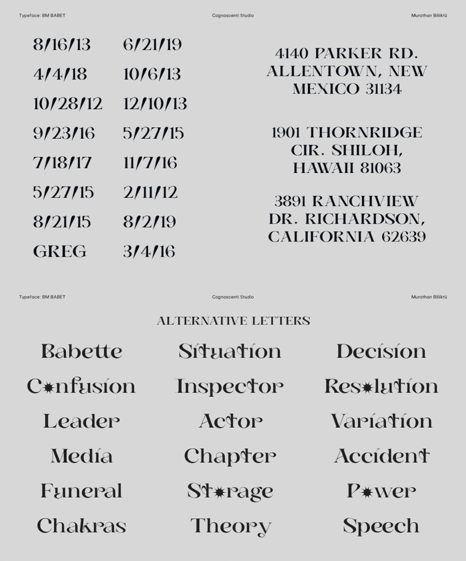
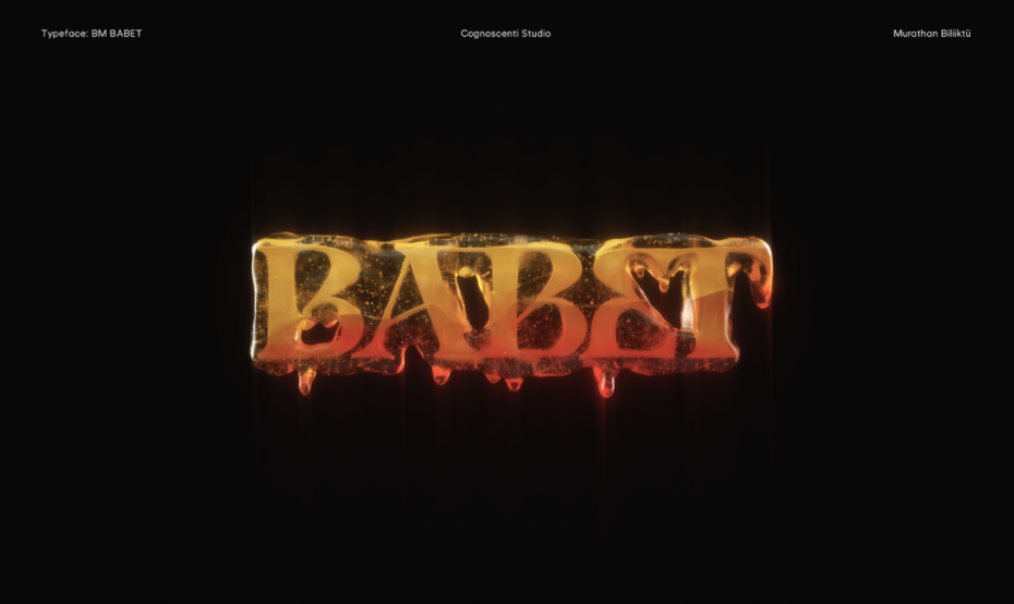
BM Babet Typeface – Eccentric Classic by Murathan Biliktü
Murathan Biliktü collaborated with Babet (@heyimbabet) to design something that looks like it came straight out of a fashion magazine from the 1980s, timeless while being unique to reflect Babet’s personality.
Available here.
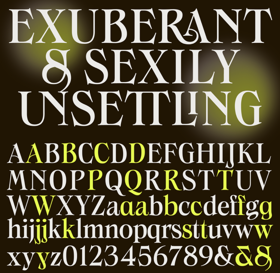
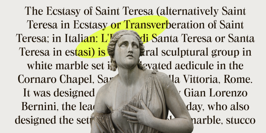
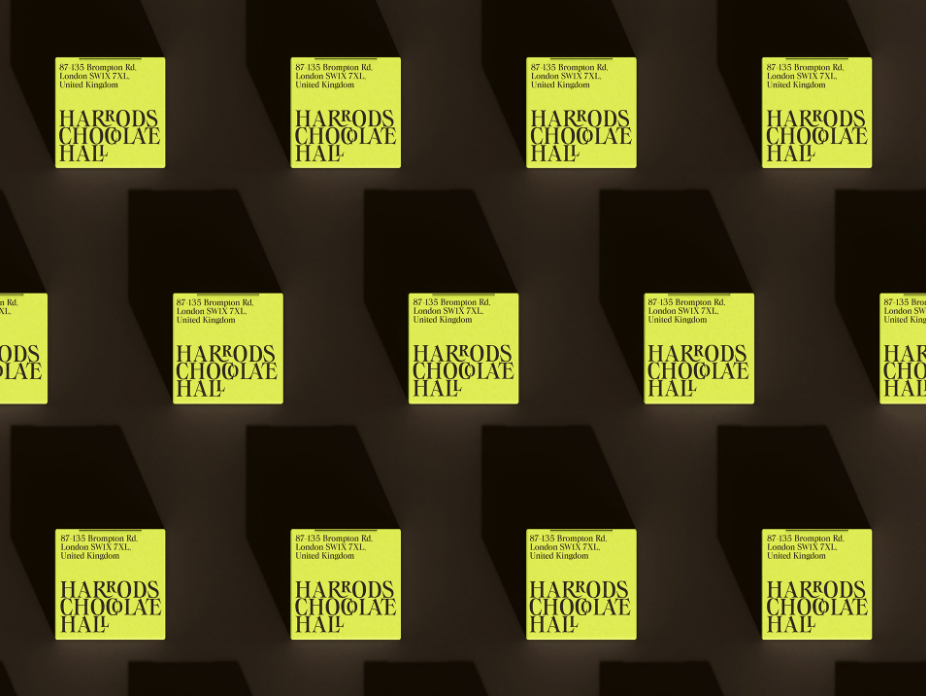
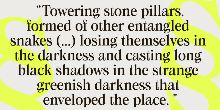
SWANSTONE – THE EVIL BEAUTY OF SHARP SERIF by Zetafonts Type Foundry
Mario De Libero from Zerafonts Type Foundry designed the Swanstone while investigating XIX Century Old Style typefaces. Designs such as Theophile Beaudoire’s Romana (1860) or Miller & Richard’s Modernized Old Style, that re-imagined the classical “Venetian” letterform adding flared serifs and early Art Nouveau influences. IN Italy, one of these fonts was Raffaello Bertieri’s Raffaello, which De Libero used as the starting point of his research in a contemporary retelling of these exuberant and sexily unsettling letterforms.
Available here.
