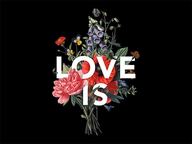
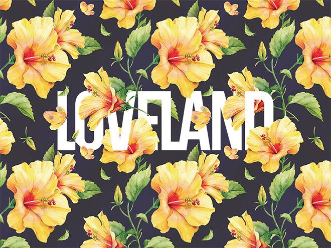
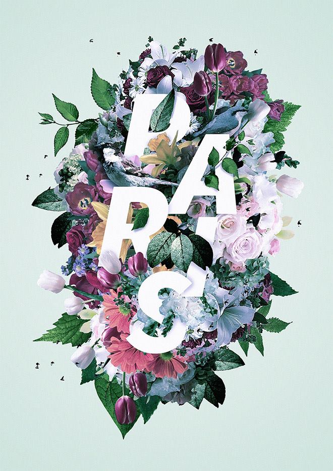
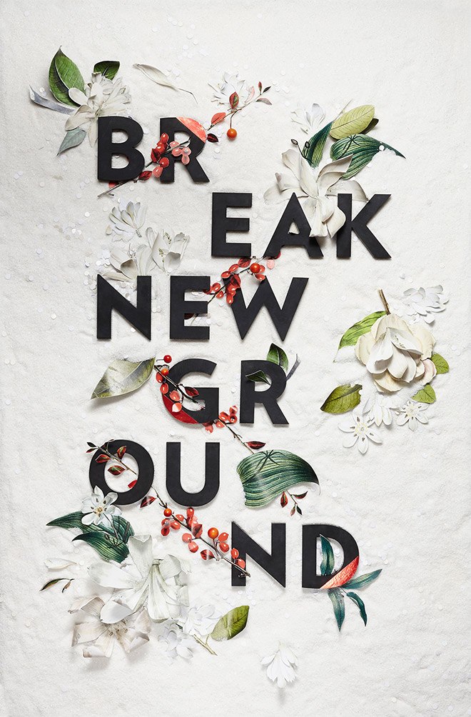
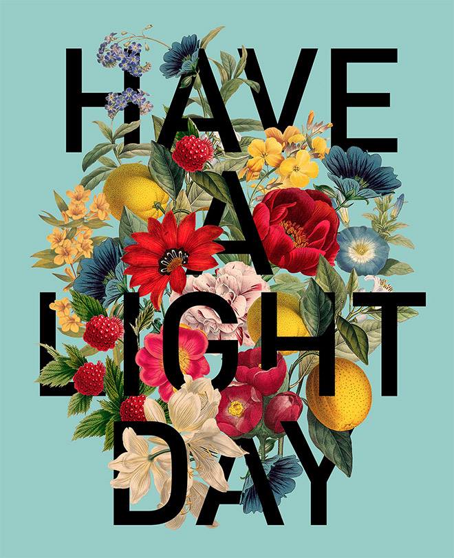
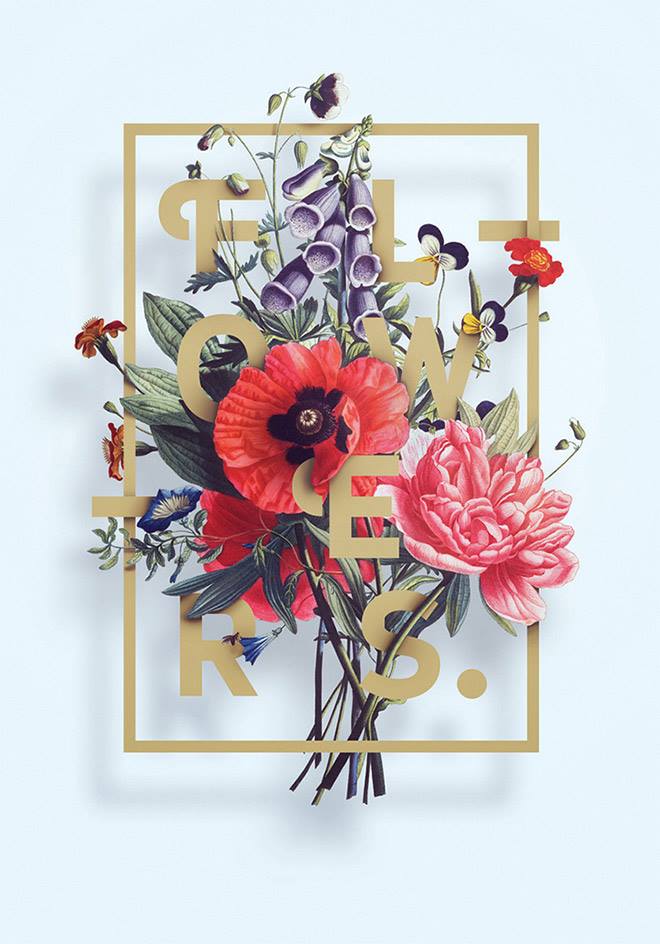
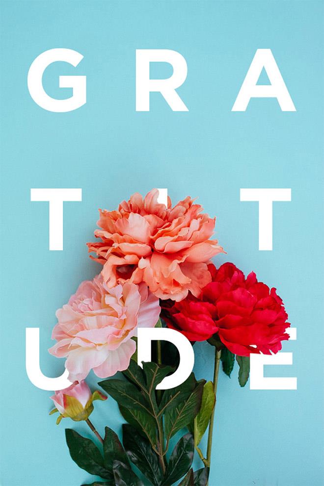
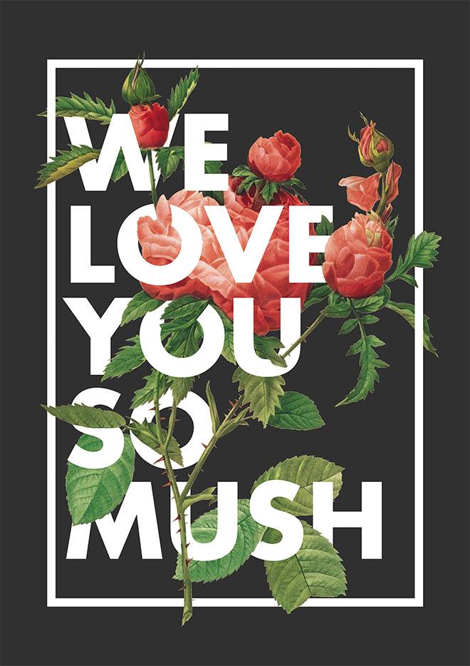
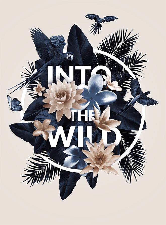
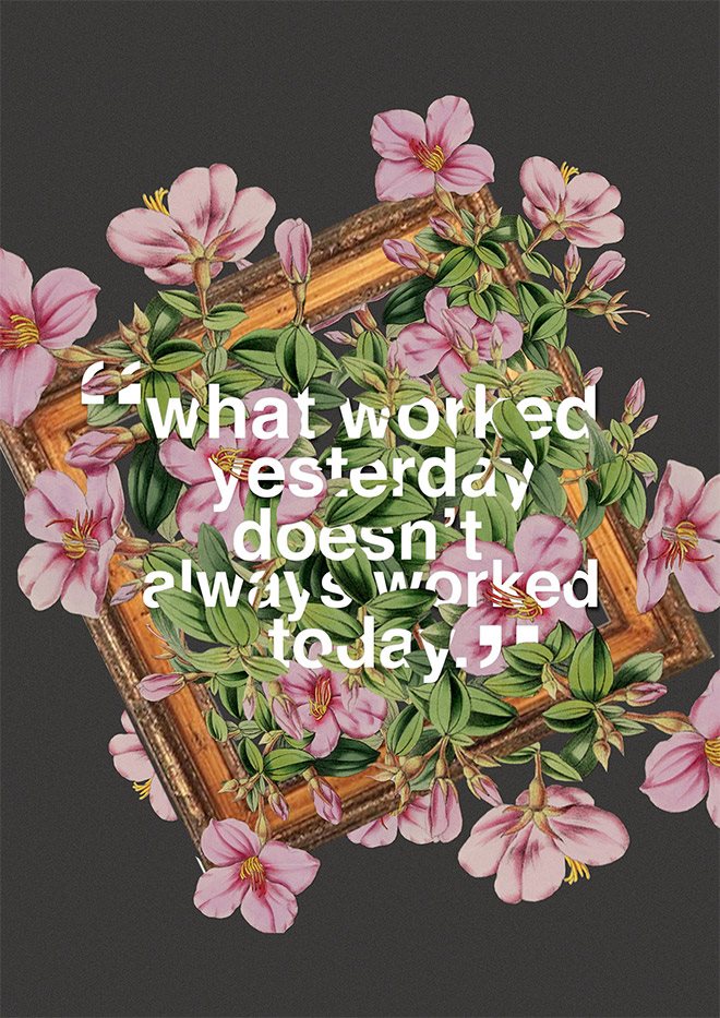
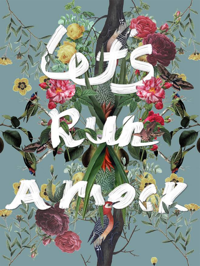
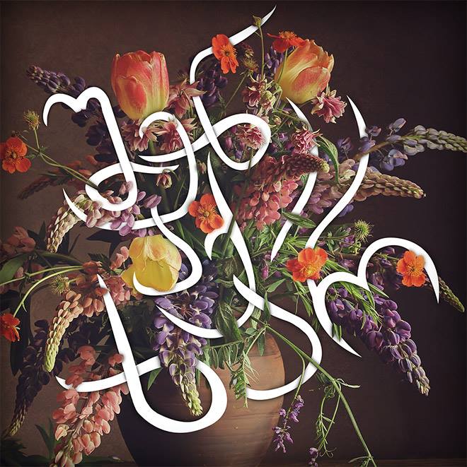
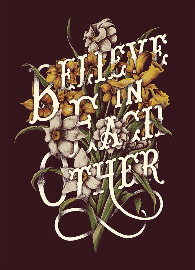
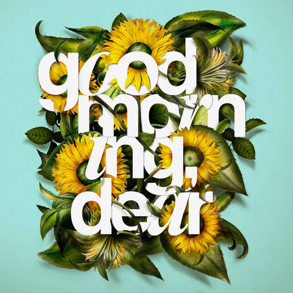
One of my favorite trends in typography is the current obsession designers have with combining flowers and text. Intertwining the letters with flowers, leaves, and stems, whether illustrated or photographed, the technique creates an illusion of depth in two-dimensional design. With a simple idea and good executing, anyone can create stunning results. Designers have adopted this technique in posters, stationery, wedding invitation designs etc. I’ve gathered here 14 beautiful examples of how it can be done, and if you are interested in learning to do it yourself, you can find a step-by-step tutorial video at the end of the post.
You are currently viewing a placeholder content from YouTube. To access the actual content, click the button below. Please note that doing so will share data with third-party providers.
Images © Spoongraphics

