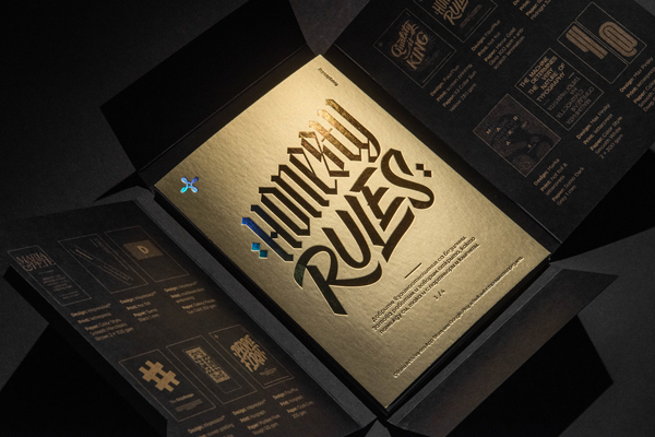
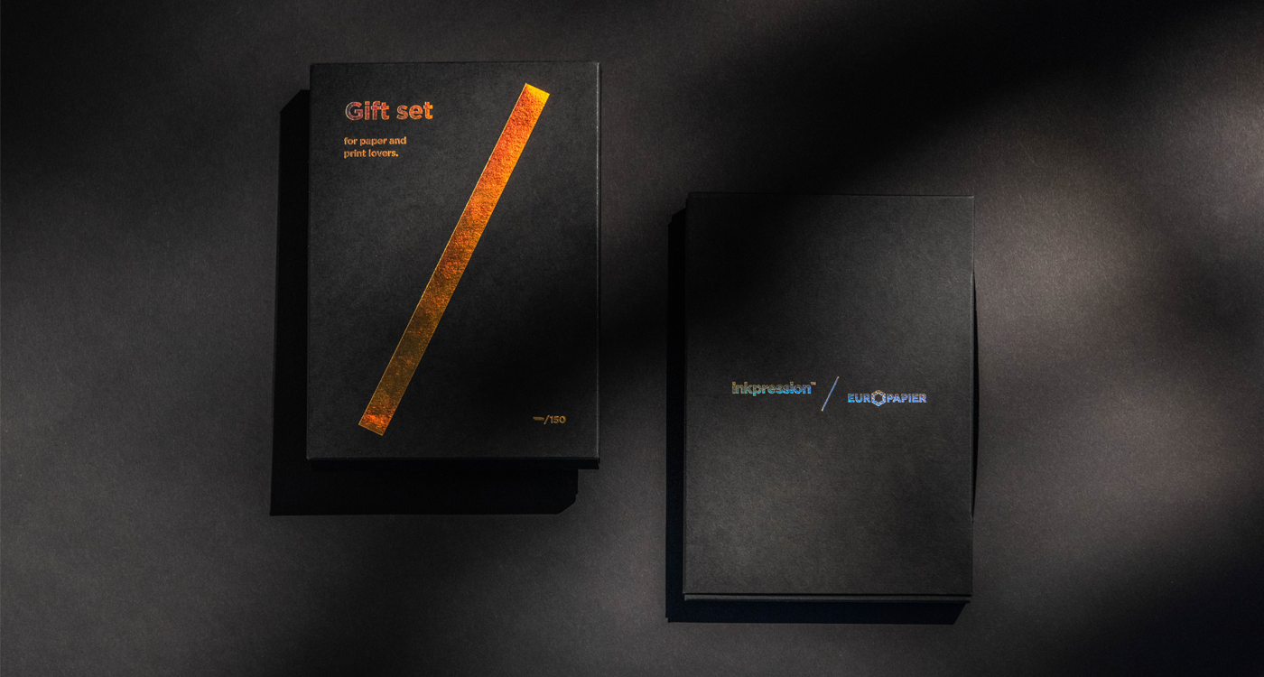
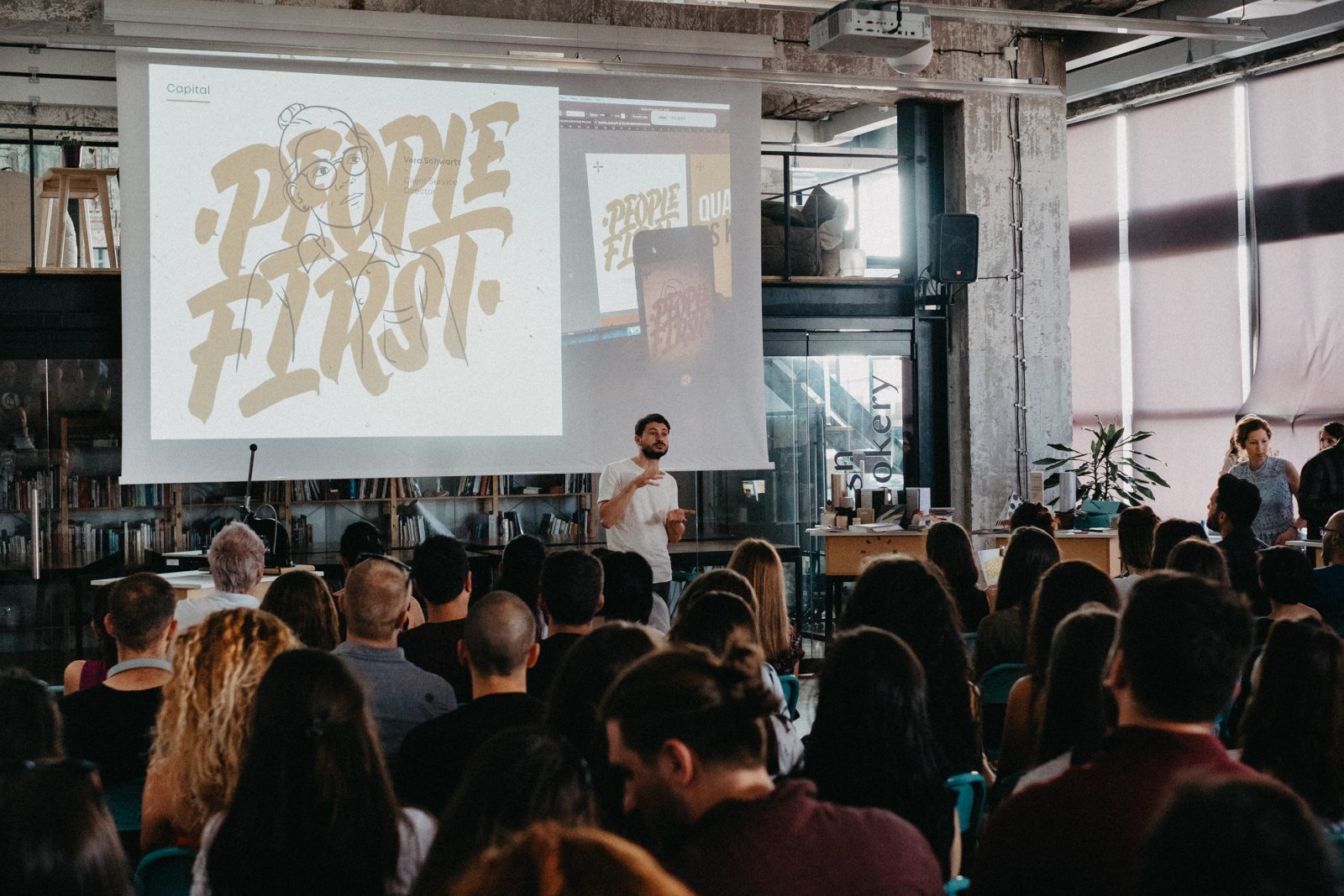
Last summer the first-ever Branding & Stationery Design and Printing event was organized in Sofia, Bulgaria by a collaborative effort by Europapier and InkPression™, together with FourPlus, Marka Collective, and Max Pirsky. Additionally to various presentations and workshops taking place at the event, the three creative collaborators were invited to utilize the newly presented paper qualities by Europapier in their self-promotional material.
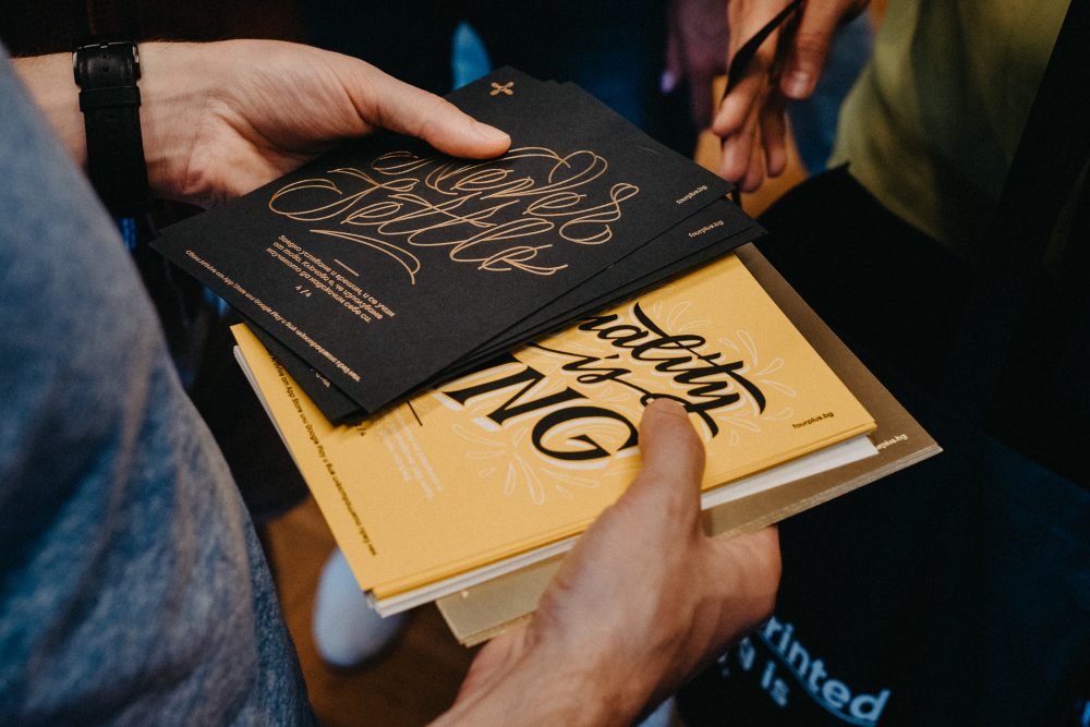
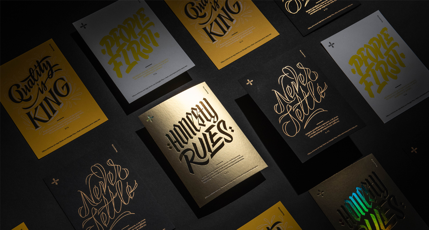
FourPlus, a design agency based in Sofia, Bulgaria, who works with clients from all over the globe with a focus on visual identity and motion design, decided to create a set of cards that represent the companies main pillars and work principles, with the cards printed on four different creative papers applying different printing techniques.
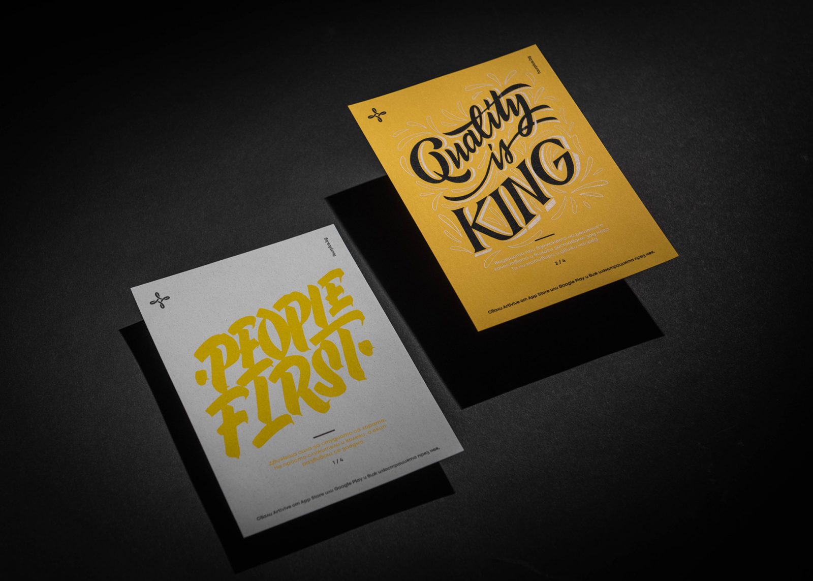
A set of four cards representing FourPlus’ main pillars and work principles, printed on different creative papers with various printing techniques
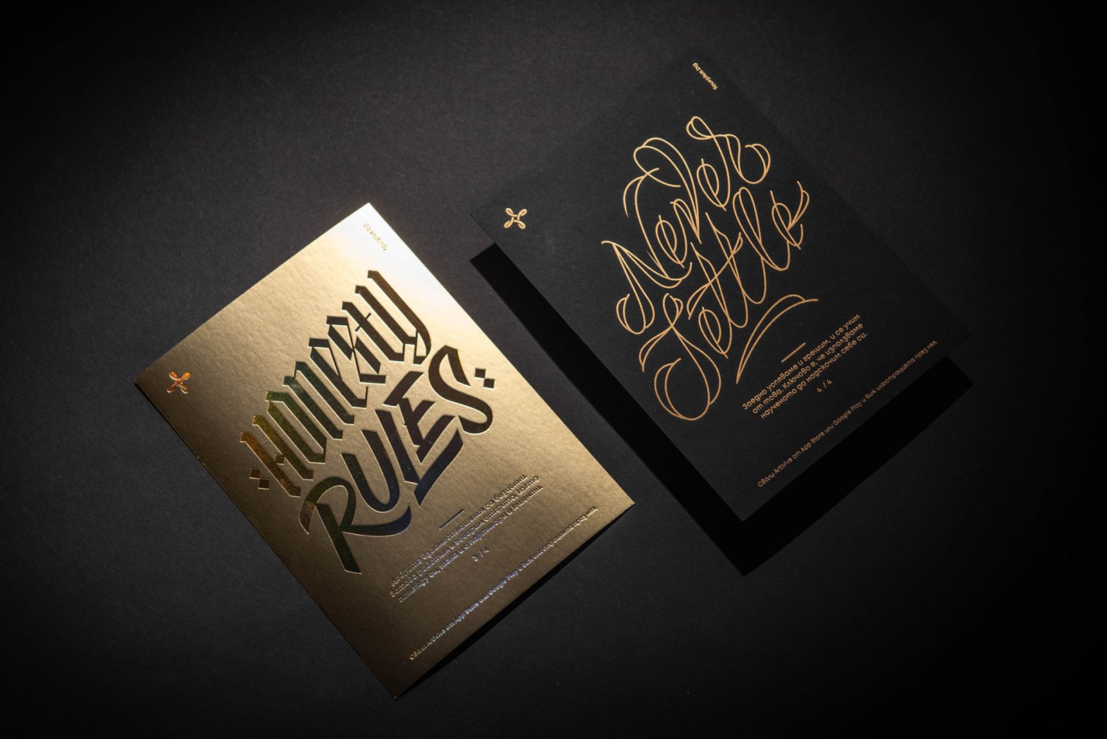
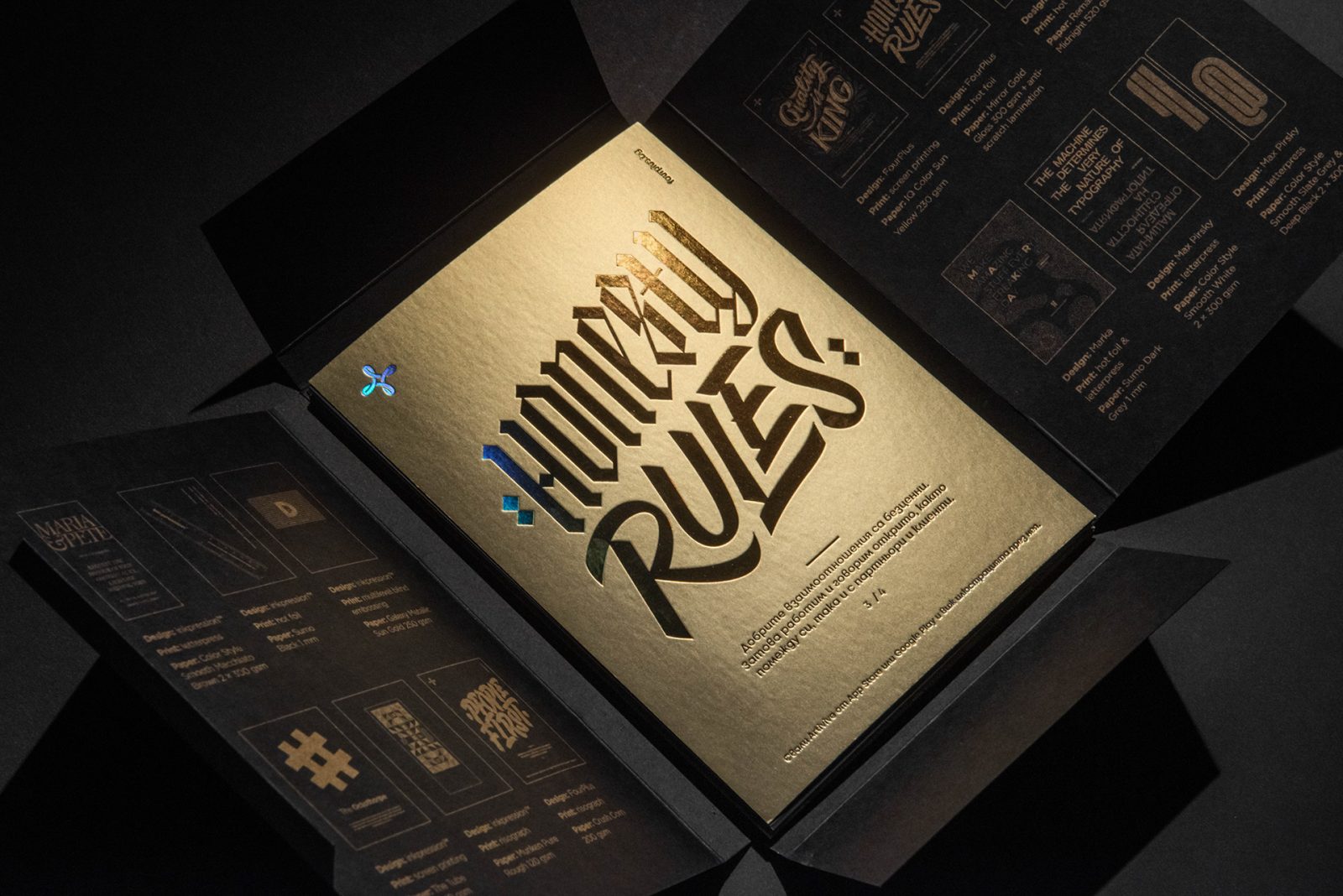
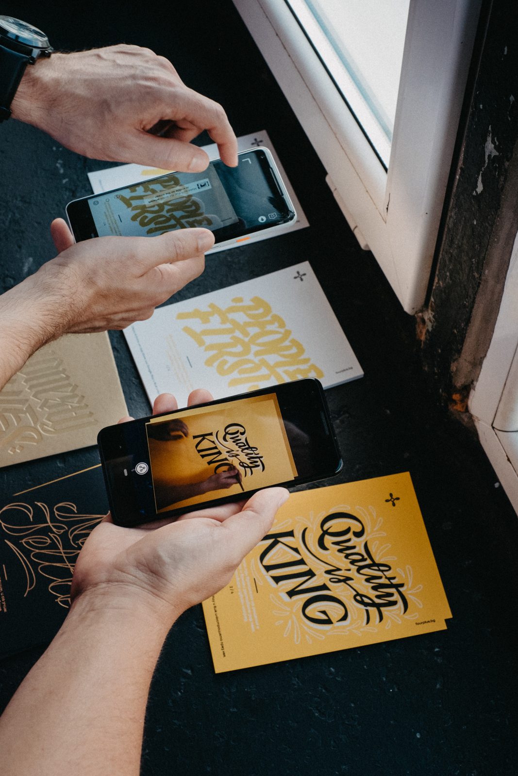
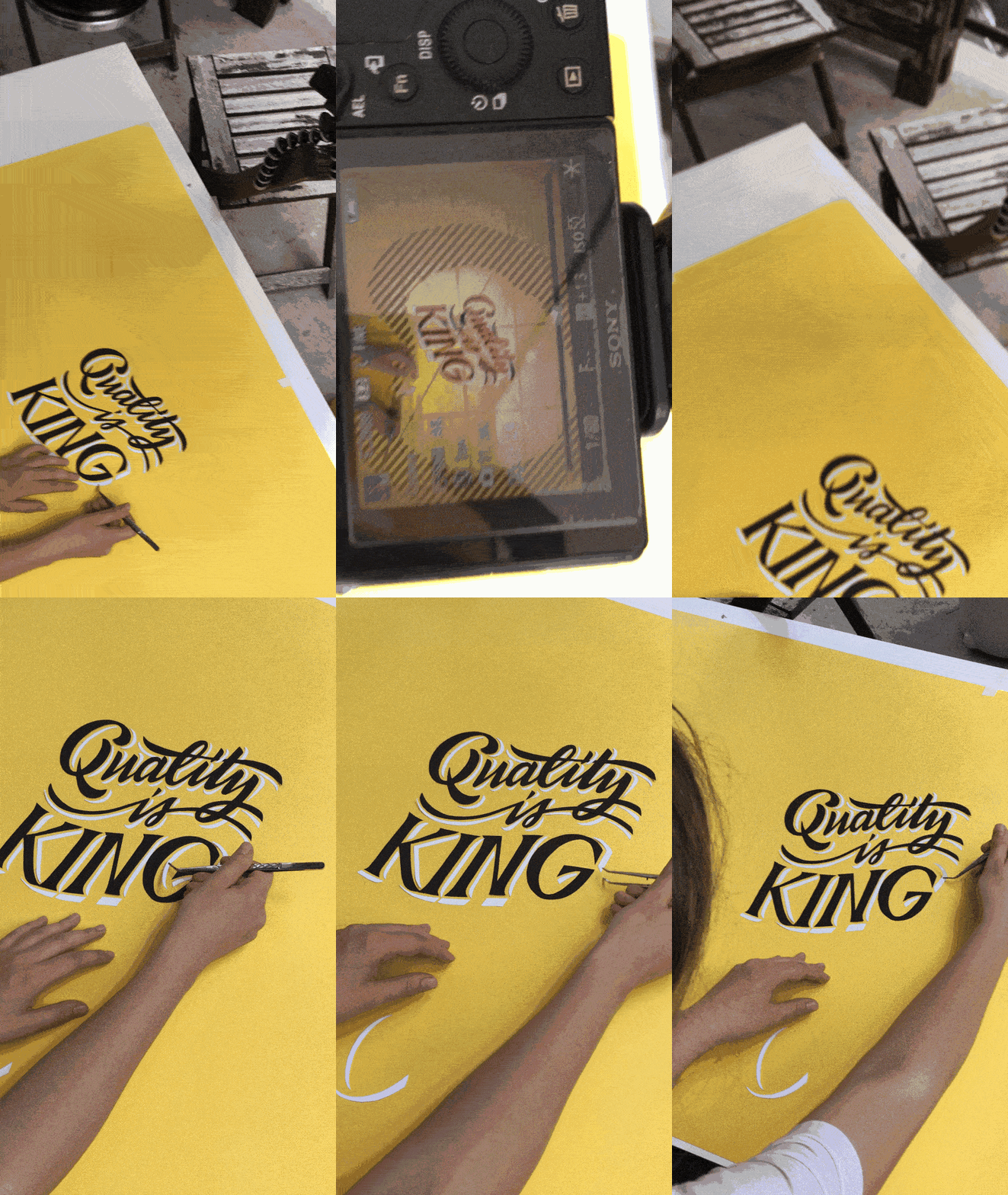
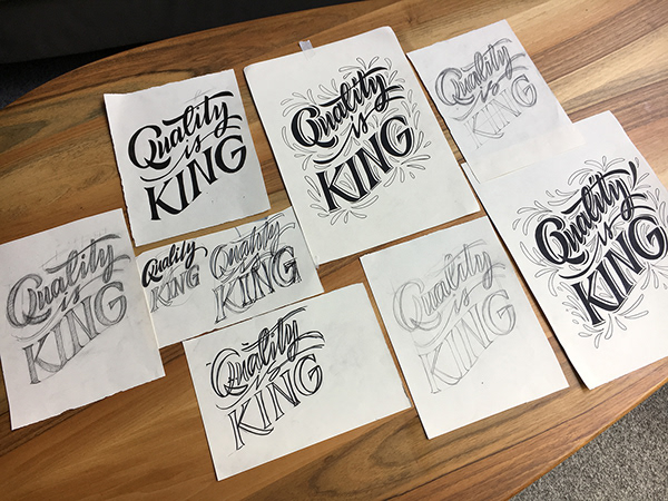
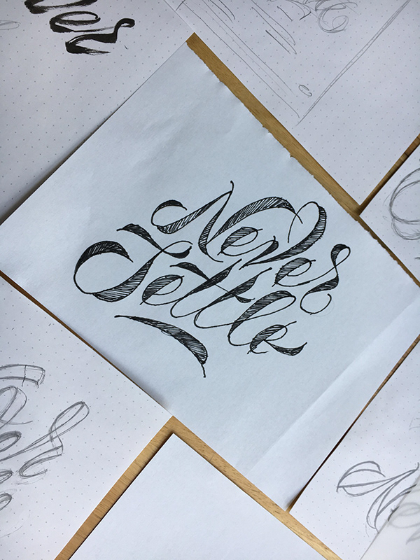
The series of four cards present the core values and ethics of FourPlus, in beautifully designed calligraphy lettering, each unique and in its own style. “Honesty Rules” which stands for honest and fair communications, is hot foil printed on Mirror Gold Gloss 300 gsm with anti-scratch lamination. “People First” represents the team spirit and value of the individual and is printed in Risograph on Crush Corn 200 gsm. “Quality is King” reveals the striving-for-excellence nature of the studio, and in screen printed on IQ Color Sun Yellow 230 gsm, while “Never Settle” captures the team’s unresting desire and aim for growth and better, and is hot foil printed on Remake Midnight 520gsm – all papers exclusive available at Europapier.
Honesty Rules stands for honest and fair communication, People First represents the team spirit and value of the individual, Quality is King reveals the striving-for-excellence nature of the studio, while Never Settle captures the teams unresting desire and aim for growth and better.
The graphic design, calligraphy, and lettering of the Value Card project – which incredibly well showcases the talent and imagination of FourPlus – was done by Ivaylo Nedkov and Tsvetislava Koleva, and the illustration by Dana Peeva, while Alex Zhelyazkov, Atanas Giev, and Desislava Spilkova were responsible for the animations, which were added to give extra value to the print formats and to highlight the studios focus on motion design. Artivive app was used by the event-goers to bring the calligraphy and lettering of the cards to life. Watch the video below showing the Quality is King card design in the making!
The project has won FourPlus the Communication Arts Typography Competition 2020‘s Award of Excellence, which is one of the most-coveted awards in the industry. Winning places you in the highest ranks of your profession – congratulations to FourPlus.
You are currently viewing a placeholder content from Vimeo. To access the actual content, click the button below. Please note that doing so will share data with third-party providers.
More Information

You are currently viewing a placeholder content from Vimeo. To access the actual content, click the button below. Please note that doing so will share data with third-party providers.
More InformationStudio images © Vasil Germanov
Event images © Inkpression

