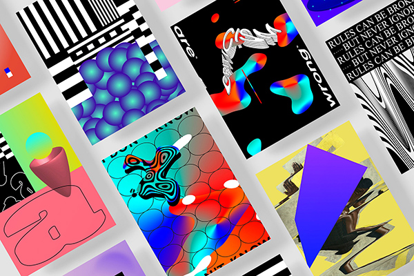
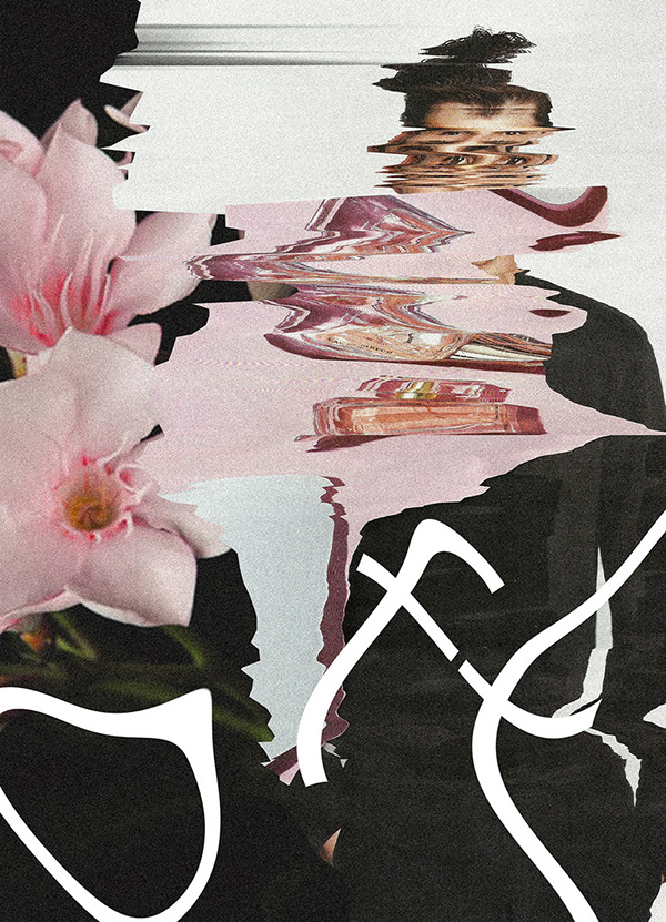
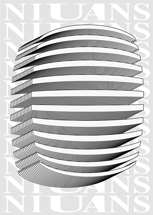
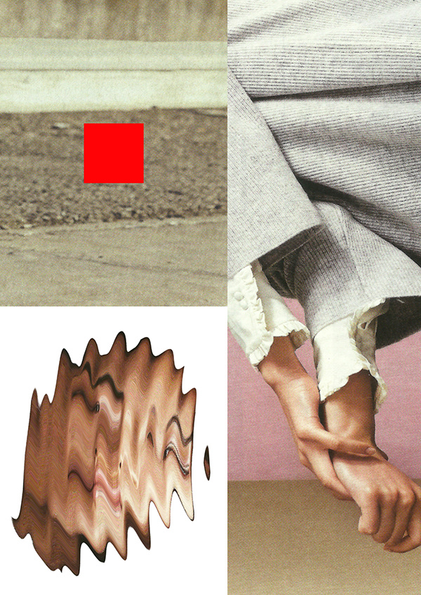
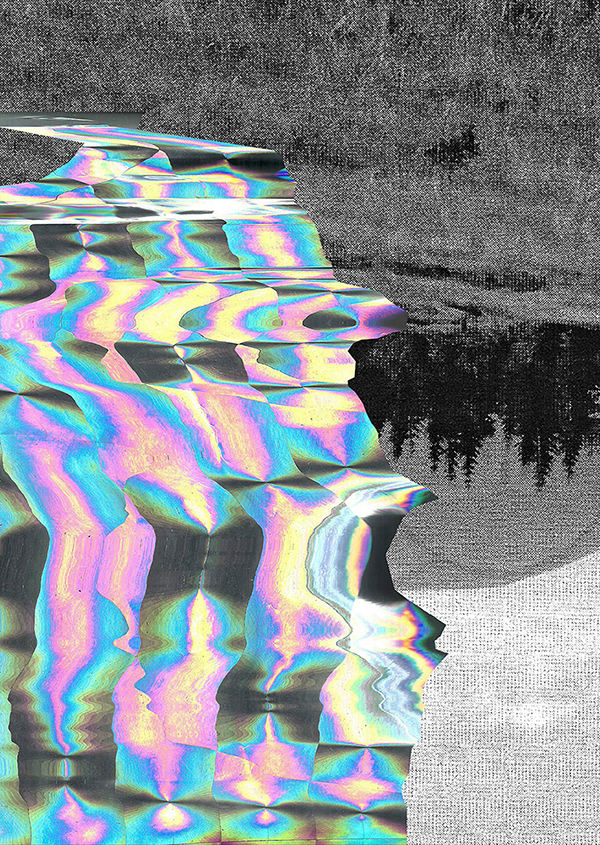
Martyna Wędzicka-Obuchowicz – an art director, graphic designer, glitch artist, poster maker, visual identity lover, and a former co-owner and member of studio less. (featured before here) from Gdansk Poland – runs a creative poster project, infamously titled #prettyuglyproject. By deconstructing and visually manipulating various visual elements, Wędzicka-Obuchowicz creates head-turning posters reminiscent of glitch art. The unique designs caught our eye, and our interest, on Instagram, so we asked Wędzicka-Obuchowicz a few questions, of how it all came to be.
What is #prettyuglyproject, and where did the idea come from, how did it start?
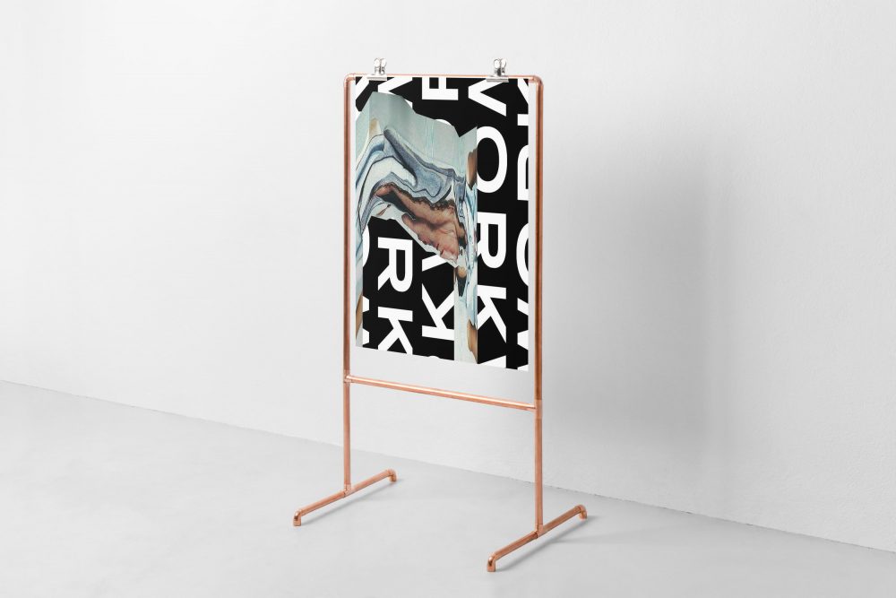
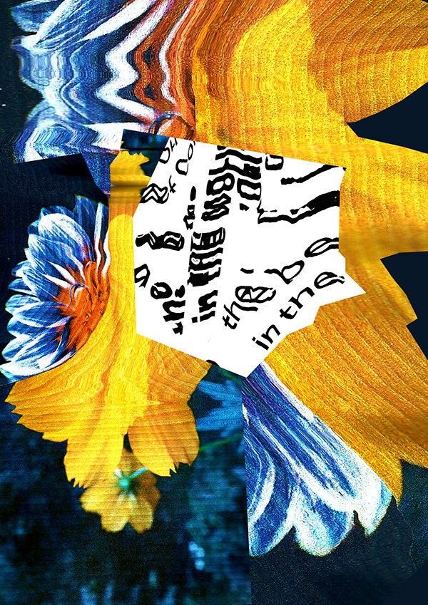
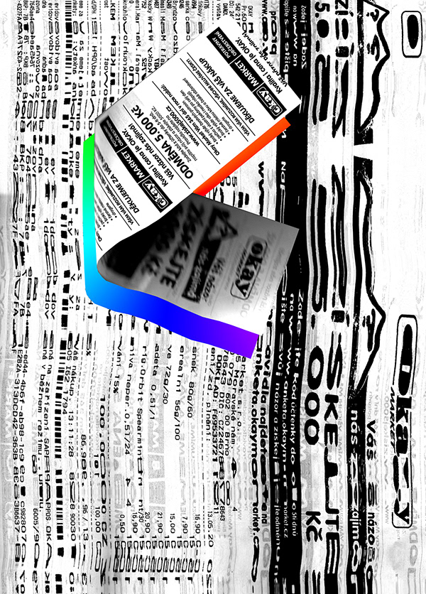
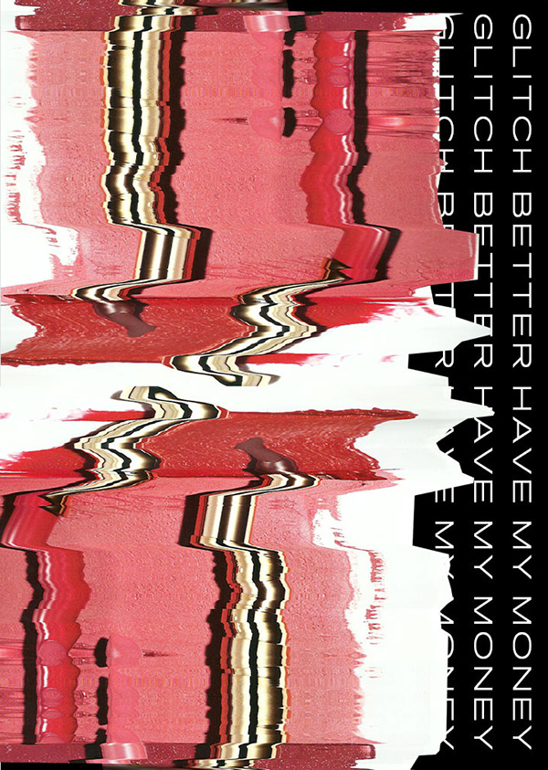
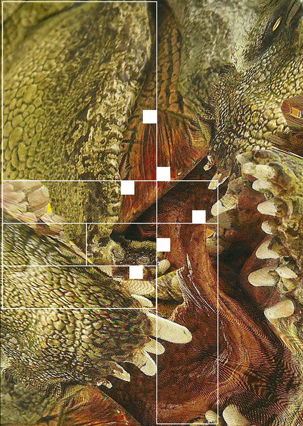
Almost 4 years ago I was tired of making only commercial projects, and I made a new Instagram account called @wedzicka_com. I made some collages with geometrical elements and distortions. In the beginning, I worked on the images in Adobe Photoshop but one day I used my scanner to destroy one of the pictures (right).
Then I thought, it could be my way to make something fresh. So I started exploring what I and my scanner-buddy could do. Now it’s a really long-term friendship.
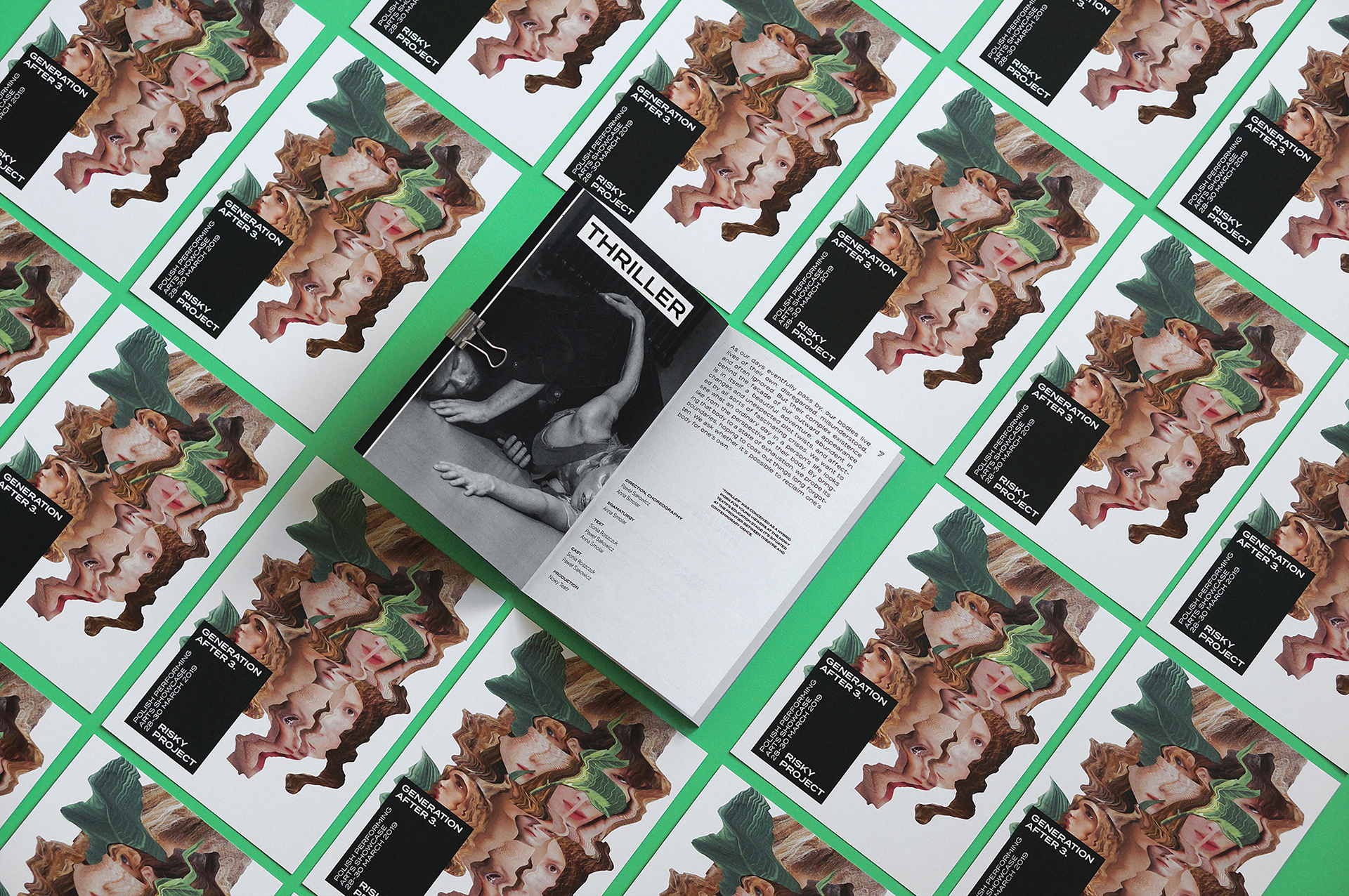
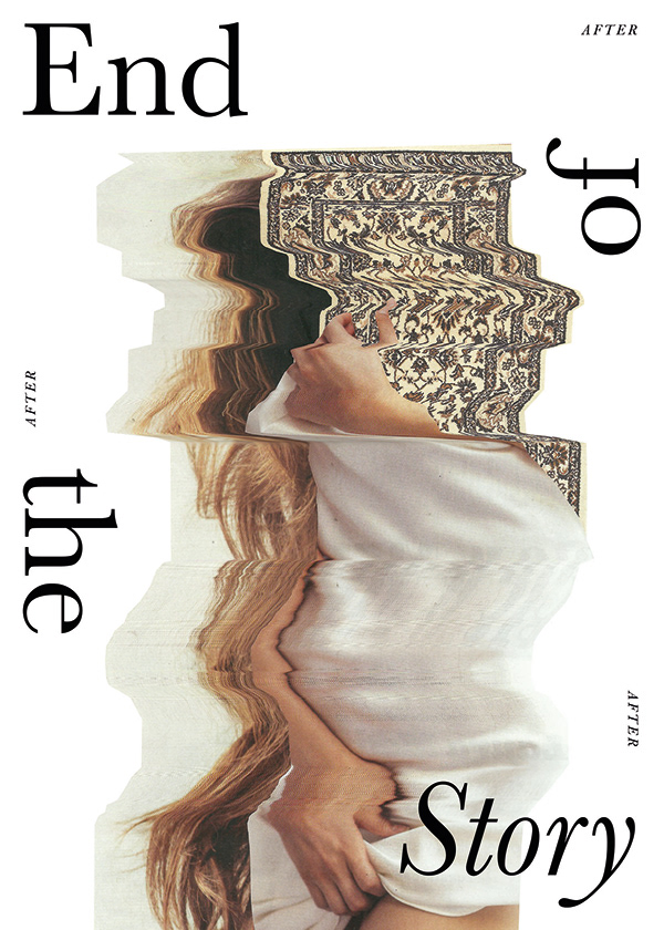
Thanks for this technique, I’ve also made a few big commercial projects, as the identity design for LAVA Avantgarde Film Festival, the identity design for Generations After 3 – NowyTeatr (below), and identity for Lust for Life event.
What is the goal of the project, where do want it to take you?
One Day I thought about musicians. They are making collaborations every day to develop their work and try something new. Sometimes there are very interesting combinations. Graphic designers don’t do that, but I decided to change that.
So I invited a few graphic designers to make a poster together: Patrycja Podkościelny, Jacek Rudzki, and Barrakuz, all talented Polish designers.
At first, I made a grid for each artist and gave them a topic. We had two weeks time to create a project for our “space”. After this, we combined the results and printed the final designs with Risograph. As we didn’t share our work during the process, but only saw the final effects in the end and have always been surprised.
One Day I thought about musicians. They are making collaborations every day to develop their work and try something new. Sometimes there are very interesting combinations. Graphic designers don’t do that, but I decided to change that.
And what inspires you, where do the themes and ideas come from?
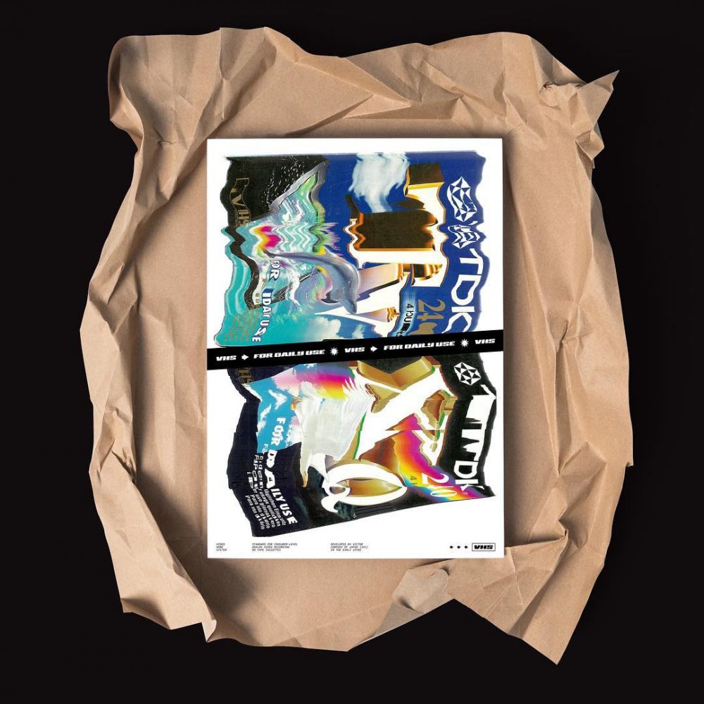
The #prettyuglyproject posters are mainly about problems, sadness, and nostalgic stuff: VHS or Pegasus Cartridges.
How do you create the posters, what techniques do you use?
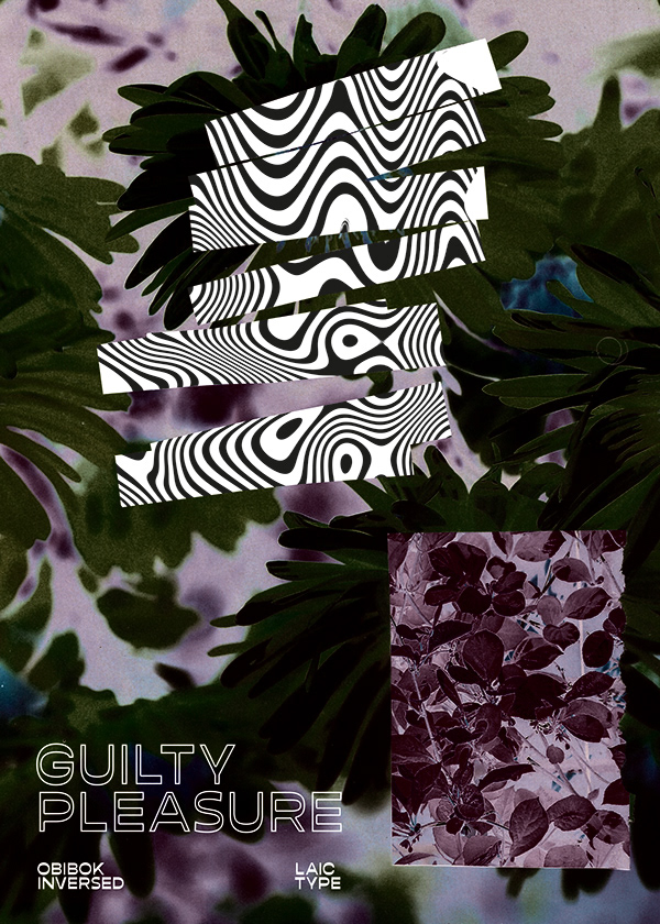
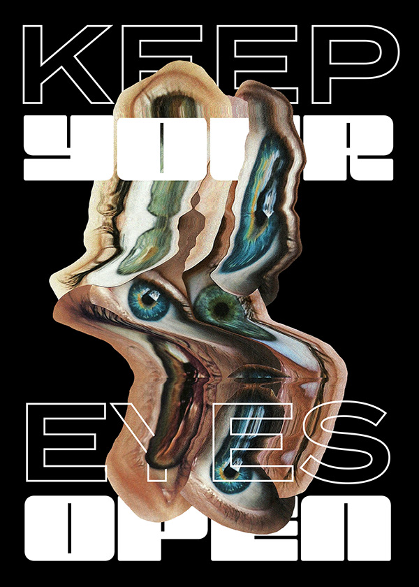
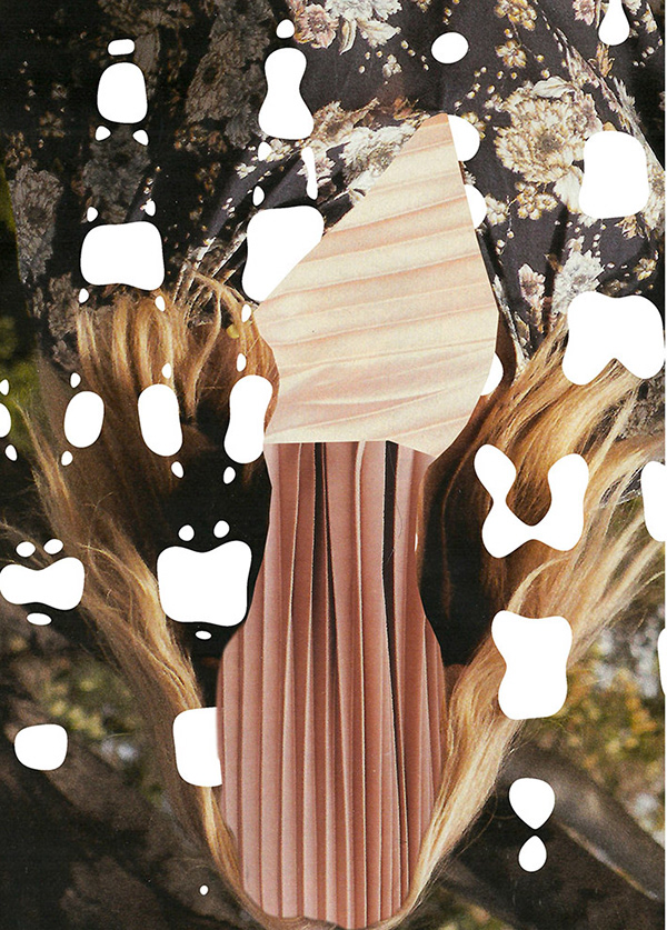
For creating I use everything from around me. Objects like stones, cassette tapes, money, plastic bags, but also collages, my own hands, and photographs. These are only elements of the posters. I put together everything on my computer where I do the final composition.
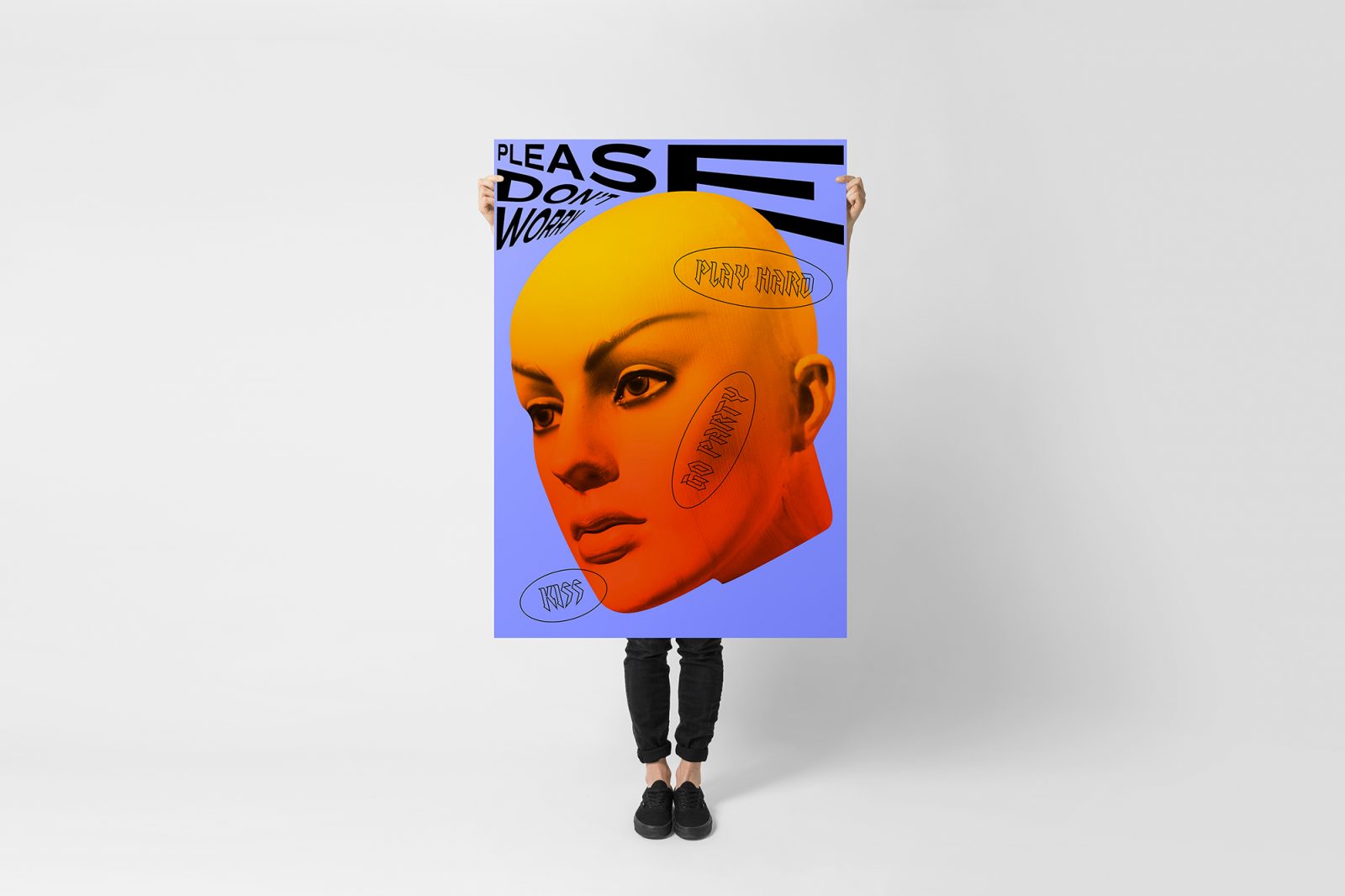
Besides working with glitch, I’m making typographic posters with geometric elements. As after few years of #prettyuglyproject I know, I can’t choose only one style of design. I really like minimalistic and simple projects, so I still make visual identities, editorial designs, and logotypes.
Follow @prettyuglyproject on Instagram
Images © Martyna Wędzicka-Obuchowicz

