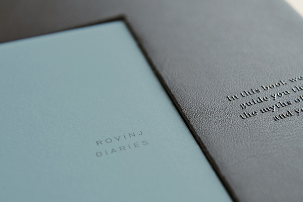
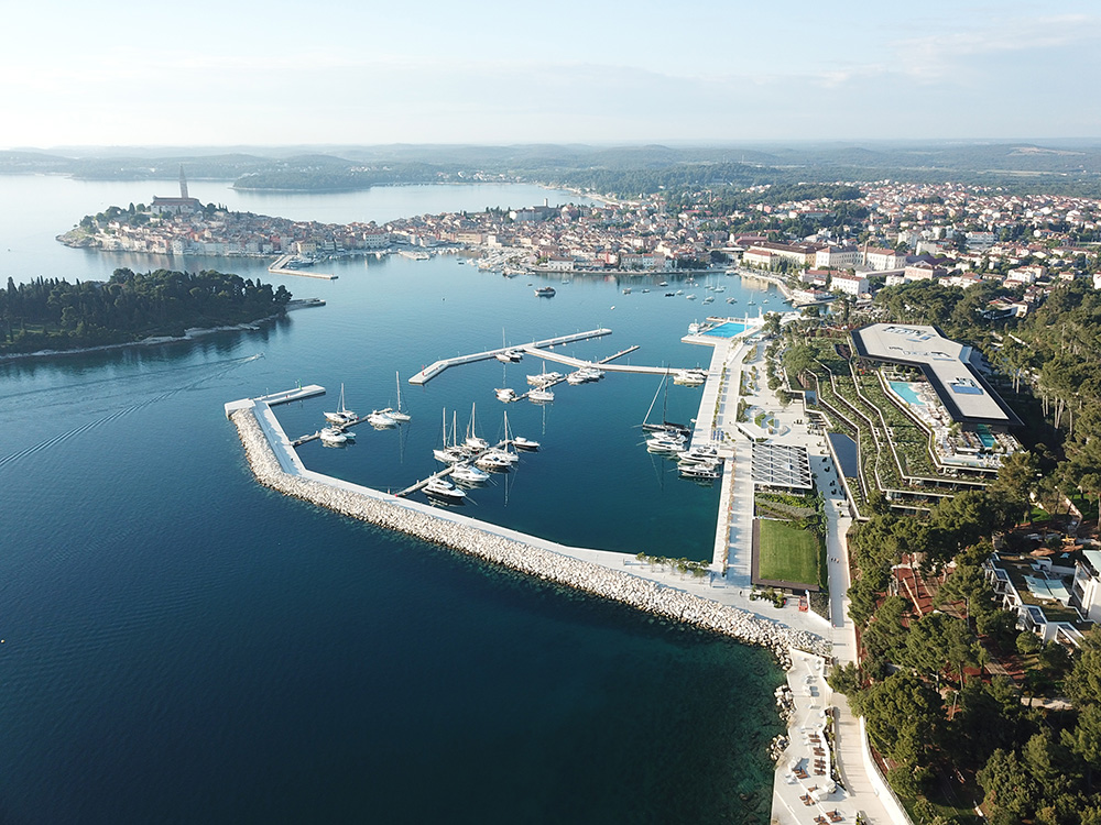
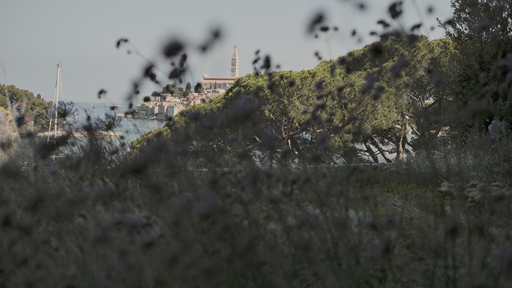
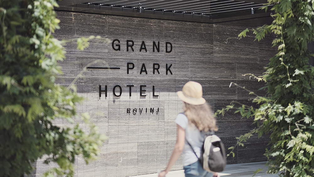
High-profile advertising agency Bruketa&Žinić&Grey (previously featured here) has created a uniquely tactile visual identity for the Grand Park Hotel Rovinj, one of the best luxury hotels in Croatia. The stunning hotel with a one-of-a-kind view over the town from virtually any room was designed by architecture agency 3LHD to blends in with its surroundings – a concept that spurred the idea of a visual identity that relies on the interaction between the guest and the town.
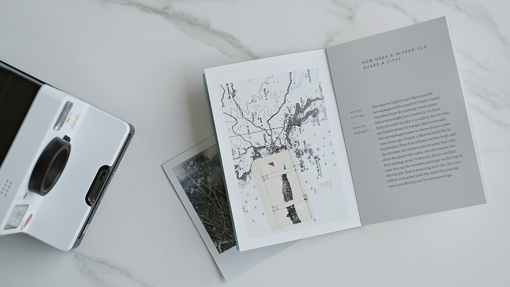
The Grand Park Hotel Rovinj’s identity is integrated into the identity of the town of Rovinj
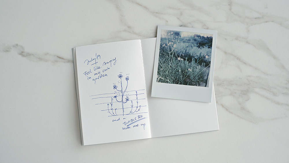
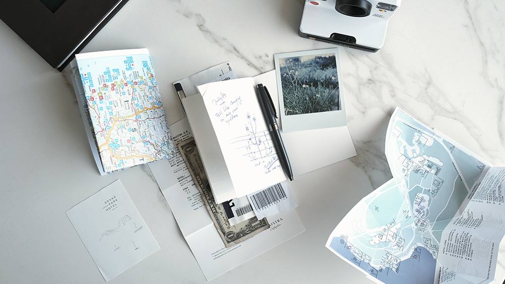
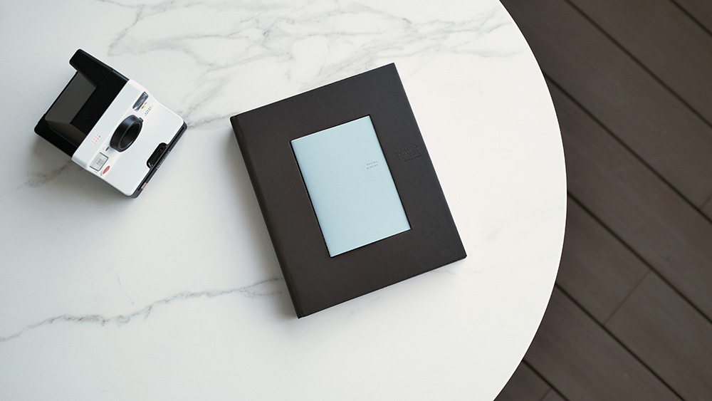
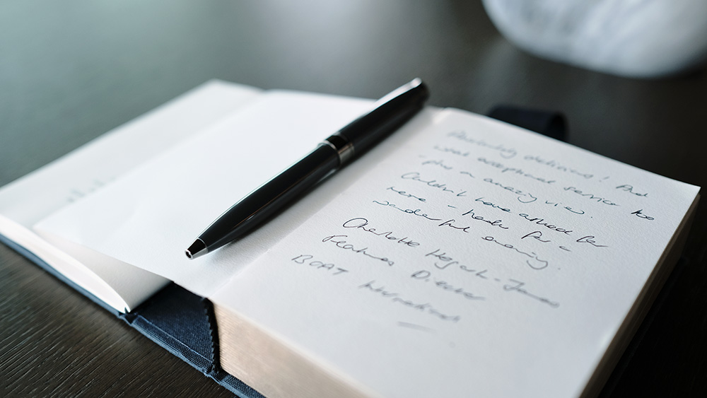
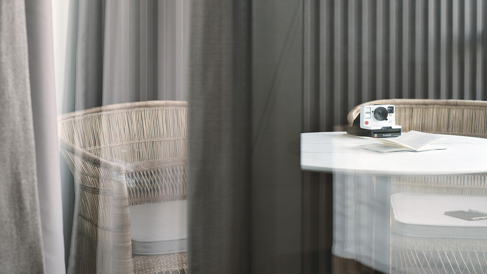
Upon arrival, each guest receives an instant Polaroid camera and a pocket-size notebook as an incentive to keep a travel log of their experiences in the region. Mindfully guided outside the hotel and exposed to lesser-known local narratives, the guests co-create the identity by keeping their memories in a travel log. The small notebook becomes the focal point of interaction in time and space, allowing the identity to become personal and repetitively recreated.
The guest’s impressions on the destination are joined with work by renowned Croatian artists Hana Tintor, Klara Rusan, Danijel Srdarev, and Marko Tadić, whose illustrations can be seen in the hotels interior and promotional items. As a result, the hotel’s identity is integrated into the identity of Rovinj, in a similar way in which the hotel is integrated into the landscape of Rovinj.
The hotel’s identity is integrated into the identity of Rovinj, in a similar way in which the hotel is integrated into the landscape of Rovinj.
 A discreet and interactive identity build of local stories and guest impressions
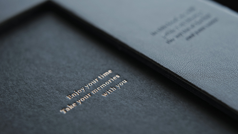
Inspired by the interactive aspect of the identity, preference was given to physical, tactile experiences like textures generated by 3D, foil printing, embossing, and similar techniques. In effect, no colors were used in the printing apart from the colors of the materials, the shades of brown, grey and blue, which match the colors of the interior, as well as the surroundings the hotel is nestled in.
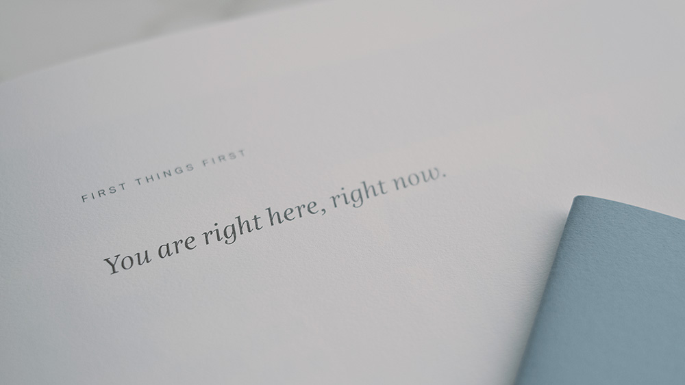
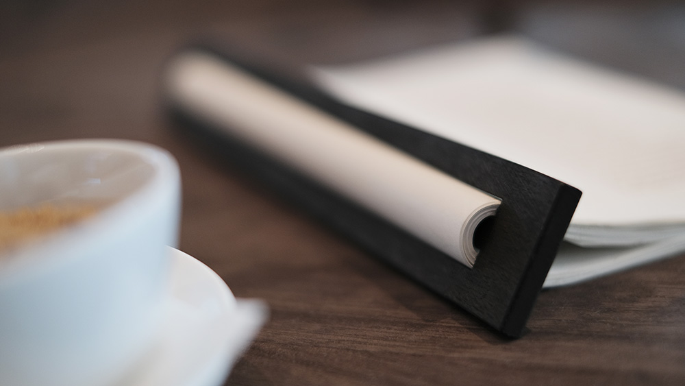
Used materials range from leather and wood, used in the stylish wooden cylinders and menu spines, to textured fabrics of outstanding tactile qualities and paper with strong haptic properties, including water-, aging- and tear-resistant features.
Utilizing Neobond, a durable and hard-wearing synthetic fiber paper, for its unique water-and tear-resistant qualities
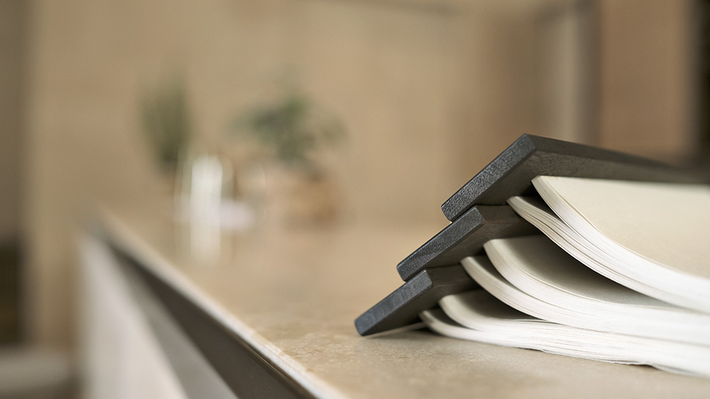
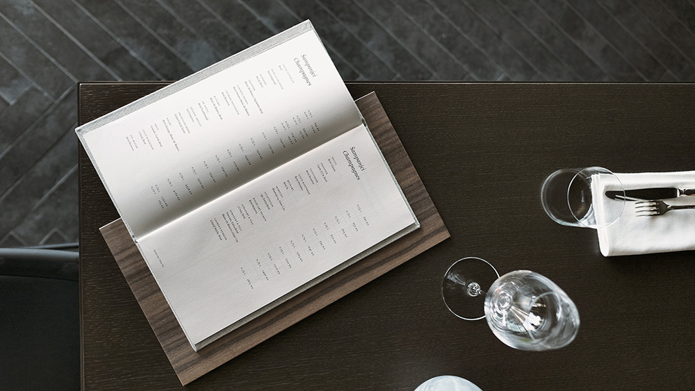
Two sorts of paper from the Europapier Design Papers collection were used in the project: Neobond White and Blue 200 gsm. As Neobond White 200 g contains an almost identical color and texture as Stucco Old Mill Gesso, which has been chosen as the main hotel paper, it matches the concept perfectly. Neobond was used for products that needed to be water-resistant and high-endurance, as well as be tear-proof because the binding methods used were not standard. These include the wellness list, the pool bar menu as well as menus of the outdoor hotel restaurants.
Neobond was used for products that needed to be water-resistant and high-endurance, as well as be tear-proof because the binding methods used were not standard.
Neobond blue 200 g was used for the covers of the Travel Journal, which was created with the idea to have a pocket-sized notebook that won’t wear out easily. Neobond’s light blue color fits perfectly into the dark brown covers of the Guest Directory.
With Neobond, the silkscreening Pantone Metallic 876 was used for the covers, and offset Pantone Warm Grey 11 for book blocks and the laser printing in the hotel for the removable price list pages. Binding techniques for the wellness list, pool, and lobby bar menus are unique – made of wooden battens and cylinders. Saddle sewn binding was used for the Travel Journal.


Images © Bruketa&Zinic&Grey / Domagoj Kunic

