With most of the world slowly but surely reopening after months of restrictions and lockdowns, there’s one thing we’ve missed terribly – restaurants and hotels. The hospitality industry has been one of the worst hit sectors in this crisis and now that it seems like light at the end of the tunnel is shining brightly in our eyes, we want to celebrate the industry in the best way we know; highlighting our favorite restaurant and hotel branding concepts that utilize paper in a beautiful or unique way.
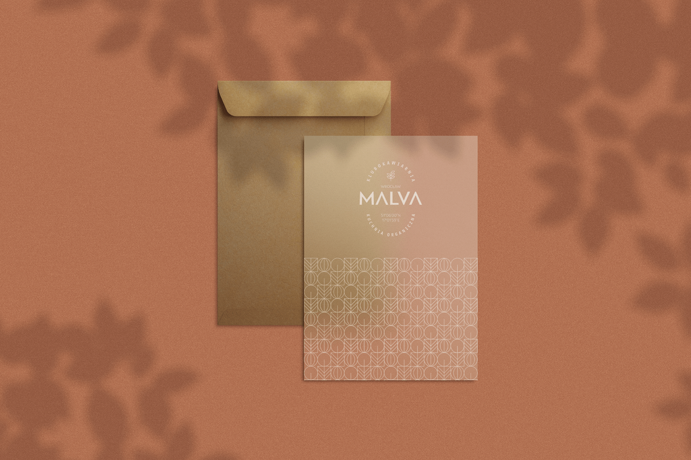
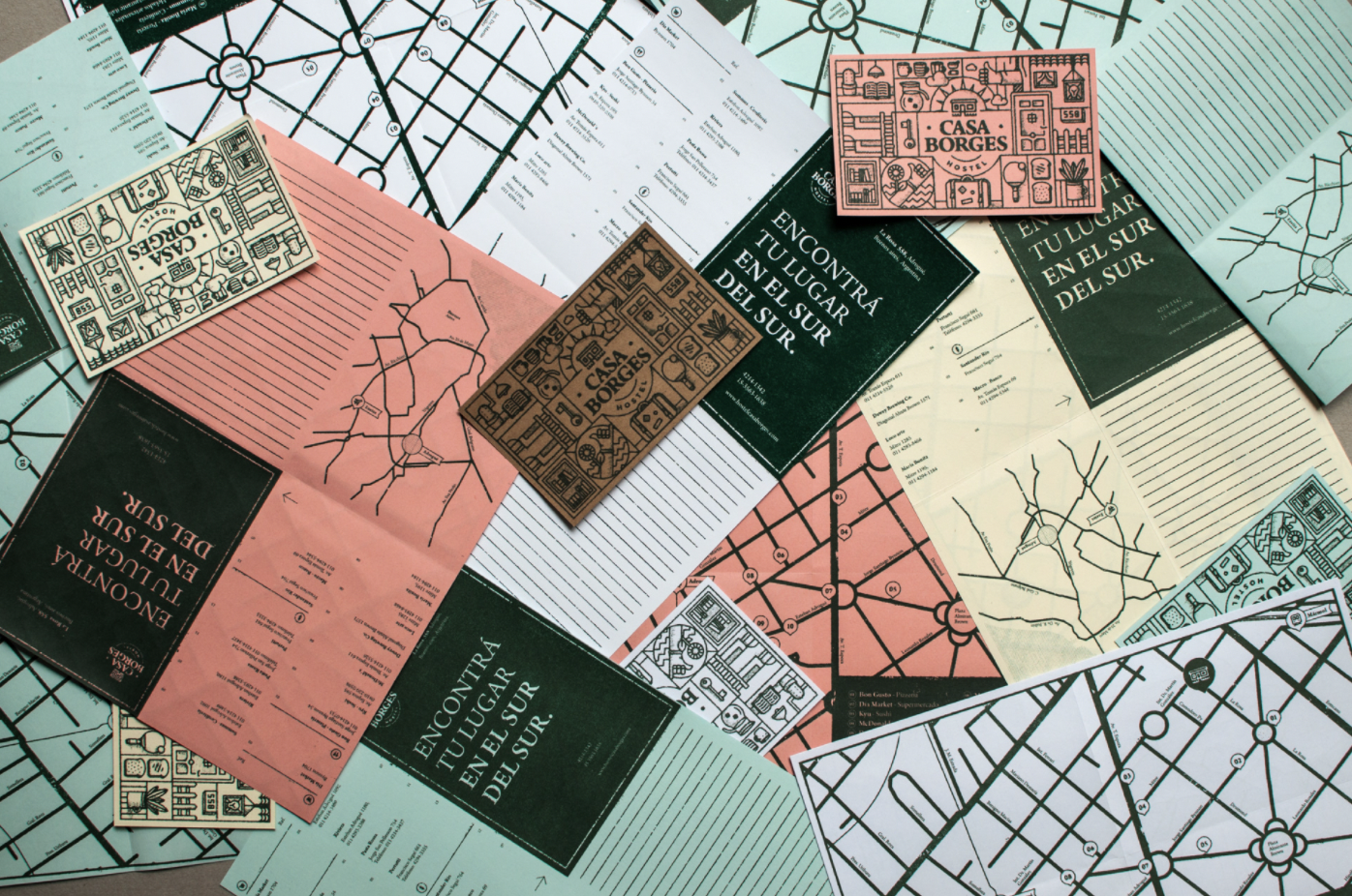
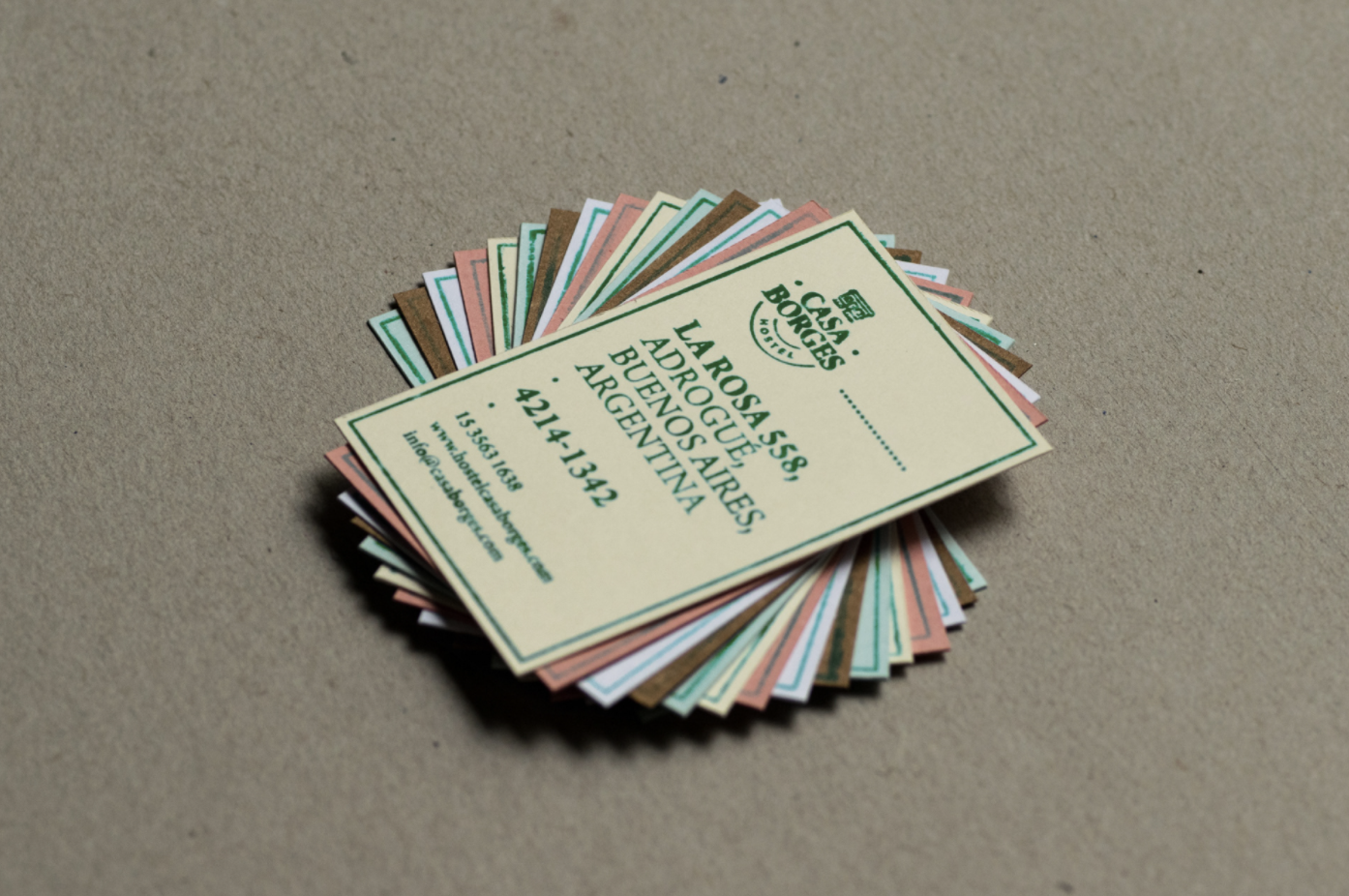
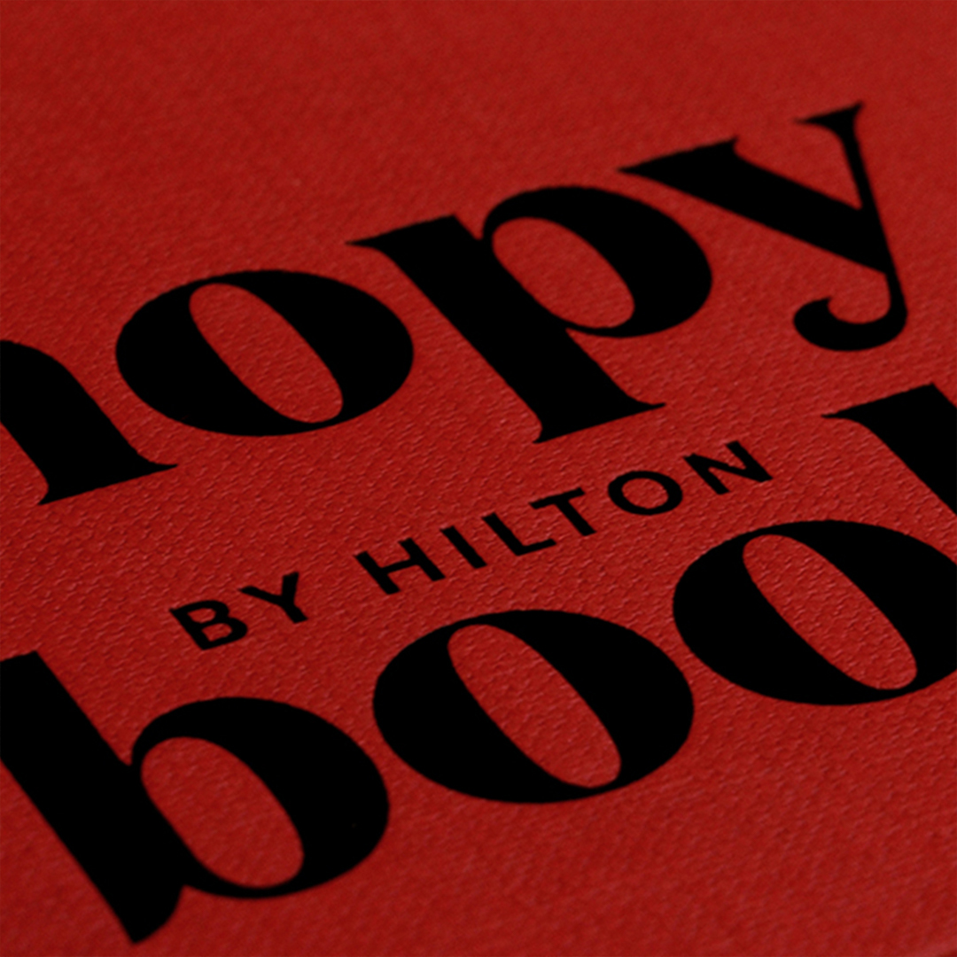
Each detail, including the paper choices, are integral parts of a successful visual identity
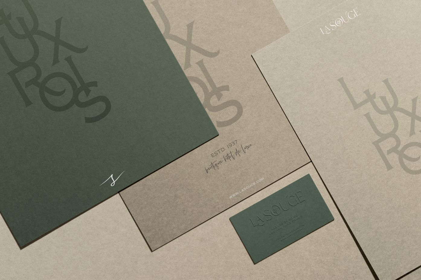
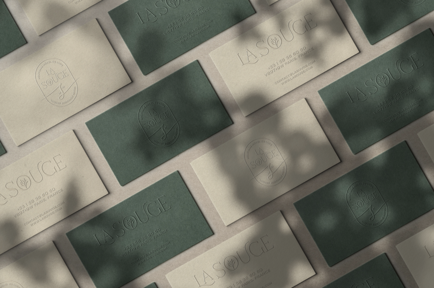
The main goal of a visual identity is to guide your perception as well as the expectation of a specific brand, service, or place prior to experiencing it. Every brand needs a clearly defined visual identity that makes the brand recognizable across all channels and appeals to the target audience, building brand awareness and equity. When dealing with brands in the hospitality sector, consumers are especially demanding, as their expectations might also be higher, and they base them off the perception they have, partly made from the visual identity. So each small detail, down to the paper choices are important.
A good visual identity captures your interest and rises intrigue, while a great one gives a promise of something new, unexpected, and worth having.
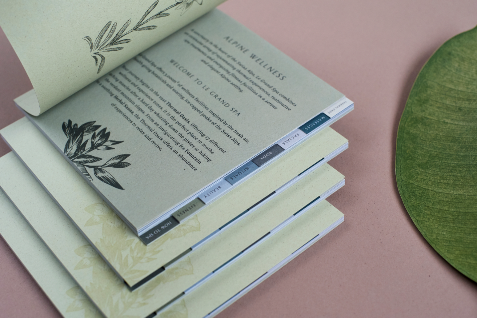
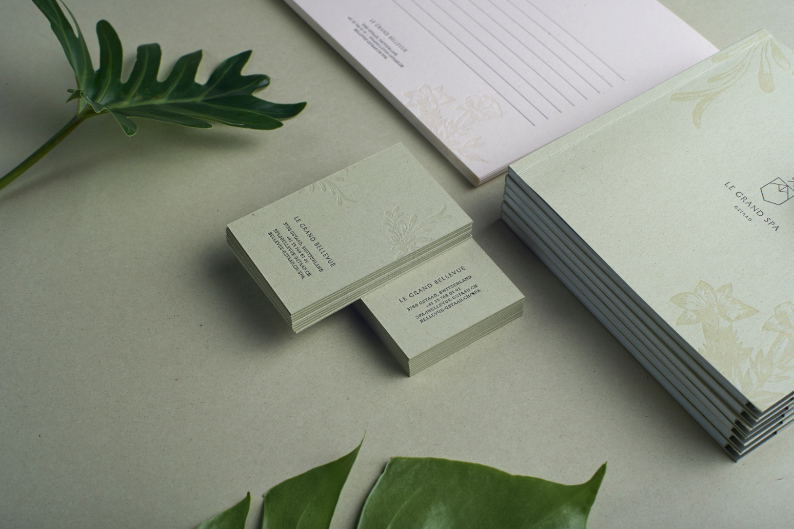
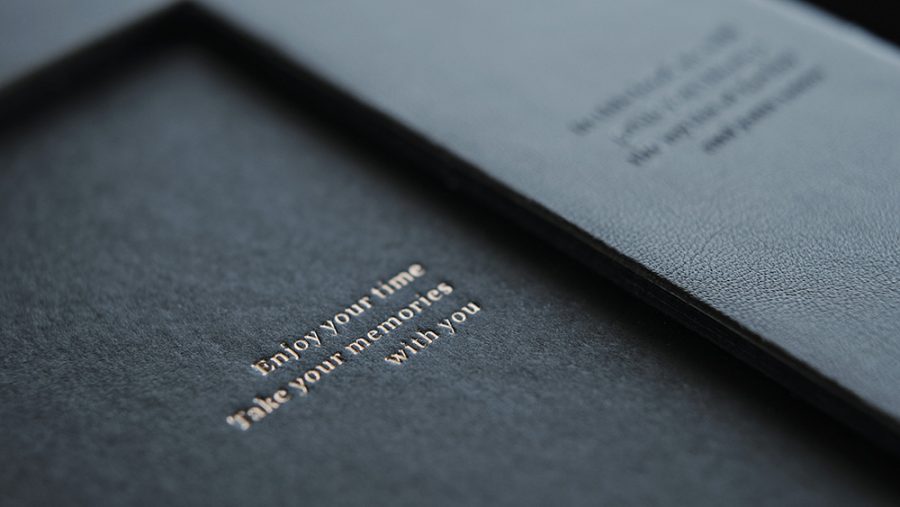
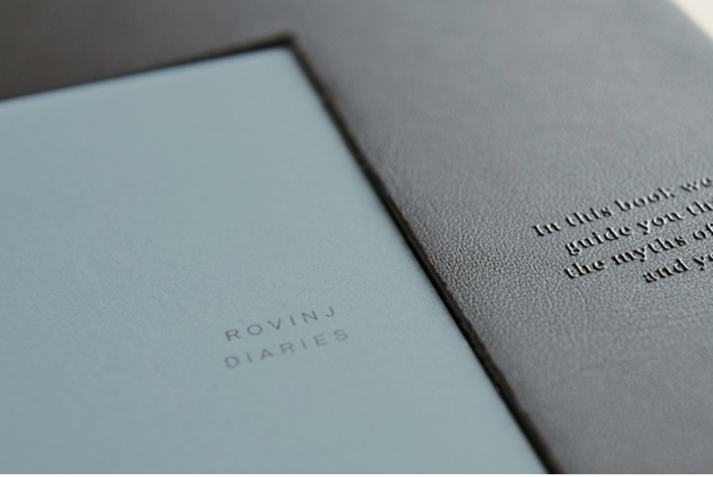
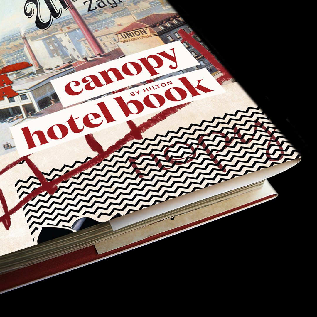
Visiting a hotel or a restaurant is expected to be a fully holistic experience, a joyous event that fulfills your needs and wants. It’s the little things that become meaningful. When you think back to your last successful hotel visit, do you remember what the room smelled like, how crisp the sheets were, or what the hotel stationery looked like? These are all integral parts of your experience. Sometimes we focus on the big things, but truly, it’s the small things like paper choices, that are the loudest.
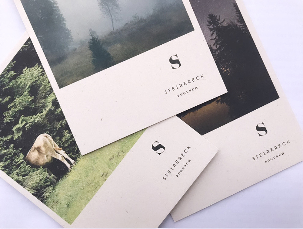
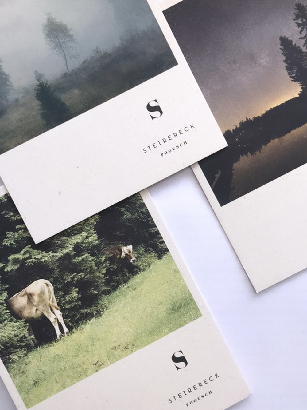
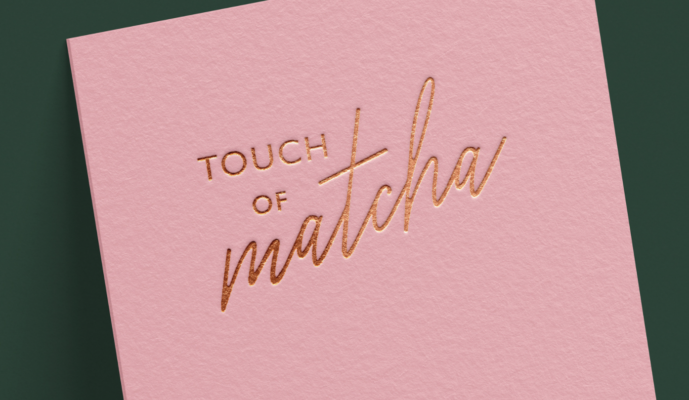
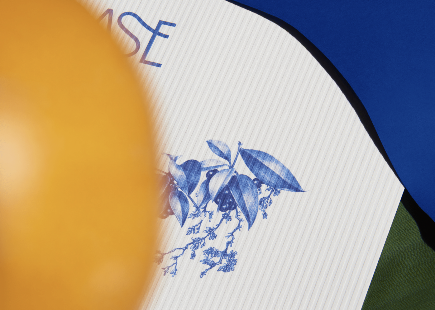
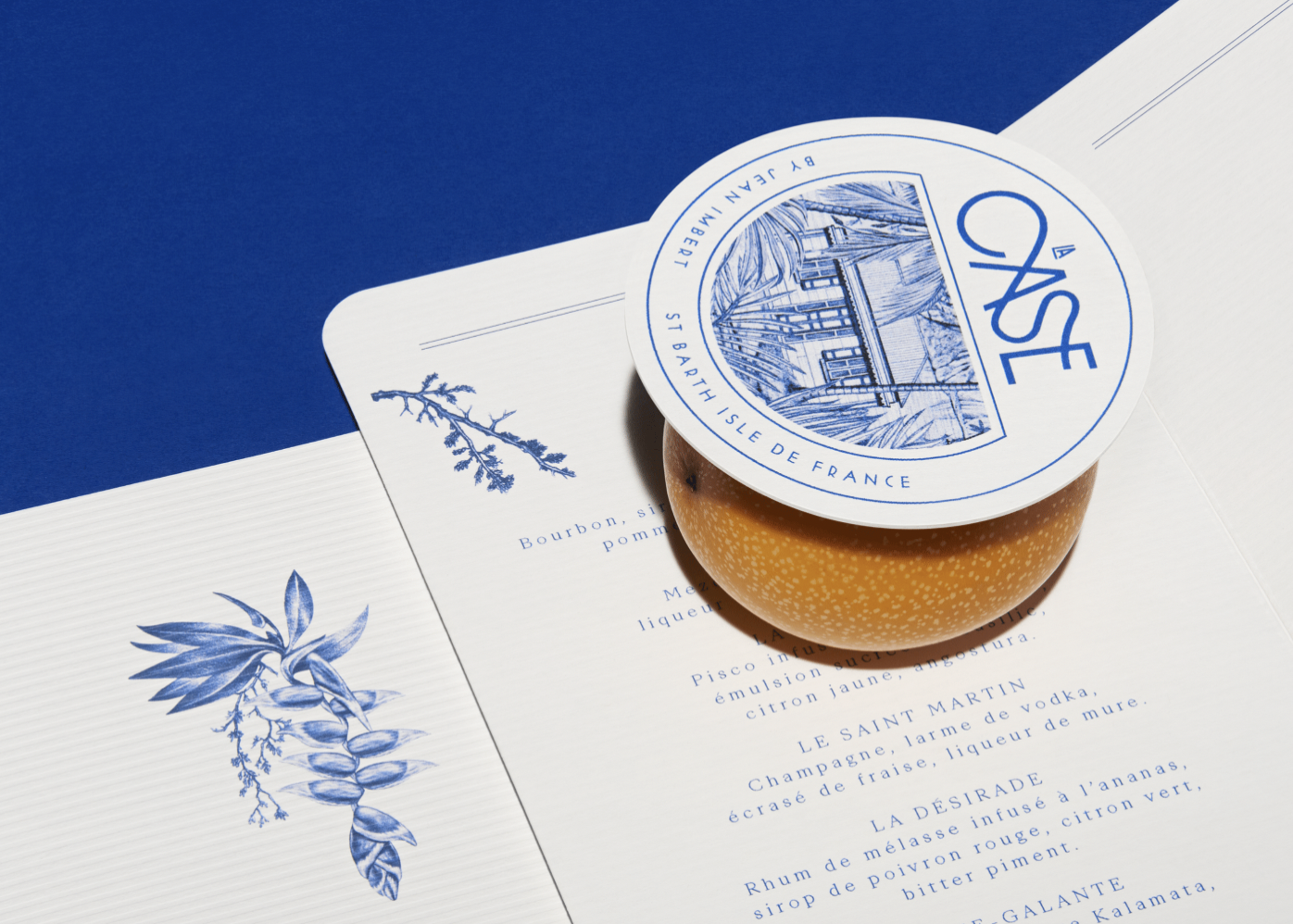
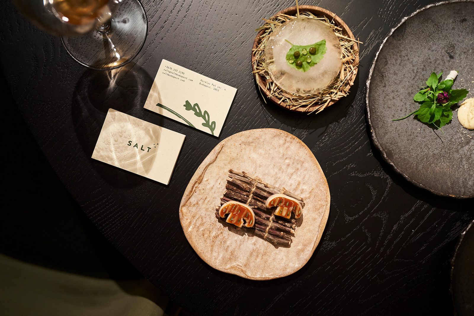
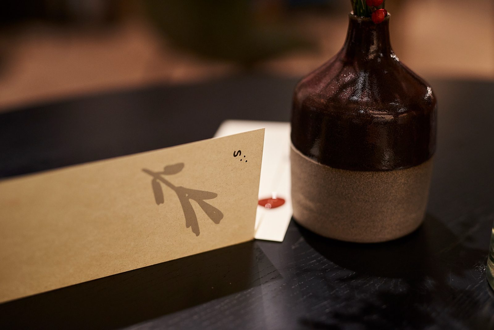
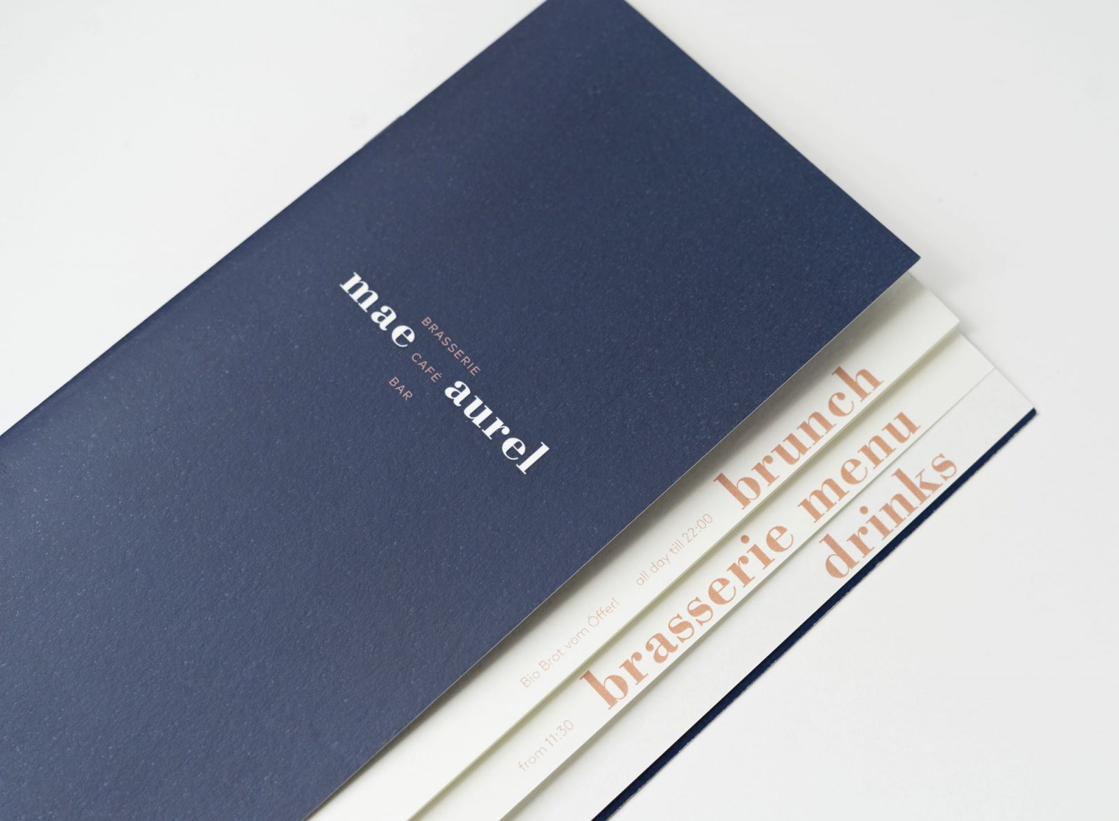
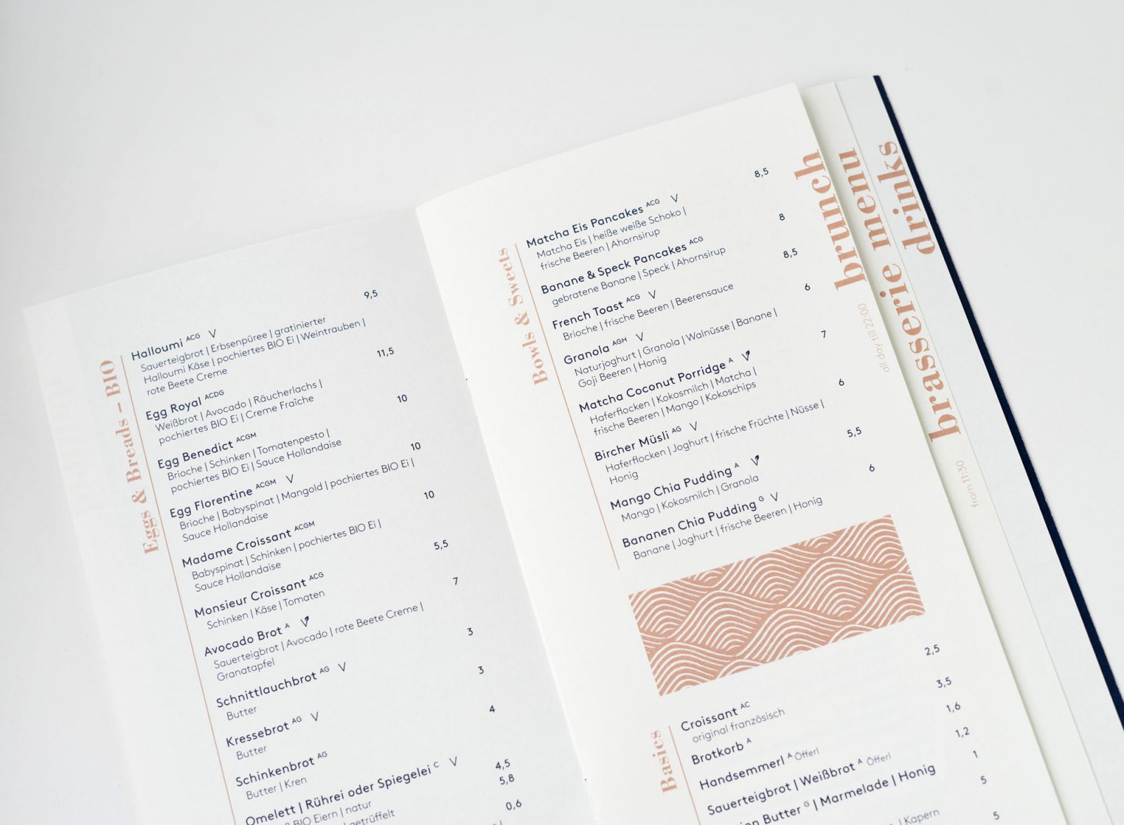
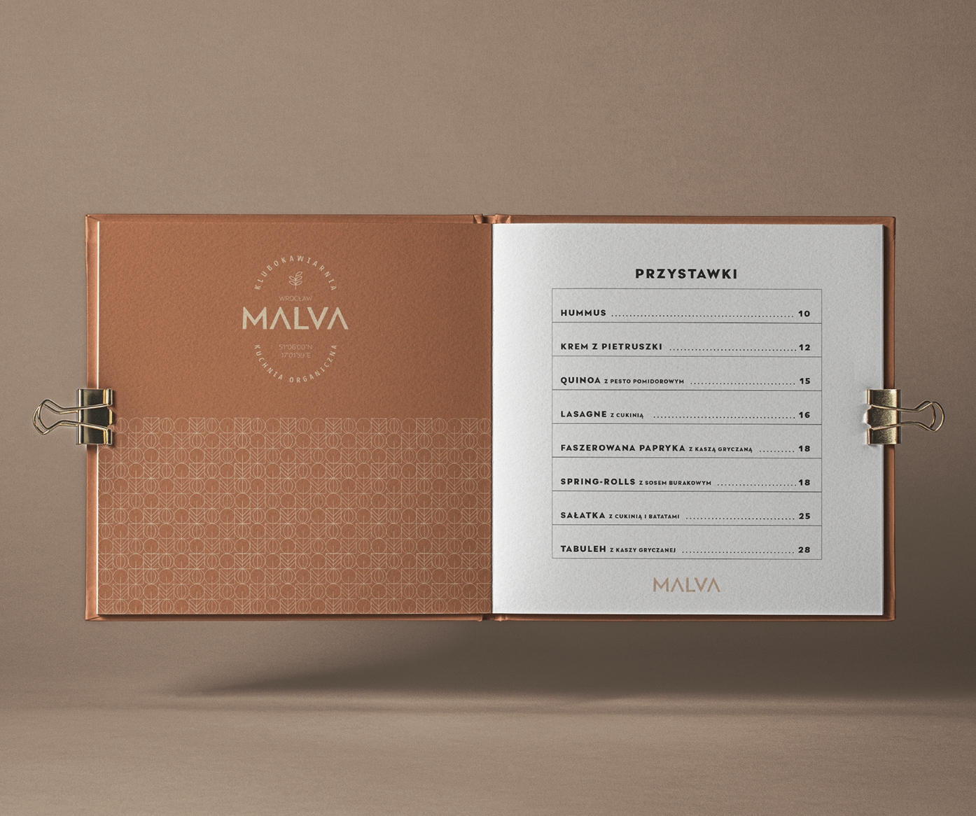
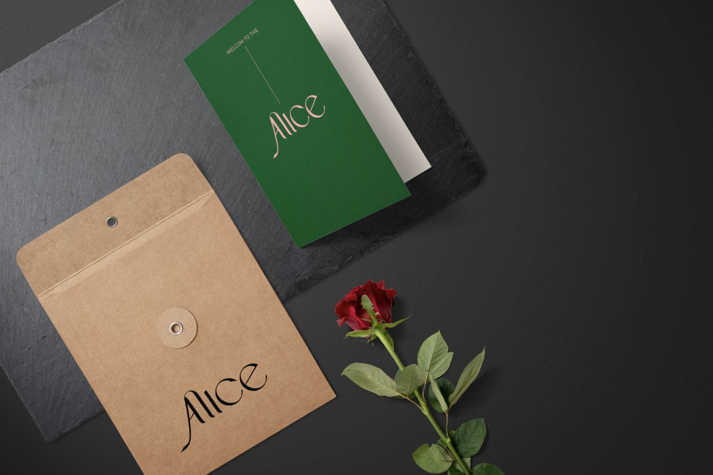
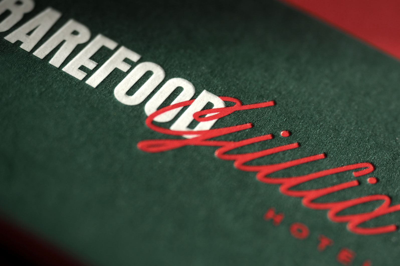
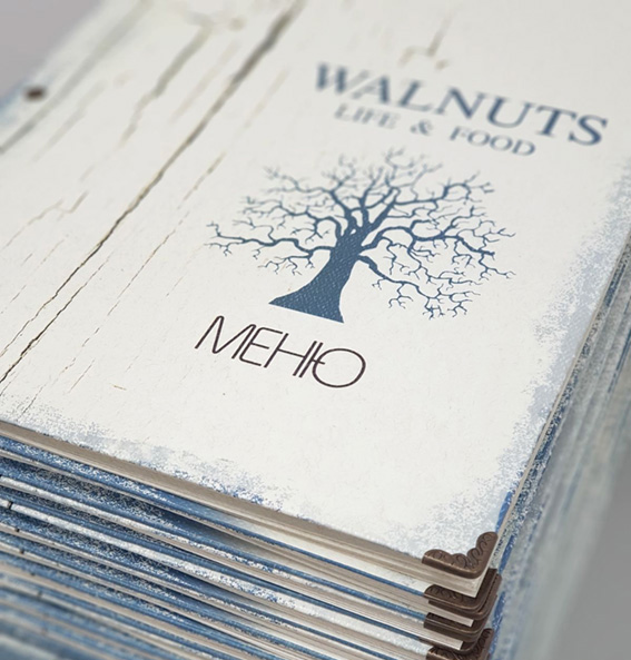
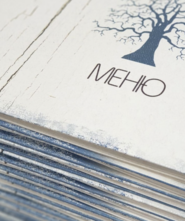
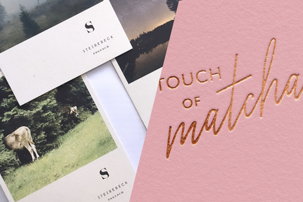
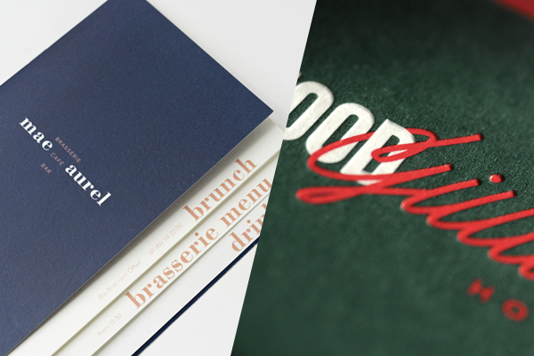
When you visit a restaurant, even before you have your first bite, you hold the menu. You feel it, is it heavy, does it feel good to the touch, does it match with the overall atmosphere of the interior? All these affect your perception, and further, your experience. Below you can see some of our favorite restaurant and hotel branding concepts that have taken paper into consideration, using it in a beautiful, memorable way.