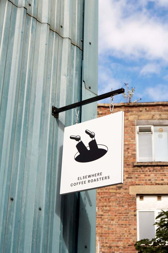
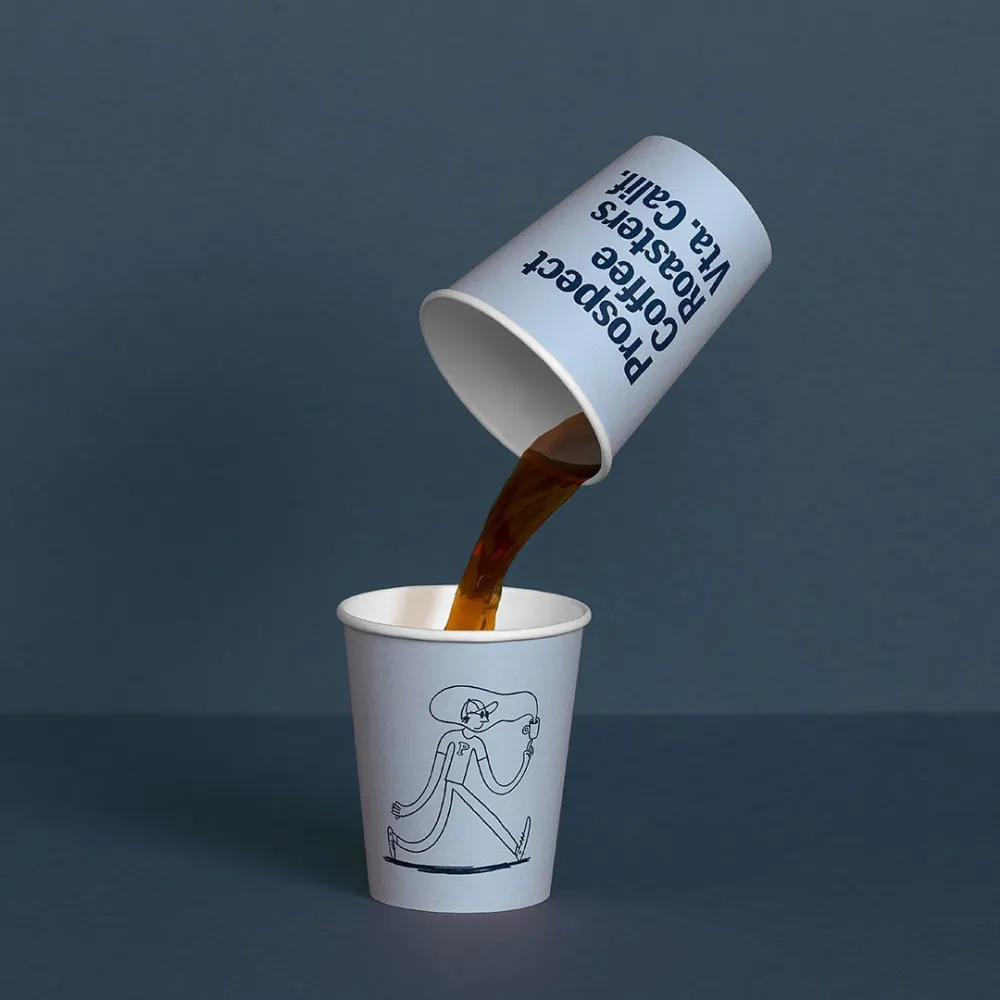
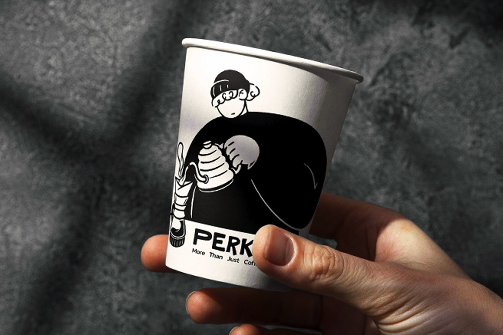
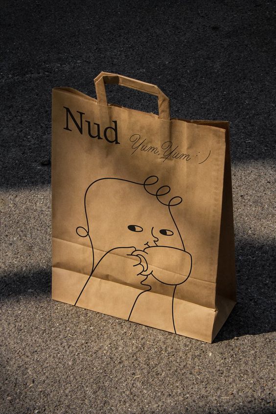
In the bustling world of coffee culture, where every sip tells a story, there’s a silent visual revolution taking place. Step into any contemporary coffee shop or peruse the shelves of their artisan coffee bean selection, and you’ll likely be greeted by a line of seemingly unique yet suspiciously identical coffee branding and packaging. What is it that made the craft coffee industry fall in love with monochrome and line illustration? Why have so many new brands chosen this style of visual identity – it can’t all be a coincidence. I’m here to investigate this new trend of humorous coffee characters and find out the source of their appeal and allure to coffee drinkers everywhere.

Let’s explore the intriguing trend of how coffee and cafe brands have embraced the simplicity, humor, and elegance of character-based monochrome line illustrations’
In a world bombarded with complex visuals and information overload, simplicity brings a breath of fresh air. Monochrome line illustrations, characterized by their minimalistic design, offer a visual escape from the chaos around them. So have coffee brands simply recognized the power that comes with simplicity, or do they truly believe these minimalistic drawings capture the essence of their products? Is it a match of classical elements, a pairing of “less is more” idealogy? How can a simple little drawn character go so well with a perfectly brewed cup of coffee?
So have coffee brands simply recognized the power that comes with simplicity, or do they truly believe these minimalistic drawings capture the essence of their products? Is it a match of classical elements, a pairing of “less is more” idealogy? How can a simple little drawn character go so well with a perfectly brewed cup of coffee?
But how it all started. A few notable coffee brands pioneered the monochrome line illustrations a few years back, setting the trend for a wave of others to follow. Whether it’s a modest takeaway coffee cup adorned with a funny little character or a bag of beans featuring a minimalist depiction of the brewing process, these illustrations have now become synonymous with the contemporary coffee experience.

Maybe its popularity lies in the power of storytelling through drawing, or its timeless elegance.
Monochrome line illustrations indeed allow brands to tell a story with just a few strokes. From the journey of the coffee bean from farm to cup to the intricate dance of a barista crafting the perfect pour, these illustrations evoke a sense of narrative that resonates with consumers. And while vibrant and flashy designs may go in and out of style, monochrome line illustrations possess a certain timeless elegance. This makes them a perfect choice for coffee brands looking to establish a lasting visual identity that can withstand the test of time.
These minimal illustrations also provide a versatile canvas for branding. They easily blend with various colors and packaging materials, allowing brands to maintain a cohesive visual identity across various products while offering flexibility and space for growth.
But probably, the magic is in the relatable and sympathetic style of the imagery – the oldest trick in the marketing book. If you manage to pull on the heartstrings of a consumer, you’ve won. The minimalistic, often slightly naive or humorous approach creates authentic and transparent communication, which builds trust with its audience.
As coffee enthusiasts, we not only crave the rich, aromatic taste of our favorite brews but seek an experience that resonates – also visually. So next time you’re sipping on a cup from a local coffee shop make sure to take a moment to appreciate the artistry that goes beyond the beans and into the visual language that enhances our coffee rituals. Till then – enjoy some of the best examples of coffee or cafe brands utilizing this trend below.


