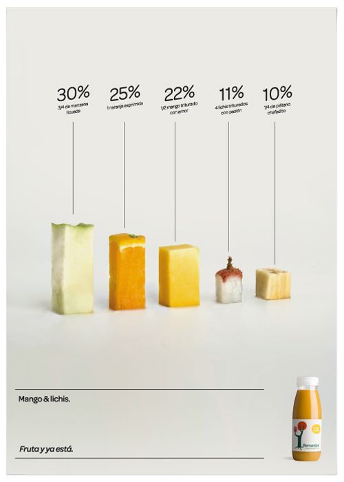
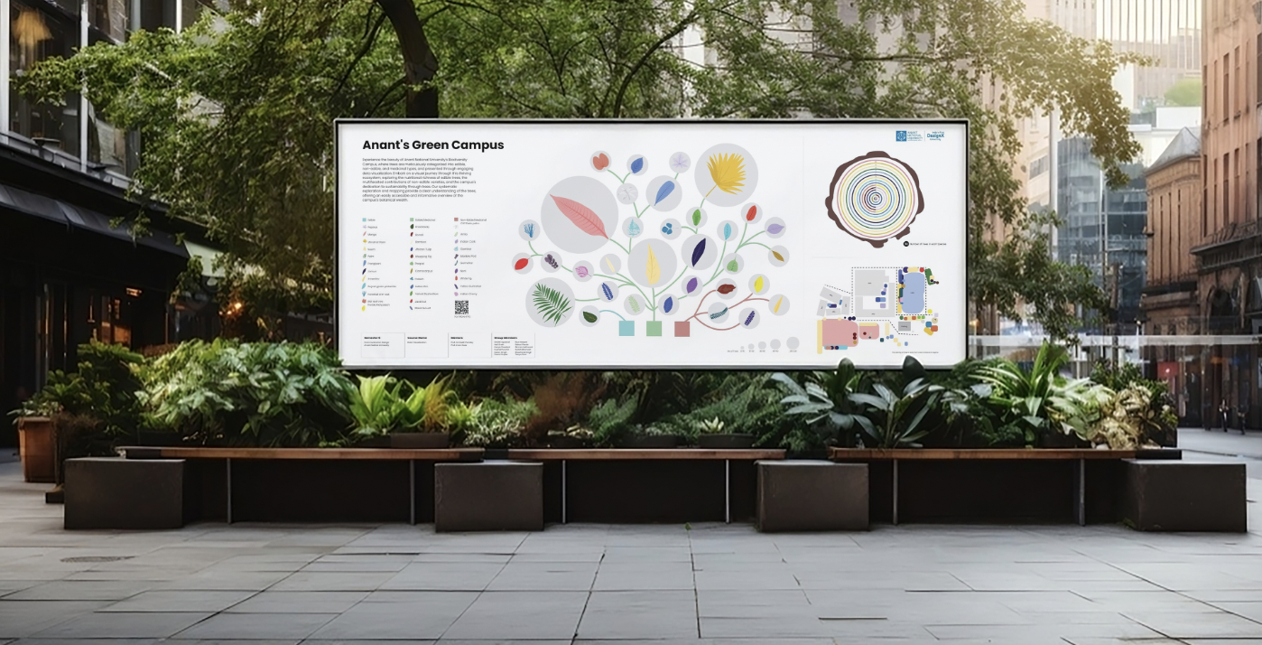
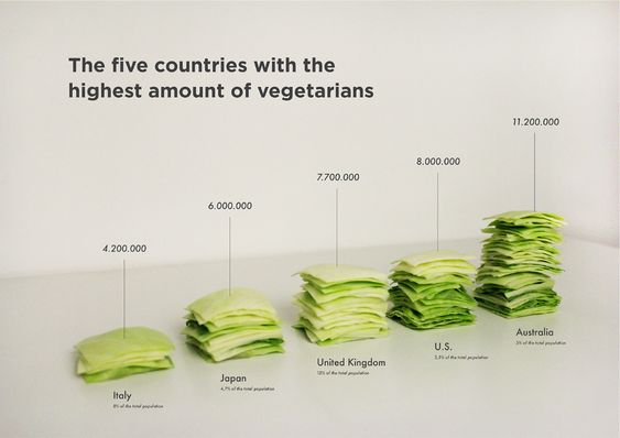
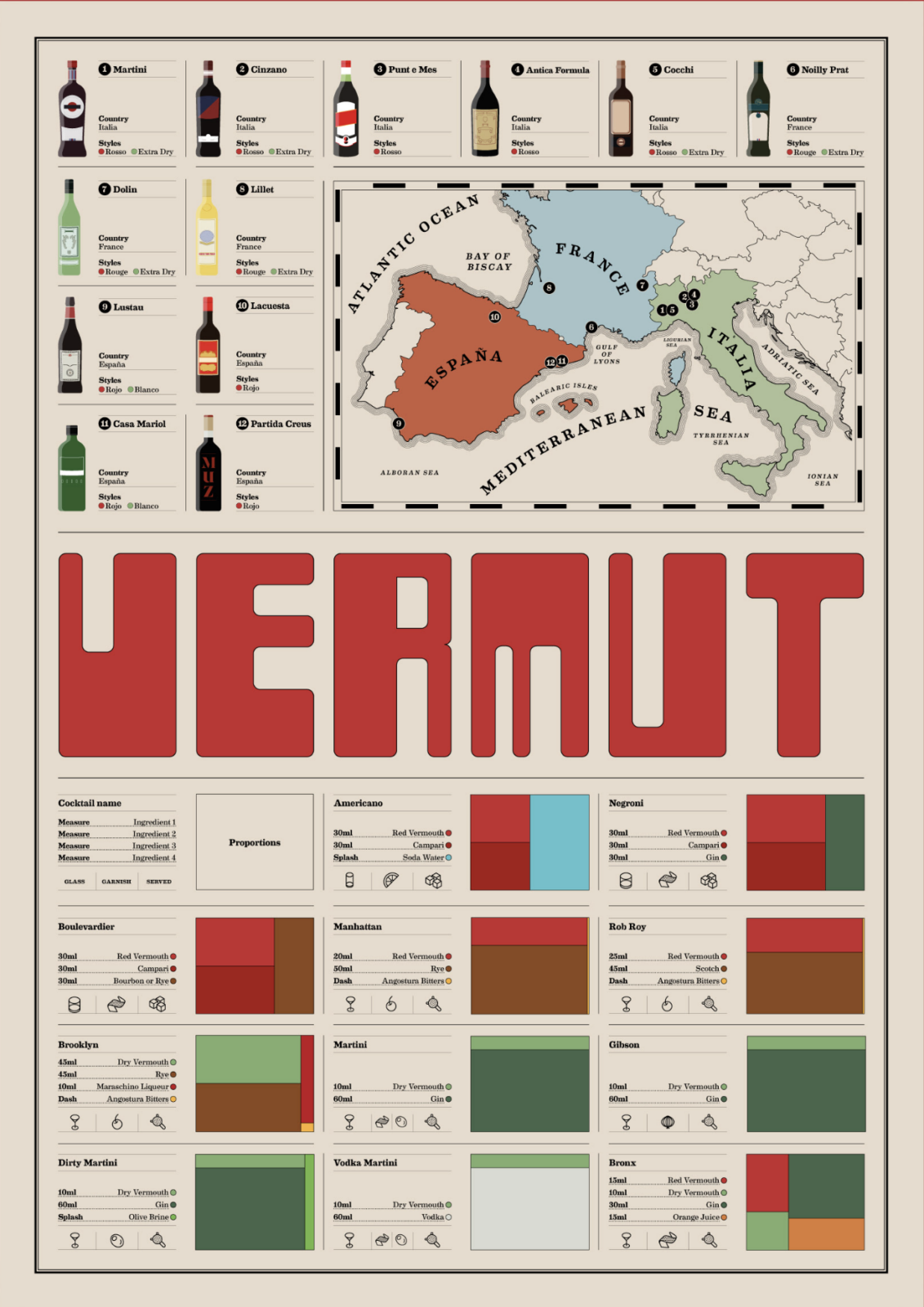
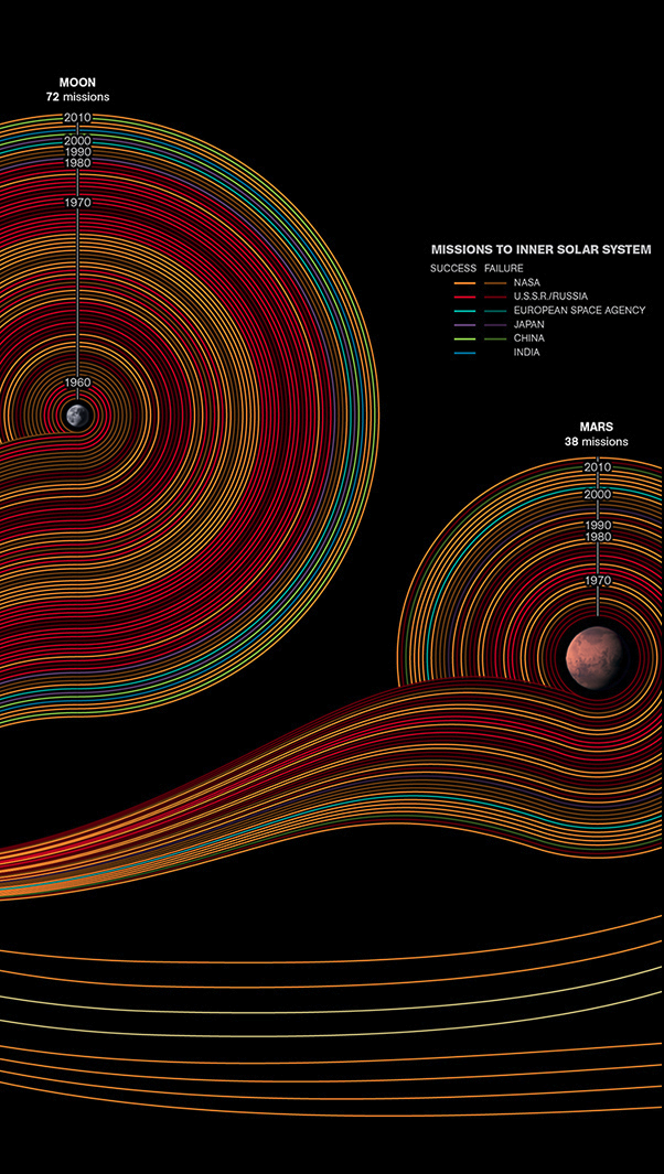
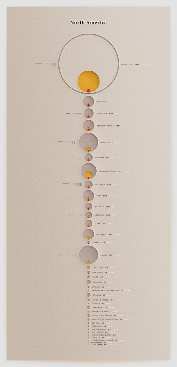
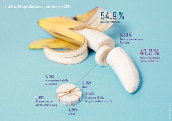
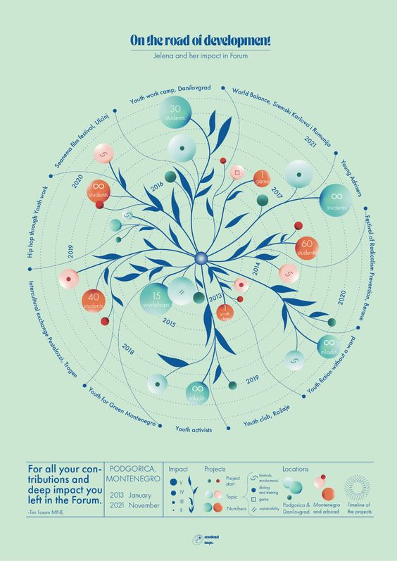
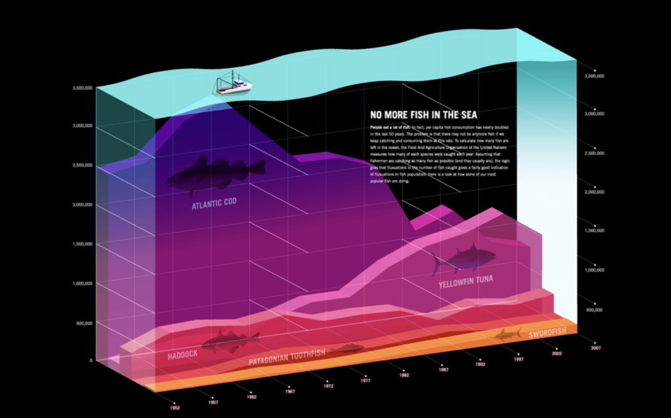
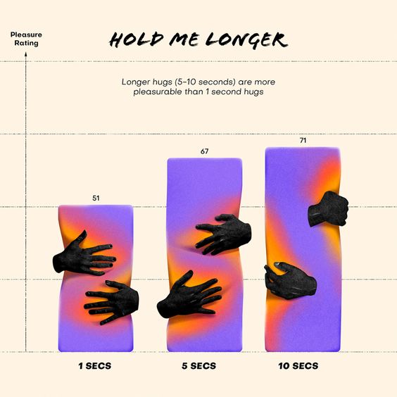
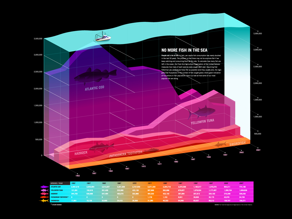
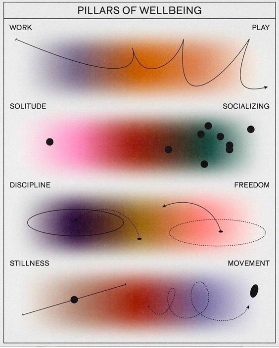
Data visualization is the art and science of presenting data in a graphical or pictorial format, allowing audiences to quickly and easily comprehend complex information. By transforming raw data into visual representations— such as charts, graphs, maps, and infographics — designers can make abstract numbers and figures accessible and understandable. Data visualization serves as a powerful storytelling tool that bridges the gap between data analysis and design, helping people see patterns, trends, and insights that may otherwise remain hidden.
For designers, data visualization can be way more than just simplifying data! It’s about creating beautiful visuals that tell a compelling story, build strong emotional connections, and provide wide or niche audiences with information in a way that is both functional – and aesthetically pleasing. Designers are leaving pie charts in the past and creating stunning visualizations that capture the eye while educating the viewer.
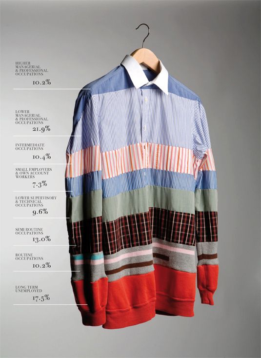
In today’s data-driven world, information overload is a constant challenge. Creative data visualization cuts through that noise, breaking down massive, complex data sets into digestible, visually pleasing formats.
Well-executed data visualization allows audiences to grasp complex information quickly and to uncover trends, patterns, and relationships that might be missed in raw data. Traditionally, in company yearbooks or annual reports, designers use infographics and charts to break down business performance metrics or highlight key milestones. While in marketing, data visualization can enhance a brand’s narrative by turning numbers into compelling visuals that captivate, whether in print ads or digital media.
When used in marketing or branding materials, it can build an emotional connection between brands and their audience by making complex information feel relatable and real.
Data visualization can also be used for improving user experience and supporting decision-making. When used in marketing or branding materials, it can build an emotional connection between brands and their audience by making complex information feel relatable and real. It cuts to the core of an issue or underlines a key factor in decision-making. Data visualization is becoming more and more popular, especially in the b2b markets where numbers often rule but the brand experience is what differentiates a company from a competitor.
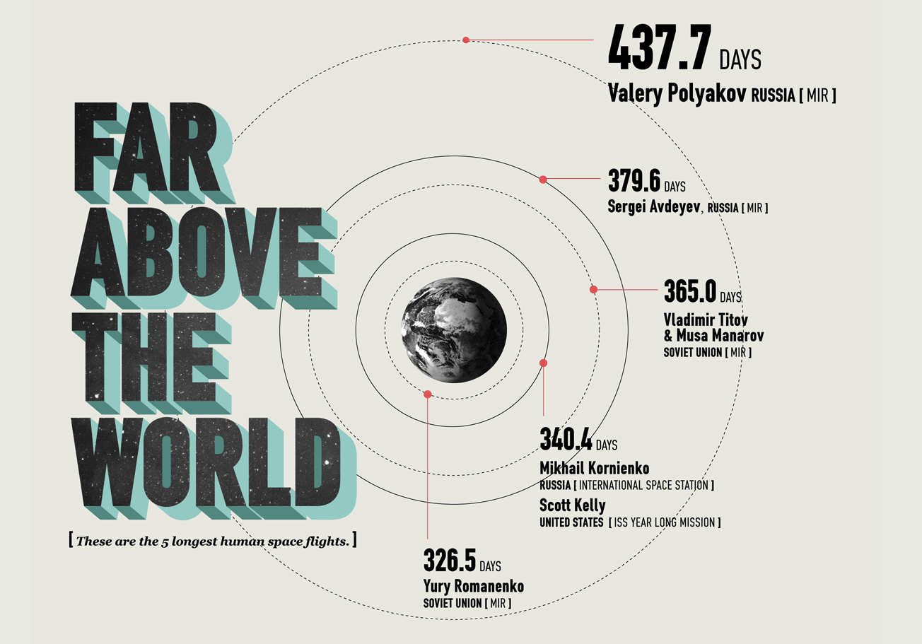
Effective data visualizations require careful thought – and a blend of design principle know-how with a deep understanding of the data.
When tasked with creating data visualizations, whether it be classic infographics or more creative illustrations, the first step for designers is to truly understand the data thoroughly and identify the key messages and insights that need to be highlighted. This may involve working closely with data analysts or clients to pull out the most important elements. In the case of a company’s annual report, for example, this could mean identifying key financial performance indicators, customer growth trends, or social responsibility milestones that will resonate most with stakeholders. But for example in a marketing campaign, that needs to capture the viewer in seconds, equally important is knowing your audience. A successful data visualization is tailored to its viewers. When designing for a broader, non-expert audience, simplicity and clarity are essential – but even more so is creativity and originality.
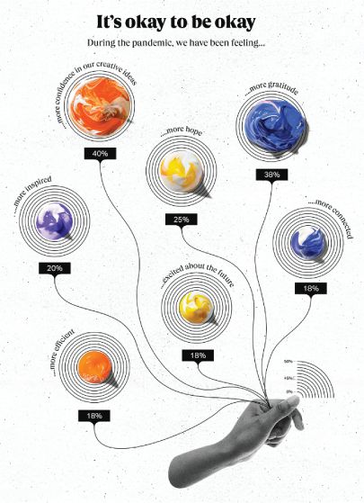
Choosing the right format is crucial to creating effective visualizations. Different types of data call for different visualization techniques. Designers carefully select the visualization method that best suits the data needed to convay, ensuring the visual format enhances rather than obscures the message.
While it may be tempting for designers to incorporate intricate design elements, the focus should remain on communicating the data clearly and effectively. Striking a balance between aesthetics and function is key.
Color often also plays a significant role in the success of data visualization. Beyond aesthetics, color choices can enhance readability, show relationships between data points, and direct the viewer’s focus to key insights. While visual hierarchy helps organize the data so viewers can quickly navigate through the visualization, using size, weight, and contrast, designers emphasize the most important information first, leading the viewer’s eye through the data logically. This is essential for both print and digital mediums, where clarity and ease of reading are paramount.
Data visualization is a vital tool in a designer’s arsenal, combining function with beauty to present complex information in an accessible, engaging way.
Whether used in annual reports, marketing materials, or ad campaigns, great data visualization allows designers to craft visual narratives that resonate with audiences. By following fundamental design principles, understanding the data, and tailoring the visuals to the audience, designers can elevate raw data into visuals that not only inform but inspire. As you explore our examples of boundary-pushing data visualization, consider how the visuals communicate their message and how they could inspire your future design projects! Great data visualization design ensures the message is both memorable and meaningful.
