The What If Series Volume 1 is so much more than the visual representation of the company but a clever port folio and showcase of their letterpress printing expertise. Drawing inspiration from creating and arranging the printing plates, Bruch decided to use the suitable skeleton of the letters I and F to create a fine structure that builds the basis of a highly flexible branding system that is able to adapt on every proportion. The simple and clear composition also functions as a flexible frame for graphics, illustrations, and typography to show the countless possibilities of printing and finishing with letterpress printing machines.
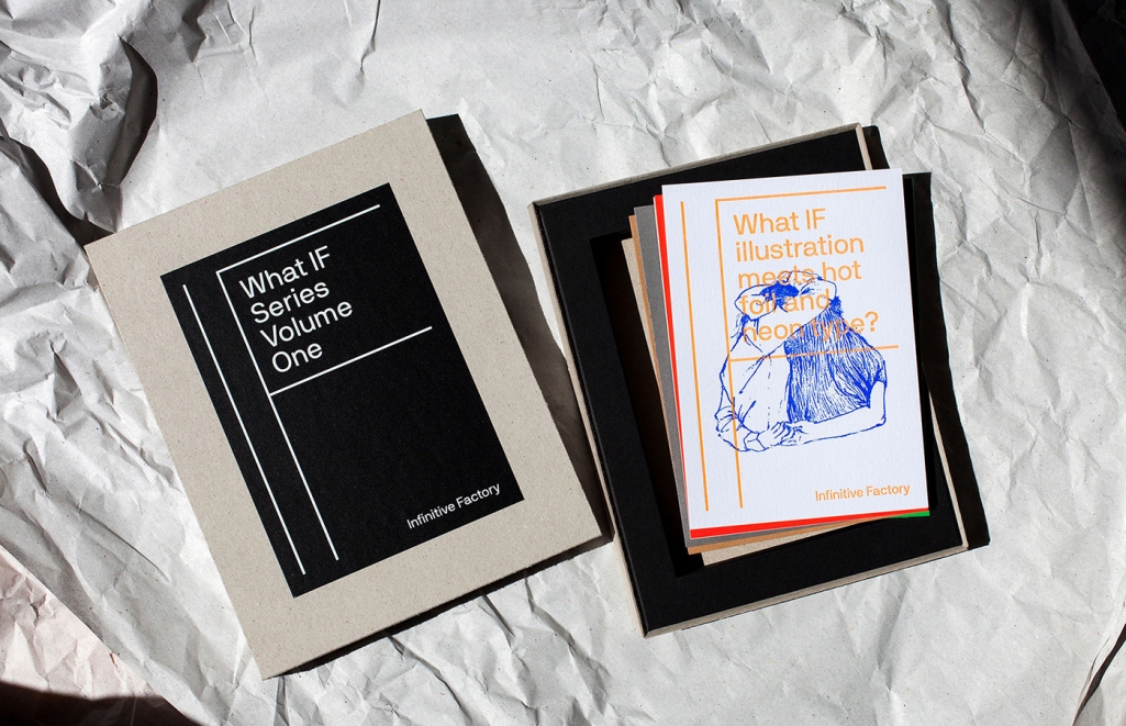
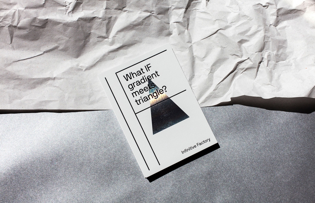
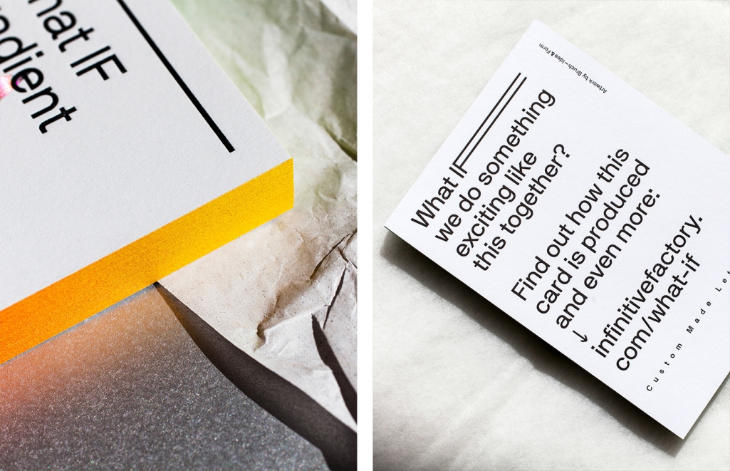
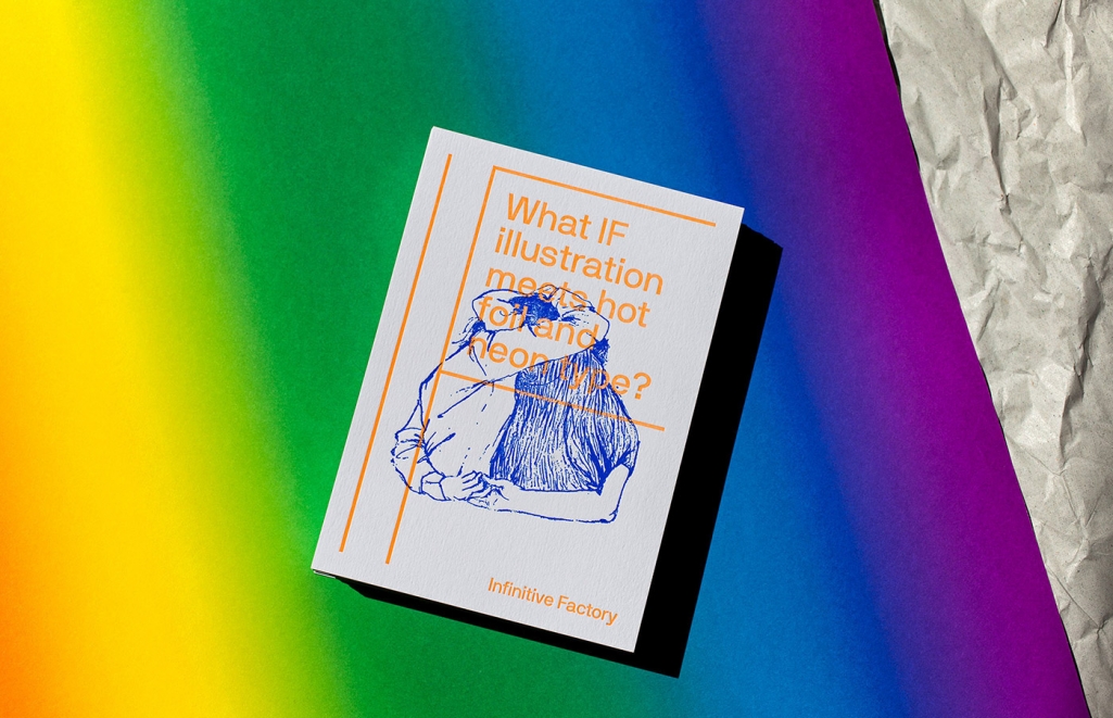
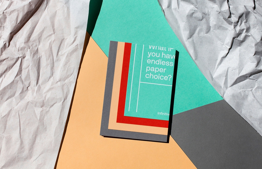
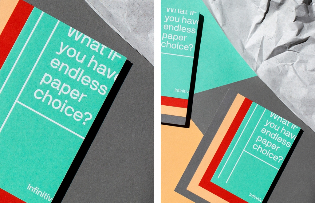
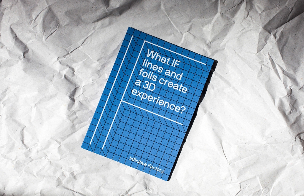
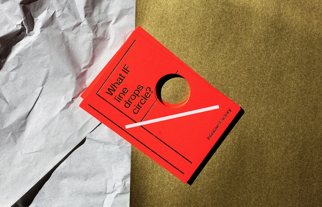
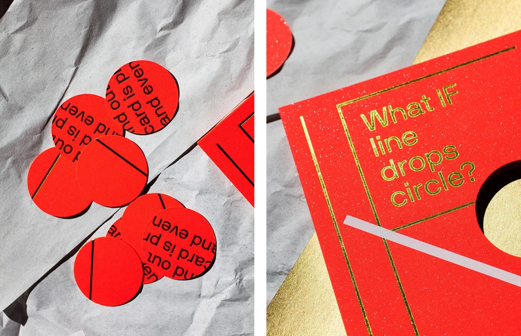
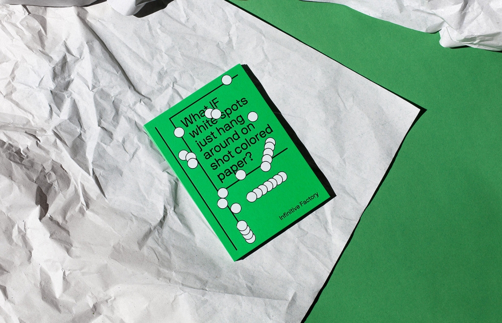
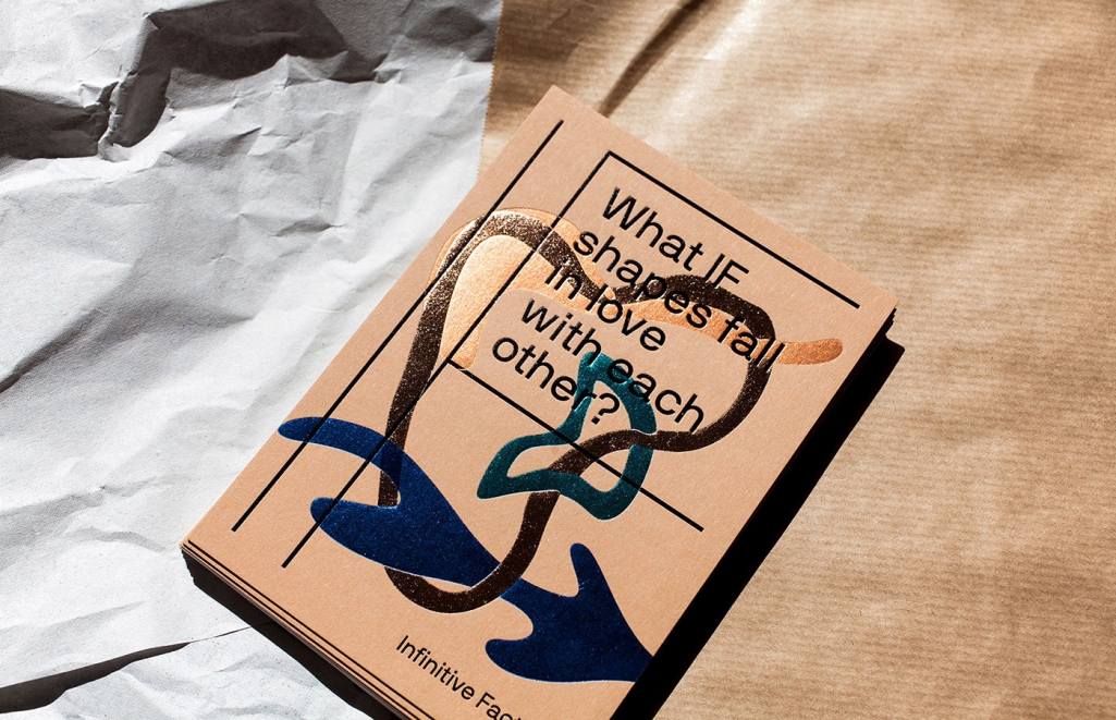
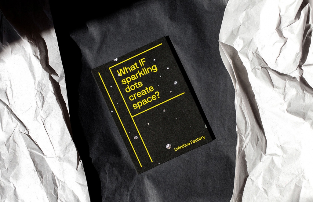
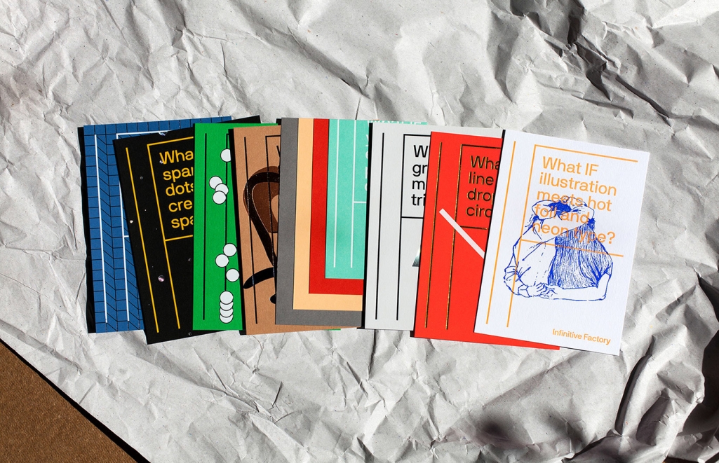
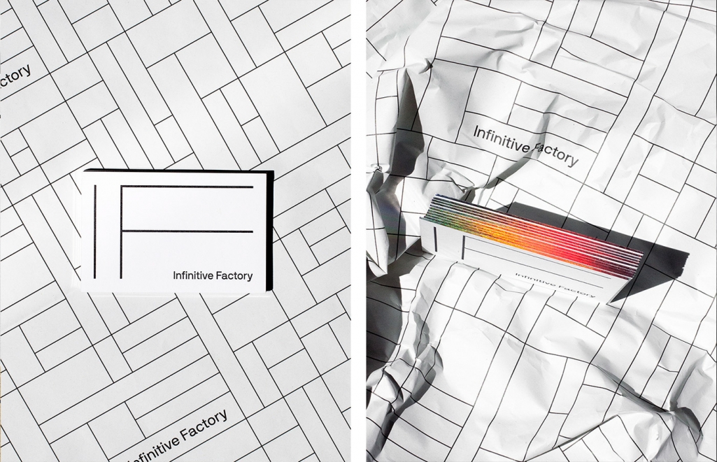
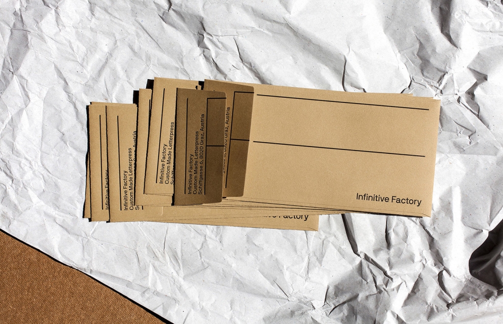
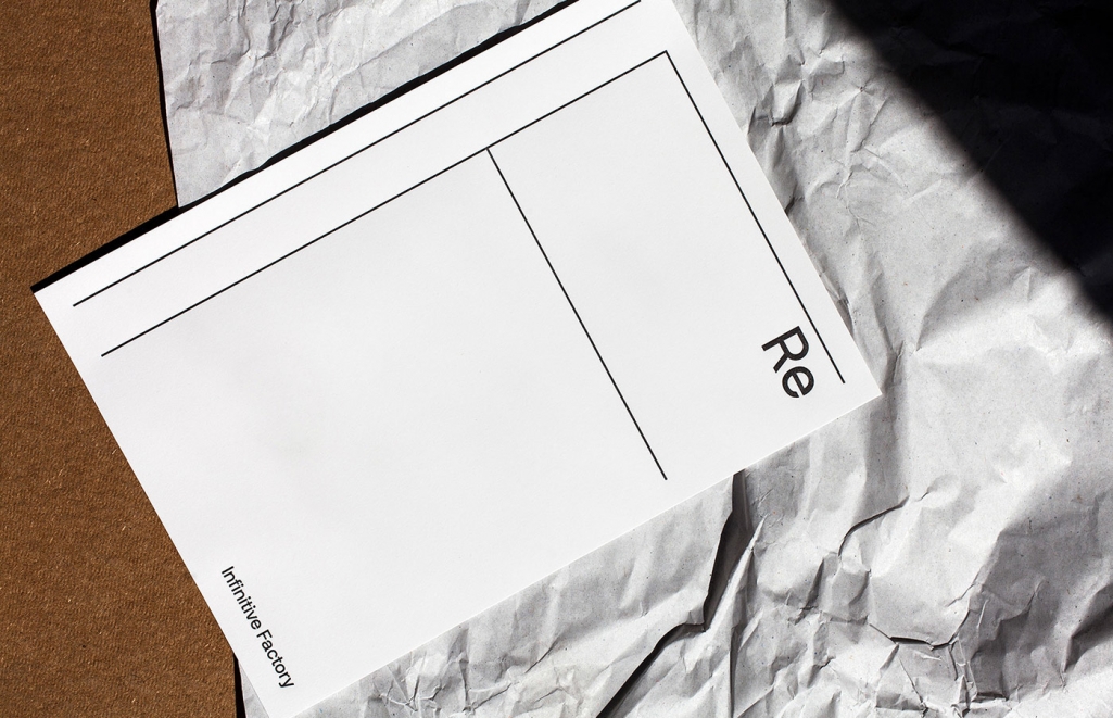
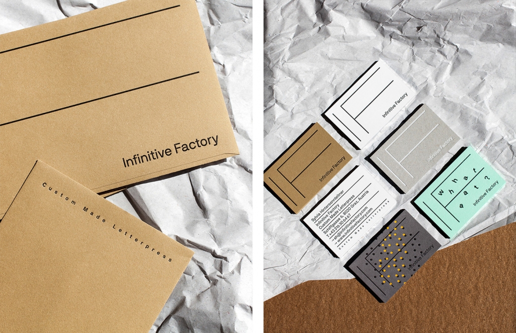
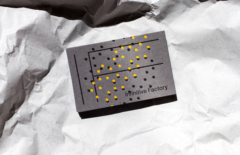 The Infinitive Factory or IF stands for high quality custom made letterpress. The Graz based company is known for pushing limits in the field of letterpressing and experimenting with new ways of creating overwhelmingly beautiful effects for their clients. They commissioned fellow Austrian creatives Kurt Glänzer and Josef Heigl from Bruch—Idee&Form to come up with a way to promote and showcase what they can do – which is – A LOT. Combining Bruch’s creative branding design with IF’s exceptional printing skills, the results are definitely something that gets every paper and print lovers knees weak.
