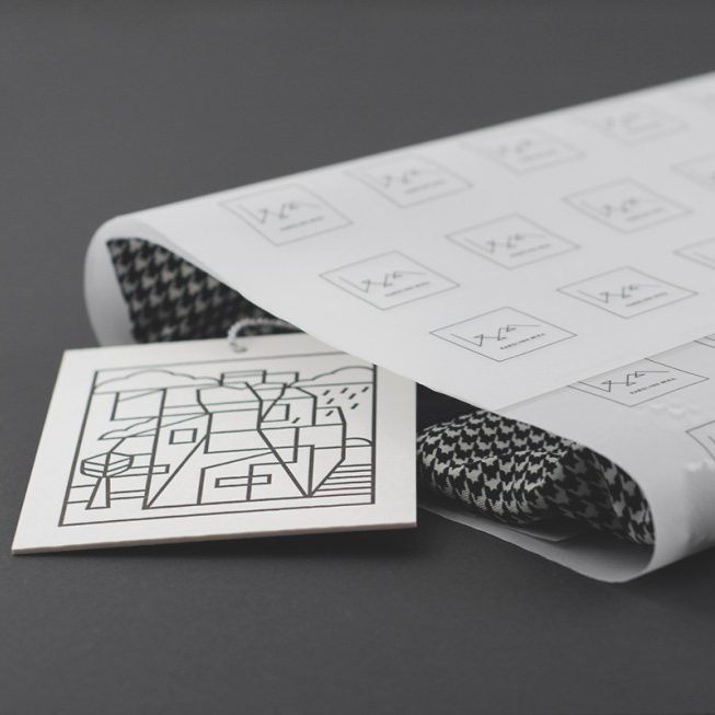
Karolina Mika – a Polish fashion designer with a background in modern dance wanted a corporate identity that embodies the free spirit and simplicity her style is build upon. The very dynamic, monochrome branding was designed by a multidisciplinary design Studio Vivid from Cracow, who in my mind, mastered the task to it’s tee !
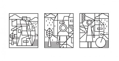
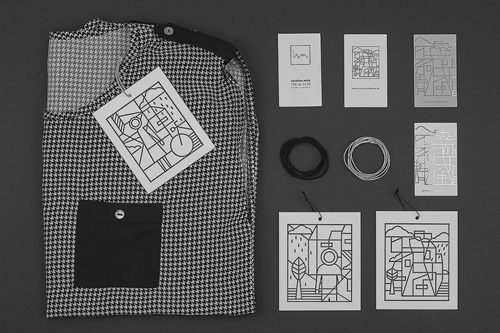
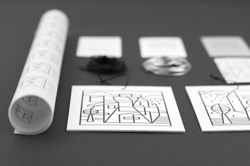
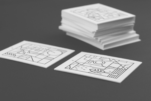
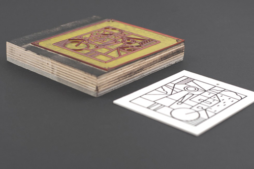
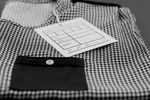
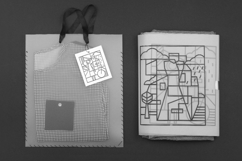
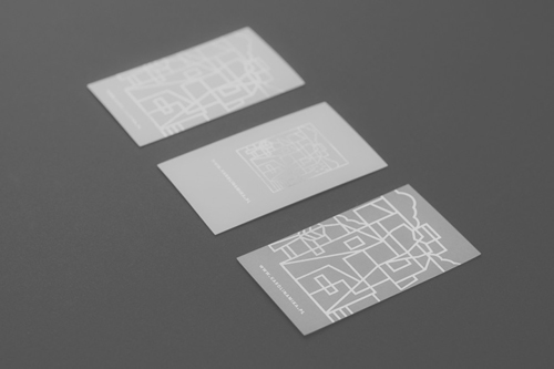
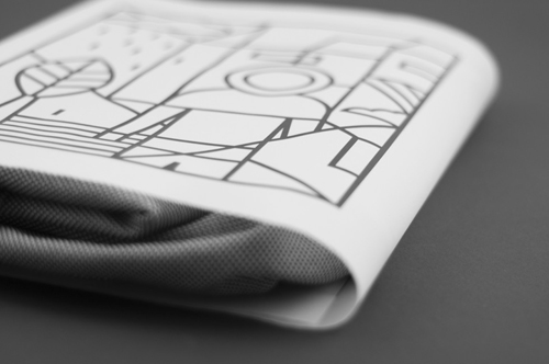
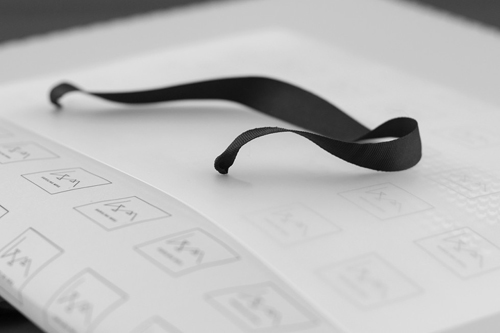
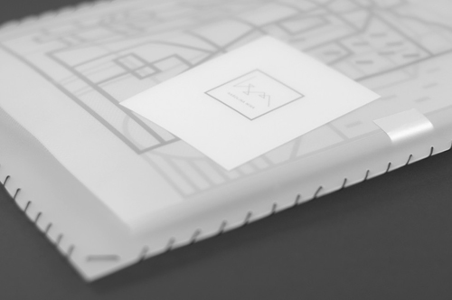
The base of the designs are in the three unique illustrations which have been applied on each item – business cards, packaging paper, clothing labels etc. The sharp contrasting lines make the design dynamic, strong and memorable, three attributes which are very important when branding a new company or label. Urban style, geometrical shapes and architectural forms are what inspires the designer so it was fitting to transform it into the identity of the brand.
The logo, which is formed out of the designers initials K and M reminds of stitching which obviously refers to the fashion. The whole identity is build on these geometric lines, compared with minimal styling and monochromatic coloring. A very modern and trendy look, perfect for a new fashion line.
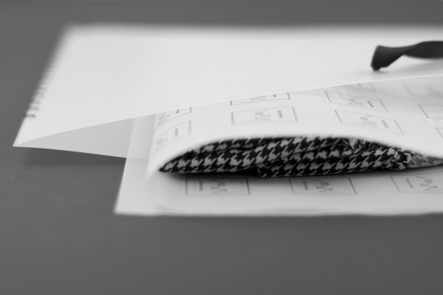
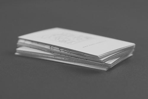
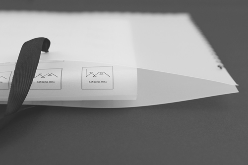
Besides the strong linear illustrations, I’m drawn towards the interesting paper choices. The see-through wrapping paper and carry bag are a modern take on packaging and a very clever marketing idea as the product inside will always show. The play on layers and textures give a feel of quality, and the silver elements in the letterpressed business cards, especially the edging, truly catches your eye. All in all a very unique yet simple design that embodies the free spirited nature of the brand.

Photos © Vivid Studio

