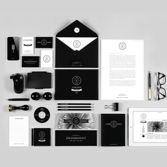
“La Forma Saporita” is a fictitious Italian pasta brand which Yanko Djarov, art director at Sofia-based design studio Astro Kit, designed as his final bachelors thesis work. Even though the brand isn’t real, it doesn’t mean the monochrome design isn’t absolutely spot-on. Indeed, it shows great sophistication and talent!
La Forma Saporita is supposed to be an Italian brand that manufactures pasta goods (e.g. spaghetti, tagliatelle, rigatoni, etc.). The brand name translates into “the tasty shape” which is obviously fitting because the pasta comes in various shapes and forms, and it is always delicious!
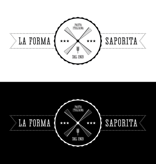
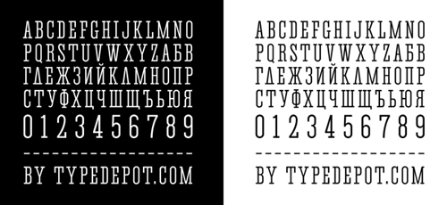
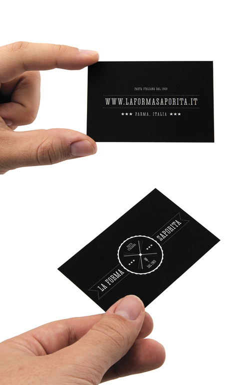
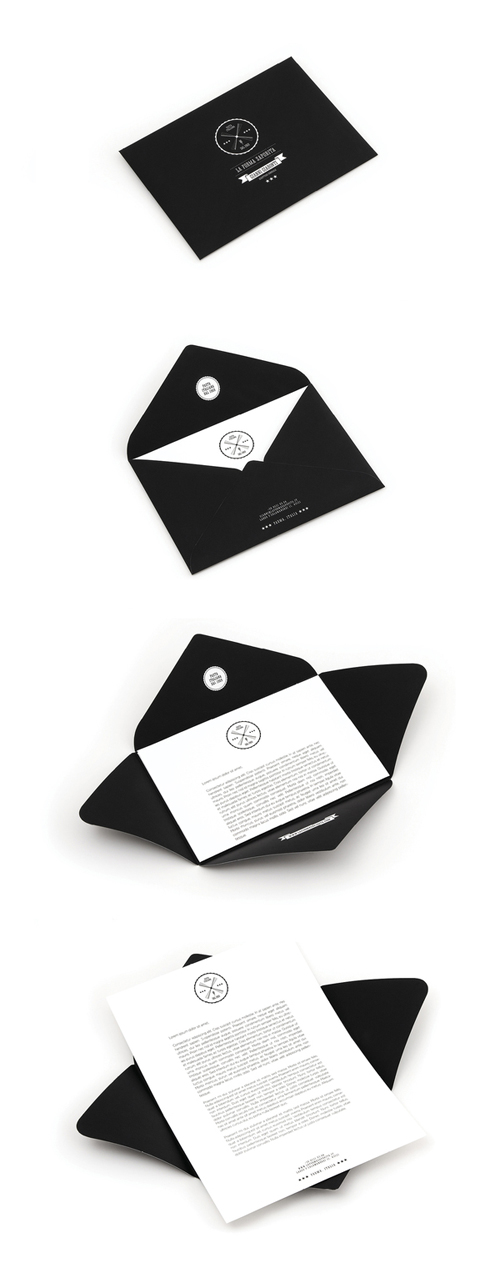
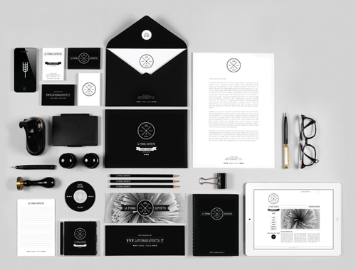
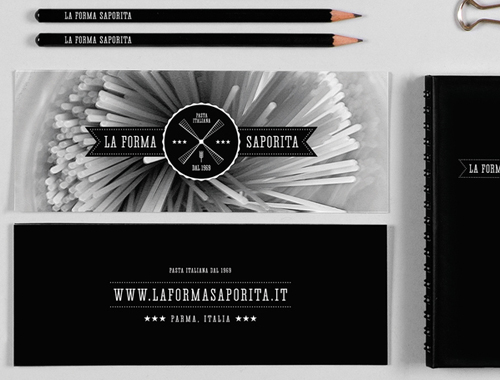
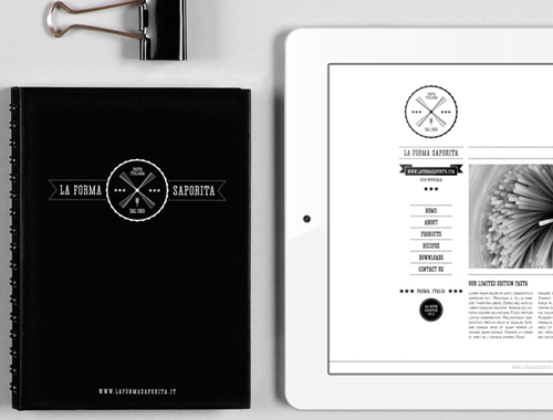
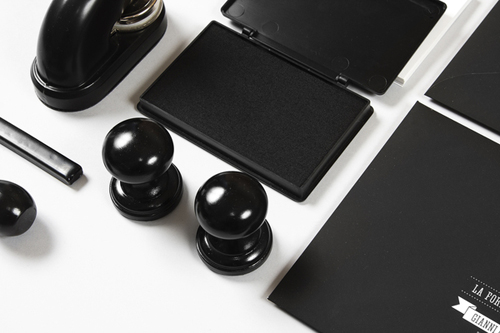
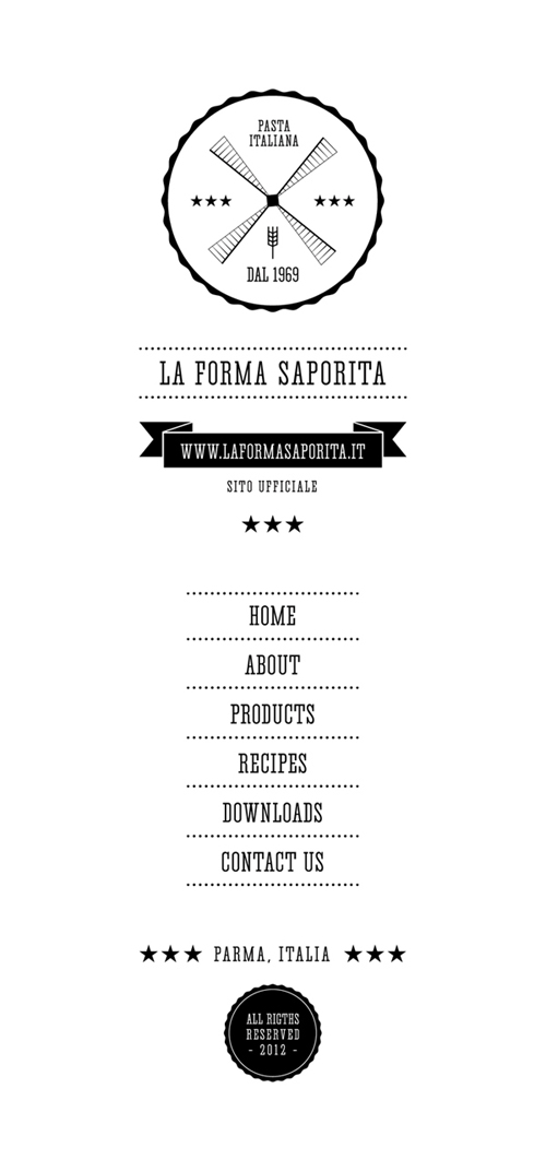
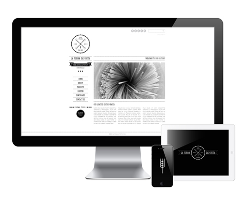
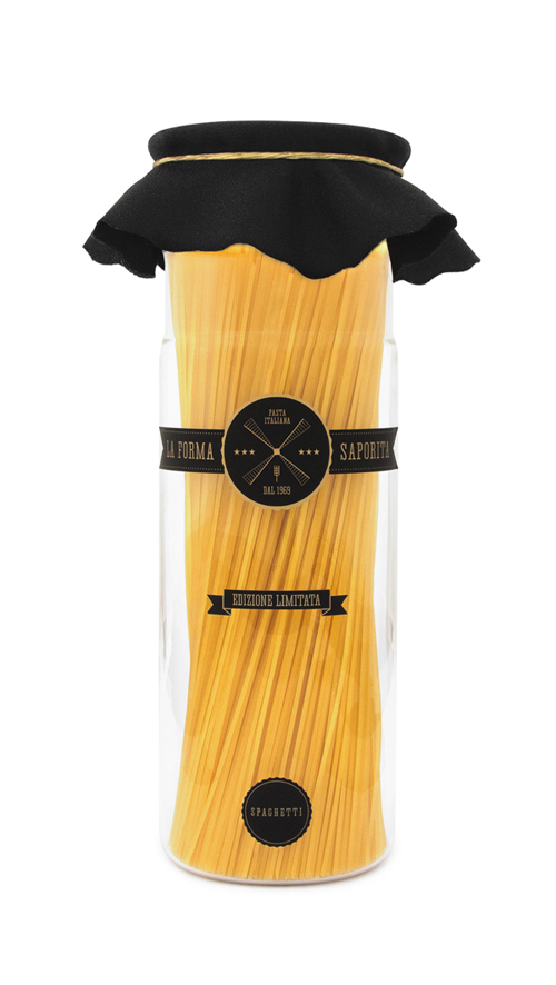
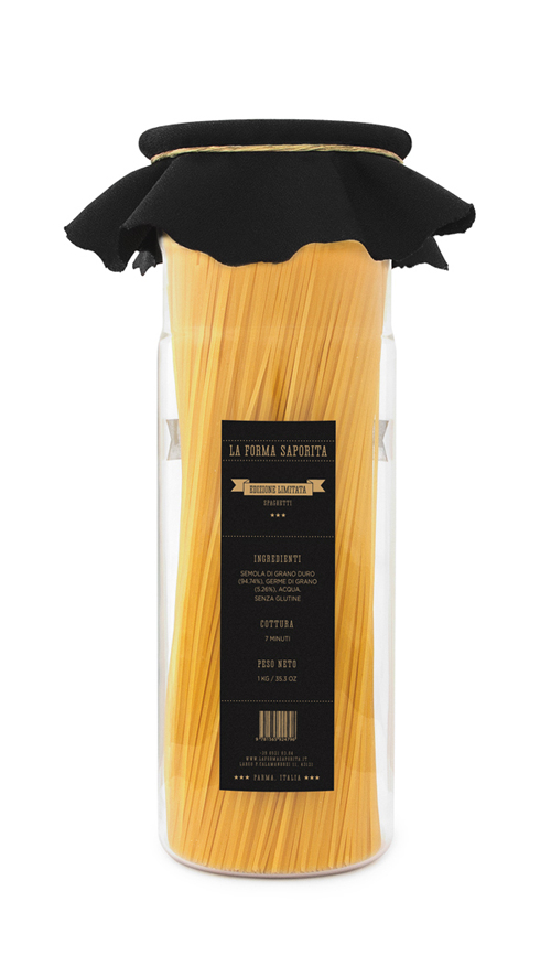
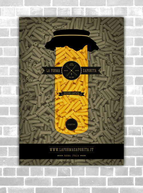
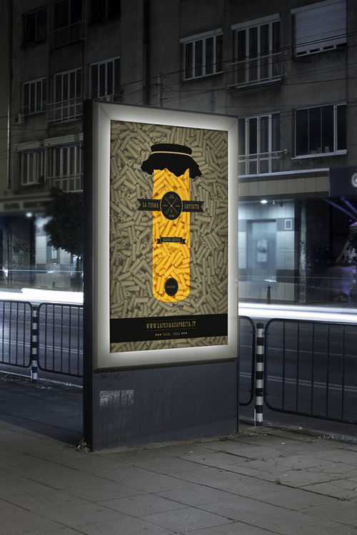
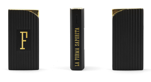
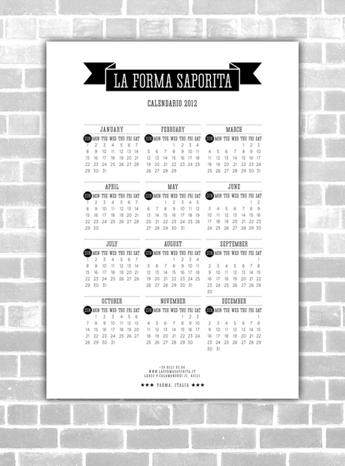
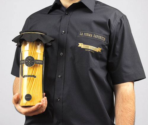
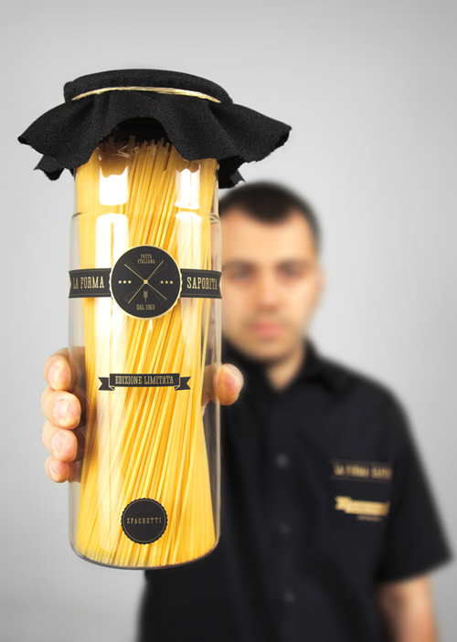
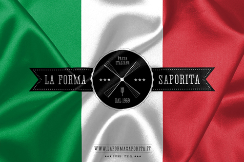
But as the brand does not exist in real life, only the visual identity Djarov created, let’s focus on that. The design includes printed materials, packaging and user interface design for web and mobile devices. The overall look is based on the logo, and typography Djarov designed. Each single design element such as the logo is done in both positive and negative. The black and white color scheme gives a classic, high quality feel to the range, as monochrome is not the most usual choice for a pasta brand.
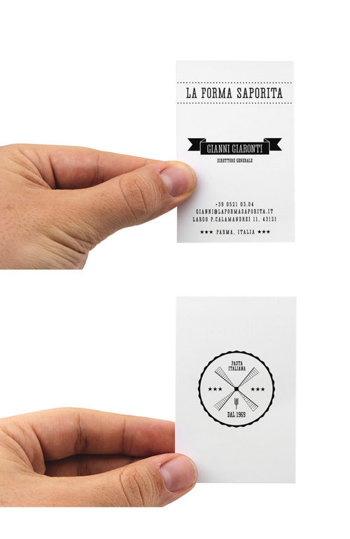
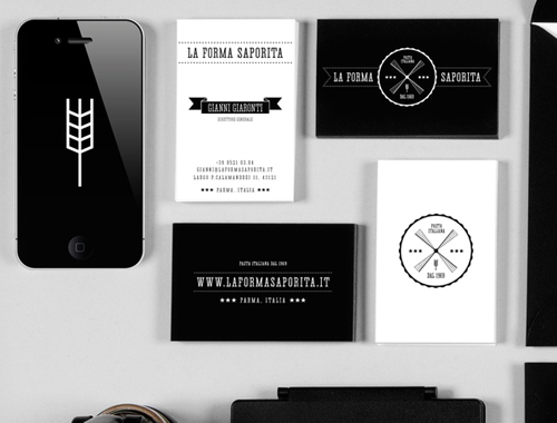
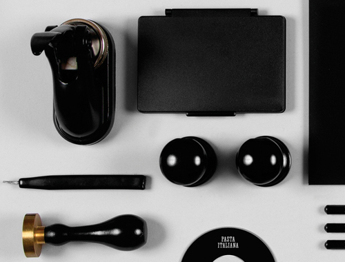
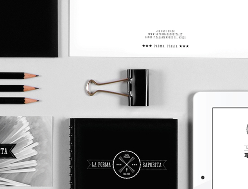
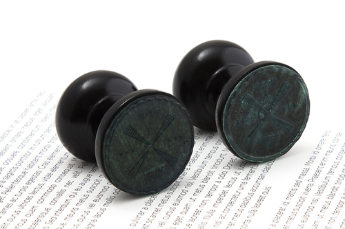
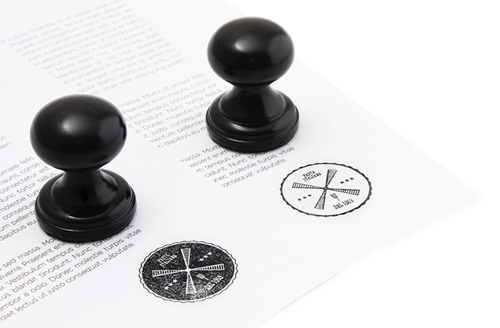
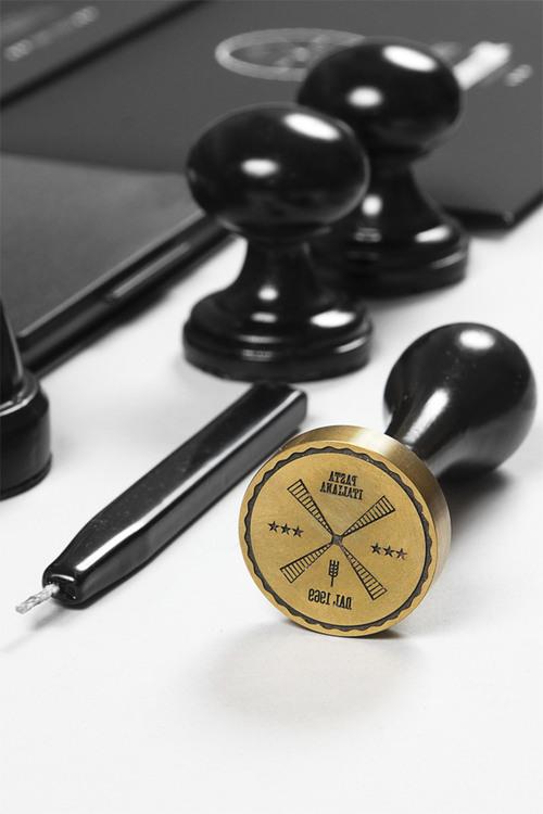
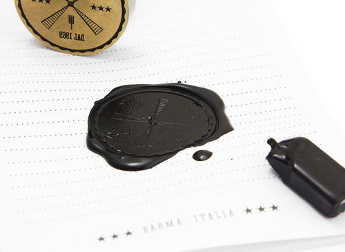
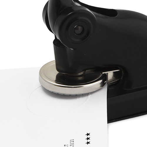
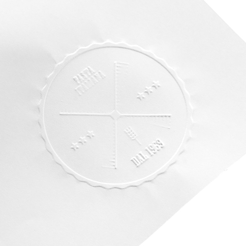
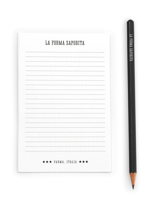
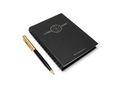
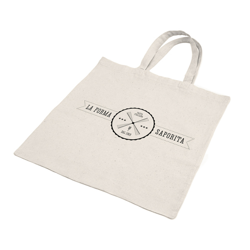
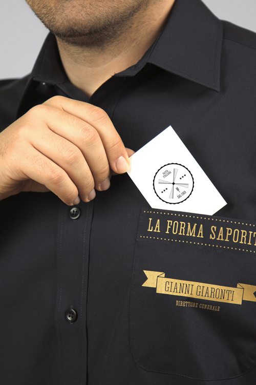
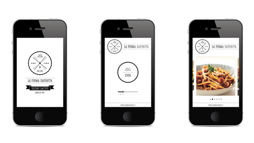
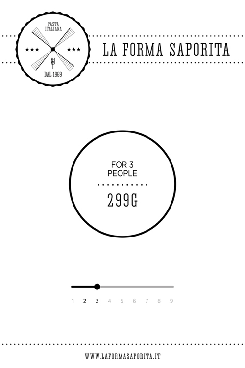
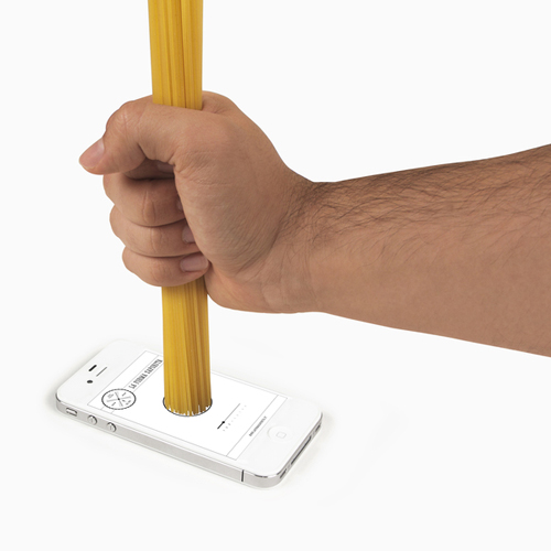
Keeping a cohesive style throughout the range, it’s amazing to see the attention to detail the designer put into his work. There are even two versions of the business card, one for corporate clients in white, and one for promotional purposes in black. And no visual identity is complete without it’s own stamp – the biggest trend of the time. On top of the usual letterheads, envelopes, flyers, notebooks, posters and other stationery products, there is also pasta containers with labels, chef jackets and tote bags. What tops it all is the cool Spaghetti measurer app Djarov has creates for mobile use. It shows measurements of how much of which pasta you’ll need for a certain number of people, and even suggests recipes. Impressive! Buon appetito!
PS Stay tuned, there is an interview with Astro Kit coming up on the blog soon!
Photos via Yanko Djarov Behance

