Two is always better than one – a saying easily proven true by Vienna based creative duo Claudia and Stefan when they decided to join forces and form Books, Ink. Working as graphic designers during the day and creative superheroes during the night, all the while updating their Instagram with stunning snapshots in the middle, they took a minute to talk to us about their story, dance parties and what exactly does it take to master the art of calligraphy. 
Design&Paper: Let’s start off by you introducing yourselves to our readers?
Claudia & Stefan: Hello, we are Claudia and Stefan, two graphic designers from Vienna. We met at work four years ago and clicked right away. As a result, we worked on tons of projects over the course of two years. A client asked us to do a corporate design for their bistro that involved hand lettering and chalk art. Back then, this was the first step to our future label Books, Ink.
This project kicked off a torrent of fresh ideas and projects. We spend many hours a night designing and crafting and producing, bouncing ideas off each other and having lots of fun. So there we were discovering and exploring pur passions – Stefan was really into book binding and I totally fell in love with calligraphy and hand lettering. We decided to apply for the Monscheinbazar in Vienna on a whim. As graphic designers we knew what it takes to bring a label to life visually, so we quickly came up with a name along with a logo. Business cards and beautiful pictures of our work followed shortly after – and so Books, Ink. was born. The name combines the stuff we do: books and ink artworks.
D&P: What projects are you working on right now?
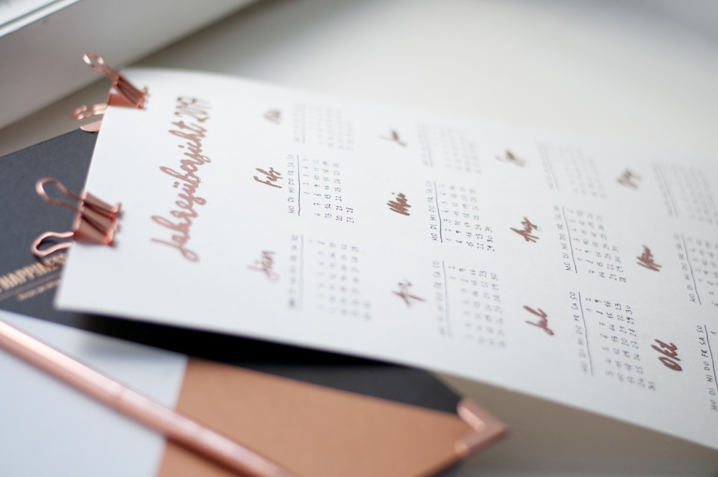
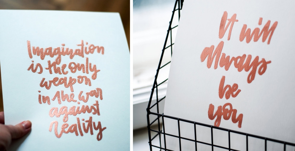
C&S: Right now we are working on a big candy shop mural and lots of new products for our online shop – a few of them are already online. Here, if you want to have a look. Our goal for 2017 is to get more into illustration, from minimalistic ink illustrations to elaborate, colorful watercolor paintings. Plus we want to focus on embossing and letterpress. A few of our new items in the shop are already copper embossed and we love it.
D&P: What has been the most challenging project or client you have worked on?
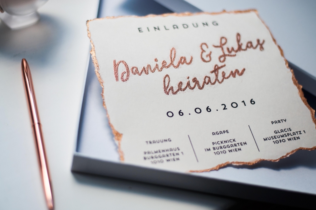
C&S: Last year we worked on wedding stationery (invitations, menu cards, chalk art, the works), which was really exciting but also challenging because we wanted it to be perfect – ideally you only get married once, so there’s almost no room for error. After all, we’re in the business of creating memories and you’ll probably save your wedding stationery forever.
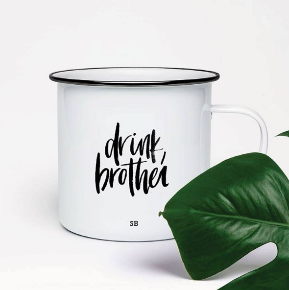
Another project we did last year was a mug design for a British band named “speak, brother”. We were really excited about it because we already loved their beautiful music. They wanted us to handwrite “drink, brother” for their mug merch, which they wanted to launch before christmas. It was a fun little international project and the response from their fans was really nice.
D&P: What inspires you?
C&S: Inspiration can not be forced. But it can be helped along and kickstarted. Or it can hit you randomly while joking around or exploring nature. Even a song can trigger ideas and get the creative juices flowing. 2017 will be the year of travelling for us. We already planned lots of trips and are very excited to come back to work with fresh minds and new ideas. But if nothing kicks of your creativity, just start a little dance party to your favourite songs.
D&P: You work a lot with hand lettering. What raised your interest in it? And what is the most challenging aspect of it to learn?
C&S: A few years a go, Stefan and I where asked to do a corporate identity design for a bistro. They wanted it to look and feel handmade so Stefan came up with a great logo and identity and asked me to design a chalkboard. Which I did and it was so much fun that I stuck with it ever since and always keep exploring and learn new things.
Probably the most challenging aspect of hand lettering as well as calligraphy, is that you have to train you muscle memory. Since you want it to look presentable you really need to work on you handwriting. For example calligraphy requires you to have a completely different movement, since the calligraphy pen doesn’t allow you to write they way you would normally with a standard pen. Progress requires practice and you need to get to know your tools individually.
D&P: Hand lettering has become more and more popular, any tips or learning lessons to someone just starting out?
C&S: The most important thing is that you have to realise that your first drafts will look really bad and you have to allow yourself to be a beginner first. Don’t be too hard on yourself if it doesn’t work out the first time, just give it a little time. Keep trying, don’t give up, repetition is the key to success. Find a set of pens you enjoy working with and buy backups in case your favourite series is discontinued. Get great paper that fits your purpose. None of the items in your starter pack are particularly expensive, which makes it a great hobby. Give yourself enough time to develop your skills.
D&P: What kind of paper do you use and how does it affect your work?
C&S: We use different kinds of paper, depending on the task at hand and the pens we use. For brainstorming, sketching and our ink quotes we use standard smooth 80gsm paper, which is also great for marker illustrations. For hand lettering artworks or watercolour paintings we mostly use 200gsm mixed media paper or 300gsm watercolor paper, which is perfect. It also has a little bit of texture, which is always a good thing. For digitising our hand lettered artwork we mostly use transparent paper, because the texture is really really smooth so it helps with those perfect lines a lot.
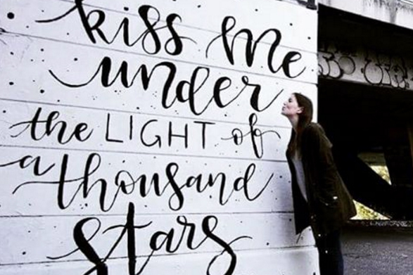
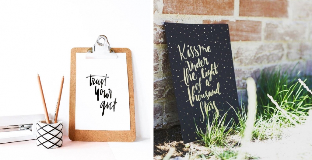
D&P: Kiss me under the light of a thousand stars – is one of my favourite artworks on the Donau Kanal. What’s the story behind it?
C&S: The quote “kiss me under the light of a thousand stars” was the first one we ever lettered. A few years ago when Stefan crafted his beautiful paper bound books we wanted them to have a quote on the cover. And to make it something special and meaningful we took the first one we ever lettered. And one day we went for a walk along the Donau canal and fell in love with the idea of making this beautiful city even prettier with one of our artworks. Something for everyone to see. Something for people to take selfies with, something to get inspired by. So we carefully picked a wall, bought supplies, and just gave it a go. It took us about 8 hours to complete and we enjoyed every second of it. We even made a video of it. Check it out!
https://vimeo.com/189596490
D&P: Besides showing the murals on Donau canal, where would you take a fellow creative visiting Vienna for the first time?
C&S: If you’re into architecture, literally anywhere, as long as you always look up to the breathtaking buildings this city has to offer. Take the D tram from Schottentor to Oper and visit the Cafe Hawelka in the 1st district. After having hot cocoa or a great cup of coffee and of course their famous “buchteln” stroll around the Wollzeile with some cute little shops until you arrive at the MAK museum. On Tuesdays the entry is free, so go get inspired. After enjoying great modern art we would recommend to head over to Vollpension, which is in the 4th district behind Naschmarkt and get some homemade cake and afternoon coffee. For dinner we love to get some pizza at Riva in the 9th district – that melted mozzarella is a dream come true.
D&P: And what will 2017 look like for Books, Ink.?
C&S: 2017 will be full of travelling, exploring, learning, collaborations, lots of new stuff in our online shop, more illustrations and more colour. Basically we want to get out of our comfort zone and discover new things.
D&P: Sounds like a great plan for the year. Thanks for the interview and keep creating wonderful and beautiful things!
C&S: Thank you.
