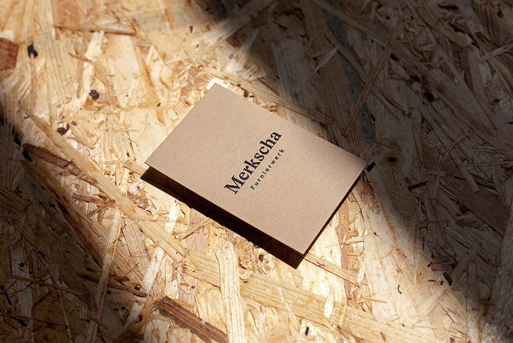
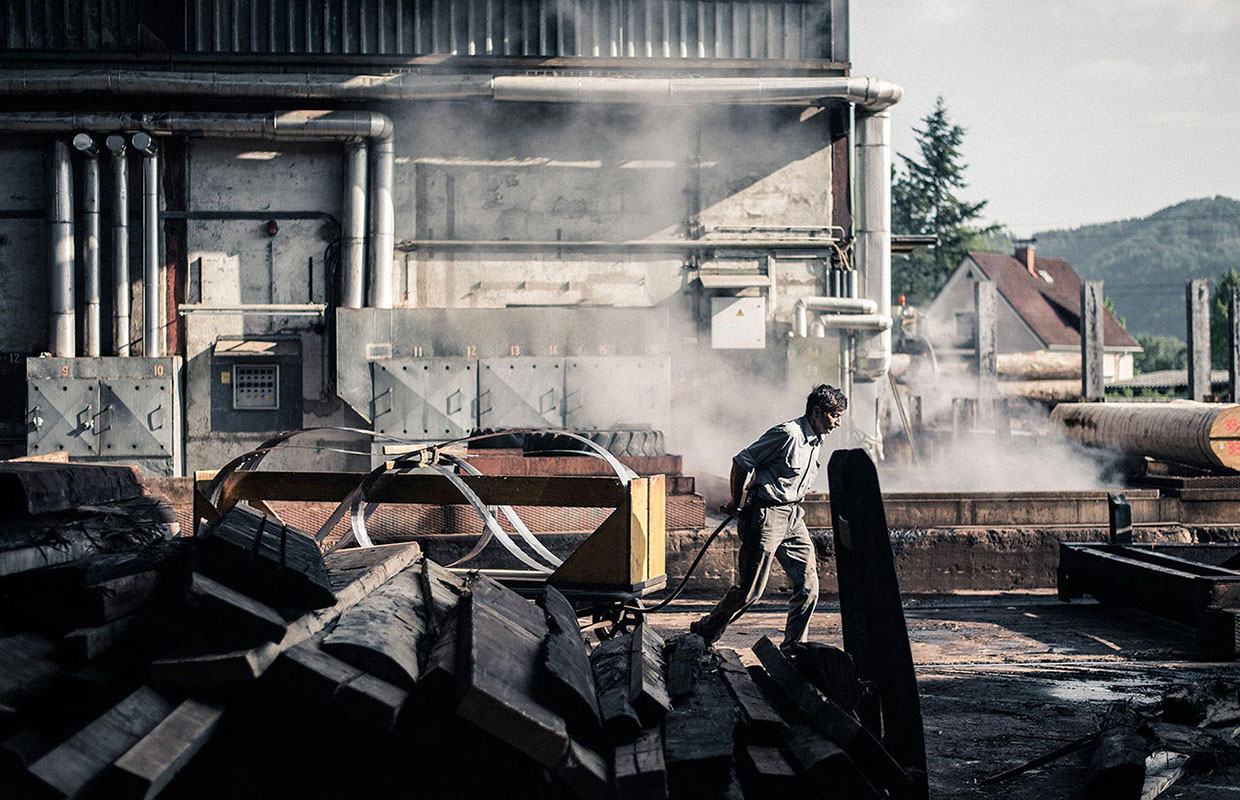
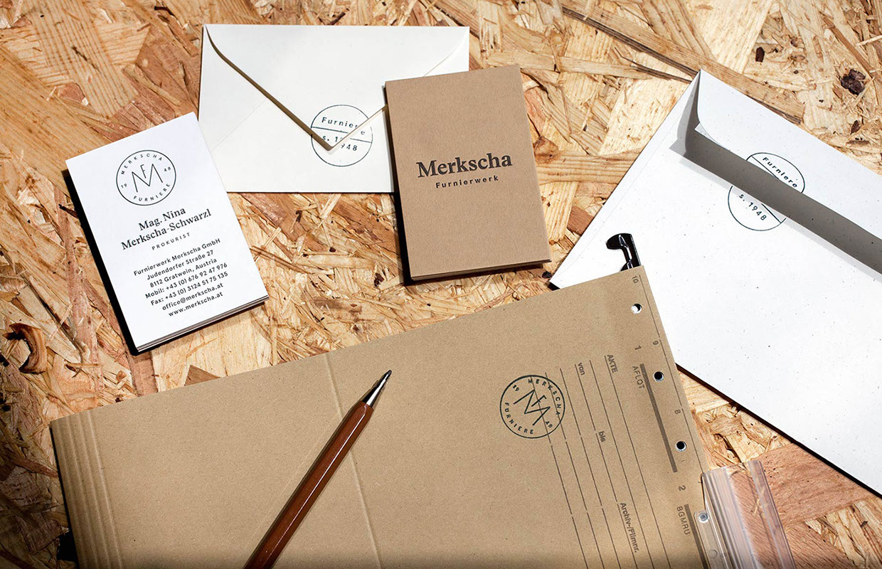
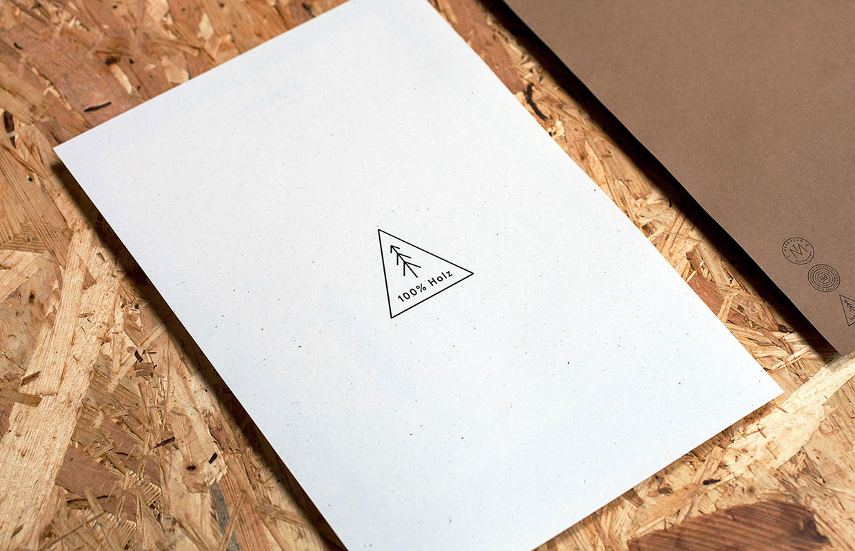
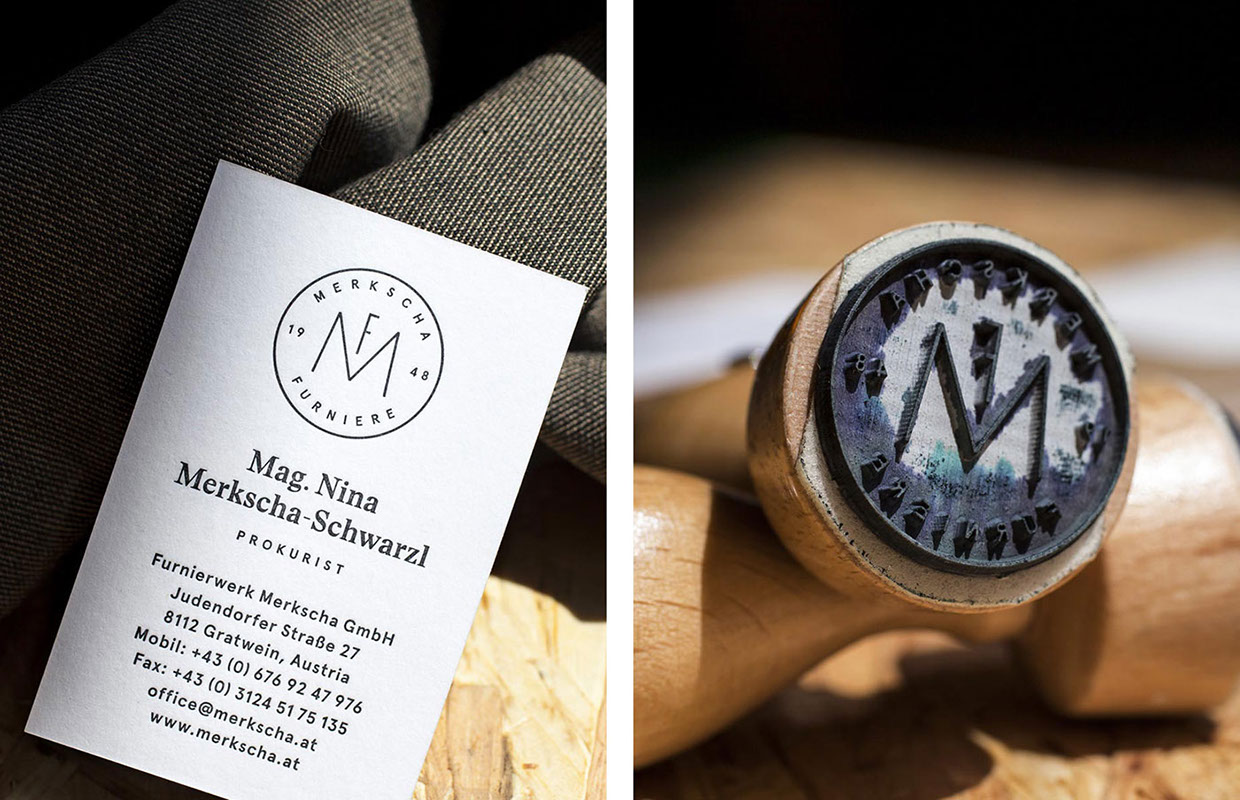
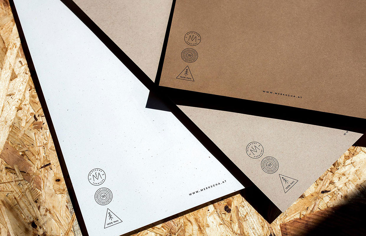
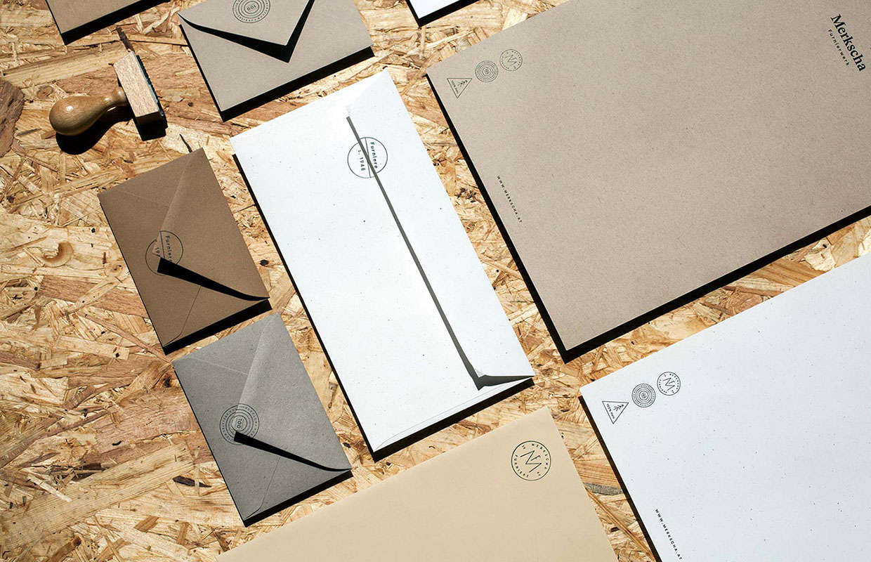
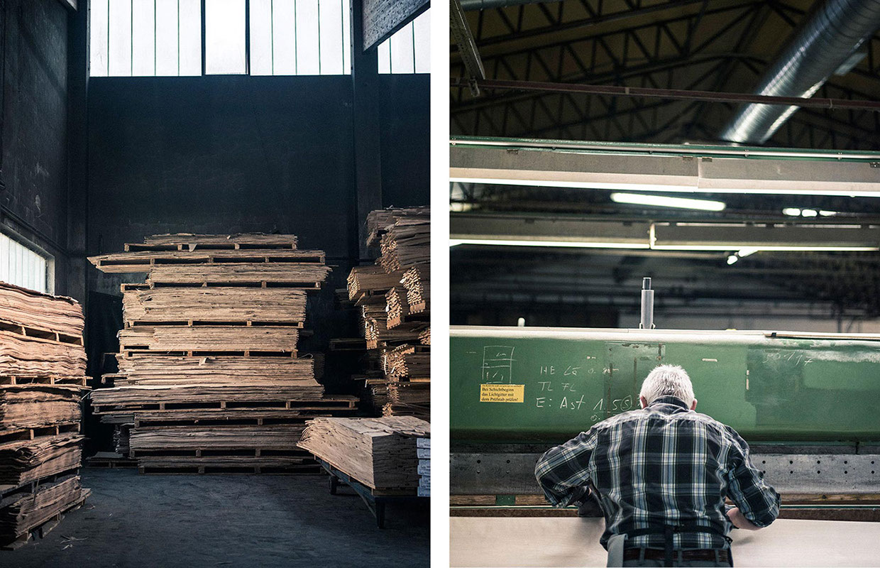
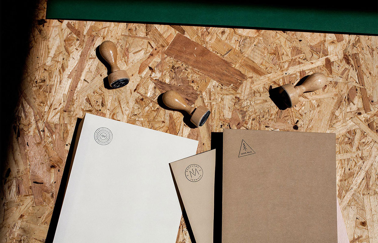
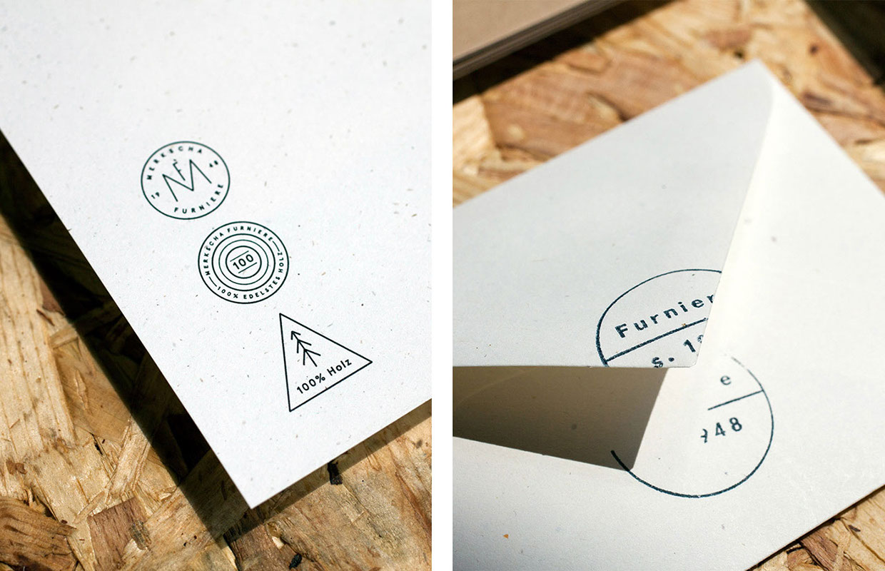
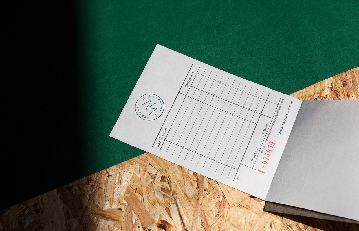
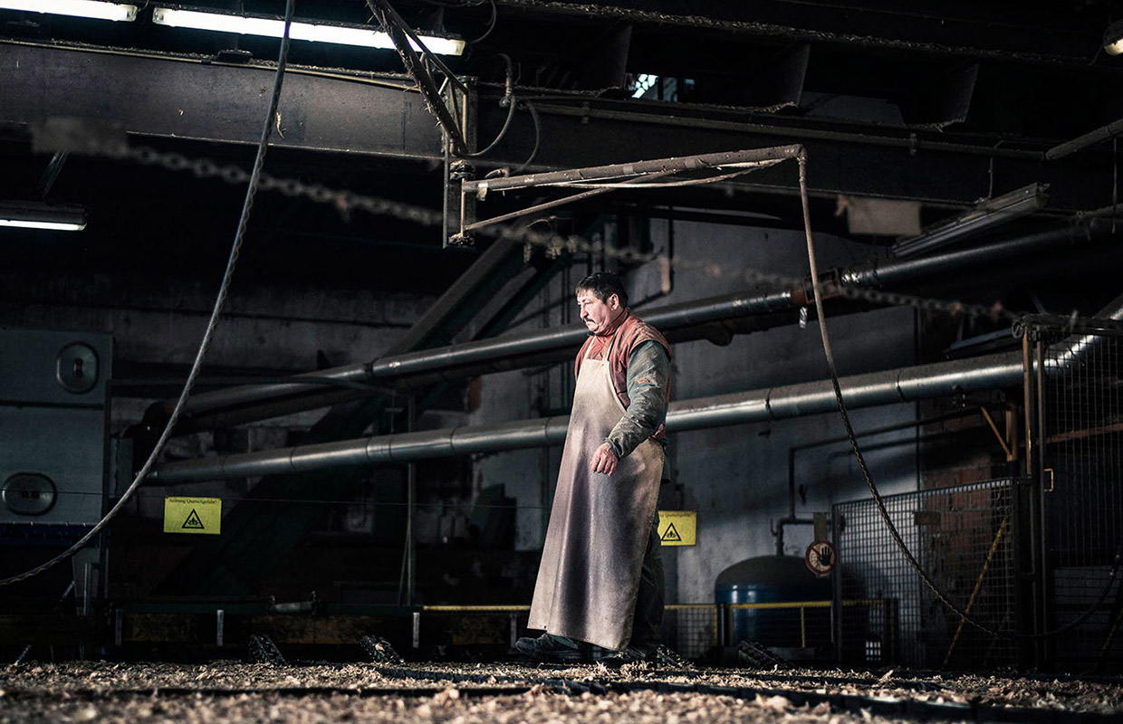
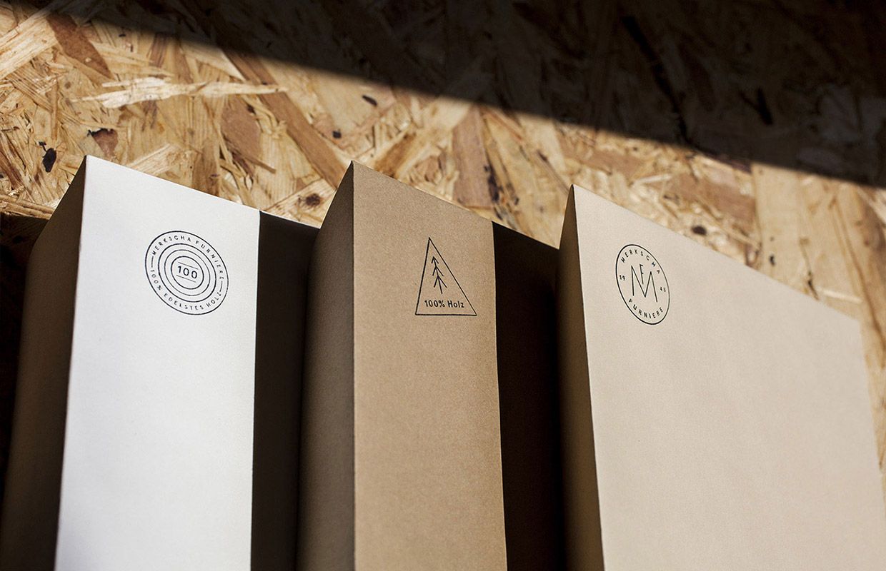
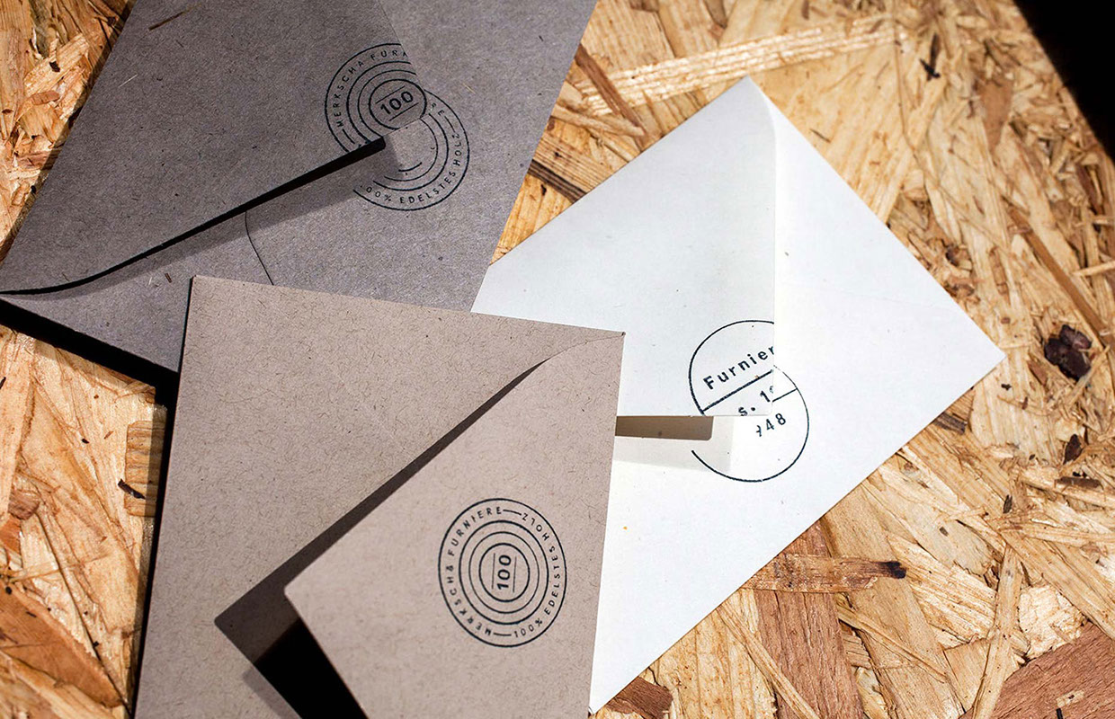
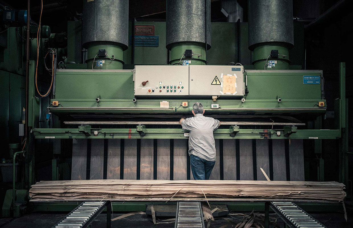
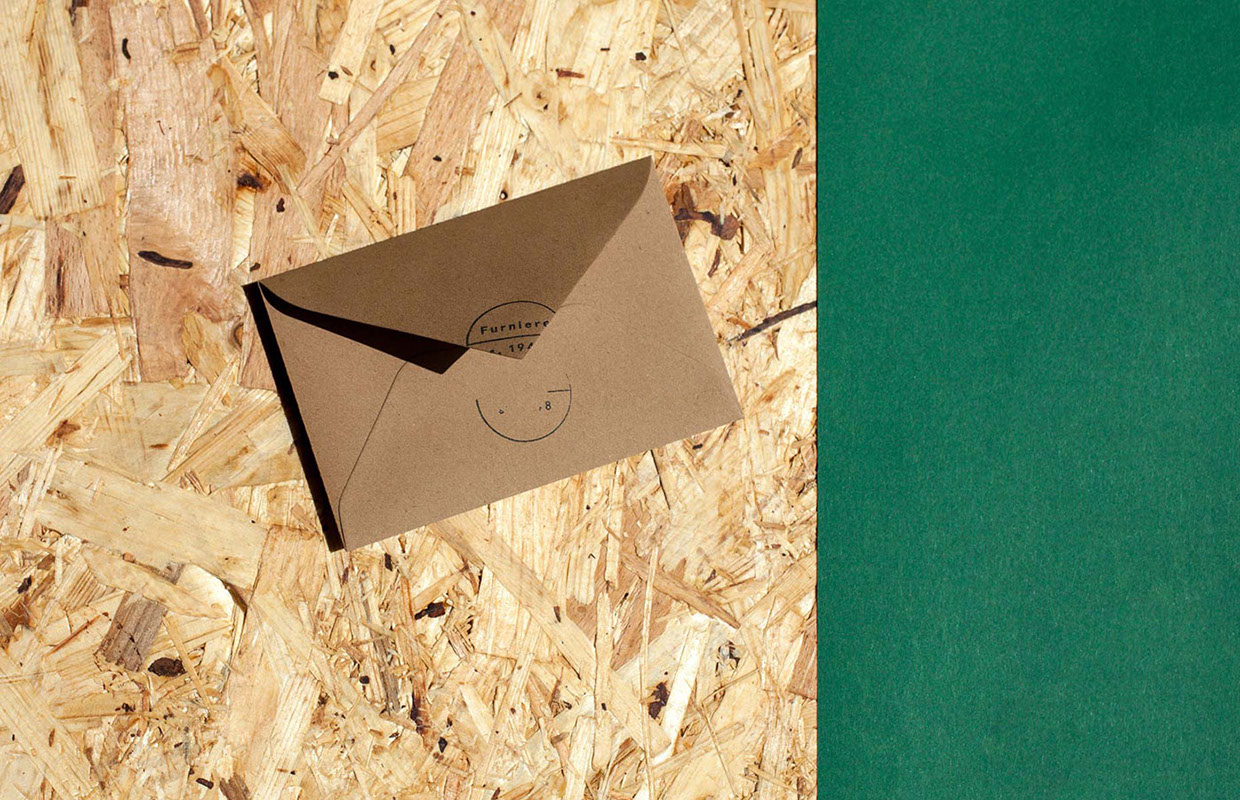
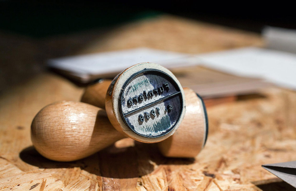
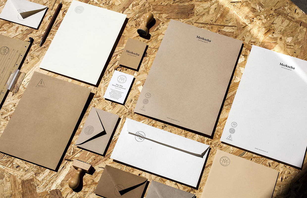
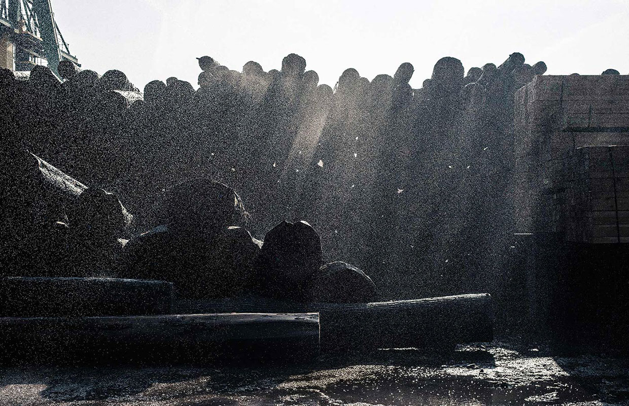
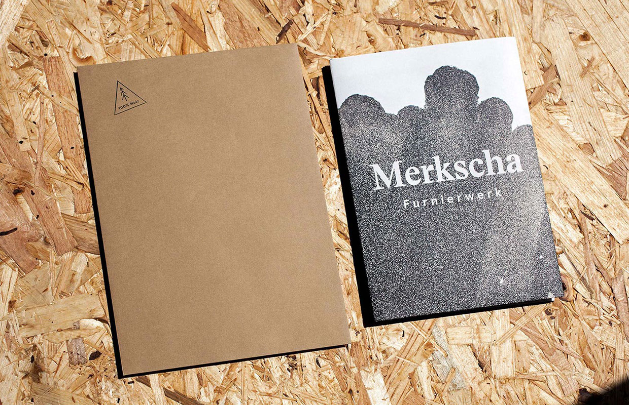
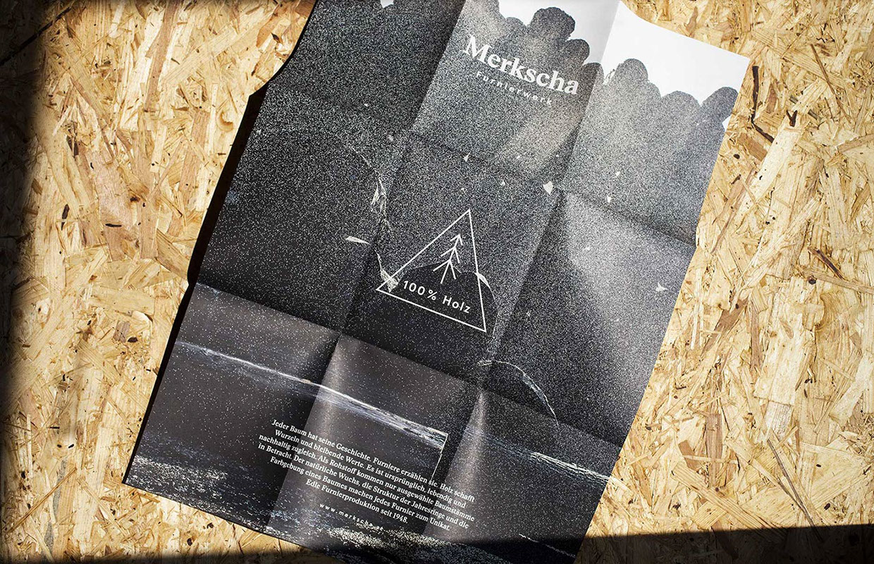
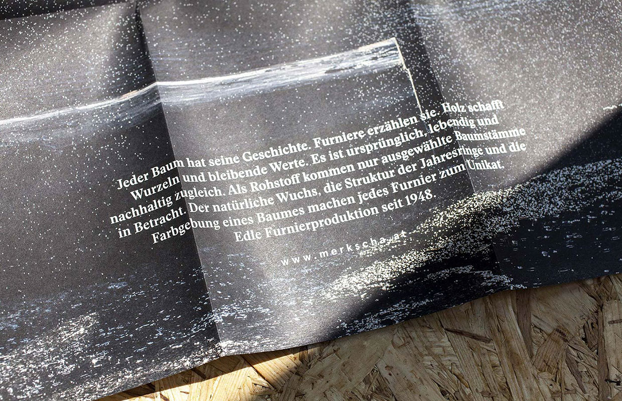
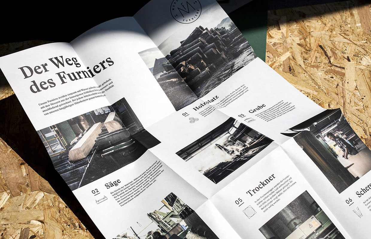
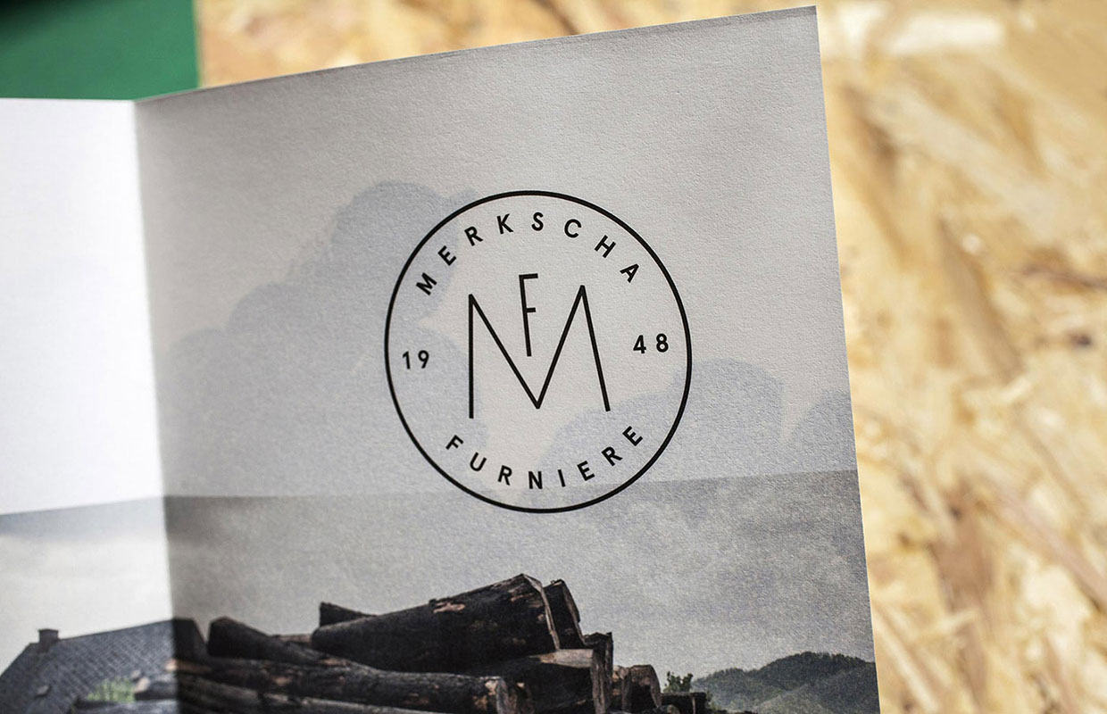
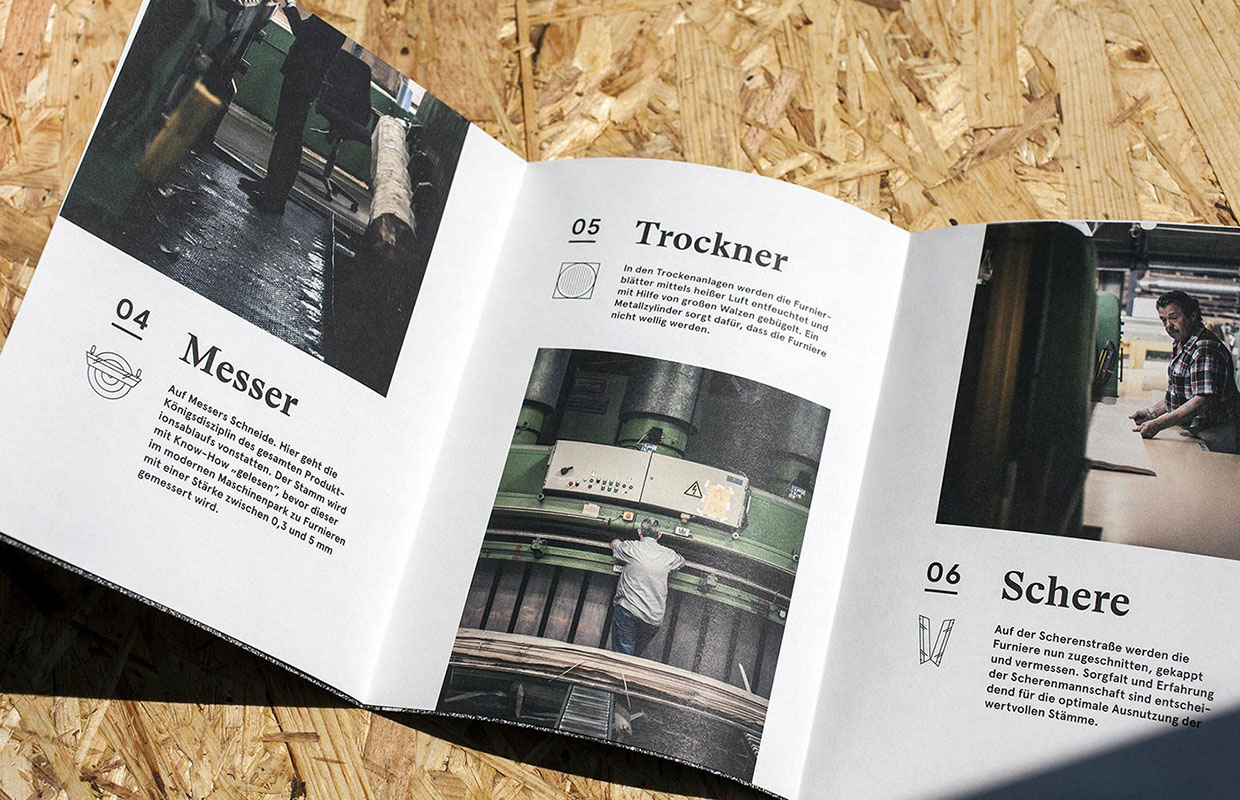
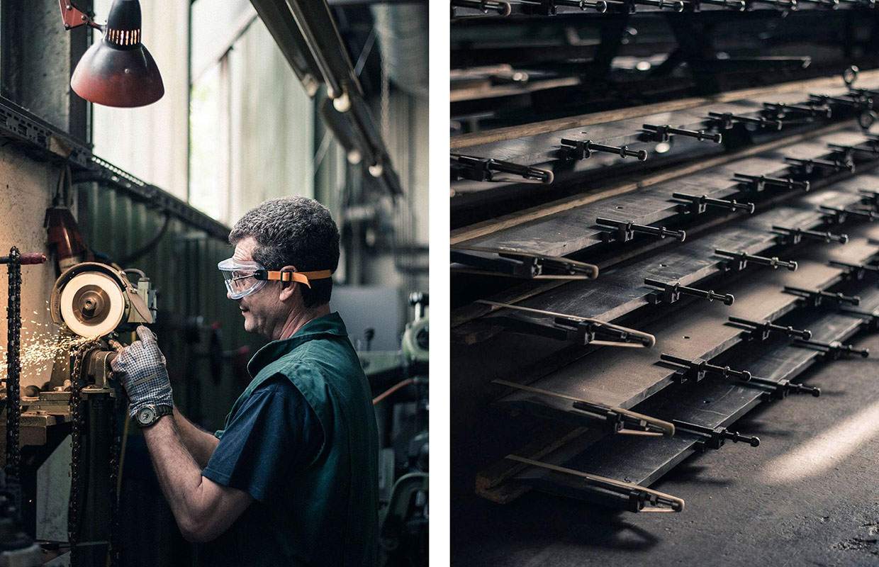
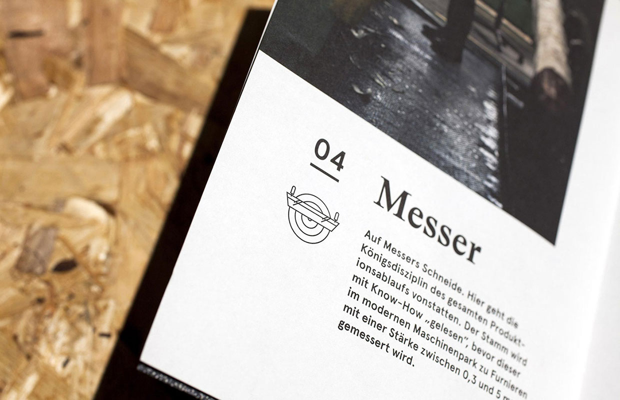
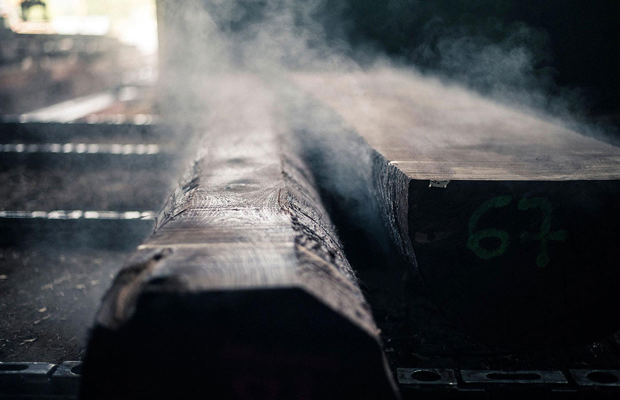
Graz based graphic design studio Bruch—Idee&Form created a new branding for Merkscha Furnierwerke—a veneer mill that produces a wide range of wood veneers. The design concept plays with a natural color palette and combinations of seals and stamps for a simple and efficient use throughout all printing materials. Each printing uses a different paper like each type of wood has its own color and grain. The stylish concept respects the traditional companies values and highlights the quality and care it puts into their product line. 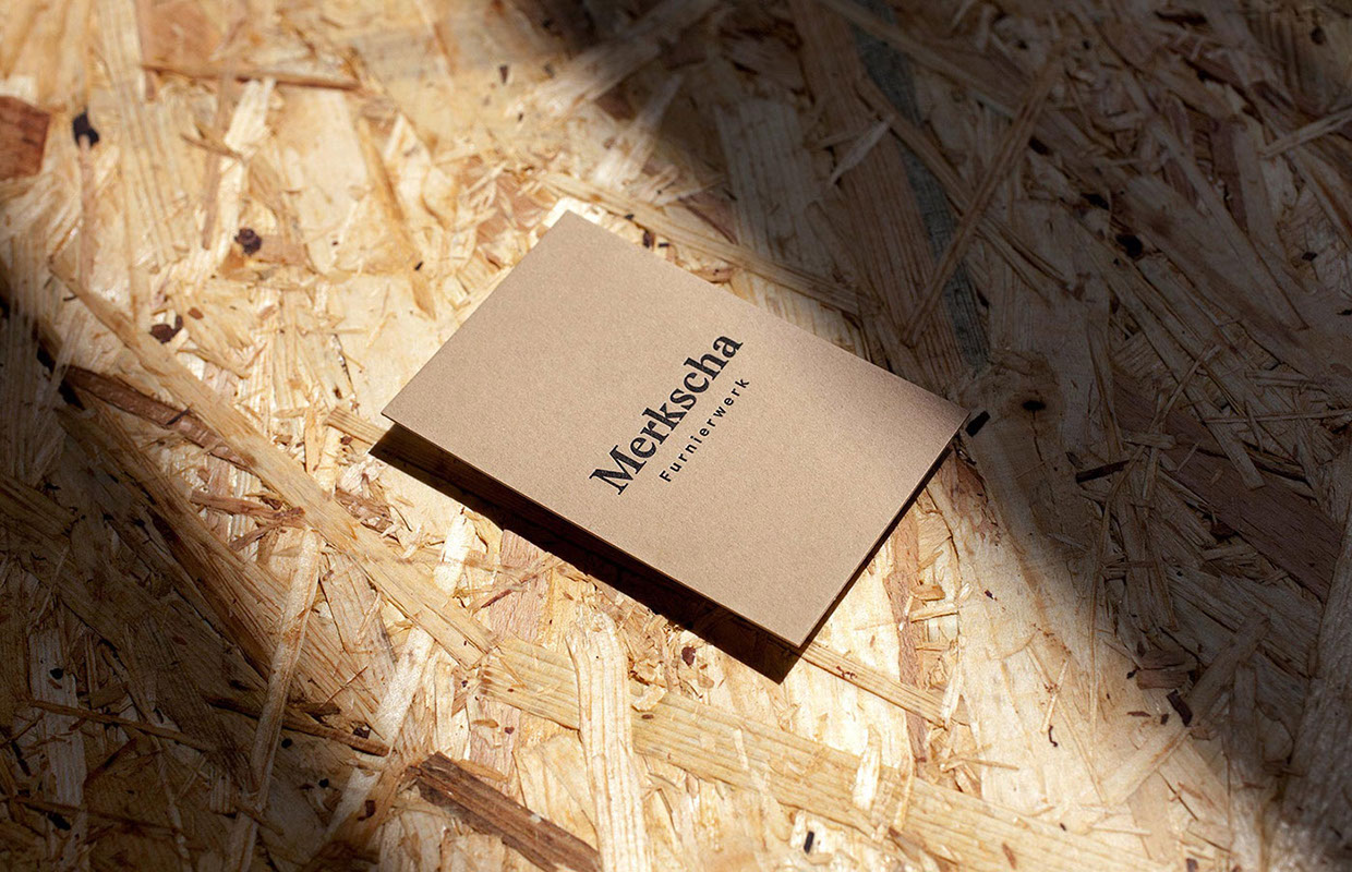 Sometimes modern branding concept fail to truly capture the spirit and style of a traditional company or brand, failing at making a distinct connection between the two. And even though it’s become a necessity for all industries across the field to brand themselves to differentiate and compete for clients, most of than not the new branding end up looking not sensear or glued on. But in this instance, Bruch—Idee&Form made an incredible good job of building the visual identity for Merkscha Furnierwerk by simply drawing inspiration from their product line itself and telling the story of the craft. Veneer manufacturing is an elaborate process and hard work – the wood steams, the air is full of dust, little light gets through dimmish air – impressions they communicated in the imagery.
The materials and printing techniques exude of quality and thought, and were not merely chosen randomly but with care and intend. The different papers and stamps bring a certain aspect of play and lightness to the range, while keeping the overall look cohesive, prestige and of high quality. And without a doubt in my mind I can claim this to be the most stylish veneer mill branding I’ve come across!

© Art Direction: Bruch—Idee&Form
Photography: Marion Luttenberger
Programming: Stefan Reinprecht

