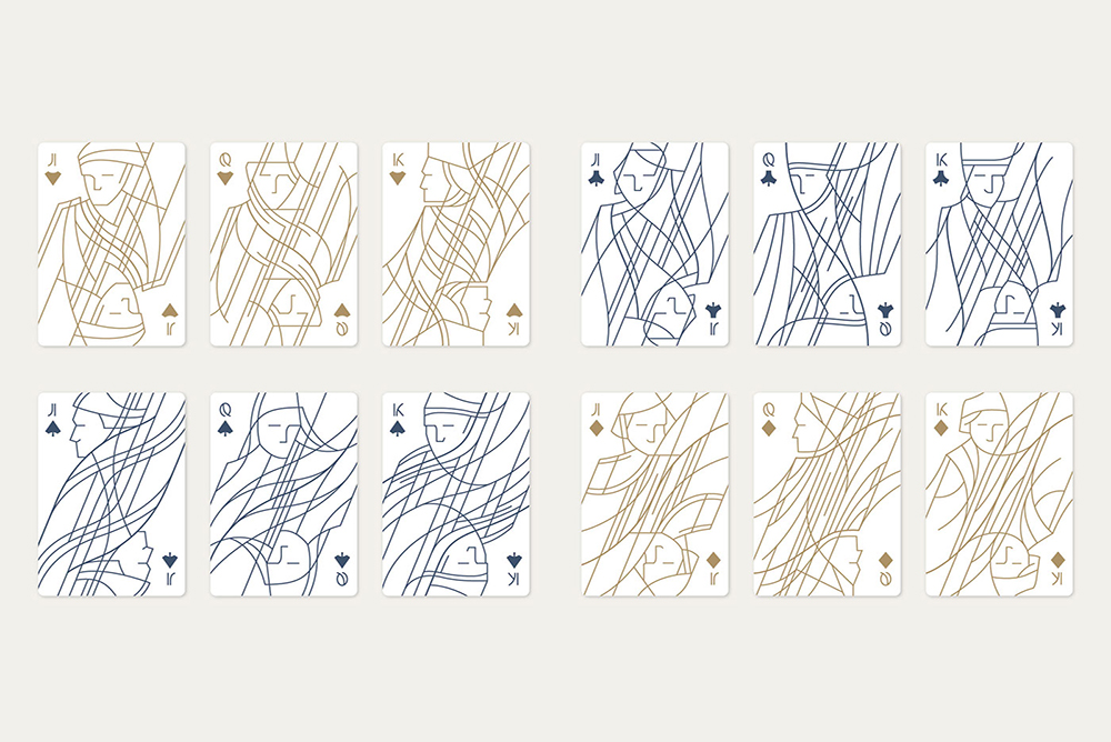
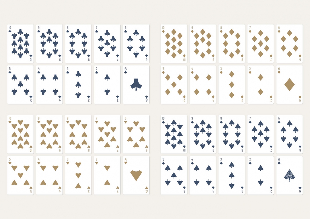
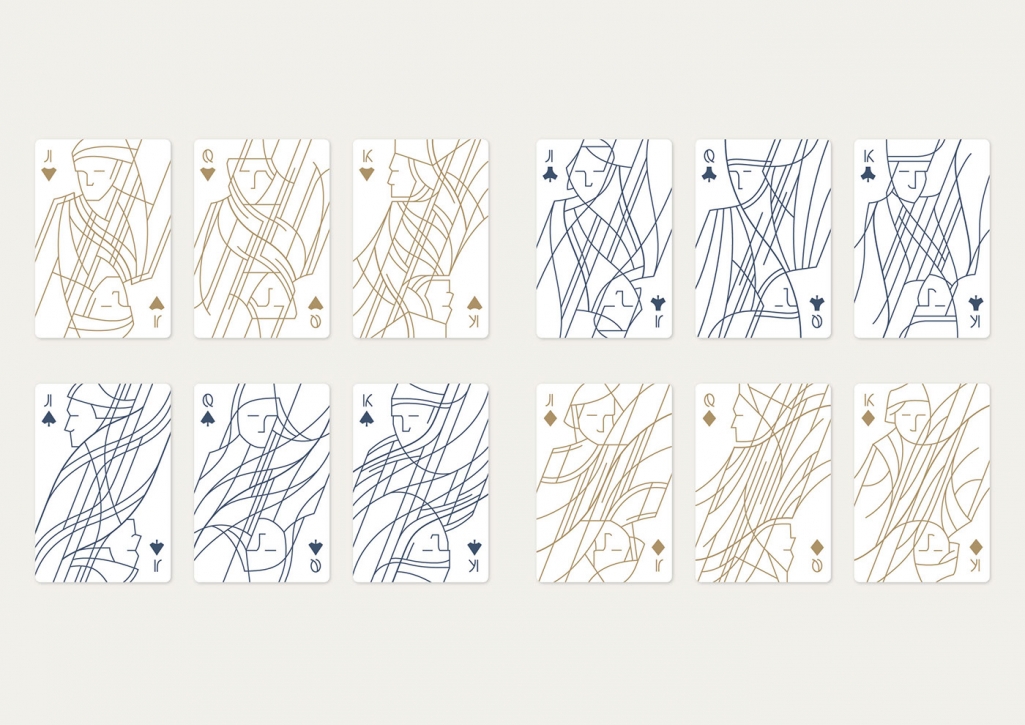
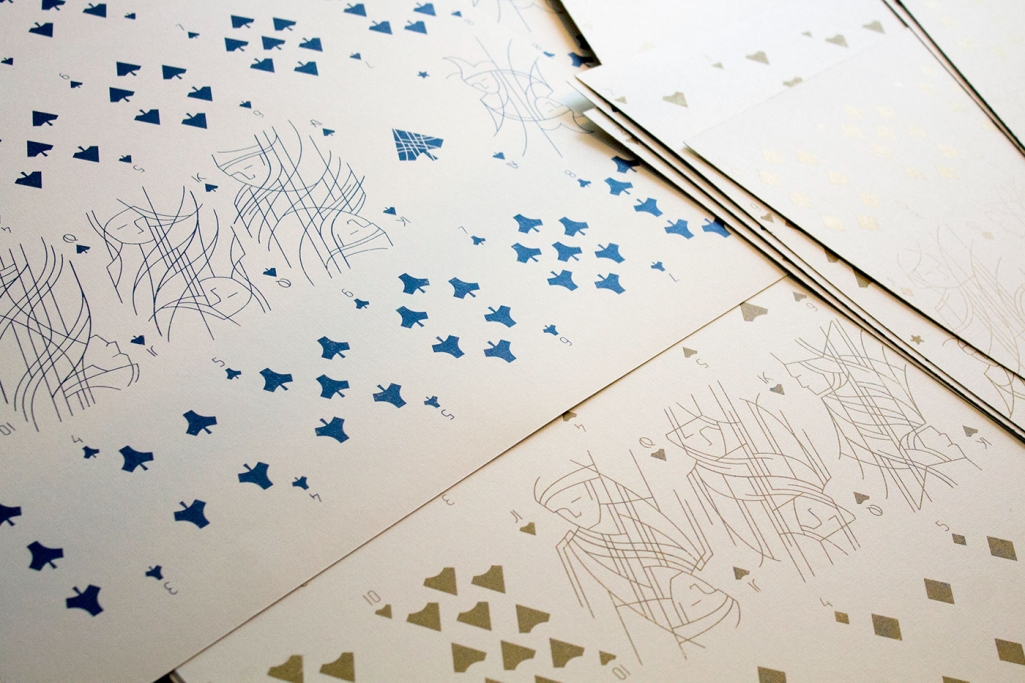
Budapest based designer Krisztina Berta took on a task many designers have felt compelled to try in recent years. Redesign a classic – the playing cards. The beloved game everyone has tried at least once in their lives offers a great format for creatives to test their imagination while having to play by the rules (pun intended). Keeping the design recognizable enough for anyone to play the game as one has to distinguish the four suits as well as the “reversible” court cards while revamping the design.
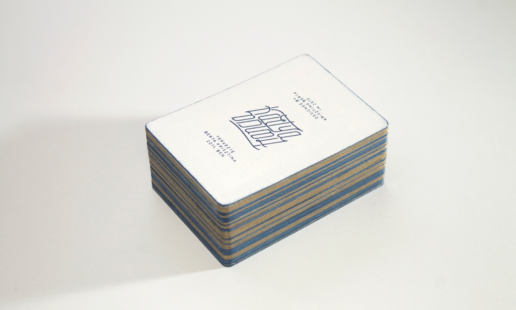
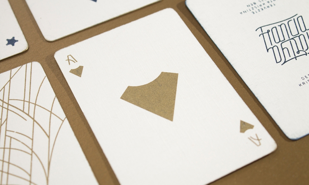
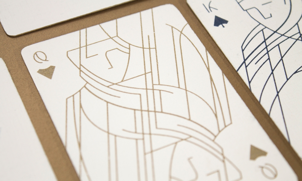
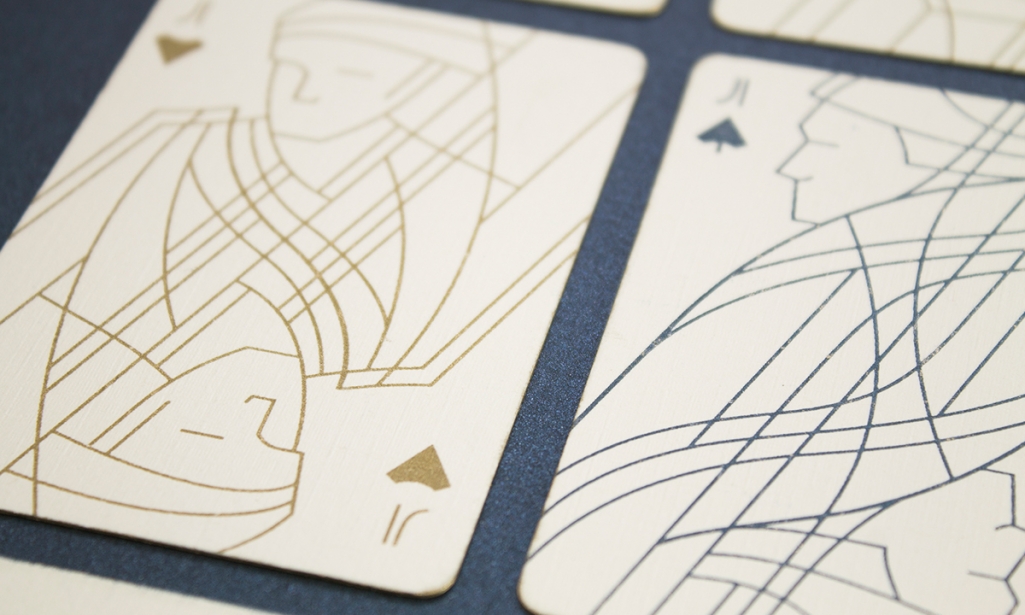
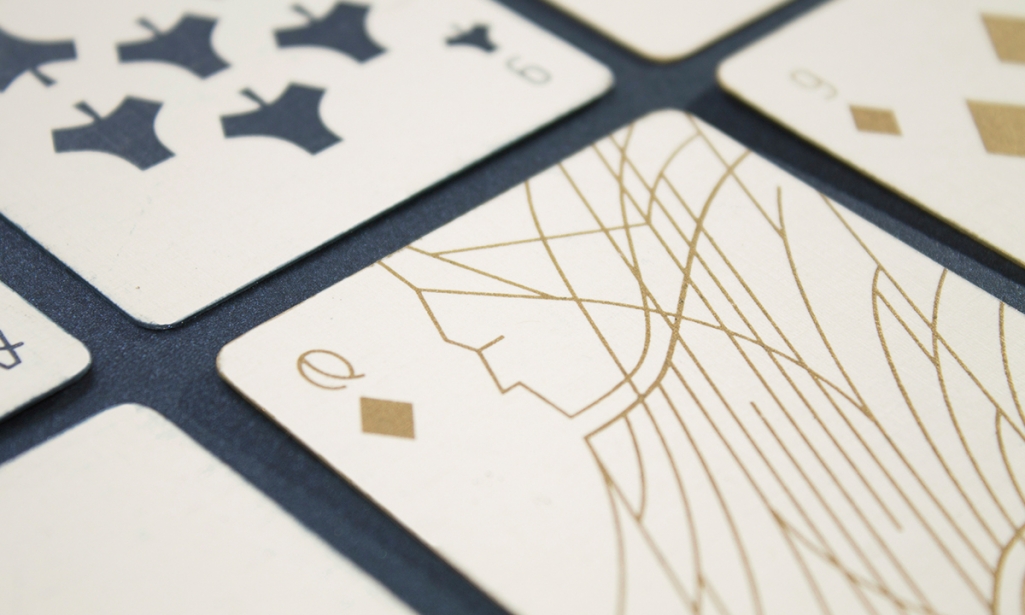
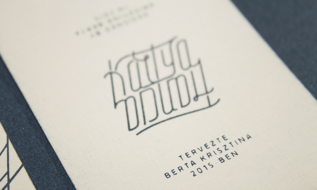
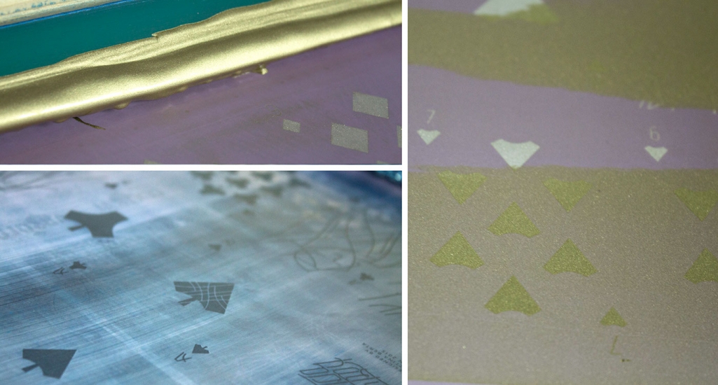
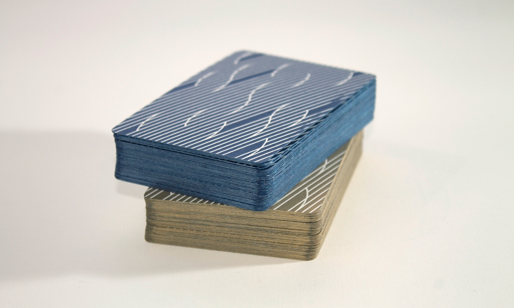
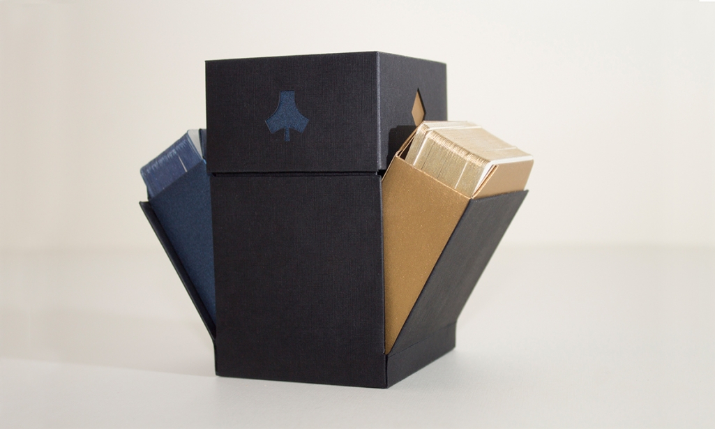
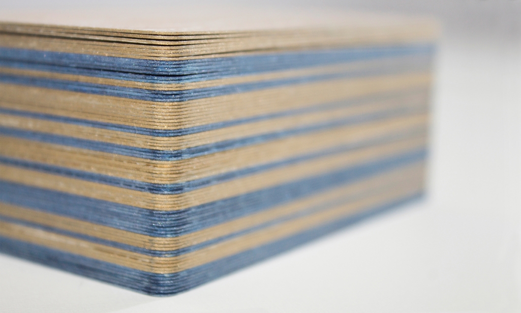
Krisztina Berta was inspired by the opportunities that lay in central mirroring typical for playing cards. A visual technique that has already been approached in many ways, most often along a horizontal line at the waist of the character’s portrait on the card. Berta’s aim was, apart from keeping the typical contents of French cards, to create a fully functional card set while using elements much different from classic ones. She designed and manufactured two sets of cards and also the packaging to keep them in. The minimal line illustration creates a contemporary feel to an ancient game, bringing the long-loved tradition of playing cards into the new millennium. With classic color combination – white, gold and blue, the style is regal and elegant, fitting for a family of royals just like the cards portray.




Images © Krisztina Berta

