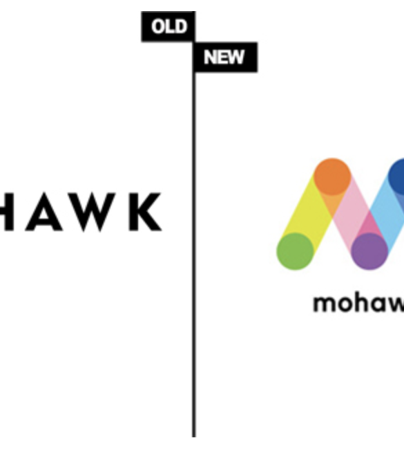
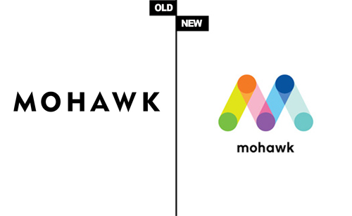
Last year Mohawk – the manufacturer of fine paper brands such as VIA, Options or Panoramic – decided that it was time to reinvent their corporate identity in order to reflect their innovative and multifaceted business and products. This also included the launch of a new logo designed by their New York agency Pentagram.
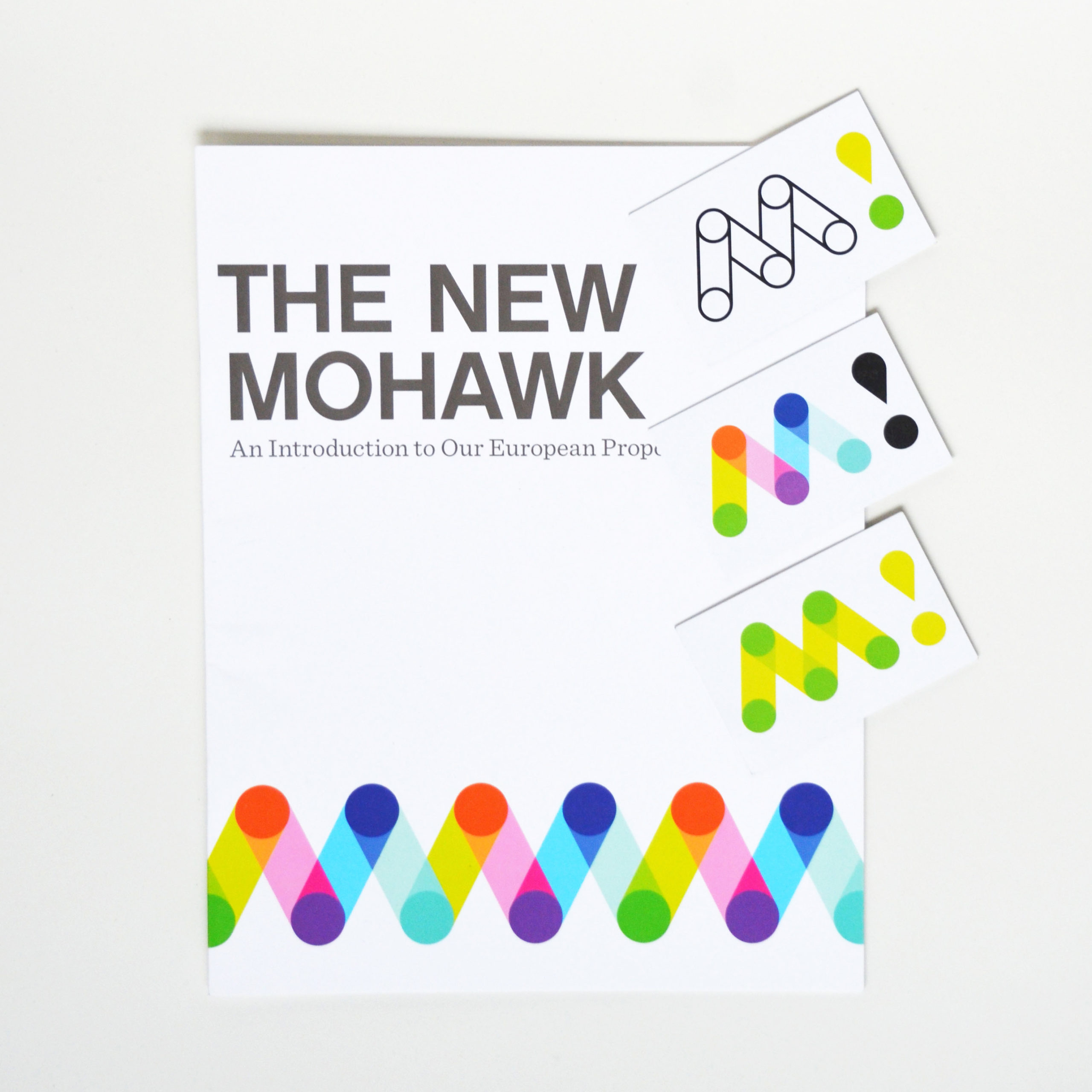
The new logo is based on the letter M and serves as a monogram for the name Mohawk. Pentagram states that the logo “is inspired by the papermaking and the printmaking process, both of which involve paper moving around cylinders. The forms of the logo suggest paper rolls, printing presses and circuit boards, as well as the idea of connection and communication, the core functions of paper.”
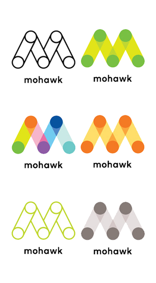 Mohawk’s new logo appears in a dozen of color variations on ads, brochures, swatch books, ream wraps, business cards, and Mohawk’s new webpage plus there can be created many different patterns based on the M shape. We love this refreshing burst of color and the idea of different variations because it adds some dynamic and fun to the logo while staying true the basic M shape.
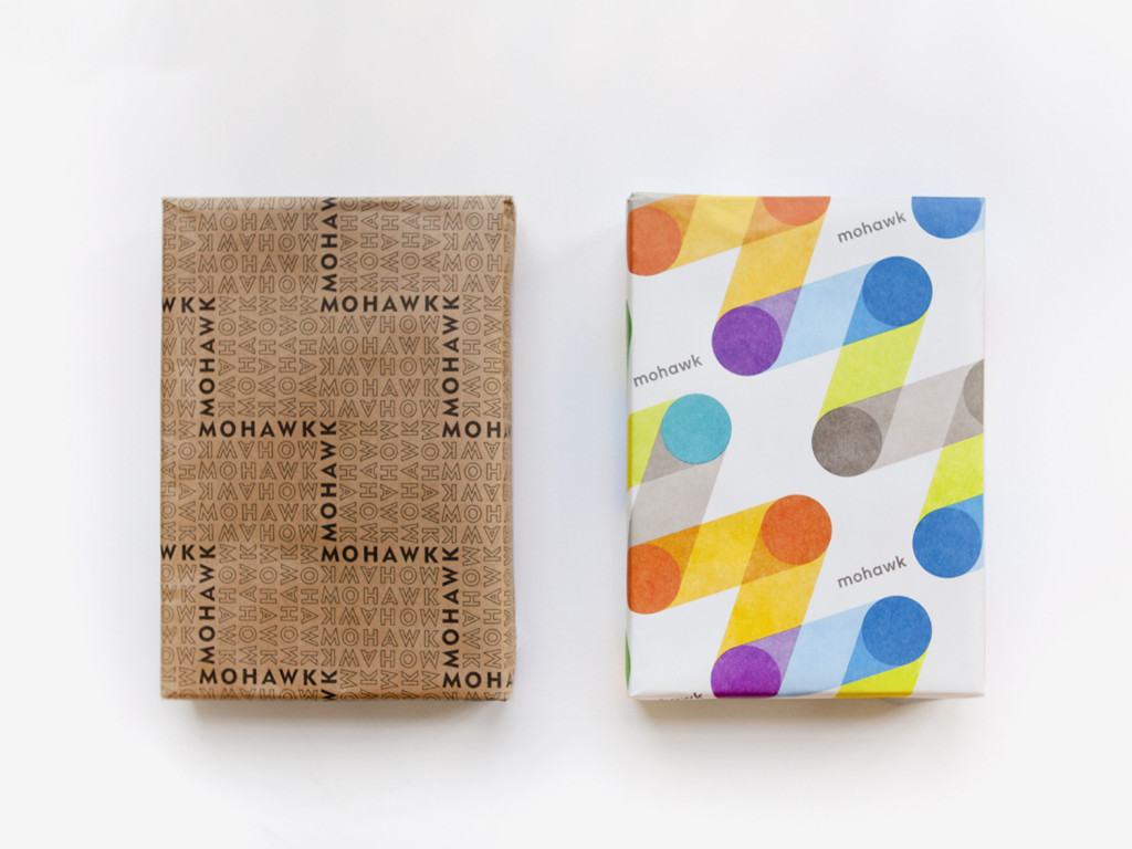
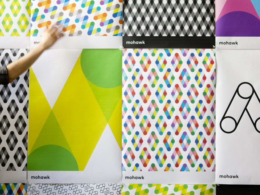 Not only we like the new corporate identity, Mohawk’s M makes heads turn wherever it appears. We noticed that whenever someone of Mohawk pulls out his business cards, people are fascinated by the different color mutations and can’t decide which one to take – they have already become collectibles in the industry!
Photos © Mohawk Fine Papers.

