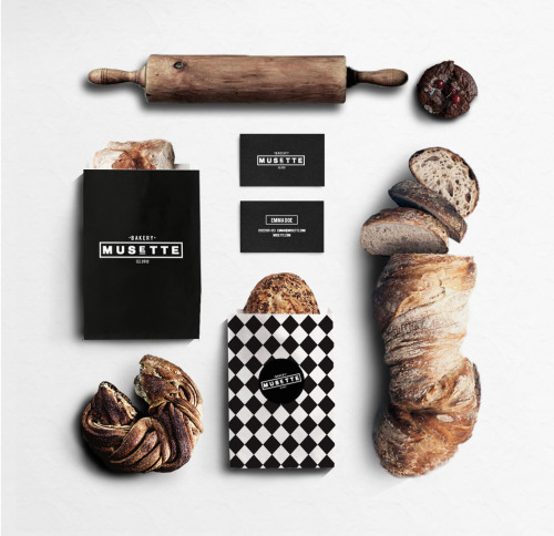
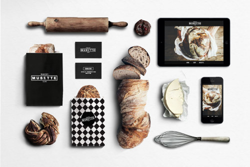
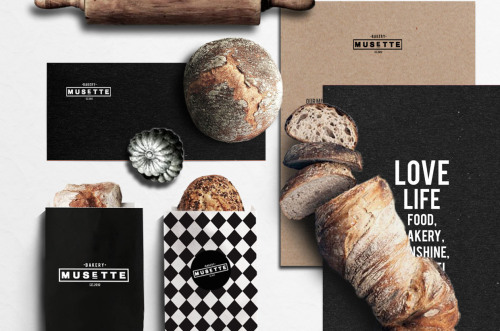
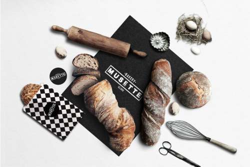
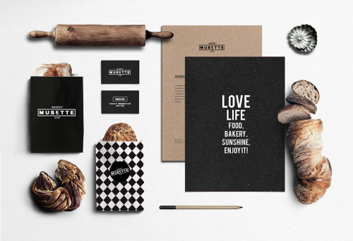
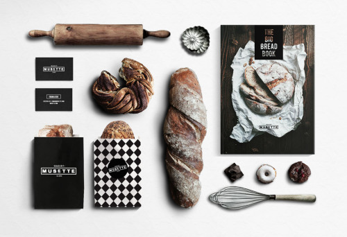
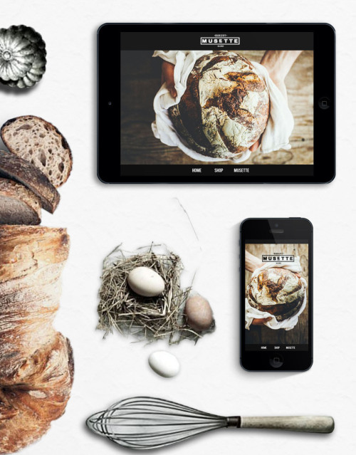
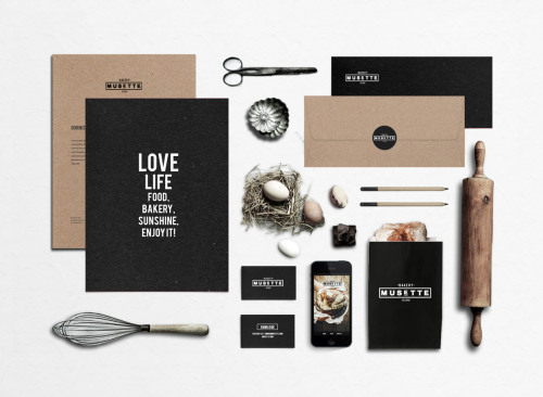
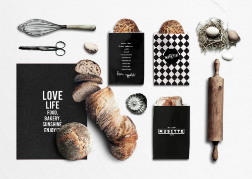
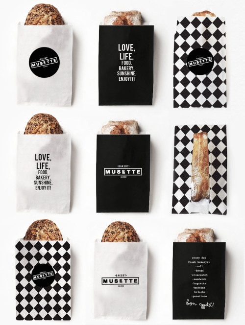
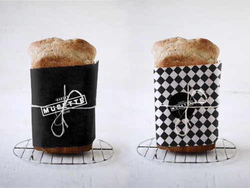
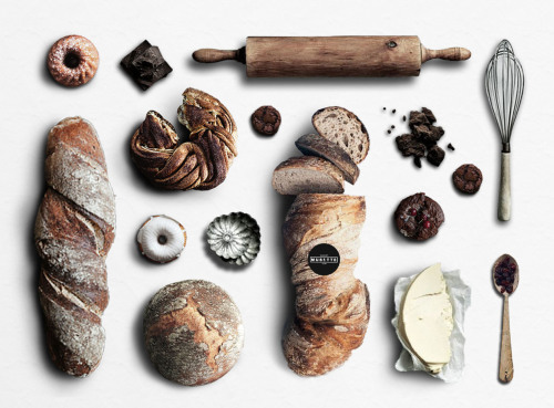
Budapest based designer Judit Besze‘s work is clean, simple and inspired by a vintage feel. Working in graphic design, art direction and branding, one of her latest projects was to create a new visual identity for Musette Bakery. The rustic bread and pastries look even yummier when wrapped in a stylish black-and-white patterned packaging. We warned: the following images will make your stomach growl.
In recent years companies across the board from barber shops to bakeries have discovered the strength of good branding. Businesses are more willing to spend that extra effort into making a personalized identity which sets them apart from their competition. And bakeries, which have been around for centuries, have jumped on board. We alone have written about a few great branding designs for bakeries in the last year. And here is another one that we could not resist, Musette bakery branding by Judit Besze.
Besze’s style incorporates strong use of color, contrasts and classic typography. Her previous designs include pastel colors and flower patterns so the monochromatic look of Bakery Musette is a step into a new direction for her. The design looks equally fresh and timeless, with the black-and-white chess pattern reminding of 50’s kitchen tiles, a combination of a homely feel you get from your mother’s cooking, wrapped in stylish new packaging. The decision to use black, white and kraft paper, combined with a geometric pattern and witty typography keeps a minimal, cohesive overall look that is recognizable and classy.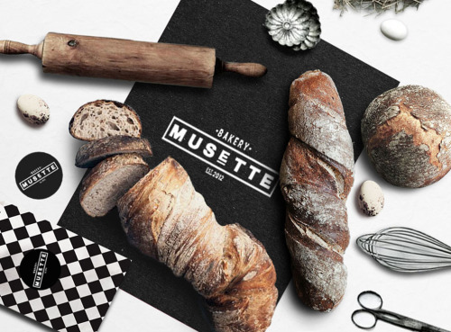
Photos via Judit Besze

