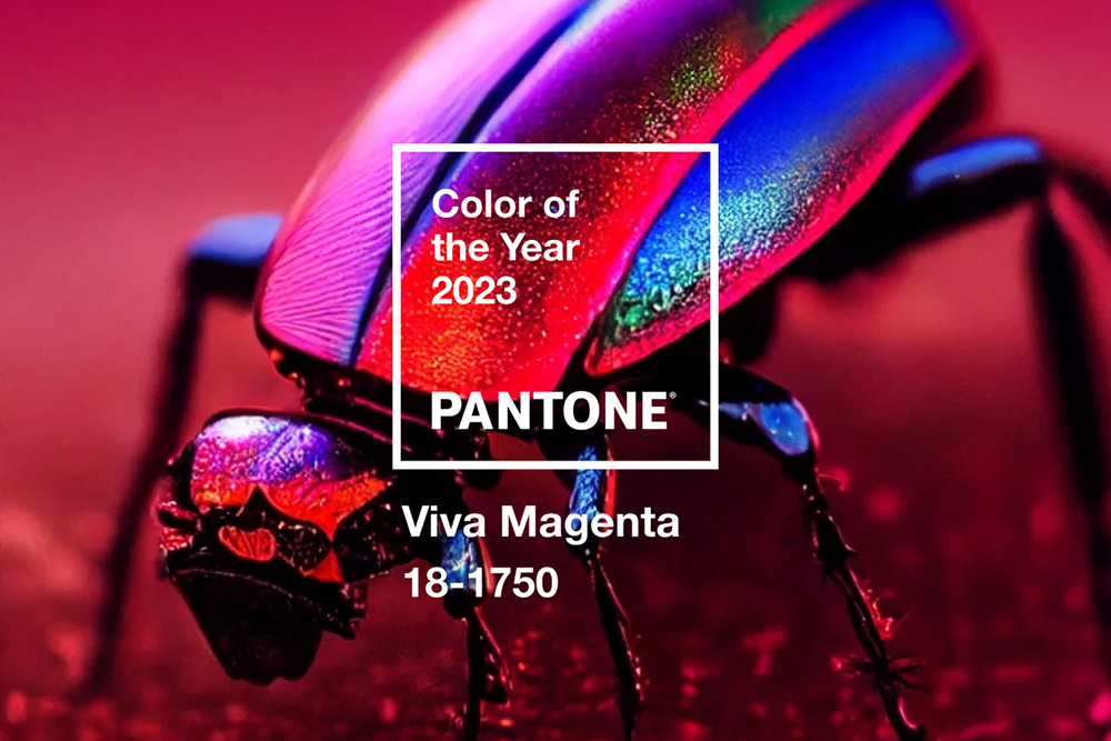
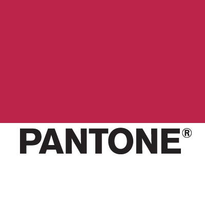
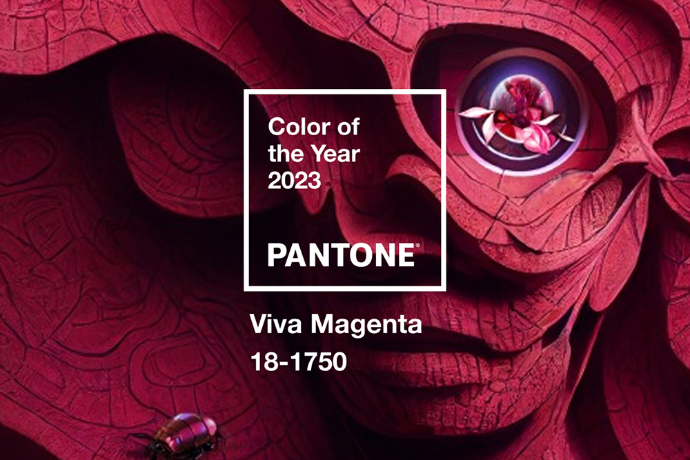
“An unconventional shade for an unconventional time: a new vision” – these were the words Pantone introduced their new Color of the Year for 2023: PANTONE 18-1750 Viva Magenta. This passionate purple, a mix of red and blue, vibrates with vim and vigor. A shade rooted in nature descending from the red family and expressive of a new signal of strength. Viva Magenta is brave and fearless, a pulsating color whose exuberance promotes a joyous and optimistic celebration, writing a new narrative.
As a nuanced crimson red tone that presents a balance between warm and cool, PANTONE 18-1750 Viva Magenta is also a hybrid color, one that comfortably straddles the physical and virtual in our multi-dimensional world. It is assertive, but not aggressive, a carmine red that does not boldly dominate but instead takes a “fist in a velvet glove” approach.
Audaciously brave and mighty, Color Of The Year Viva Magenta welcomes all as they are, as Pantone embodies the importance of inclusivity and the rebellious spirit of our time
Viva Magenta is powerful and empowering. The vibrant red tone embodies pure joy, encourages experimentation and self-expression without restraint and manifests as a stand-out statement. There’s no hiding, no apologies, nothing shy about the shade. But the audacious tone feels inclusive and aims to welcome anyone and everyone with the same verve for life and rebellious spirit.
“As a nuanced crimson red tone that presents a balance between warm and cool, PANTONE 18-1750 Viva Magenta is also a hybrid color, one that comfortably straddles the physical and virtual in our multi-dimensional world. It is assertive, but not aggressive, a carmine red that does not boldly dominate but instead takes a “fist in a velvet glove” approach. Exuding dynamism, PANTONE 18-1750 Viva Magenta is a transformative red tone capable of driving design to create a more positive future”, Pantone writes about their chosen color for the upcoming 2023.
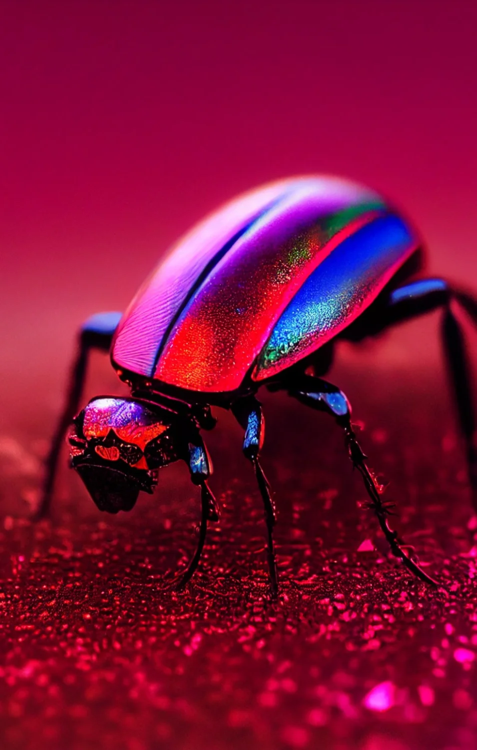
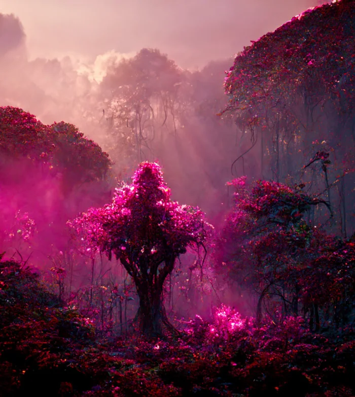
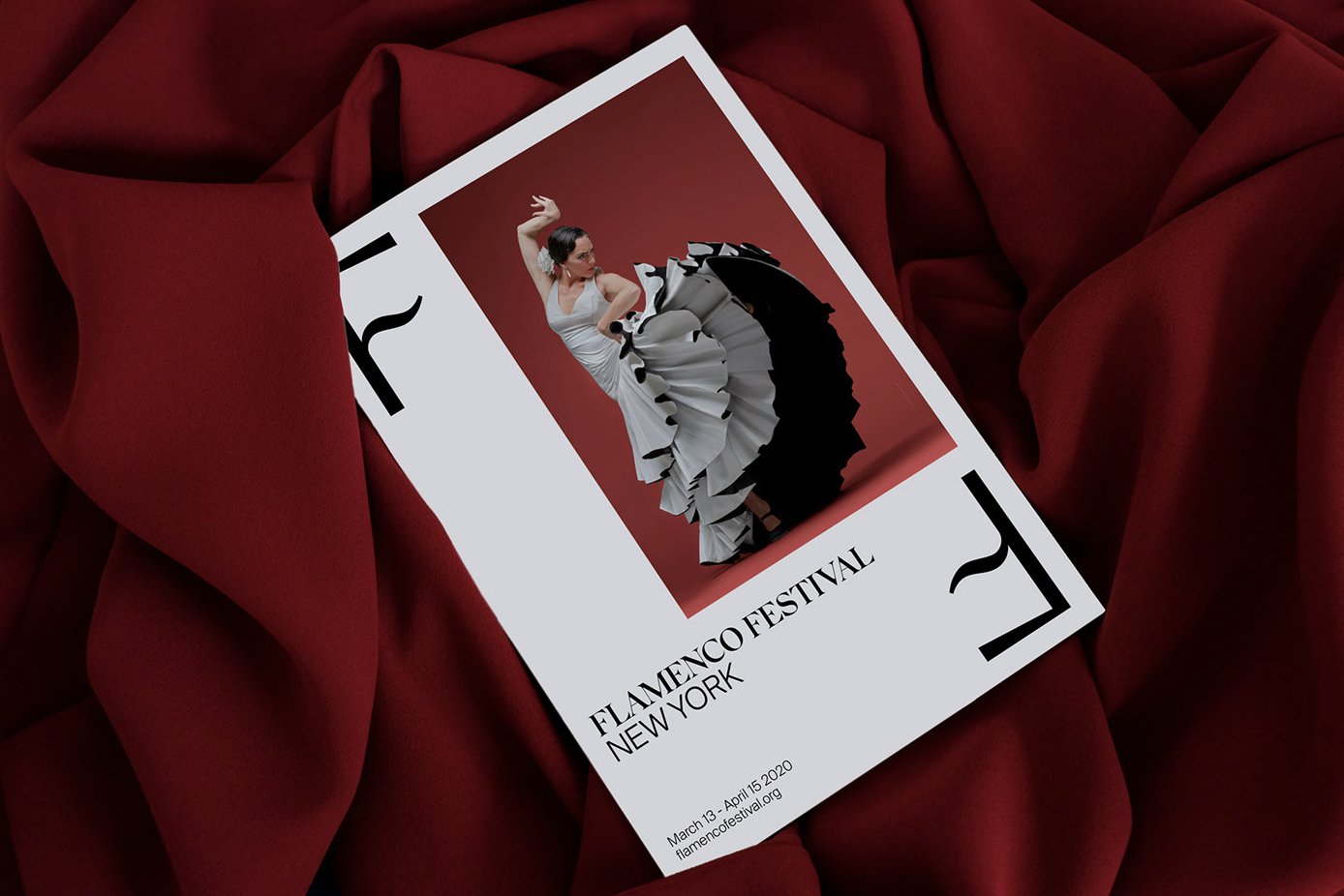
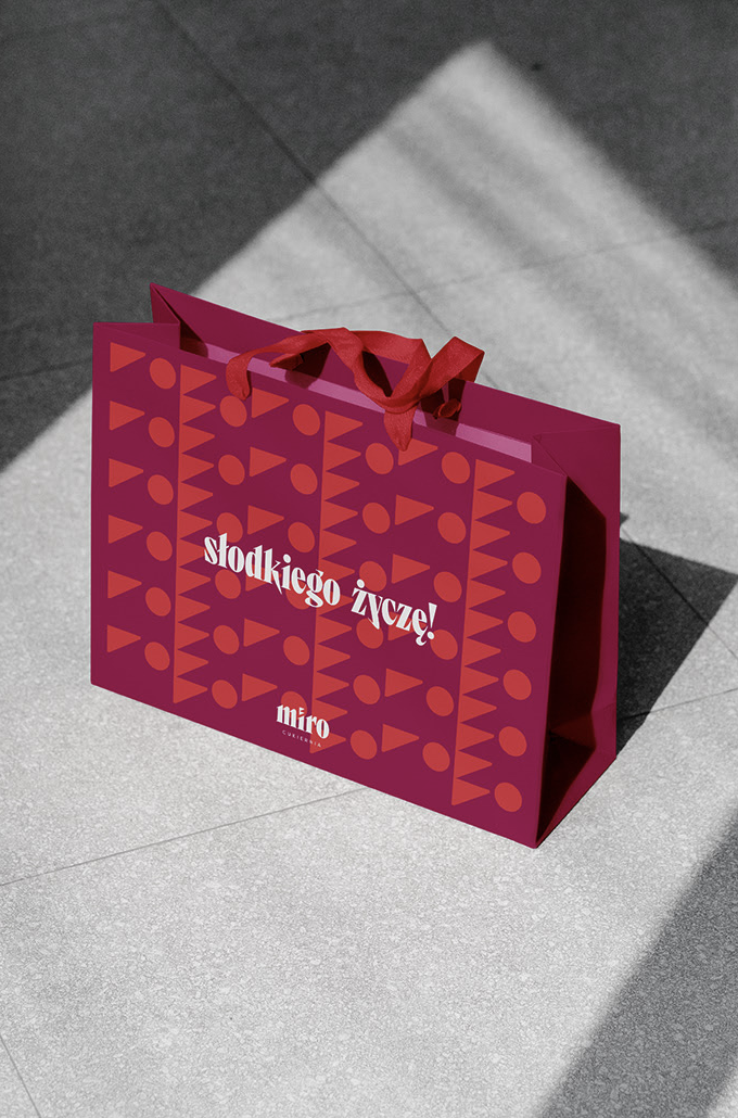
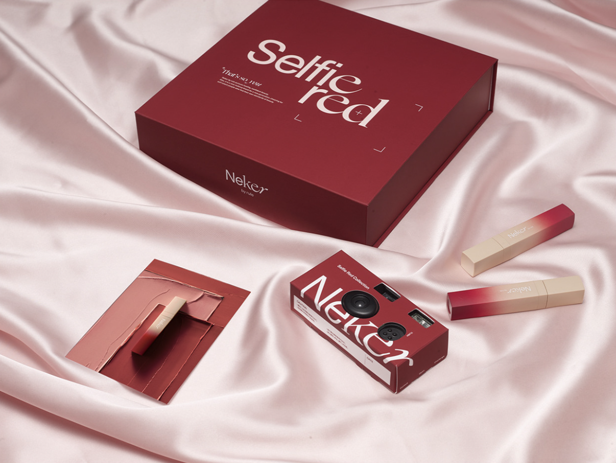
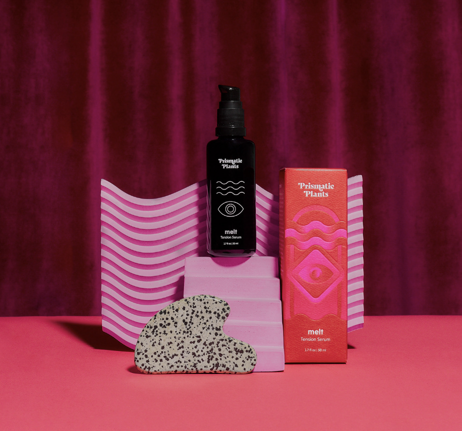
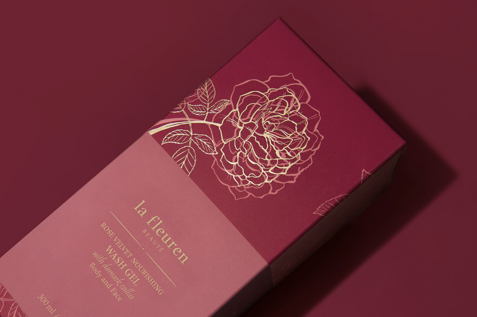
You see some of the inspiration images below PANTONE welcomes the new Color Of The Year to the world with, as well as some of our picks from the BRANDING+PACKAGING world that echo the sentiment of the new trendy shade. We’ll be diving deeper into the color journey of the Viva Magenta in the future, but for now, you can learn more about the decisions and thoughts that led PANTONE to choose the powerful red as the stand alone shade of the year here. What do you think of PANTONEs choice of color? Let us know in the comments!

