GRAFIS, a design studio in Plovdiv, Bulgaria, specializes in logo, identity, print, and digital design, as well as photography and videography. With over two decades of experience, they believe “good design is a harmonious interaction between aesthetics and expedience”. They’ve had the responsibility and honor to design and develop the print as well as digital advertising projects for the Plovdiv State Opera over the past six years.
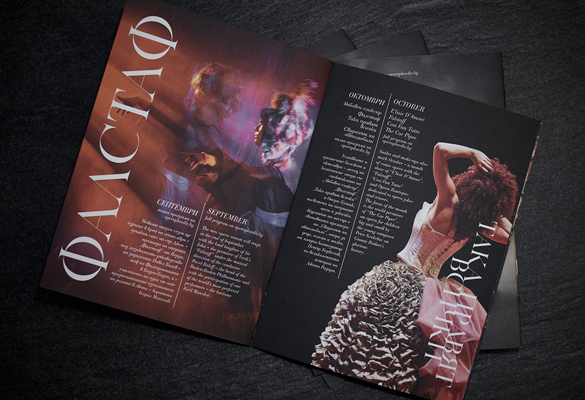
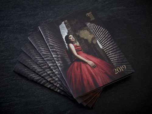
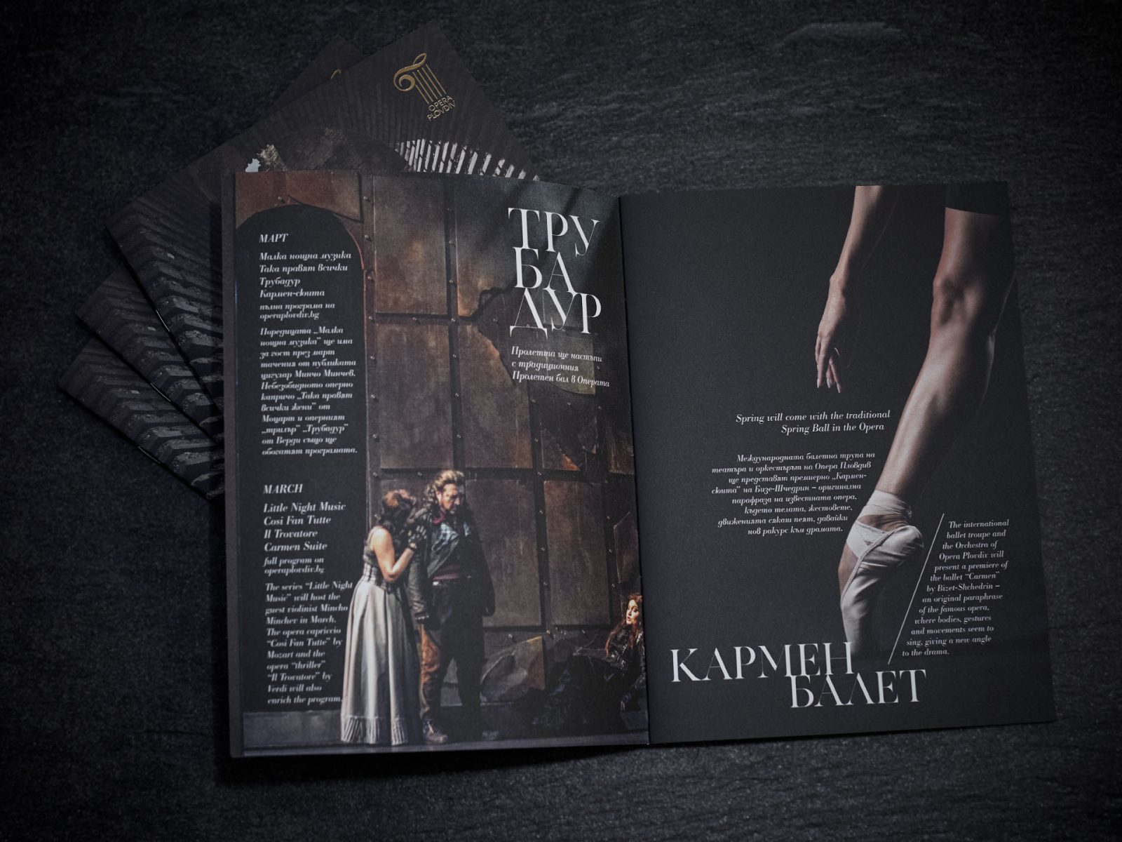
The spectacles of Plovdiv Opera are a major highlight in the program of Plovdiv European Capital of Culture 2019 and as such needed a program catalog that will satisfy the highly demanding eye of foreign opera visitors who have the chance to frequent the most notable opera theatres in Europe. The catalog had to be elegant, minimalistic, but at the same time bilingual and providing all the necessary information for both tourists and local visitors.
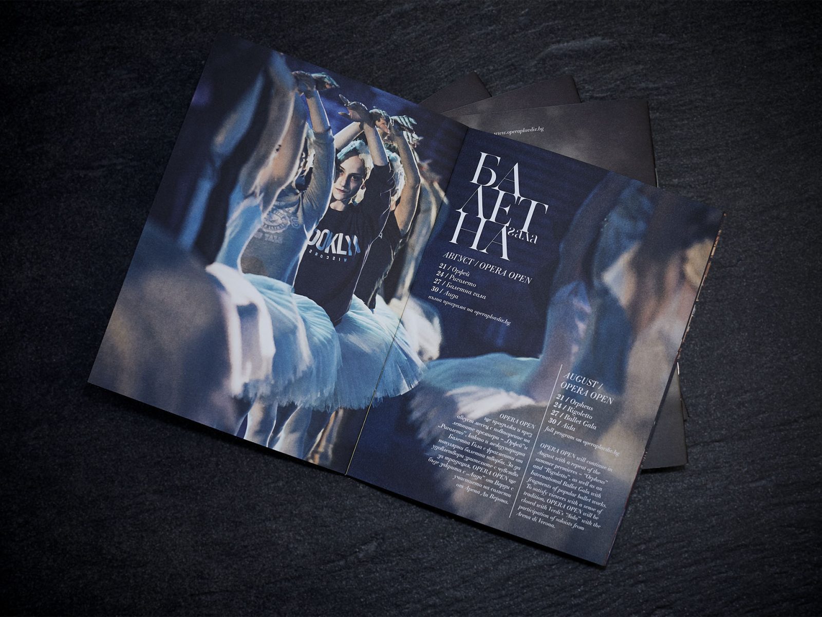
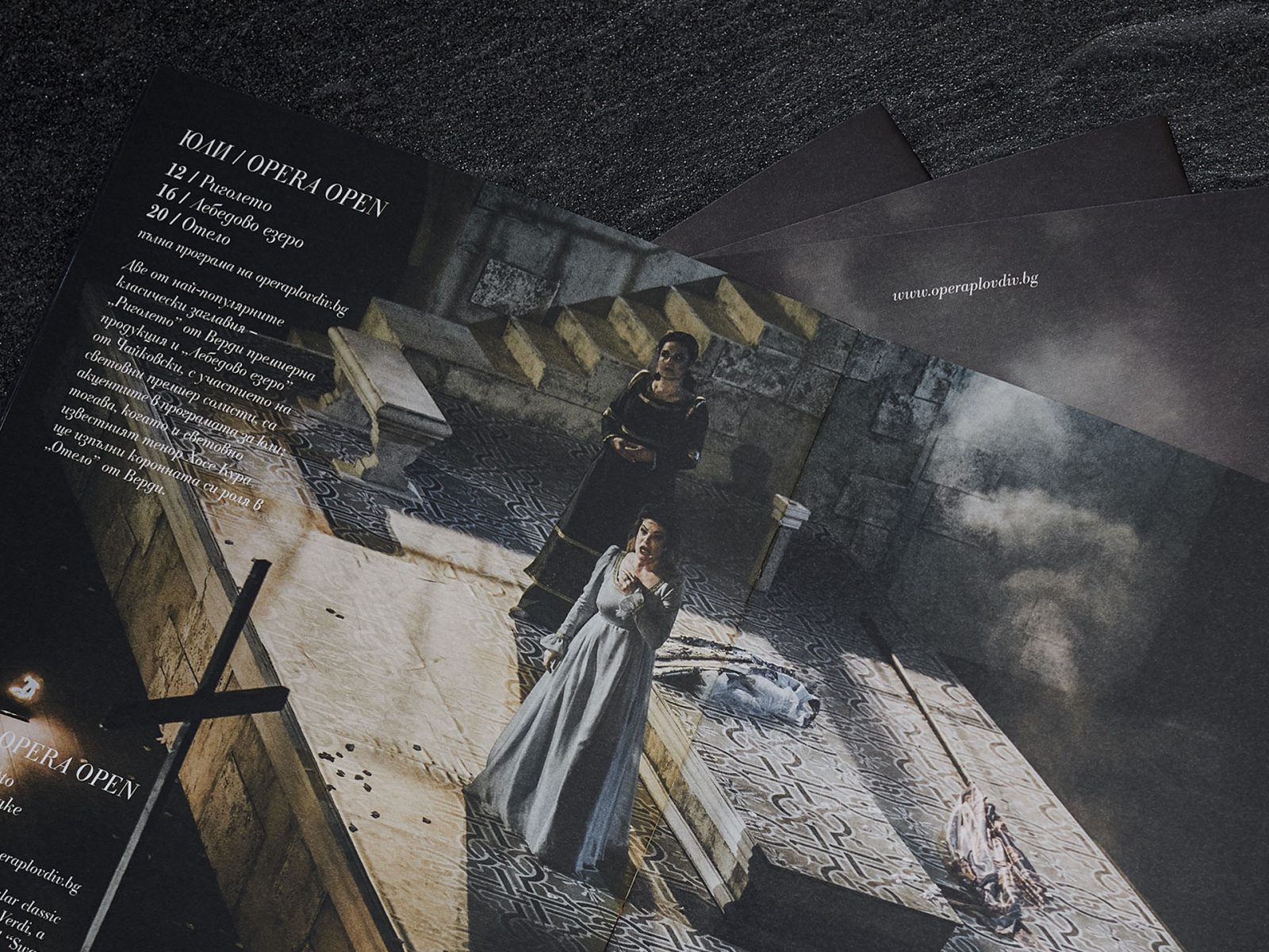
GRAFIS utilized a collection of beautiful, artistic photographs by Alexander B. Thompson and Valentina Bilareva. Most of the photographs used are candid, taken during premiers or dress rehearsals, to portray the true emotion and drama of opera.
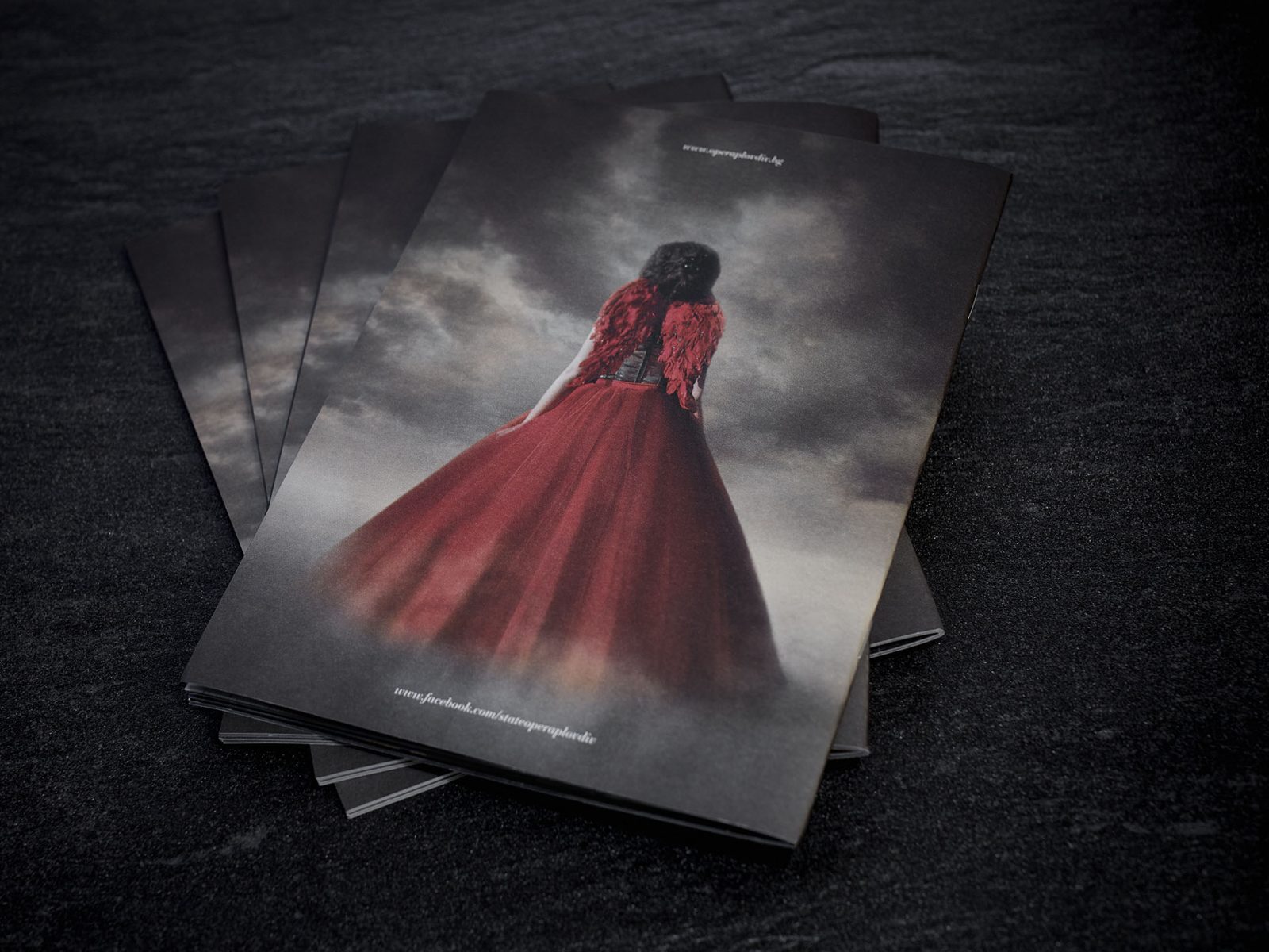
The challenge was to process the images to fit the catalog layout and to have enough free space to fit the text; also to keep the images different enough to show the heart of each individual performance, but at the same time in good tune with one another in terms of coloring and composition. The back of the cover was the most challenging of all for we did not have any photo to match the front. As it turns out very frequently, one can reach more satisfying results exactly when having the strictest limitations. So this is how Violetta from Verdi’s opera “La Traviata” appeared with her devil red dress and angelic wings floating in the clouds. And this is the original photo, explains Adelina Valkanova, the designer behind the project.
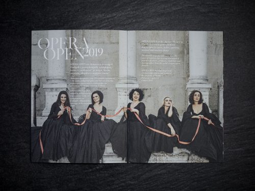
The Roman theatre of Plovdiv is where OPERA OPEN Summer Festival, the culmination of the artistic efforts of Plovdiv State Opera, takes place every year. One of the world’s best-preserved ancient theatres and its architectonical features inspired the Plovdiv State Opera logo, which features the Ionic Capital, the top element of a Roman pillar. This also led to the choice of the most classical typography – the serif Capitalis Monumentalis font family which most precisely conveys the era in which this magnificent landmark was created. Later on, finding a matching Cyrillic font became a major challenge in the project – as it needed to be elegant, round and light enough to fit the requirements for large titles – which Valkanova overcame by creating a custom font.
Because of the synergetic character of opera, Valkanova felt it was important to choose contrasting materials, to match the abundance of this unique form of theatre. Pergraphica® Classic Smooth, paper exclusively available at Europapier, perfectly suited her intention to keep the colors of the photographs rich but not too vivid and bright.
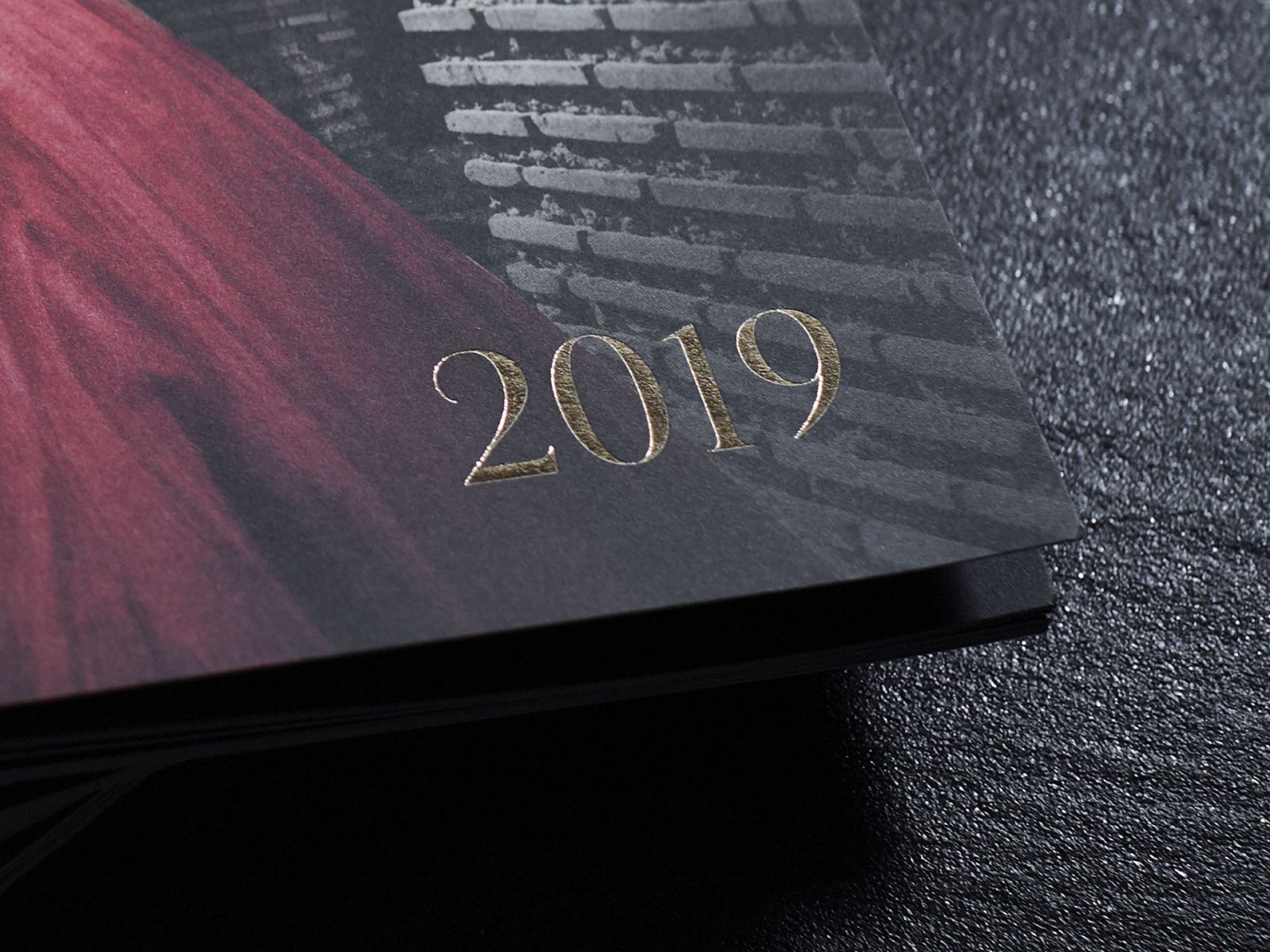
I like how the grainy structure of the photographs is opposed by the unexpected smoothness of the paper. An interesting controversy that accentuates the artistic value of the photographs even further. The printed program appear to have a rough texture and the velvet touch of the paper is a pleasant surprise that gives the viewer the impression of exclusive quality. This is completed by the precise gold hot print and debossing on the cover. Again the two contrasting materials are in good harmony because they emphasize еаch other’s structure, Valkanova says.
Images © Alexander Богдан Thompson
Valentina Bilareva /Il Trovatore La Traviata
Alice in wonderland Photos

