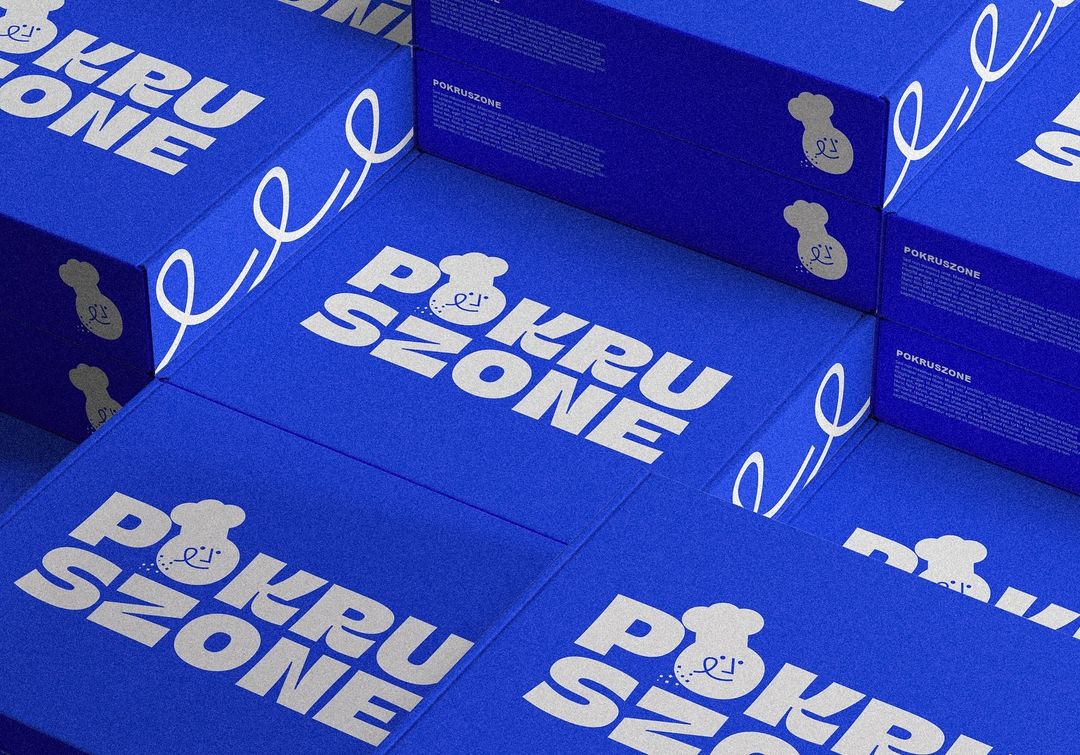
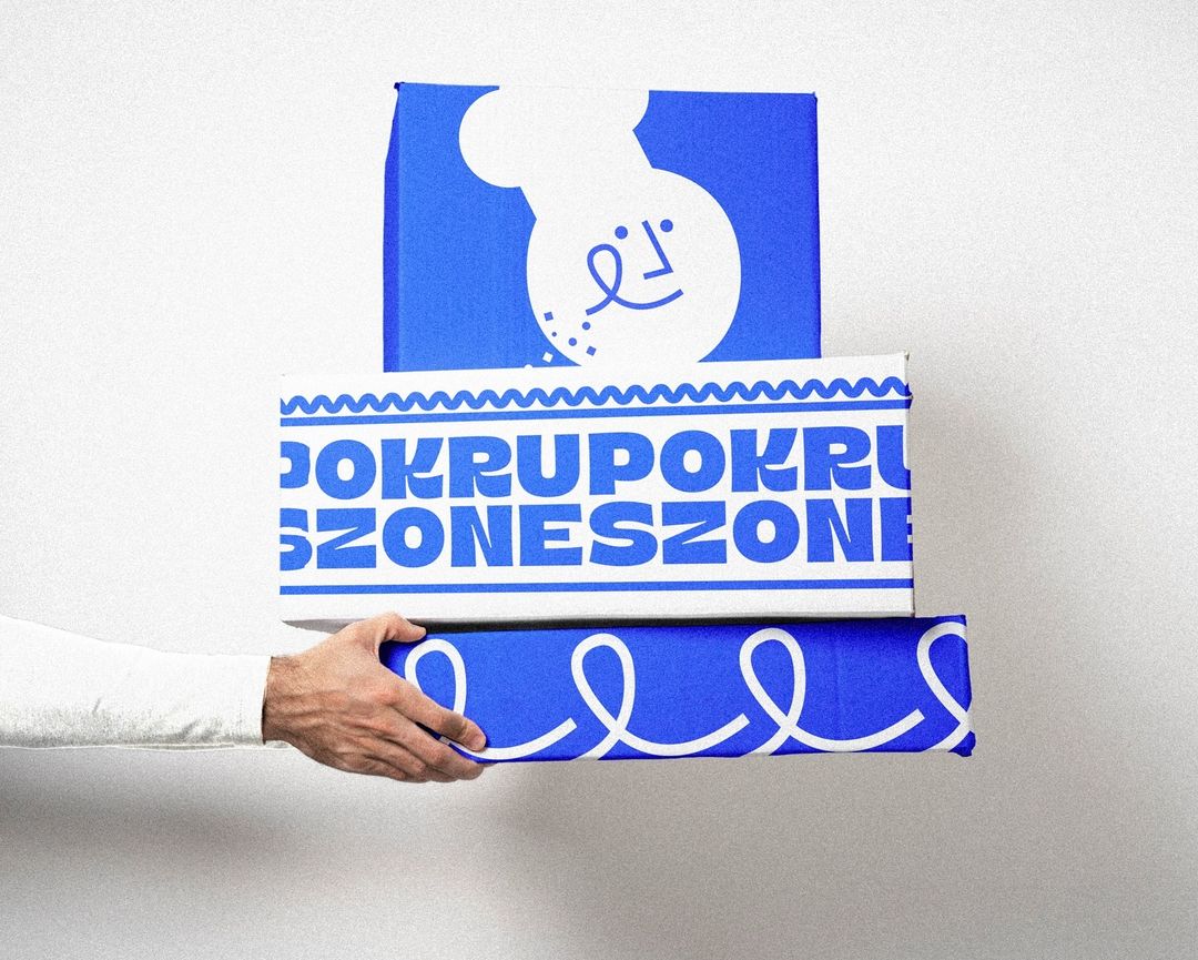
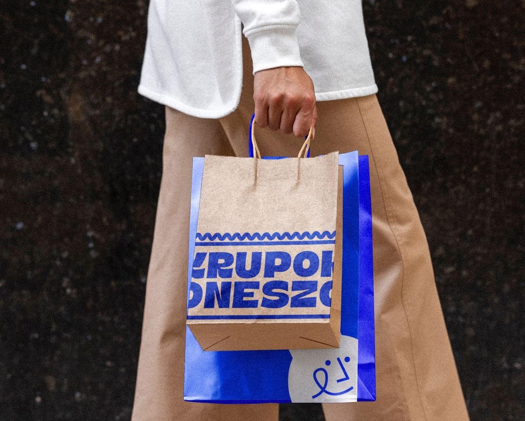
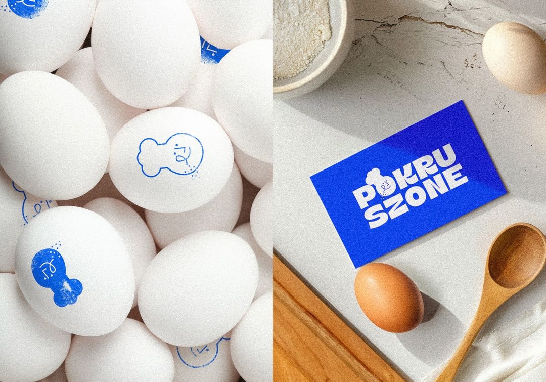
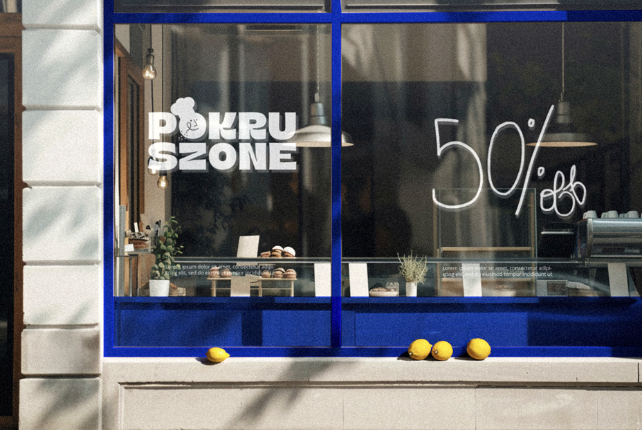
Pokruszone, a cherished Polish bakery known for its custom cakes, has undergone a beautiful rebranding, courtesy of the talented team at Mato Creative Studio. Specializing in weddings, birthdays, and special events, Pokruszone has long been beloved for its delicious, crumbly cakes — a key feature subtly referenced by the bakery’s name, which translates to “crumbled” in Polish. The rebranding project aimed to modernize the bakery’s visual identity, aligning it with its growing reputation for quality craftsmanship and creative confections.
Pokruszone has long been beloved for its delicious, crumbly cakes — a key feature subtly referenced by the bakery’s name, which translates to “crumbled” or “crumbs” in Polish.
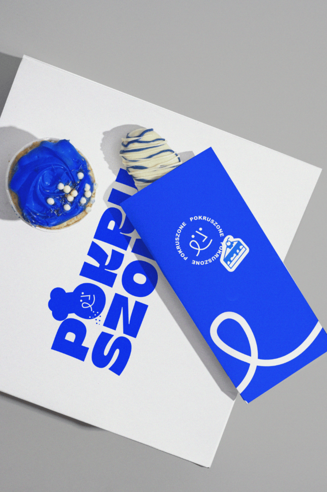
A rebranding that aligns with the client’s growing business and evolving brand identity includes thoughtful symbolism behind the colors
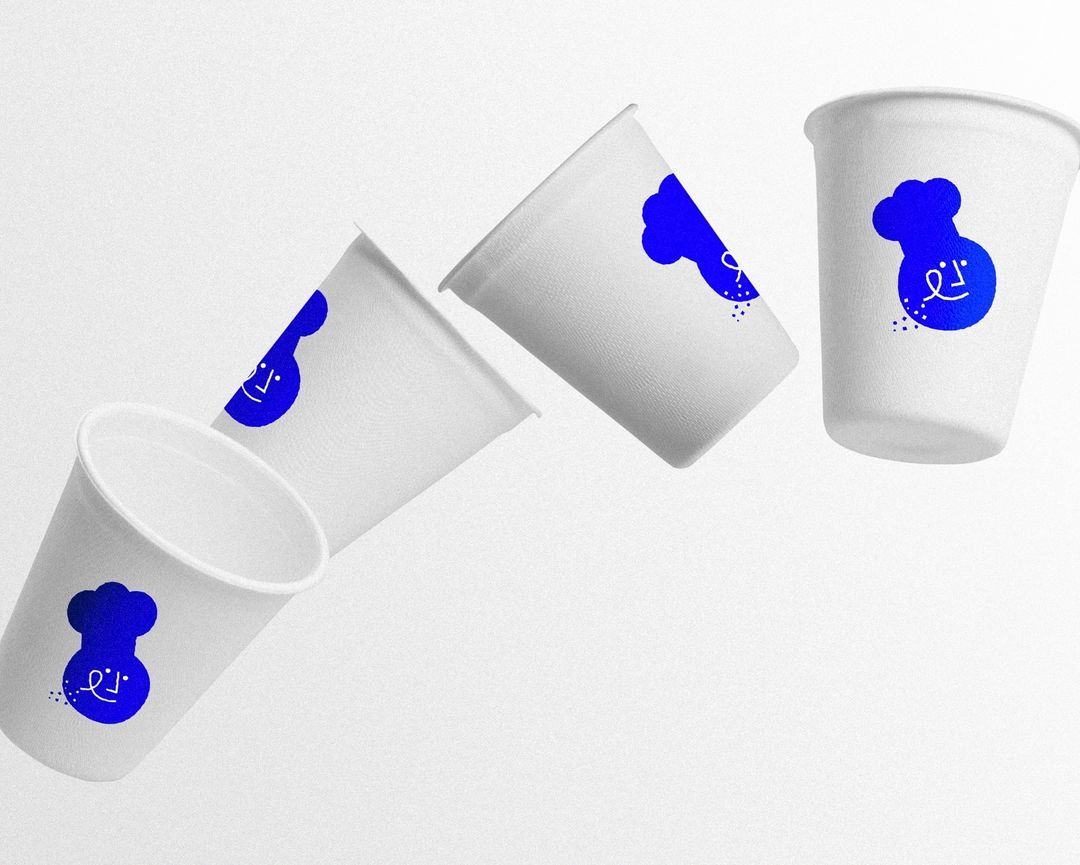
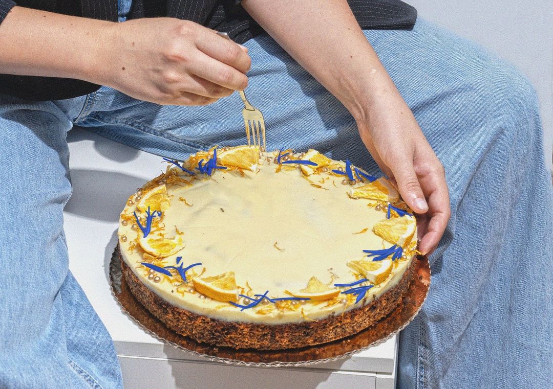
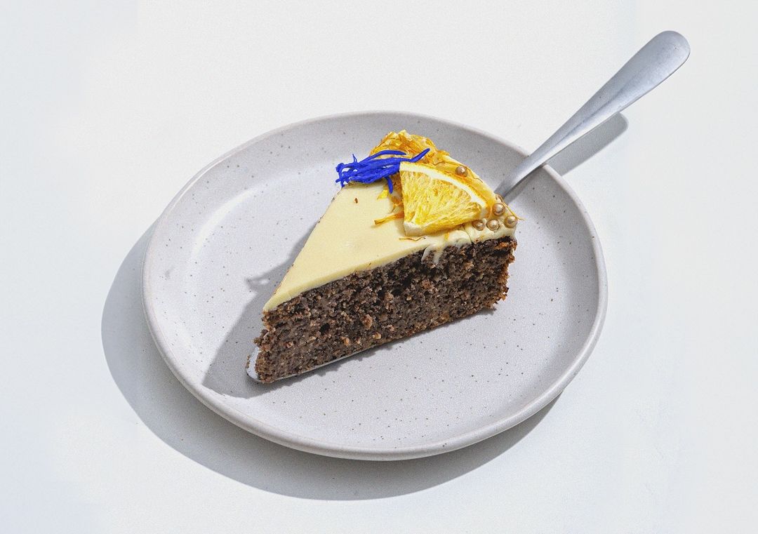
The redesign features a harmonious yet bold color palette of blue, white, and yellow, each chosen for its symbolic meaning. Blue, often associated with trust and reliability, mirrors the bakery’s consistent commitment to high-quality service. White evokes a sense of purity and cleanliness, underscoring the precision and simplicity behind Pokruszone’s delicacies. And finally, yellow injects a burst of warmth and happiness into the identity, adding playful energy to the brand, much like the joy that comes with sharing a beautifully crafted cake at life’s important celebrations.
By blending color theory and design expertise, the studio created a vibrant, aesthetically memorable rebranding concept that reflects both the artistry and the heart behind Pokruszone’s cakes.
Mato Creative Studio, founded by Nadine Ghannoum in Wroclaw, Poland, spearheaded the rebranding effort. The studio’s mission to empower entrepreneurs and build innovative brands is evident in this project. By blending color theory (which we recently wrote about: The Magic Of Color Theory In Branding And Packaging Design) and design expertise, the studio created a vibrant, aesthetically memorable rebranding concept that reflects both the artistry and the heart behind Pokruszone’s cakes.
This rebranding doesn’t just refresh Pokruszone’s image; it communicates their essence — a bakery that is as reliable and pure as it is joyful and inviting. Follow Mato on Instagram for more inspiring design and branding concepts.