Angel & Anchor is a ballsy branding studio based in Belfast, Northern Ireland, that blends strategic identity systems with unique messaging, helping brands rise to be highly respected heavy-hitters in their industry. Their work stands out from the bunch for the studio’s non-apologetic hustle to create the best, most daring, and most interesting concept for their client while making it heartfelt. A perfect specimen of the talent and creativity of the studio comes off in their latest endeavor of designing packaging for the independent specialty coffee roaster Process.

Valuing the process of continually trying, learning, and perfecting – lead to drawing inspiration from the distinct feel of the low-fi 90s era and the spirit of skateboarding
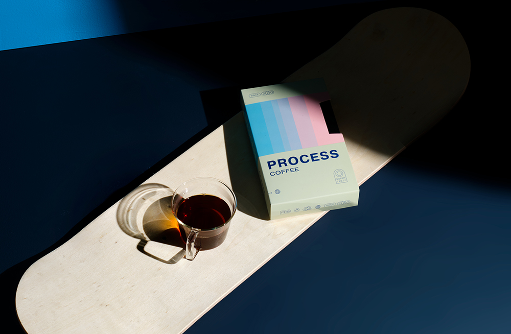
Process was founded by Ben Hamilton to carve out a new space in the industry where he could blend his passion for coffee and skateboarding. “The brand’s foundation is built upon the belief that there’s growth and joy found between the beginning and the end. Everyone starts somewhere and whether it’s specialty coffee or not, all are invited to keep learning and progressing. Process celebrates that idea with an approach to coffee and business that is anti-exclusive and highly inclusive”, the studio writes.
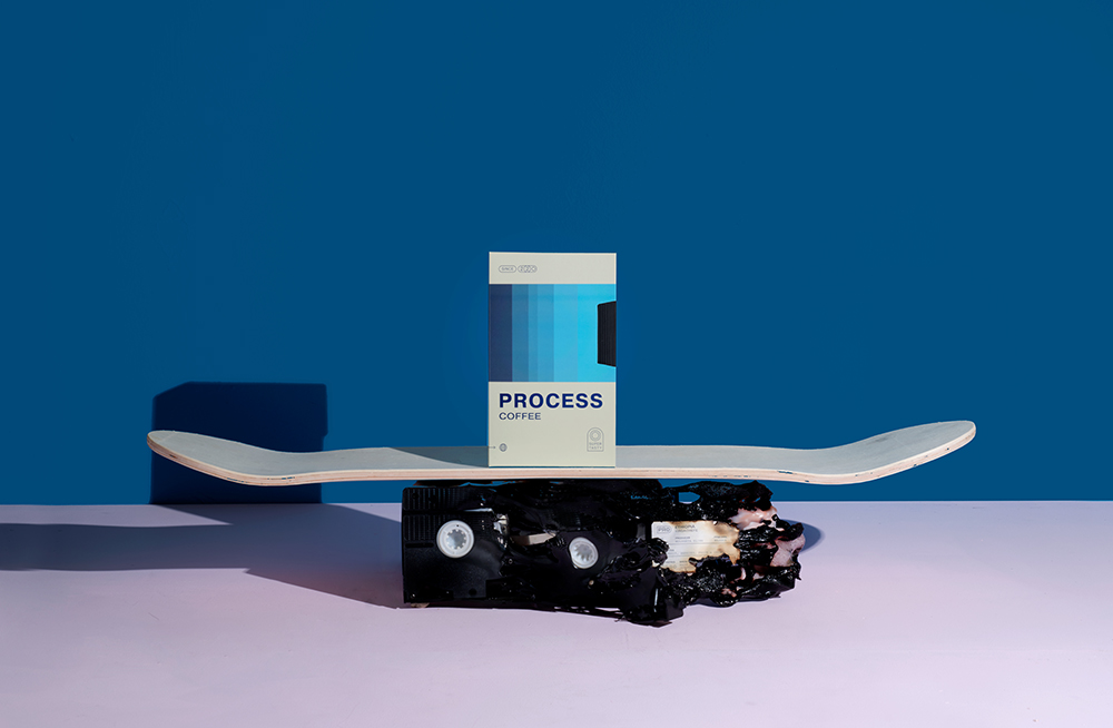
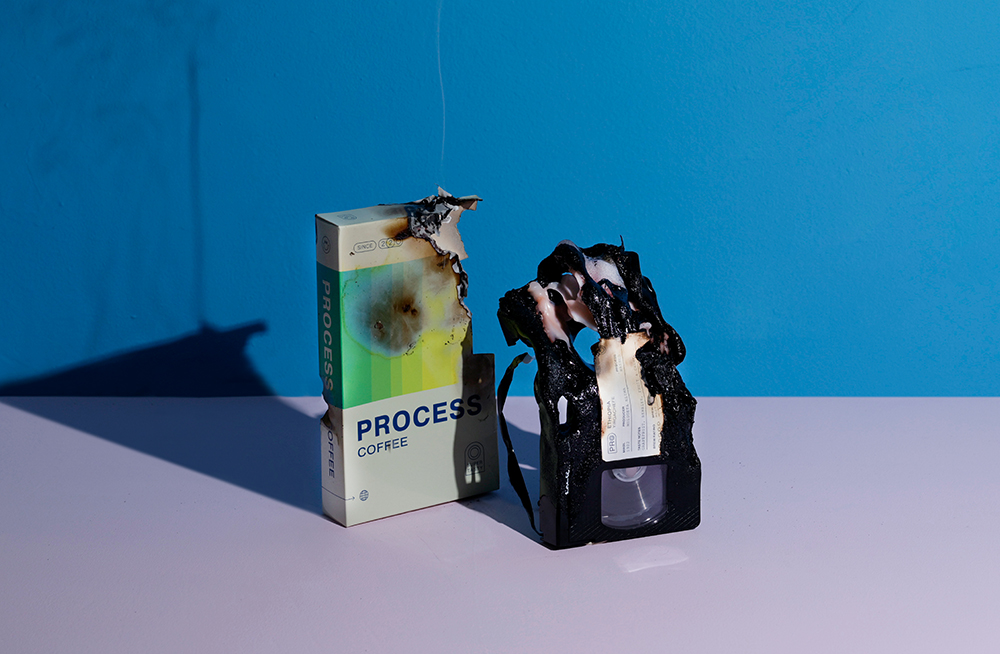
This spirit of continually trying, learning and perfecting is not only found behind the espresso machine but also at the skatepark. Breaking boards in frustration or the elation of landing something ‘first try’ perfectly encapsulates the ups and downs that come with progress. Then, it made sense that the brand would be built around a low-fi 90s feel with a never-give-up attitude.
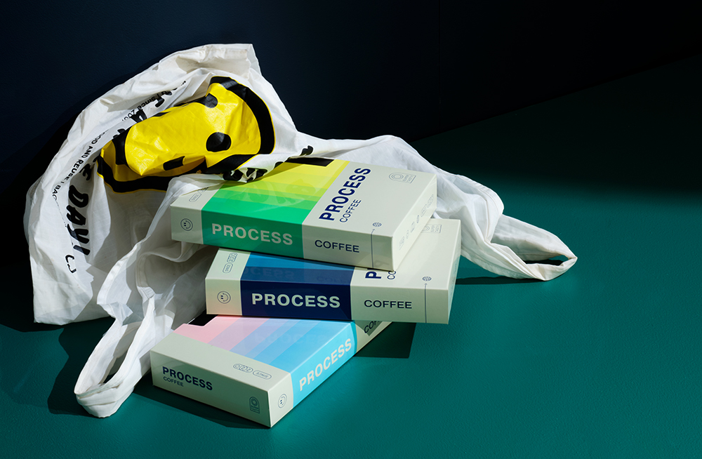
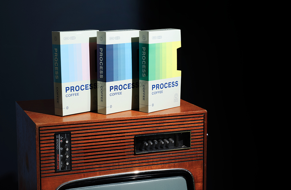
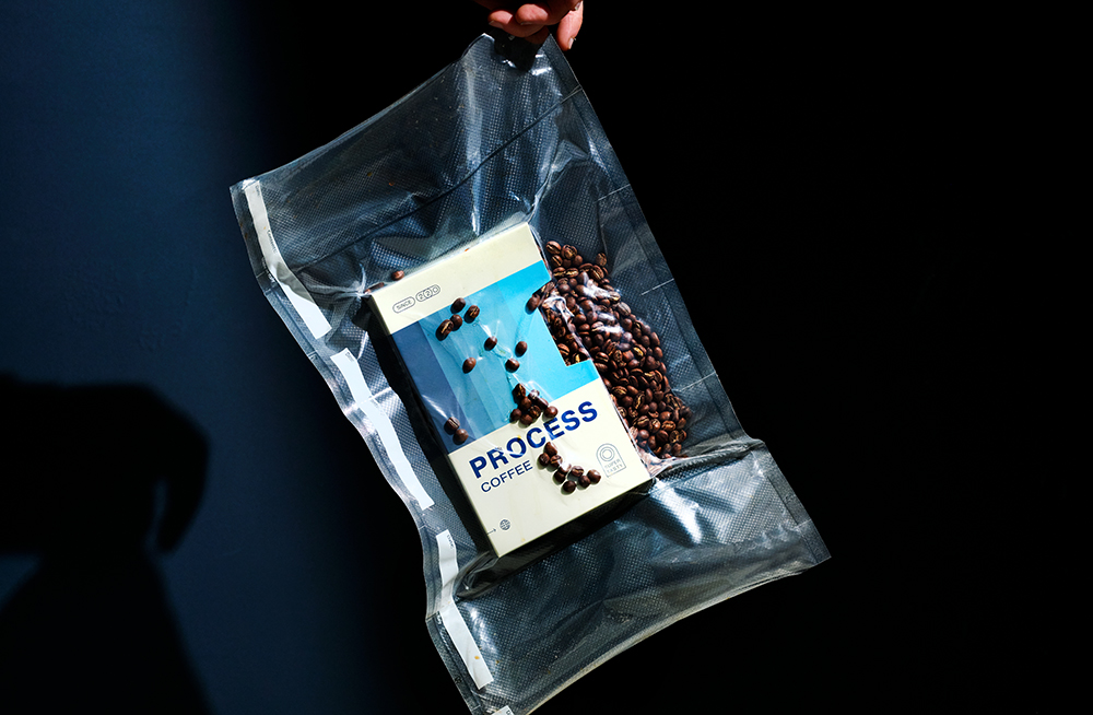
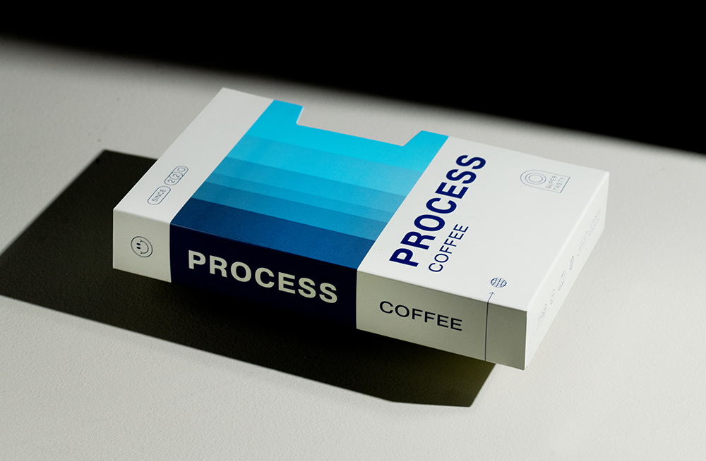
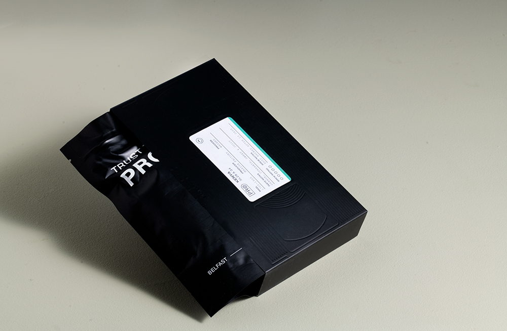
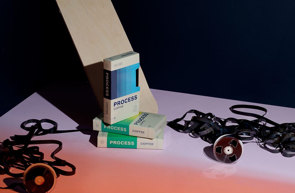
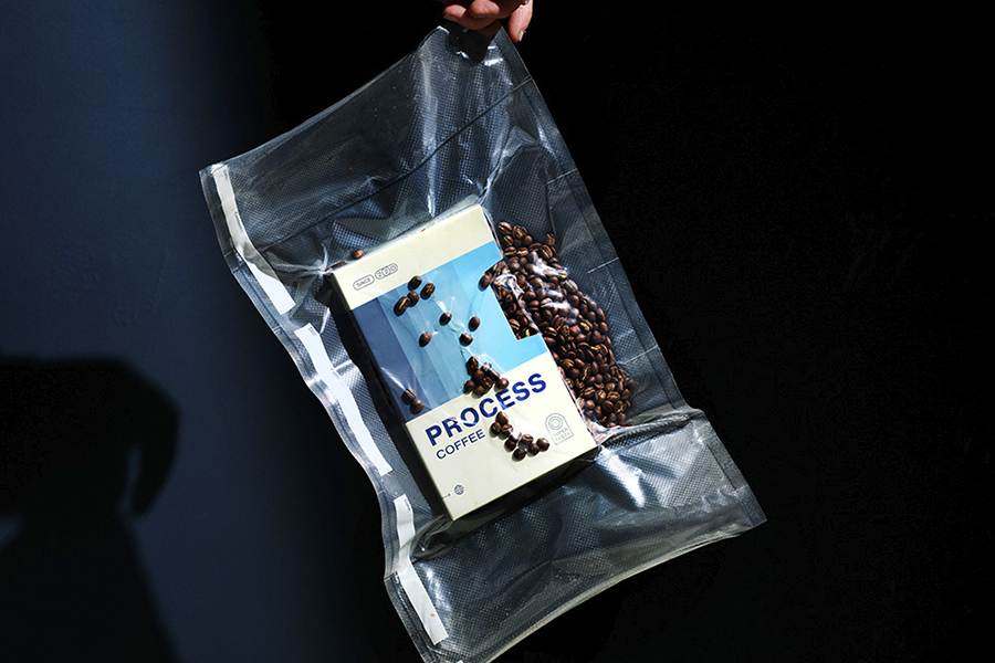
Against the current trends of the industry, the studio chose to take a whole new approach when it came to the packaging of the coffee, a risk that paid off – and got honored as a packaging design finalist in the 2021 Sprudgie Awards. Drawing inspiration from the nostalgia of the VHS tapes and the 90s, a design was created that engages the user in a fun way, facilitating a whole new coffee experience. “From the ground up, the design was created with interactivity in mind. The glossy VHS tray container slides away from an inner tape that reveals deboss details and a matt finish. After engaging with the cassette, you can find a bag of tasty coffee inside. With three layers of opening and sliding, and revealing, this packaging truly expresses the notion that more is more”.
 Each detail and touchpoint of the Process coffee packaging takes you down a memory lane to the days of handwritten labels and rewinding video casettes
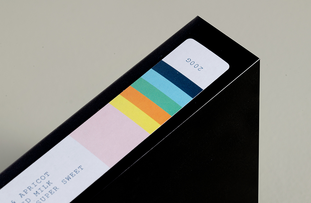
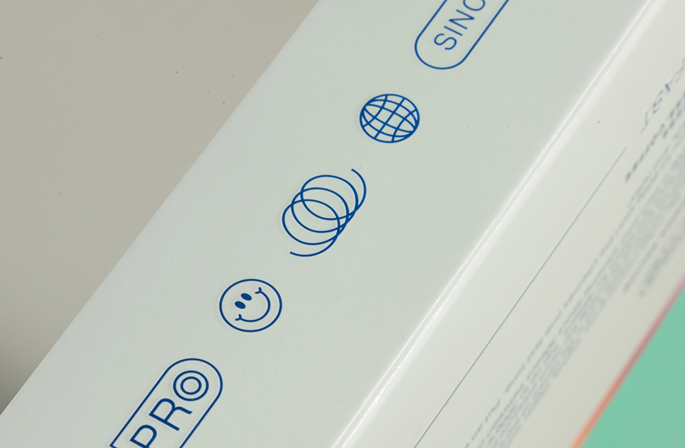
The Process coffee packaging is so much more than simply inspired by nostalgia, as several memorable VHS-style touchpoints are included in it – from the Pragmatica typeface which provides that bold, default feel while supporting the broader vibrant expression, to the playful icons and smiley faces used in place of what would typically be a Kodak or Fuji logo. While the labels, which we all (who are old enough) remember as being handwritten over and over again, now showcase the information of the product, including the region and variety.
The Process packaging has taken the coffee Insta-sphere by storm. The initial novelty has progressed to a genuine coffee experience unlike any other. We couldn’t be more stoked at the final design, the feel of the box in hand, and the response by coffee and design nerds across the world. Insert, play and enjoy… remember to rewind when you’re done.
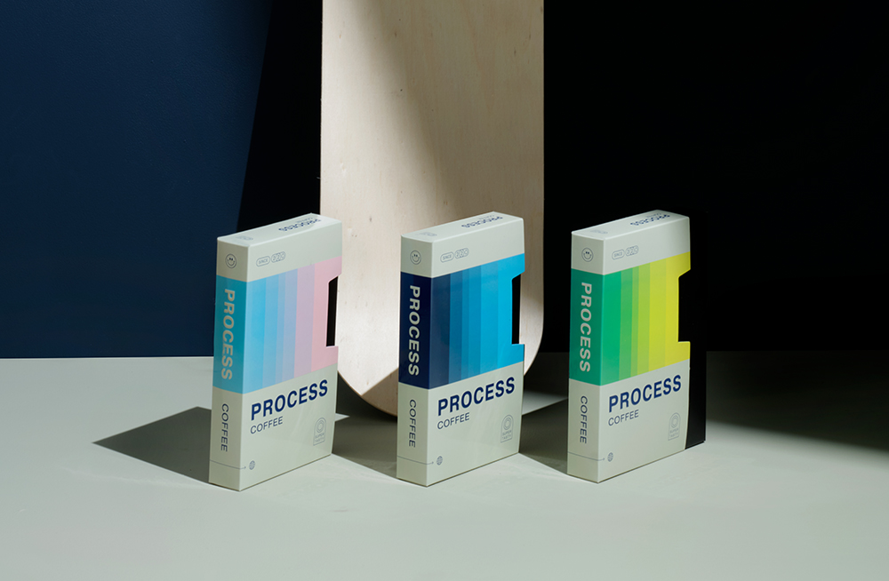
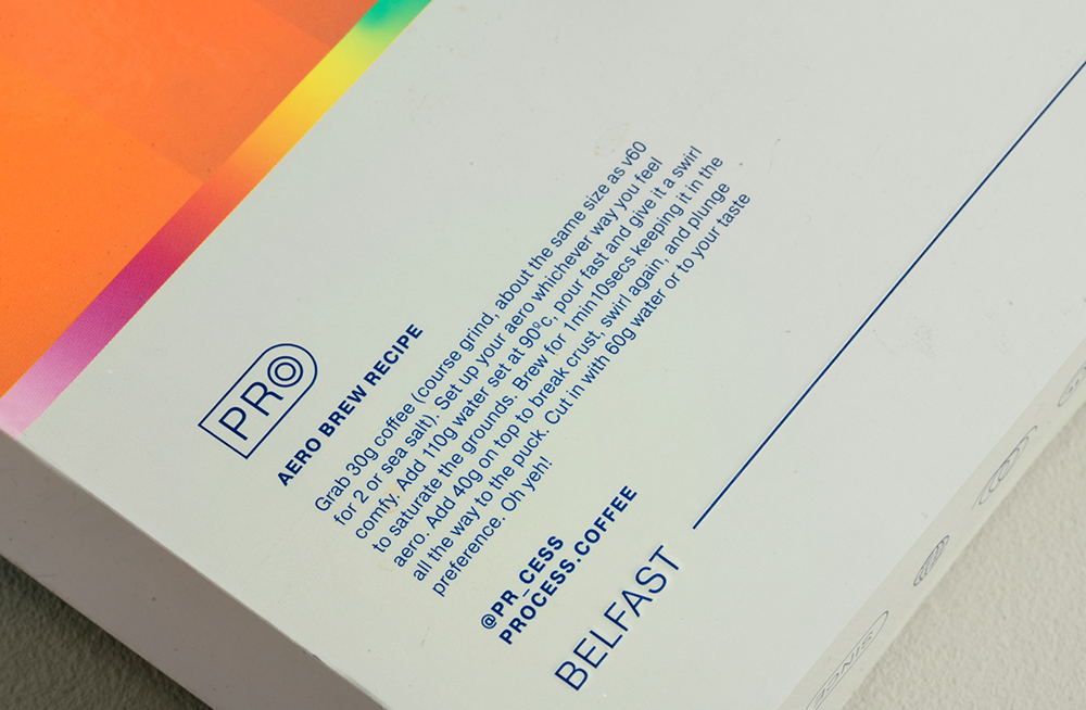
The familiar spectrum of vibrant hues and tones on the packaging and labels distinguishes the identity of each coffee while allowing the product to stand out on the shelves. And while knocking out the competition, Process coffee stays true to its name and origin by including step-by-step brewing instructions on the back of each box, helpful for novice and seasoned home brewers alike.
Make sure to join both Process and Angel & Anchor on Instagram for more coffee and design inspiration.
