Whatever form your holidays take or how you like to spend your Christmas time, one thing in common most of us have is the tradition of gift-giving at the end of the calendar year. Whether it’s on Christmas Eve with loved ones, to spread the holiday cheer among neighbors, or a token of appreciation to your colleagues at work – most of us give or receive something during this special time. And I could bet my hat that at least once, that gift has been chocolate.
As one of the most common and traditional gifts to give, chocolate is loved by many and comes in many forms. It can be something fun and sweet for the young ones, or a more luxurious delicacy for grown-ups. And beyond its universal approval as the perfect gift, what makes it even better, it often comes in beautiful packaging that doesn’t need wrapping to be gifted. Inspired by the season of gift-giving, we’ve listed below six of our favorite chocolate branding and packaging design concepts that are so stylish and thoughtful – anyone would be lucky to receive them.
For more Branding + Packaging inspiration read the Ice Cream A Day Keeps The Doctor Away🍦30 Cool Ice Cream Packaging Designs article.
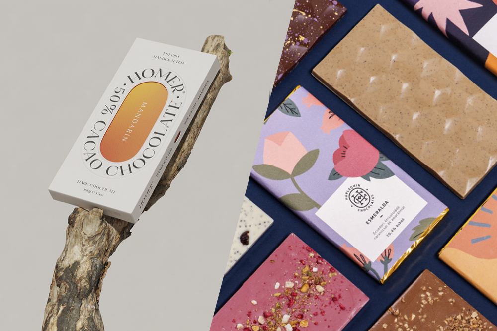
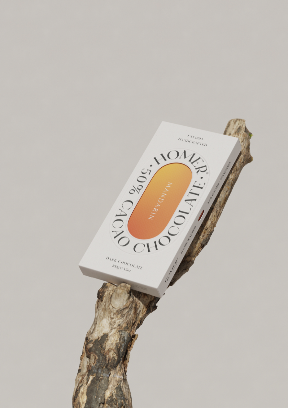
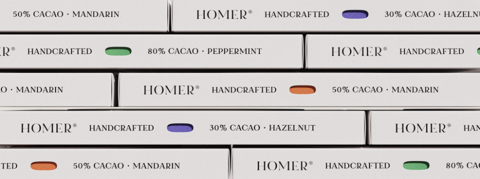
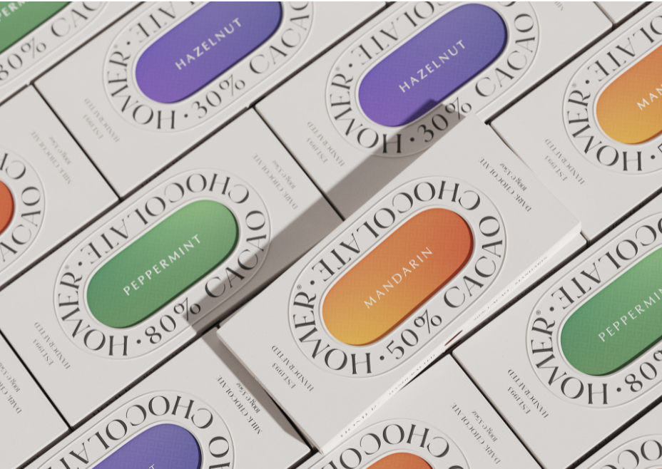
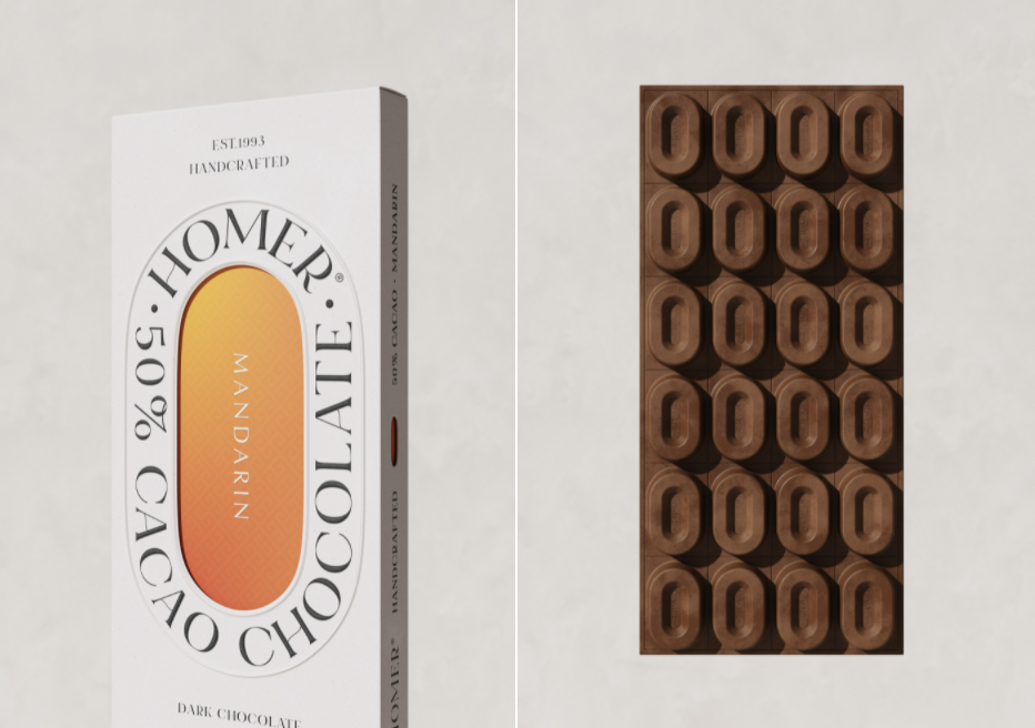
HOMER CHOCOLATE packaging by Paul Lee
The uniquely crafted Homer cacao chocolate is designed with minimal yet vibrant packaging and comes in three flavours – Peppermint, Mandarin and Hazelnut. Not only it thrives best in its appearance, but Homer also delivers a great tasting experience. Hand-picked and handcrafted cacao chocolate delivers an artisanal taste. To minimise the carbon footprint, Paul Lee removed the foil wraps and used recyclable cardboard only.
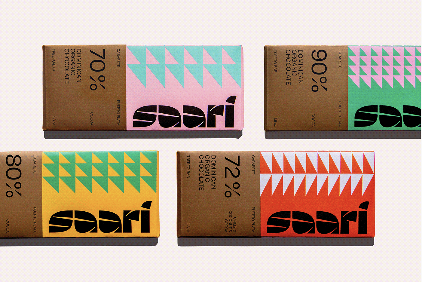
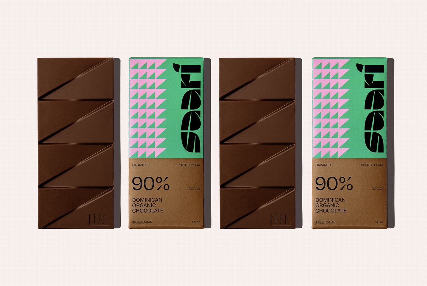
Saari, a Dominican chocolate brand with a Finnish twist, designed by Renan Vizzotto and Robert Ashorn
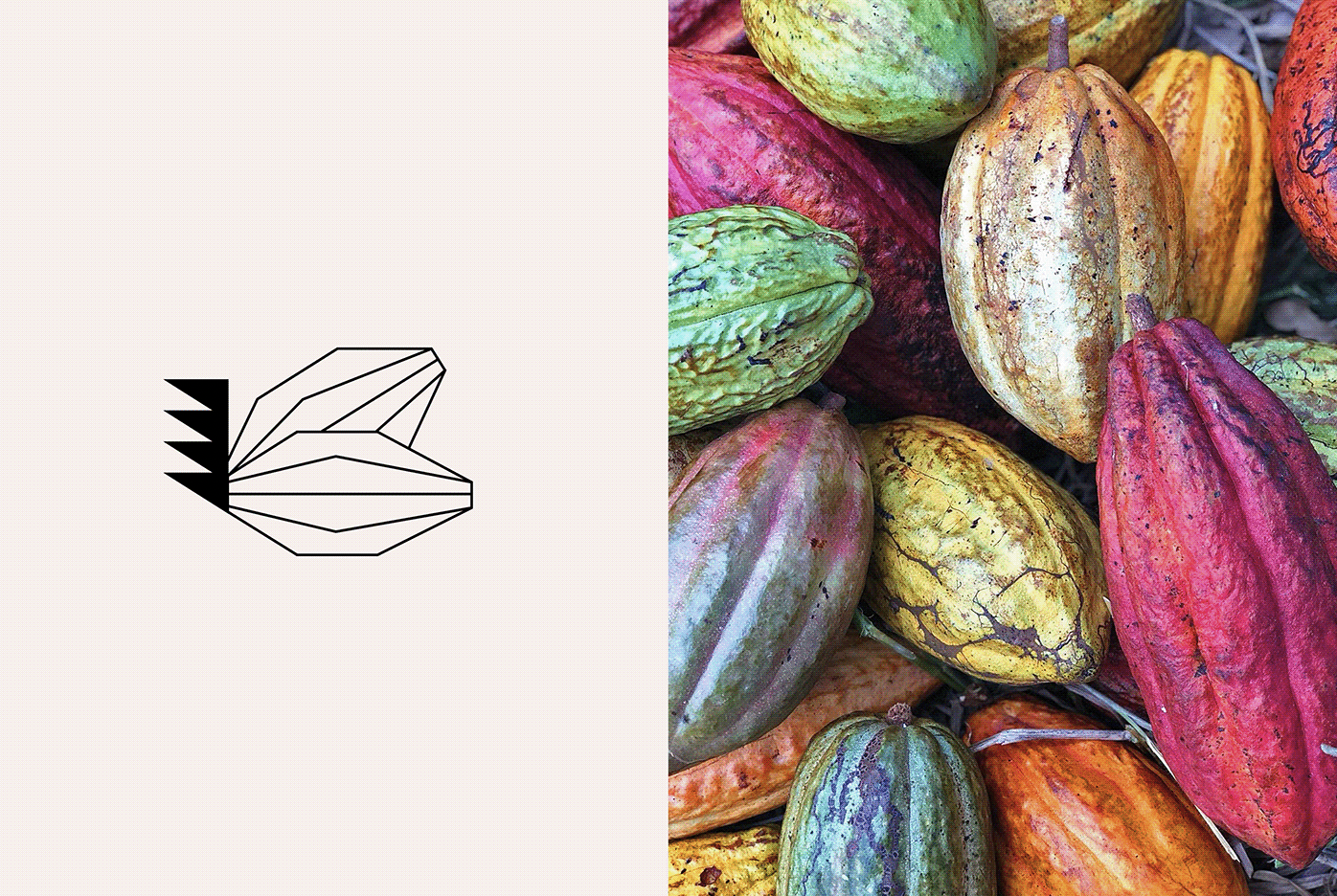
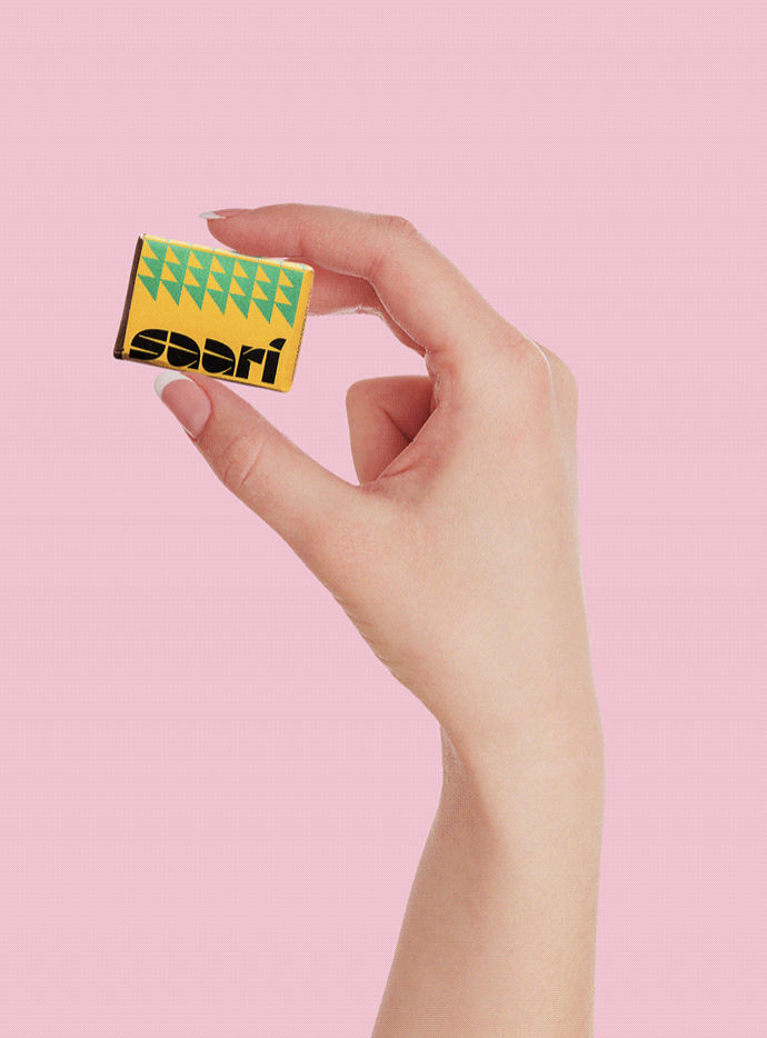
When designing the branding and packaging for Saari, Renan Vizzotto and Robert Ashorn were tasked to bring its tropical roots front and centre. And nothing represents more the tropics than the evergreen, majestic palm trees, which are all over the Dominican Republic. But as a Finnish-owned company (with its farm and factory headquartered in the Dominican Republic), an overall minimalist design was created. As a solution, simplified palm tree leaves counters in a flexible triangle, bringing simplicity to match the tropical colours and logotype. This way, Saari can use the number of triangles to represent the cacao percentage or the recipe mix.
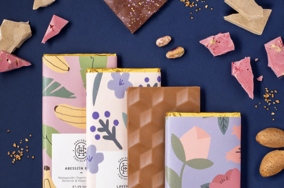
Chocolate bar packaging by Gabrielle Rogers
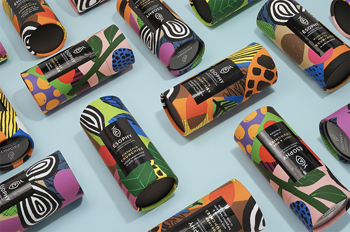
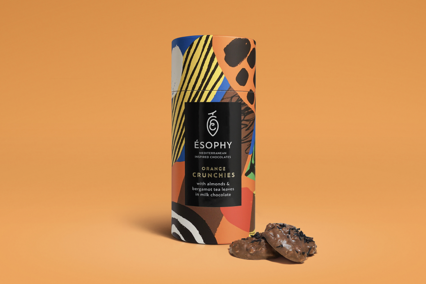
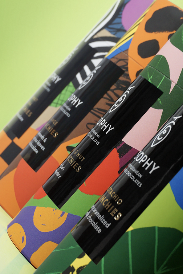
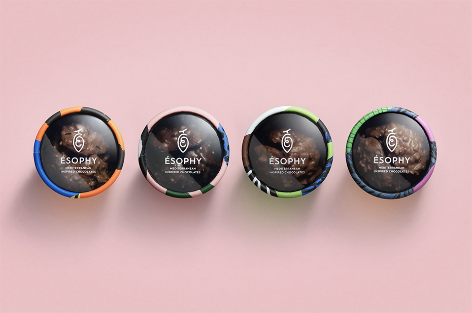
ÉSOPHY Crunchies Packaging by George Probonas
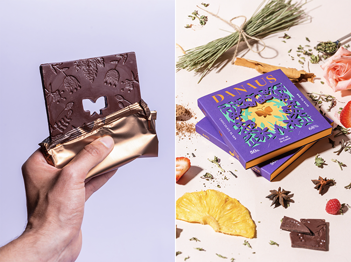
Danaus Chocolate by Alejandro Gavancho
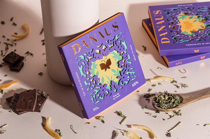
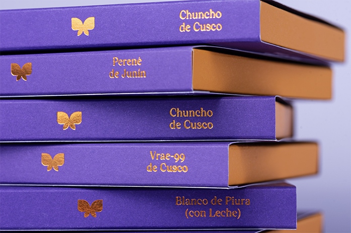
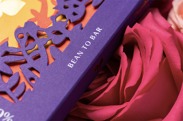
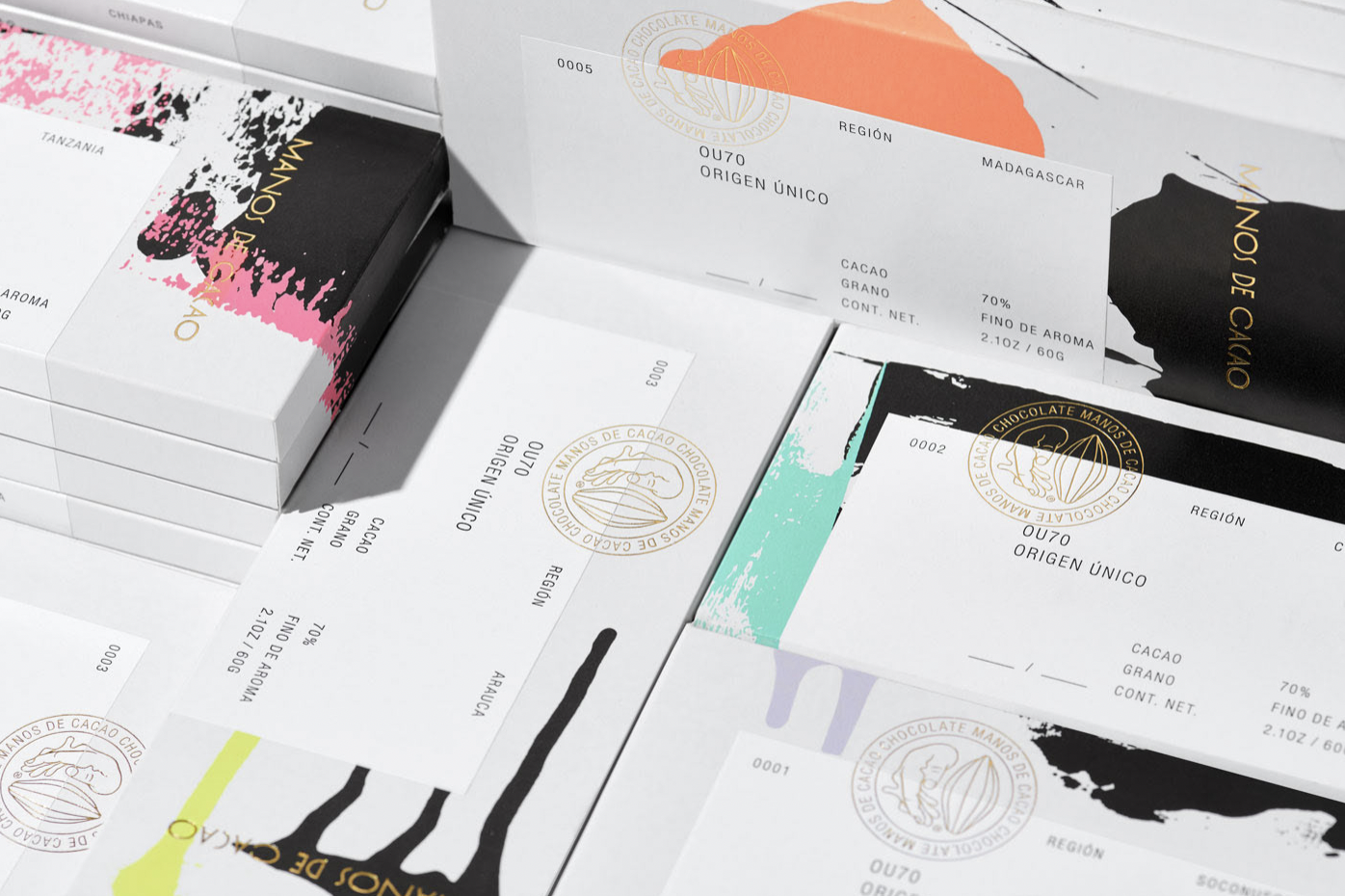
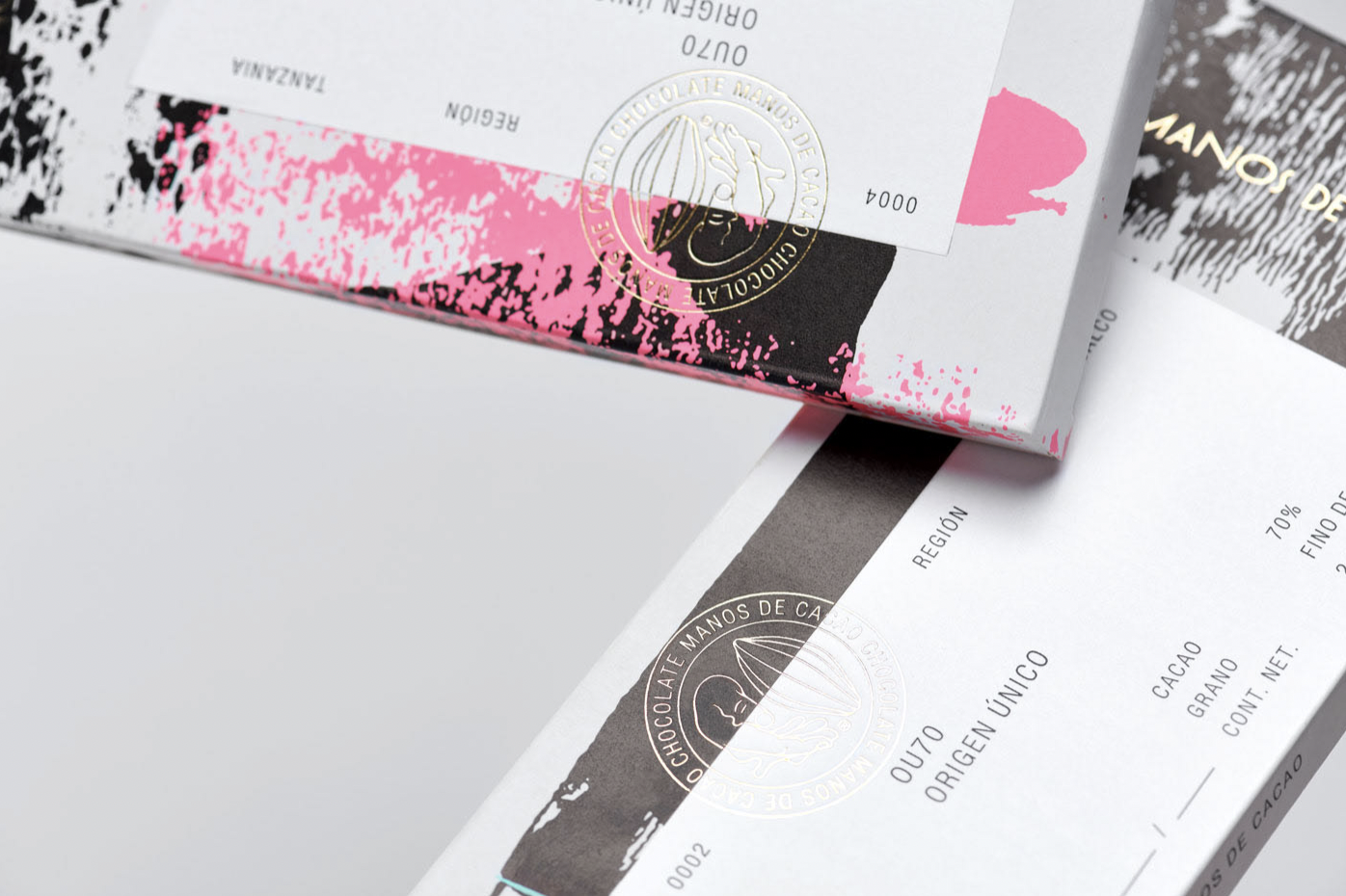
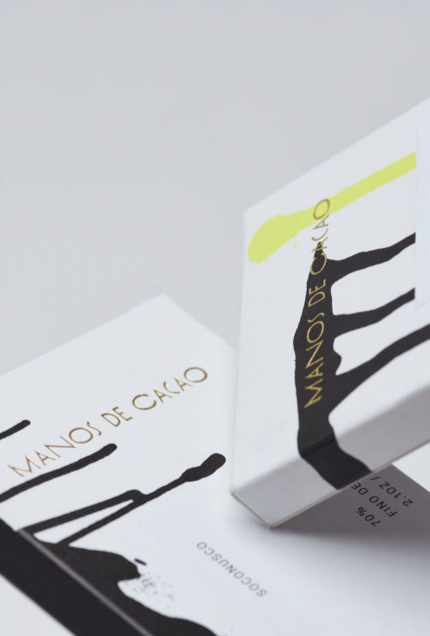
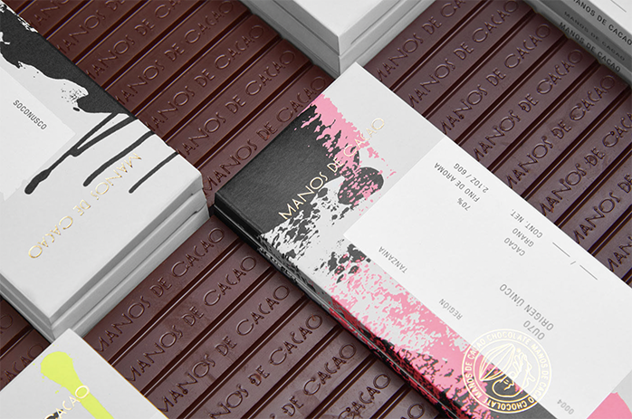
Manos de Cacao by Anagrama Studio
