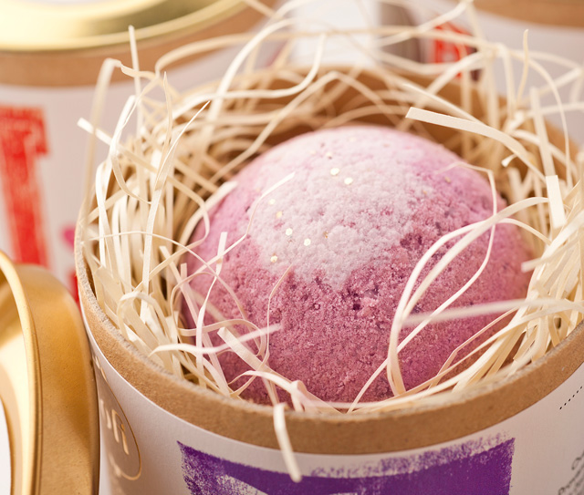
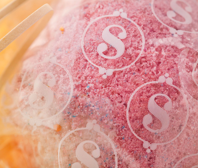
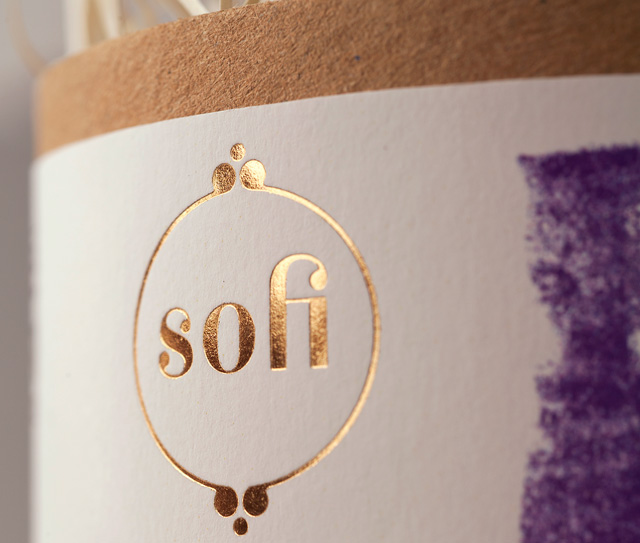
Bratislav Milenkovic, our favourite Serbian illustrator who we interviewed last spring, is also part of one of the most awarded south-east European design agencys: Bruketa & Žinić OM. Working with numerous international clients from small organizations to big multinational companies, one of their latest projects included designing the branding and packaging for SOFI, a small family production of organic handmade cosmetics.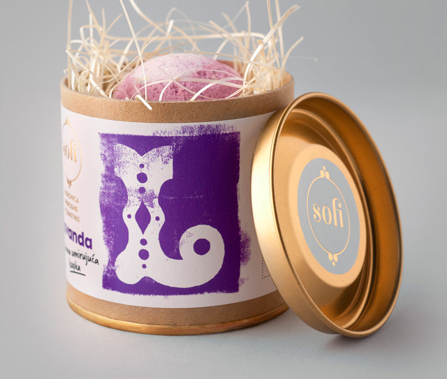 Defining the visual identity, and designing the packaging for soaps and gift packages, art directors of the project: Boris Marcetic and Bratislav Milenkovic created a typography inspired visual identity emphasizing the manual production, the quality of the resources as well as of the final products.
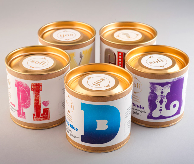
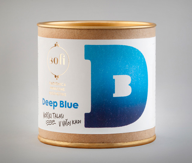
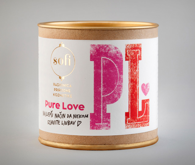
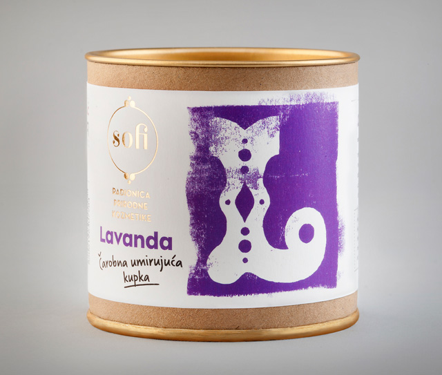
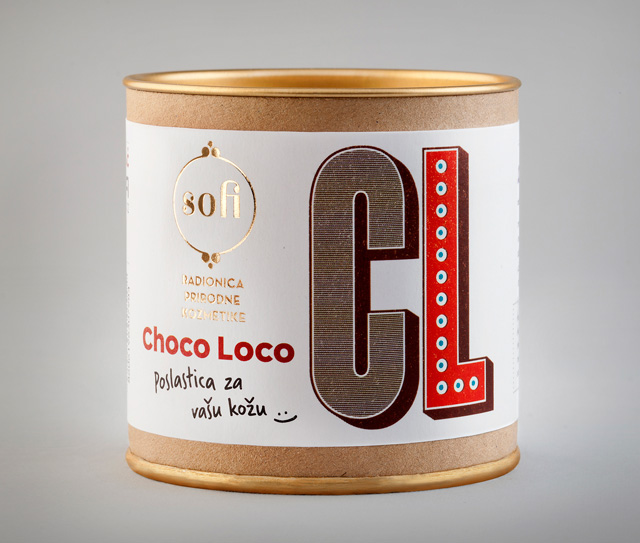
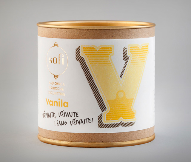
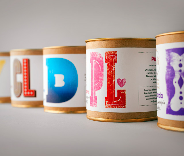
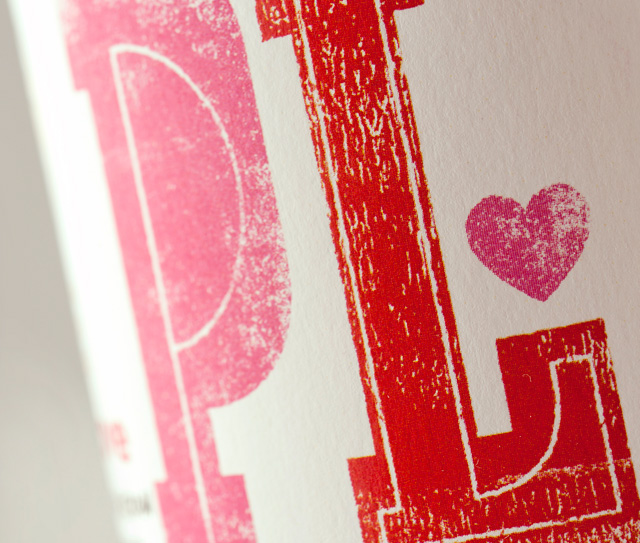
Highlighting the different soap variaties, each style got it’s own color and a separate initial of its name blown up as the main visual. Having done so, they managed to maintain a strong visual identity of the whole category of products, as well as to create a distinctive graphical element to ensure that new packages are noticeable in sales points.
In addition to the previous, this way of typography usage in creating packaging design is not so common within the domestic market, which makes it more visible and recognizable compared to competition. The main element, the typographic characters each have a particular hand made feel to them, which is a characteristic of the entire range of SOFI organic products.
Images © Bratislav Milenkovic
