Faith Samuel, a brand identity designer known for crafting distinct visual stories, recently unveiled the identity for Sprouta, a modern potted plant brand. Enhancing home and garden spaces with greenery, Sprouta helps bring a sense of elegance, growth, and natural beauty into everyday life. The visual concept, rooted in Samuel’s signature approach of blending design with functionality, stands out through its bold and playful visual elements that perfectly encapsulate the brand’s mission to cultivate fun and cool, plant-filled environments.
The visual identity of Sprouta reflects the brand’s ethos: nature, simplicity, and elegance.
Samuel began developing the concept by researching plant and home decor trends, devoted to creating a brand identity that would best resonate with plant enthusiasts and interior decor lovers alike. At the core of the concept is the idea of growth and renewal, while bringing a touch of nature into modern homes. Every design decision, from the custom wordmark logo to the color choices, was made to align with these values.
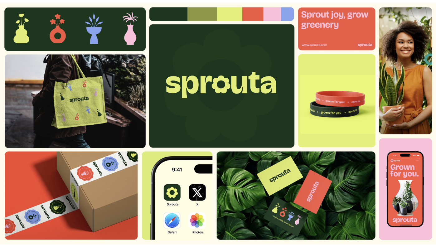
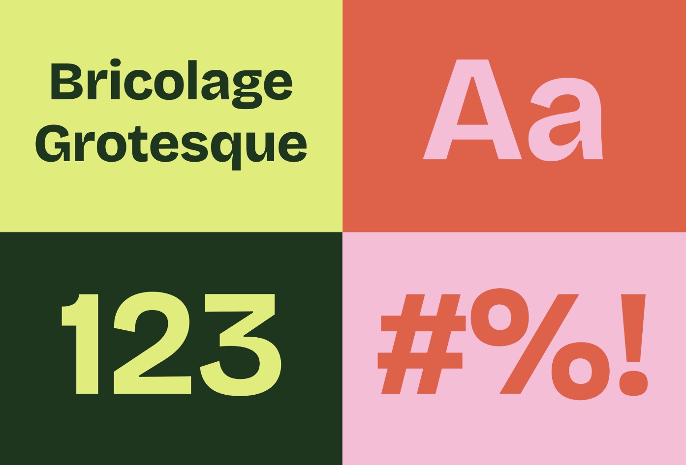
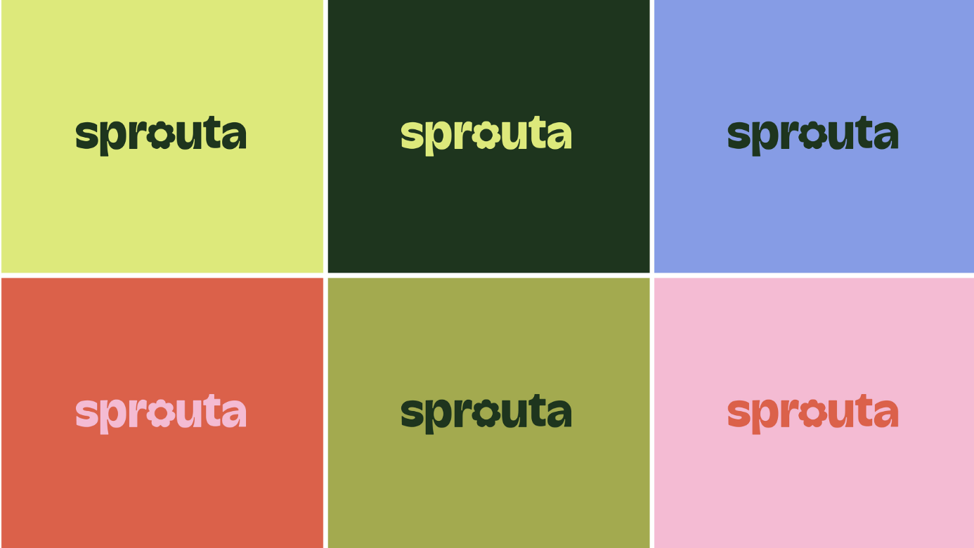
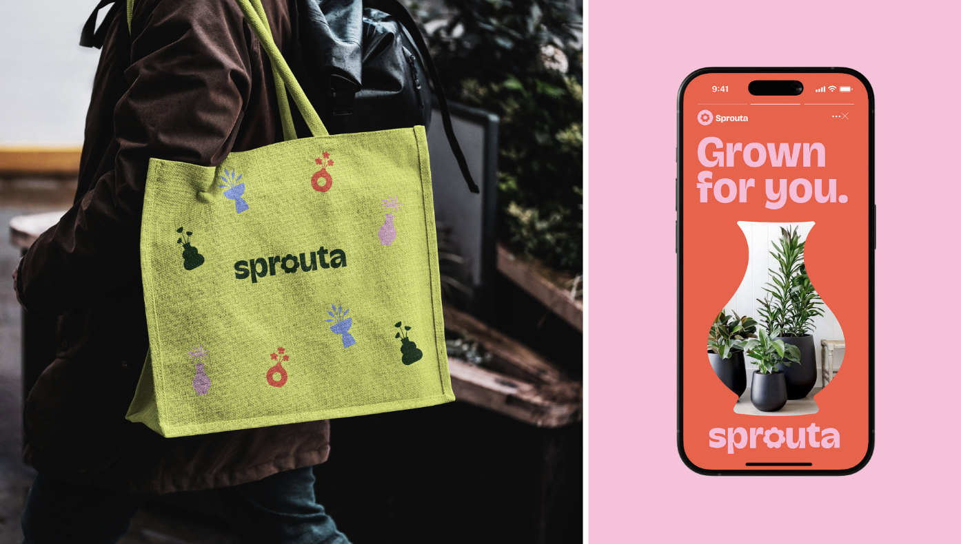
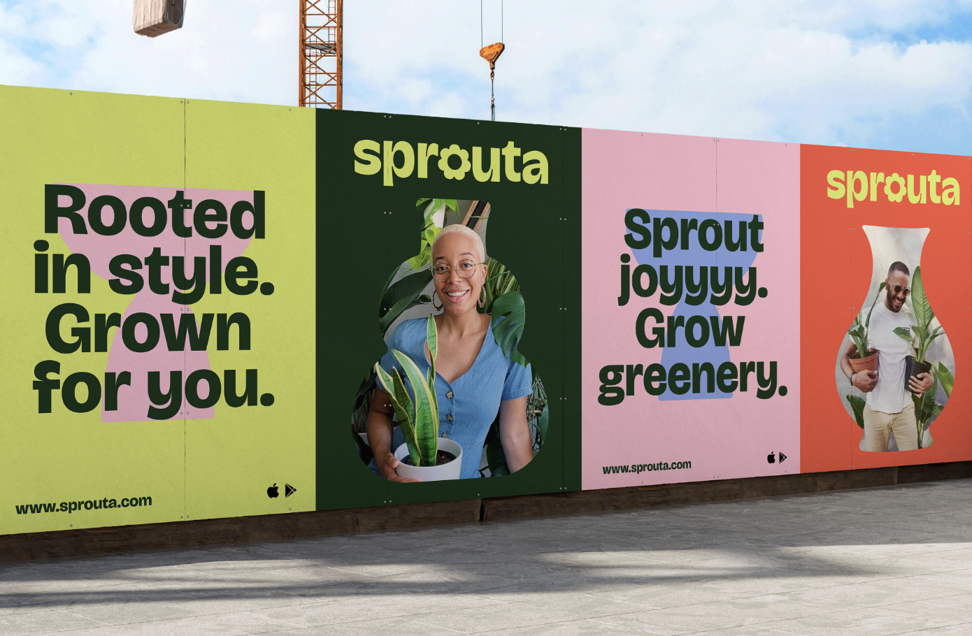
The centerpiece of the identity is the playful, bespoke wordmark logo. Designed in a bold, contemporary font, the logo symbolizes modernity and elegance. The letter “o” in Sprouta is cleverly crafted into a flower symbol, its open center representing growth and new beginnings. The organic flow of the petal-like design connects the brand to its nature-inspired roots and speaks to the idea of life flourishing in everyday spaces. This subtle yet striking element brings Sprouta’s mission of infusing homes with vitality and beauty to life in a fun, stylish, yet accessible way.
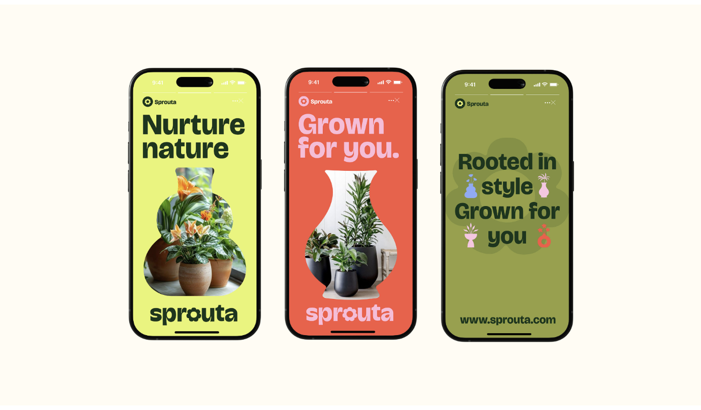
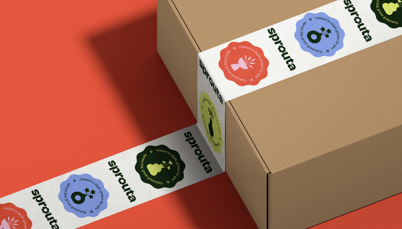
Inspiration for the Sprouta identity is drawn directly from the natural world. Samuel’s design process was truly motivated by the calming essence that plants bring into homes and gardens. The brand’s core message, centered on elegance and growth, finds expression through design elements that evoke the organic beauty of nature — flowing lines, soft forms, and a minimalistic aesthetic that highlights simplicity without compromising on sophistication.
The brand’s core message, centered on elegance and growth, finds expression through design elements that evoke the organic beauty of nature — flowing lines, soft forms, and a minimalistic aesthetic that highlights simplicity without compromising on sophistication.
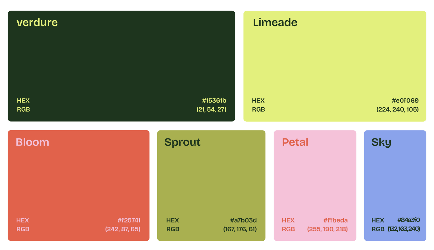
The color palette Samuel selected for Sprouta is as vital to the brand’s identity concept, as the logo itself. The palette captures the vibrancy and harmony of nature, reflecting Sprouta’s mission to introduce calm, joy, and life into any space. The standout greens, Verdure and Sprout, evoke a sense of vitality and freshness, while Limeade adds a zesty brightness reminiscent of new growth. To complement these greens, Blush and Bloom — soft pink and coral shades — inject warmth and a sense of blooming vibrancy, mirroring the natural blossoming of plants. The final shade, Sky, a soft, tranquil blue, rounds off the palette with a calming touch, bringing a sense of serenity that plants naturally infuse into spaces.
Together, these colors create a cohesive, vibrant, and calming aesthetic, reflecting both the beauty of nature and the modern, elegant vibe that Sprouta aims to convey. Whether in a home or garden, the Sprouta brand identity ensures a touch of stylish and soothing nature.







Images ©Faith Samuel
