

Bó Burger & Fries is a new star on the rise the culinary map of Kielce, claiming to serve the best burger and fries in town. It’s one of those places that was born out of sheer passion. A place in which everyone is welcome, and most importantly, enjoys the highest quality of food. Only original recipes, high-quality ingredients from regional suppliers and top notch service can only be matched by an equally amazing and stylish corporate identity. In this place, no detail is too small to ignore, as the experience – from the famous sesame sauce to the hand painted store facade – is designed as a whole.
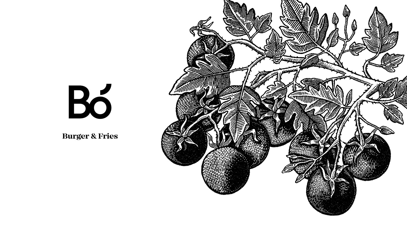
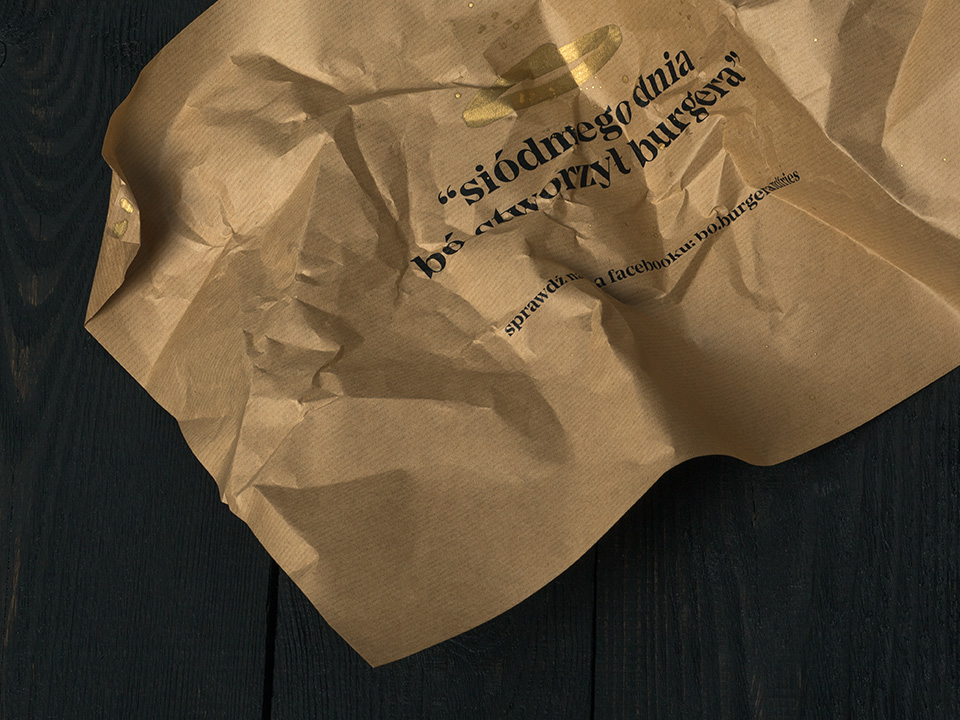
Warsaw-based Hopa Studio, run by a design team created by Piotr Hołub and Marcin Paściak, created a contemporary branding for the restaurant that plays with the contrast of street art and luxury. And it’s exactly this uncommon marriage of spontaneous, freestyle calligraphy and high-end produce that peaks the by-passers interest. The corporate identity assumes two layers – the first associated with slow food, urban life, and culture. The second – golden – refers to the style of the New York subway, graffiti, and hip-hop culture. The black&white line illustrations by Joanna Walczykowska and Kamil Borowski’s golden calligraphy work seamlessly together, creating frames for the otherwise minimal and bare interior and branding. Also, a very important element of Bó’s identity is the design of the restaurants’ facade as it’s face and first impression, as it is the base on which the visitor will decide whether to enter. And my guess it, many choose to enter.


