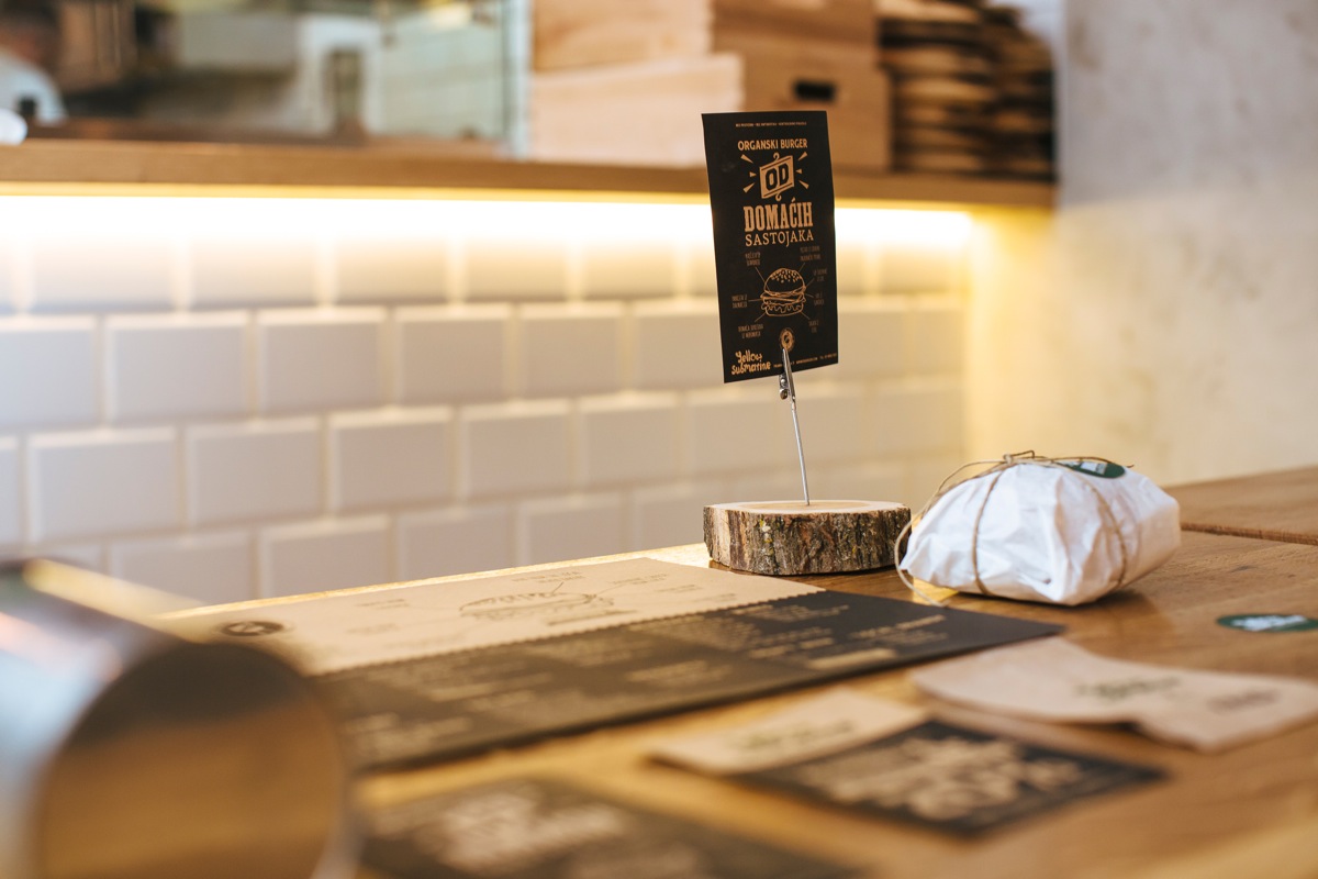
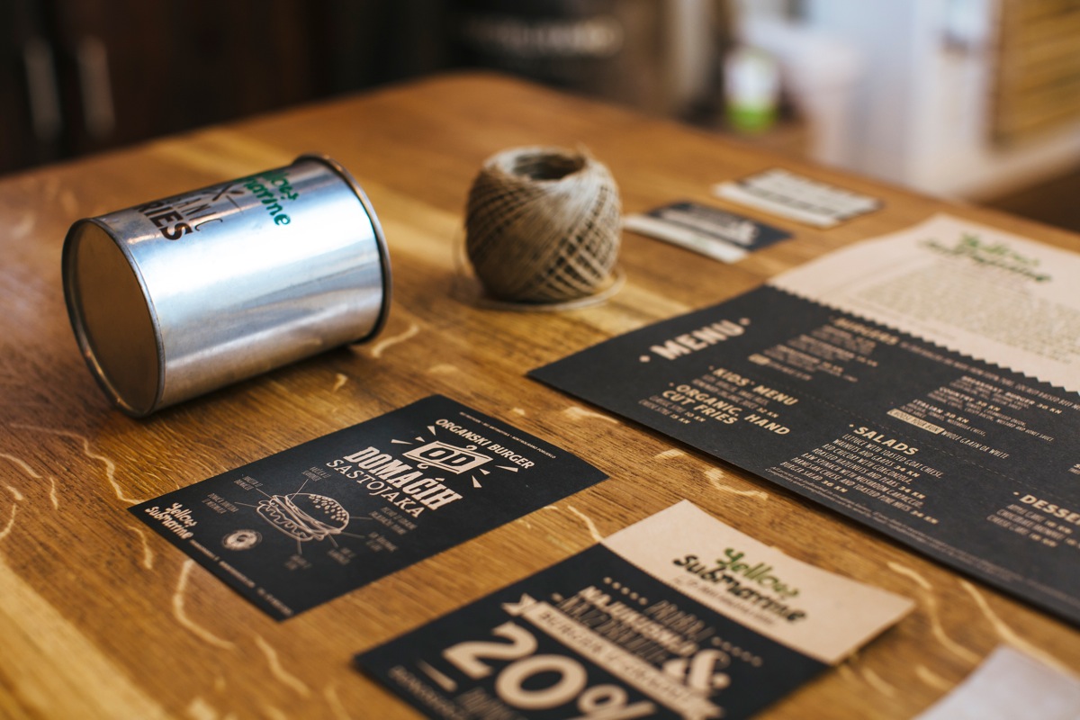
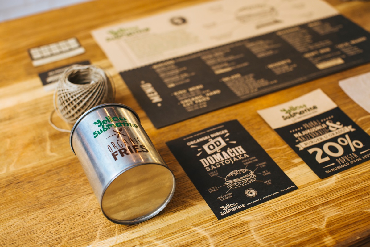
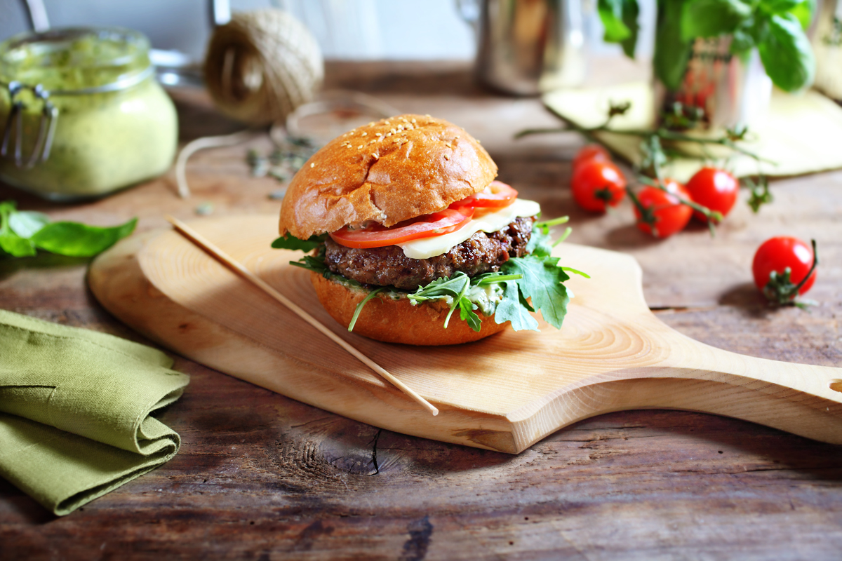
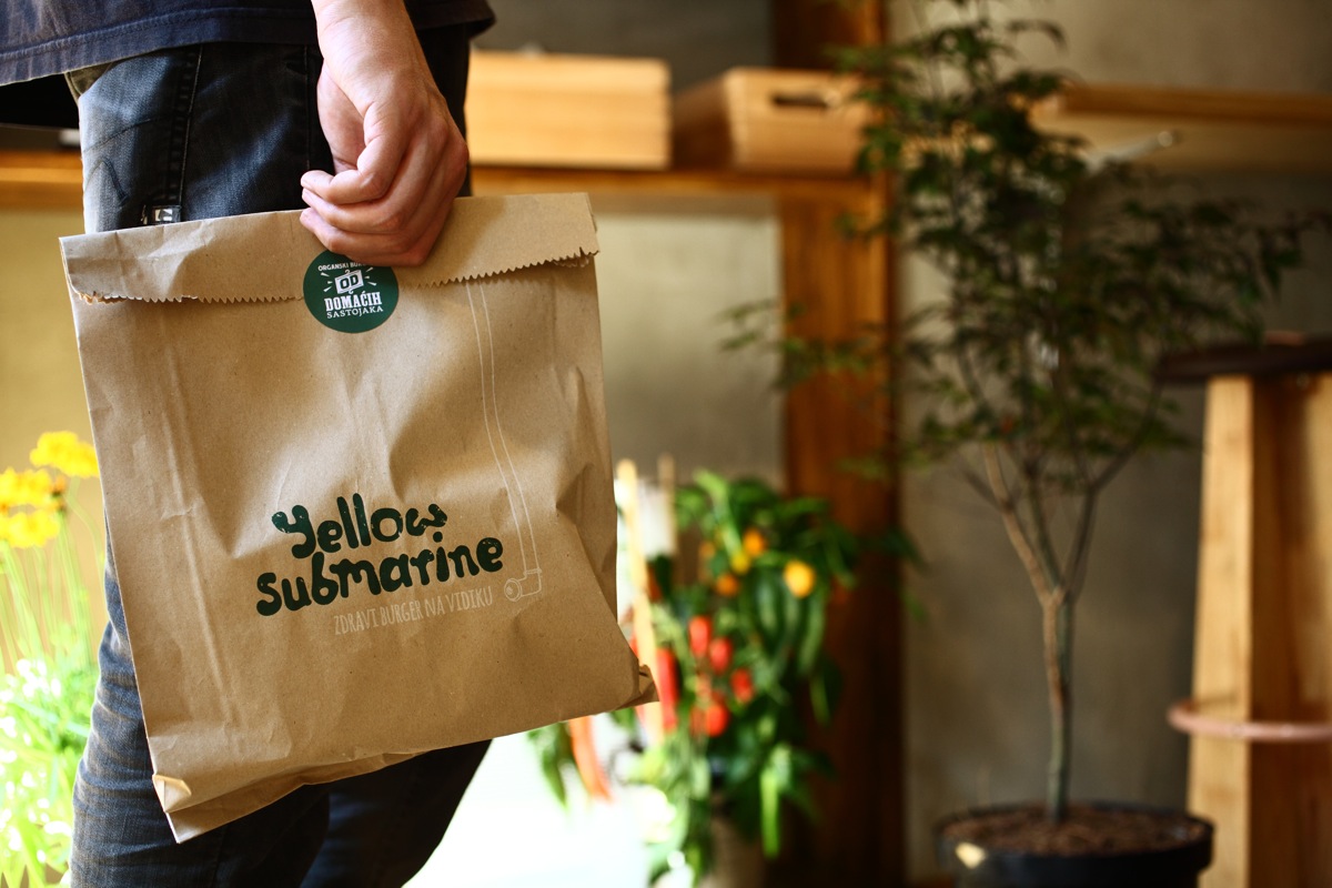
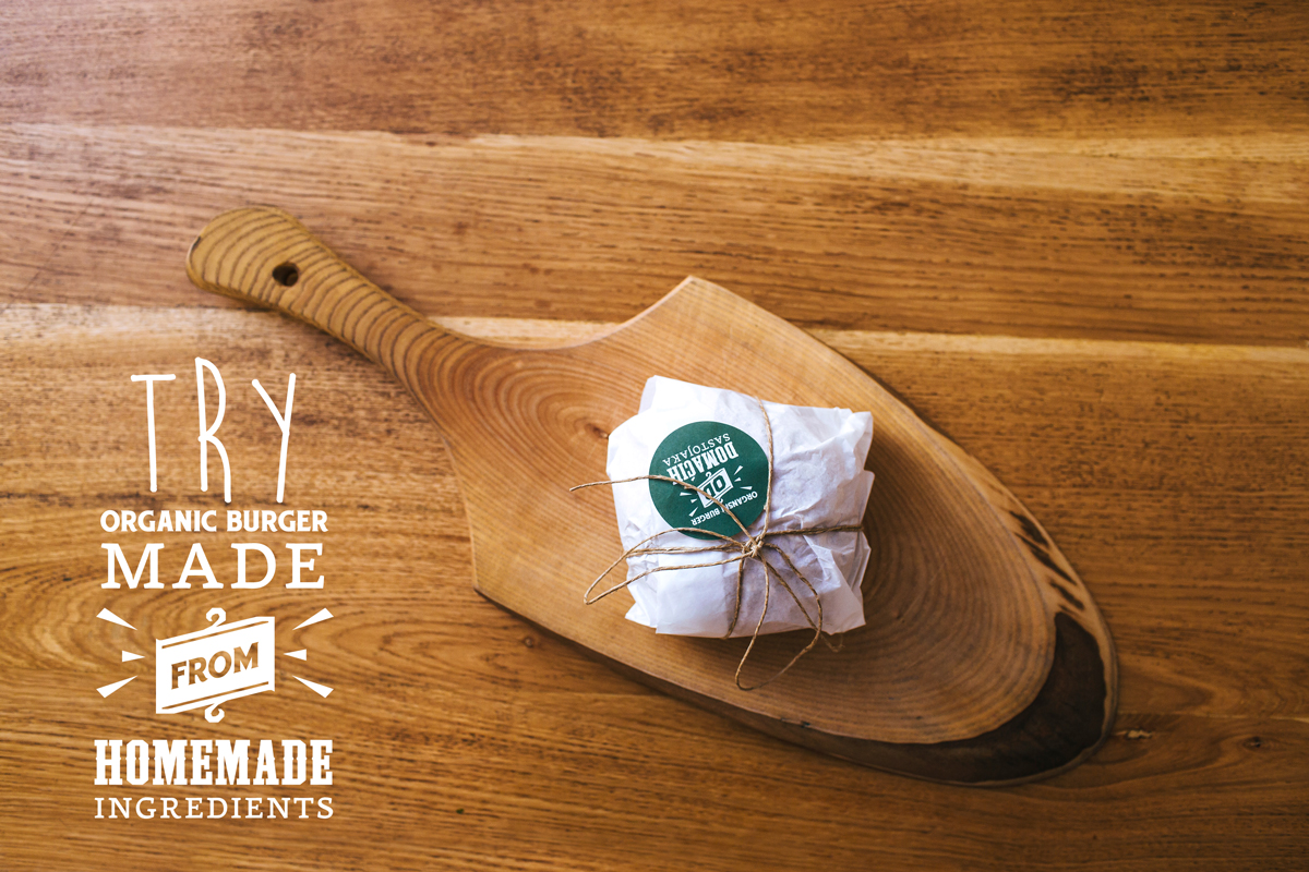
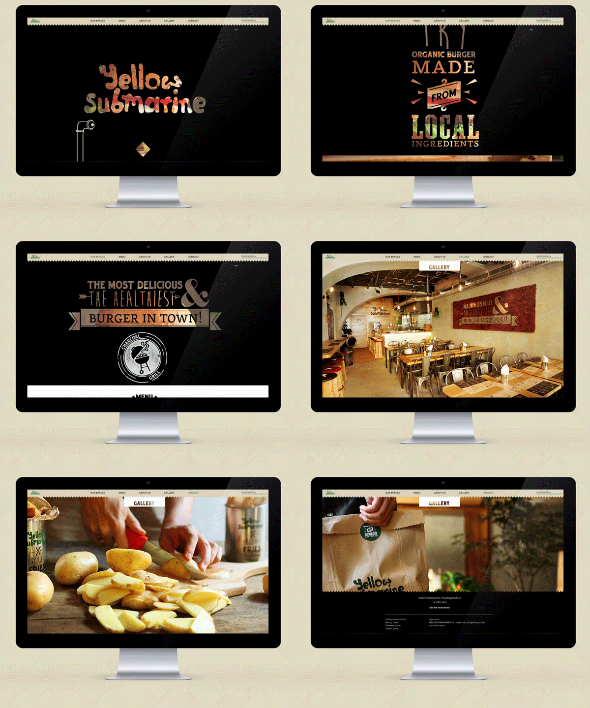
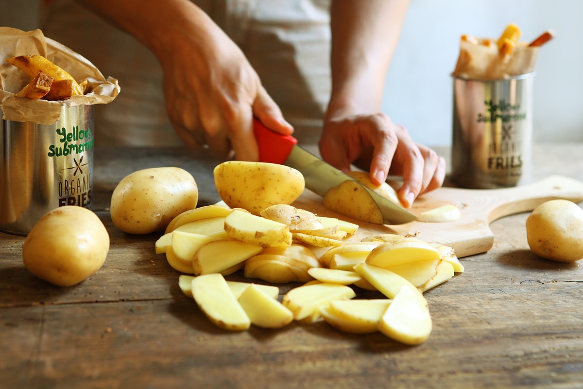
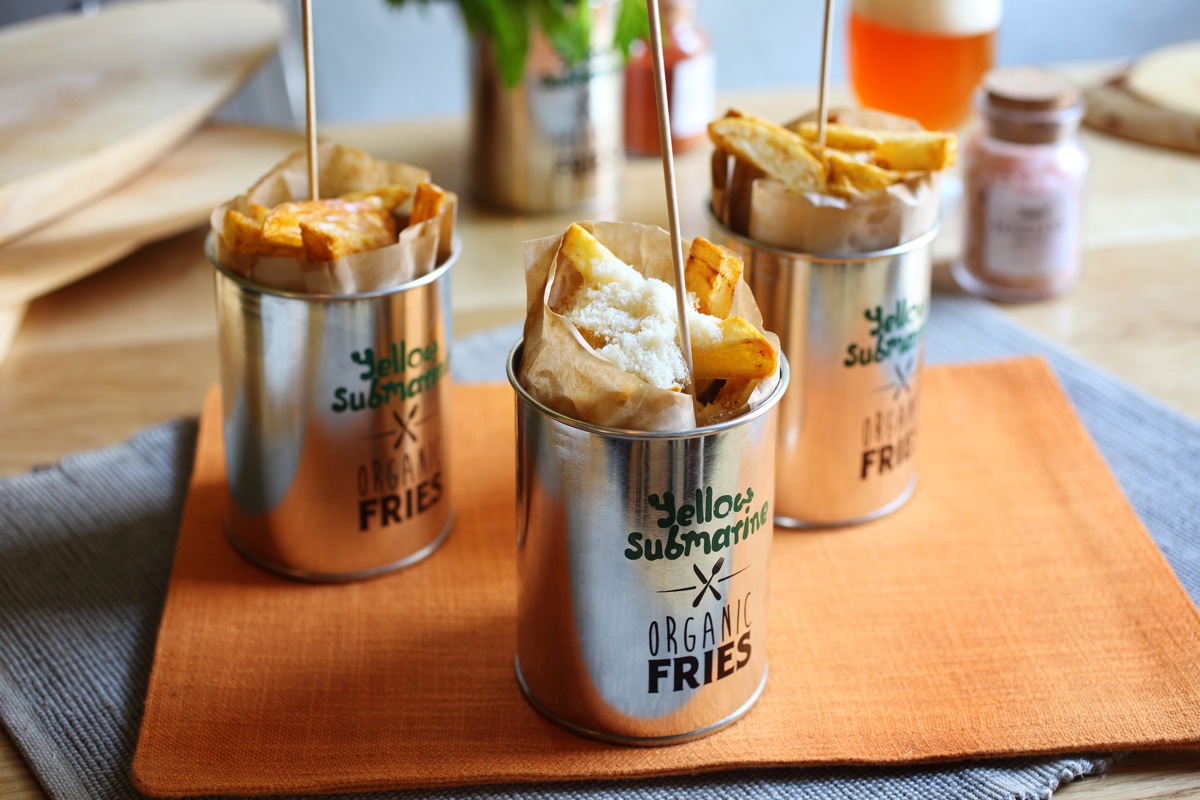
Can burgers be delicious and healthy? Organic Burger Bar Yellow Submarine in Zagreb, says YES of course! They claim the title of the best and healthiest burgers in town, and they do it in style. Croatian designer Ivan Dilberovic designed the visual identity, with a periscope as the main supporting element. The organic theme was taken into account in everything from a scheme to paper options and packaging materials.
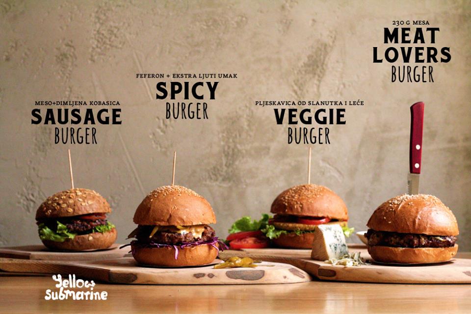
Yellow Submarine offers top quality burgers made exclusively from organic, locally grown ingredients, which won’t contain any additives, antibiotics or GMOs. They support the development of small, rural farms, only use recyclable materials in their packaging and even run their own 1 for 1 charity program where on four days a year they match the number of sold burgers by giving the same amount to socially disadvantaged groups. The next 1 for 1 day is next week on the 16th of December, so if you are in Zagreb, pop by to enjoy a delicious burger and help out the disadvantaged. We wish we could join you!
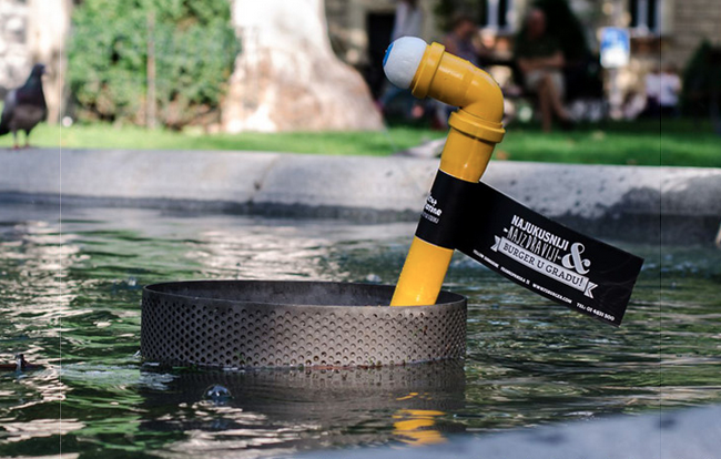
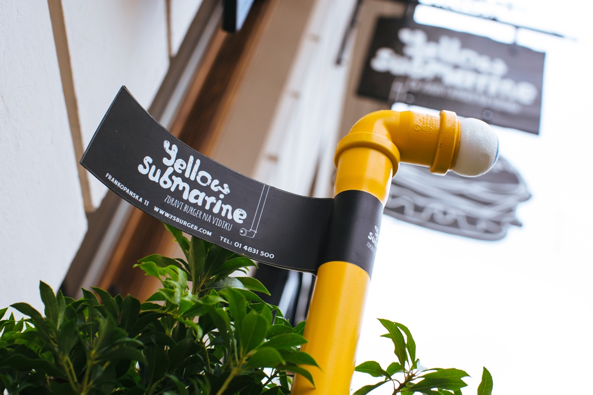
Local designer Ivan Dilberovic who runs his own Studio Dilberovic has worked for numerous clients and won multiple awards for his work. He was responsible for the branding and visual identity of the new burger place since the beginning. Before the actual opening of the Yellow Submarine, a very successful guerrilla advertising campaign was done in Zagreb in which dozens of yellow periscopes were places around the city with the address of the place on it. The campaign brought in customers and put it on the culinary map of Zagreb on day one of their openings.
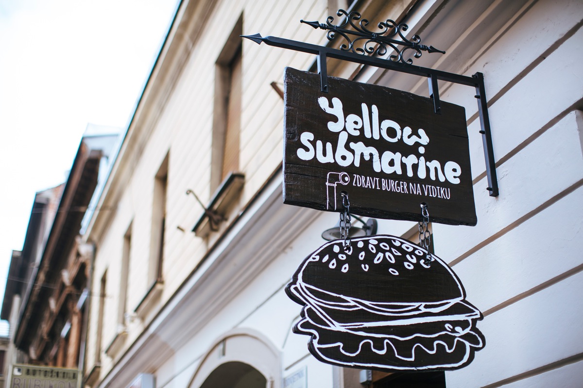
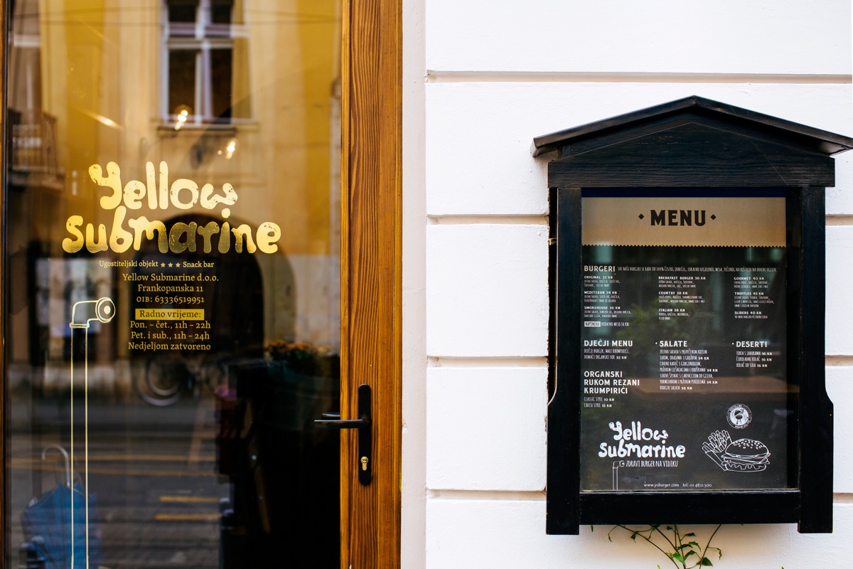
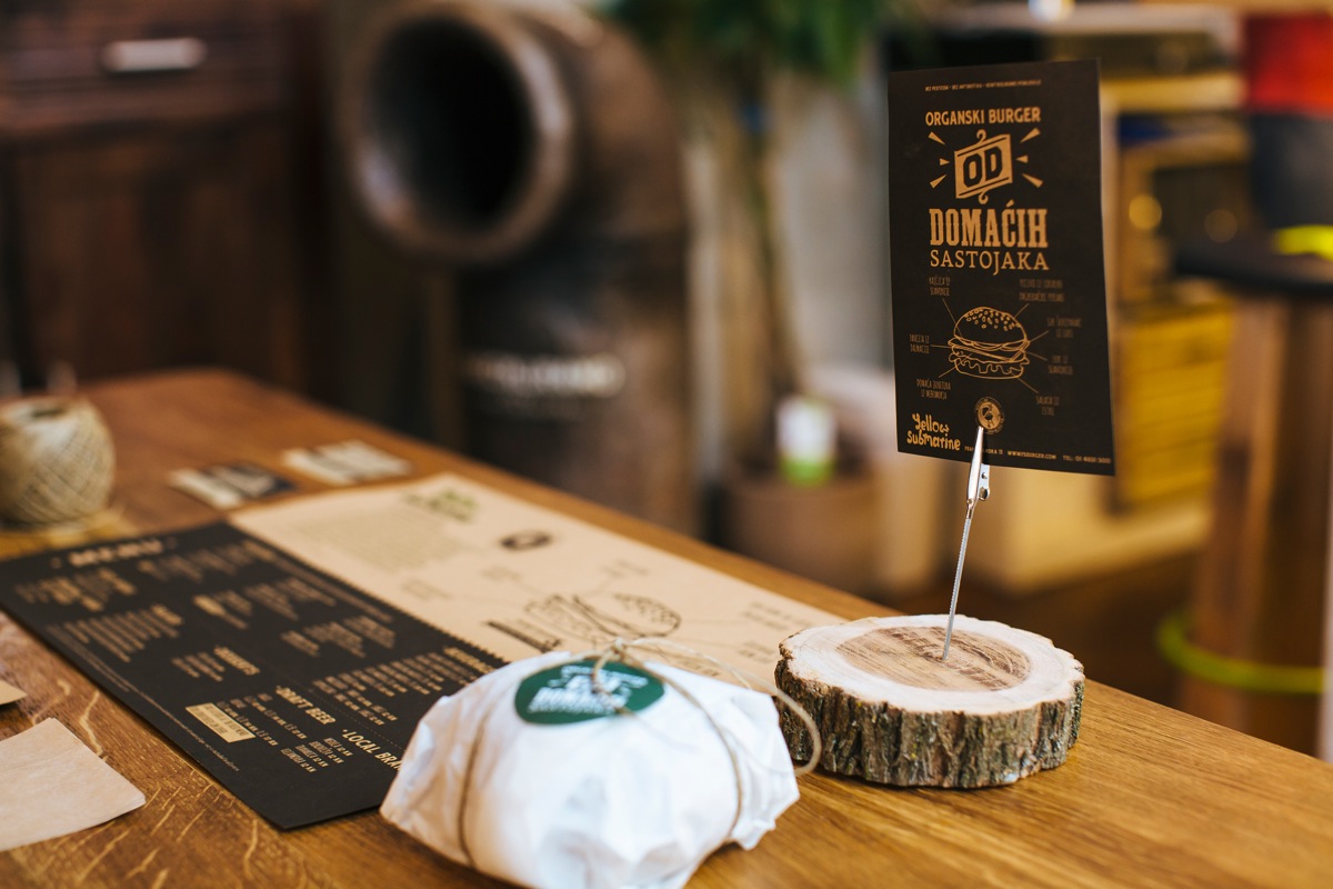
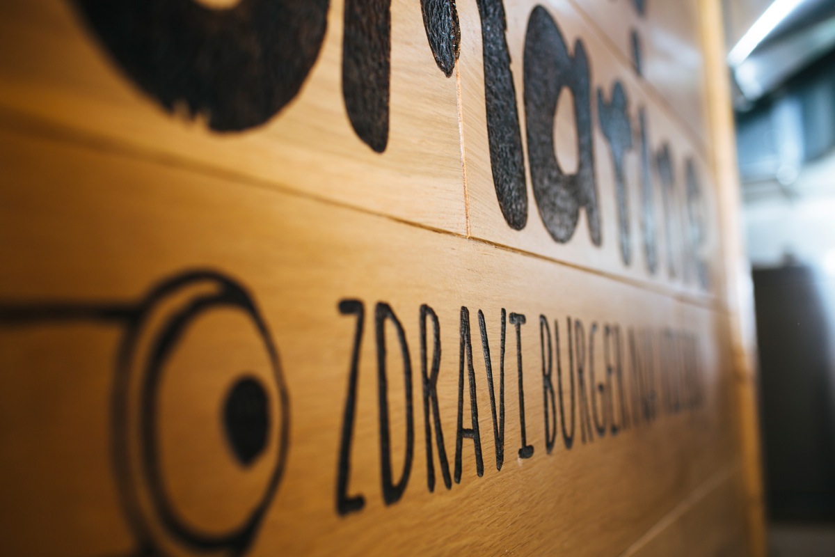
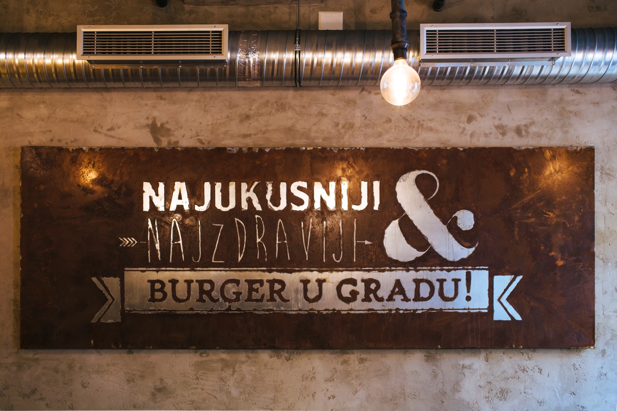
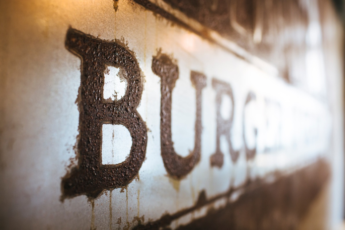
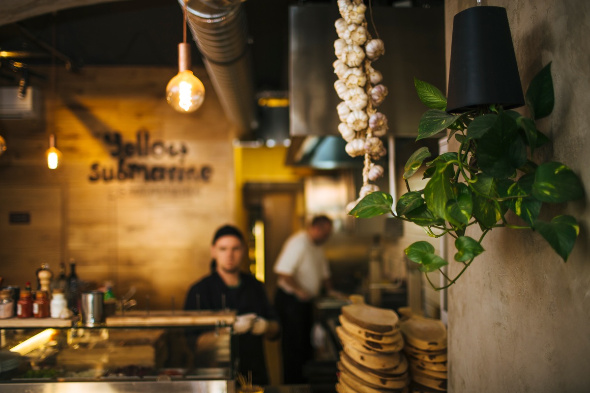
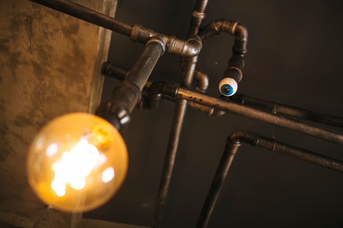
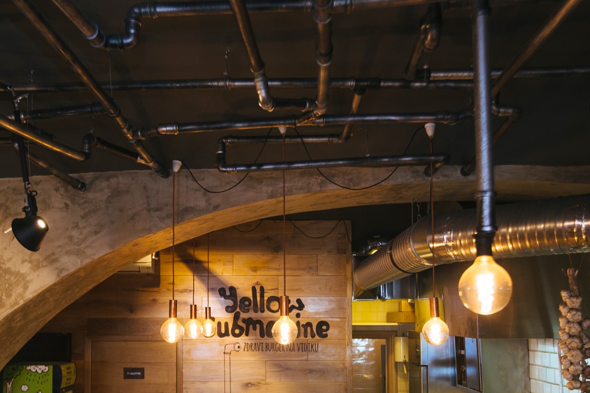
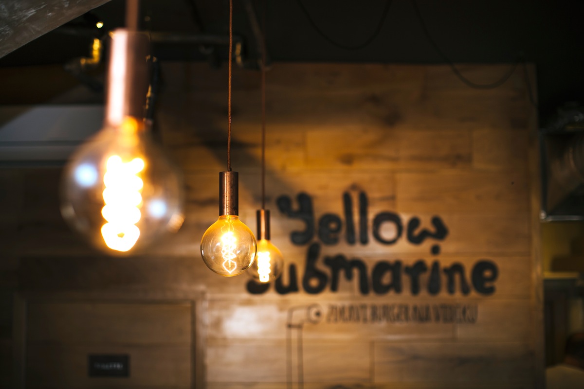
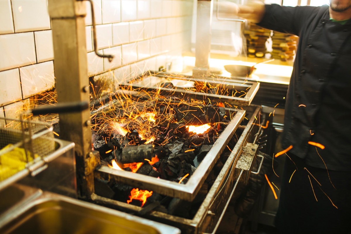
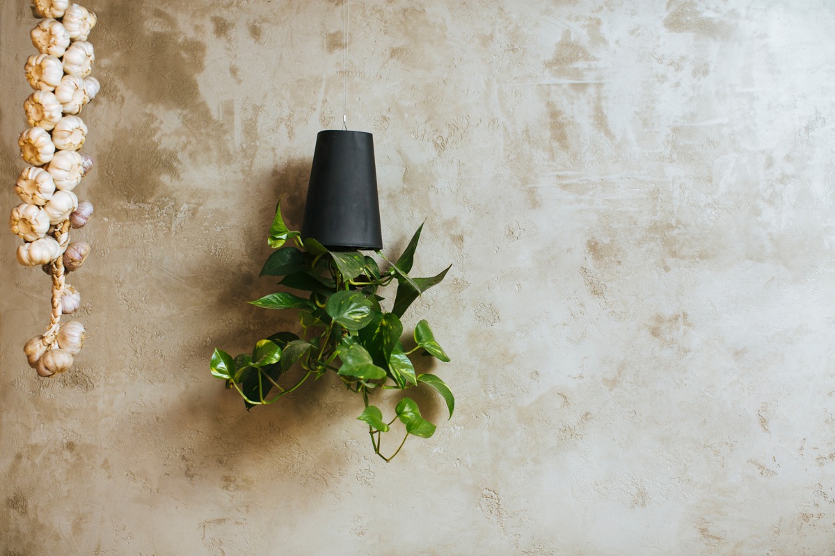
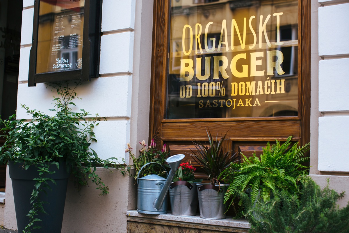
You can find the place at Frankopanska 11, under the large hanging burger sign. The interior goes together with the theme, with dozens of pipelines crossing in the ceiling, wood and metal mixed in the furniture. All in all a great welcoming atmosphere is build under the low arches of the old building. Typically to the current trends, hand made typography is used as decoration together with bare rugged concrete walls.
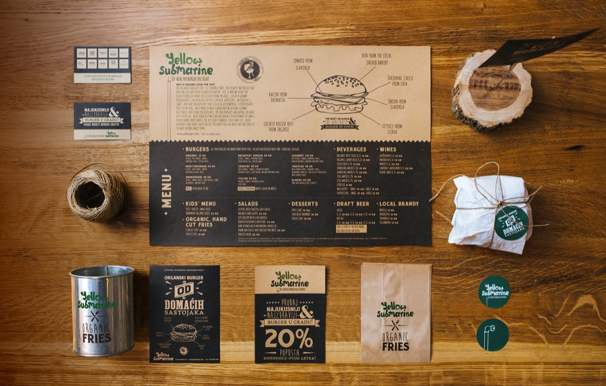
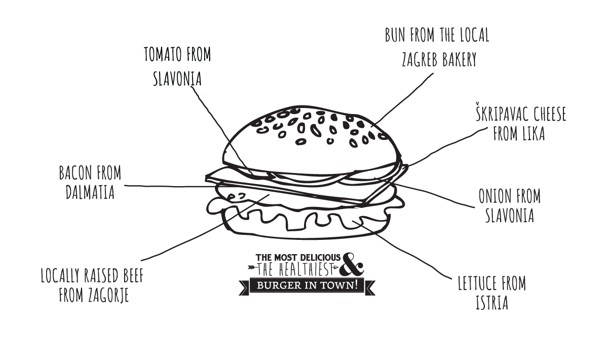
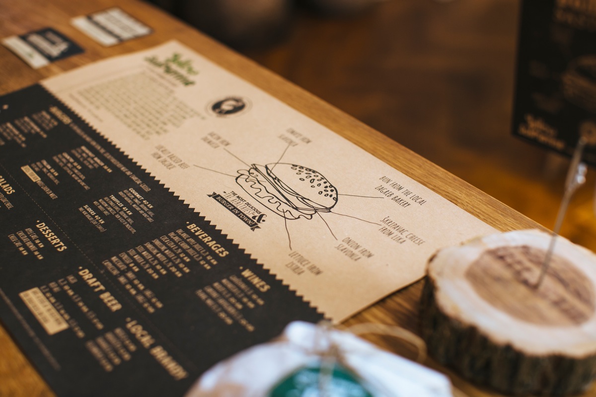
The visual identity echoes the values of Yellow Submarine, with down to earth, organic colour scheme: black, brown and green. Surprisingly leaving the obvious choice of yellow out. The paper materials are designed around the combination of good typography and illustrations, repeating the main element of periscope. The customers can read straight from their place mats where each ingredient comes from, as the illustrated burger shows: tomato and onions from Slavonia, buns from Zagreb’s bakery, bacon from Dalmacia, lamb from Međimurje, cheese Škripavac from Lika and lettuce from Istria. The whole country of Croatia in one tasty burger!
So what are you waiting for? Go on already! We’ll race you there!

Photos © Ivan Dilberovic

