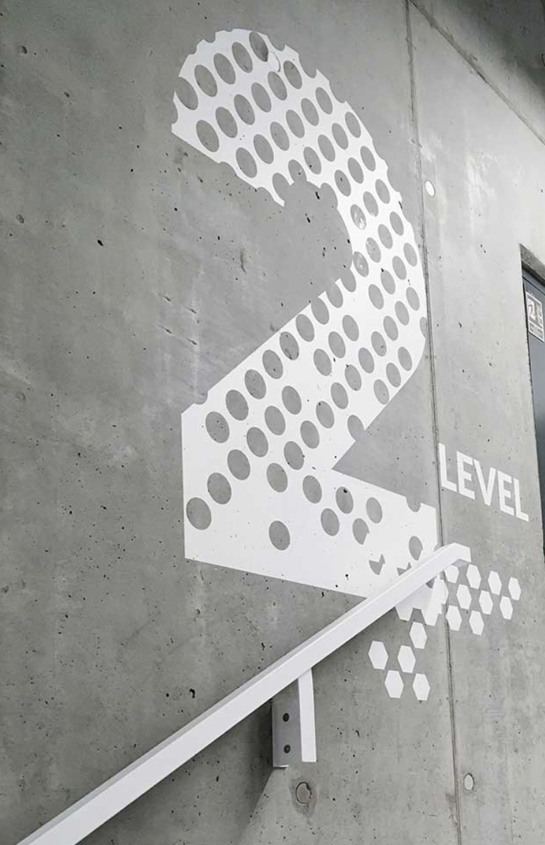
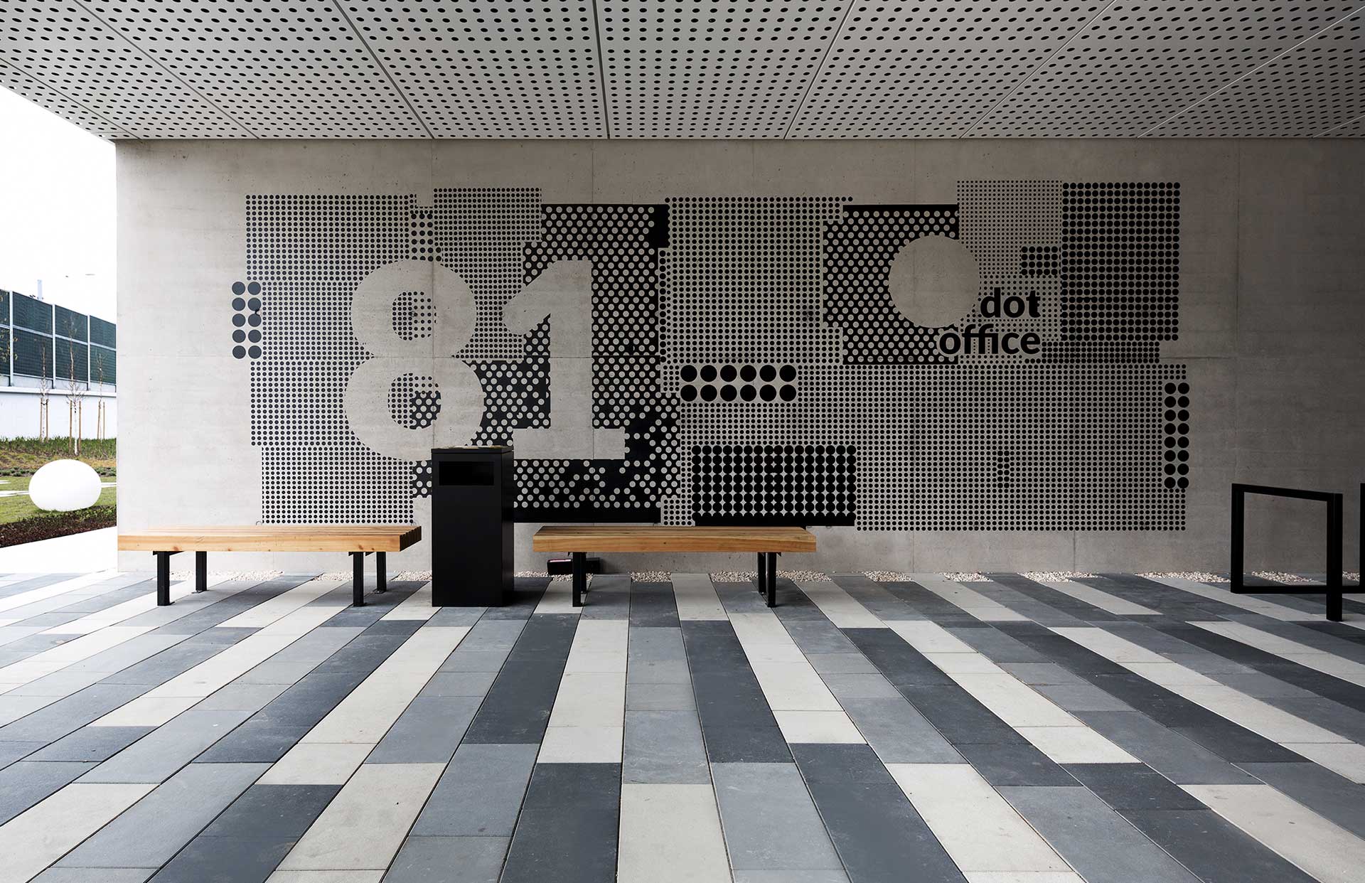
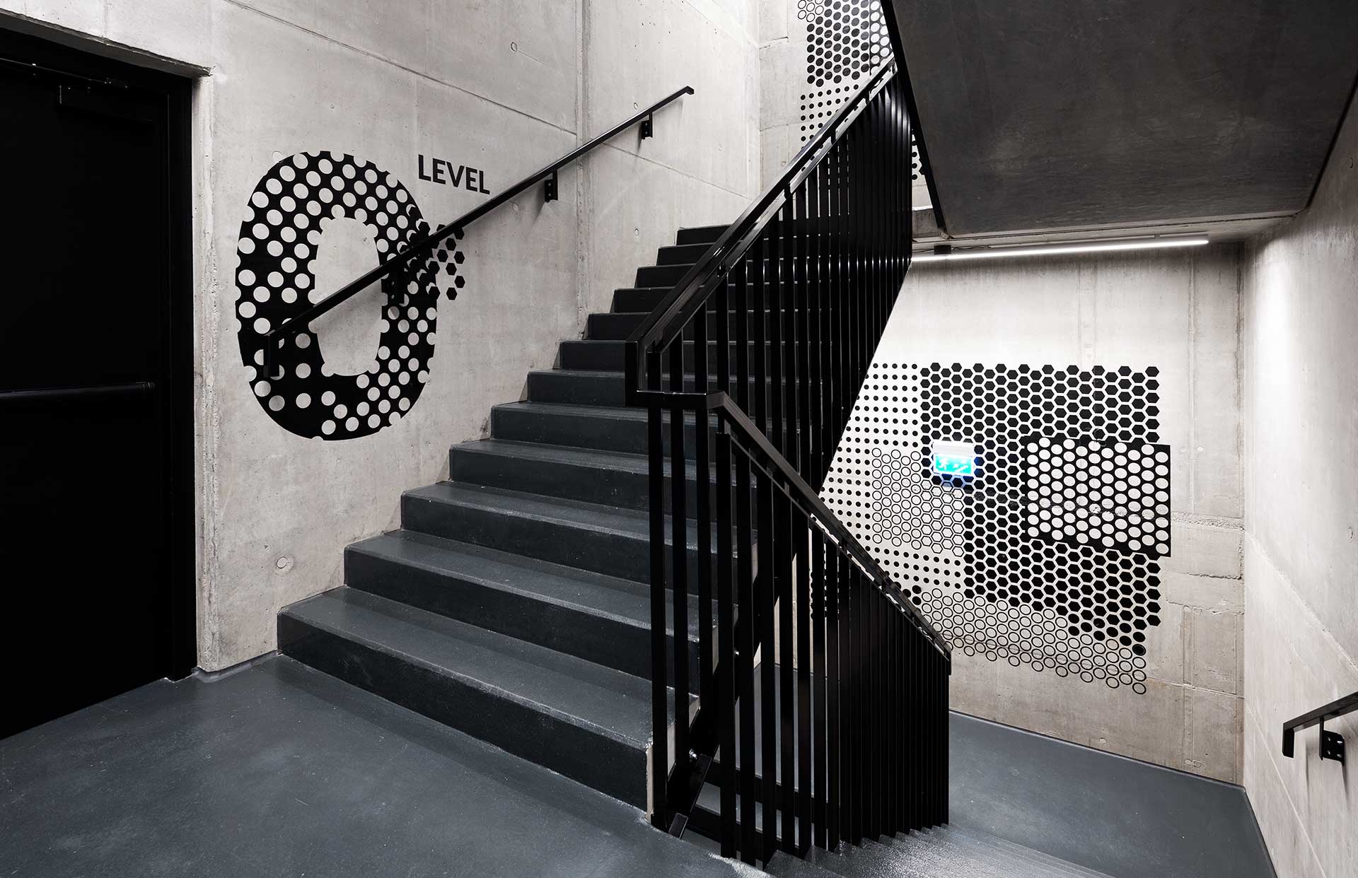
Kolektyf is a Wrocław-based collective of designers, architects, and artists who work together creating and maintaining cool and creative atmospheres for clients in both the private and public sectors. Their work includes numerous high-profile destinations in Wroclaw and the surrounding area, including large office complexes, schools, and even the 2nd largest shopping mall in Poland, and it was their extensive catalog of wayfinding and signage system concepts that captured our interest.
For Kolektyf wayfinding signage concepts are way more than very nice walls
Wayfinding signage design plays a vital role in making buildings and interiors ‘legible’. It’s a specialized field of design that uses pictograms, maps, graphics, and typography to help people find their way around. Many of the symbols and terminology utilized are universal, while others reflect the language, culture, and iconography of local communities. Wayfinding signage is an interesting aspect of graphic design as it often is required to simultaneously seamlessly blend into its environment, but be extremely effective. And while some say wayfinding signage is something we rarely notice – before we are lost – Kolktyf’s approach feels fresh and bold, as their design concepts demand attention and are as stylish and throughout, as any contemporary design concept. Below you can see ten brilliant examples of Kolkty’s wayfinding signage work with each one including an intriguing take on typography and graphic illustration. You can enjoy more of their work by following them on Instagram.
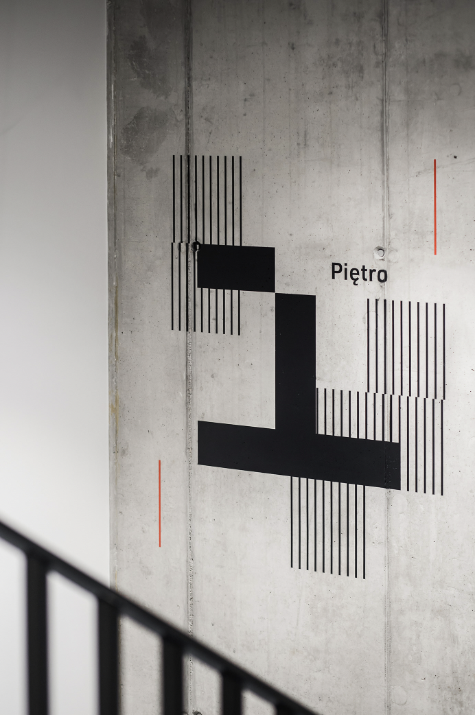
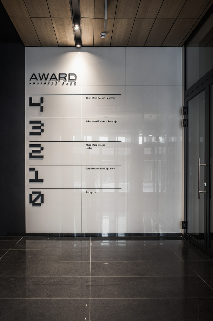
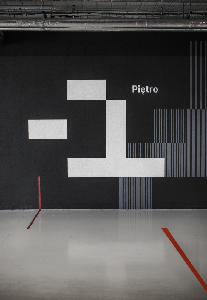
AWARD BUSINESS PARK
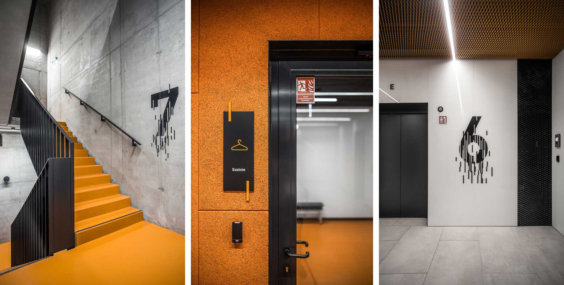
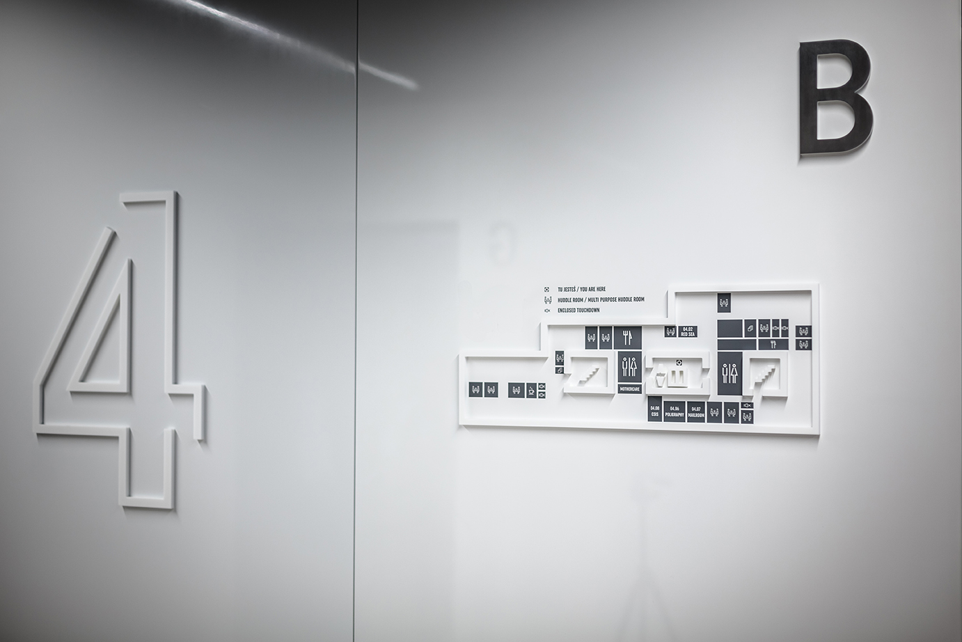
A wayfinding signage system corresponding to the architecture of the Award Business Part buildings, with a modern limited color scheme of black, white, gray, and red, and a characteristic element of pixel numbers.
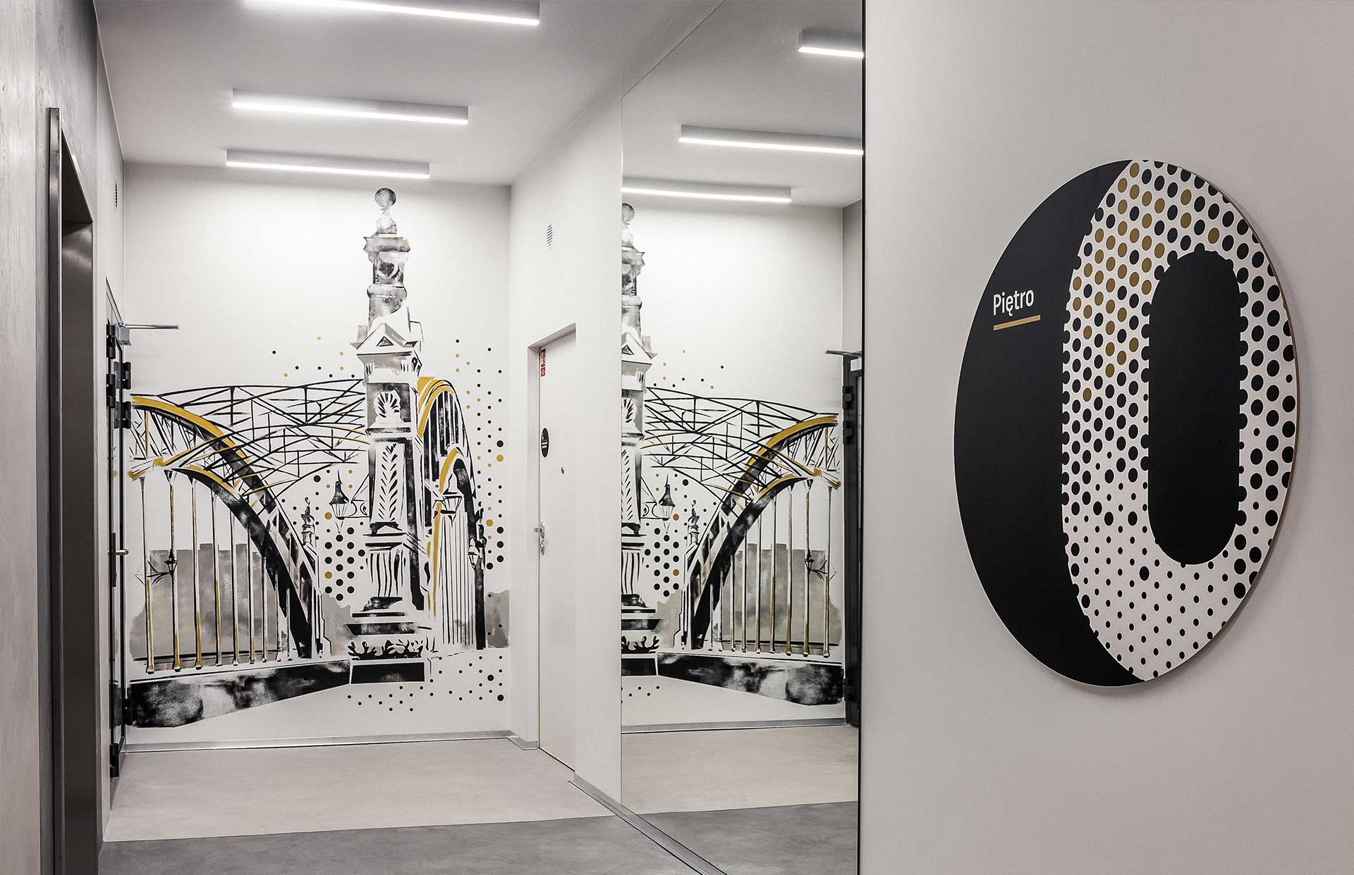
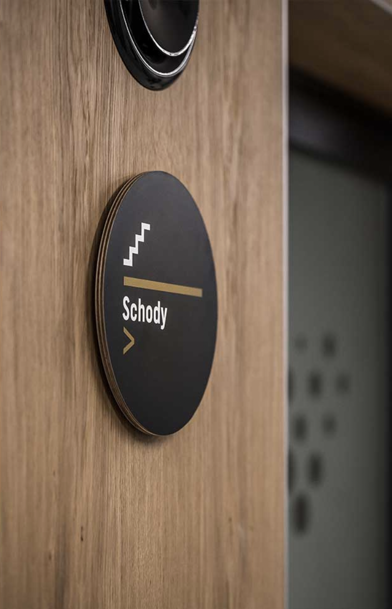
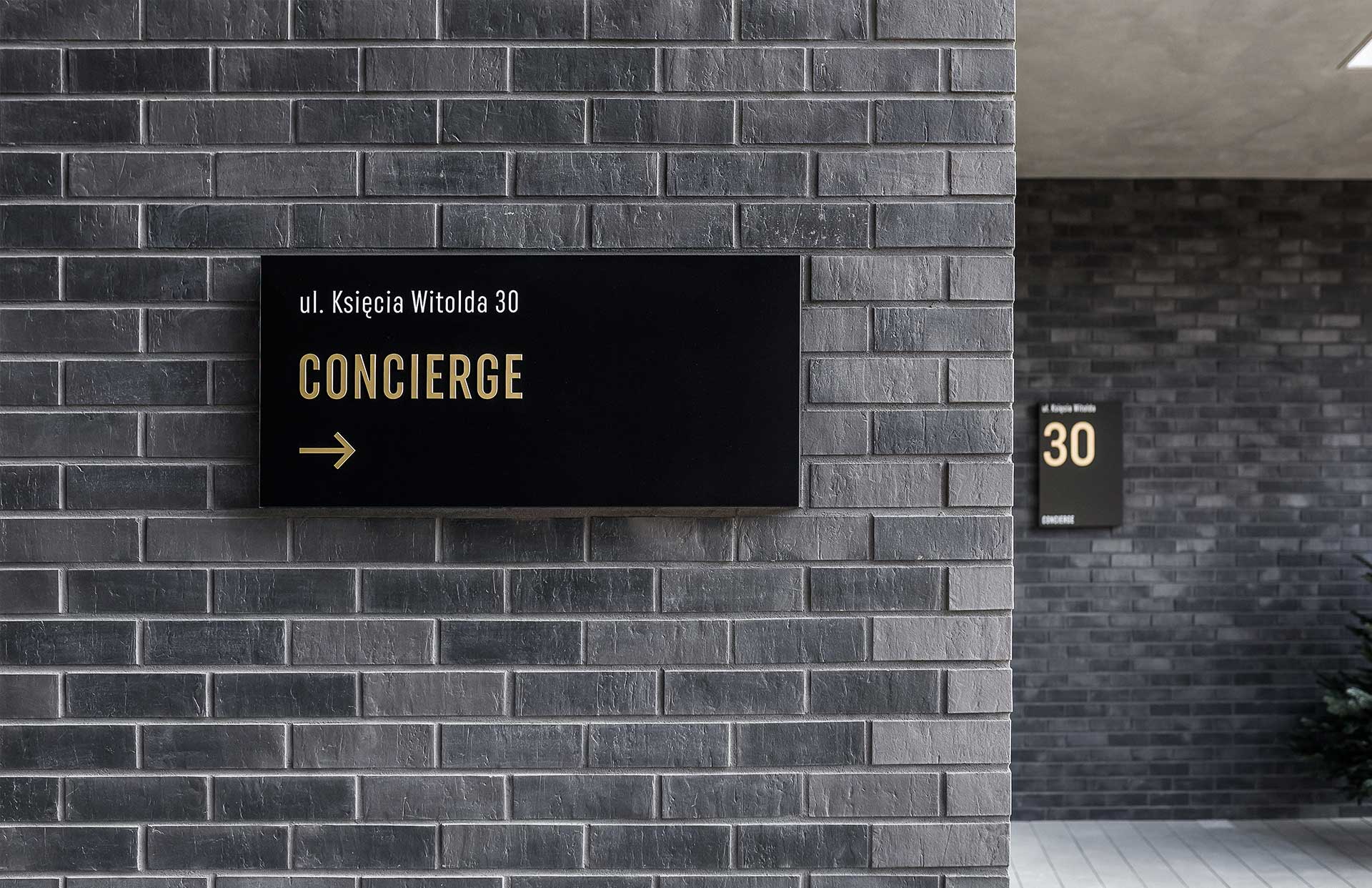
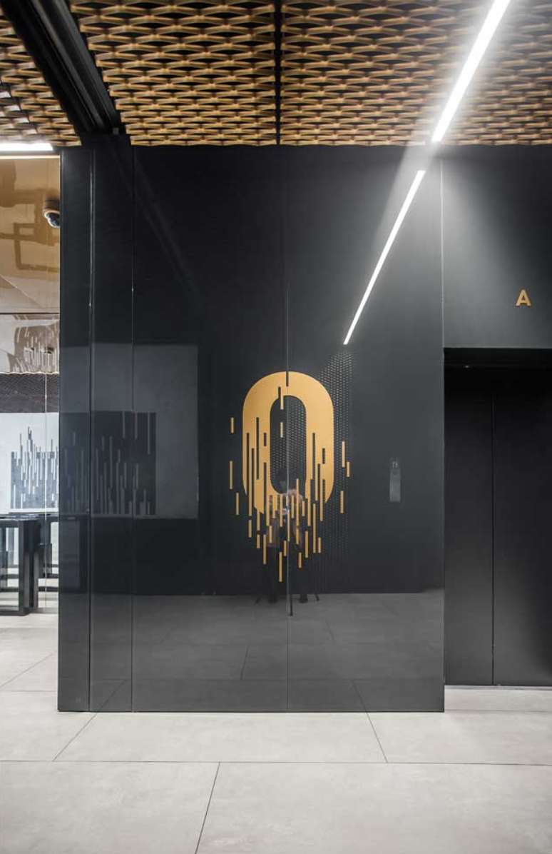
APARTAMENTY KSIĘCIA WITOLDA
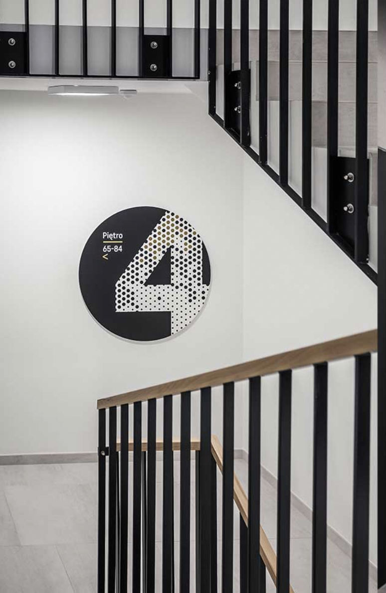
When creating the floor markings, navigation and signage for the KSIĘCIA WITOLDA apartments in Wrocław, Kolektyf combined black and gold, circle-shapes, and a screen-style graphic inspired by the facade of the facility.
AKADEMEIA HIGH SCHOOL
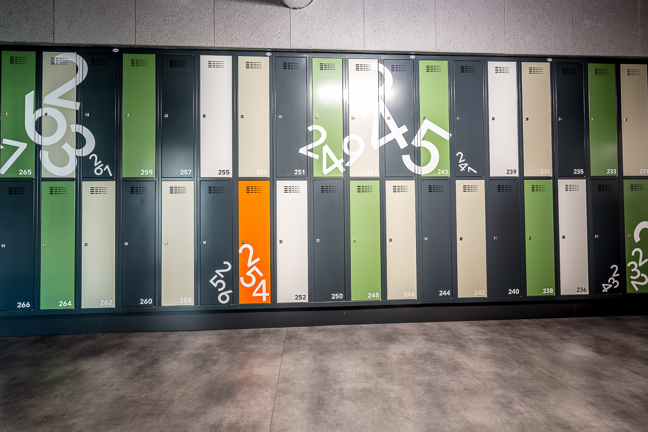
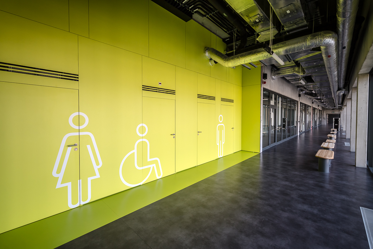
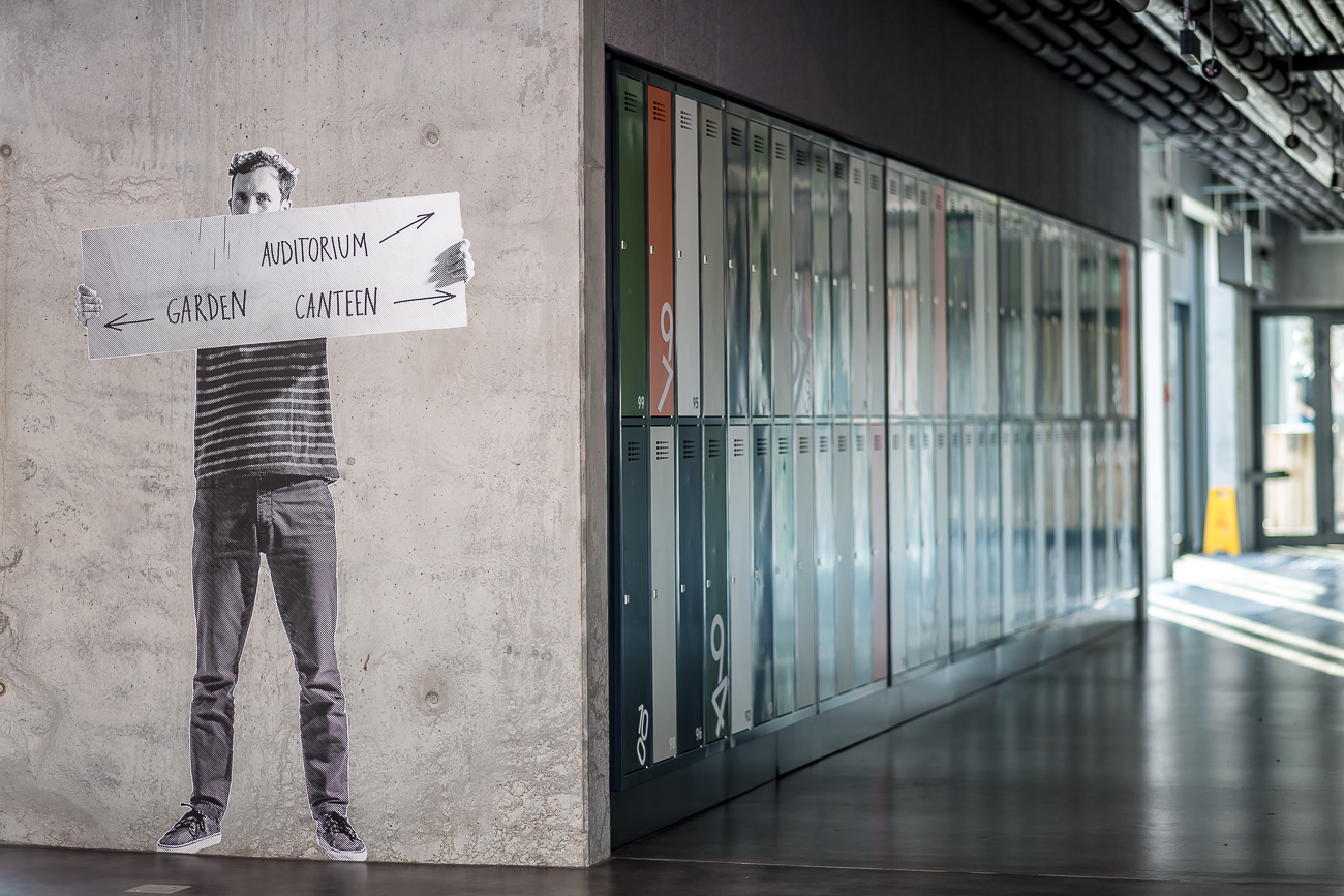
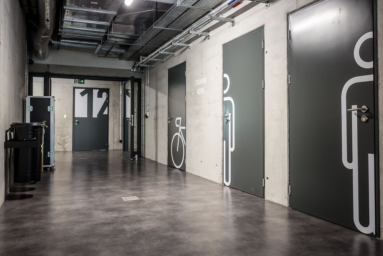

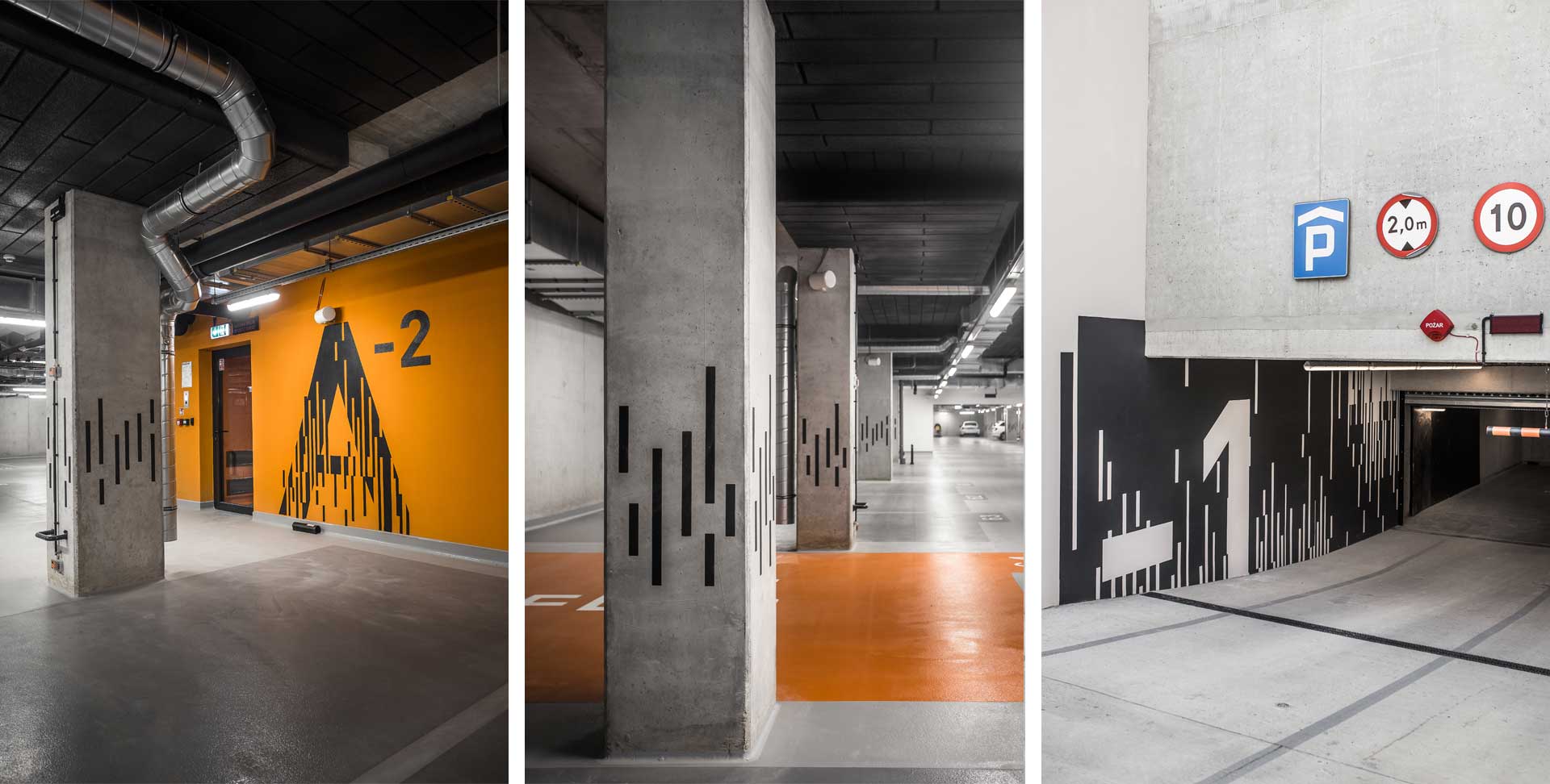
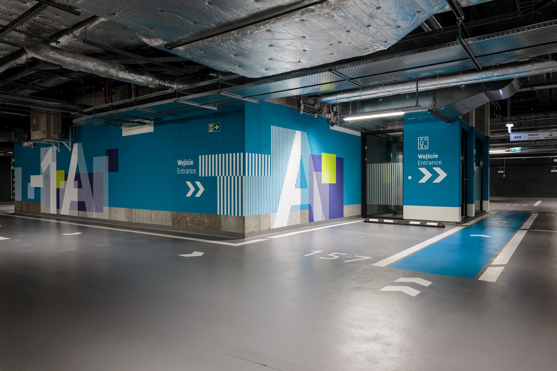
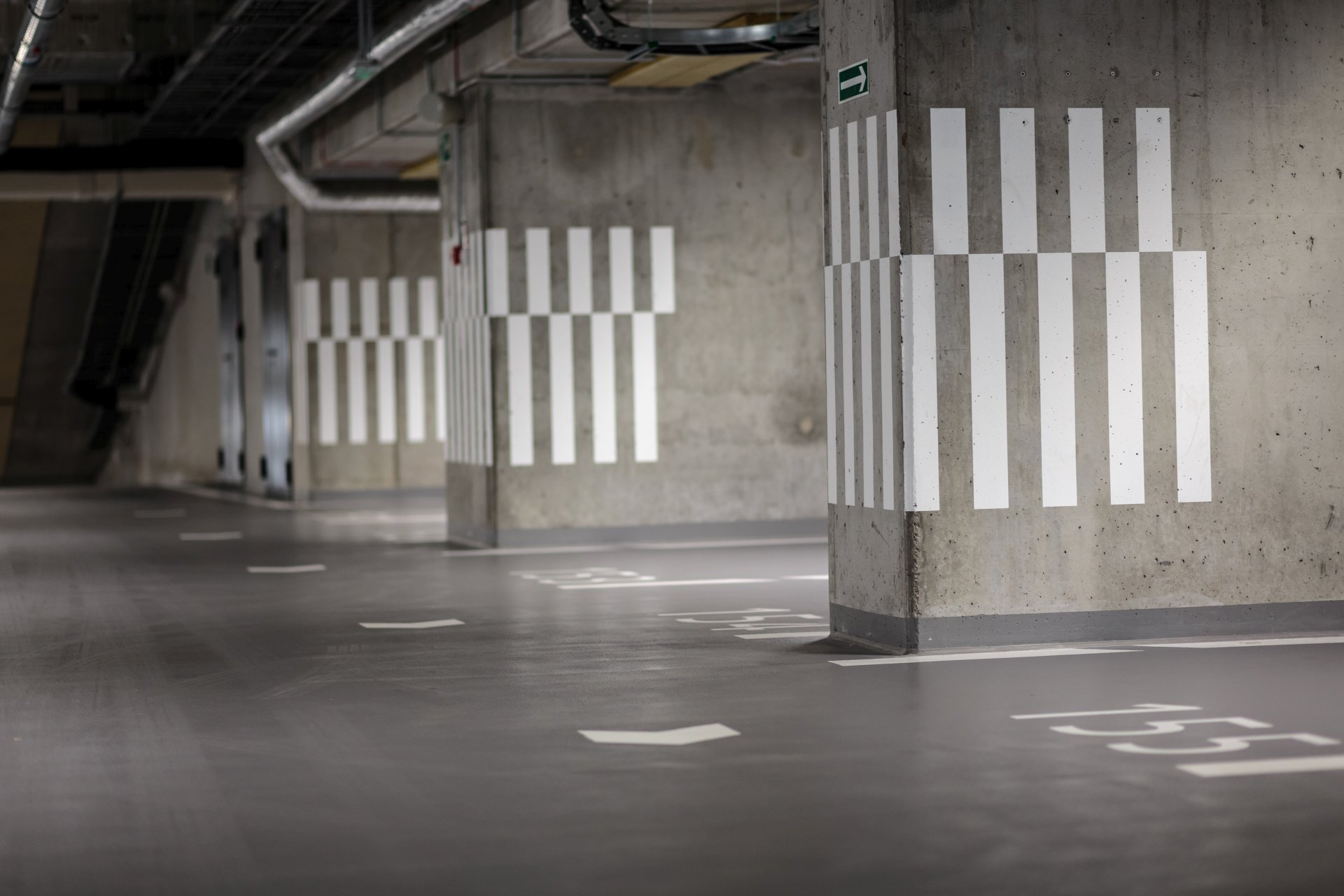
GDAŃSKI BUSINESS CENTER PARKING
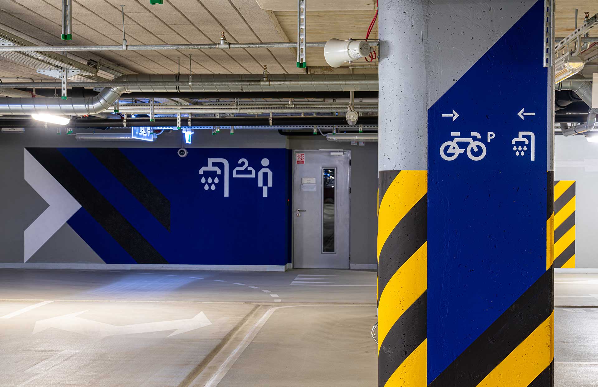
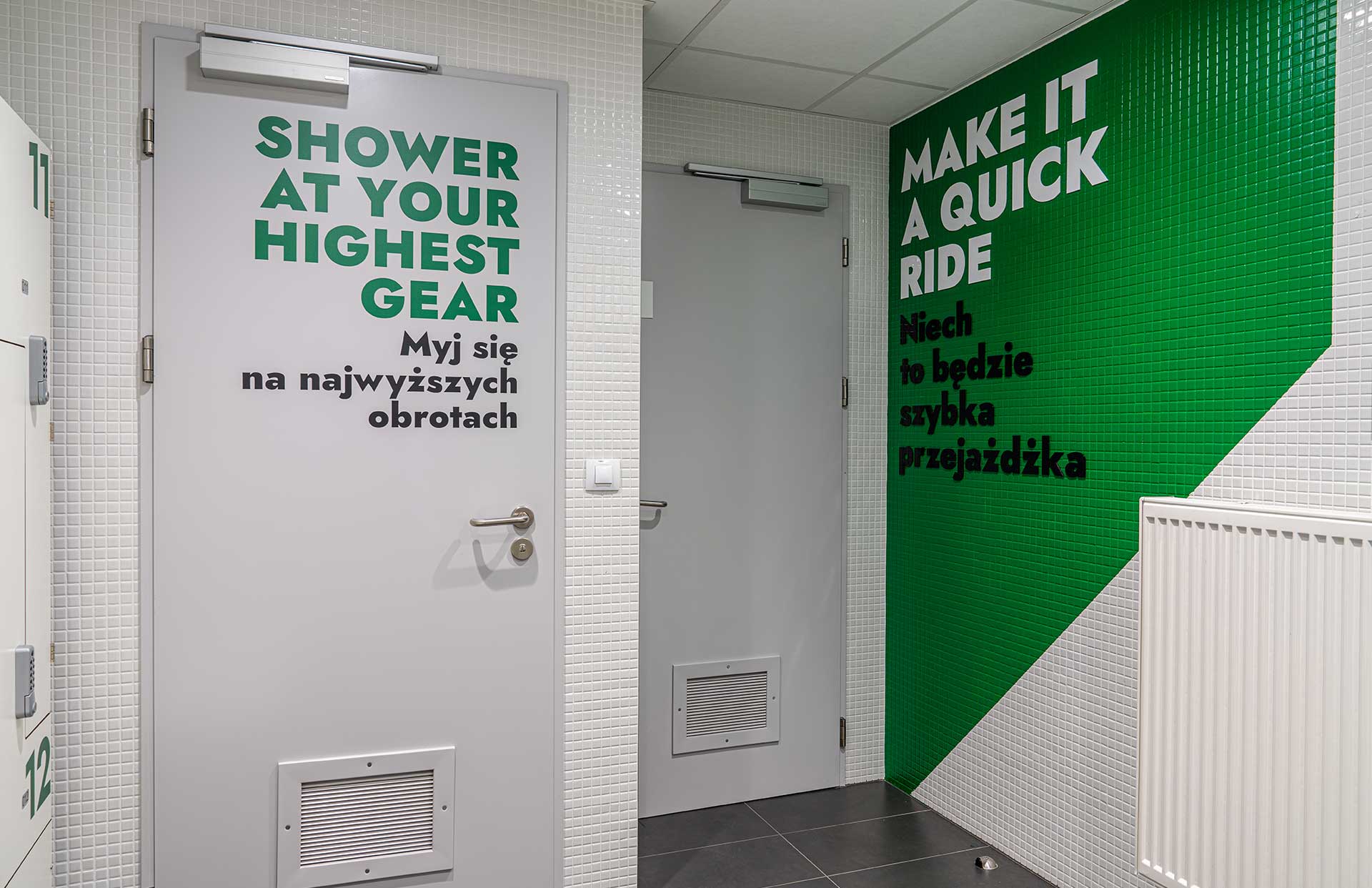
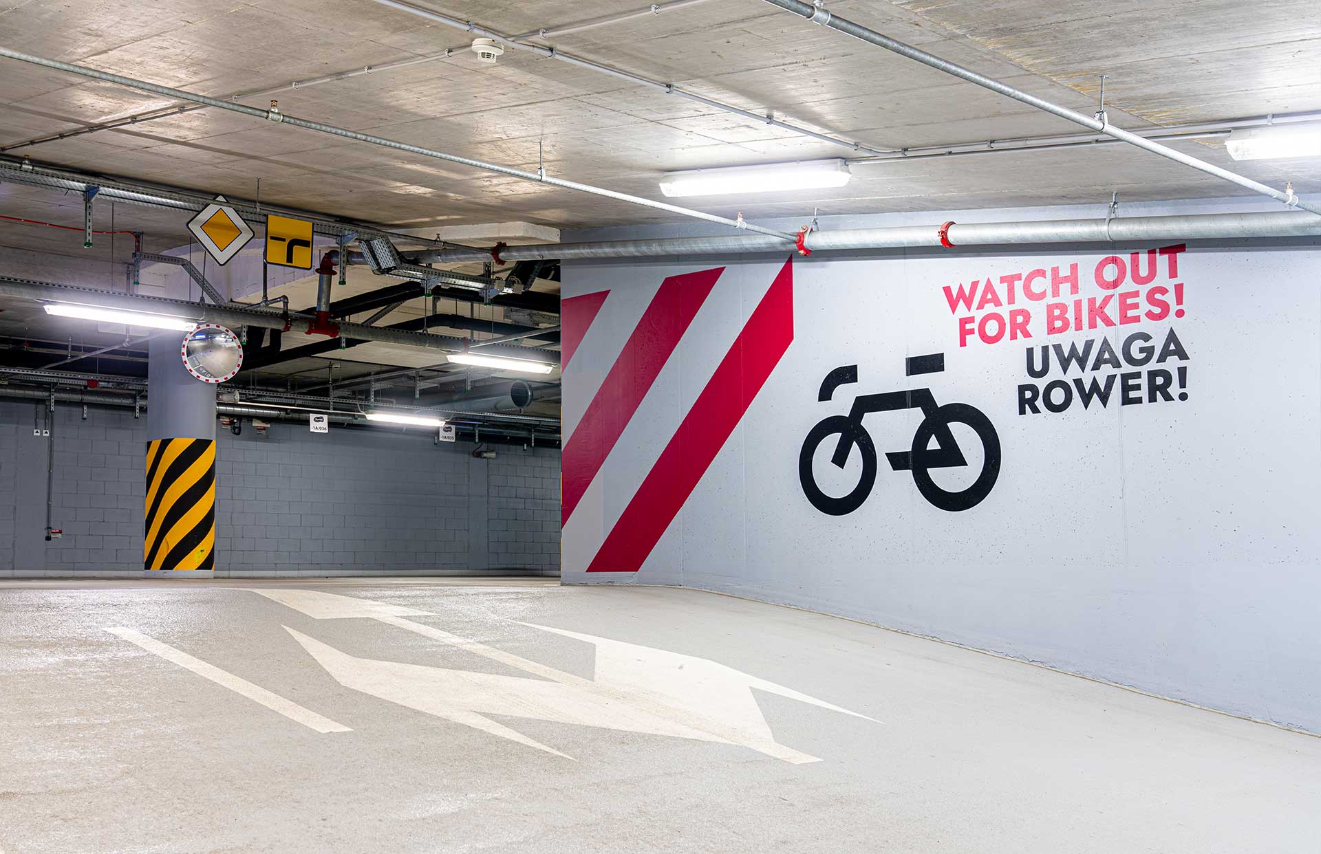
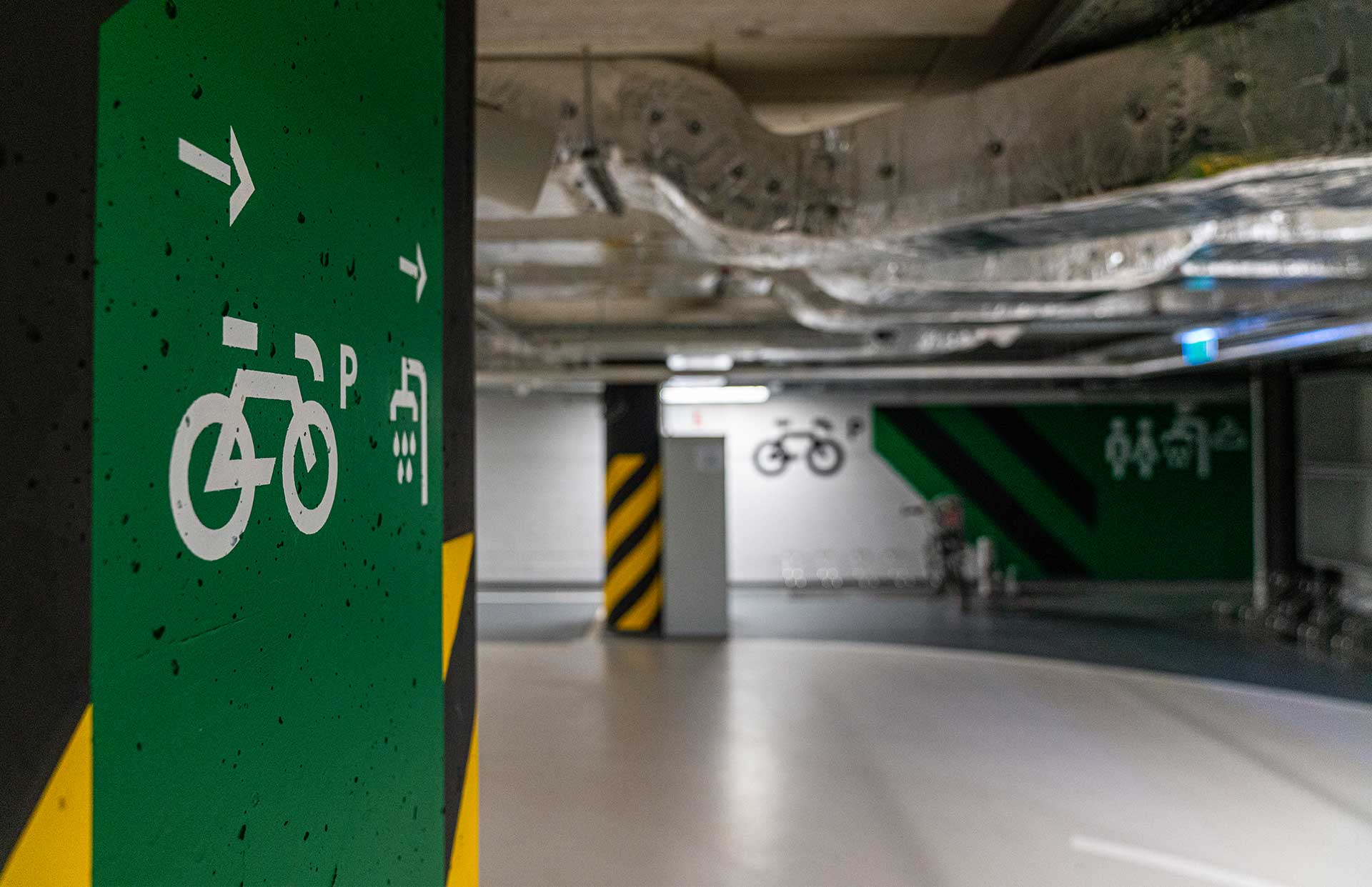
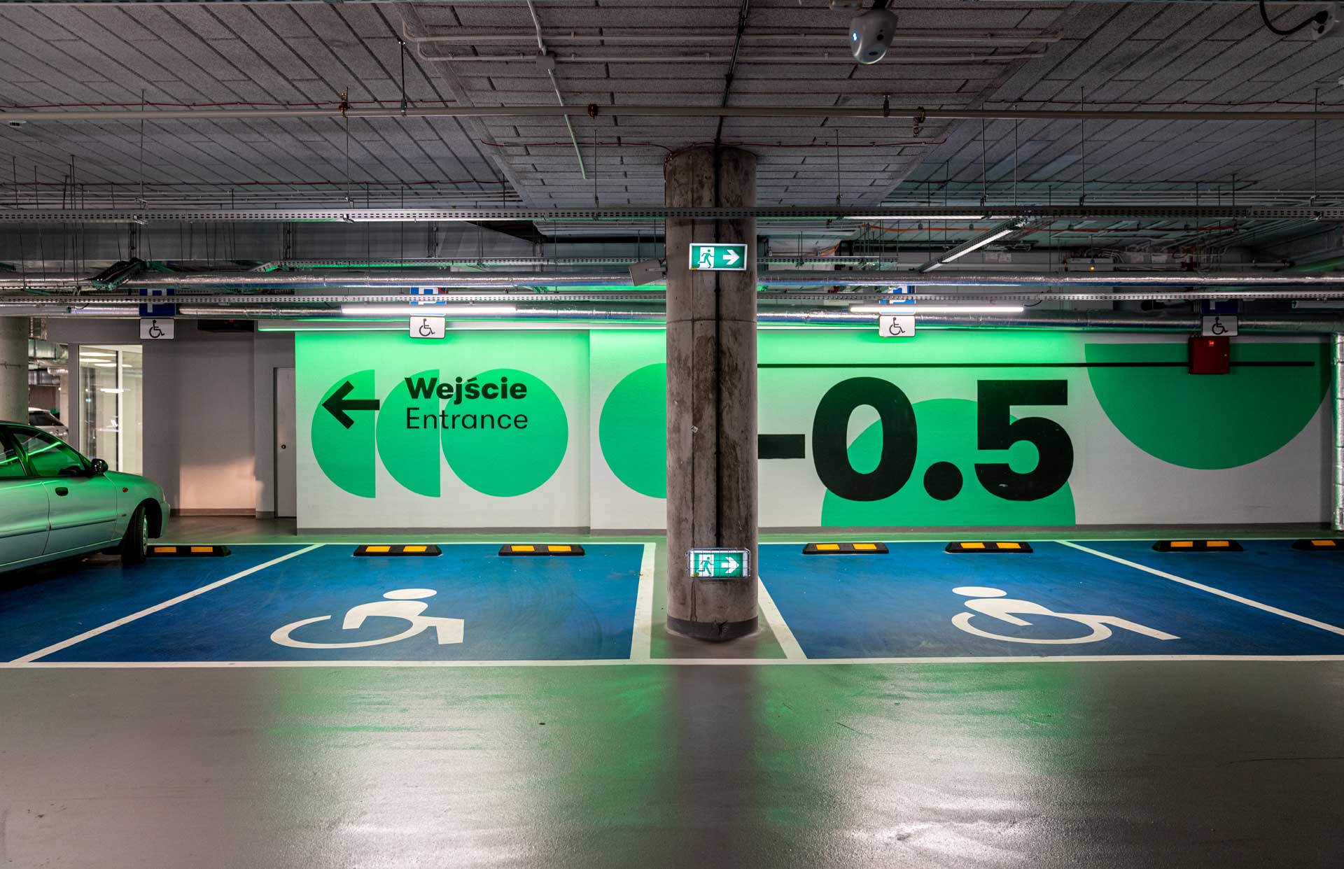
The wayfinding signage system at the Gdanski business center parking combines bold colors, bold typography, and bold graphics in the classic attention-seeking stripe patterns.
NOWY TARG OFFICE & SERVICE BUILDING
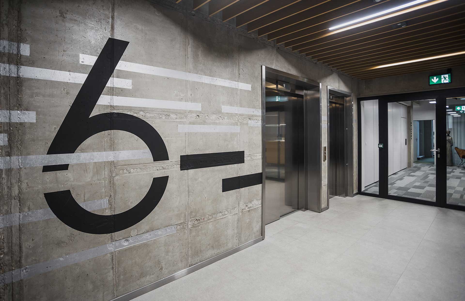
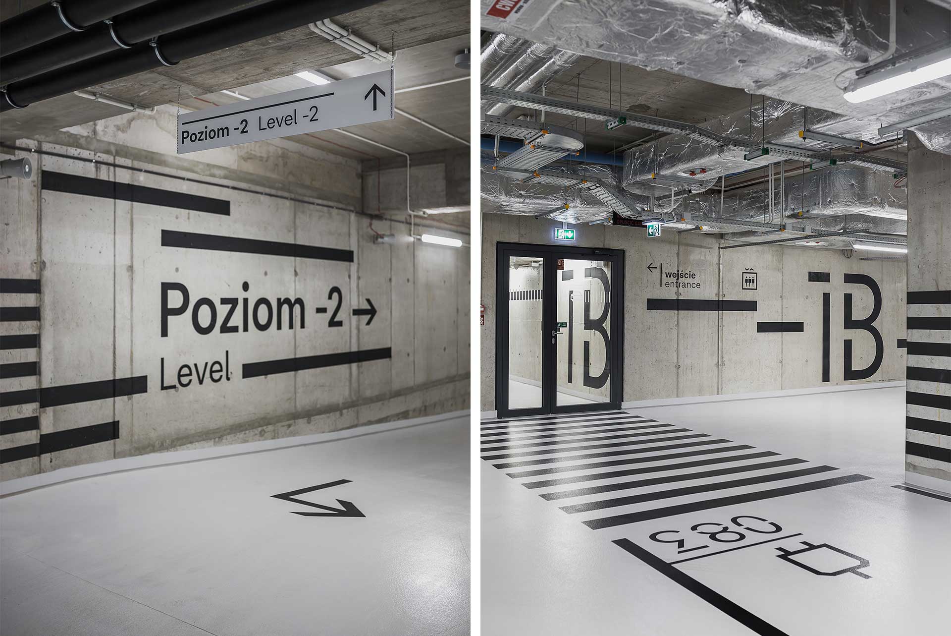
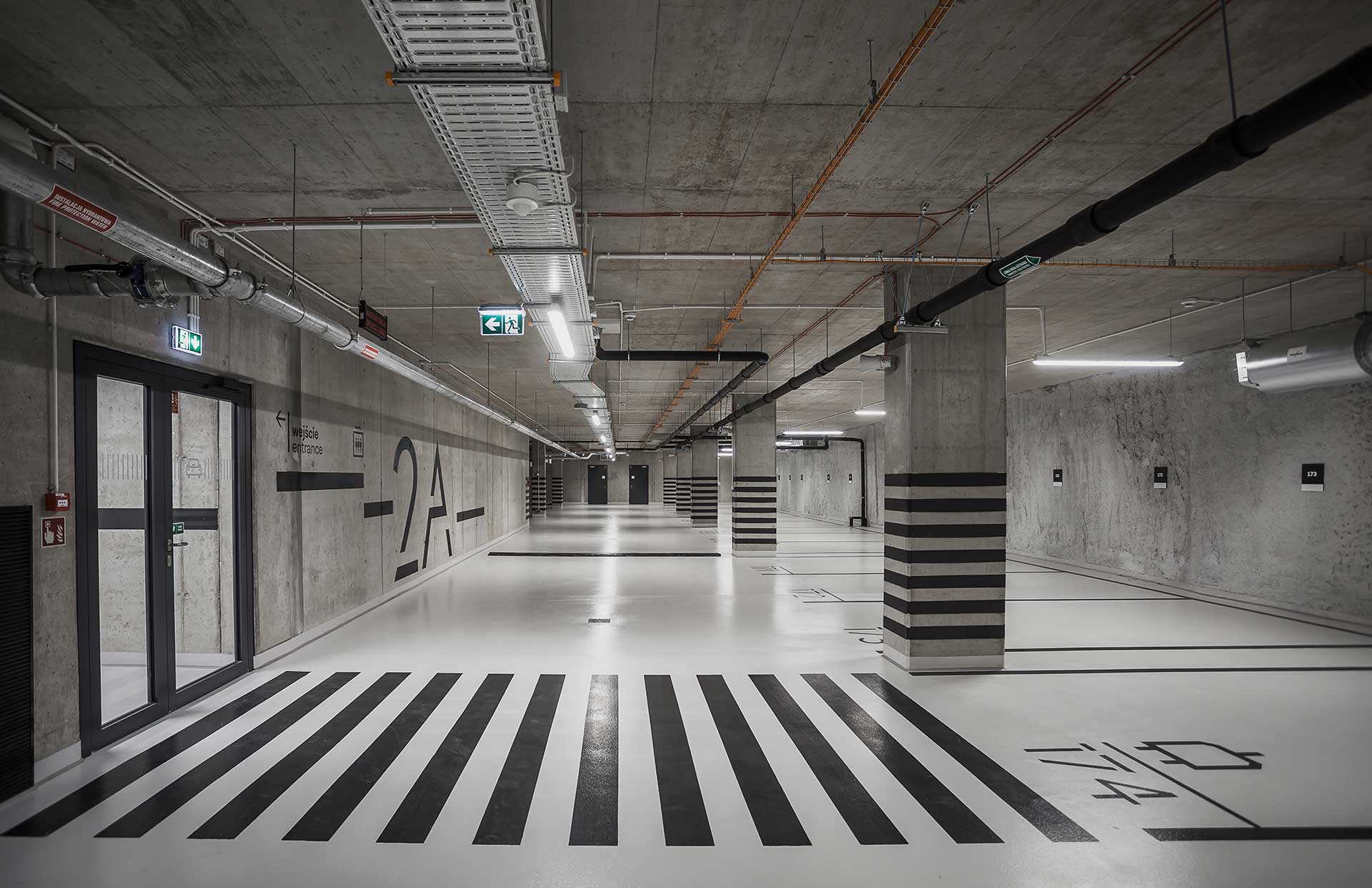
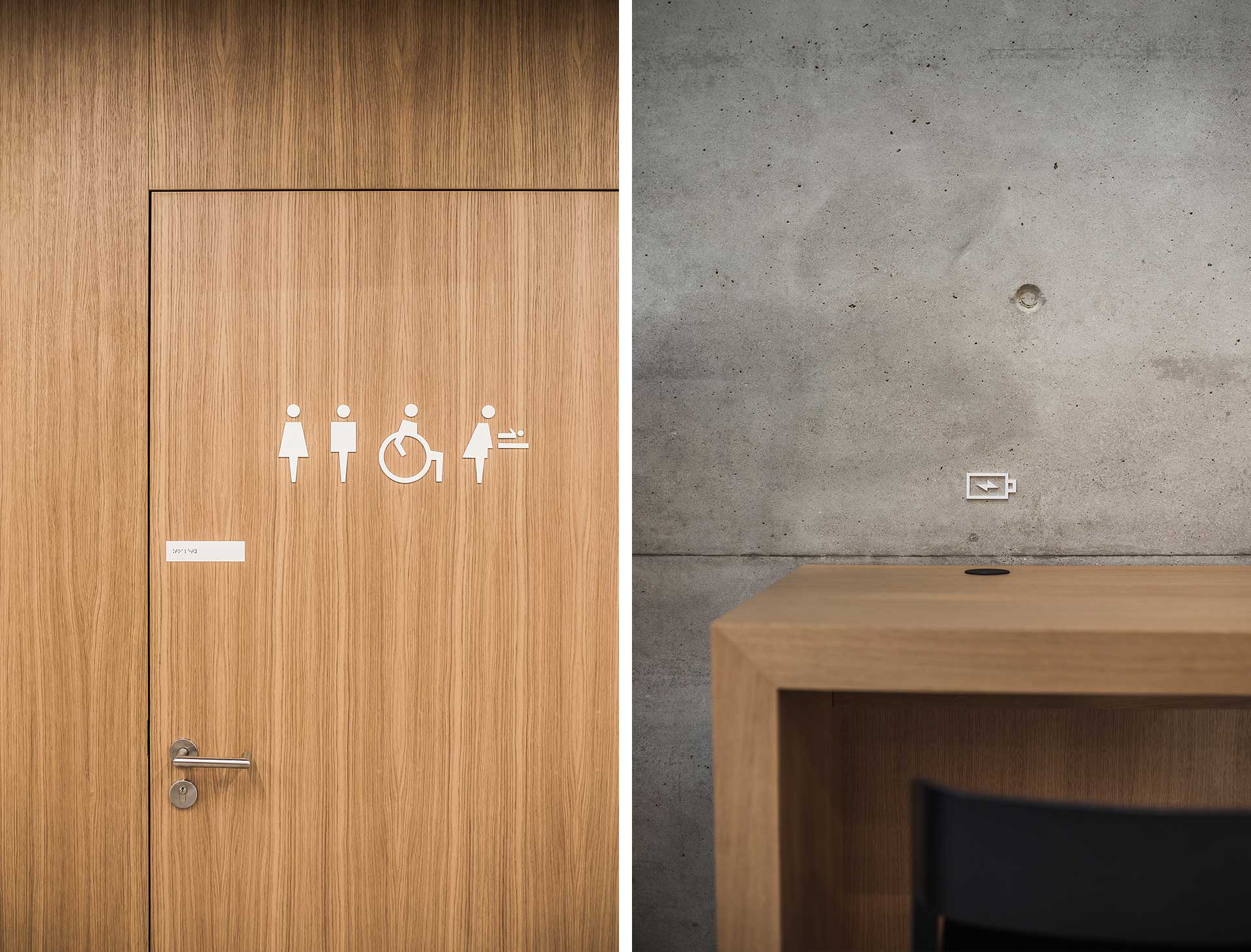
The signage and wayfinding system for Nowy Targ, an office and service building in Wrocław that is distinguished by a concrete facade made of grained concrete and a rhythmic facade – which inspired a reduced style with large elegant typography and strong graphics.
GALERIA MŁOCINY SHOPPING CENTER
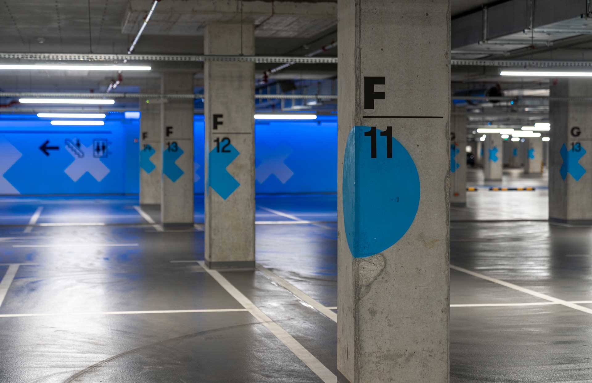
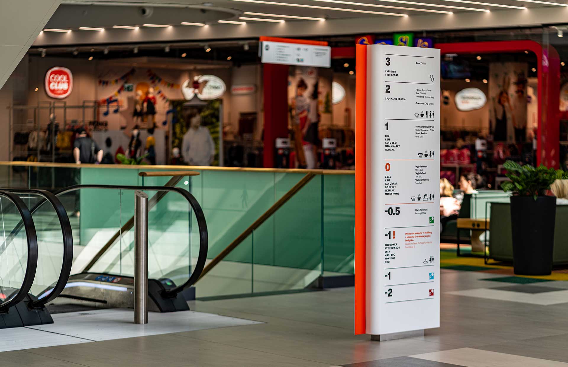
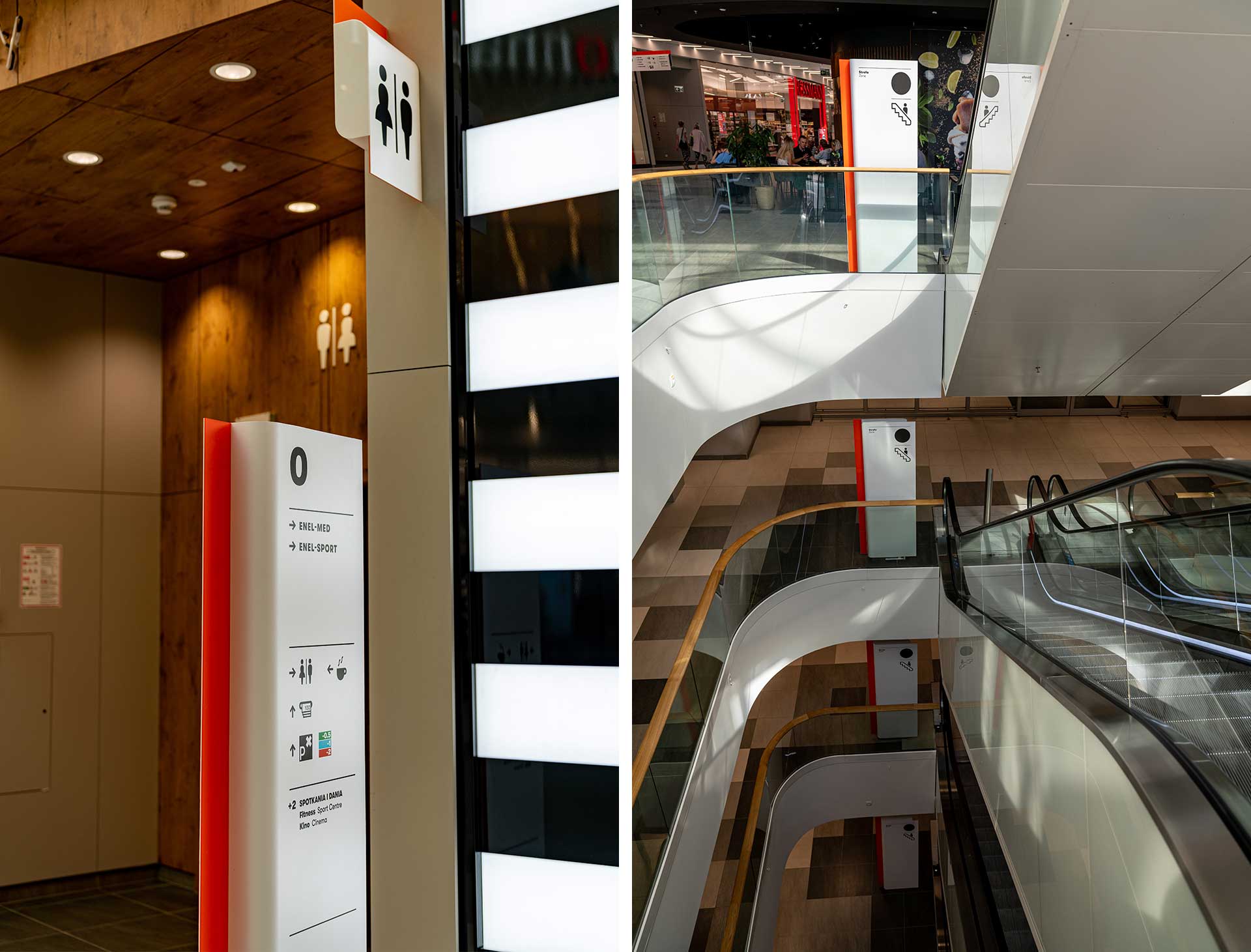
Signage system for Galeria Młociny, a seven-story shopping mall in Warsaw’s Bielany. The gigantic space required a cohesive and comprehensive marking system with intuitively readable solutions. Each level of the three-story garage was divided into zones with assigned colors and geometric shapes, while in the commercial part, signs were designed in a spatial form with the use of contrasting graphics and orange color.
CU OFFICE BUMA
GENERATION PARK OFFICE BUILDING COMPLEX
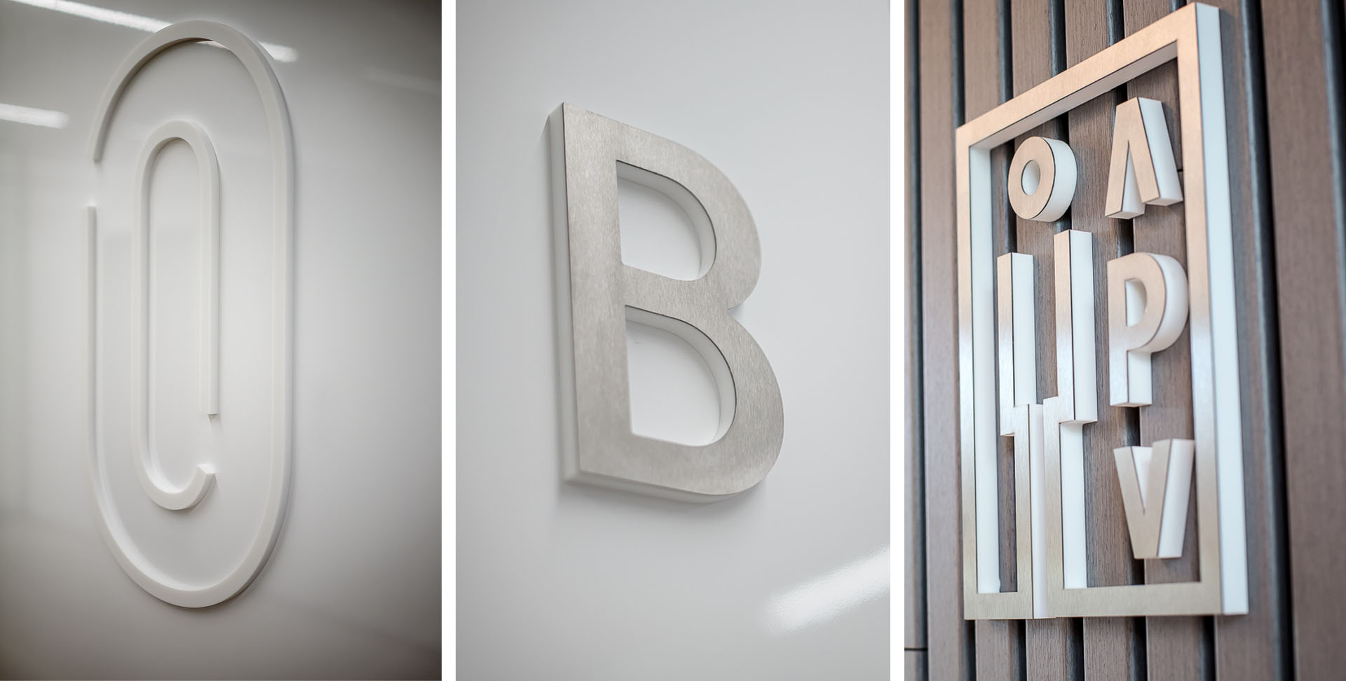
Generation Park aims to bridge between what was old and what Warsaw will be like in the future, so Kolektyf designed a visual information system that was inspired by the building’s unique architecture with beautiful results.
SILICON & SOFTWARE SYSTEMS
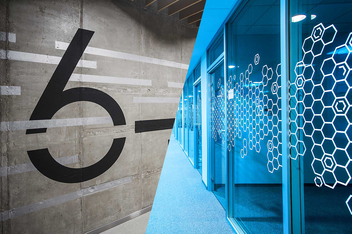
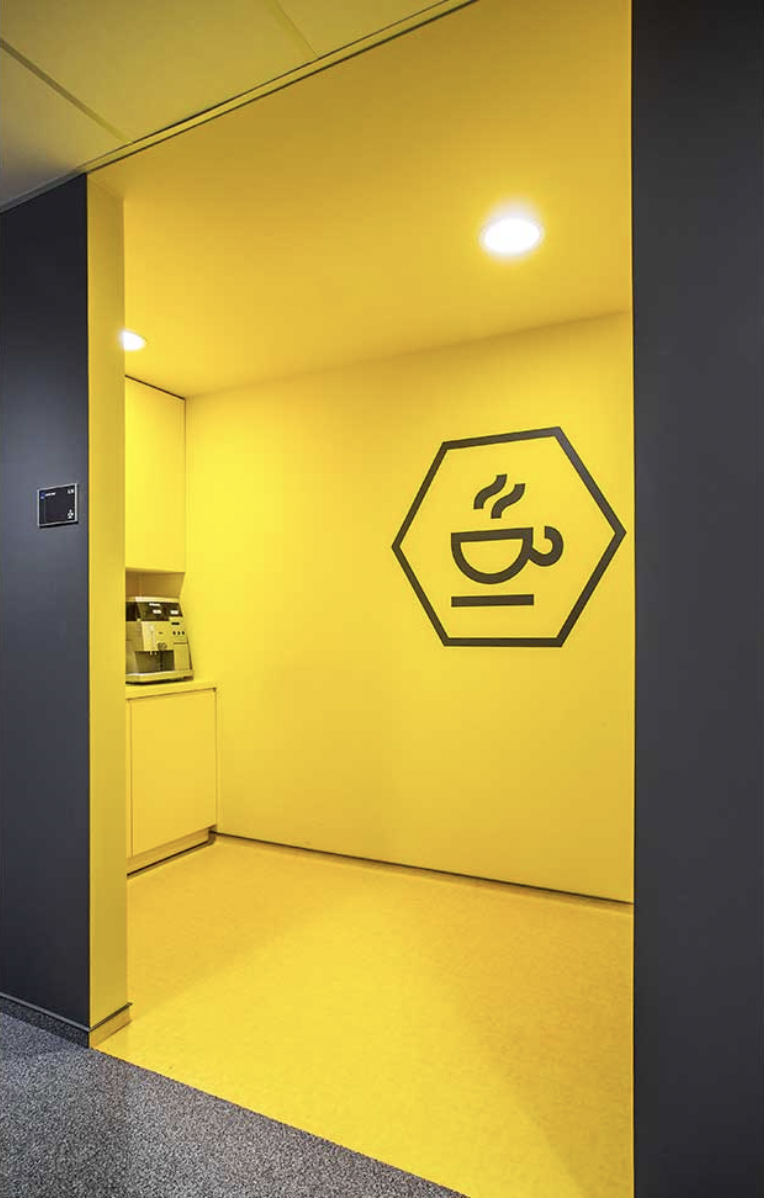
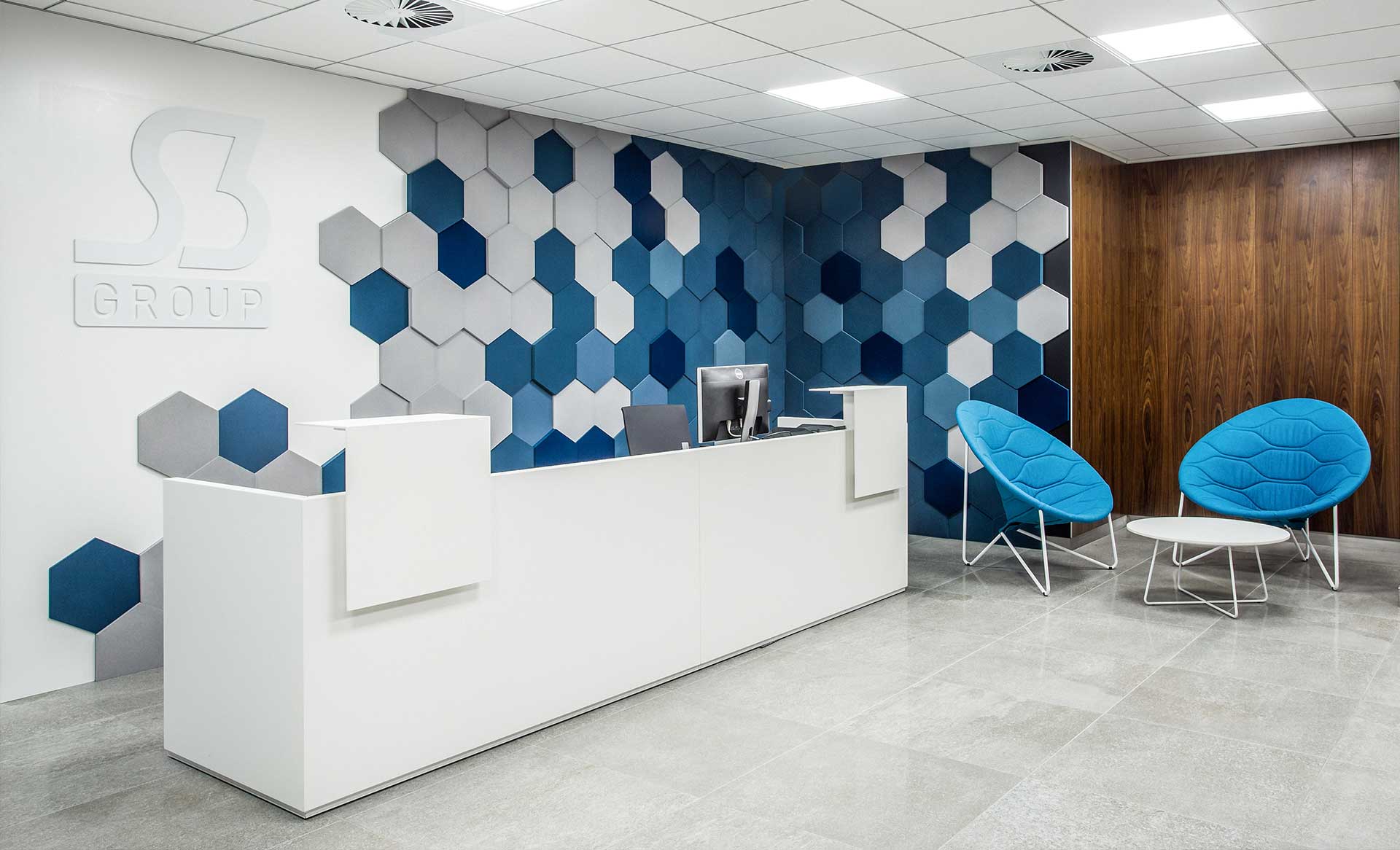
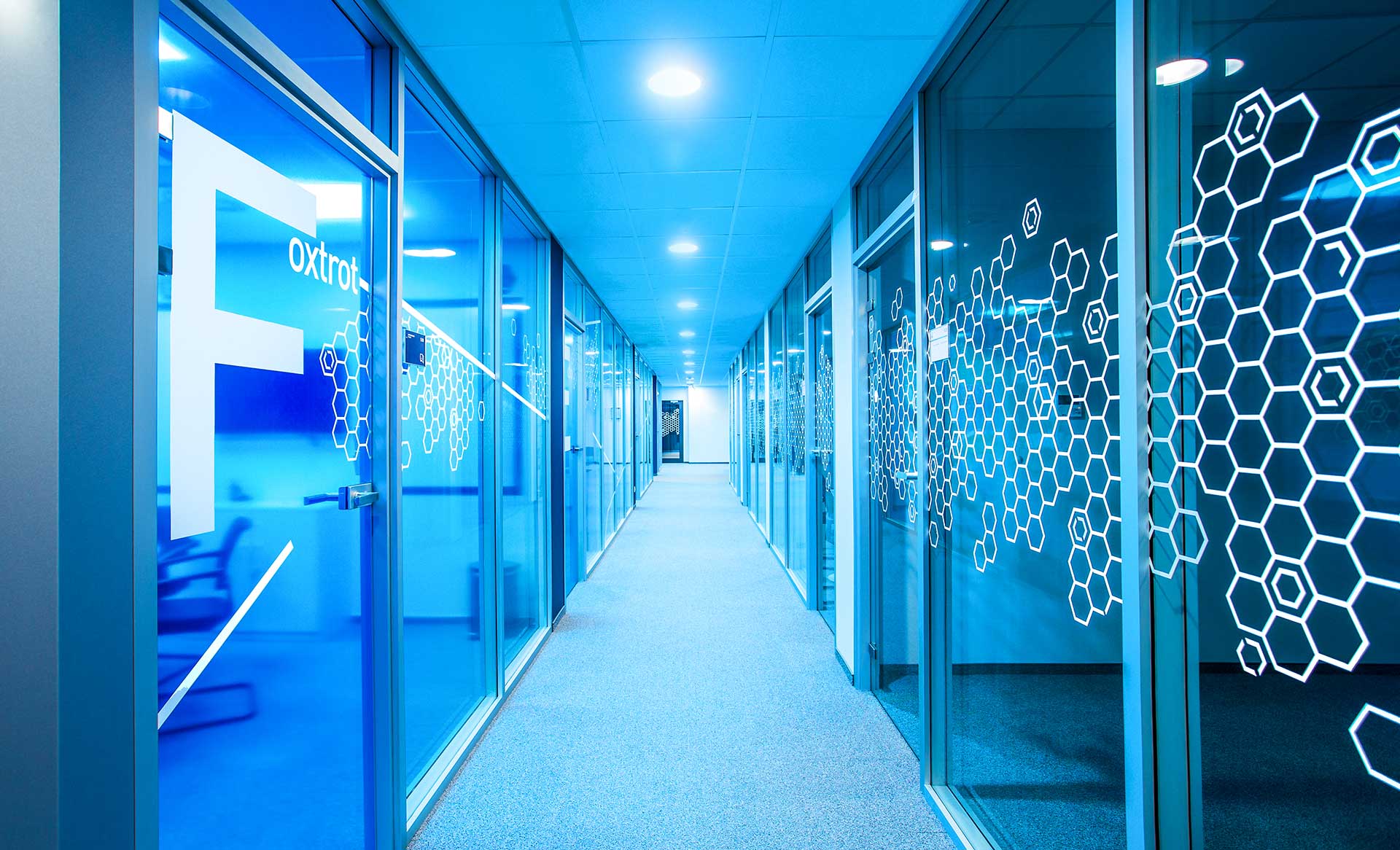
Interior, including signage and wayfinding system design for S3 Group’s Polish office. A series of wall graphics with a hexagon as the leitmotif is the star motif, which is multiplied to create a mesh pattern and combined with typography. Colored zones organize the space, while hidden four-leaf clovers can be discovered as a nod to the home country of S3, Ireland.

DOT OFFICE BUMA
