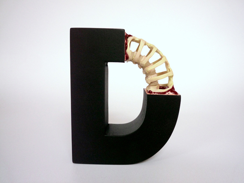
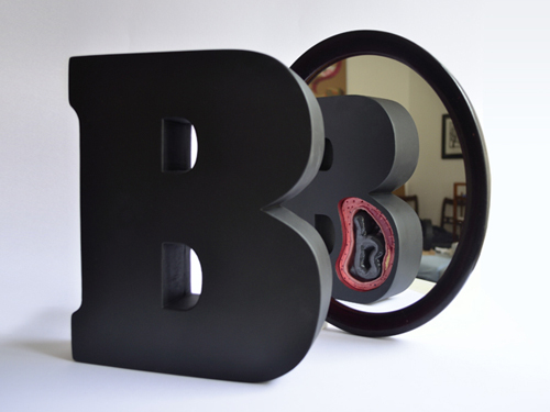
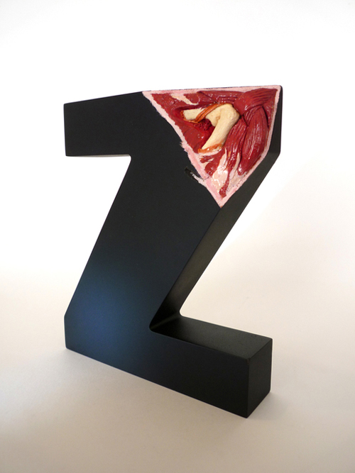
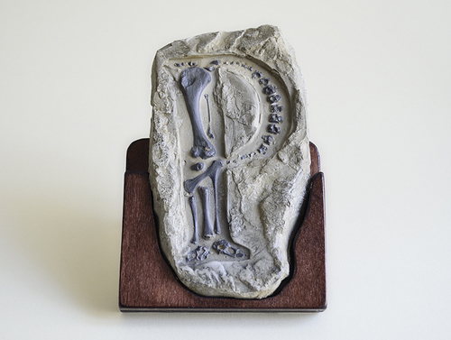
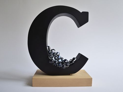
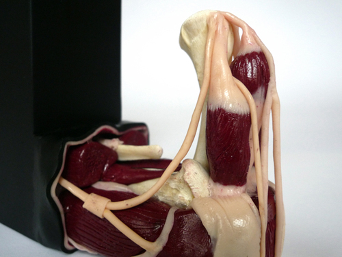
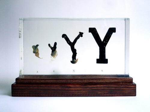
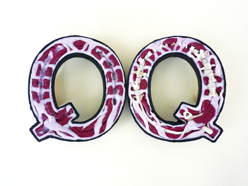
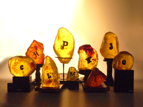
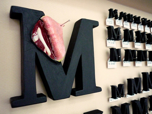
Austrian designer Andreas Scheiger believes that letters are full of life, and following this theory, he has cut into the anatomy of typography by dissecting and rearranging their basic elements, researching their development and origins. You can see his unbelievable handiwork in The Evolution of Type, a series of letter sculptures.
Andreas Scheiger is a Vienna based illustrator, graphic designer and artists. His works celebrate the craft of etching, engraving and letter design with a nod to both science and the graphic design of the Victorian era. Some for his work borderlines surreal, but is still deeply based on traditional craftsmanship. The ongoing project, The Evolution of Type is inspired by The Alphabet and Elements of Lettering (1918), a book by the pioneering and vastly prolific American type designer Frederic W. Goudy. Goydy believed that letters themselves were a record of man’s history and development, and that each possessed an essential and organic form. Inspired by his ideology, Schneiger has developed and designed a series of typographic sculptures, shown below.
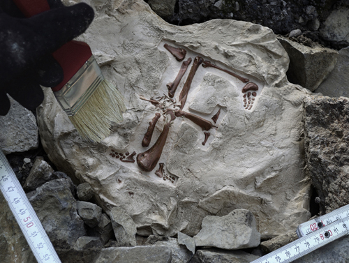
In The Evolution of Type, Schneiger put each of the letters of the alphabet under a microscope and studied its structure and original development. The almost autopsy like pieces show a never seen before aspect of typography, making you see something so ordinary, in a new light. In the case of some letters, he went even further than showing the structure, actualizing the development of the form and anatomy in its earlier stages. Watching these photographs you can not help but be mesmerized by Schneiger’s imagination and skill set to produce a series as impacting as The Evolution of Type. See for yourself! What do you think?
photo via glandis.com
