The Hungarian Guggenheim is a fictional design project, conceptualized by two students from the Hungarian University of Fine Arts,
Lakosi Krisztián and
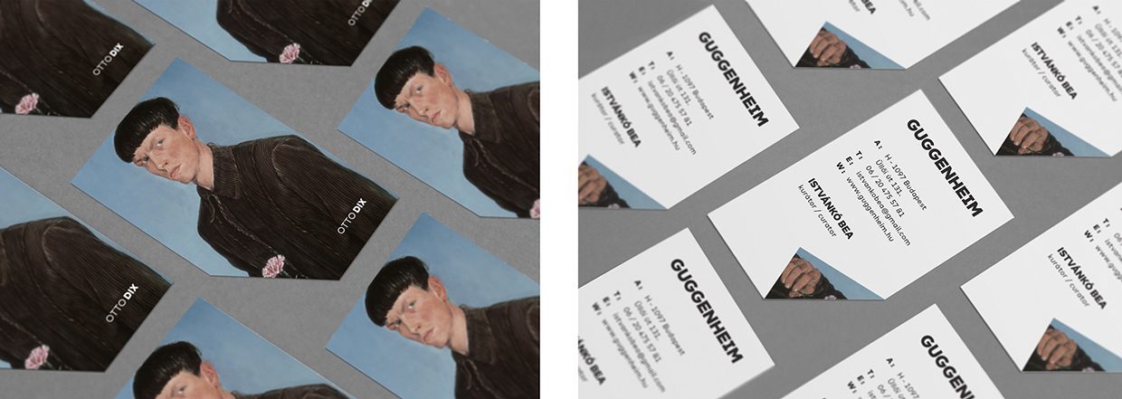
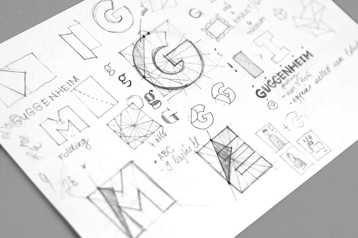
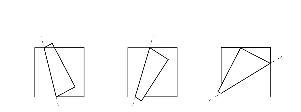
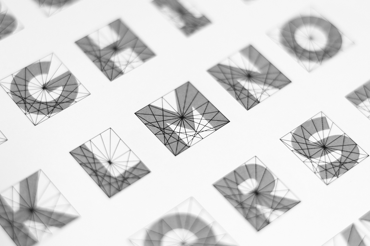
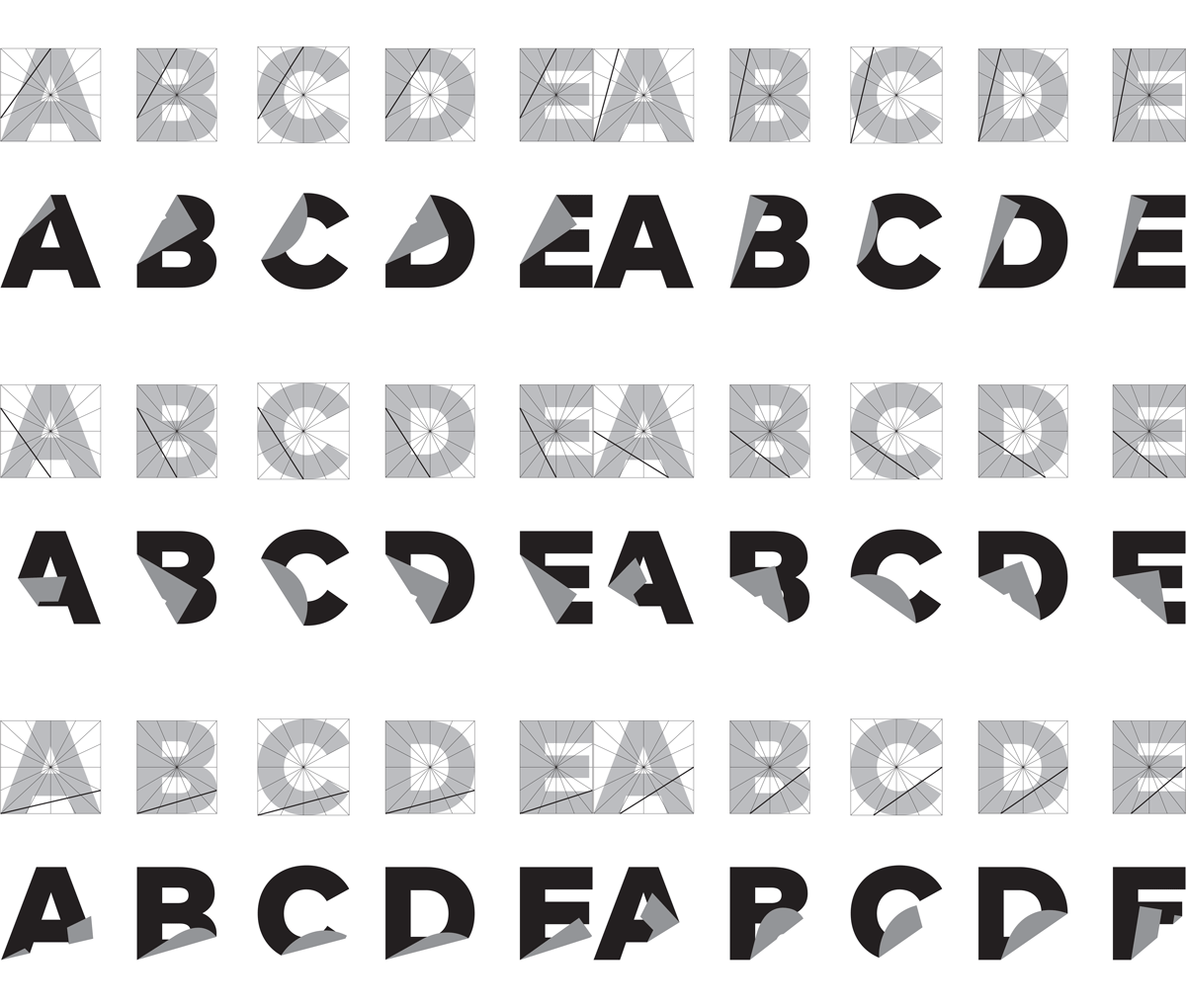
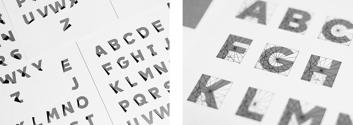
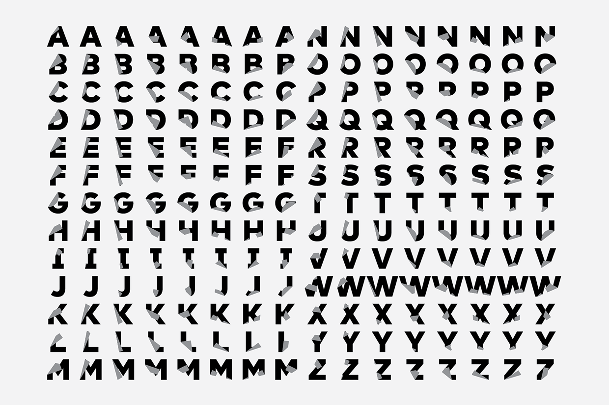
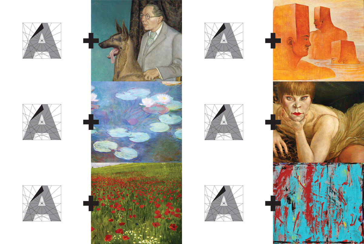
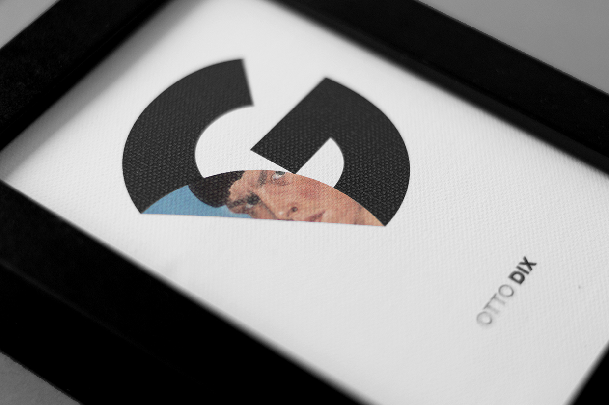
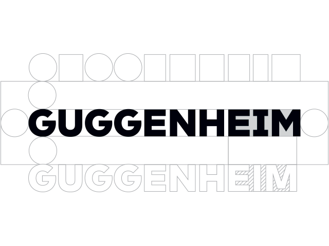
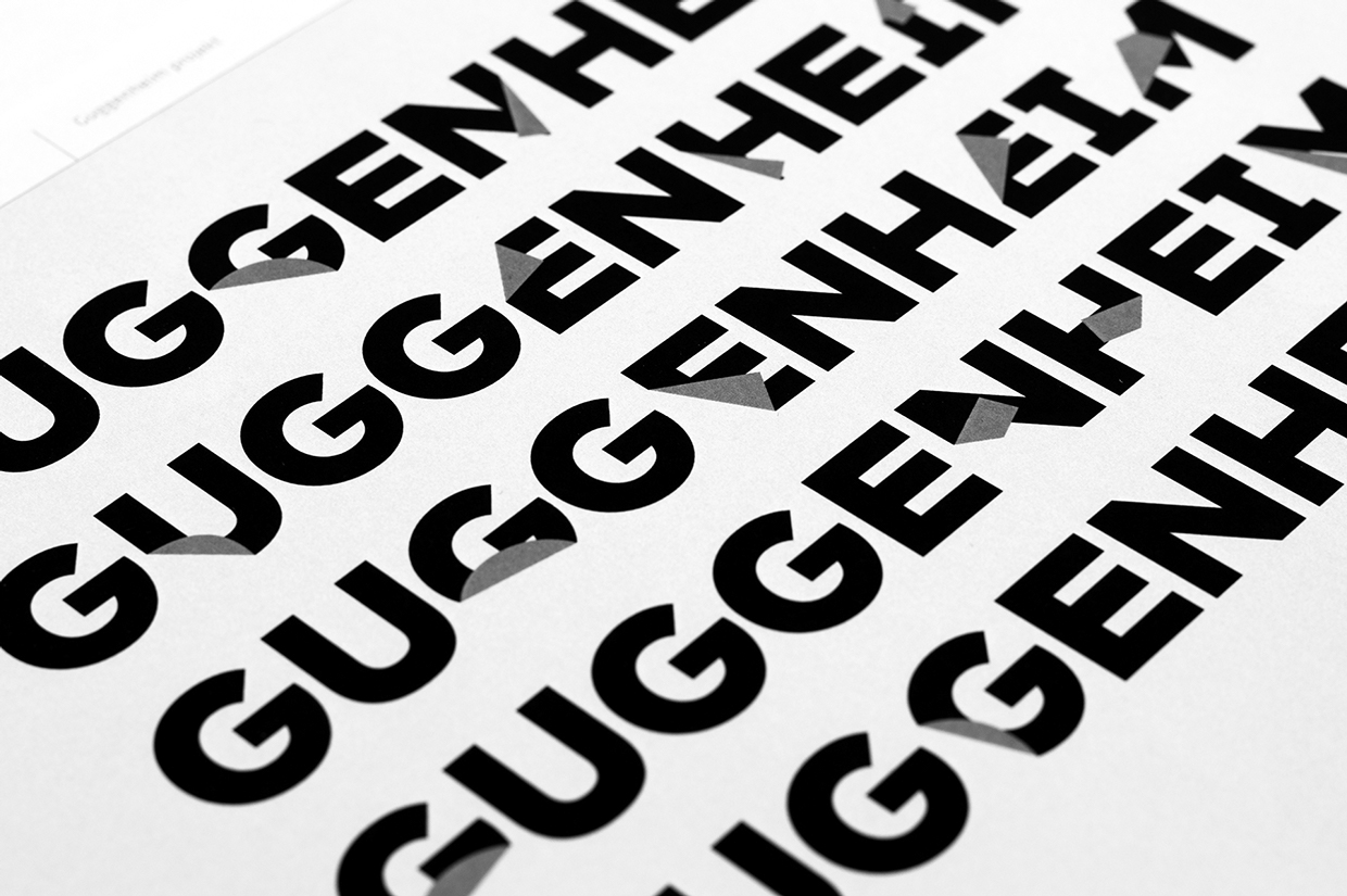
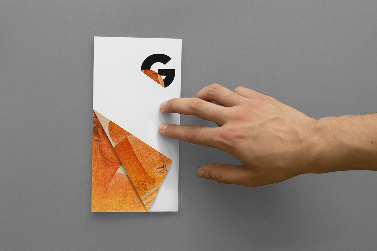
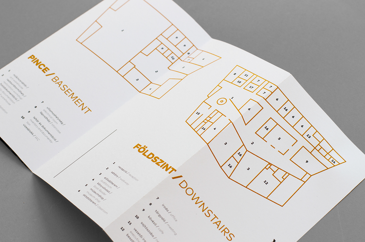
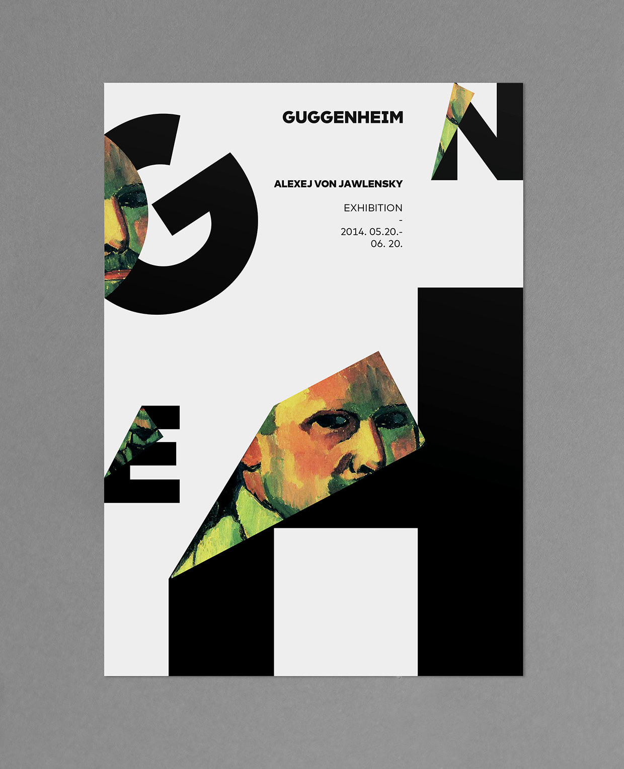
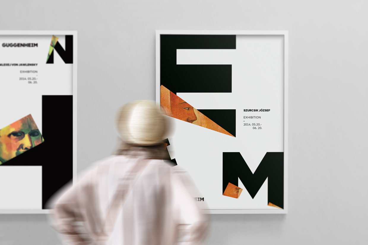
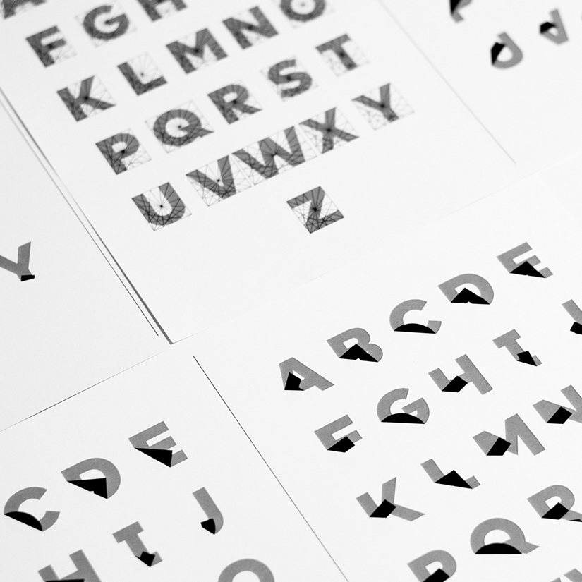
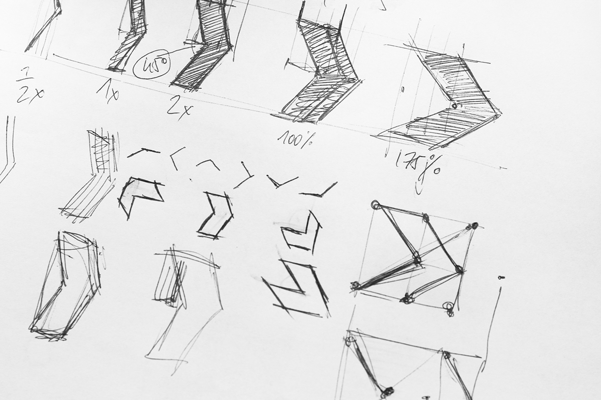
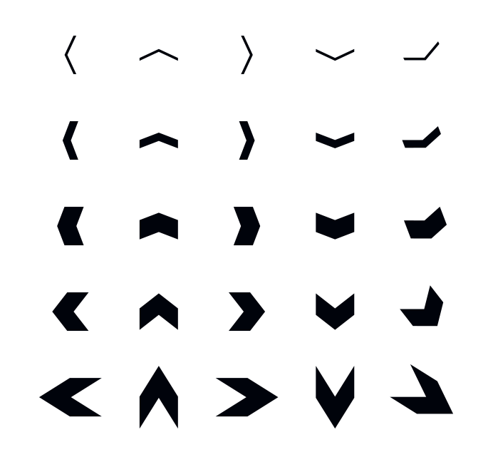
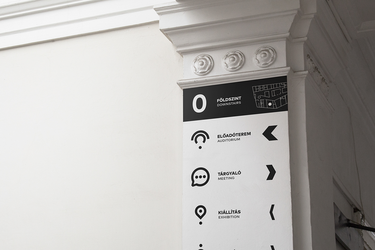
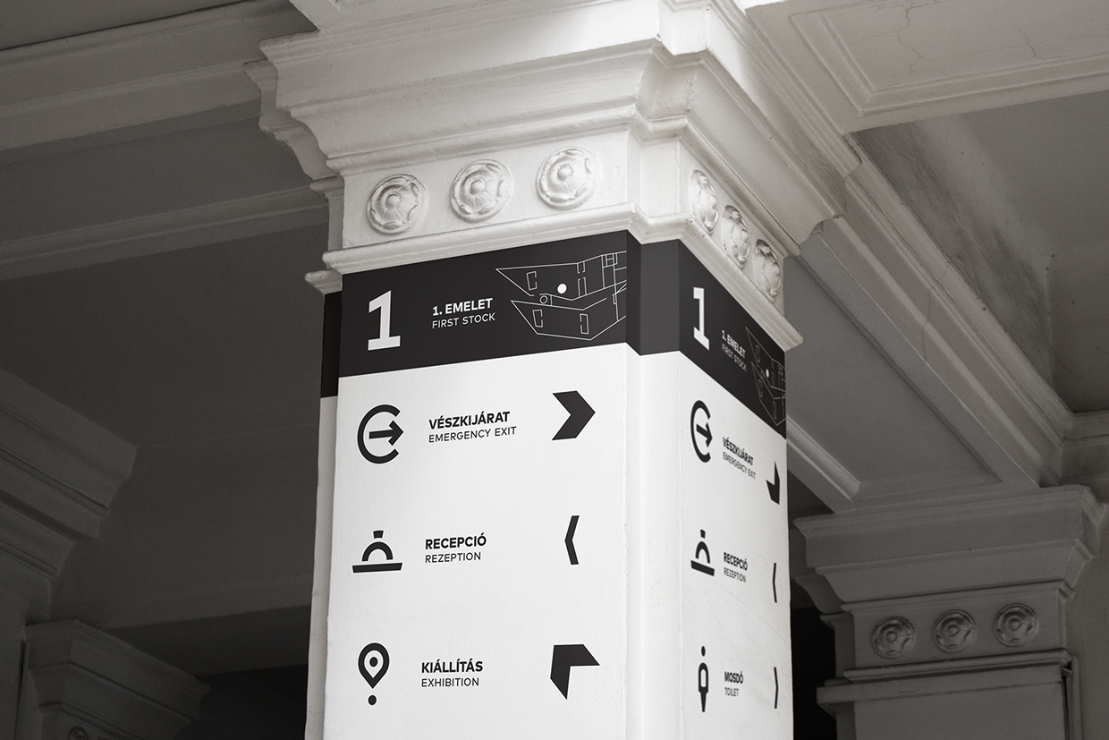
Lakosi Richárd. The main question in this project was: How would the Hungarian Guggenheim version look like? The designers answered with a very appealing and interesting flexible corporate identity system, focusing on folding inspired typography.
The project consisted of three stages. First art theory students acting as the next generation of museum professionals, filled out a questionnaire and outlined the parameters of the ideal institution. Then a selected group of Hungarian theorists were asked to synthesize the results of these questionnaires and develop a more specific picture of the ideal institution.

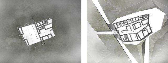
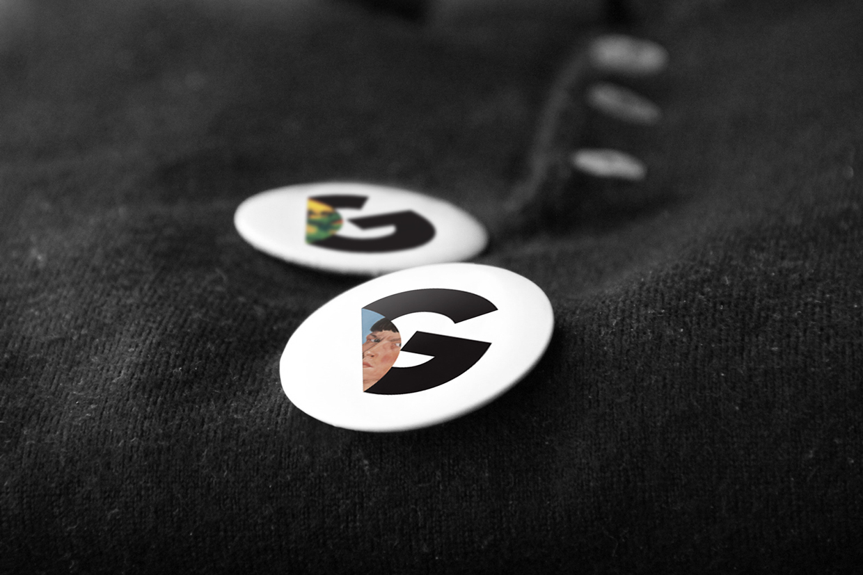
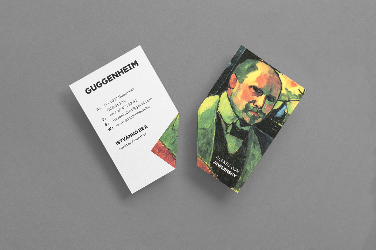
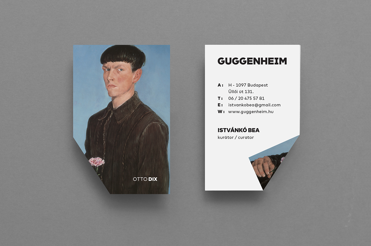
In the third step, the students of three different universities examined the effects of the fictitious institution from four basic angles: institutional system, architecture, communications, and economic impacts. The results were an array of unique works of art, visual plans, architectural models and infographics, which visualize a fictitious institution. The flexible visual identity Lakosi Krisztián and Lakosi Richárd designed is an outstanding example of minimal, consistent and well-rounded branding for a world-renown museum concept. By highlighting the adaptability of the identity and creating a twist to a classical approach was smart.
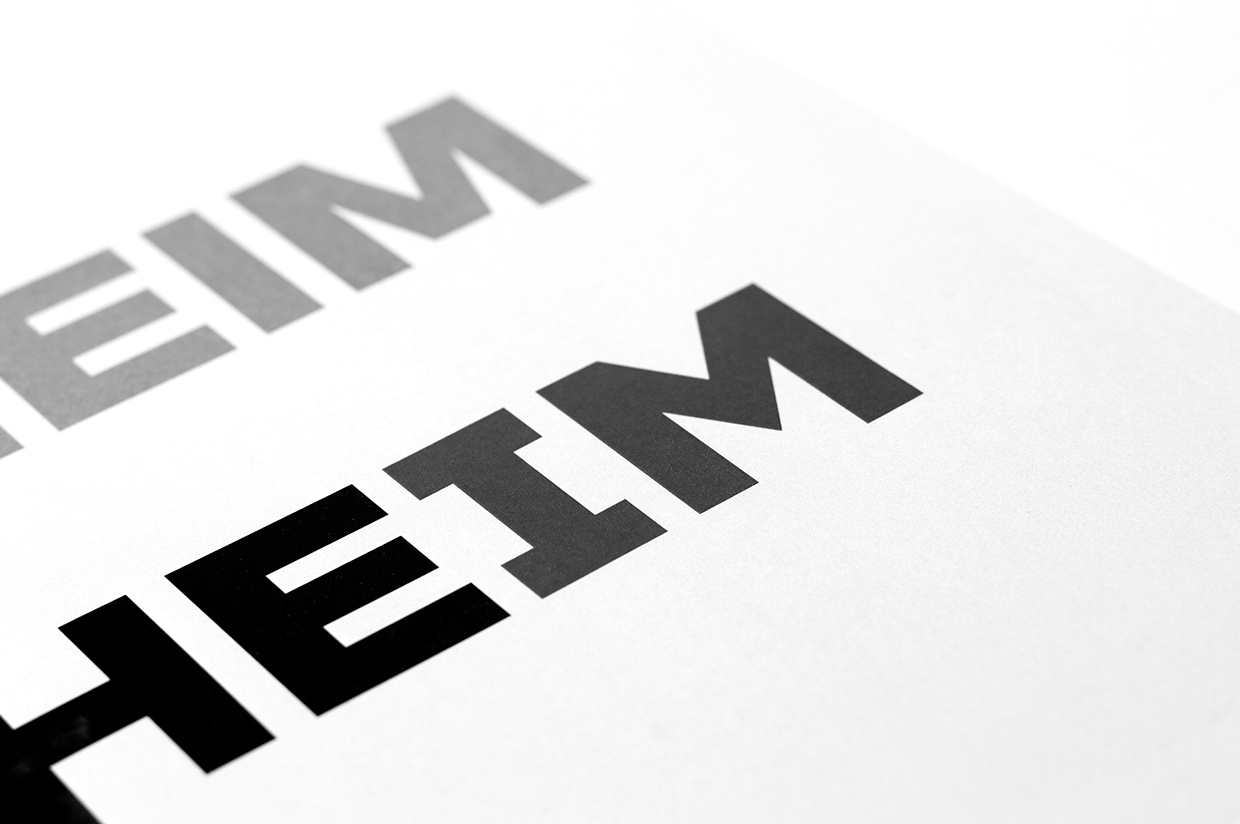
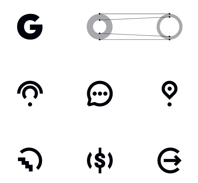
This well-rounded project showcases how typography can be used in a very tangible way. It not only delivers the needed information but works as the main, central graphical elements.








 Images ©