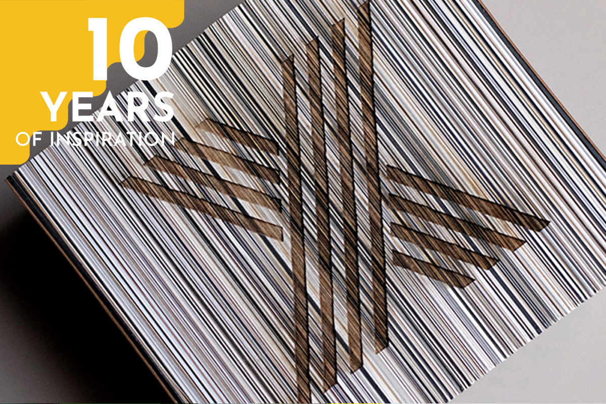
Beyond anything else, what we most cherish about Design & Paper and what we have built here in the past decade, is the loving community of paper lovers and an incredibly talented and creative network of designers, printers, artists, and paper professionals. So our 10 Years Of Inspiration-celebration is as much for us as it is for them, as without the people around us creating these wonderful works for us to admire and write about, there simply wouldn’t be Design & Paper. One special member of our community is The Letterist, a design studio specializing in bespoke stationery founded by Anja Savic, whose amazing work we’ve featured here before, and who we’ve now asked to join us in celebration of our ten-year anniversary with a special project featuring our very own papers from the Design Papers Collection.
Below, you can read in Savic’s own words about Project X, the beautiful and thoughtful work The Letterist has created for Design&Paper’s 10-Year Anniversary.
The Letterist for Design & Paper’s 10-year anniversary: Project X
The famous German designer Dieter Rams once wrote, “Having small touches of colour makes it more colourful than having the whole thing in colour,” which is a quote that is always on my mind when I’m selecting papers for our projects – be they for our own letterpress calendars, minimal and modern wedding invitations, or sophisticated personal and business stationery.
The Europapier Design Papers catalogs can at times be overwhelming in their vastness – so many tones and textures, oh so many weights – but I have over the last four years of working with them in a way curated our own Letterist edit: whites and nudes, greys and taupes, sandy beiges and browns, and a whole load of blacks. This may sound like only four or five shades, but it is in fact still close to 50 different swatches, the combinations of which we can and will continue to explore without end.
When we were invited by Design&Paper to create a work in commemoration of their ten-year anniversary, I wanted to honor and showcase the richness of their catalog – highlighting how that richness is not one bit lost even when you get rid of all the “obvious” colors – the yellows, oranges, reds, purples, greens, blues…
When we were invited by Design&Paper to create a work in commemoration of their ten-year anniversary, I wanted to honor and showcase the richness of their catalog – highlighting how that richness is not one bit lost even when you get rid of all the “obvious” colors – the yellows, oranges, reds, purples, greens, blues…
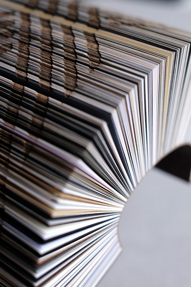
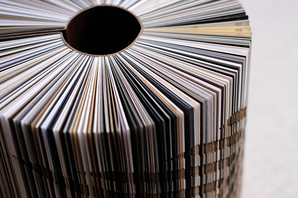
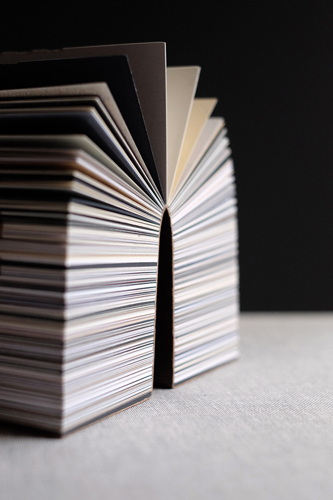
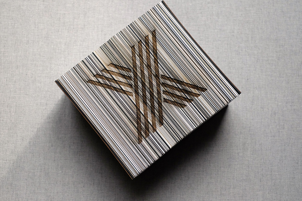
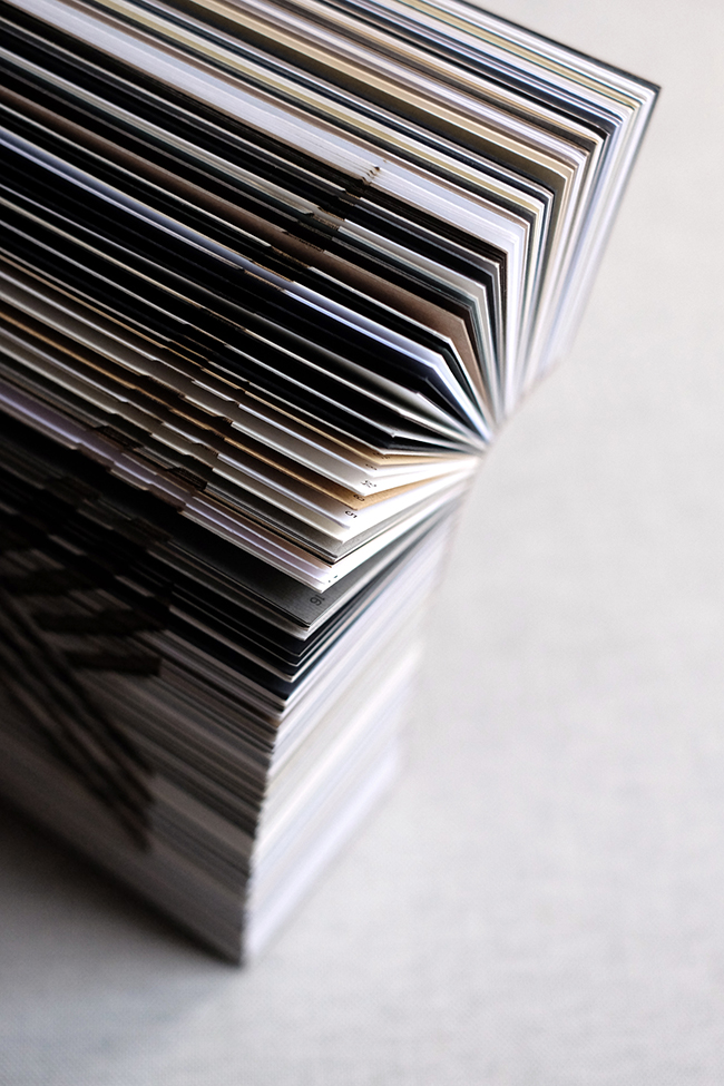
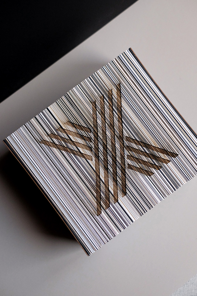
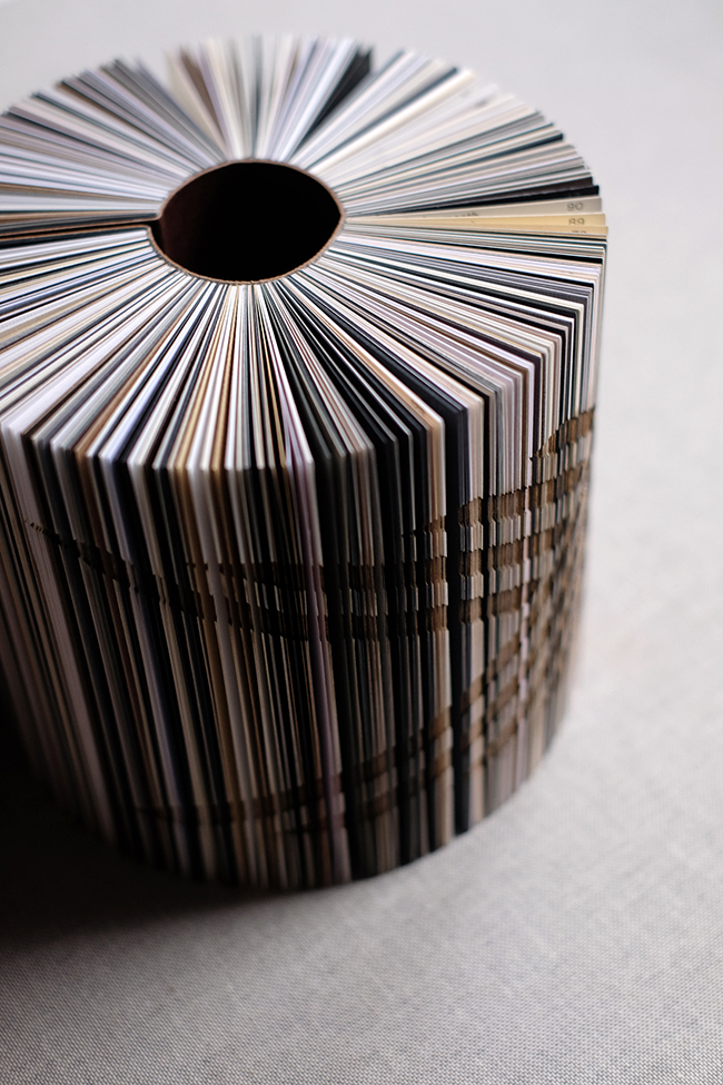
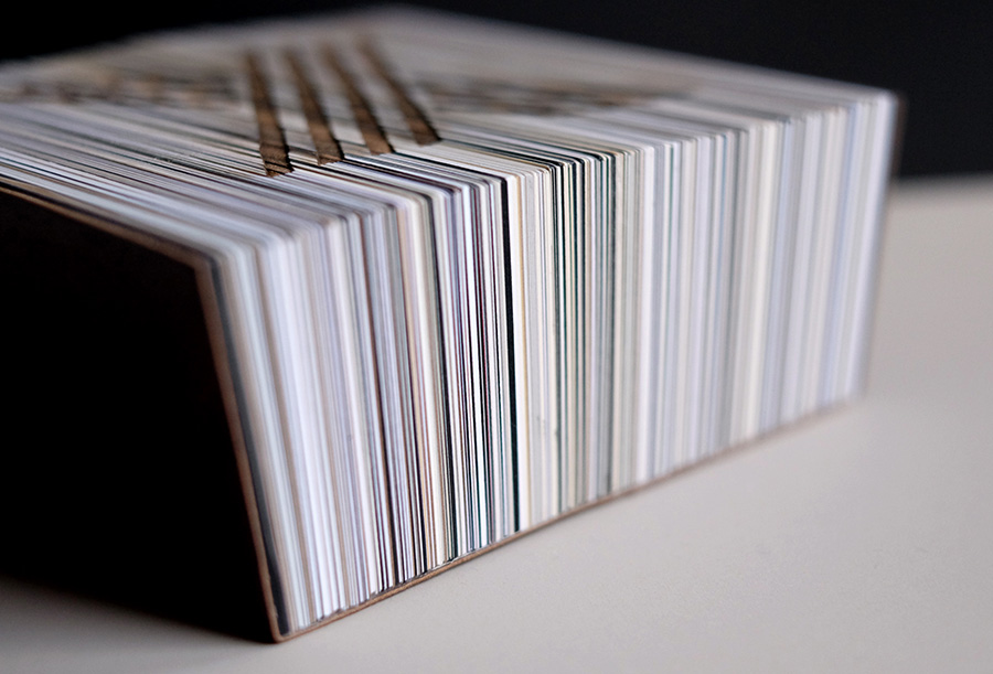
We spent a good few weeks brainstorming what form this would take – I knew I wanted it to have a massiveness to it, to be an imposing and impressive compendium of neutrals…and when I realized we had a stack of old catalogs lying around, we decided to take ten of them apart and put them back together with only the neutrals selected.
Unsure of what the final product would actually be, we began calling it “Project X.” When we one day realized that “X” is also the roman numeral for 10 – we decided to laser cut an X out of the block – to mark the ten years in a permanent and momentous way. The “happy accident” in all this was that the laser cutter slightly burned some of the edges, adding yet another tone of sepia that perfectly complemented all the other tones in the edited selection. Ten years, ten catalogs, hundreds and thousands of subtle, sophisticated, and unexpected combinations yet to explore.
Congratulations to Europapier and Design&Paper on this significant milestone, and we are forever grateful for this elaborate and unique collection of papers that continues to inspire and enable us to create and live up to our own The Letterist tagline – Love on Paper.
Images © Anja Savic / Founder & Creative Director of The Letterist, Dec 2022

