Ever wonder why certain brands catch your eye while others blend into the background? Or why you feel inexplicably hungry when you see a particular shade of red and yellow at your favorite fast food joint? Well, that’s not a coincidence — it’s color magic! Okay, I must admit, maybe not magic, but it’s close enough. Designers know how to wield the power of color like a wizard with a palette, using color theory to create visuals that make us see things, feel things, and sometimes, even do things. So, what is this sorcery known as color theory and how exactly do designers use it? Let’s look at how psychology meets creativity in color theory.
Color Theory is like a designer’s secret spellbook.
At the heart of a designer’s color wizardry lies the color wheel. Most of us where in elementary school when we were first taught about, and most probably, you’ve even painted one yourself. It’s a circular rainbow of possibilities. But don’t let its simplicity fool you. This wheel holds the power to create the perfect mood, vibe, and emotional connection.
It’s like the “Hogward’s” of colors. Each house plays a role, but when they combine forces, amazing things happen.
The color wheel is divided into three main sections. Primary colors: the holy trinity of red, blue, and yellow, secondary colors: green, orange, and purple, and tertiary colors: hybrids like red-orange and blue-green. It’s like the “Hogward’s” of colors. Each house plays a role, but when they combine forces, amazing things happen.
But designers don’t just stop at the wheel. They take it up a notch with color harmony. This might sound peaceful, but it’s a tactical strategy to make your eyes happy. For instance, a monochromatic scheme is all about taking one color and utilizing it in different shades and tints. It’s soothing and sophisticated. Then there’s the analogous scheme, where colors that are neighbors on the wheel are joined to create a unified look. Picture a sunset of reds, oranges, and yellows working together in perfect harmony.
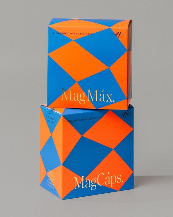
If designers want to spice things up, they use complementary colors like red and green or blue and orange — which are direct opposites of the wheel. These combos create a contrast that’s impossible to ignore, which is great if you want something to stand out.
If designers want to spice things up, they use complementary colors like red and green or blue and orange — which are direct opposites of the wheel. These combos create a contrast that’s impossible to ignore, which is great if you want something to stand out. And then there’s of course the triadic scheme, where three colors spaced equally around the wheel can be combined to create a balanced yet energetic palette.
Designers also take into account the psychology of color because colors aren’t just pretty – they come with serious emotional baggage. Red? That’s passion, excitement, and sometimes danger. Blue? Think calmness, trust, and the soothing voice of your meditation app. Yellow screams happiness and optimism, while green brings nature and health vibes. Black is all about sophistication and mystery. Designers know these emotional triggers like the back of their hands and use them to subtly influence how you feel about a brand or product.
Designers don’t just see color — they feel it, dissect it, and use it to tell stories without saying a word. Whether it’s in branding or packaging design, color is the silent but powerful tool that shapes how we perceive and connect with the world around us.
First and foremost, color helps brands be memorable. Everyone knows Coca-Cola’s iconic red or McDonald’s golden arches. These colors have become such synonymous with the brands that even if you saw them from the corner of your eye, you’d probably know what they are. It’s like recognizing a familiar laugh in a crowded room. Studies have found that color boosts brand recognition by an incredible 80%! Designers try to choose colors that’ll stick in your mind like a catchy song.
Then, there’s the fine art of differentiation. No brand wants to look exactly like its competitor. If every coffee brand or wine bottle looks the same, how would you know which to choose? The trick is to stand out among the competitors. Sometimes, this means going against the grain, like choosing warm, friendly tones in a sea of tech-company blues or going bold in an industry full of pastels.
If every coffee brand or wine bottle looks the same, how would you know which to choose? The trick is to stand out among the competitors. Sometimes, this means going against the grain, like choosing warm, friendly tones in a sea of tech-company blues or going bold in an industry full of pastels.
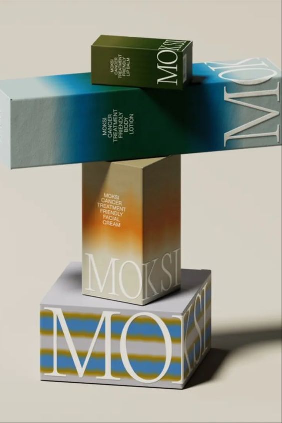
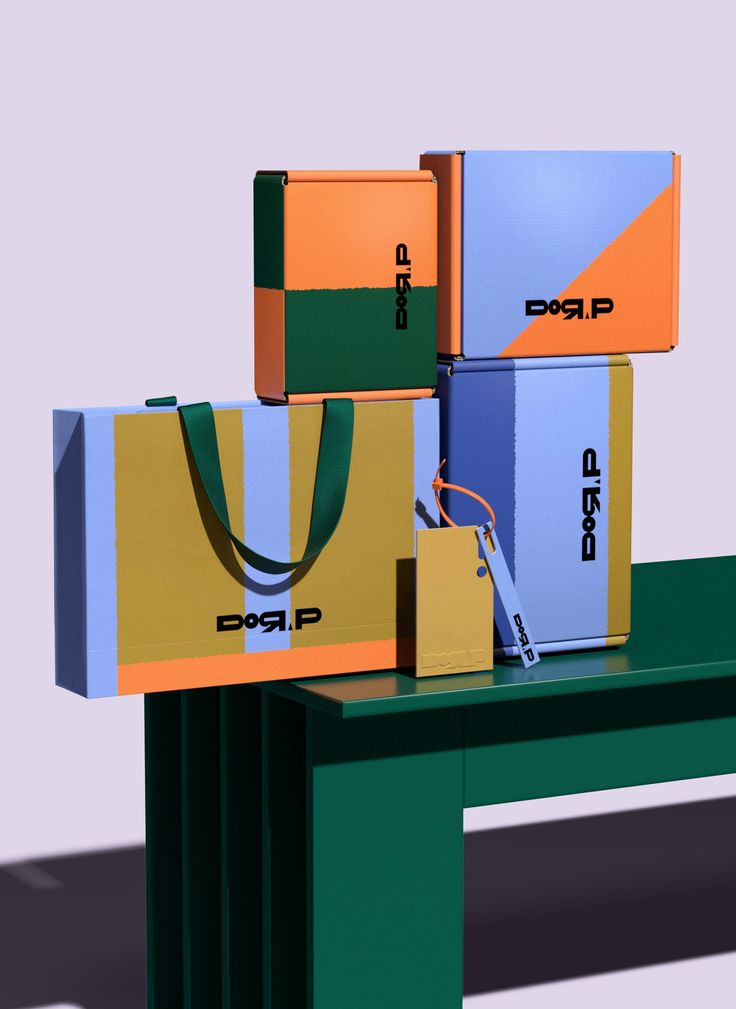
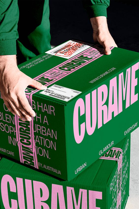
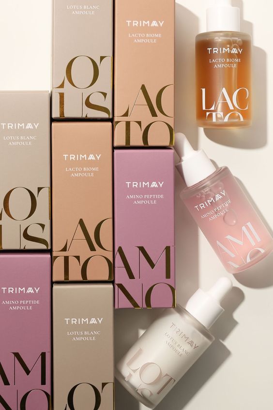
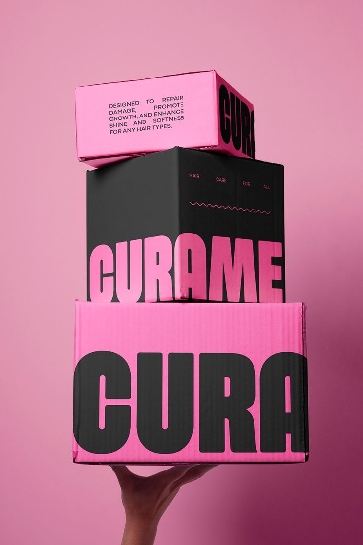
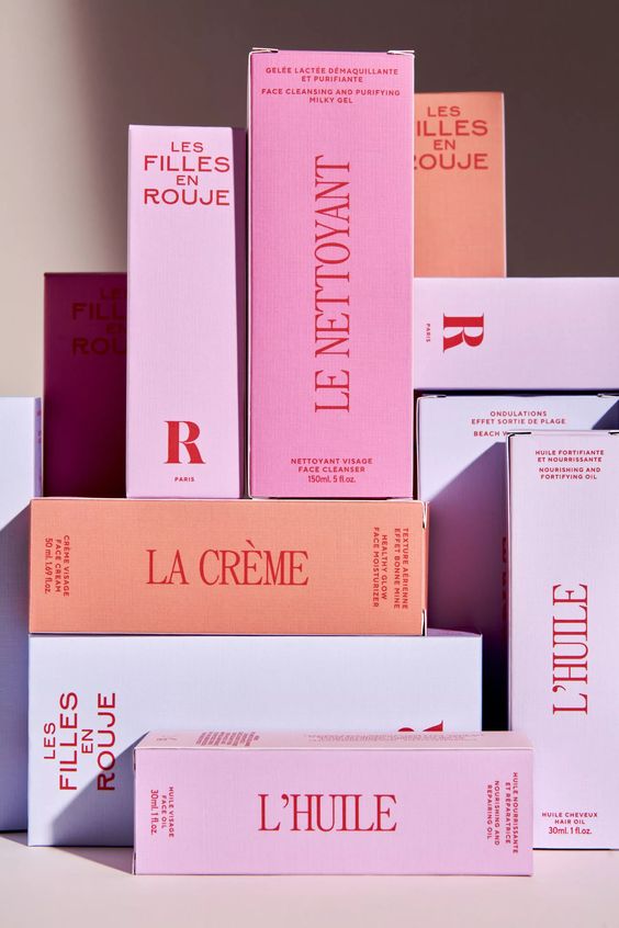
And, of course, color is the go-to tool for conveying brand personality. If your brand is fun and carefree, then maybe a bright orange or playful pink is in order. Or is it more of a classy, elegant type? You’ll be reaching for deep purples, black, or gold. A brand’s colors speak volumes about its values, so designers choose shades that give the right first impression and build brand consistency.
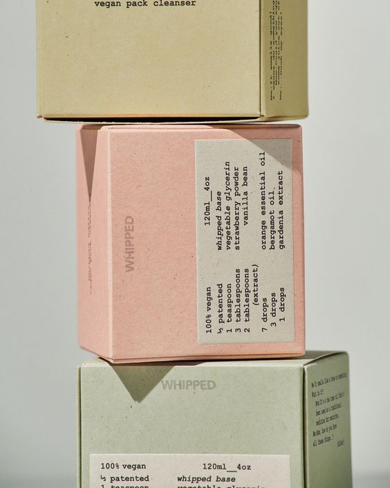
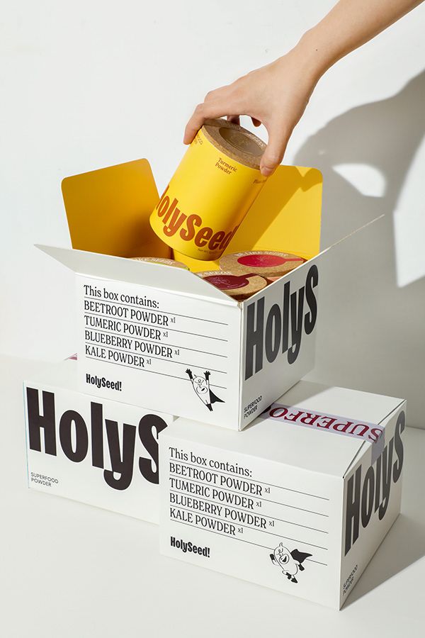
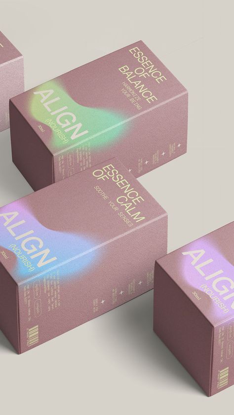
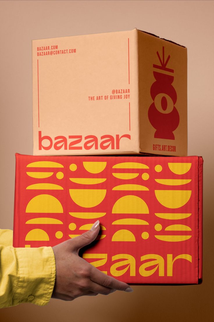
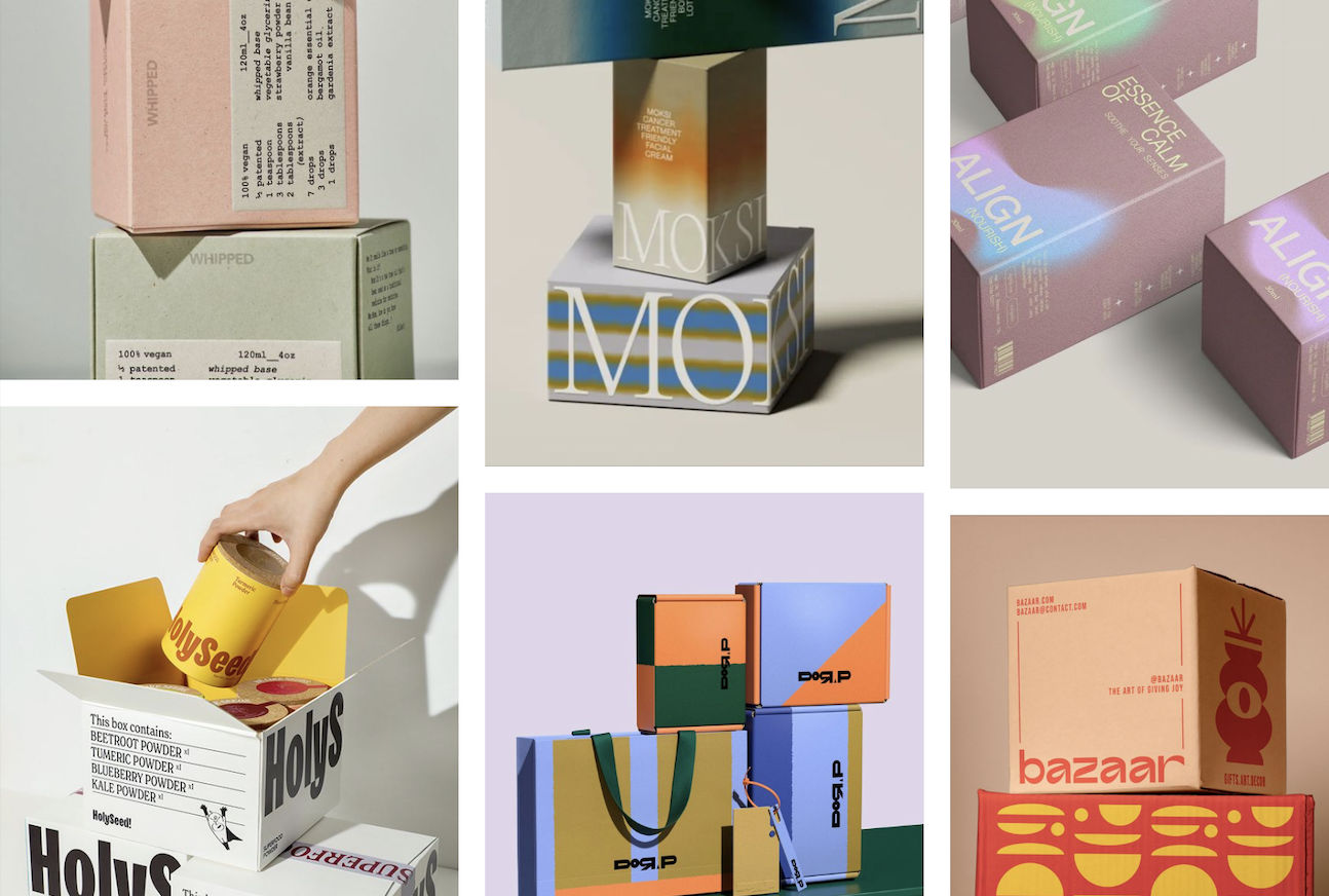
Bright, high-contrast colors can make a product jump off the shelf and shout, “I’m fun, I’m exciting, and you definitely need me in your cart!”. But not every packaging design needs to be loud. Sometimes, softer tones and a more muted color palette signal luxury or sophistication. Color also helps to communicate what’s inside a packaging. You can tell a lot about a product just by looking at the colors on its packaging. For example, greens and earth tones on a product are a not-so-subtle way of saying “I’m eco-friendly” or “I’m organic.” Just like white and blue on skincare packaging convey cleanliness and purity. But food packaging is where things get truly interesting. Brands use warm, rich colors like red, yellow, and orange to literally make your mouth water.
Next time you find yourself inexplicably drawn to a product, just remember: it’s not just the color you’re seeing. It’s the work of a designer, using the full power of color theory to make sure you can’t resist adding that item to your cart.
And if you are left needing more color inspiration, and evidence of how it can affect your feelings or thoughts, I’d recommend reading up on our longest-running series “Inspiration+Paper” in which we search for themes and topics that can act as a source of inspiration when working with design papers.