Last week we took out our crystal ball and had some fun making predictions on what kind of branding and packaging trends we’re expecting to see this coming year, but among the trends mentioned then, we keep seeing the rise of heavily typography-focused designs in the genre. And while type has definitely been embracing the spotlight for a while now, we’re anticipating the craze to accelerate into a higher gear this year as we are seeing a massive boom in eclectic and unique designs, which draw inspiration from the playful ’90s and ’00s, futuristic sci-fi, and the “ugly-pretty” aesthetics to only name a few.
While type has definitely been embracing the spotlight for a while now, we’re anticipating the craze to accelerate into a higher gear this year as we are seeing a massive boom in eclectic and unique designs, which draw inspiration from the playful ’90s and ’00s, futuristic sci-fi, and the “ugly-pretty” aesthetics to only name a few.
Some of the most amazing yet bizarre trends we’re seeing on the rise are Flared & Flowing Details, Liquid Letters, Bloaded & Playful, Hand Drawn & Personal, and Warped Or Distorted. You can read below our takes on each of the weird and wonderful typography trends, and examples of how we’re seeing it in action. Is there something we’ve missed, or maybe a design that should be included in the list? Let us know in the comments, or submit your own designs over here.
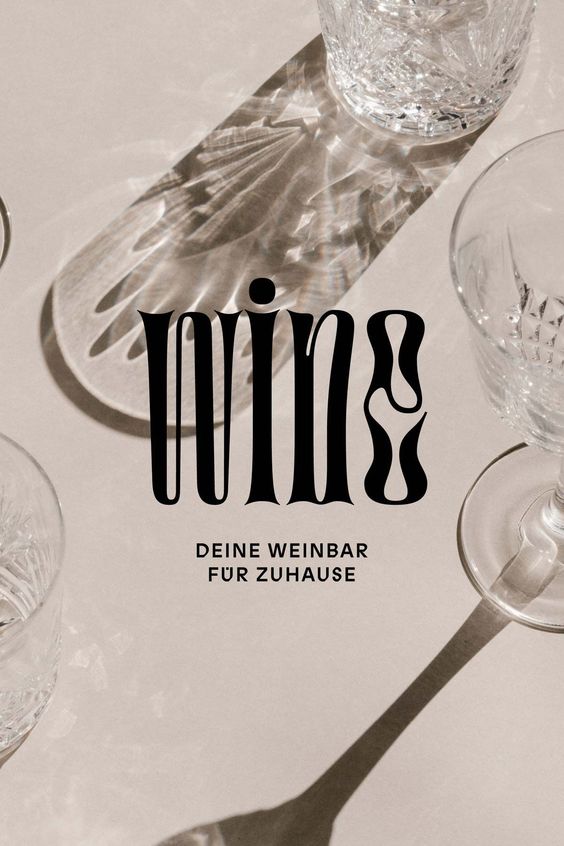
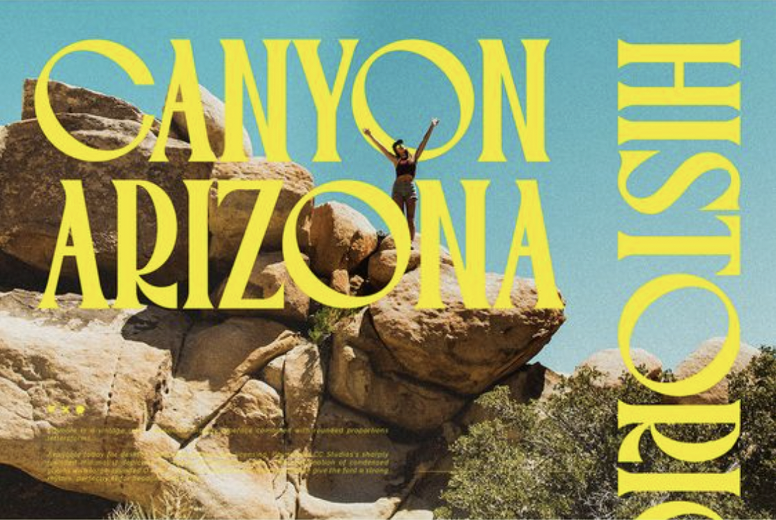
Flared & Flowing Details
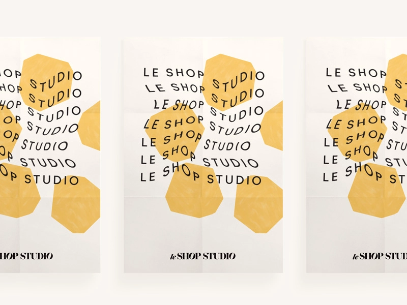
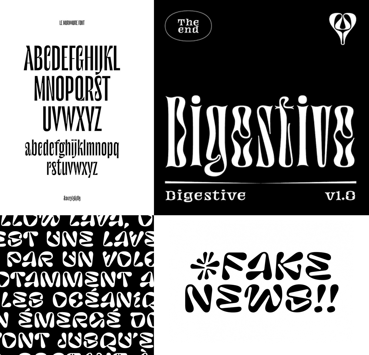
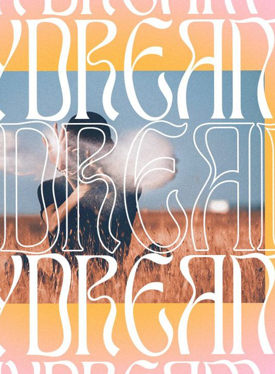
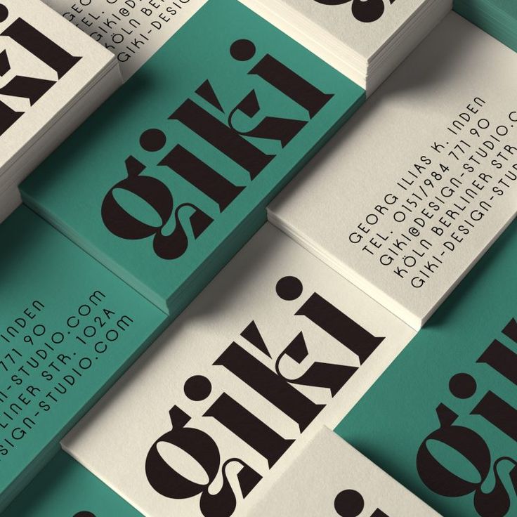
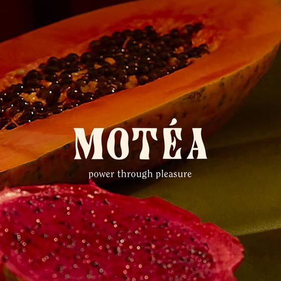
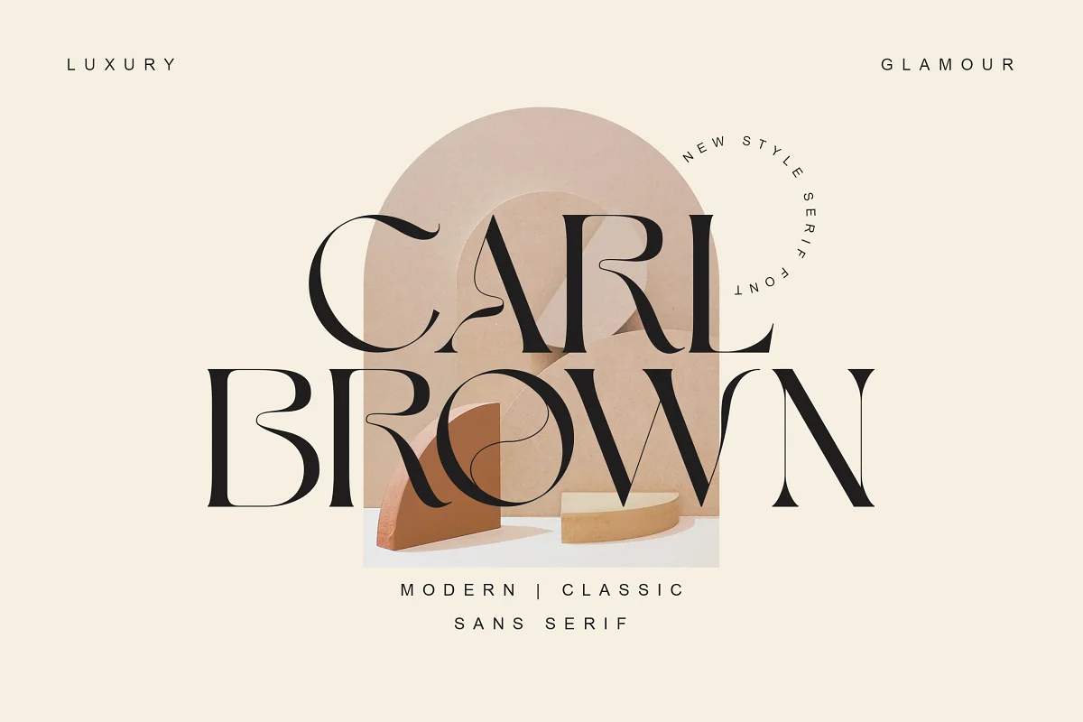
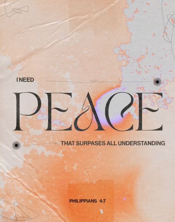
Flared or flowing details in fonts give it a touch of character, as they are most often used in logos and short taglines in a single letter, or two. The trend has been here for a year or two now, but as there are countless ways of incorporating the concept to almost any type, it seems there are still ways of doing it uniquely and surprisingly.
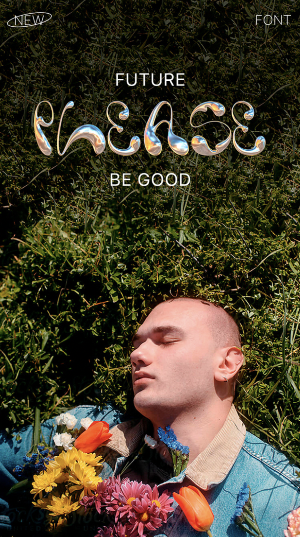
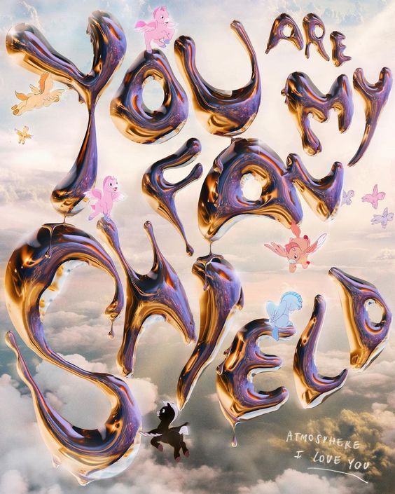
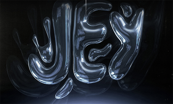
Liquid Letters
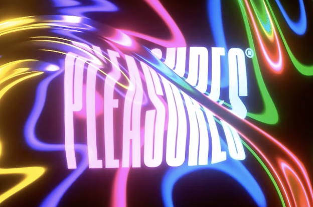
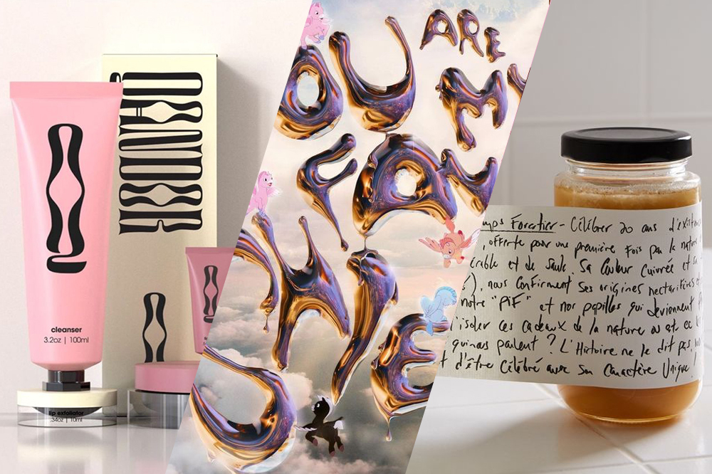
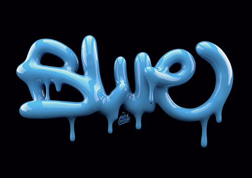
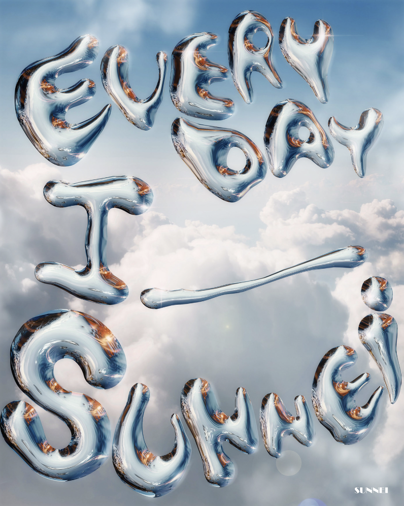
The 3D liquid metal or chrome typography trend of the past year or two, which is an amazing mix of playfulness and futuristic space-age vibes, is now getting more textures and finishing options to its side, as we’re seeing new takes on more watery iridescence, shiny paint, and even jelly-like compositions. It’s fun, it’s slippery, and it’s mesmerizing!
Bloaded & Playful
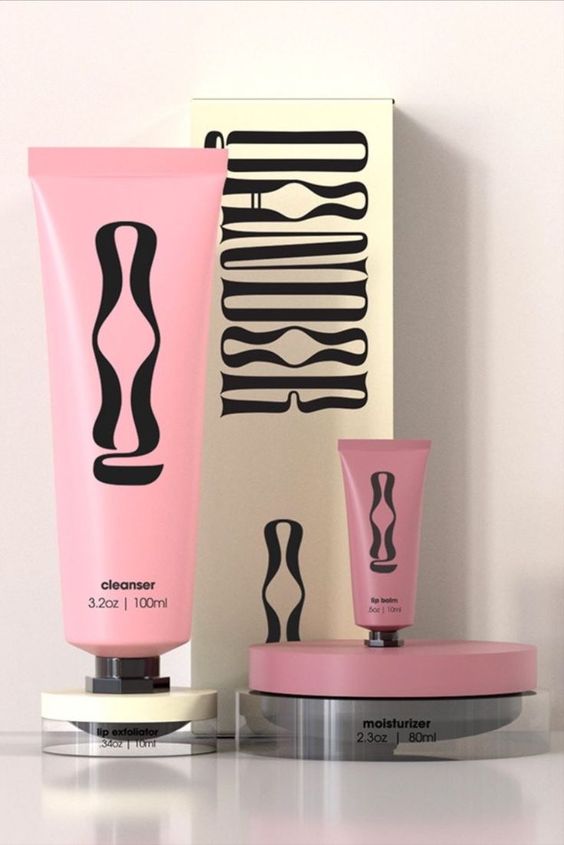
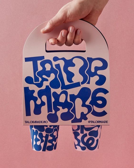
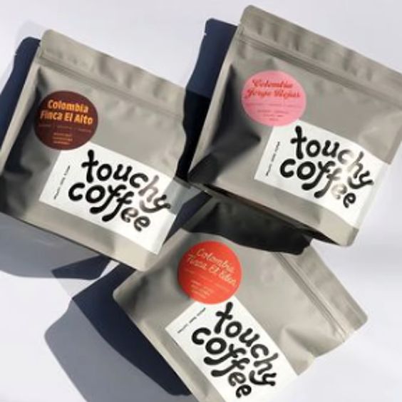
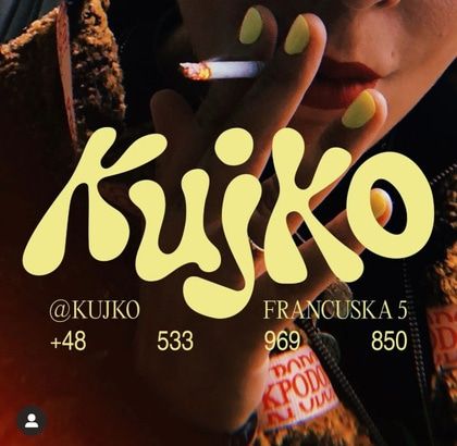
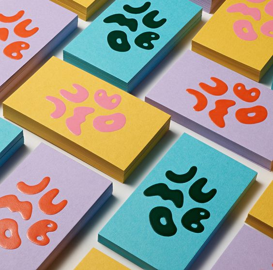
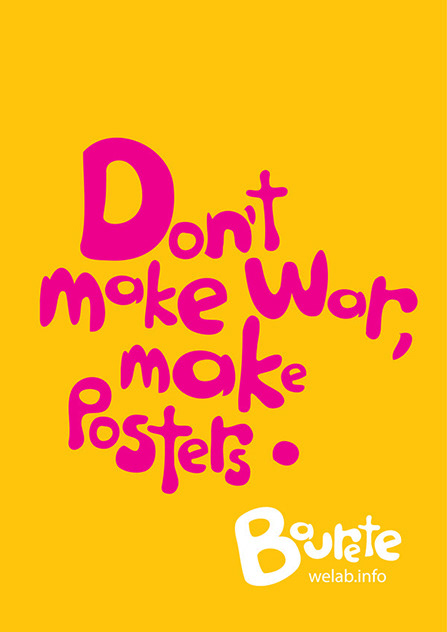
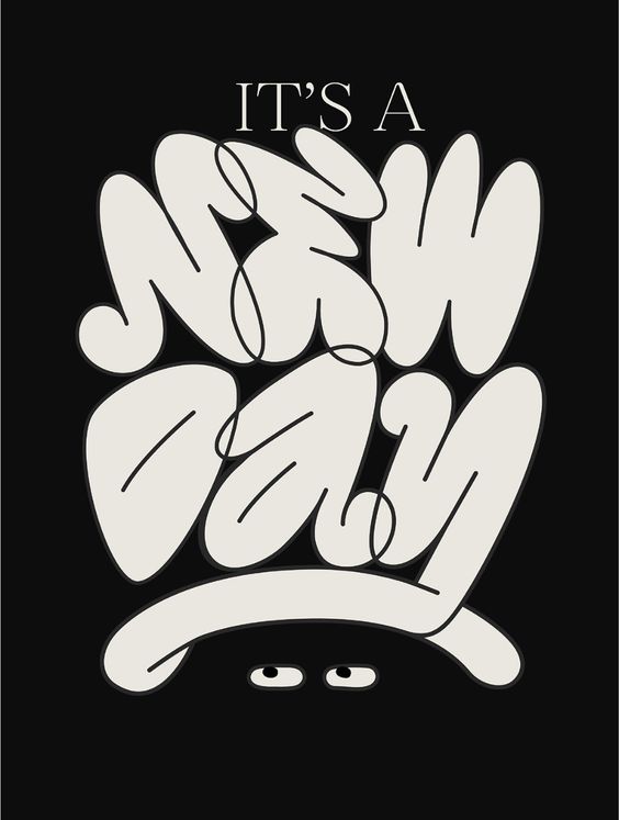
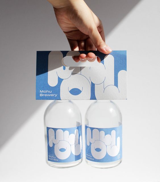
This trend is almost like a mix of the two above, as it combines the bloated and liquid-like look with playful squiggly lines. It gives a touch of three-dimensionality with super-rounded edges, while the flat design creates an almost cartoon-like feel. It works in monochrome as well as in bold, contrasting colors.
Hand Drawn & Personal
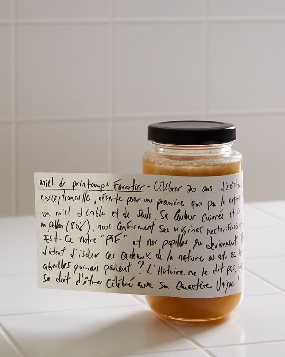
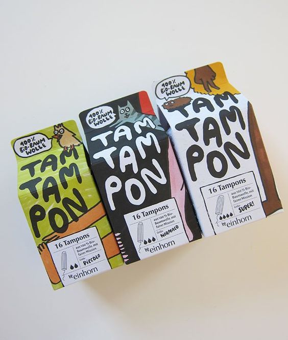
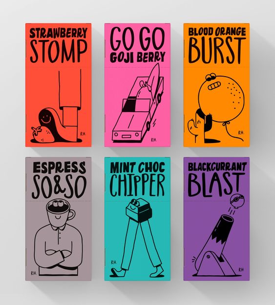
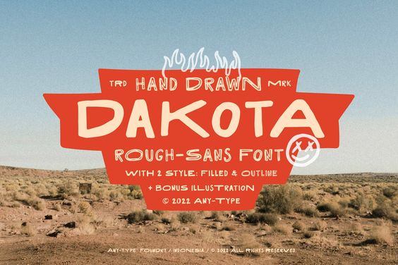
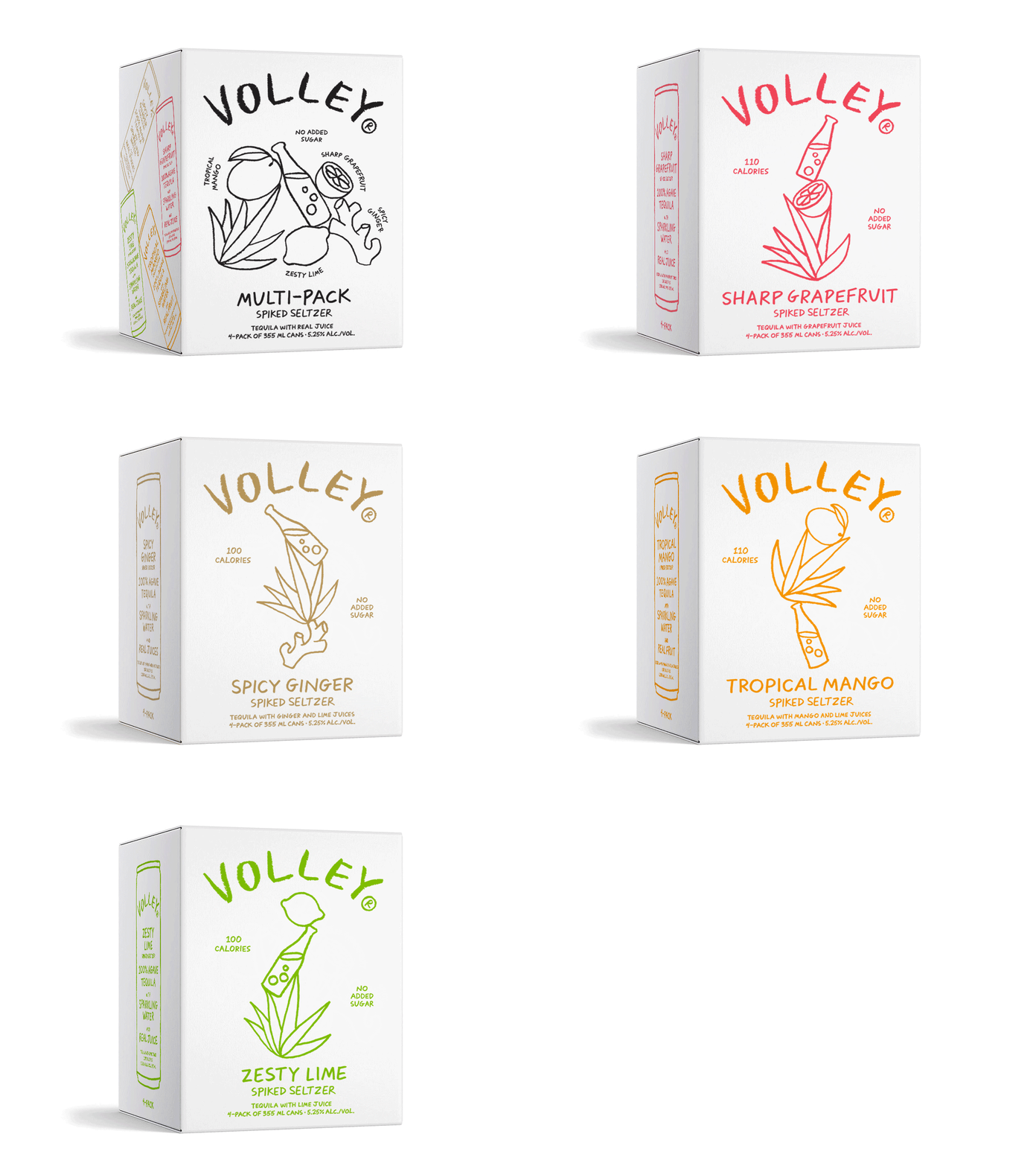
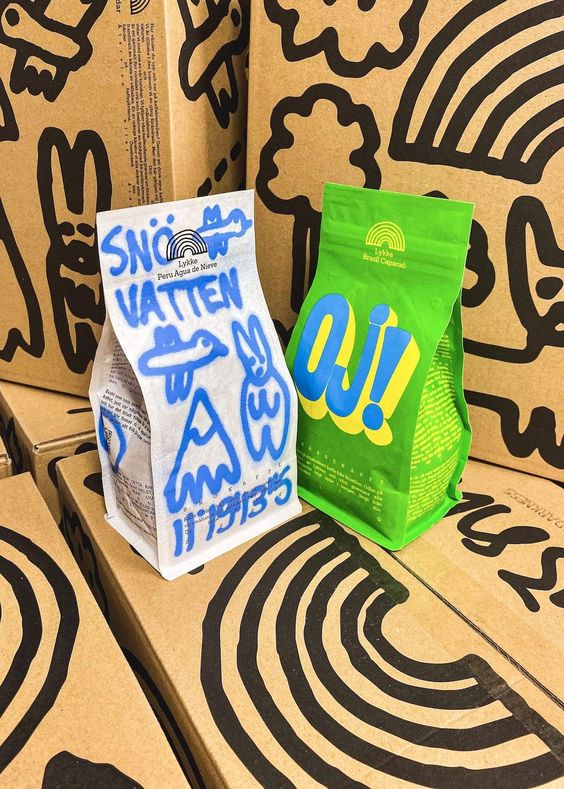
Hand drawn details, whether its illustrations or the typography, automatically add personality and exclusivity to the design. But the long lasting reign of elegant calligraphy seems to have been overthrown by super simple stick lettering or almost bad-looking handwriting. It looks like the note your neighbour left you, or the little doodle you made while on the phone – but now it’s on the side of products and packagings.
Warped Or Distorted
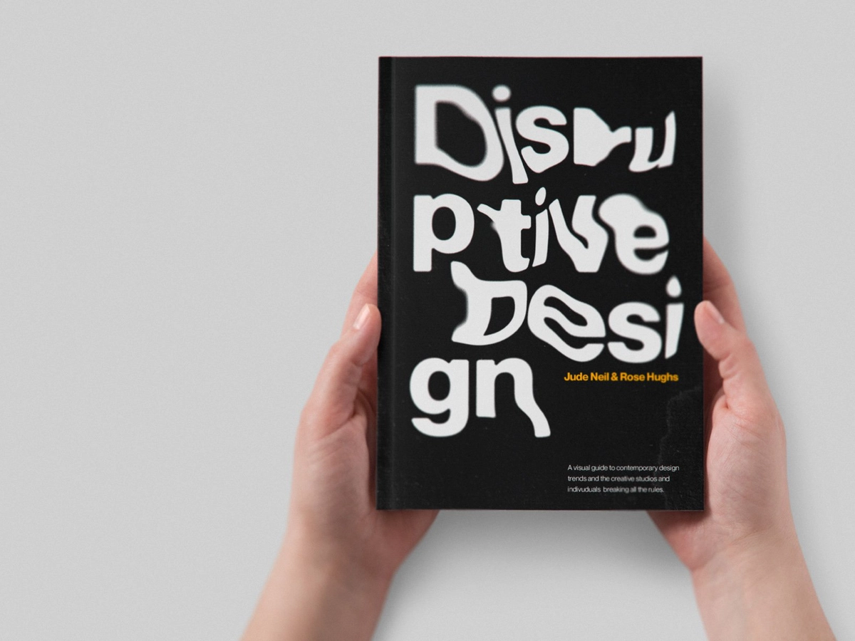
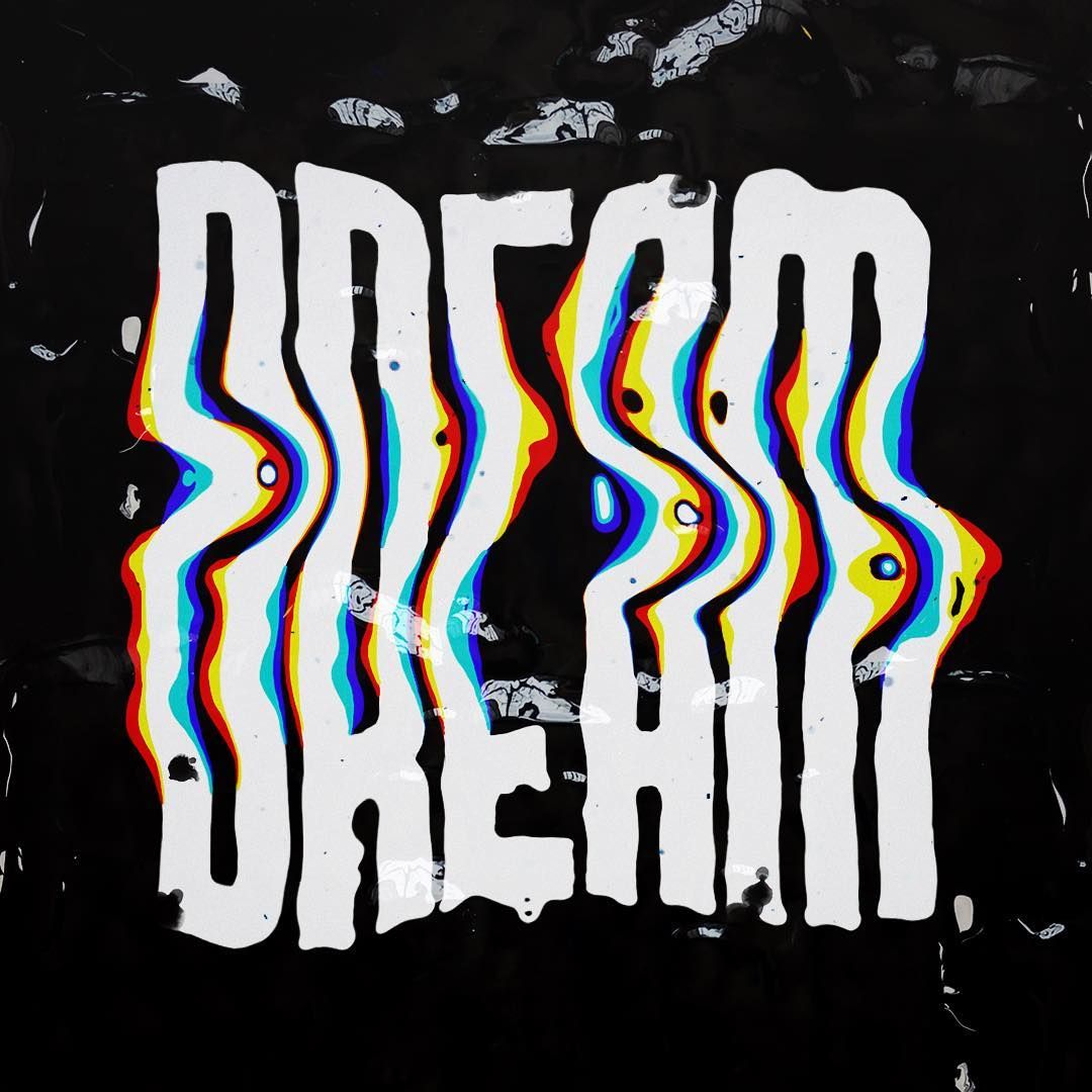
Continuing on the playful and lighthearted route, this trend (like the ones above) does not take itself too seriously as it ignores the most basic rule of typography: to be clear and readable. Bordering on illegibility, mischievous warped, or distorted type designs are all about demanding attention while hinting at something unseen. Especially great for metaphors and animated designs!
