Bruch – Idee&Form is a design studio based in Graz, Austria, run by Kurt Glänzer and Josef Heigl, that develops visual design concepts and appropriate strategies in the fields of branding, editorial design, packaging, and signage. With nationally and internationally awarded work, Bruch – Idee&Form’s strength lies in clear concepts and meticulous execution. With a strong idea brought to life in visual form, their latest endeavor, fresh visual identity for The Mozart Hotel is a true showstopper in its bold elegance – combining classical notes with contemporary flair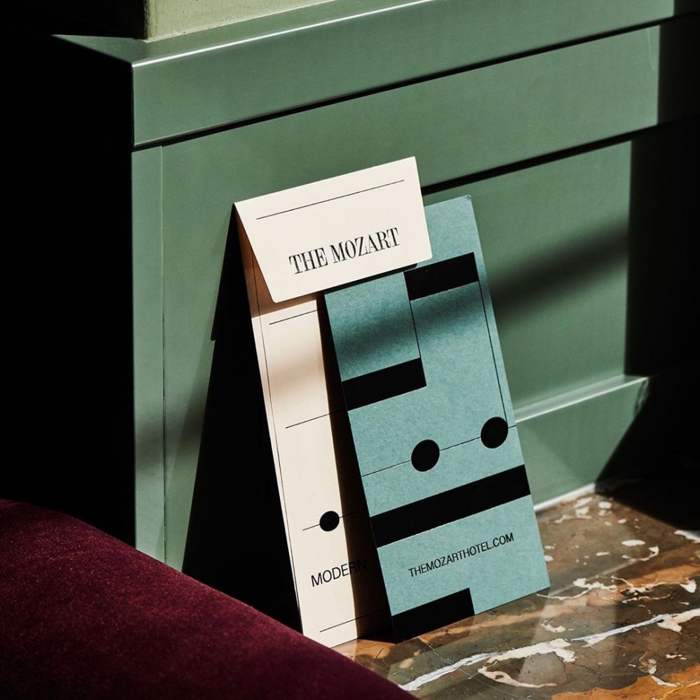
With a strong idea brought to life in visual form, their latest endeavor, fresh visual identity for The Mozart Hotel is a true showstopper in its bold elegance – combining classical notes with contemporary flair.
Effortlessly combining history and tradition with contemporary style and modern flair, the concept for the visual identity feels timeless and polished
Situated in the beautiful Andräviertel, described as the ‘Paris of Salzburg’, between Kapuzinerberg and the Mirabell Palace and gardens, The Mozart Hotel has stood the test of time. Since the 1950’s it has hosted guests from all over the world, charmed by its classic reputation and traditional values of hospitality. But as the new decade begins, it was time for a fresh look, that breaths new life into an institution worthy of some attention and dedication.
Today, its past has become an important feature of its present and future, with a new design that blends both its history and tradition, with a more modernist approach, in keeping with the requirements of guests in the 21st century. Like Mozart, whose music has proved timeless, we think we have achieved that, producing a hotel which could be described as a ‘modern classic.
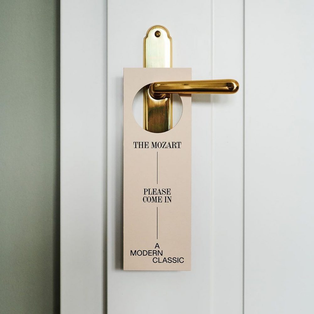
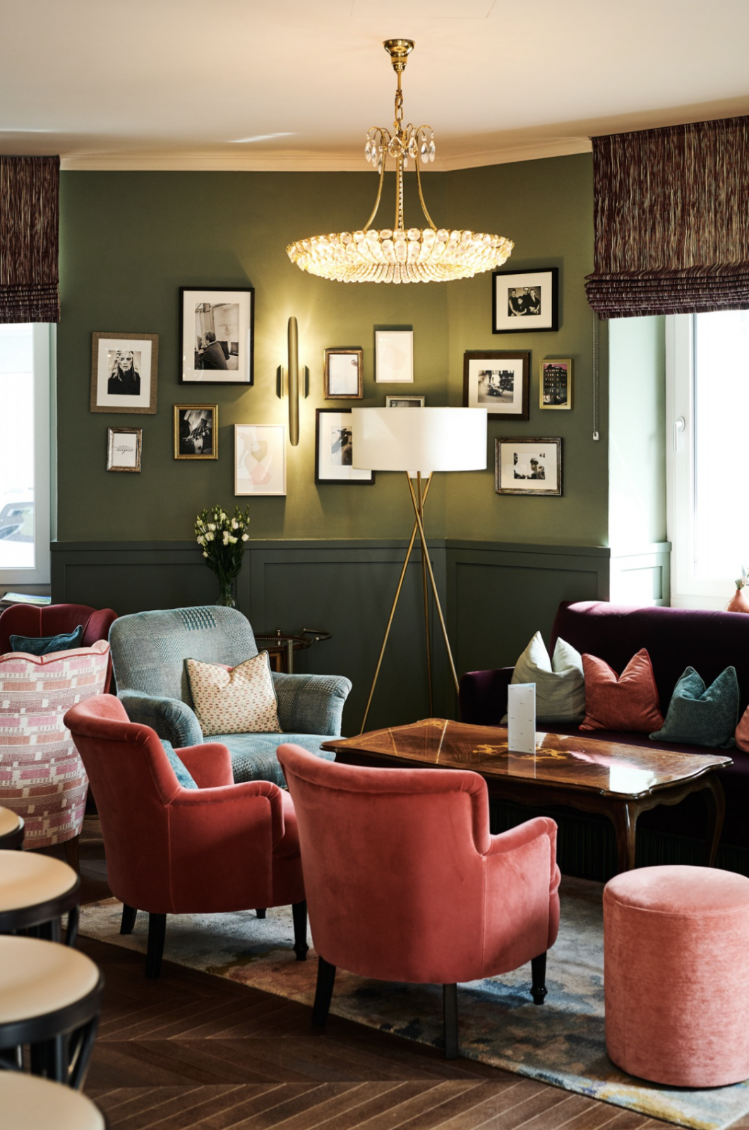
And while you can’t talk about the city of Salzburg, without recognizing it’s most famous composer Mozart and classical music, the three are inseparable and act as the force of inspiration behind the design. Effortlessly combining history and tradition with contemporary style and modern flair, the concept for the visual identity feels timeless and polished in a way that honors the hotel’s history while energizing it with a promise of something new and exciting.
“Today, its past has become an important feature of its present and future, with a new design that blends both its history and tradition, with a more modernist approach, in keeping with the requirements of guests in the 21st century. Like Mozart, whose music has proved timeless, we think we have achieved that, producing a hotel which could be described as a ‘modern classic’”, Bruch – Idee&Form writes.
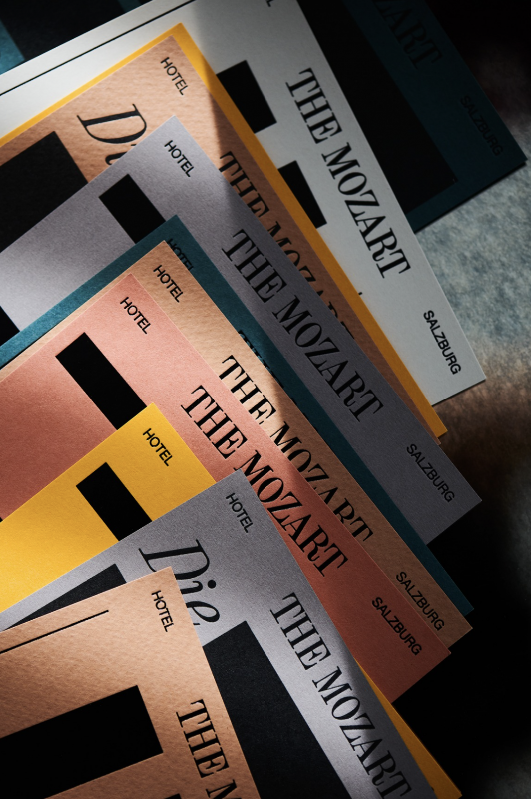
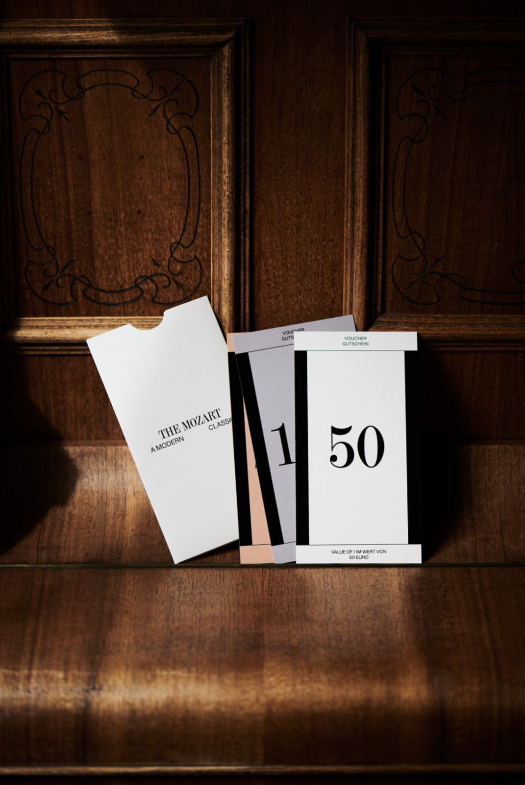
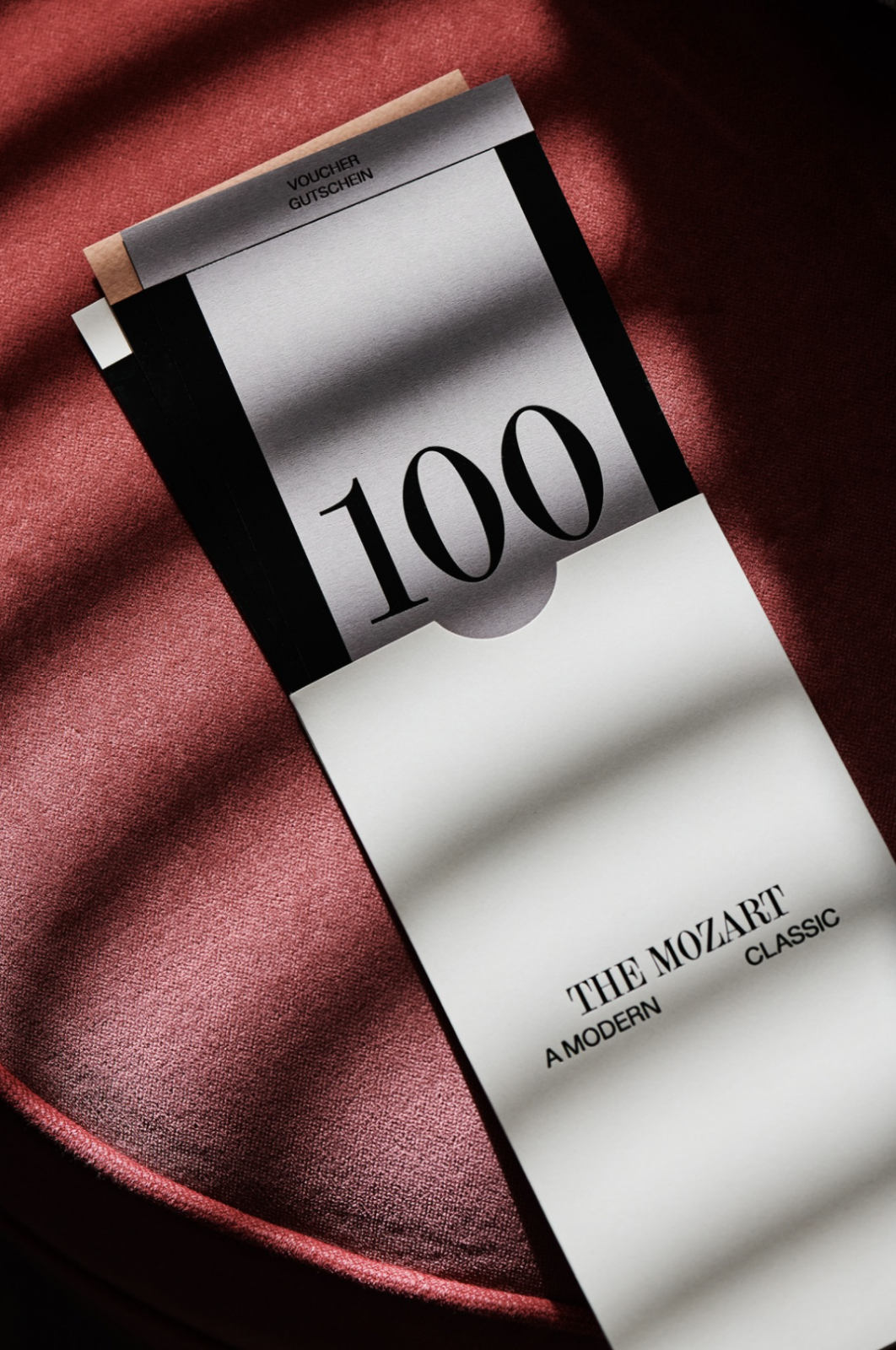
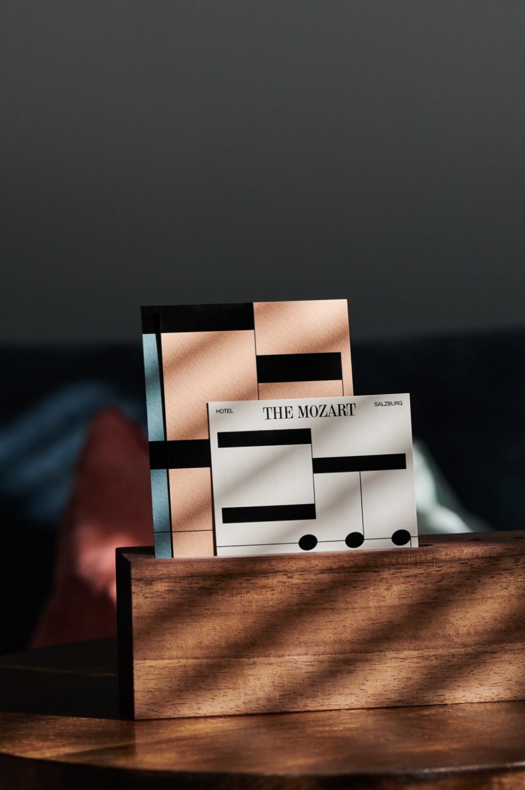
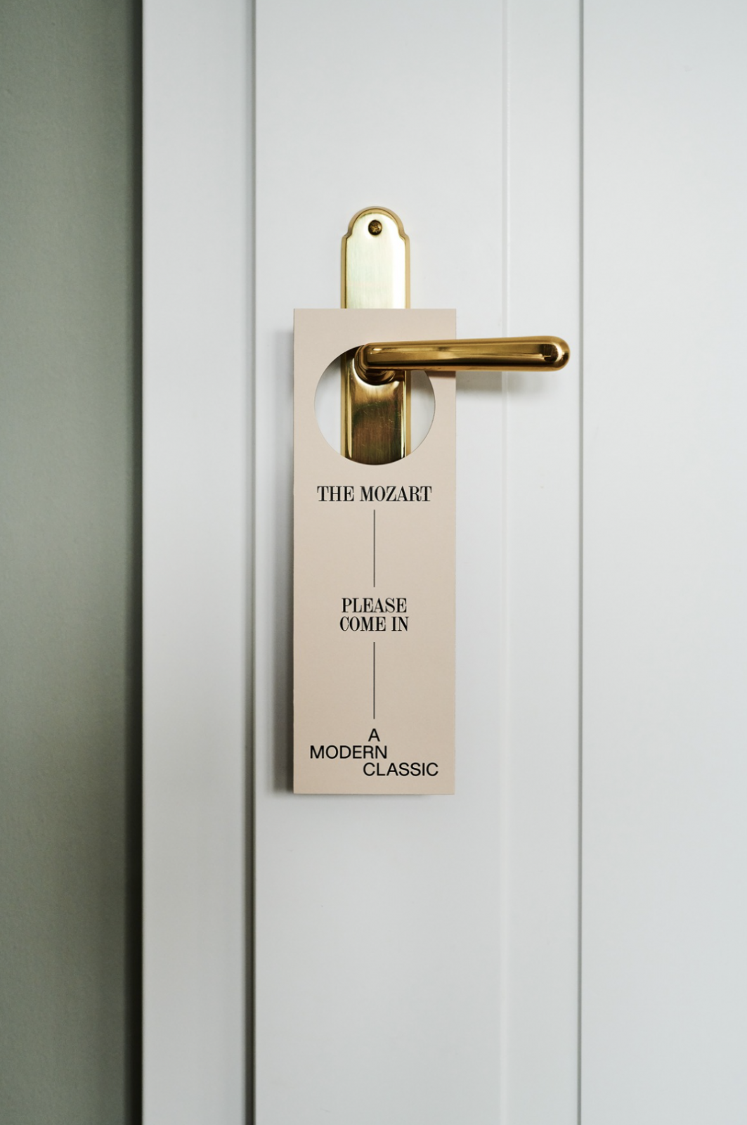
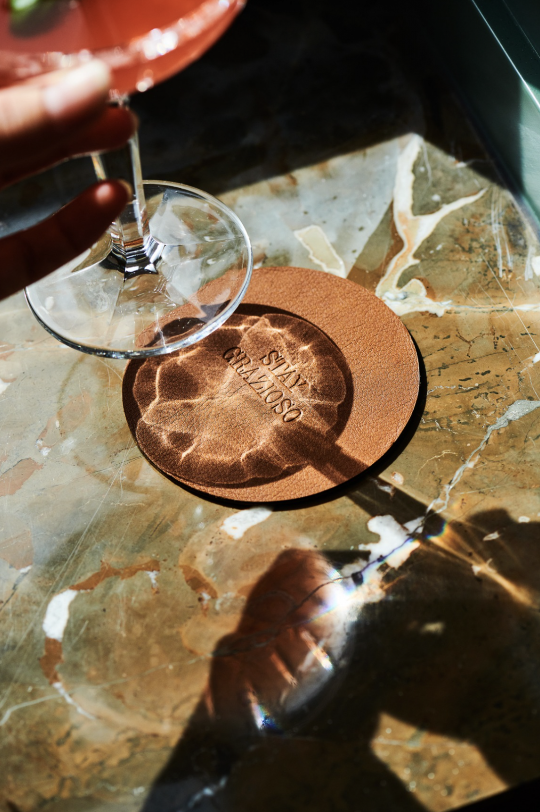
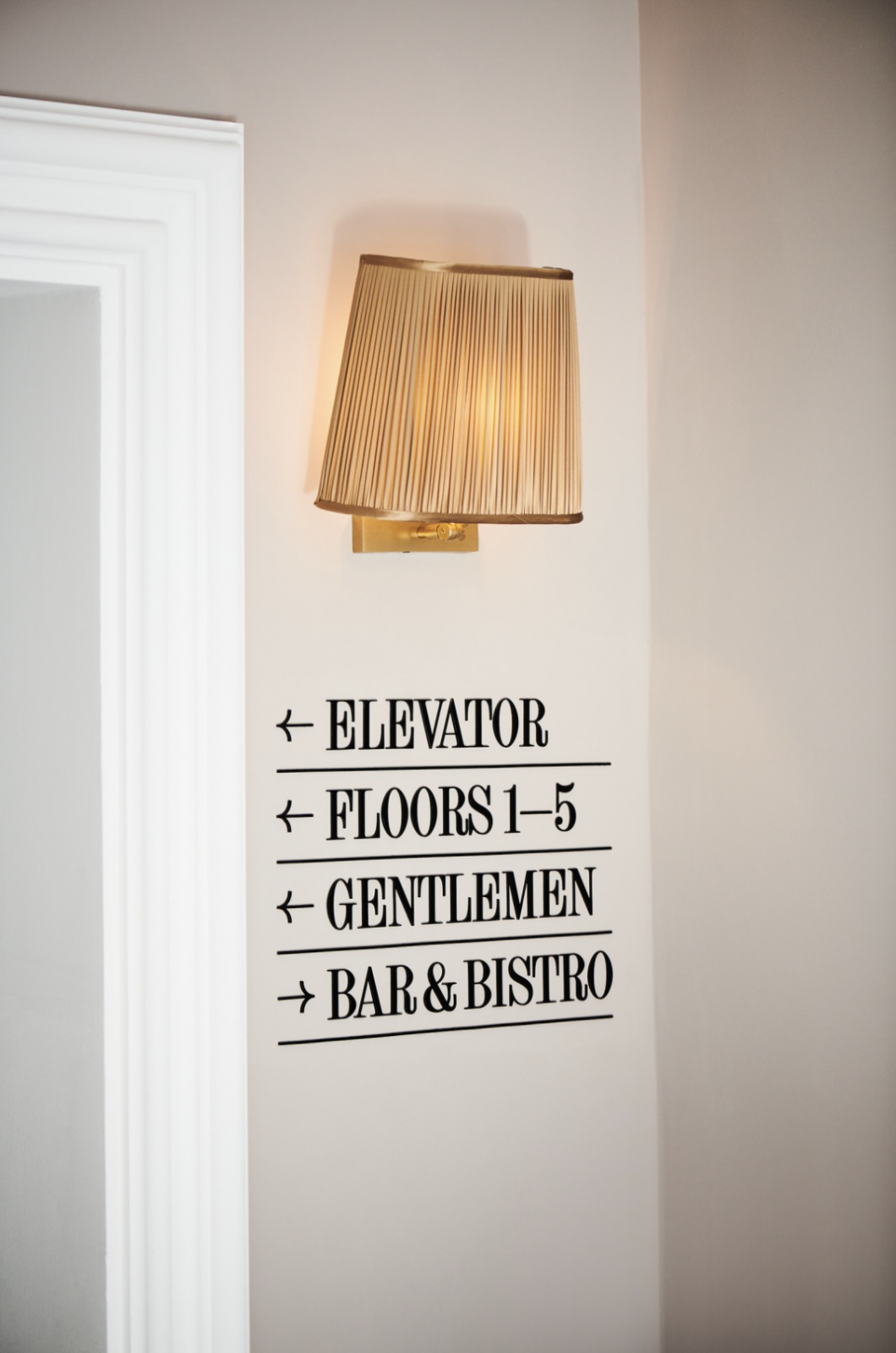
Harmonious colors, thoughtful design elements, and charming typography create a graceful visual identity
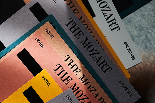
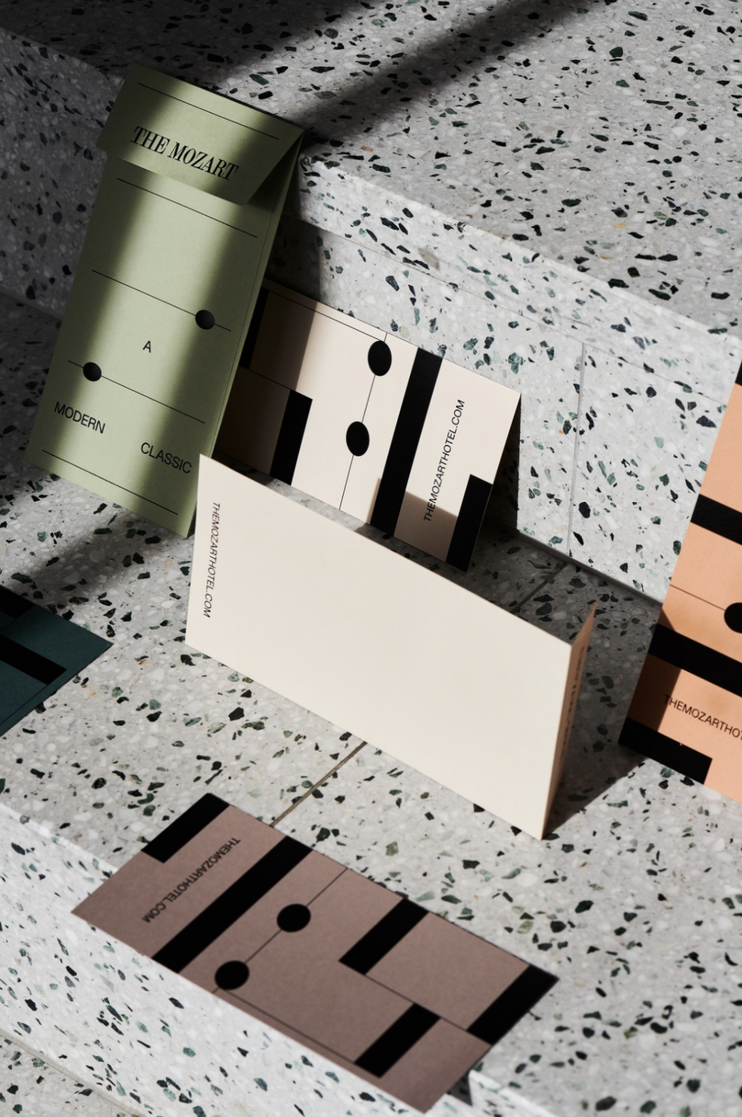
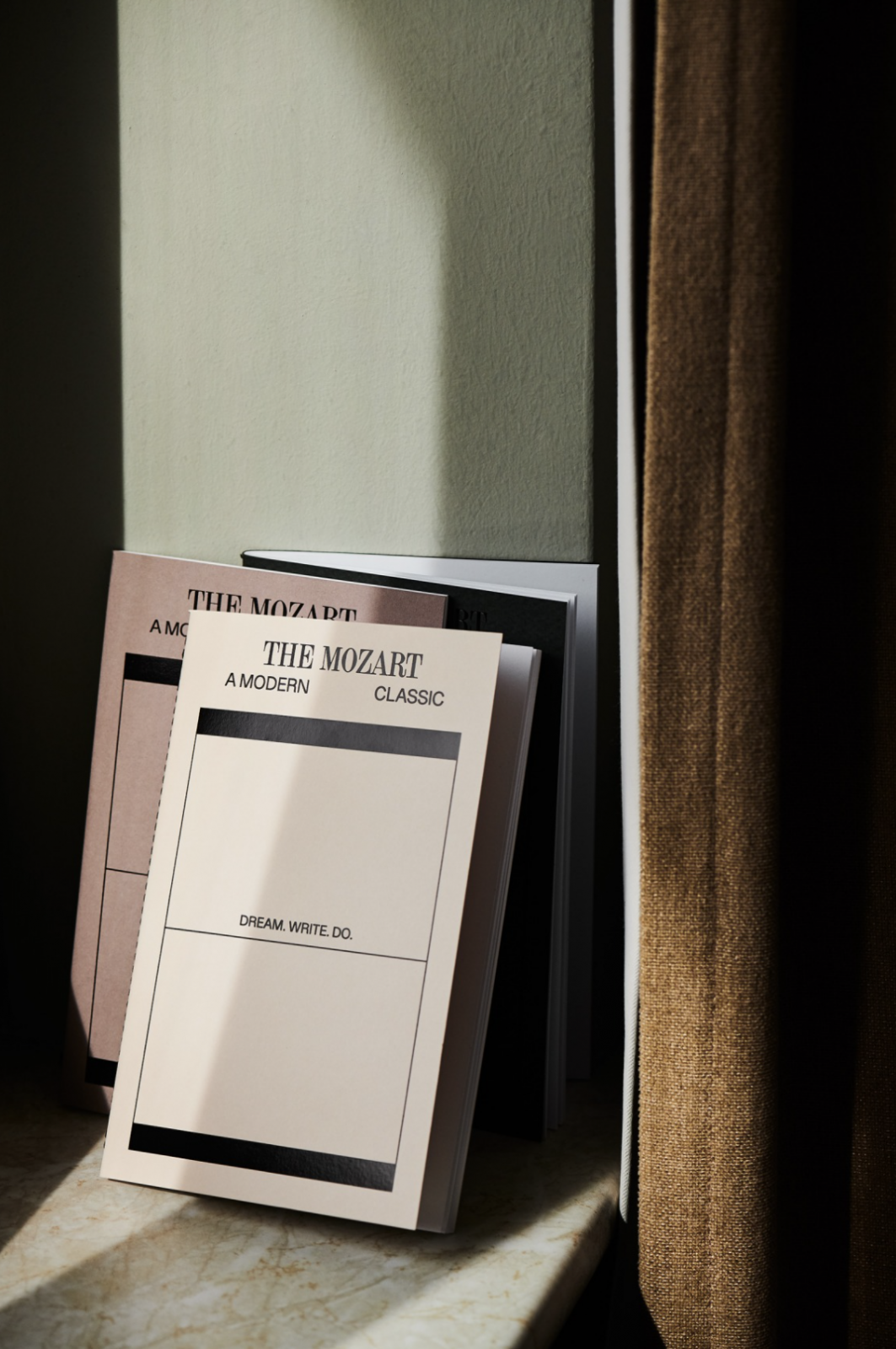
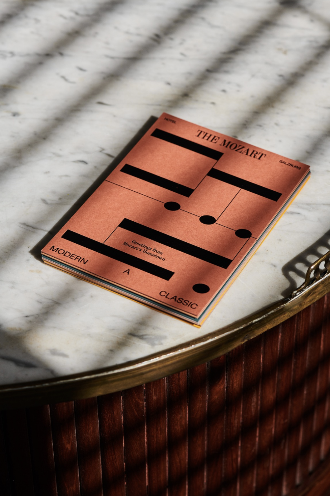
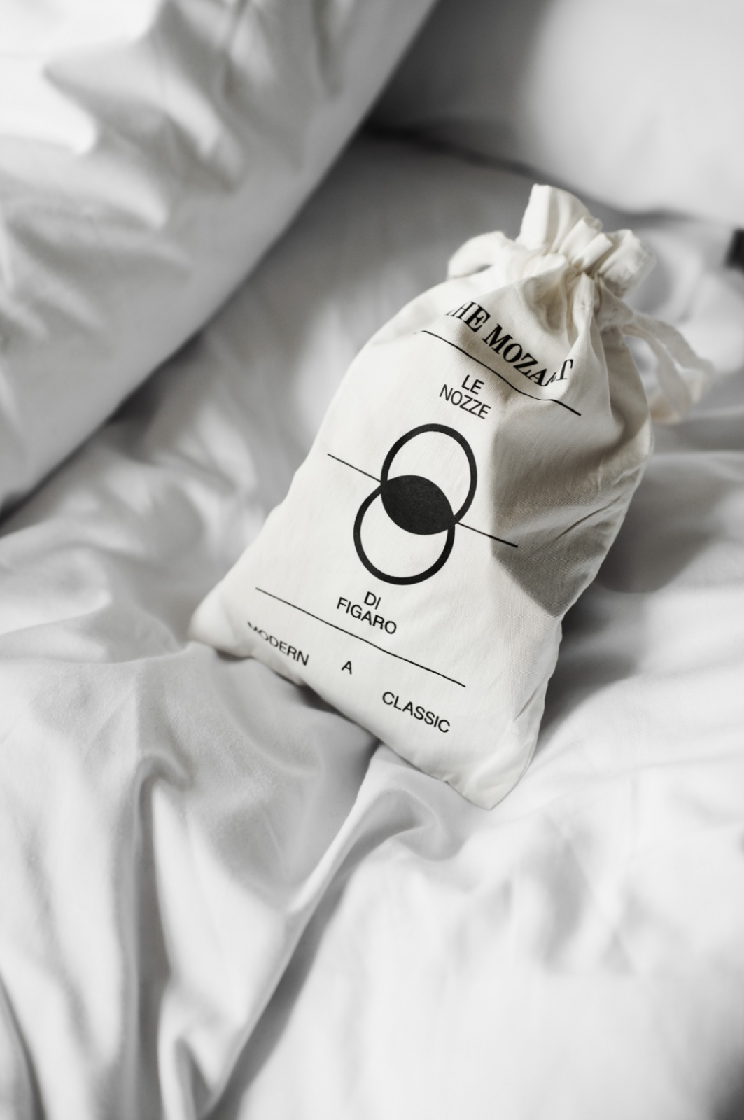
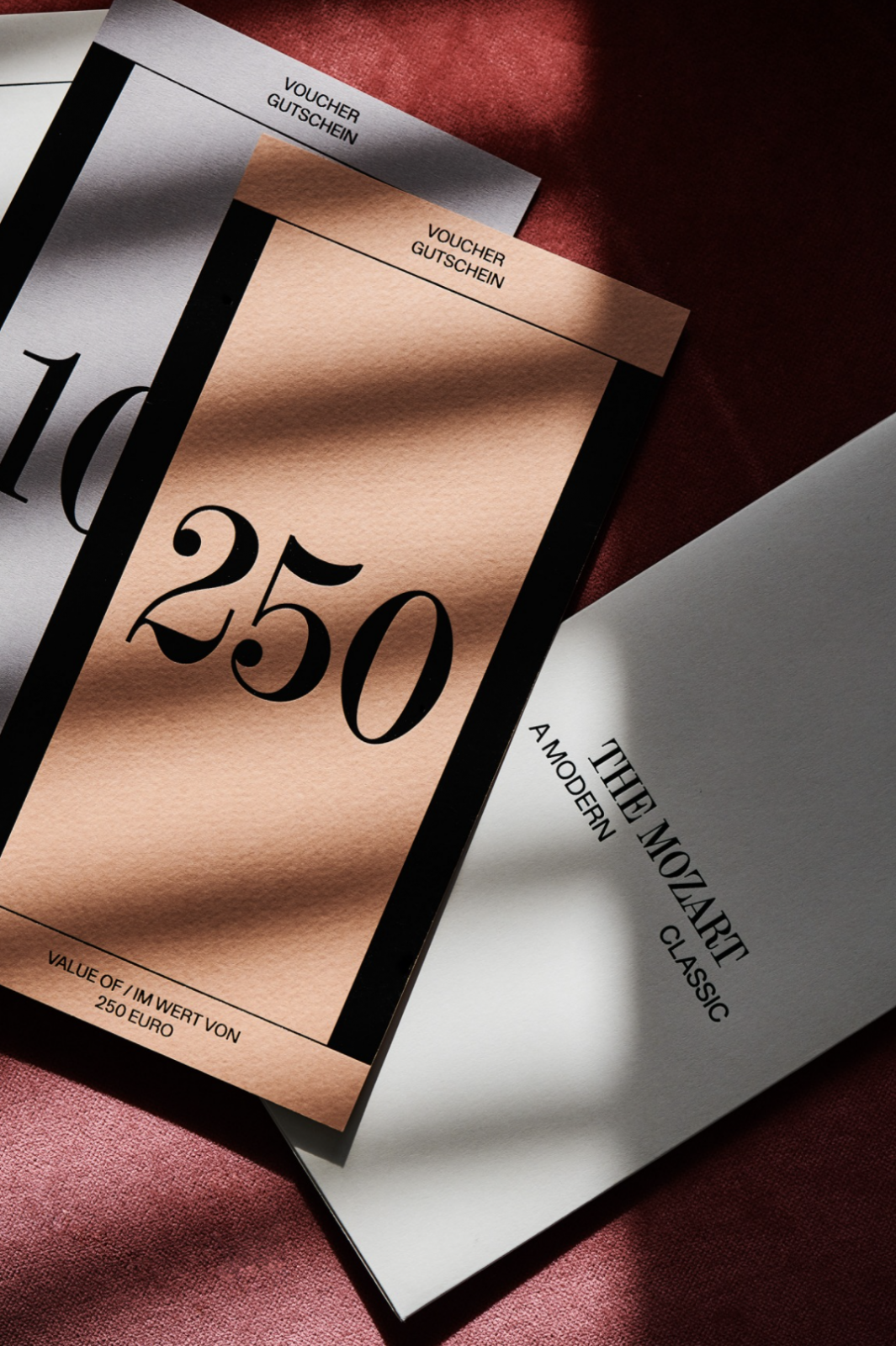
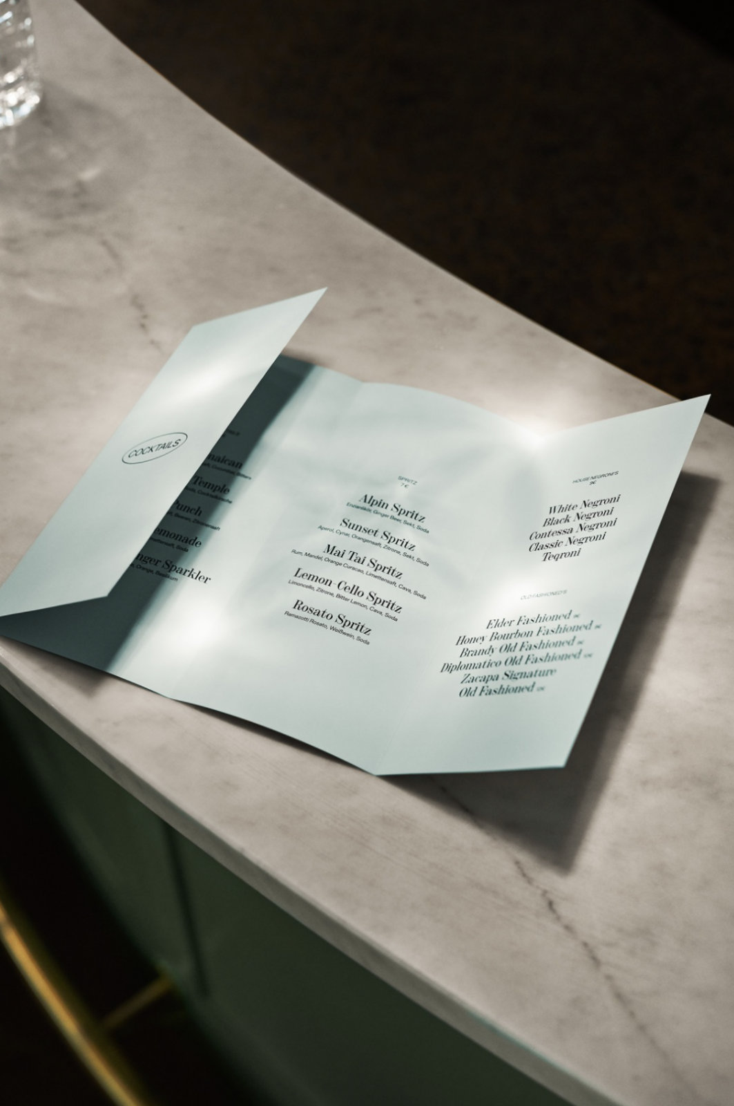
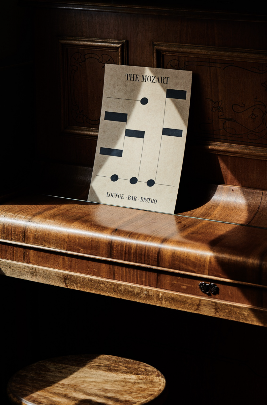
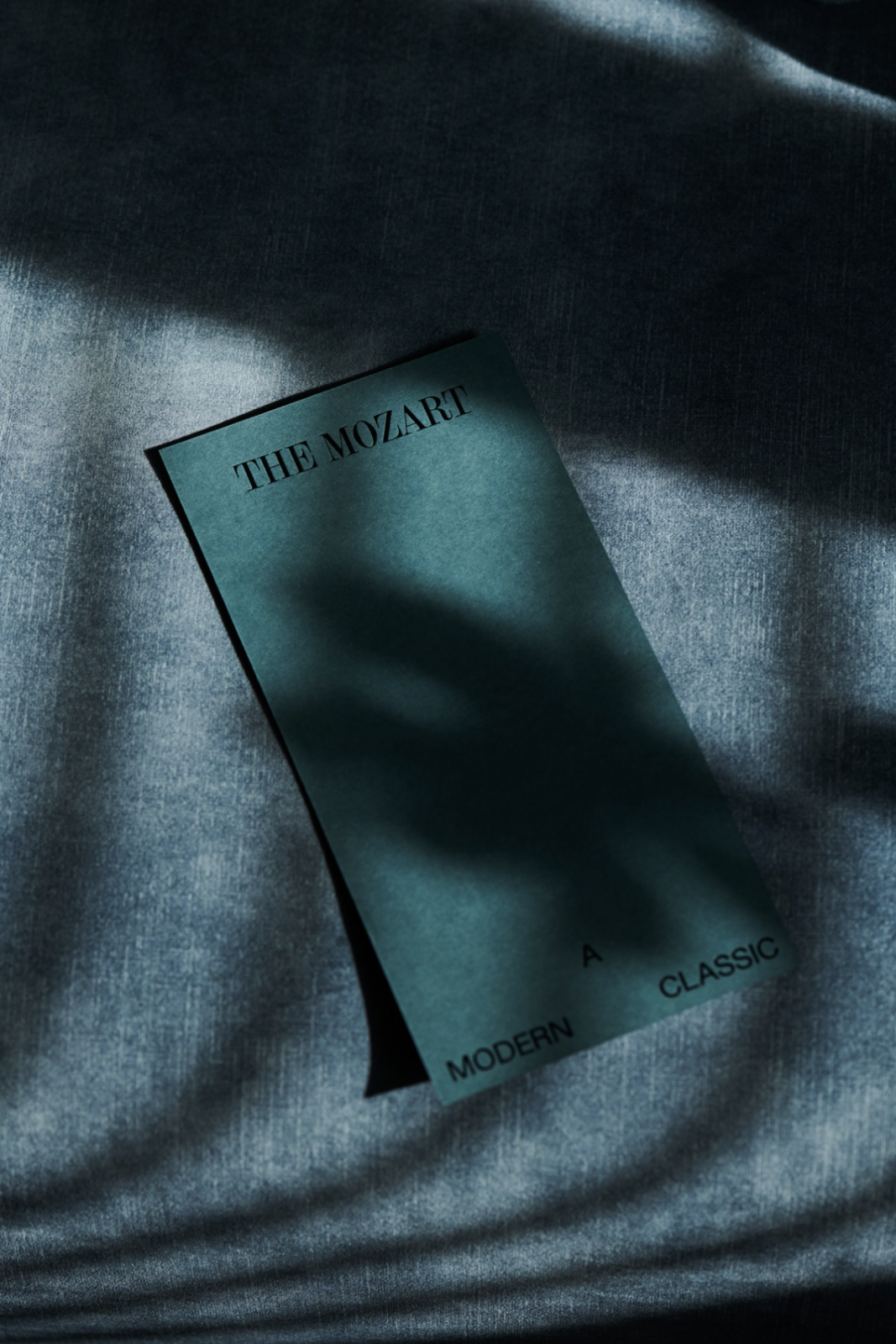
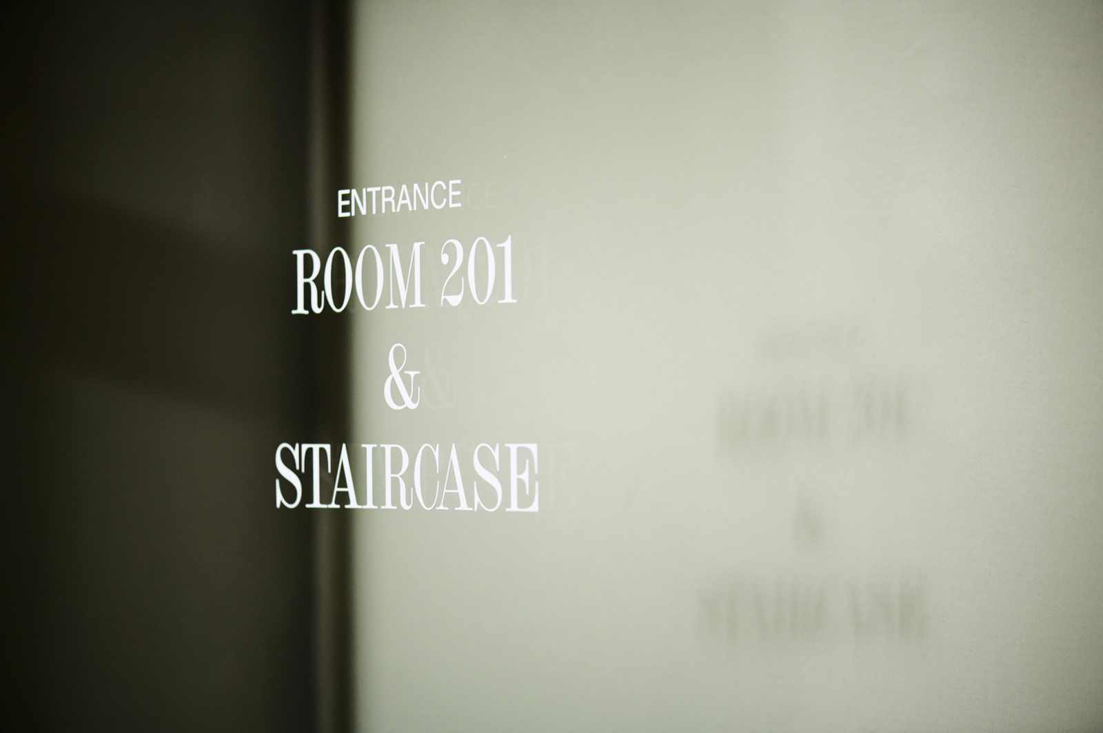
The cohesive concept includes everything from stationery and branding elements to hotel signage and signature skin & hair care products, all of which are created in a flexible design rhythm, that communicates the hotels’ classic roots with a modern twist. Incorporating musical elements in the minimal illustrations feel like an ode to the namesake of the hotel, while the beautiful Amen display serif typeface designed by type design studio Hungarumlaut keeps the concept graceful, almost regal. The wide harmonious color range of pastels and earthy tones feel thoughtful and luxurious – all things you can expect from the Mozart Hotel.
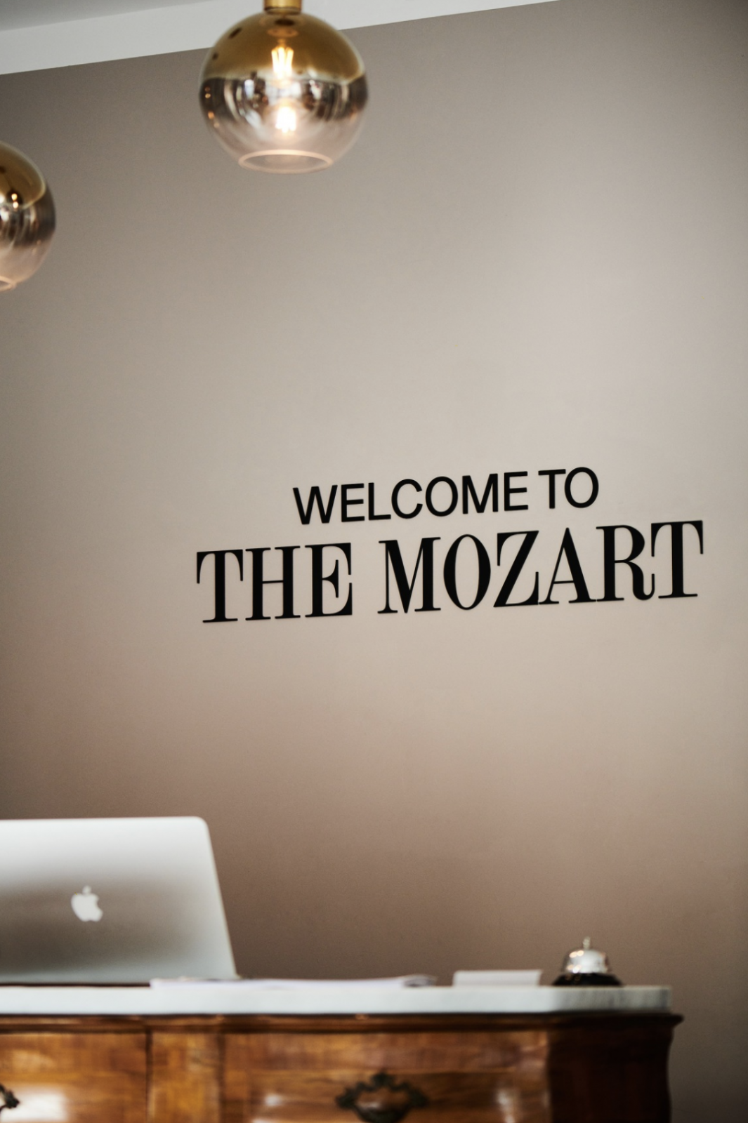
Portraits Mozart © Pia Clodi
Photography Interior & Stationary © Marion Luttenberger

