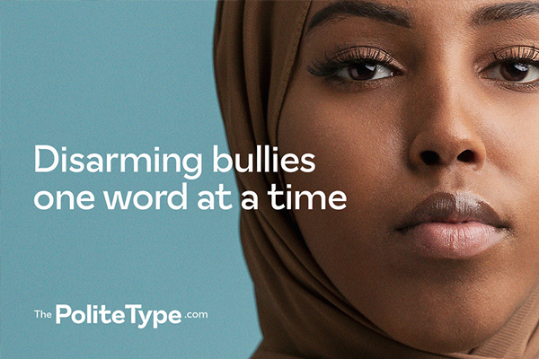
The Polite Type is an open-source font that rewrites hurtful words by replacing them with more inclusive ones, reminding us how the words we choose shape our reality. Led by TietoEVRY, a leading digital services and software company, the Polite Type initiative aims to disarm cyberbullies and raise awareness about the issue across borders. “We want to create room for the important discussion on how we can make the online world a safer, more inclusive place for everyone”, TietoEVRY has written on the Polite Type website.
We want to create room for the important discussion on how we can make the online world a safer, more inclusive place for everyone.

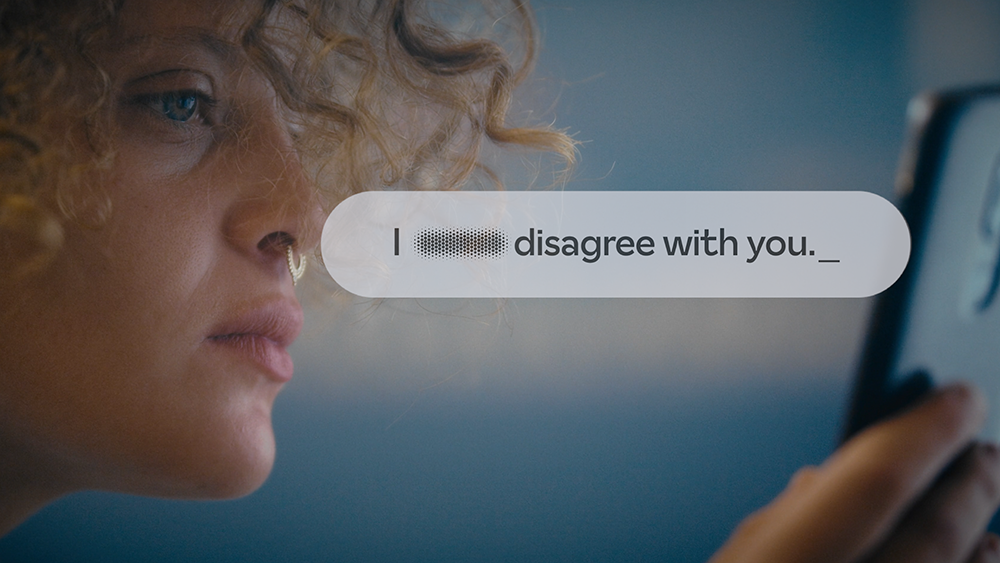
The Polite Type recognizes common insults and slurs and rewrites them with more inclusive ones
The Polite Type has been developed in close collaboration with a diverse team with wide-ranging backgrounds in anti-racism work, gender research, and D&I consulting. Additionally, the initial vocabulary for the font has been co-created with high-school-aged teenagers and youth from diverse backgrounds, together with The Children and Youth Foundation. The Polite Type font was created in an open-source format and utilizes a continuously expanding vocabulary, inviting those who want to develop it further to get involved.
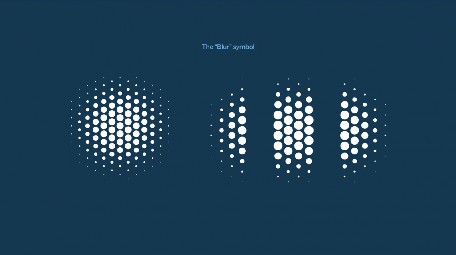
In action, the OpenType font file (free download here) recognizes a number of discriminative and offensive English-language words in real-time and substitutes them with more neutral, inoffensive words. And with words and phrases without literal translation, or too broad of meaning, the font automatically uses a blur symbol. The Polite Type does not aim for censorship or control over free speech but to remind us all of the harm words can do – and simply make the online world we so often occupy, to a slightly safer space.
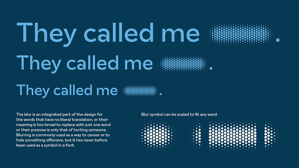
The positive feel of the design emphasizes the sensitive nature of the project
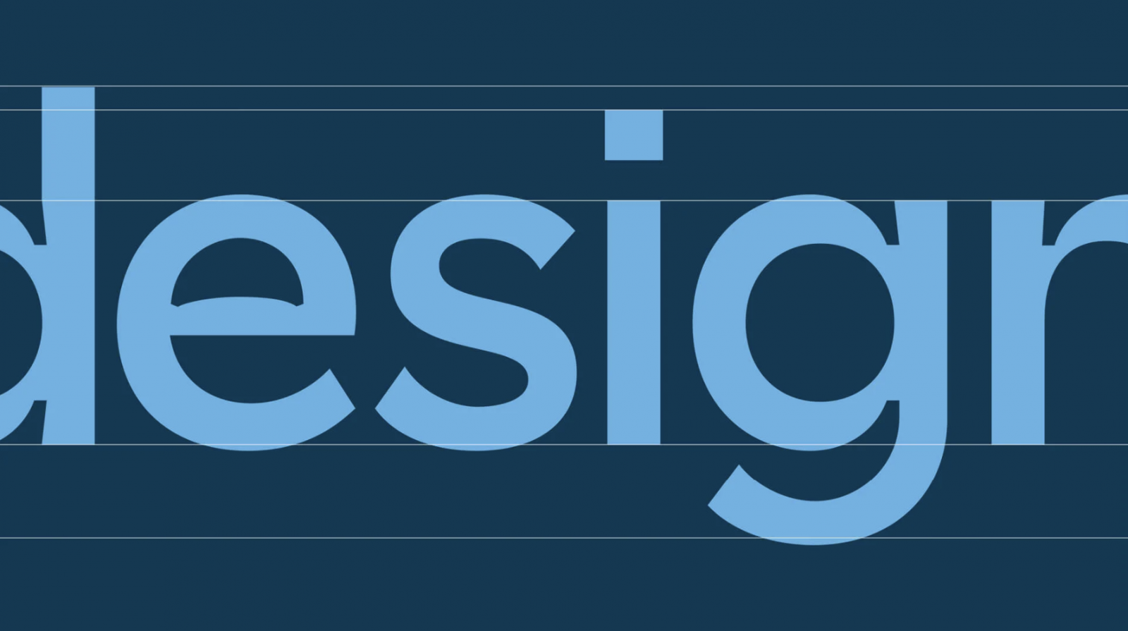
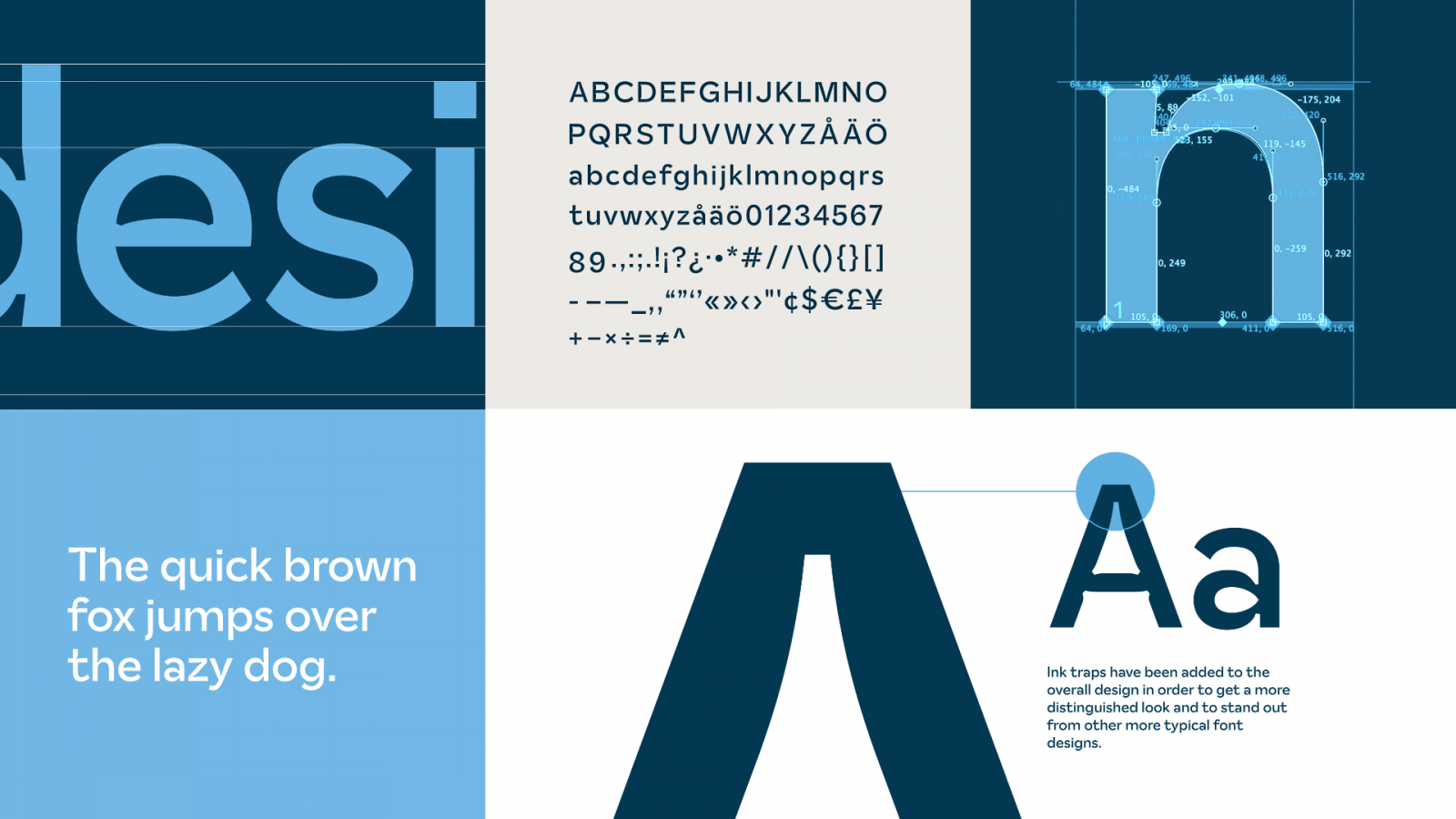
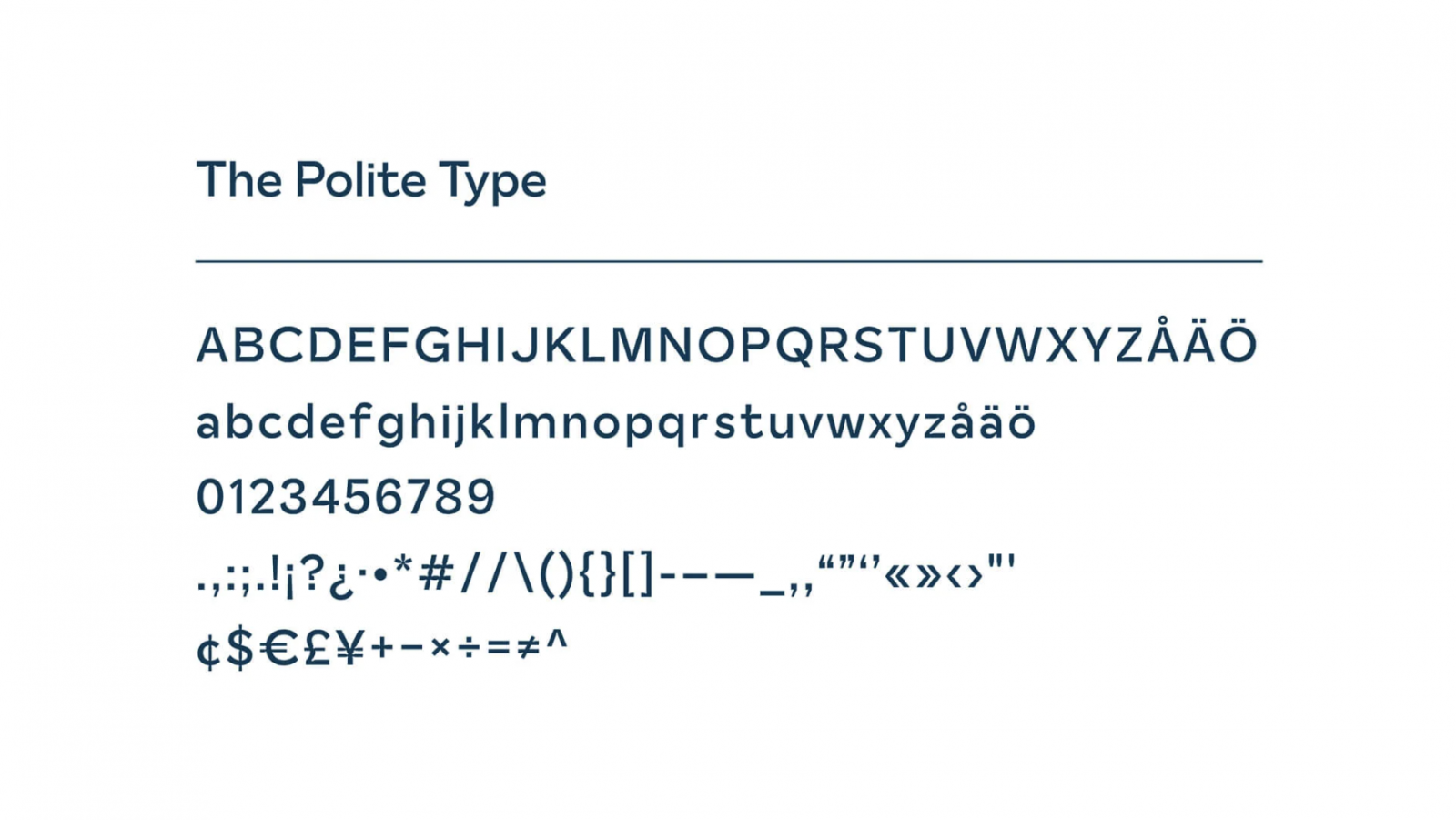
The design of the font retains a visually positive and progressive feel throughout the whole typeface design, emphasizing the sensitive nature of the project. As a unique feature, ink trap elements in several letterforms help the font to stand out from others while creating a distinguished look. The sans serif typeface feels playful and fun, while still professional and thoughtful, representing the initiative of The Polite Type to a tee.
Follow the project on Facebook and download The Polite Type for yourself.
Images © The Polite Type

