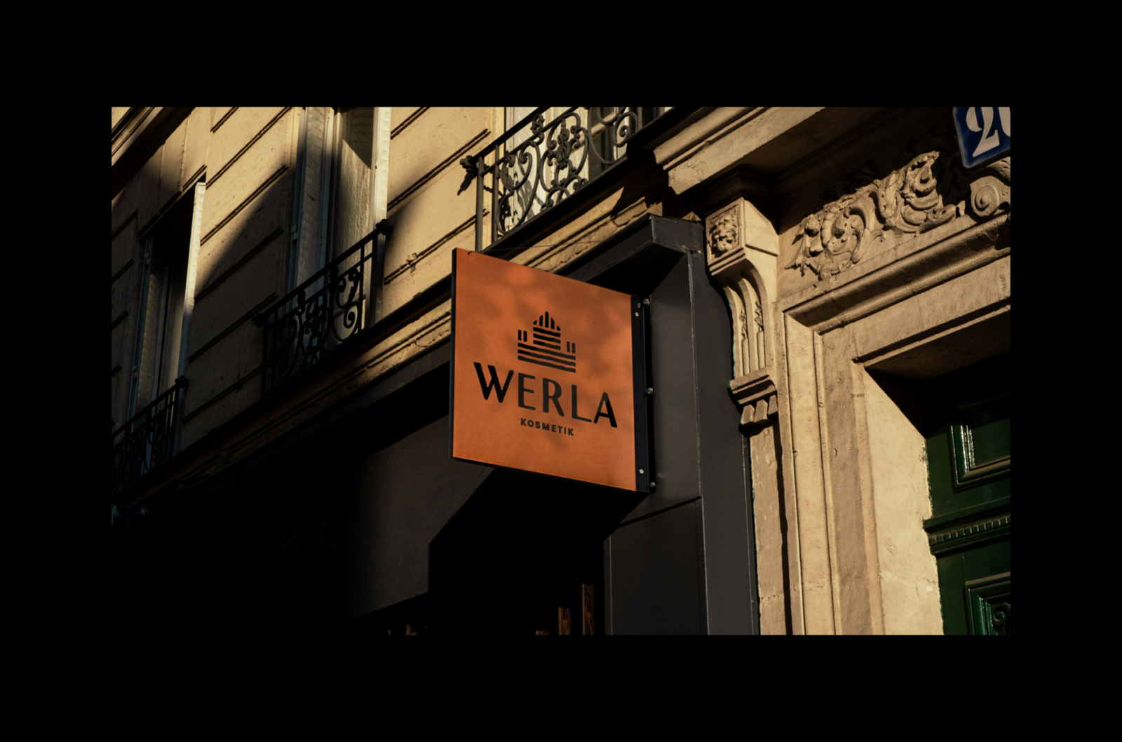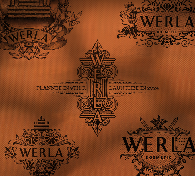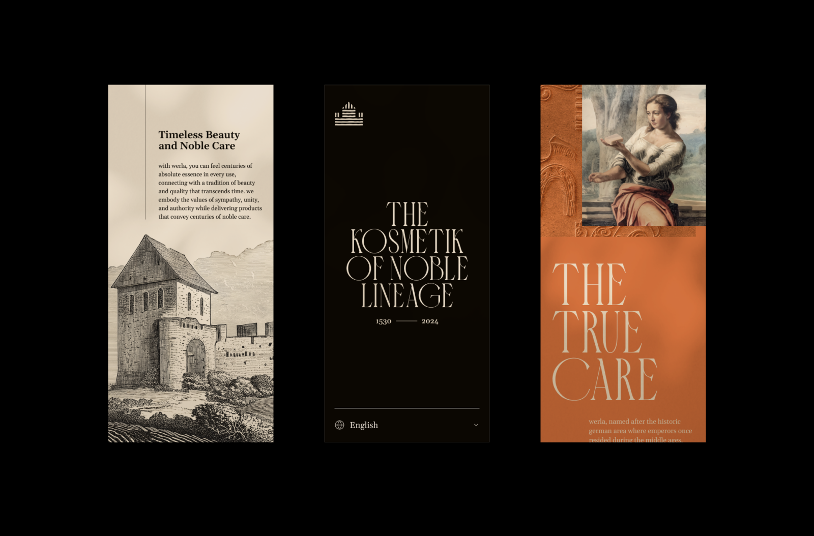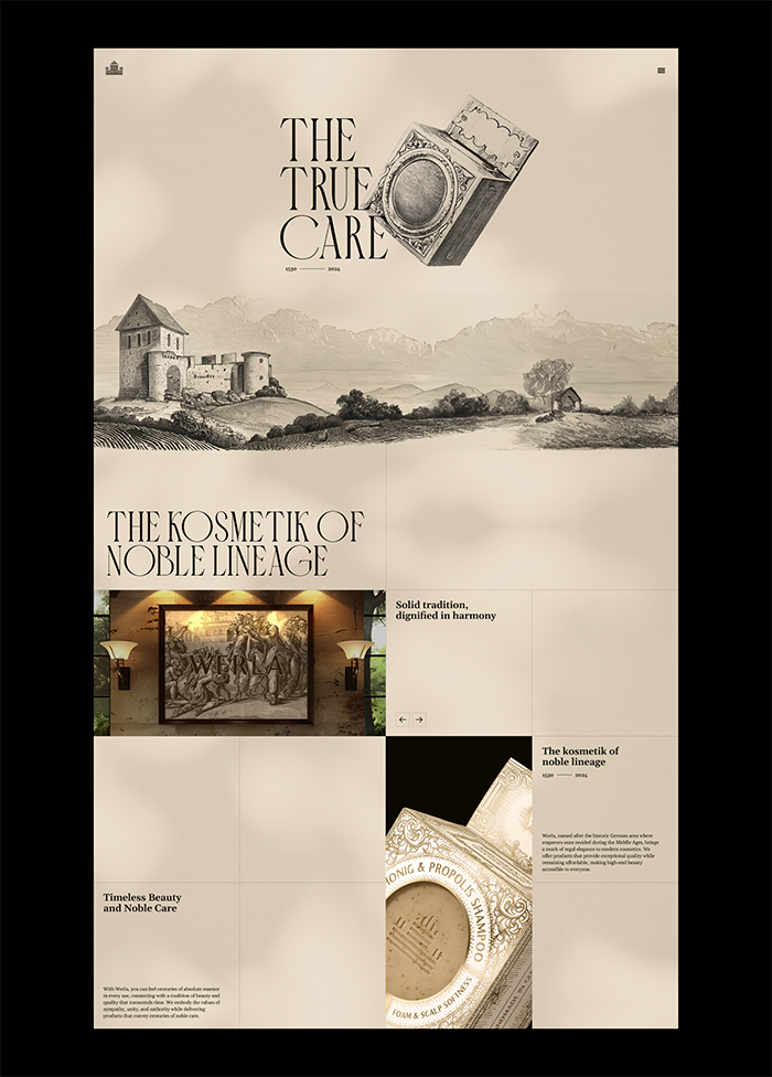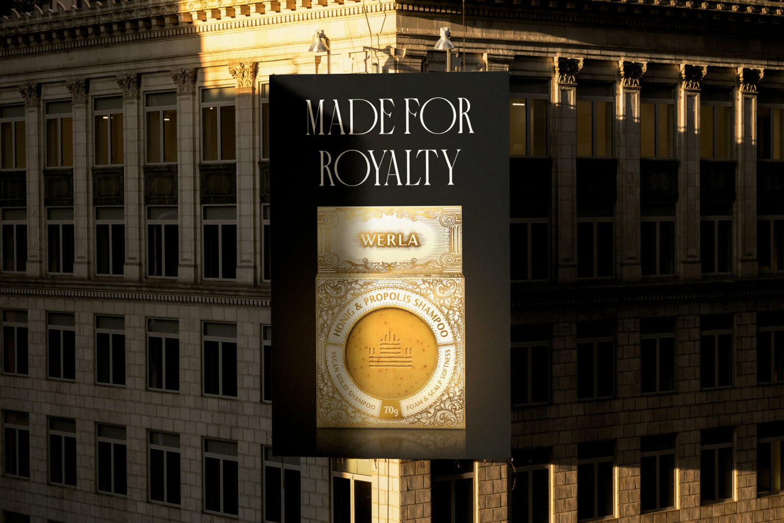
In the realm of beauty and cosmetics, where trends often dictate design, Werla stands apart with a visual identity that resonates with both history and modernity. Developed by Design with blink with a team of creative minds, including Lucas Coradi, Victor Weiss, Luiz Arthuso, Landerson Lineker, and Artur Weiss, the Werla brand captures a sense of regal elegance inspired by its namesake. In this historic German area, emperors once resided during the Middle Ages.
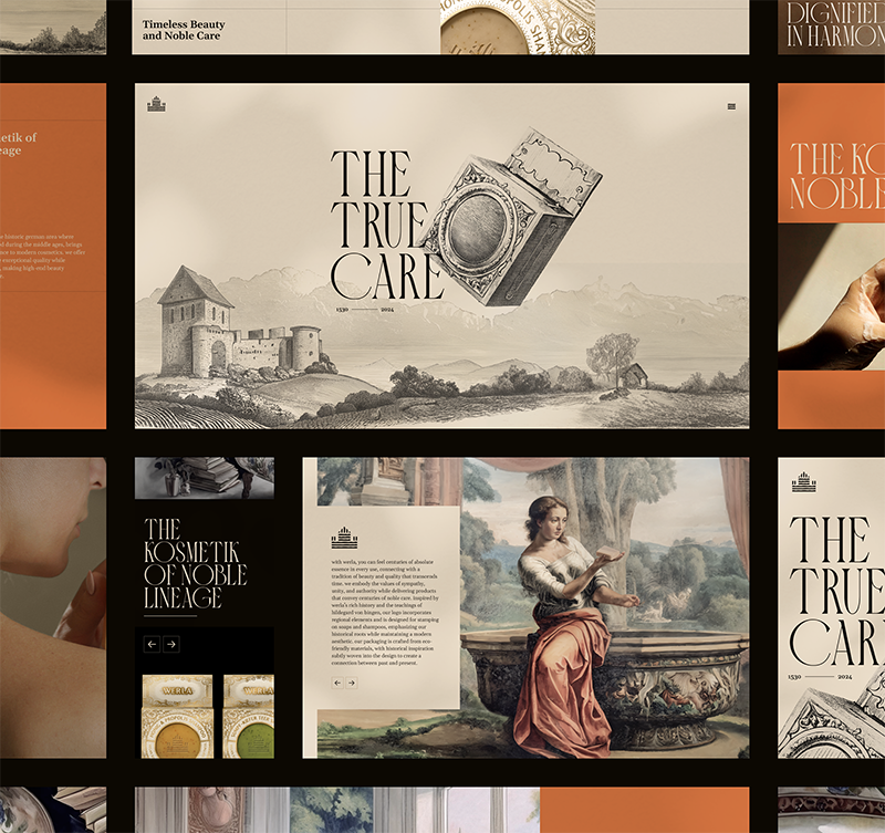 The foundation of Werla’s visual identity is a deep connection to history, particularly the rich traditions and teachings of Hildegard von Bingen, a figure synonymous with natural healing and medieval wisdom.
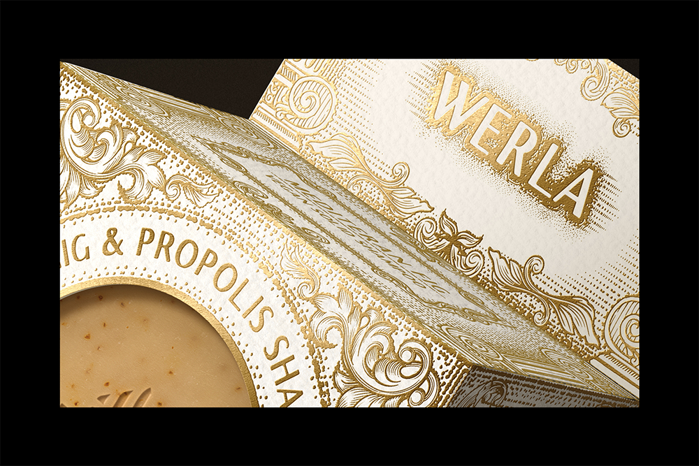
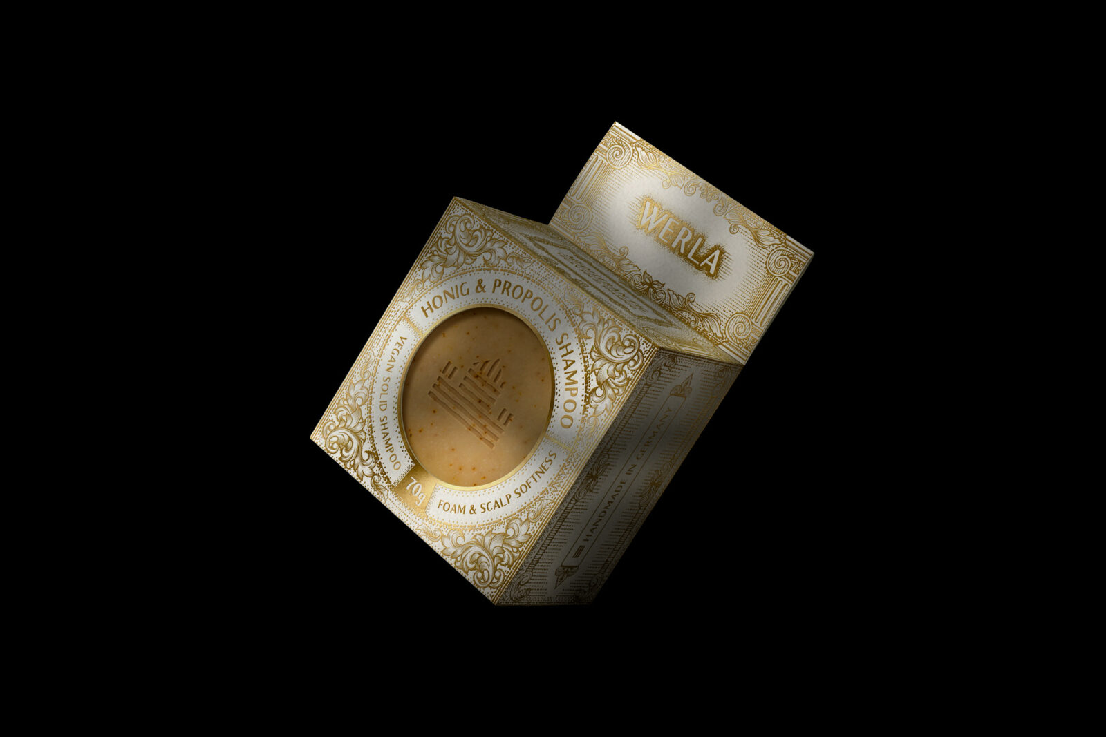
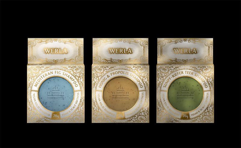
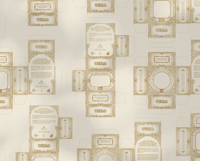
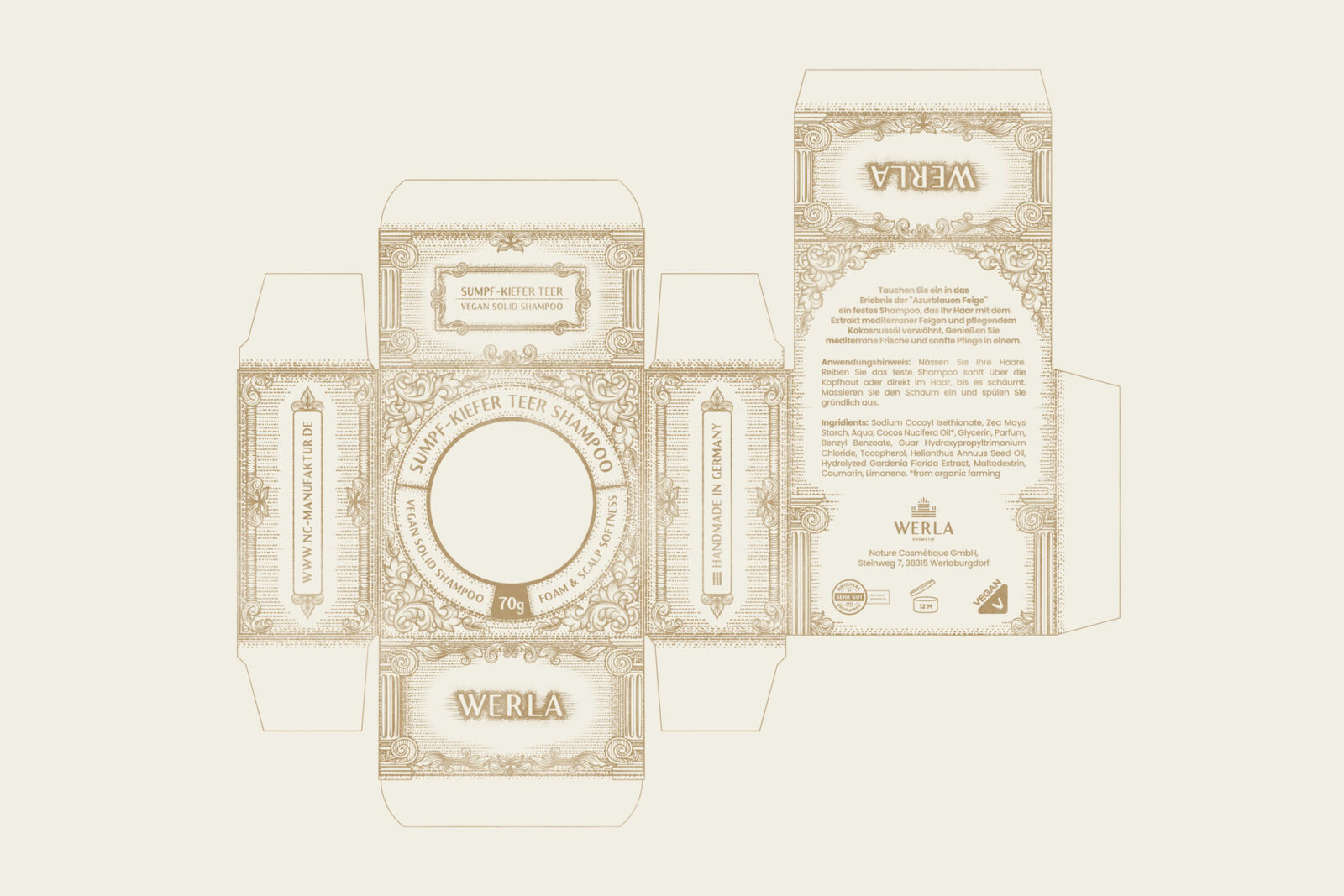
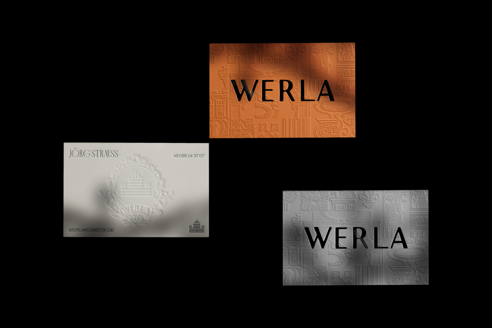
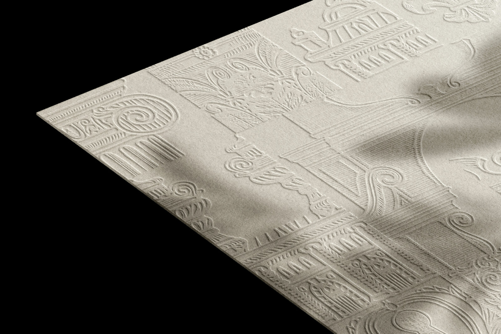
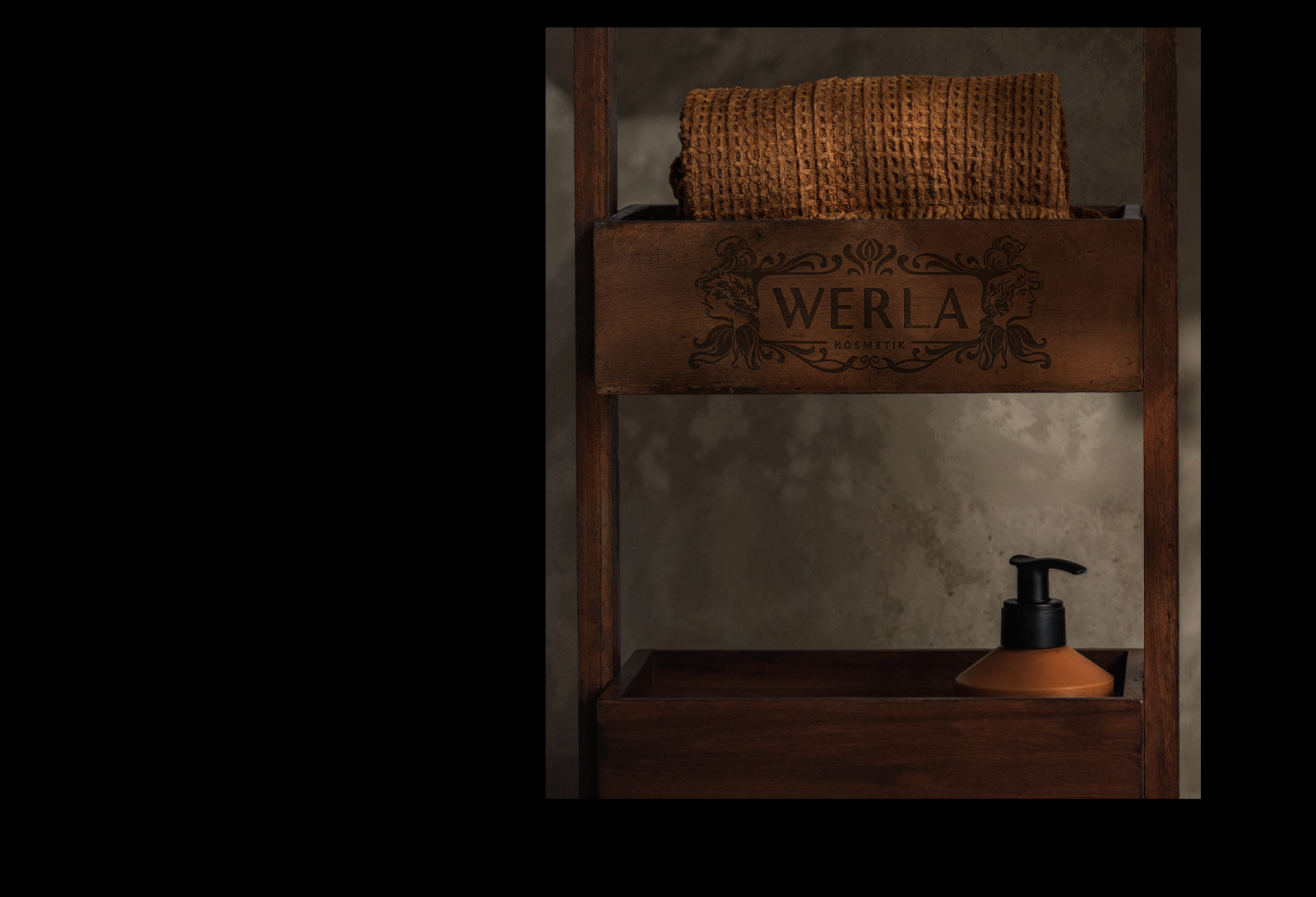
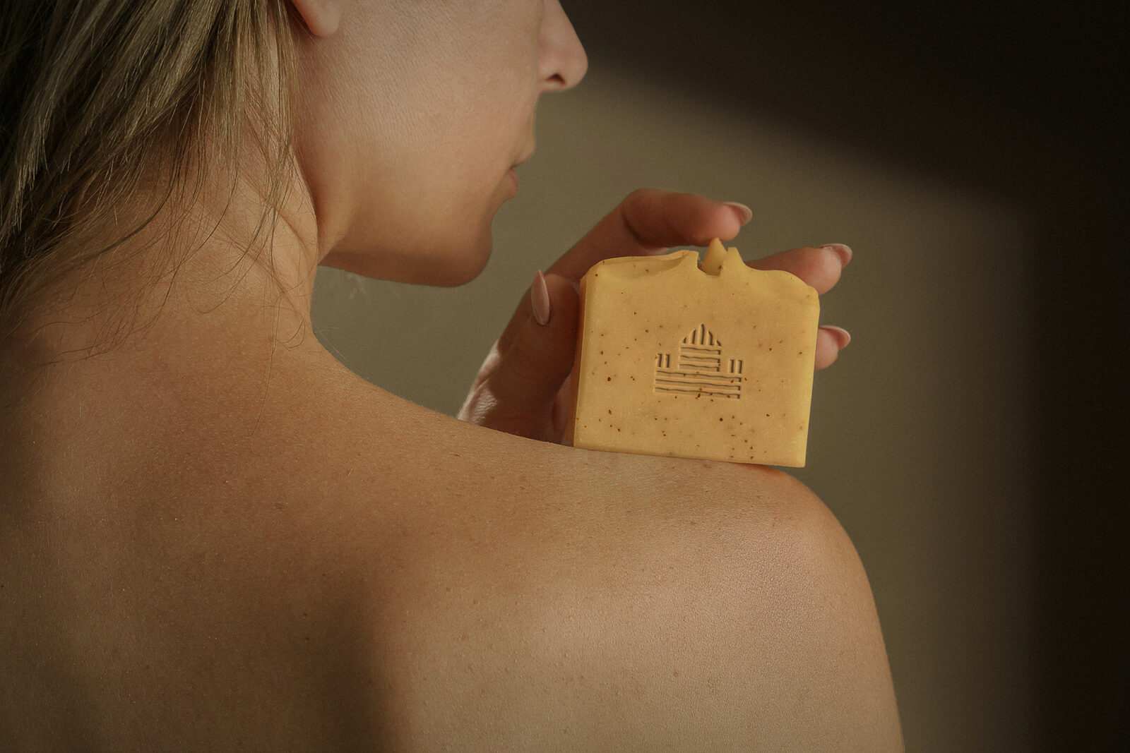
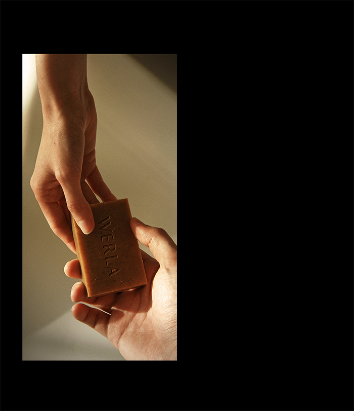
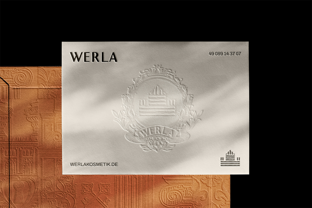
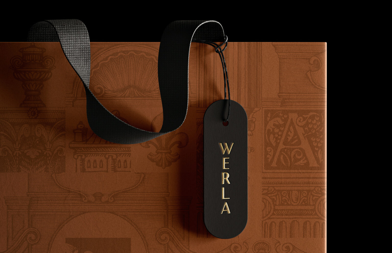
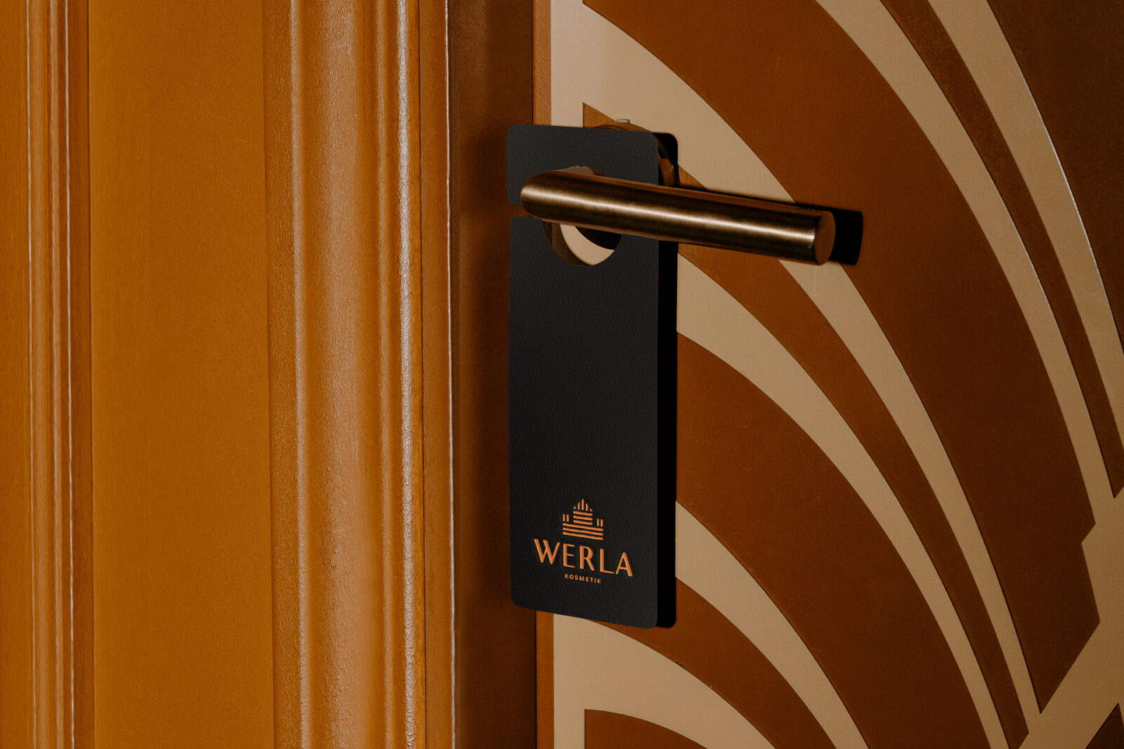
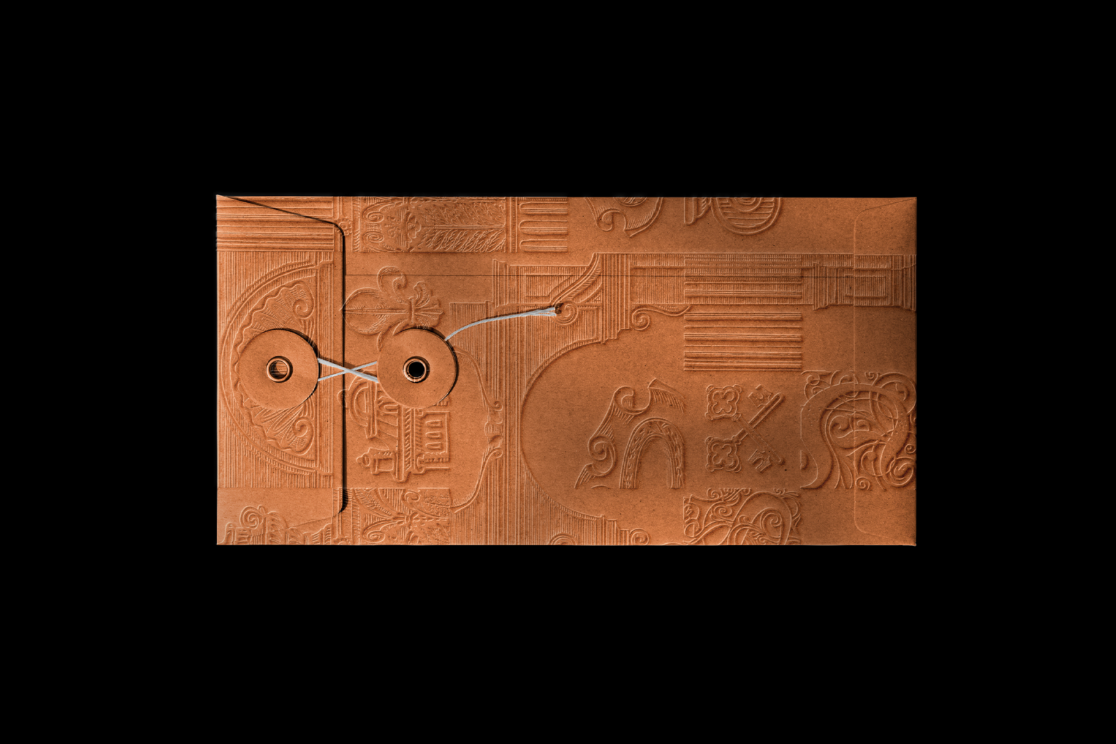
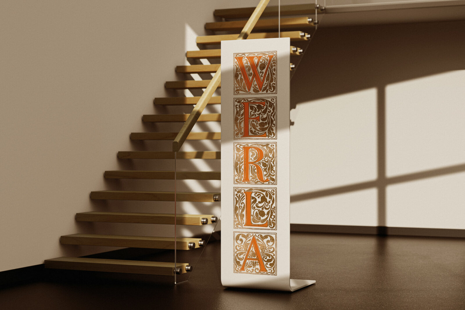
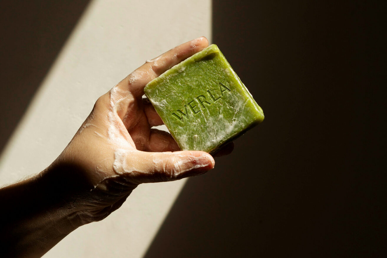
This historical influence is evident in every element of Werla’s design, from the logo to the packaging. The logo, for instance, features a hand-drawn icon inspired by the medieval towers of Werla. This symbol, designed for easy stamping on solid shower bars, shampoos, and soaps, reinforces the brand’s commitment to authenticity and tradition.
Our minimalistic approach features a clean font with slight details that give it enough personality to stand alone without an icon.
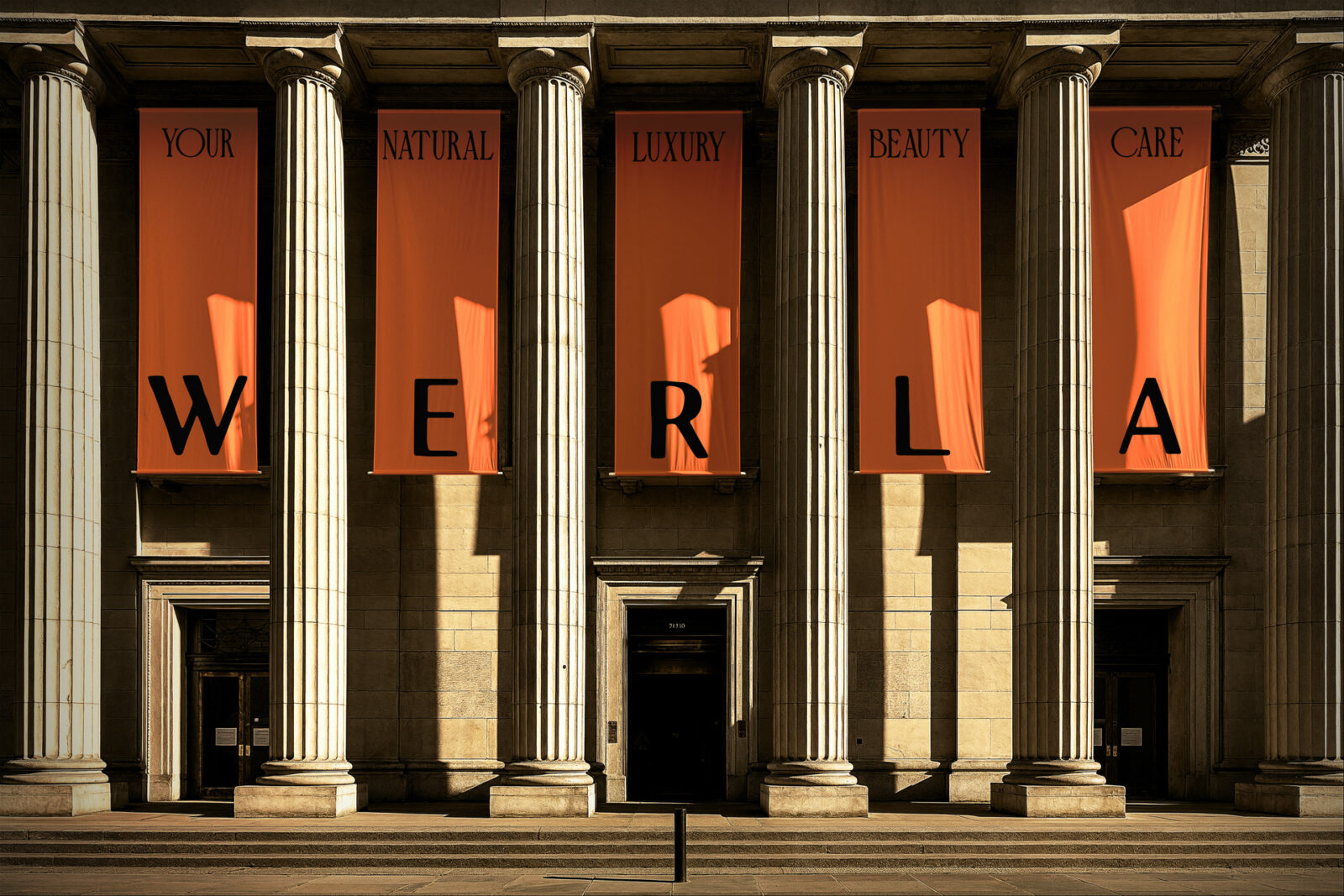
The design team opted for an organic, sans-serif font that evokes a nostalgic medieval feeling, adding to Werla’s unique character. This choice of typography plays a crucial role in the brand’s visual identity, striking a delicate balance between historical reverence and modern sophistication. As the team explains, “Our minimalistic approach features a clean font with slight details that give it enough personality to stand alone without an icon.” This careful consideration ensures that the brand’s typography is not just a complement to the icon but a strong visual element on its own.