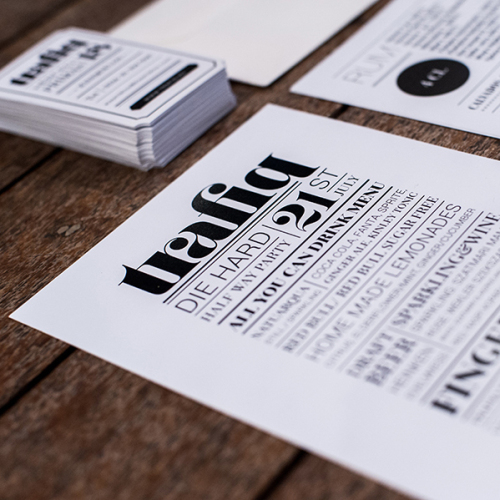
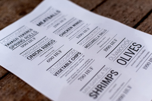
A Hungarian creative and visual artist who goes by the name Kissmilkos was given a gigantic task of creating a sophisticated bohemian brand and atmosphere for Trafiq, one of the most popular bars in downtown Budapest. This incredibly comprehensive project must have been a massive undertaking, which the designer seems to have tackled with style and ease, as the result is an astonishing and unique typographic wonderland, with everything from the visual identity and interior graphics to web and packaging design matching to the tee.
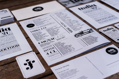
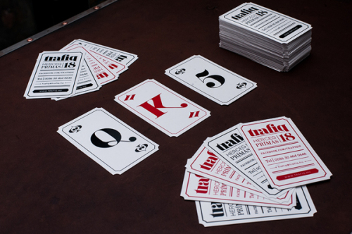
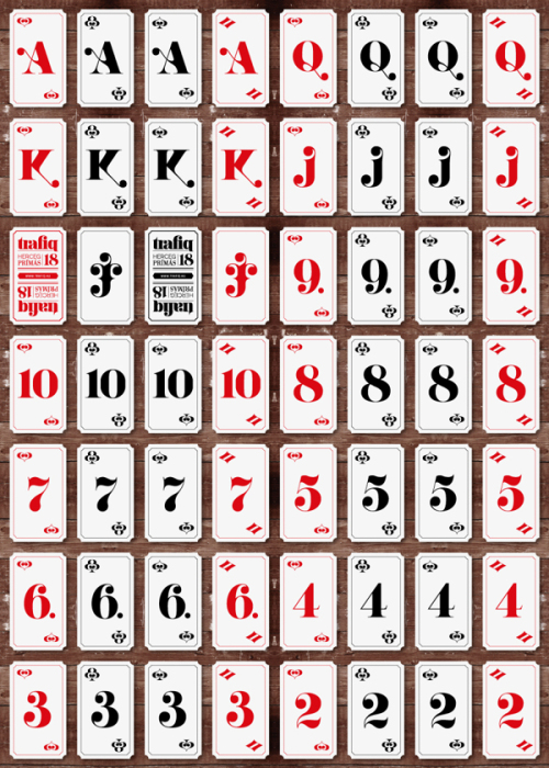
A “trafik”, common in the late 19th to early 20th century, was a type of store selling tobacco, newspapers, sweets, toys, and other knickknacks, a real wonderland for children. The goal was to create a concept that revives that feeling with reinterpreting its vintage vibe by adding contemporary elements. Kissmilkos purposefully created an image that reflects this classic atmosphere of a trafik: the typography resembles broadsheet newspapers, while French cards, the essential accessories of early 20th century clubs and the typical souvenirs of the time, serve as accentuated design elements. Trafiq has its own deck of cards, which, besides being used as business cards, fills various functions, further strengthening an already well-established visual identity.
The attention to detail is very impressive, which is often overlooked in a task this size. Nothing is exactly what it seems, each design element and choice is thought-out and comes with a great background story. Great design makes you question, it draws you back time after time, just like Trafiq.
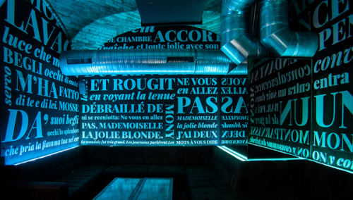
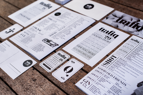
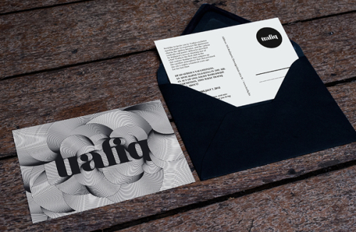
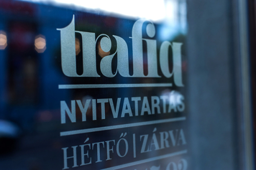
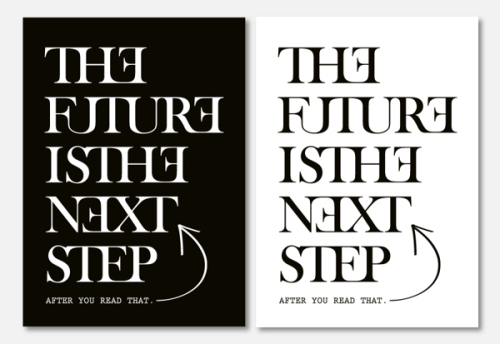
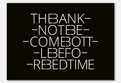
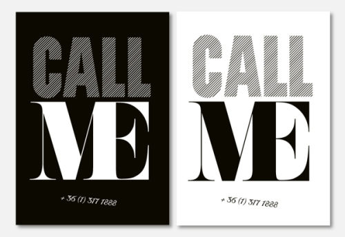
The logo is based on a roman-type font and mixed with a playful, classic ligature. Also, the address of the venue is included in the logotype, creating a unified look with the place. The monochromatic black and white design of the stationery heavily leans on typography, lifting it on a pedestal and turning the spotlight right on it. The mix of different typefaces, heights and intensities create a pattern which effortlessly transforms from the necessary paper goods to interior graphics.
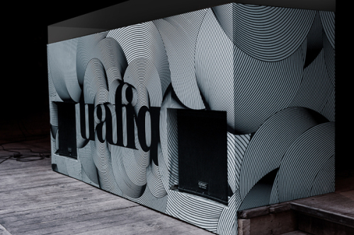
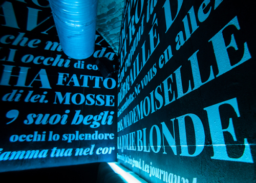
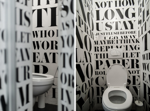
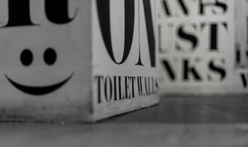
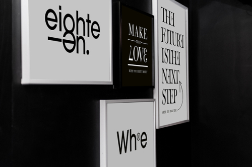
The quotes on the walls are taken from timeless literary masterpieces such as Apollinaire’s The Eleven Thousand Rods, Boccaccio’s Decameron and Geoffrey Chaucer’s The Canterbury Tales. The idea is carried through all the way to the restrooms where simplistic graffiti, often found on a wall of a toilet, collected from Anglo-Saxon countries separate the genders. The humorous posters spread over the walls with witty saying as well as the large highlighted DJ booth add to the character of the place.
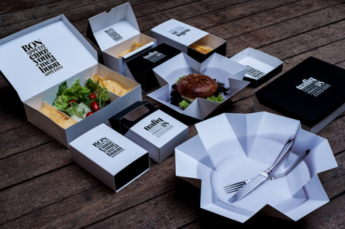
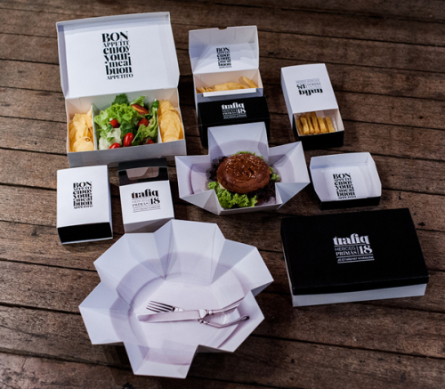
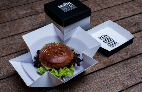
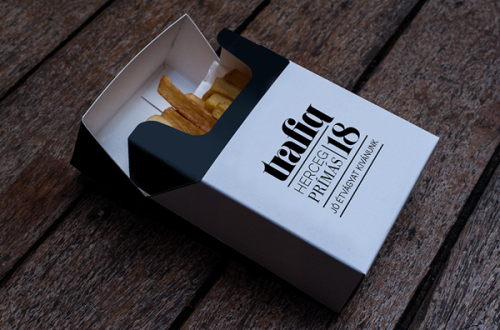
The concept of the packaging is based on the formerly described world of trafiks, and puts simple, playful ideas into practice: such as hard-pack cigarette boxes and matchboxes. But without losing the elegant and modern style that outlines Trafiq’s image. Kissmilkos managed to create a modern day meeting point where the old world can be felt but the new worlds are on show.

Photos © KissMiklos Behance

