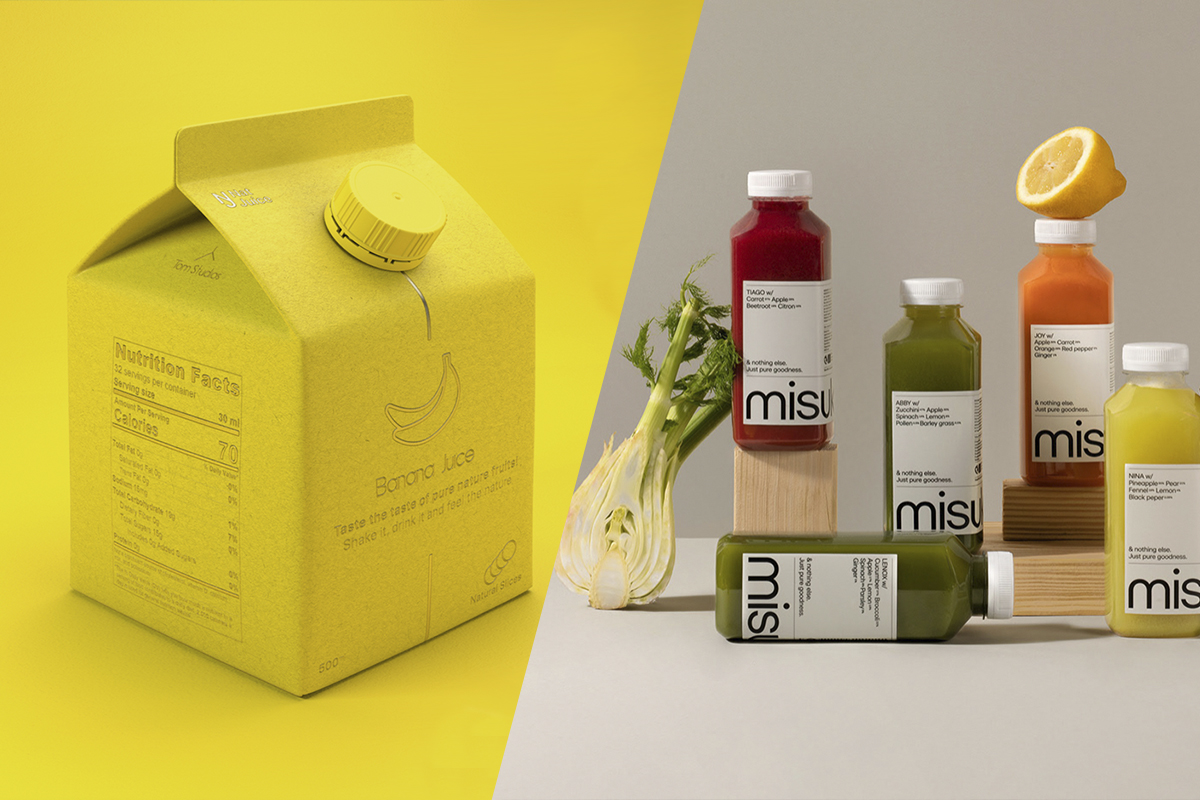
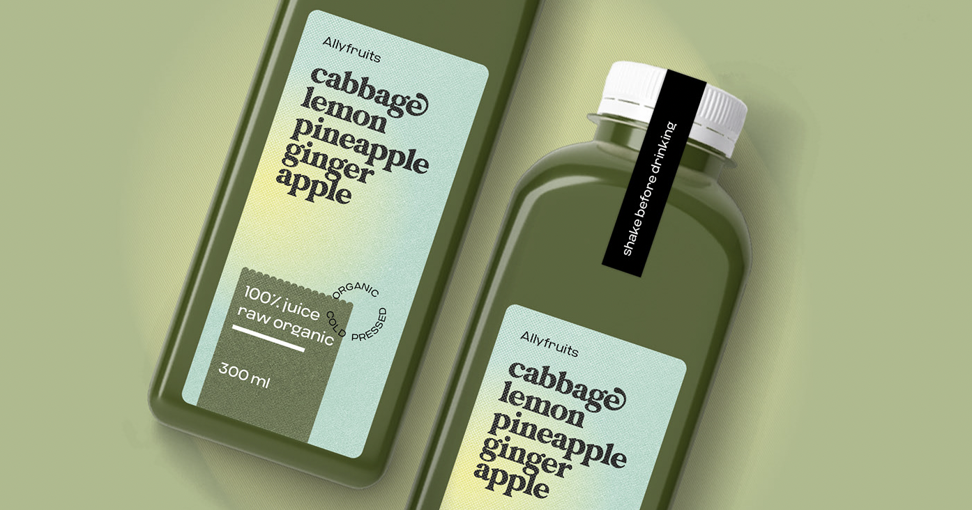
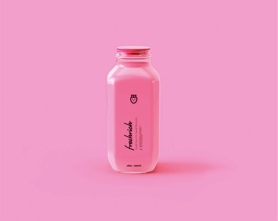
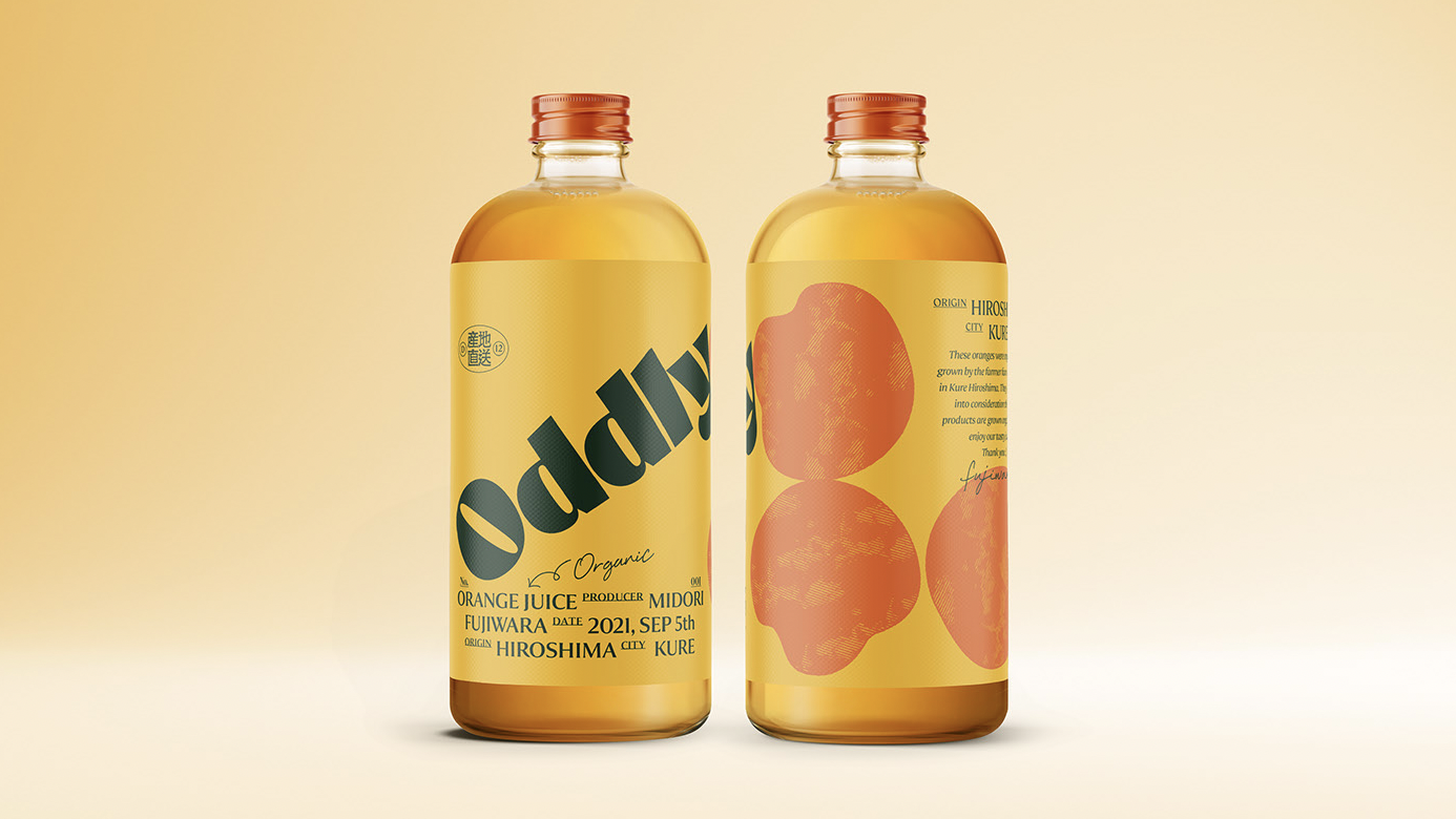
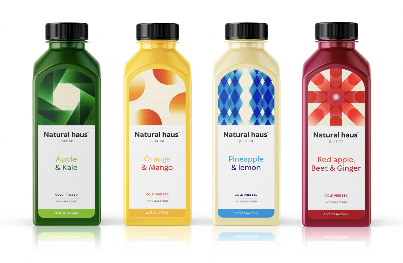
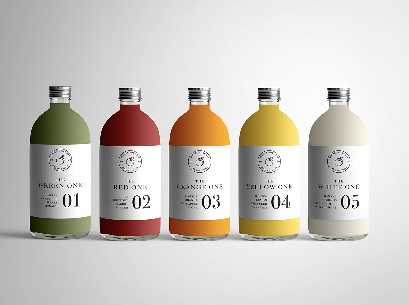
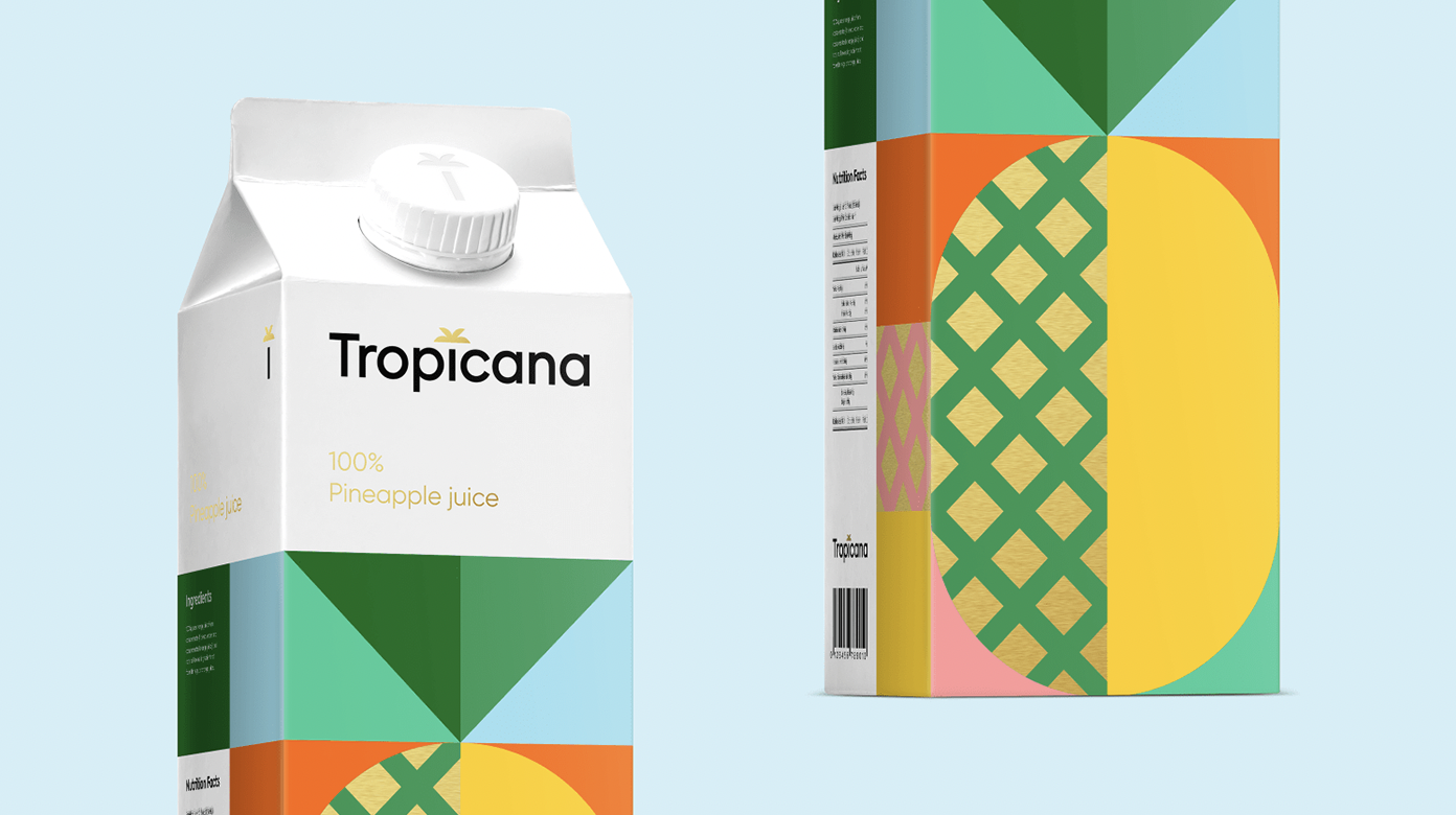
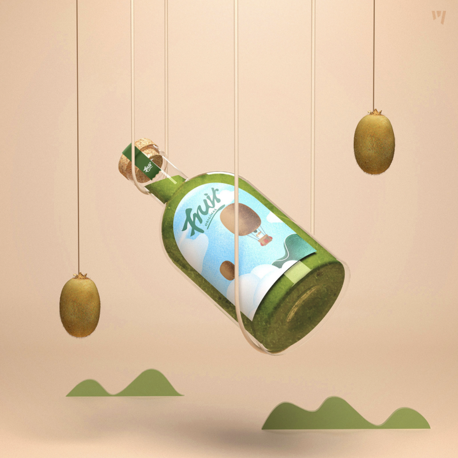
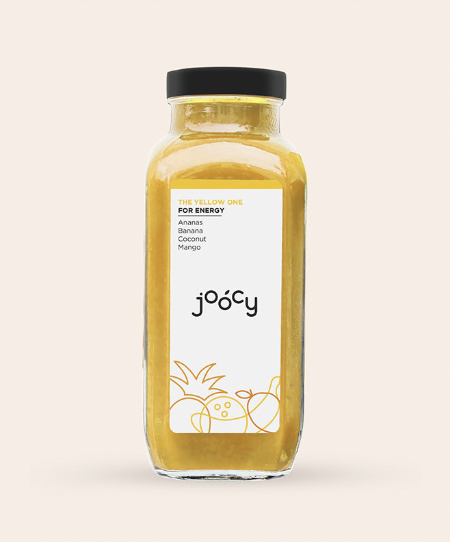
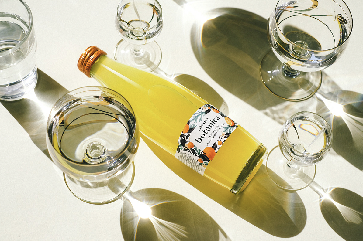
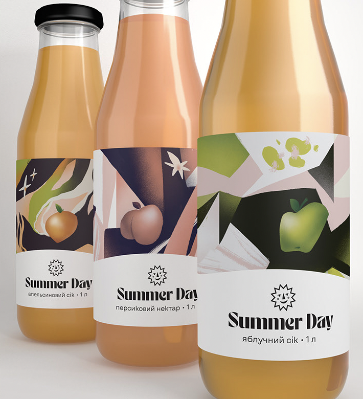
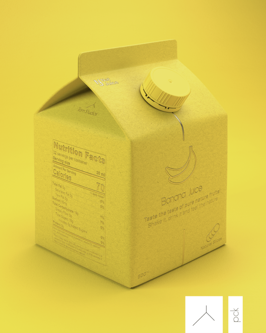
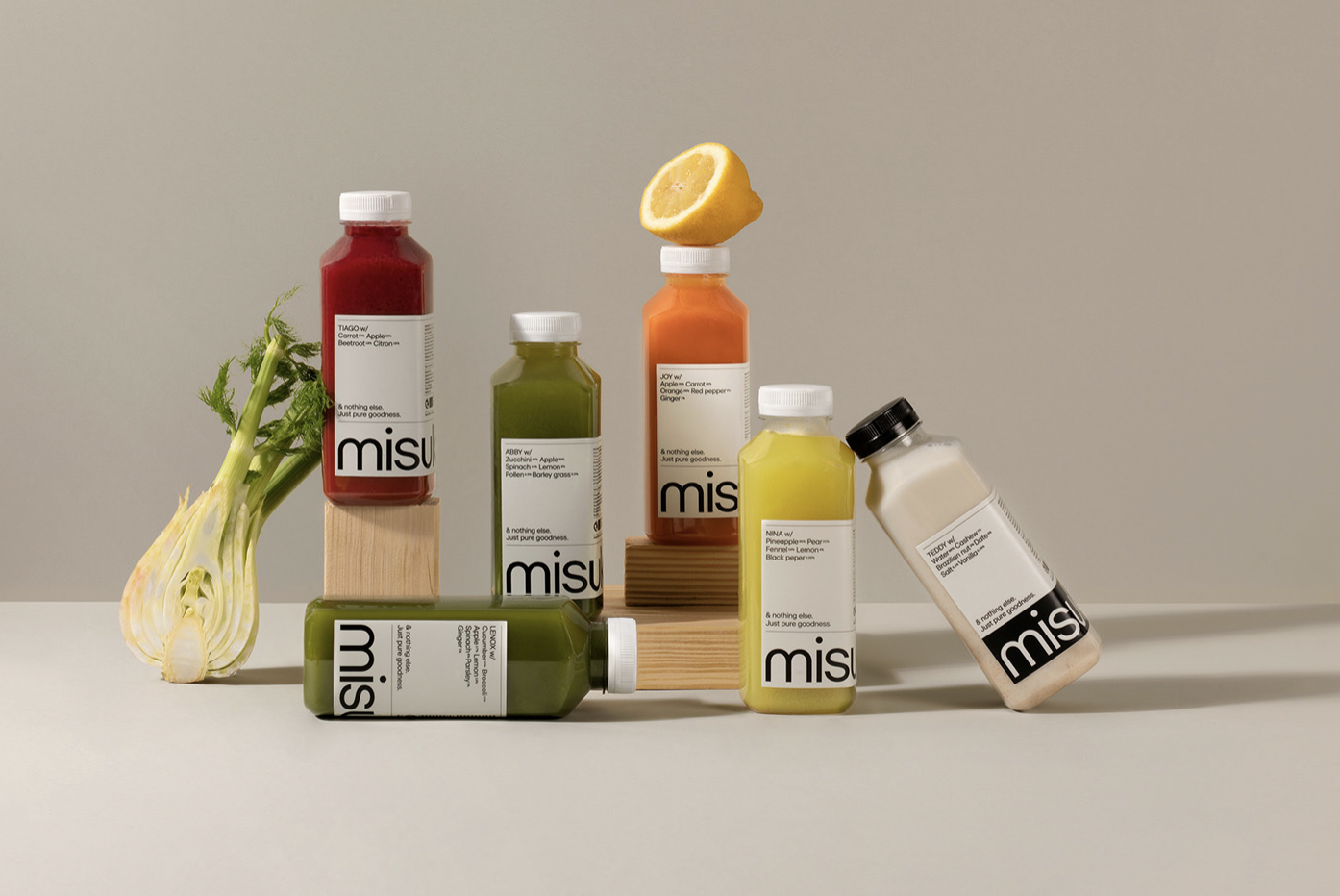
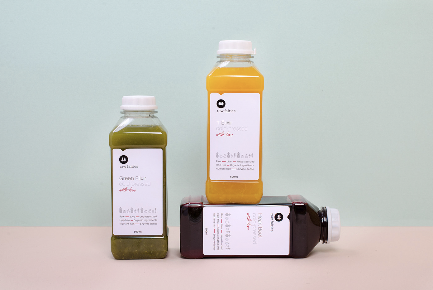
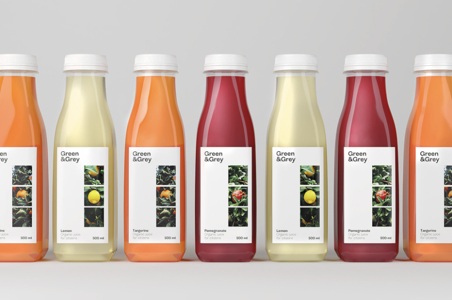
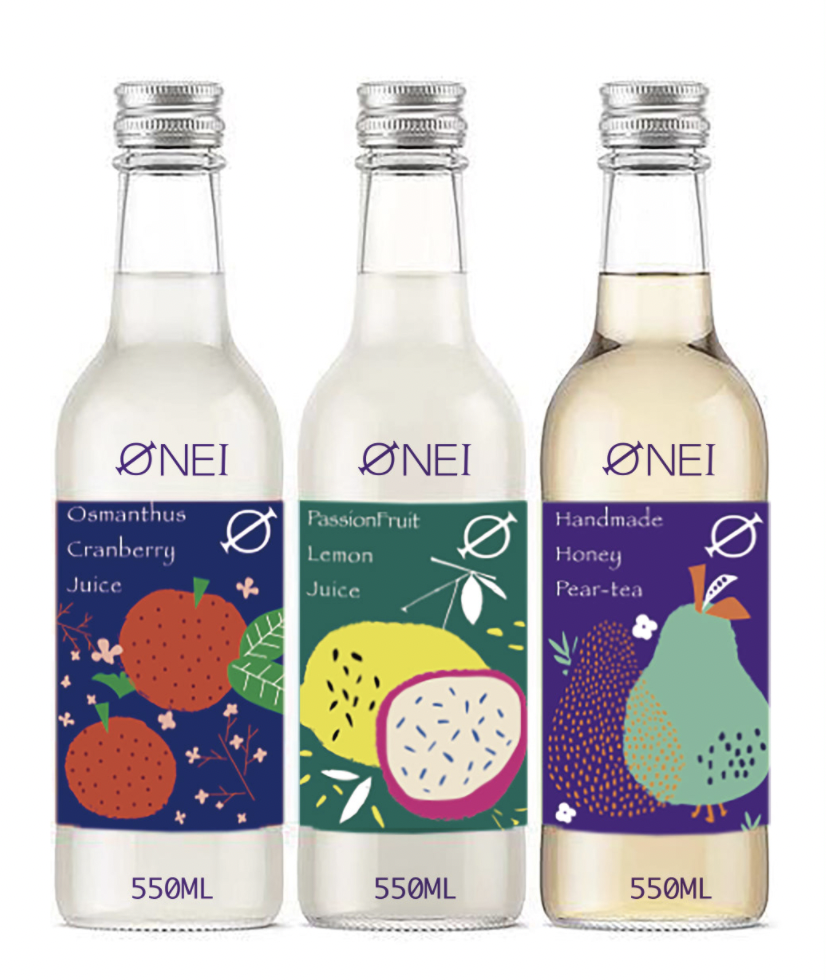
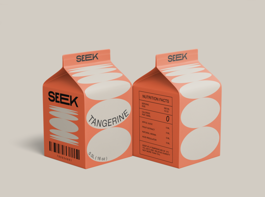
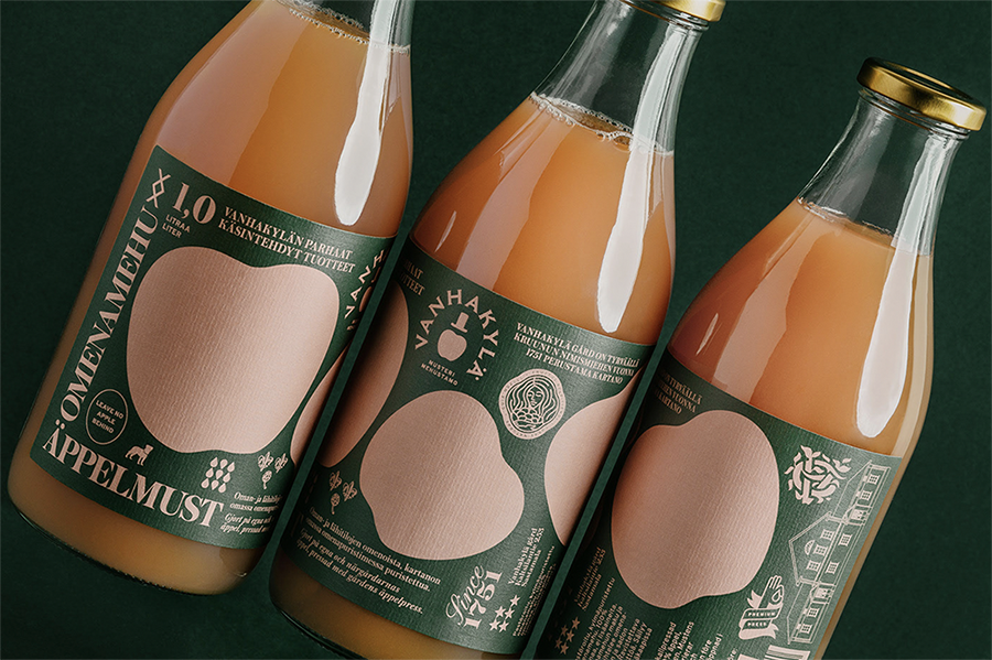
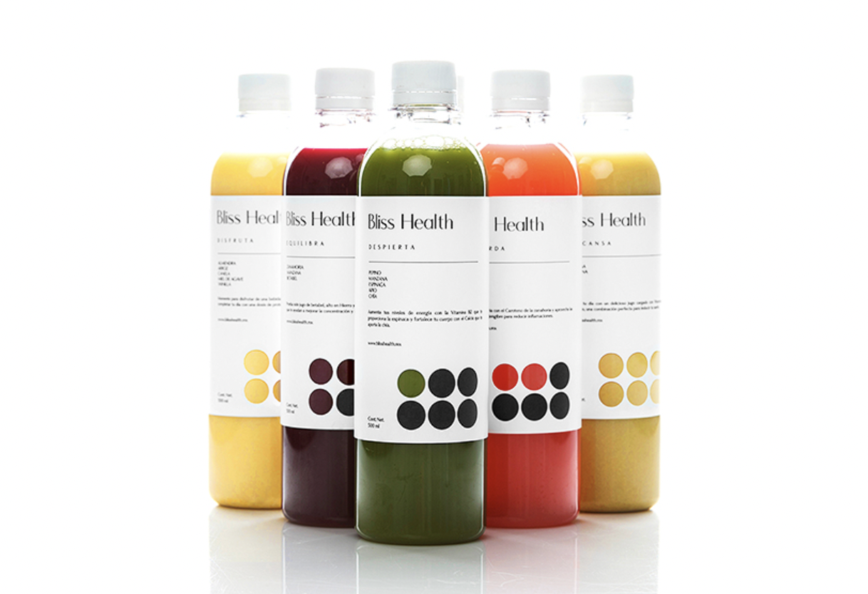
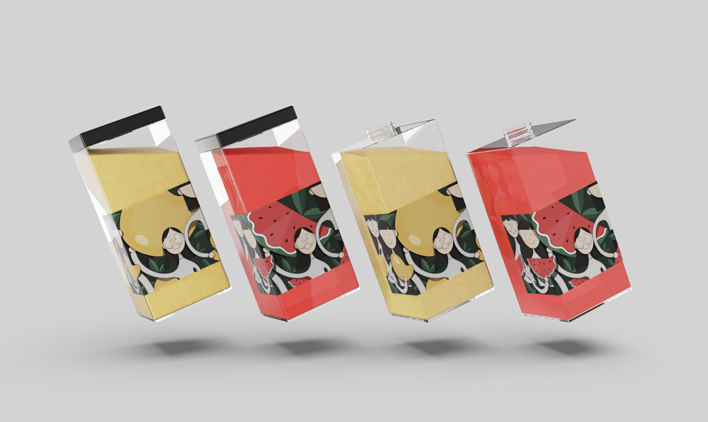
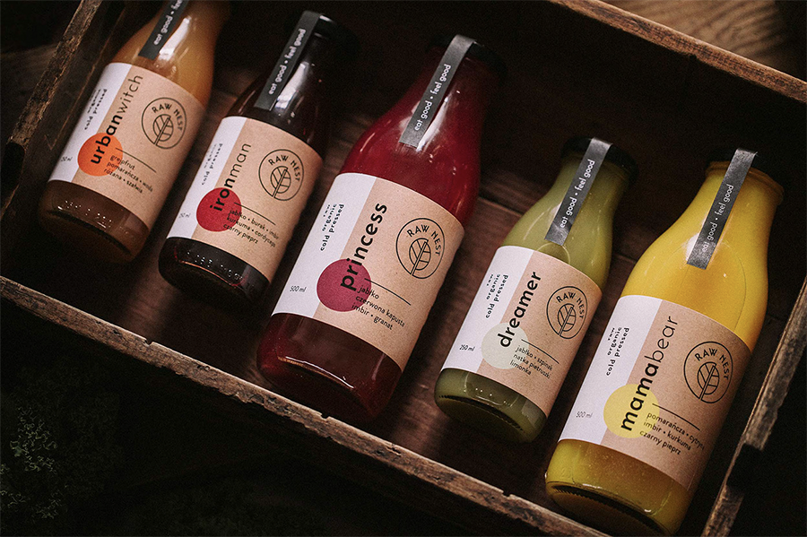
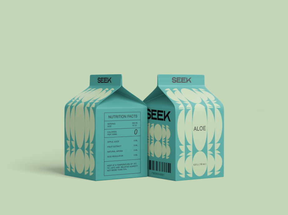
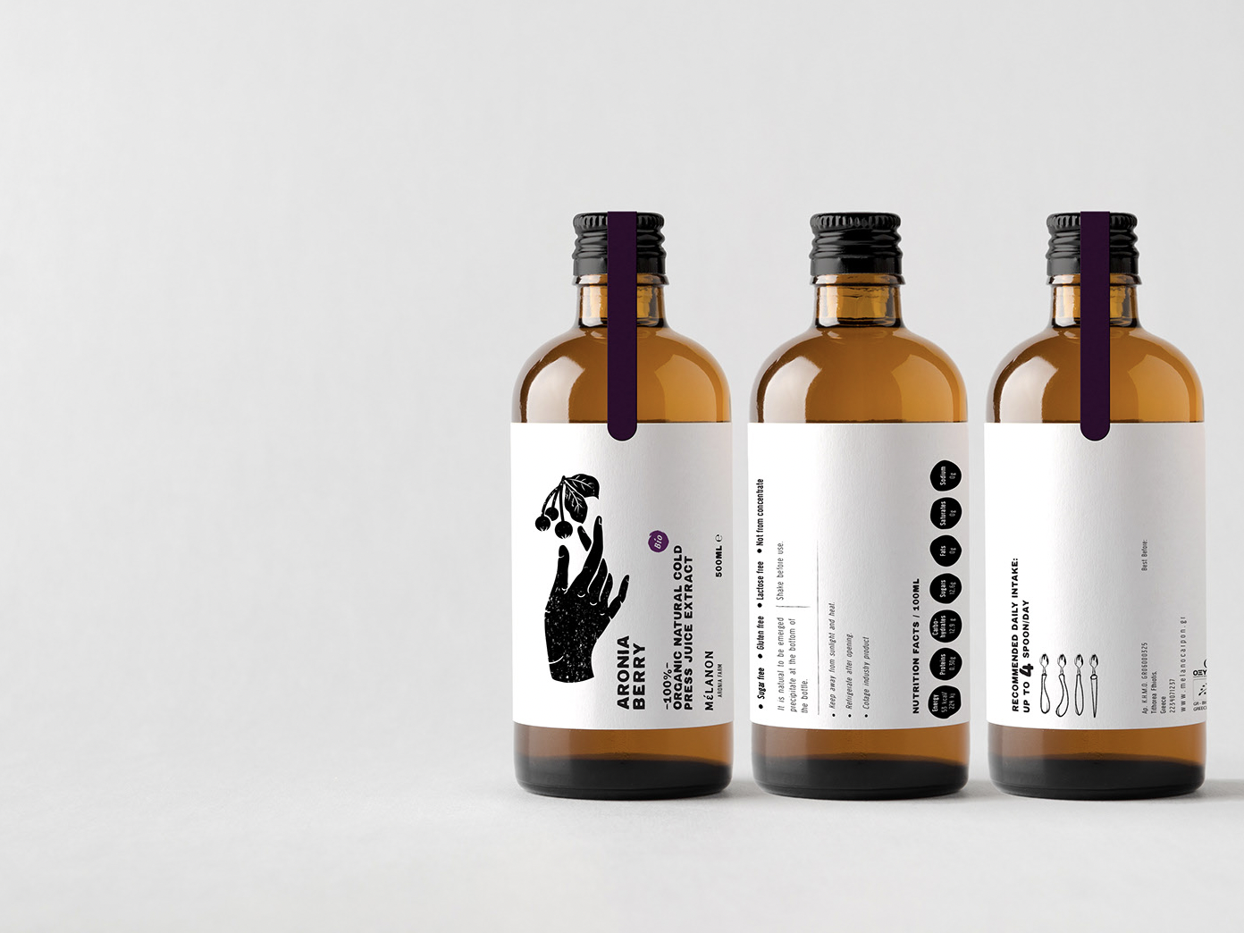
Like many consumer goods sectors, the juice aile at the supermarket keeps growing, demanding for brands to get creative with their juice packaging design in order to stand out among many. As fresh juices, wellness drinks, and detox brands regularly utilize similar ingredients, the trick often is to highlight the product inside and show off the beautiful colors and hues and textures of the fruits and vegetables in the drink. But sometimes, brands think of something new that elevates the product above the rest.
From minimalistic branding and creatively shaped and sized juice bottles, to typography focused or monochrome label designs
These twenty two examples of fresh juice packaging concepts had their designers thinking outside the box – or some cases, bottles. Bold colors, playing with proportions, unique and eye-catching typography, and bottle design have all been considerated carefully, with together contributing to creating visually stylish and innovative juice packaging design. In many, the inspiration is clearly drawn from the health and energizing benefits juice can offer, its clean ingredients and fresh and lush taste and zesty flavour, while the color of the actual juice inside offers a beautiful backdrop for the visual outlook itself.

