In the ever-evolving world of typography, the contrasts between trends reflect the diverse needs and tastes of today’s designers and brands. And while trends come and go, some always leave a lasting impression and become classics on their own. Recently, the design landscape has been characterized by a fascinating dichotomy between two strikingly different typographic styles: the soft, round, almost three-dimensional typefaces that feel hand-drawn, and the elegant, refined serif fonts that evoke a sense of tradition and classicism. These trends, though seemingly at odds, co-exist beautifully, offering designers and brands a versatile toolkit for expressing their unique identities. Let’s delve into these two trends, exploring their characteristics, uses, and the broader context of current typography.
While one trend leans towards playfulness and approachability, the other upholds tradition and sophistication
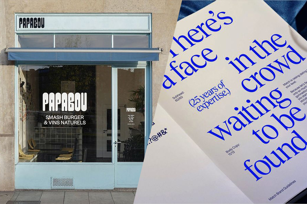
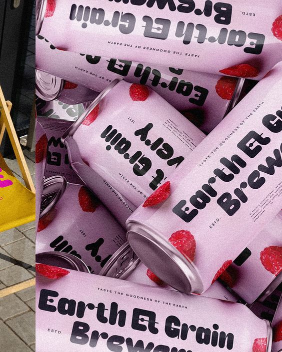
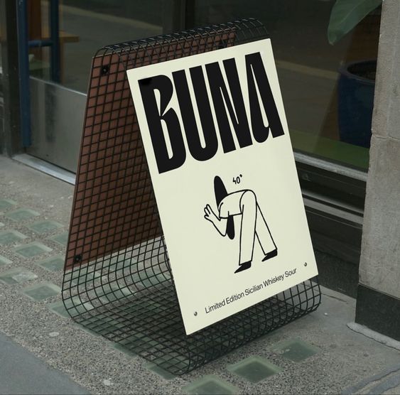
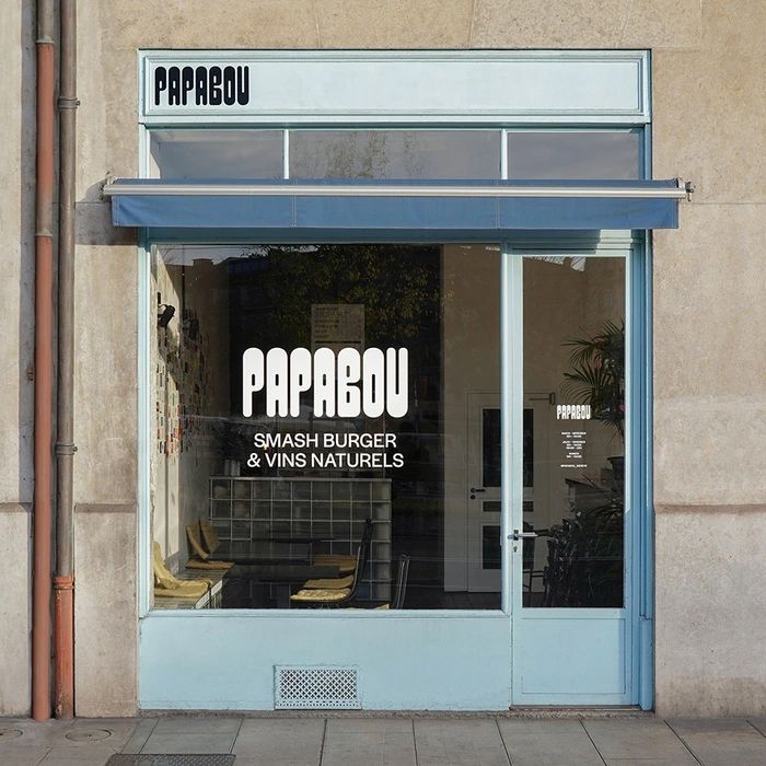
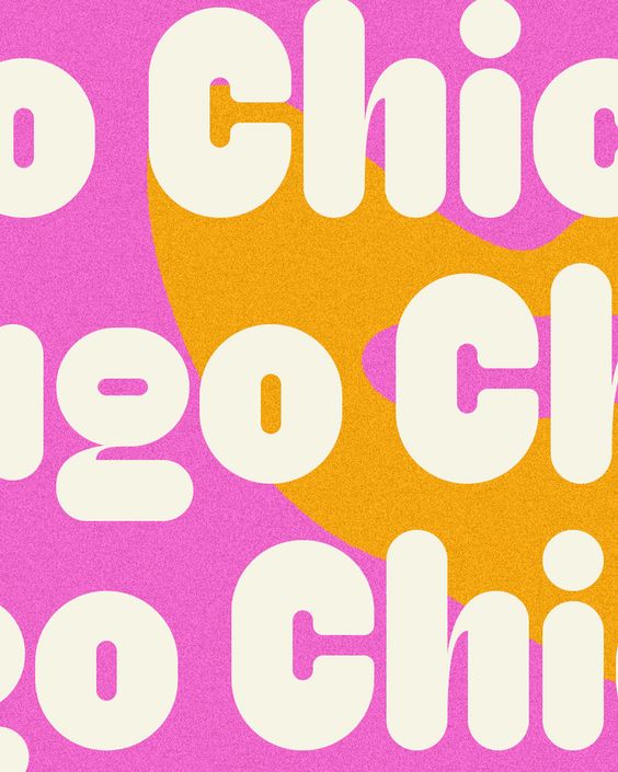
We’ve been seeing the rise of soft typefaces that seem to leap off the page (or screen) with their rounded three-dimensional appeal. These fonts are characterized by curved edges – smooth, rounded corners that exude friendliness and approachability. Volume and depth – many of these typefaces have a subtle depth, making them appear puffed or inflated, adding a playful, tactile quality. And despite their digital origins, these fonts often mimic the imperfections and organic shapes of hand-drawn letters, adding warmth and a human touch.
This style is ideal for brands and projects that want to convey a sense of fun, creativity, and approachability. And it’s often seen in industries like children’s products, casual dining, and lifestyle brands targeting younger audiences. Whether used in logos, headlines, or packaging, these fonts draw the eye and evoke a sense of comfort and joy. Consider a brand that wants to market a new line of eco-friendly, kid-friendly toys. A soft, round typeface would instantly communicate the playful, safe, and fun nature of the product, appealing directly to both children and parents.
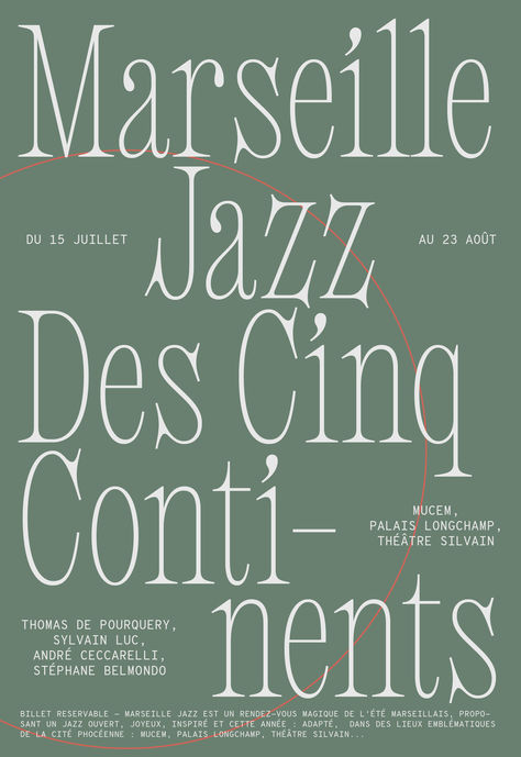
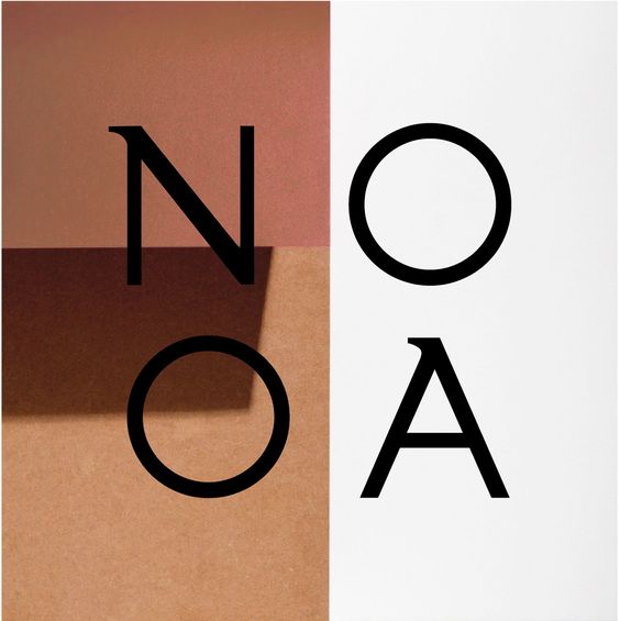
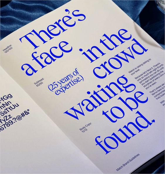
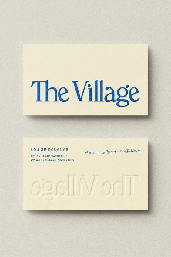
In stark contrast, elegant serif fonts have also surged in popularity, embodying a completely different aesthetic. These fonts are defined by refined lines. Thin strokes with sharp, pointed serifs add a touch of formality and precision, while classic proportions which are rooted in centuries-old typographic traditions, offer a sense of history and reliability. The slight variations in stroke weight and the delicate terminals of these fonts bring a sense of sophisticated luxury and elegance.
Elegant serifs are the go-to choice for brands that want to communicate sophistication, heritage, and authority. They are often found in luxury branding, high-end editorial design, and industries like fashion, law, and finance, where a sense of tradition and trustworthiness is paramount. A luxury watch brand, for instance, would benefit greatly from using an elegant serif font. The typeface would not only highlight the brand’s long history and commitment to craftsmanship but also appeal to consumers seeking timeless, high-quality products.
While these two trends may seem to represent opposite ends of the typographic spectrum, they often coexist within the same design landscape, offering a rich palette for designers.
For instance, brands might use a soft, round typeface for playful, attention-grabbing headlines, while employing elegant serifs for the body text to convey reliability and depth. This interplay between the two styles can create a dynamic visual hierarchy, guiding the viewer’s attention and enhancing the overall user experience.
In addition to these two dominant trends, there are a few other noteworthy movements in typography that are worth exploring: Nostalgia is a powerful tool in design, and retro fonts tap into the collective memory, bringing a sense of familiarity and fun to modern projects. A resurgence of 1970s and 1980s-inspired typefaces, characterized by bold, geometric shapes and vibrant colors is all the rage now. And as brands fight to stand out in an increasingly crowded market, maximalism offers a way to make a strong, unforgettable impression. Maximalist fonts offer a counter-movement to minimalist design, maximalist typography is all about big, bold, and unapologetically expressive type. And simultaneously as digital tools are becoming more sophisticated, designers are pushing the boundaries of what’s possible with type, creating innovative and surprising visual experiences. Breaking the rules of traditional typography, this trend includes distorted, fragmented, or otherwise unconventional type treatments.