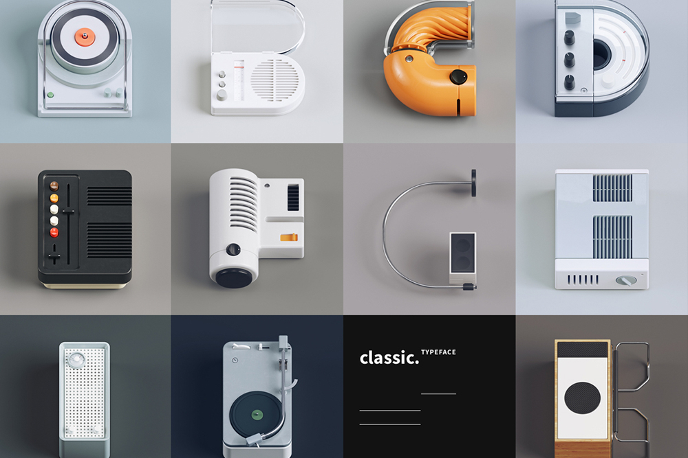
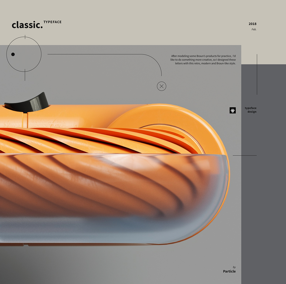
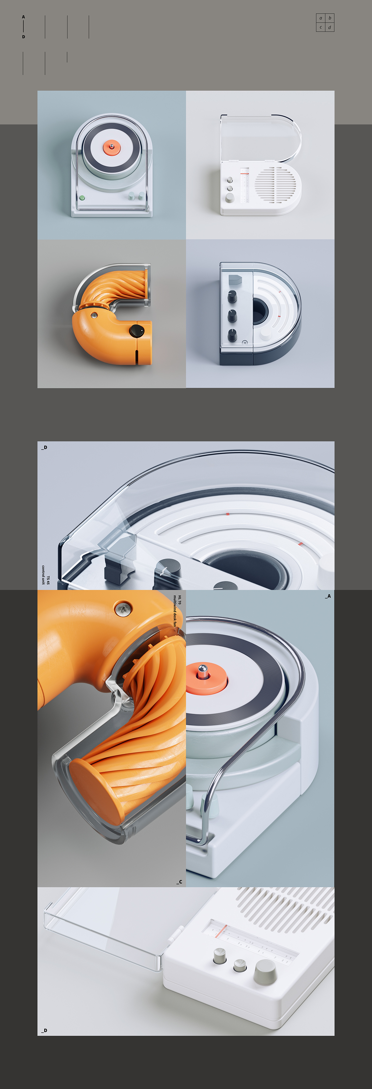
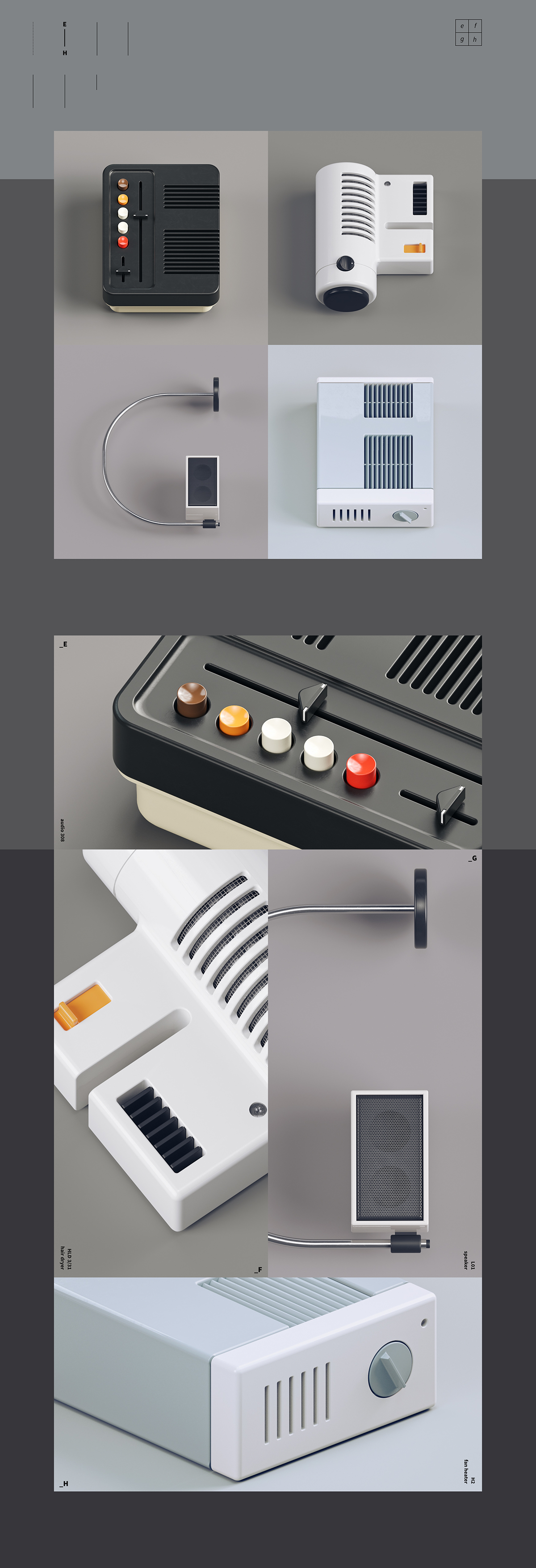
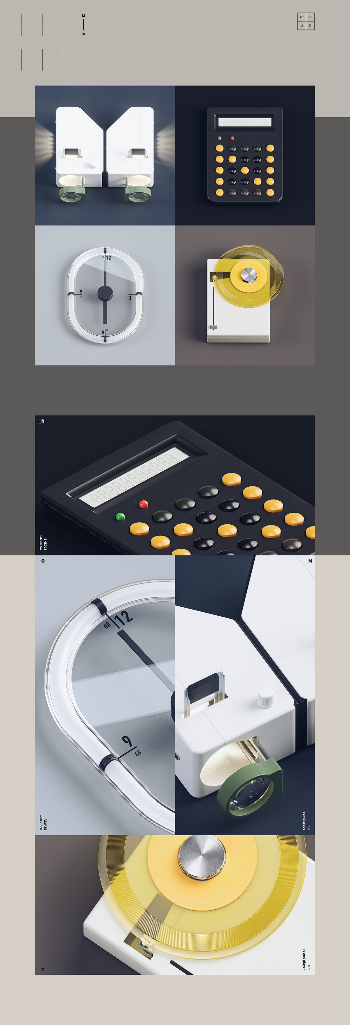
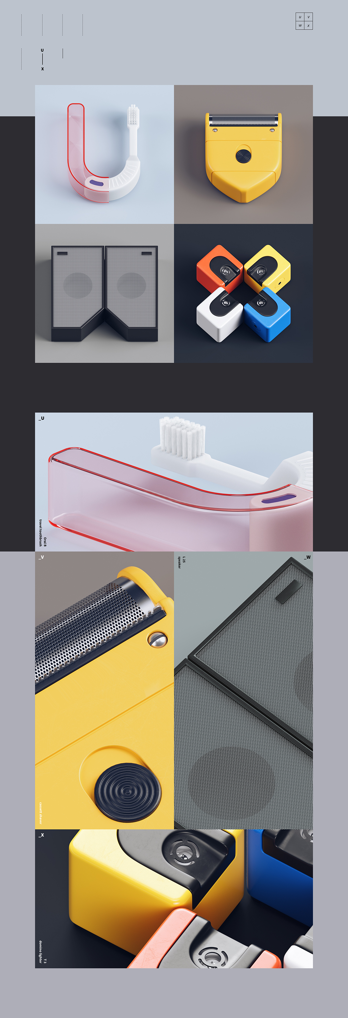
After modeling some of world-known electronic giant Braun’s products for design practice, Chinese designer Gao Yang wished to do something more creative, so he started designing a full alphabet of letters in the retro Braun-like style. By simply taking real products from Braun’s catalog, Gao created an amazing set of typography by making small alterations to them while keeping the loved aesthetic recognizable and the essence of the “Braun-ness” intact.
While creating an incredibly impressive personal portfolio of work for himself, Gao manages to pay homage to Braun’s legacy that has influenced industrial designers across decades with their functional and clean style.
The letter U made of a toothbrush is my favorite, which is yours?




Images © Particle

