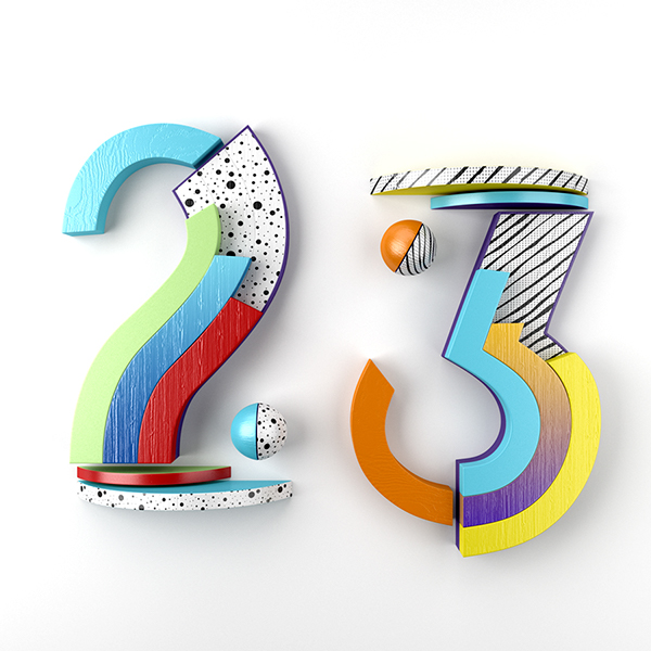
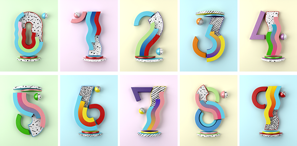
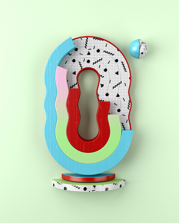
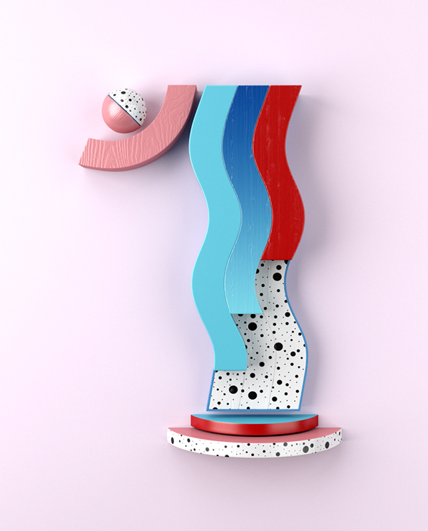
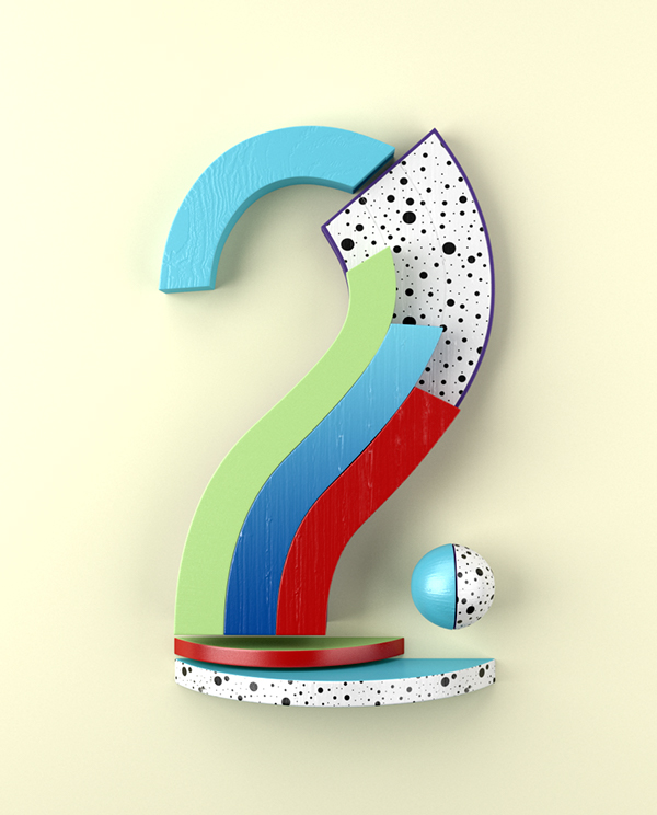
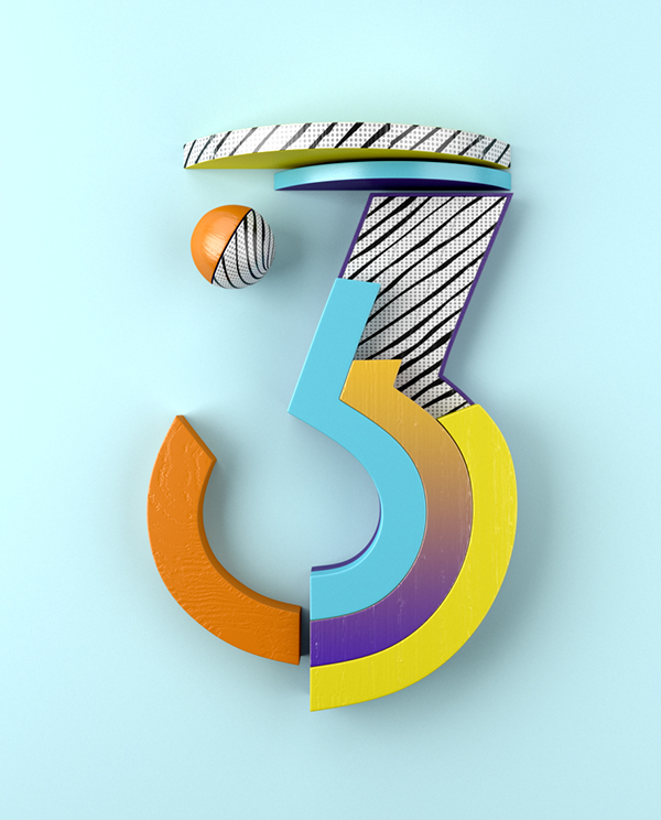
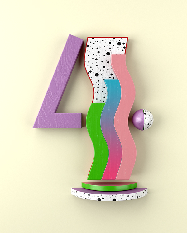
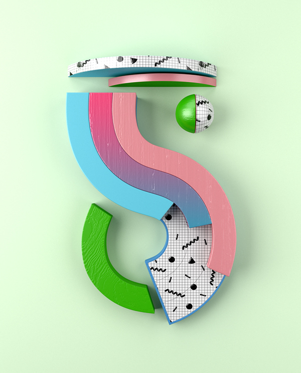
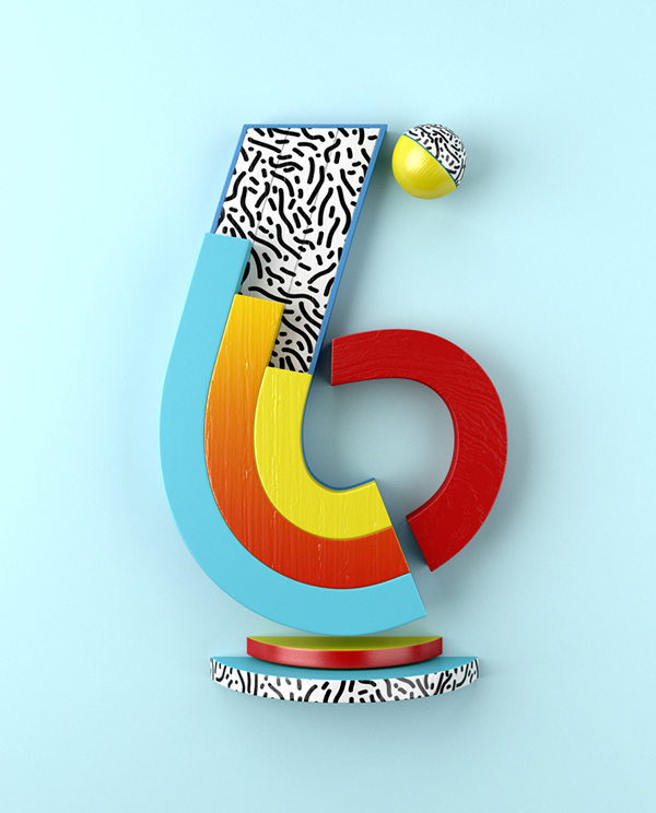
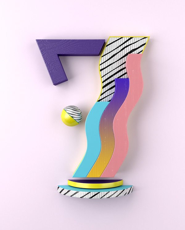
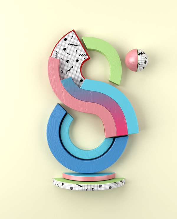
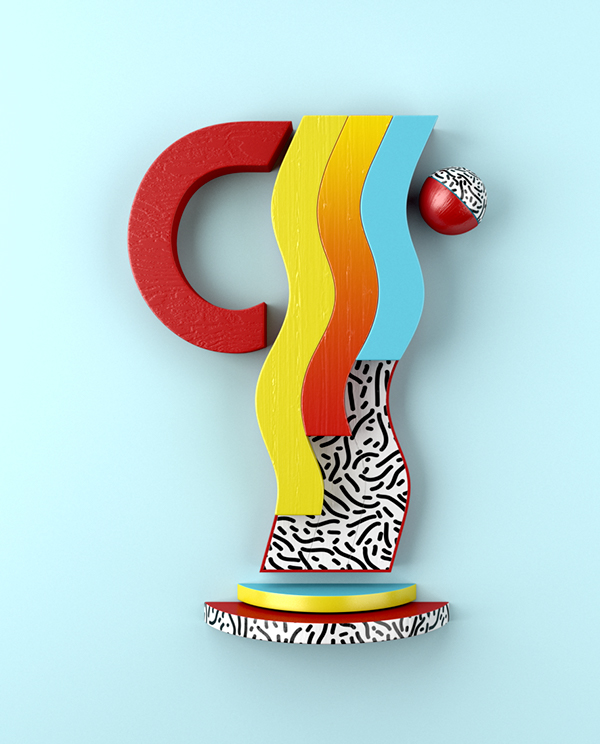
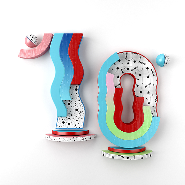
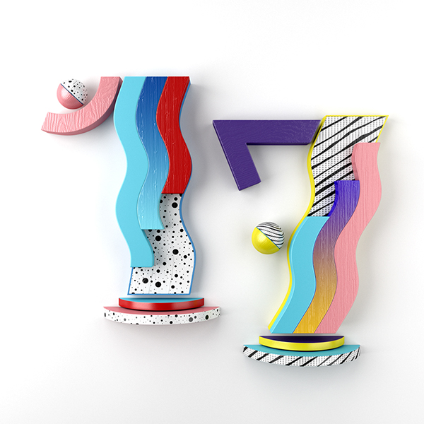
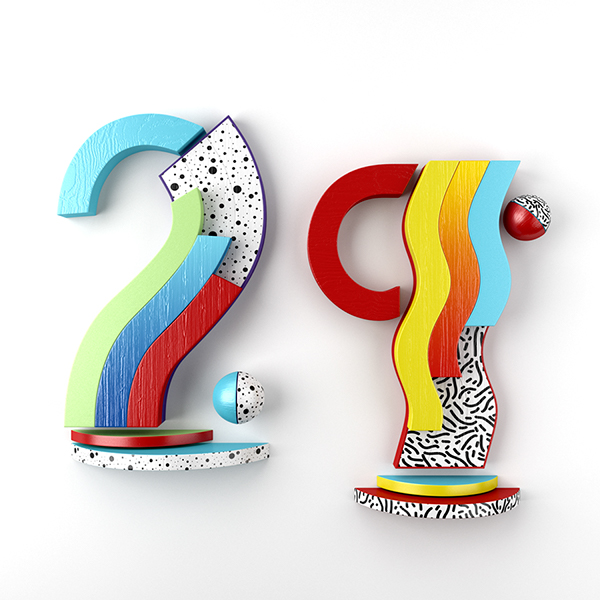
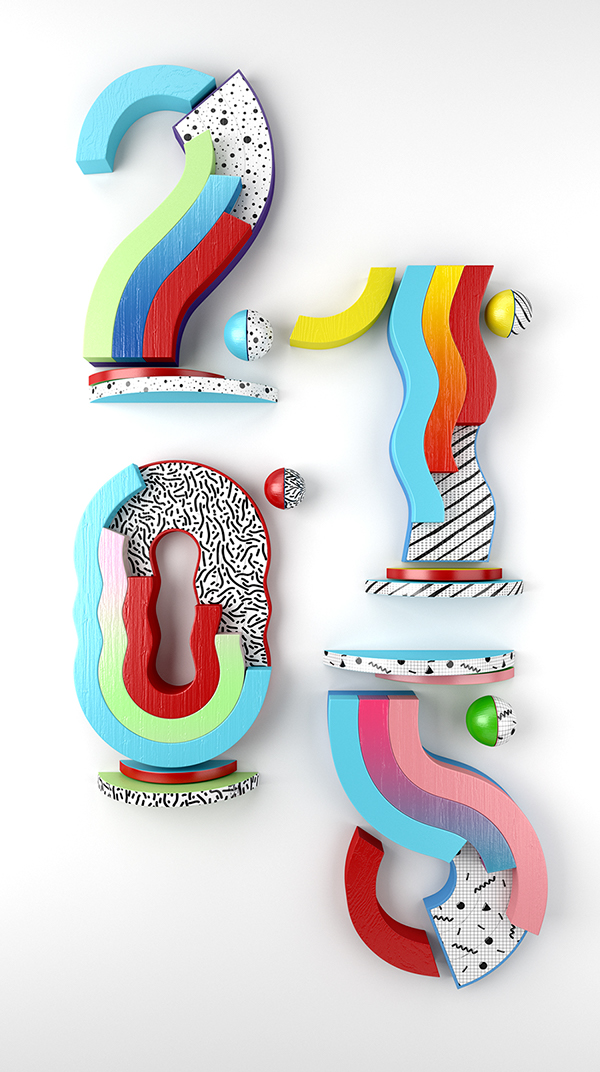
Graphic designer Muokkaa was commissioned by Spanish cult magazine Yorokobu to create numbers from 0 to 9 to be used in a calendar in their 58th issue. With his extensive portfolio it came as no surprise how insanely creative and cool the end result is. With crazy texture and color combinations, this TypoThursday just might be my favorite one!
Currently working as a motion graphics artist in Madrid, the man behind Muokkaa, Alejandro López Becerro, is obsessed with typography, 3D and illustration, in his own words. He’s done some incredibly innovative, creative and fun typographic designs, and the YOROKOBU numbers are no exception. The overflow of color, pattern, texture, layers, and shapes is surprisingly balanced and harmonious, which is extremely hard to achieve.
The style remotely reminds me of the Memphis Group, Italian design and architecture group founded in Milan by Ettore Sottsass in 1981. The mix of bright, contrast colors with 3D shapes is what the group represented visually. Becerro just has done it with a modern twist. I don’t know what the lure is, but I can’t stop obsessing over these numbers! What do you think?
Photos © Muokkaa

