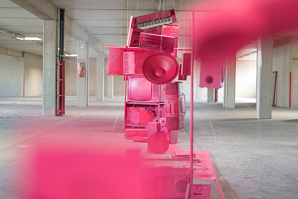
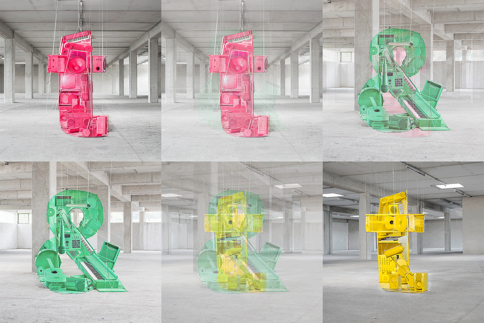
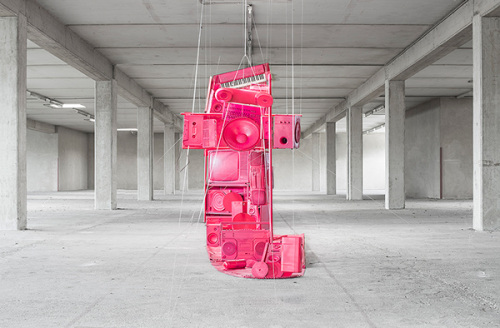
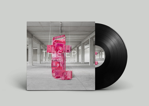
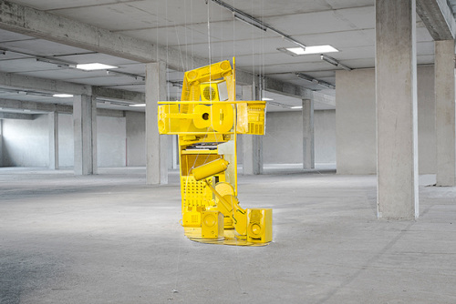
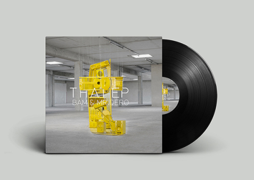
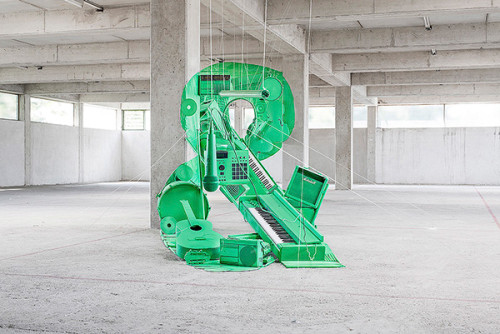
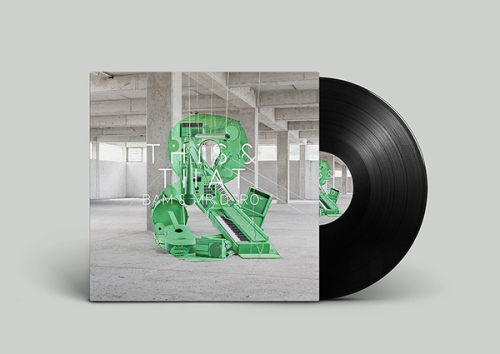
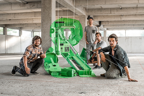
BAM of the legendary ‘90s hip-hop group The Jungle Brothers and Austrian DJ Mr. Dero were looking for an innovative visual concept for their collaboration double EP/LP titled “THIS” and “THAT”, which together constitute the full album title “THIS&THAT”. Two creatives from Graz, graphic designer and art director Simon Lemmerer with photographer Stefan Leitner came up with an original idea to create an anamorphic installation of the initial letters of the album titles.
This must be one of the most creative and inspirational typographic projects I’ve come across in a while and each member of the creative team gets a standing ovation for their patience and dedication to pull something like this off. Even though the original idea was to create an anamorphic installation of the two full words with different colors and plotted letters, which quickly was realized to be too complex and impossible, the result of the two t’s and the ampersand is quite enough to impress.
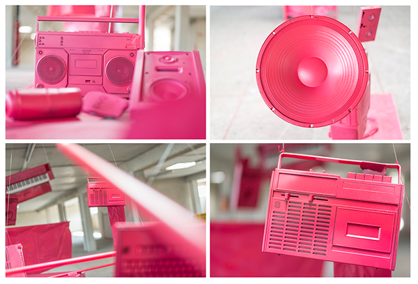
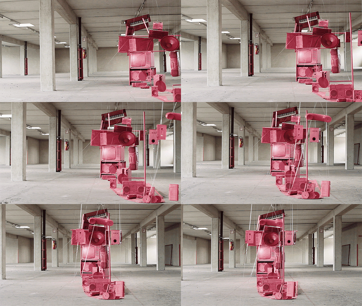
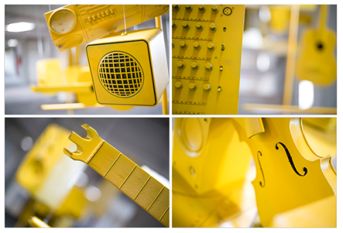
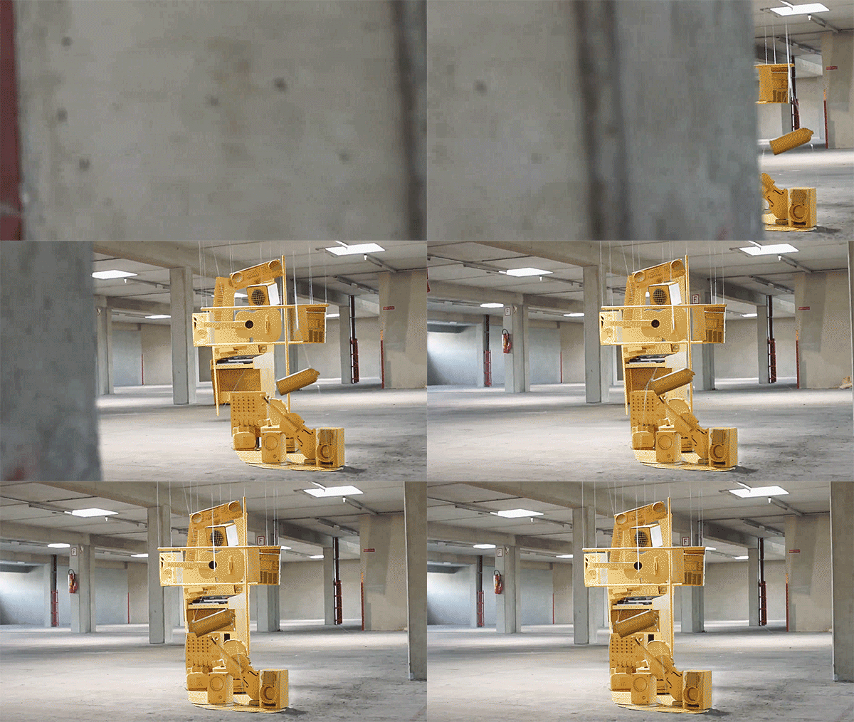
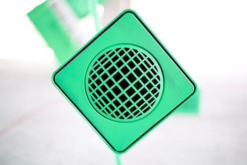
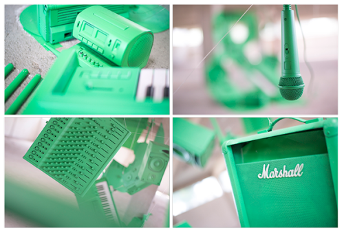
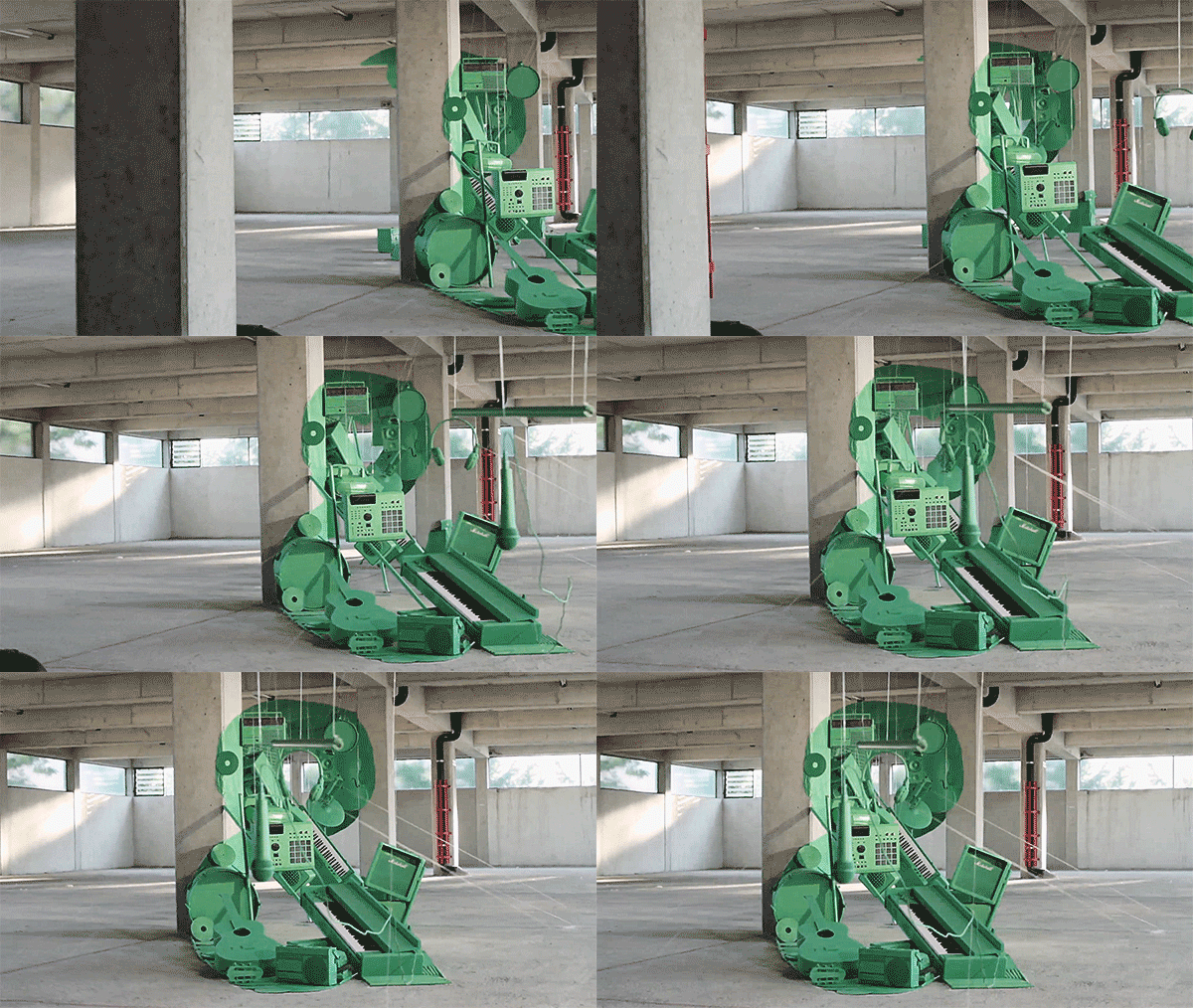
The team rescued old instruments and other music equipment from the junkyard or picked up non-repairable instruments from collectors and music stores around Graz. Different colors were chosen for each photo set, meaning each cover, yellow, pink and green, which meant dozens of objects and instruments had to be painted to match. The individual glyphs were then constructed by positioning the various objects in an empty parking house by suspending them from the ceiling with nylon threads or attaching them on walls or floors. The wanted font was printed on tracing paper and placed in front of the camera to help show the form of the letter needed to create. To find out exactly how it was done, see the making of video in the end.
Get inspired by the innovative typographic project,
and enjoy the first This EP here.

You are currently viewing a placeholder content from Vimeo. To access the actual content, click the button below. Please note that doing so will share data with third-party providers.
Photos & video © Simon Lemmerer Behance

