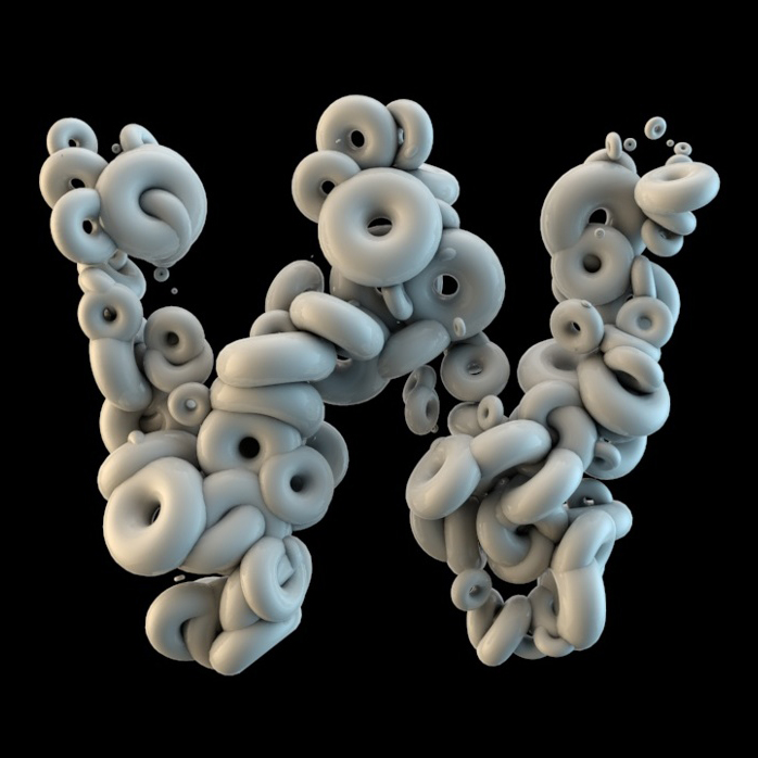
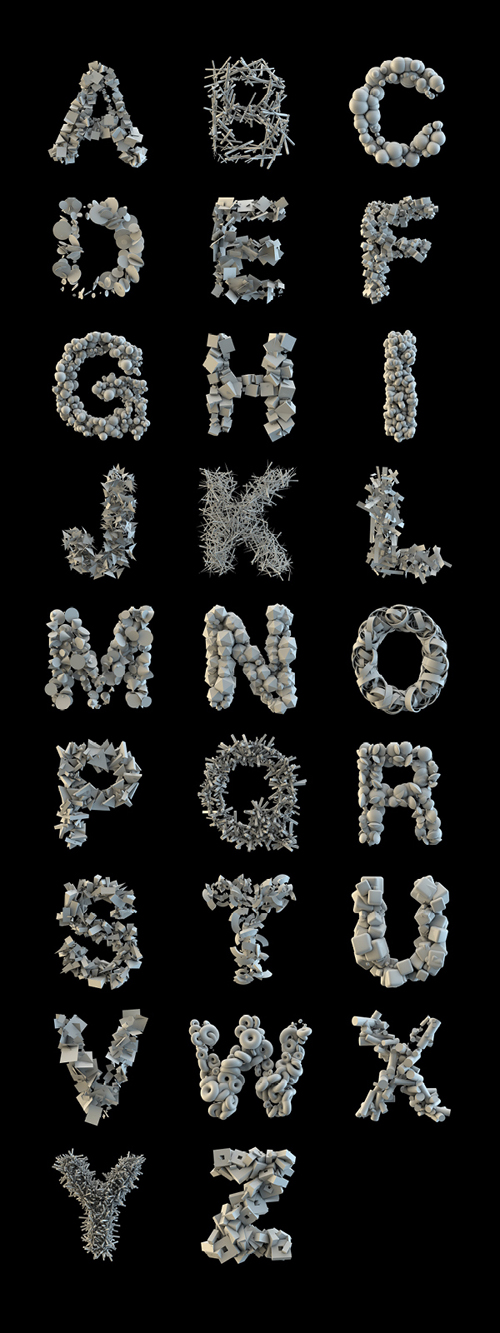
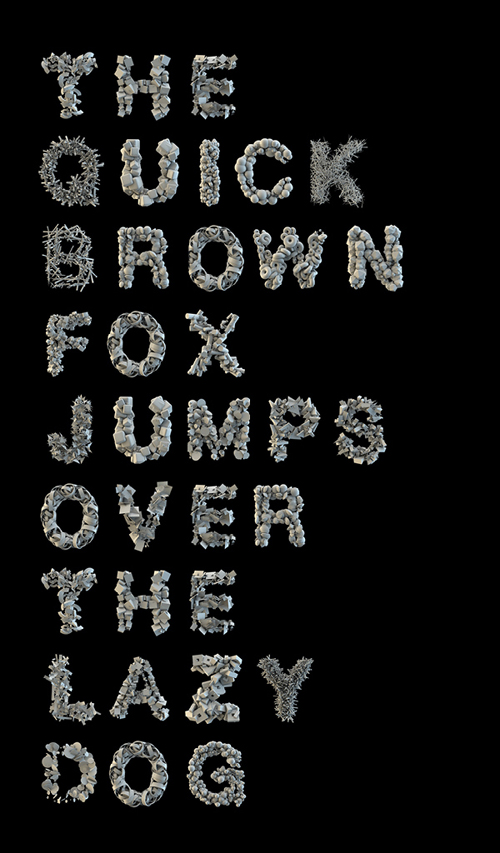
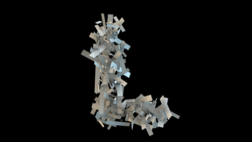
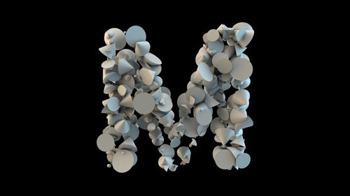
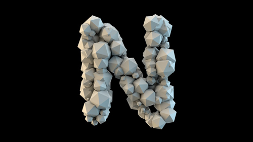
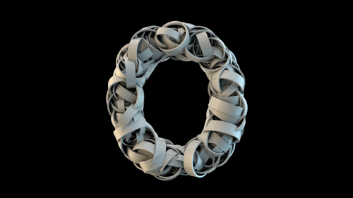
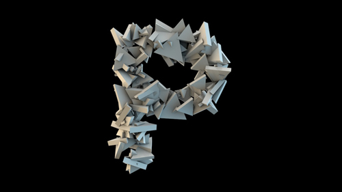
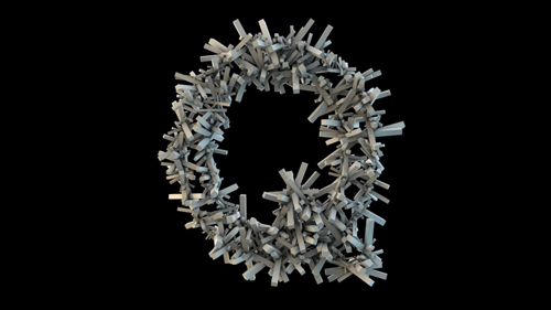
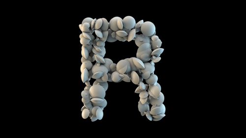
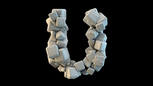
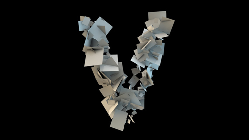
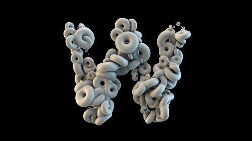
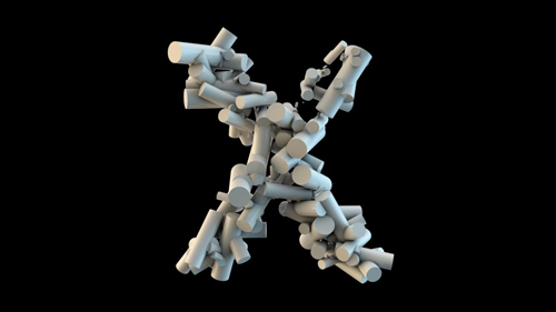
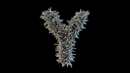
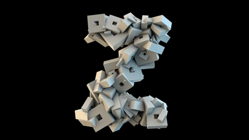
Echotypes is an experimental 3D typographic project by graphic designer Romain Rogers. It is based on the construction of a letter by different shapes in movement. The strange fluid-like consistency of the material is so compelling, you wish you could touch them. But of course, they only exist in the digital world we so often wish we could visit.
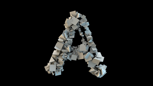
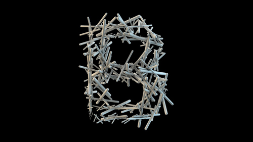
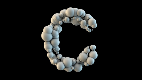
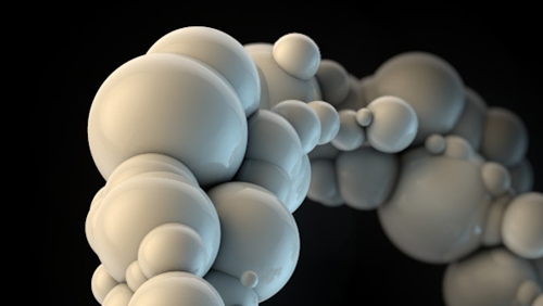
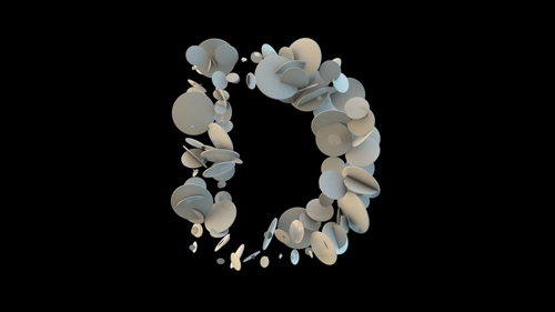
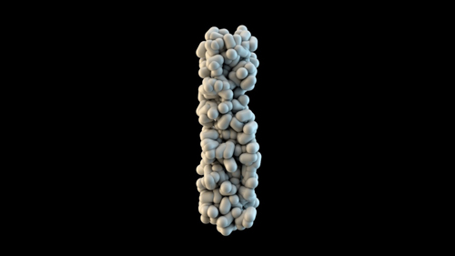
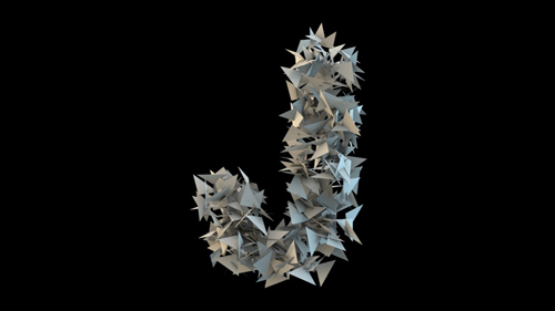
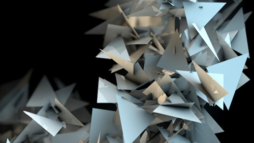
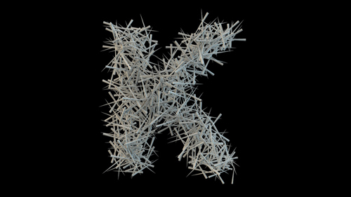
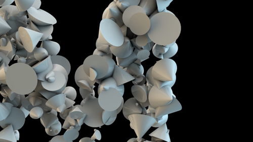
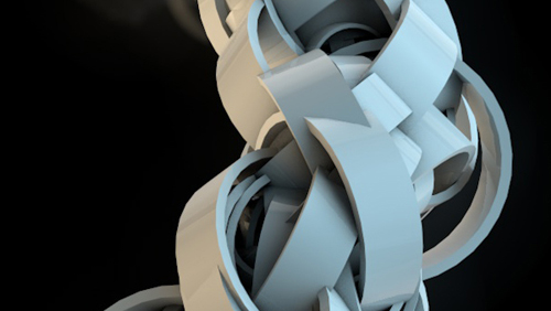
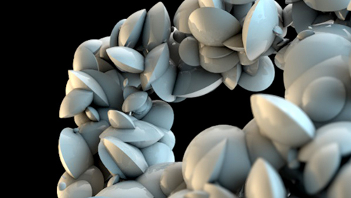
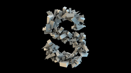
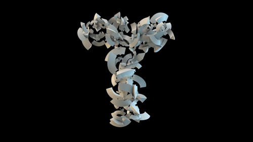
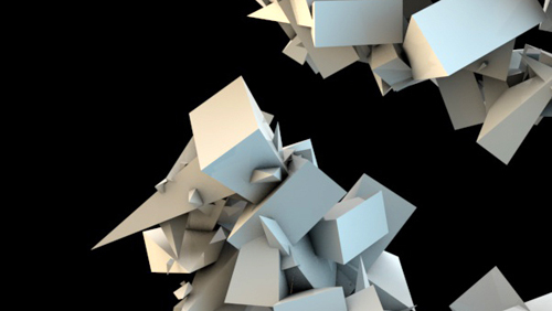
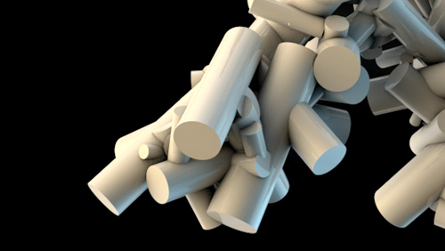
Using basic geometric shapes: circles, squares and triangles, as well as more intricate cylinders, balls, donuts, sticks, and whatnots (see for yourself) Roger builds basic letter types by gathering a bunch of these objects together with 3D editing software. A strange balance of matter and movement is achieved in his work, making it impossible to look away.
Watch the video below and see how the letters are formed by individual objects, what Romain calls the “rebirth of a typeface”, how they quietly exist for a second before dissolving back into nothing. The movement of the letters come from its building blocks, all its small elements that when put together, form a typeface. In all its visual simplicity, there is something very poetic in the Echotype alphabet.
You are currently viewing a placeholder content from Vimeo. To access the actual content, click the button below. Please note that doing so will share data with third-party providers.
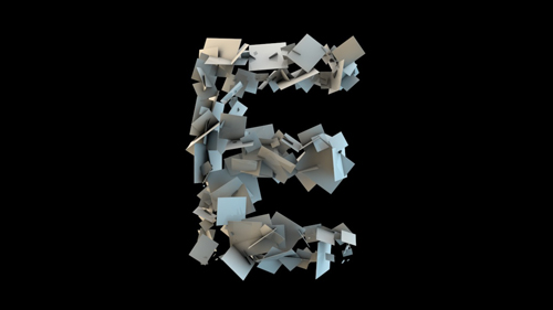
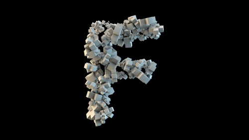
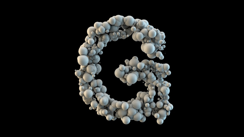
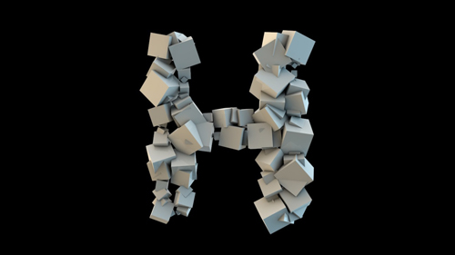
Photos © Romain Roger

