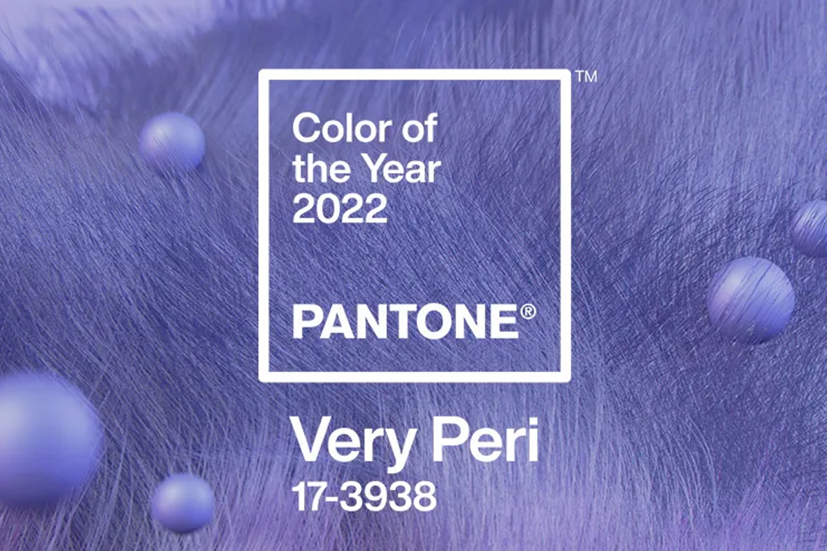
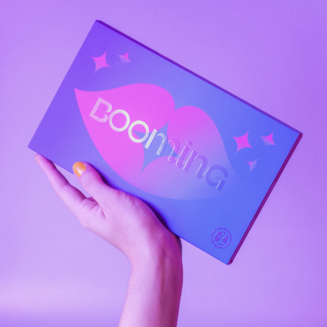
Pantone has announced The Color Of The Year For 2022: Veri Peri 17-3938. “The new Pantone color whose courageous presence encourages personal inventiveness and creativity”, was apparently inspired by the transformative times we live in. The light yet dominant purple shade – that comes from the blue color family, with violet and red undertones – displays carefree confidence and a daring curiosity that helps us embrace an altered landscape of possibilities, opening us up to a new vision as we rewrite our lives.
PANTONE 17-3938 Very Peri places the future ahead in a new light
Pantone crowns the Very Peri shade as a symbol of the global zeitgeist of the moment and the transition we are going through. From the prospects of a new future to the ways, our physical and digital lives have merged. The unique color illustrates the fusion of modern life as it celebrates the recognizable color trends of the digital world that are being manifested in the physical sphere and vice versa.
But what makes the Veri Peri color truly unique, is the fact that it’s the first time in the 23-year long history of the Pantone Color of the Year color program that a new color was custom created. So just like the unprecedented times we live in, before the 9th of December 2021, you had never seen or experienced the exact color shade Veri Peri.

Utilizing the Veri Peri color in branding and packaging
The Pantone Color of the Year influences product development and purchasing decisions in numerous industries, including fashion, home furnishings, and industrial design – and especially the fields of product packaging and graphic design, because of their faster life cycle and production reaction time. Numerous designers around the world take note of Pantone’s color announcement, but more often than not, the very same industry people have been the front runners of the trend, with numerous design concepts to not only show in the color scheme – but in the spirit, which Pantone so well captures, year after year.
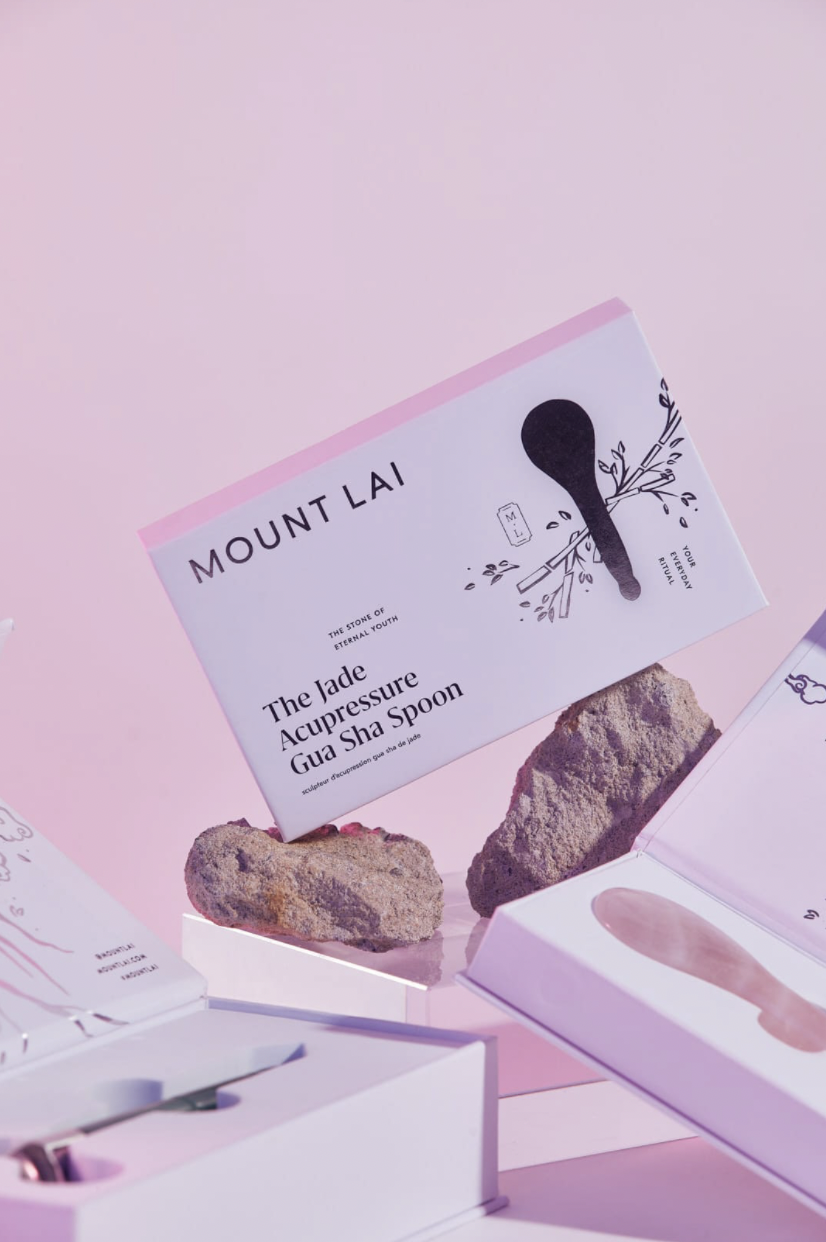
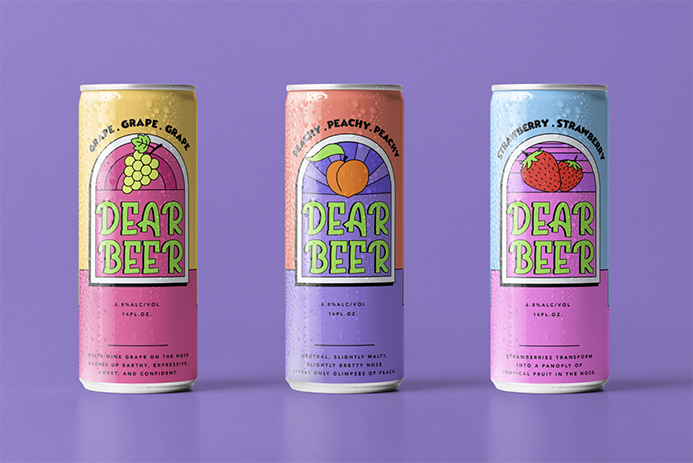
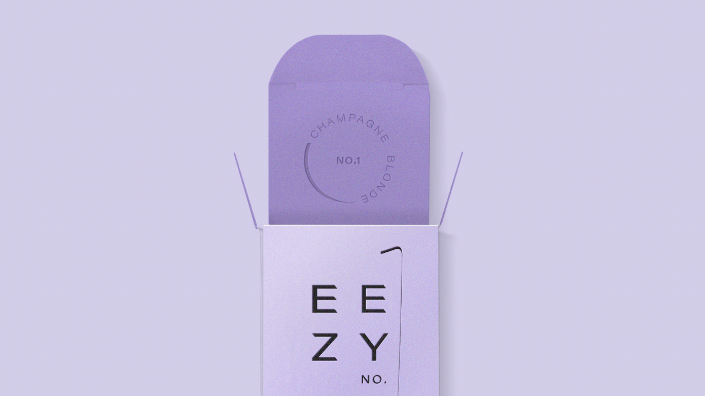
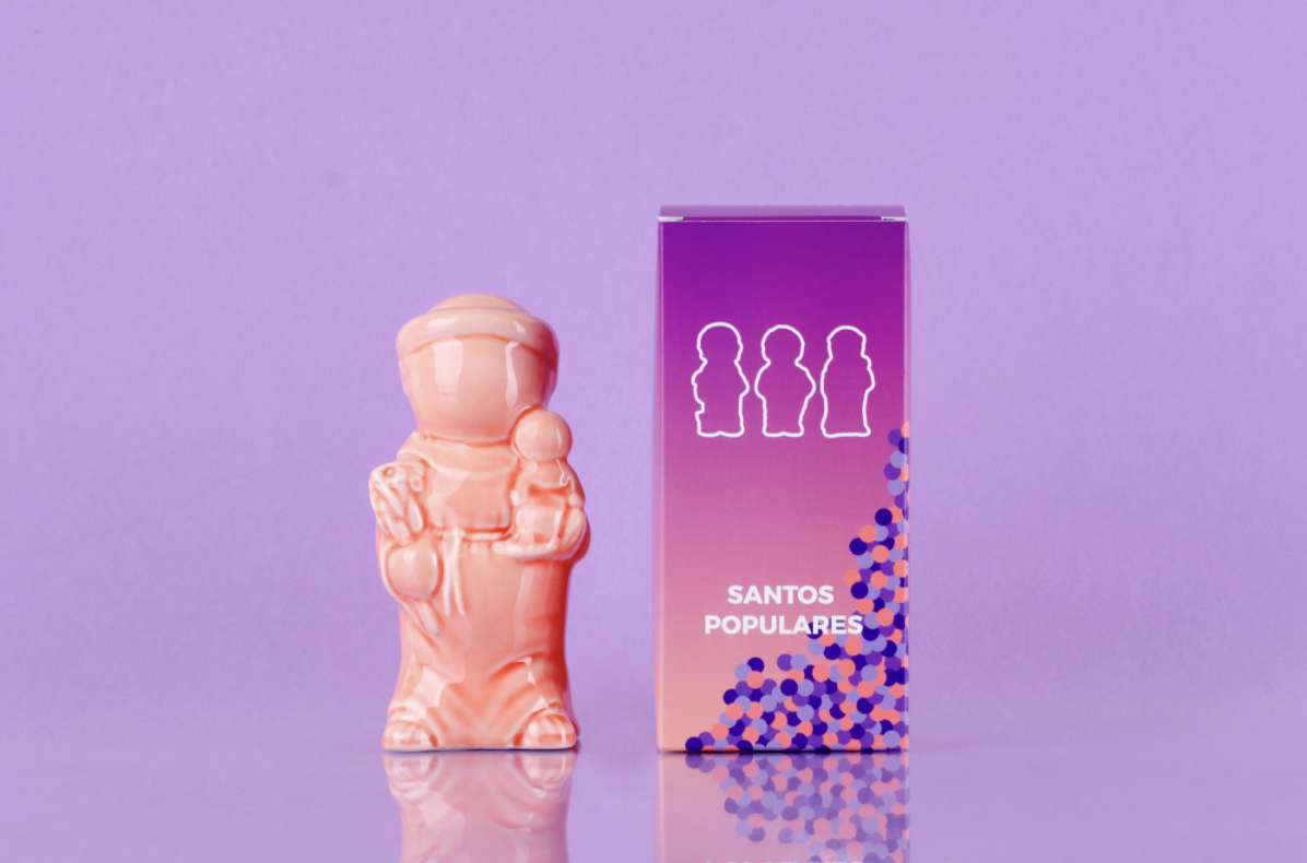
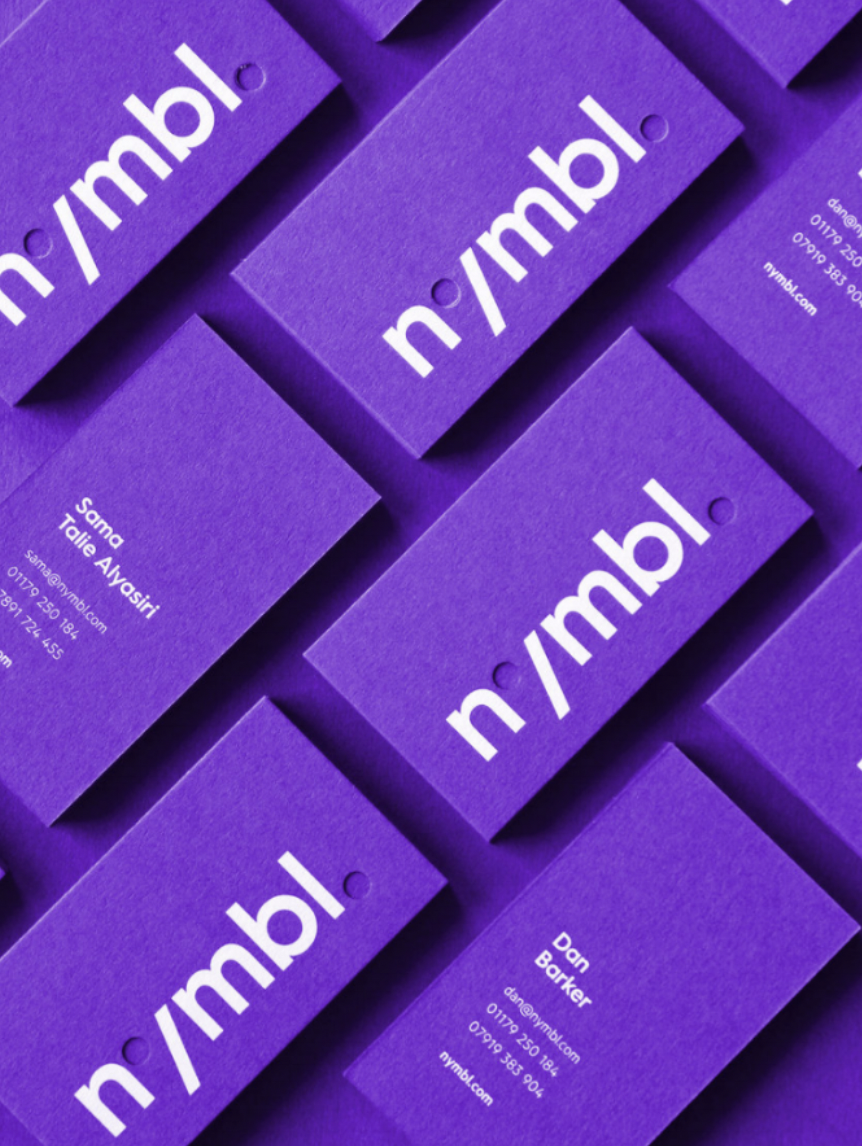
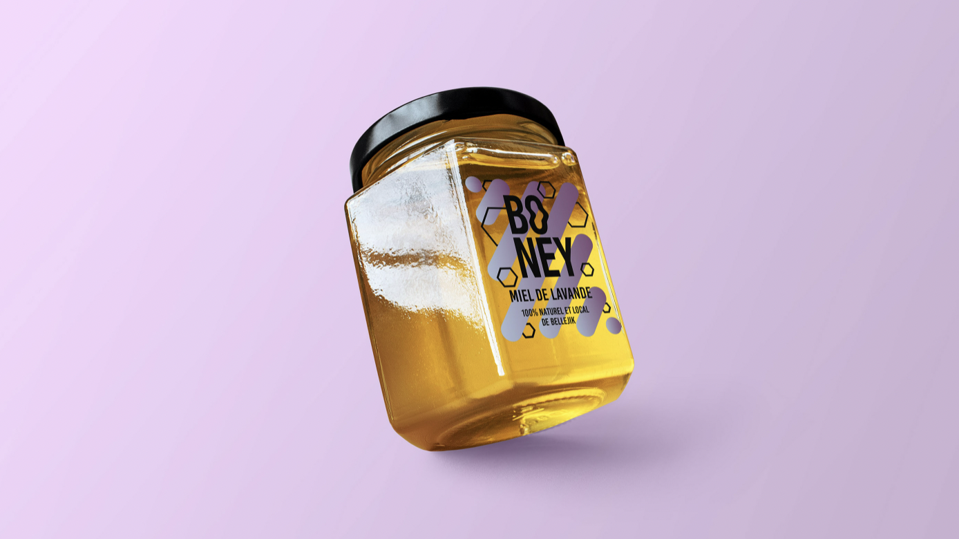
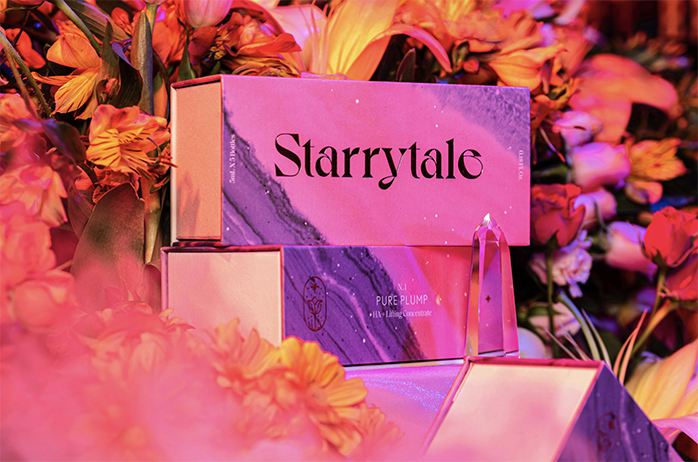
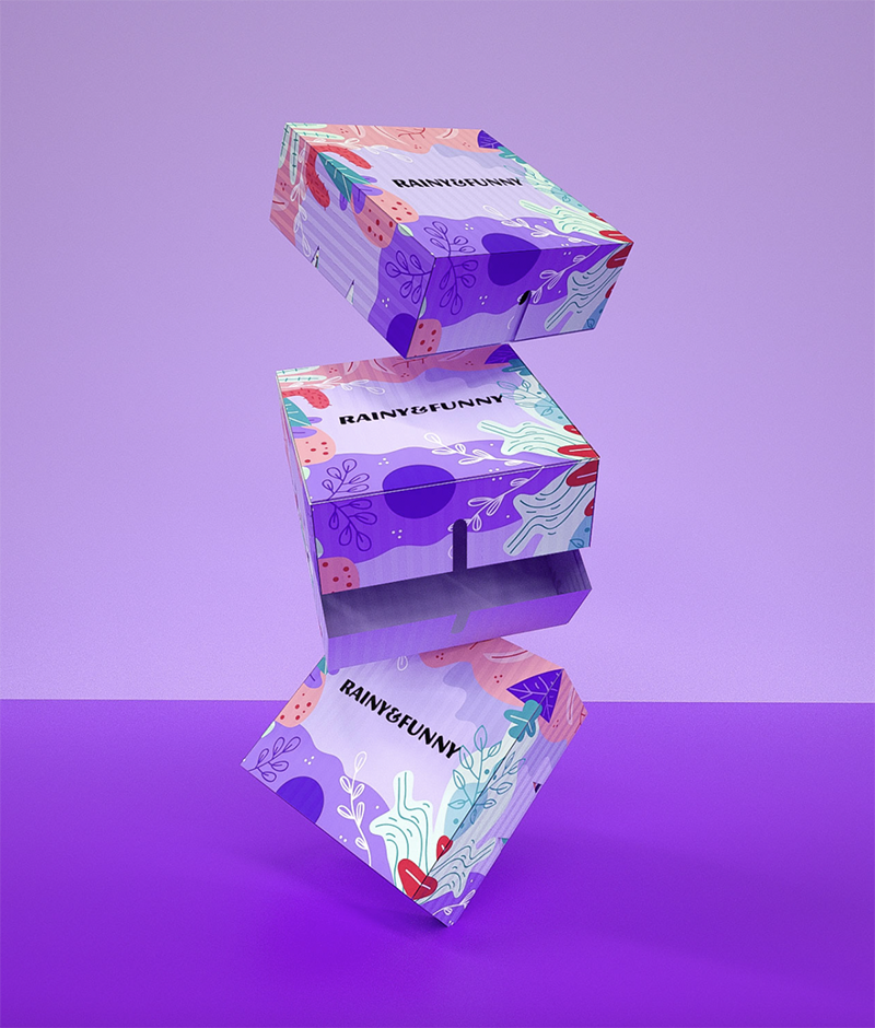
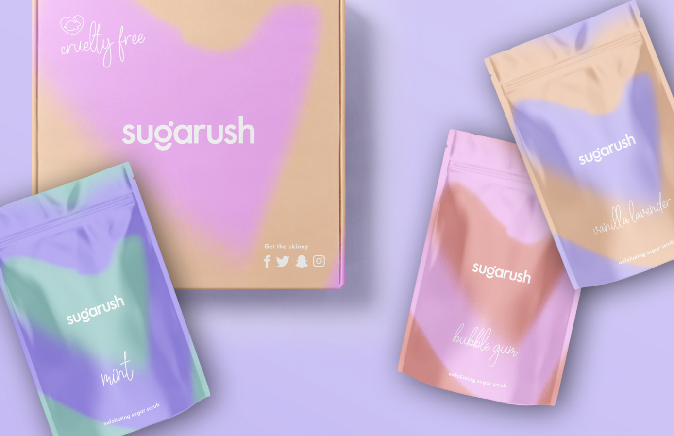
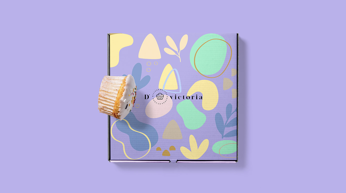
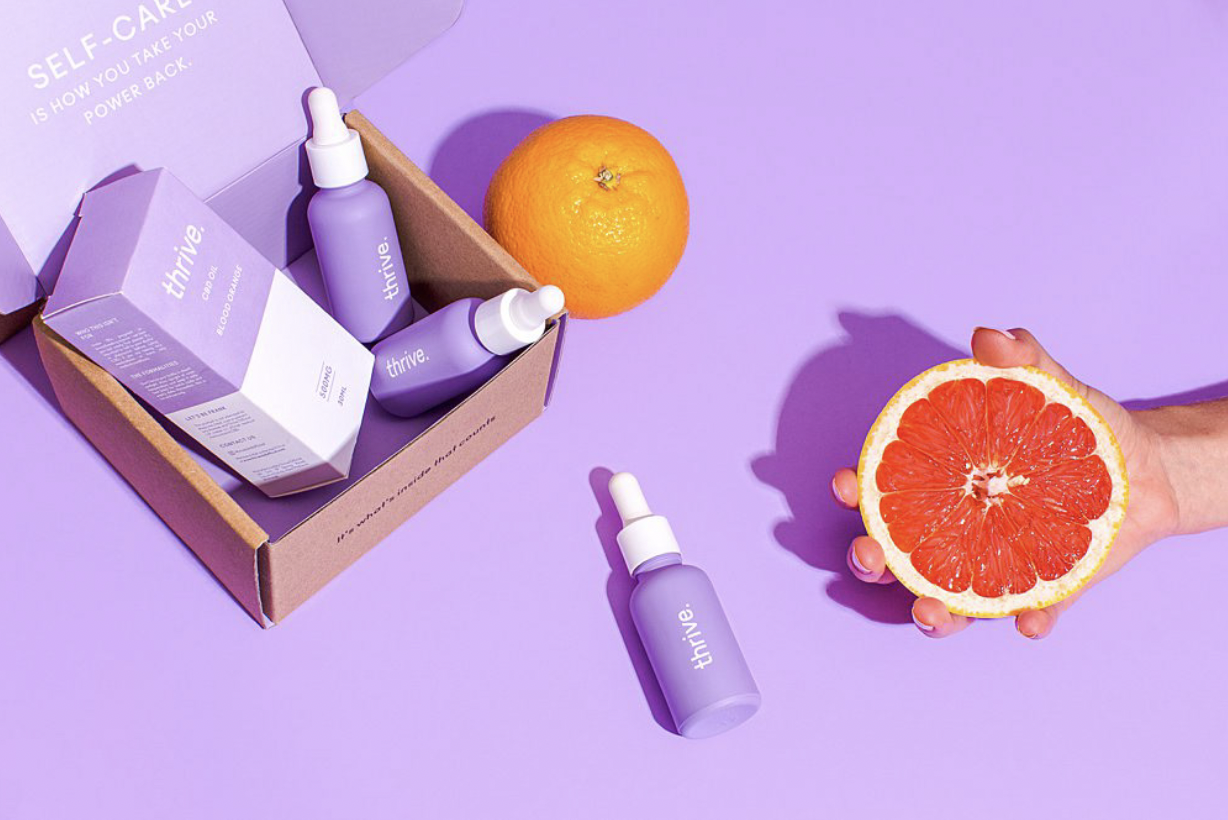
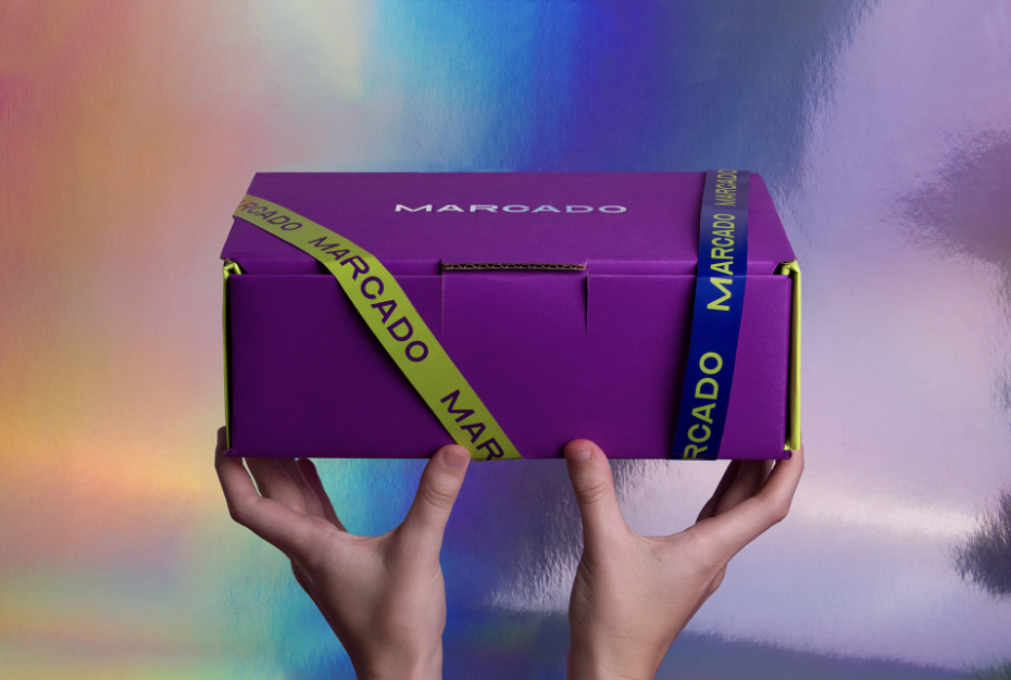
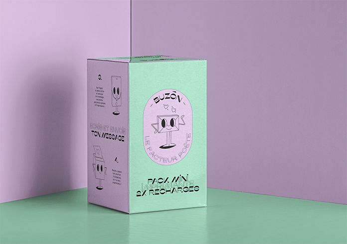
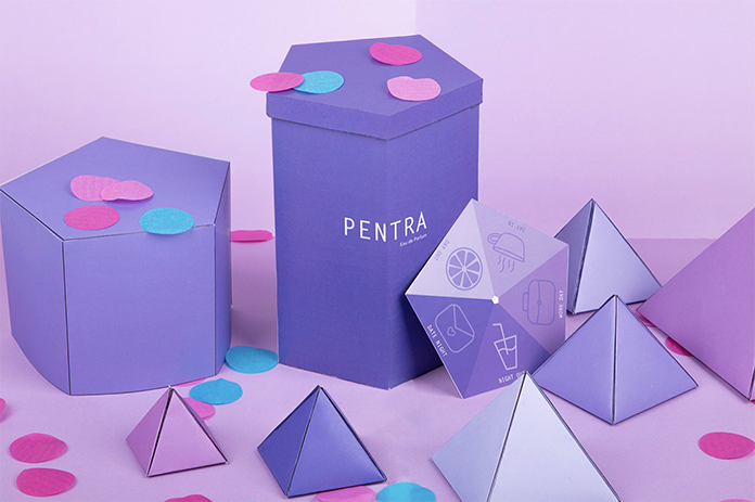
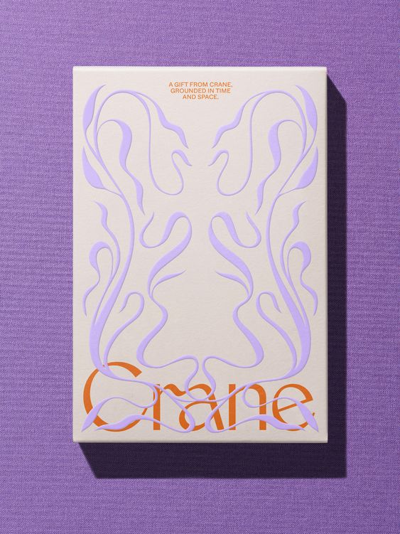
The colors a company chooses to represent its brand, can either be based on the effects it has on the mood, feelings, and behaviors of its target consumers – or the ones the brand aims to provoke. And while we might have an inkling what type of brands will gravitate towards the Veri Peri shade, some might come as a surprise. Below you can see various examples from diverse industries that have chosen to utilize the color.

