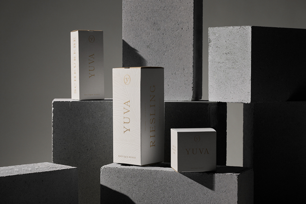
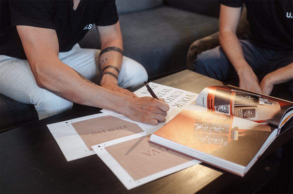
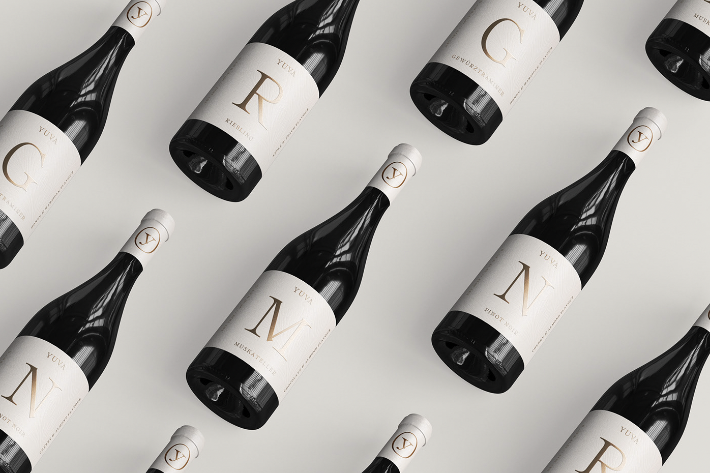
Landau-based design studio UNDESIGNED helps clients turn their businesses into lovable brands by creating an emotionally engaging and attractive brand experience their customers can’t help but fall in love with. Focusing on creating cohesive, legitimate, and individual concepts that help the brand stand out from its competitors and make authentic connections with its target audience, UNDESIGNED takes a holistic approach to designing brand experiences that convey the values, personality, and character of the company. The studio worked its magic when composing a fresh visual identity and packaging concept for a new wine brand called YUVA, that beautifully echoes the sophisticated yet relatable personality that is at the heart of the YUVA brand.
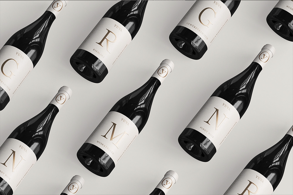
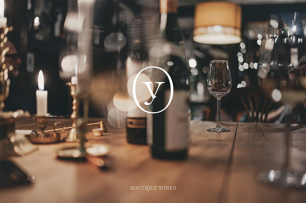
YUVA is a new wine brand that combines the heritage of the grapes and a contemporary approach to producing boutique wines
YUVA is a new vineyard specializing in the creation of unique, authentic, and tasty wines for all people. Their goal is not only to attract wine experts but also beginners who appreciate good quality wines and the lifestyle that goes with enjoying them.
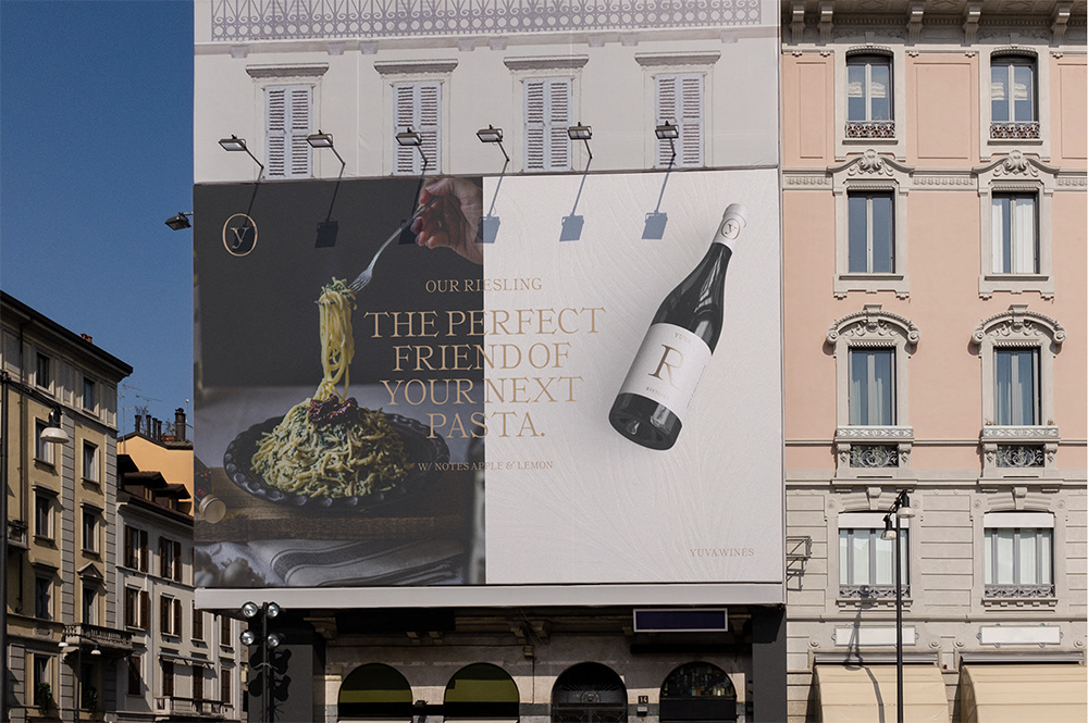
UNDESIGNED was tasked with helping YUVA to design its new visual identity and to position its wines as high-quality lifestyle products. The overall goal of the creative direction was to pay tribute to the heritage of the products – the grapes and to create a reduced, yet still recognizable visual system.
The overall goal of the creative direction was to pay tribute to the heritage of the products – the grapes and to create a reduced, yet still recognizable visual system.
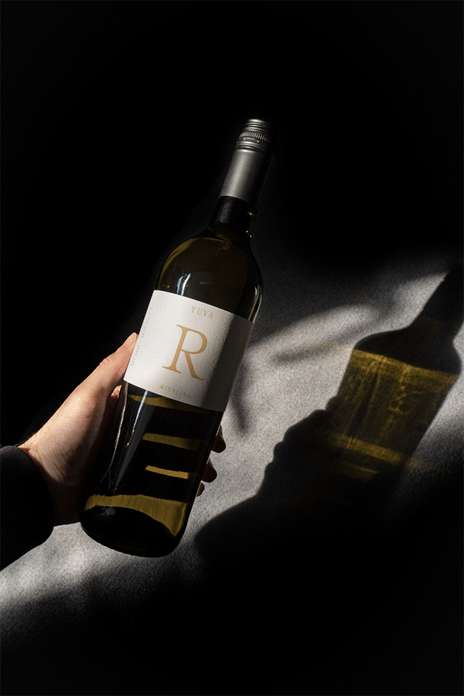
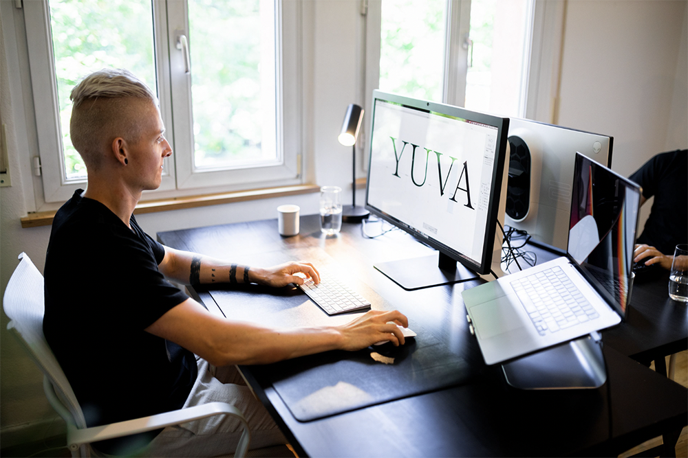
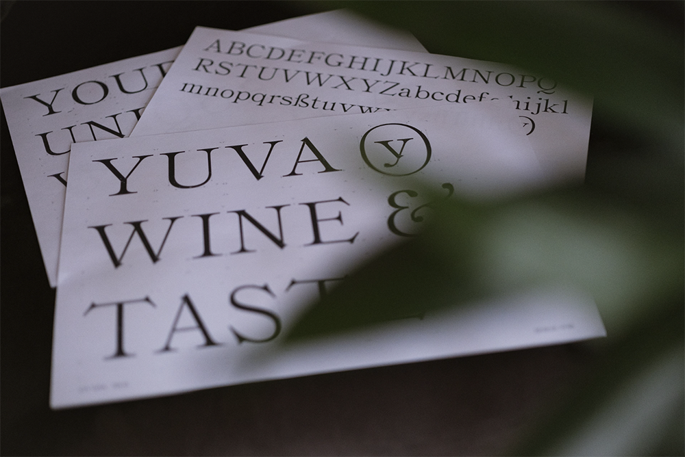
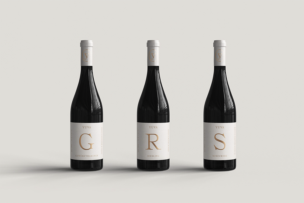
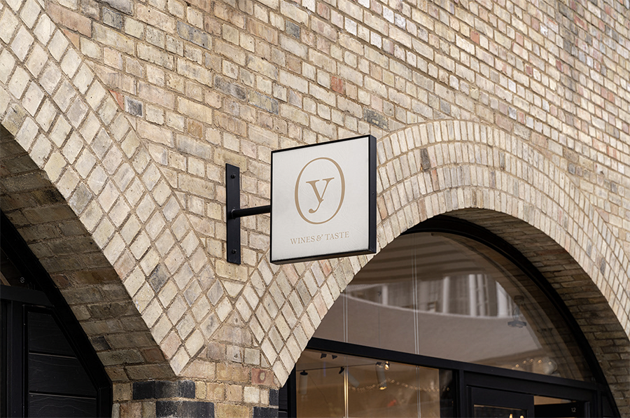
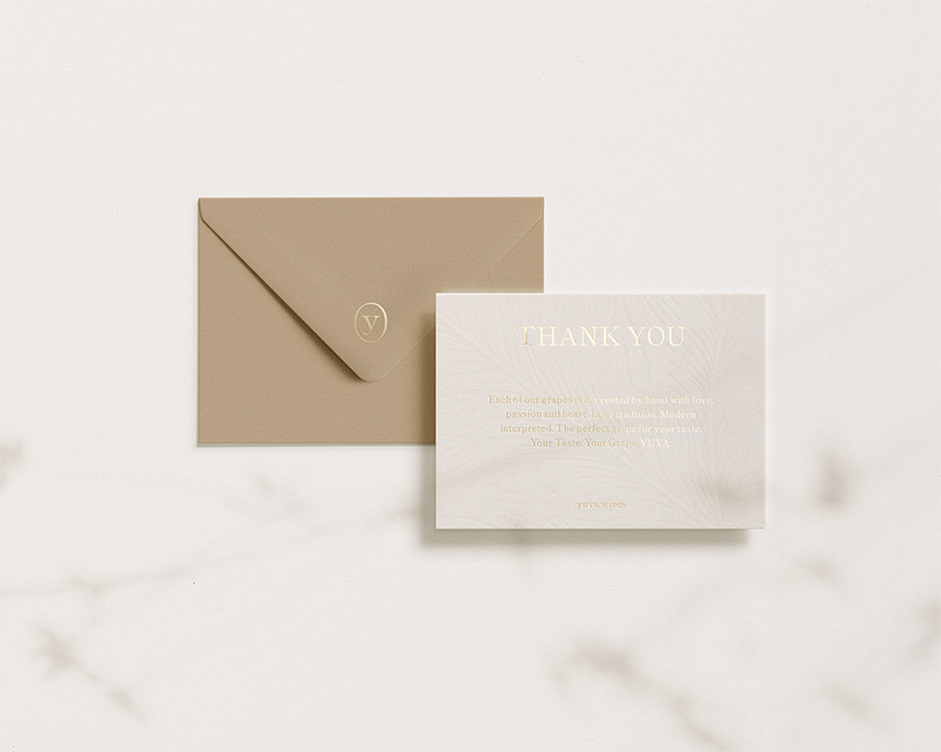
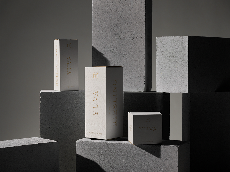
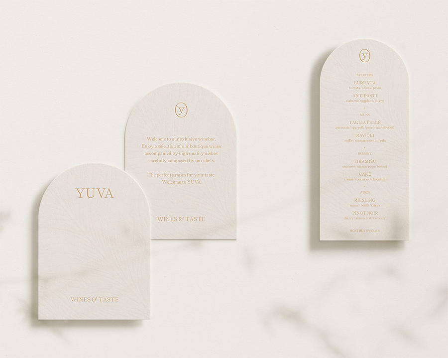
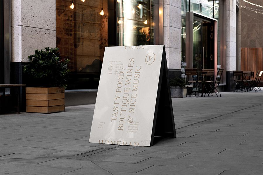
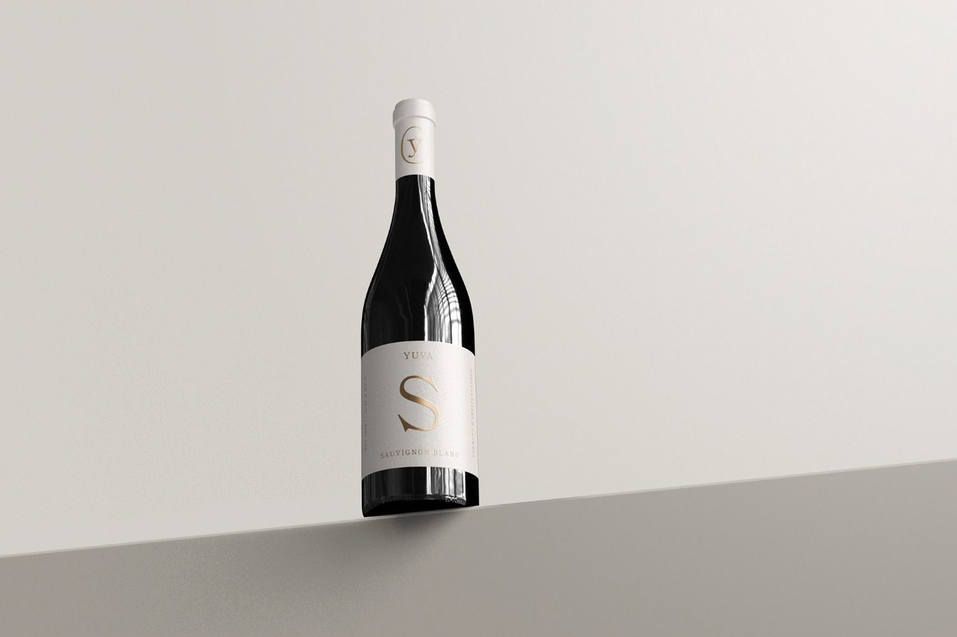
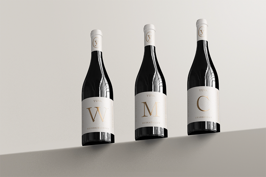
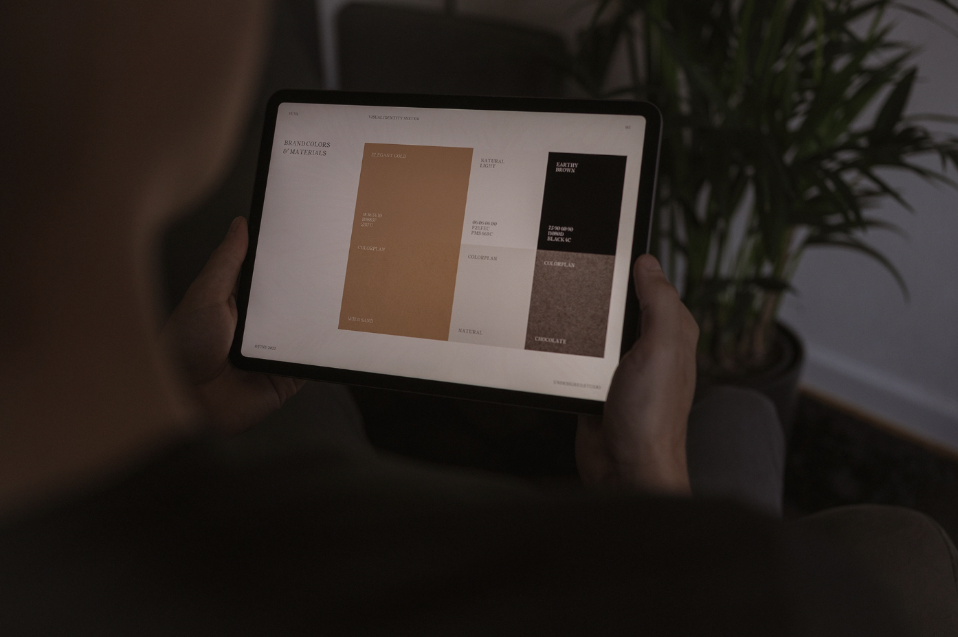
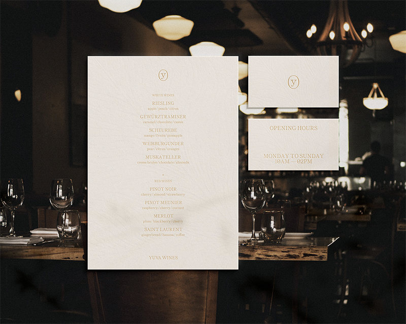
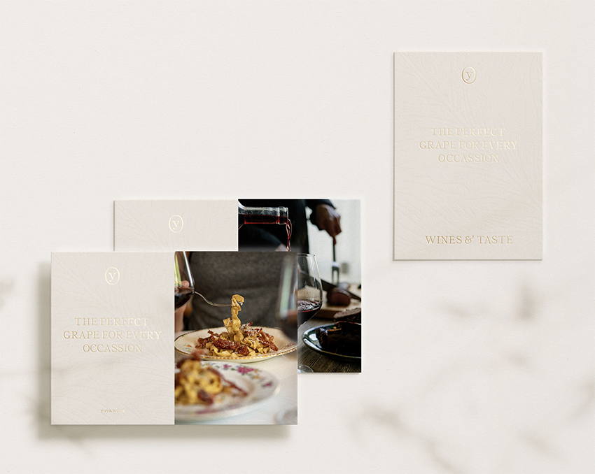
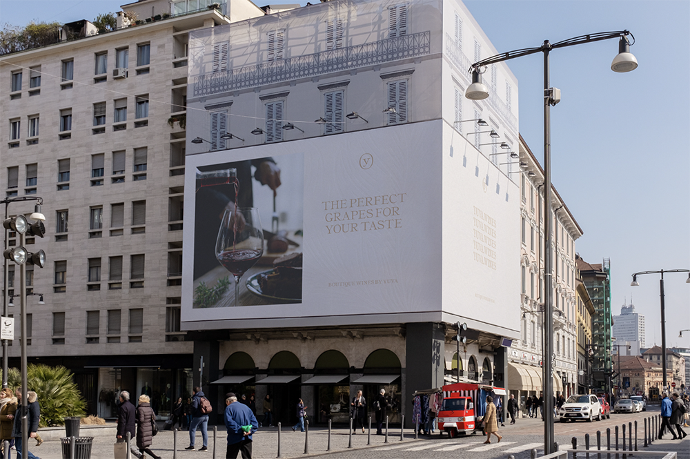
The Latin word UVA translates to grapes. To archive a memorable, distinctive, and recognizable name the studio added a Y to the name as an indicator for “You” and the uniqueness of the product itself. YUVA provides the best grapes for the individual taste of its customers. The studio also created a beautiful, bespoke typeface that is inspired by old print specimens of the historic typeface Ronaldson from the early 1900. UTF YUVA typeface has a very sophisticated yet natural feel with some organic touches and letter shapes that reflect the shape of the grapes. The usage of only one weight combined with the minimal design visualizes the approach of the vineyard – focus on the basics, but do it great. The gold foil printed labels and accompanying stationery add a touch of glamour and elegance, while the type-focused overall concept feels fresh and contemporary. You can see more of the studio’s recent works over on Instagram.
Images © UNDESIGNED

