
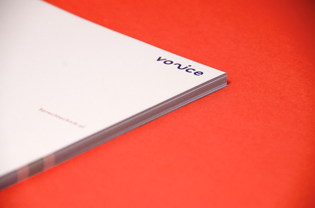
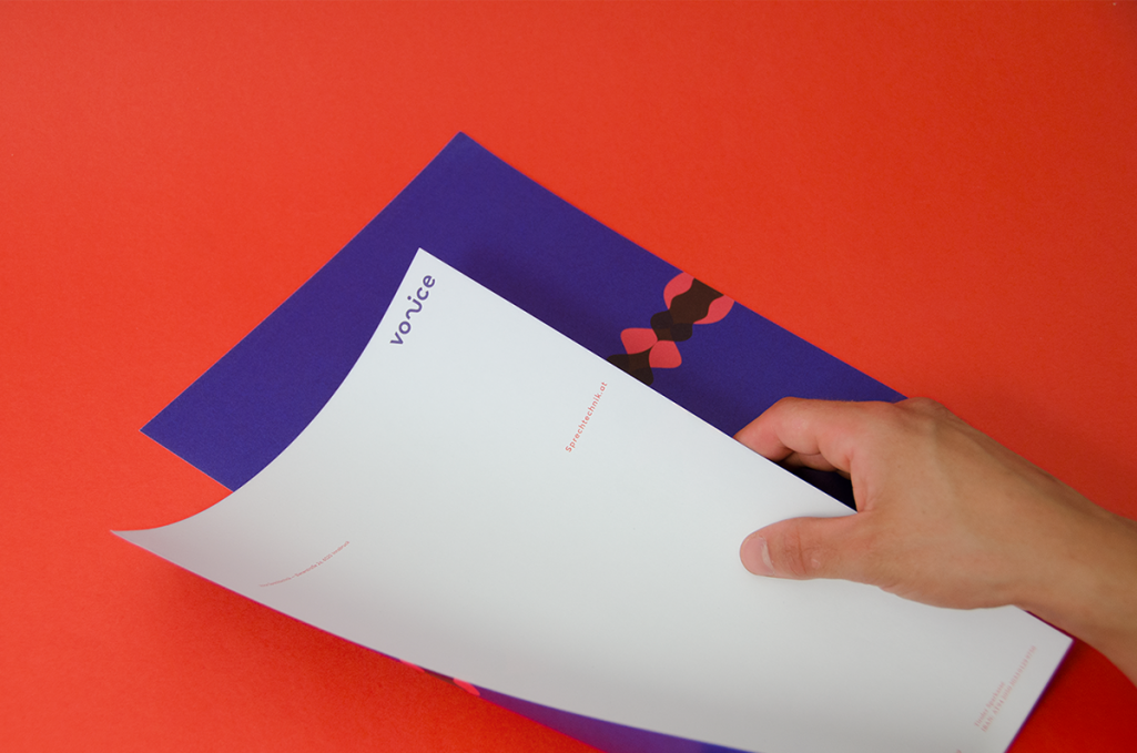

Design is the silent ambassador of a brand – a known fact about the importance and responsibility of branding. It delivers where words can’t reach. Innsbruck based Icarus Creative build a bridge between these two and created an identity for Voice, a speech and voice training company, inspired by language and words.
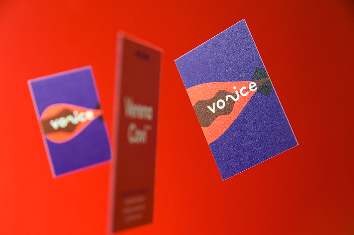
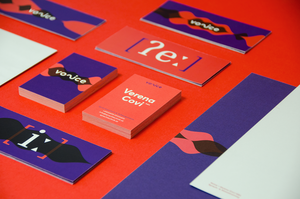
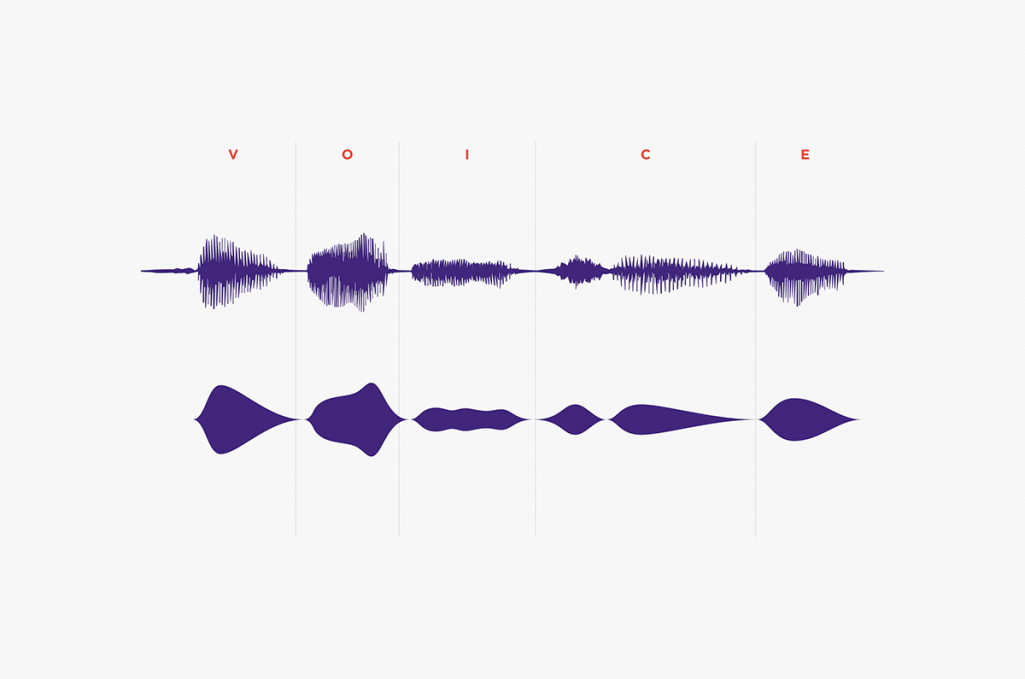
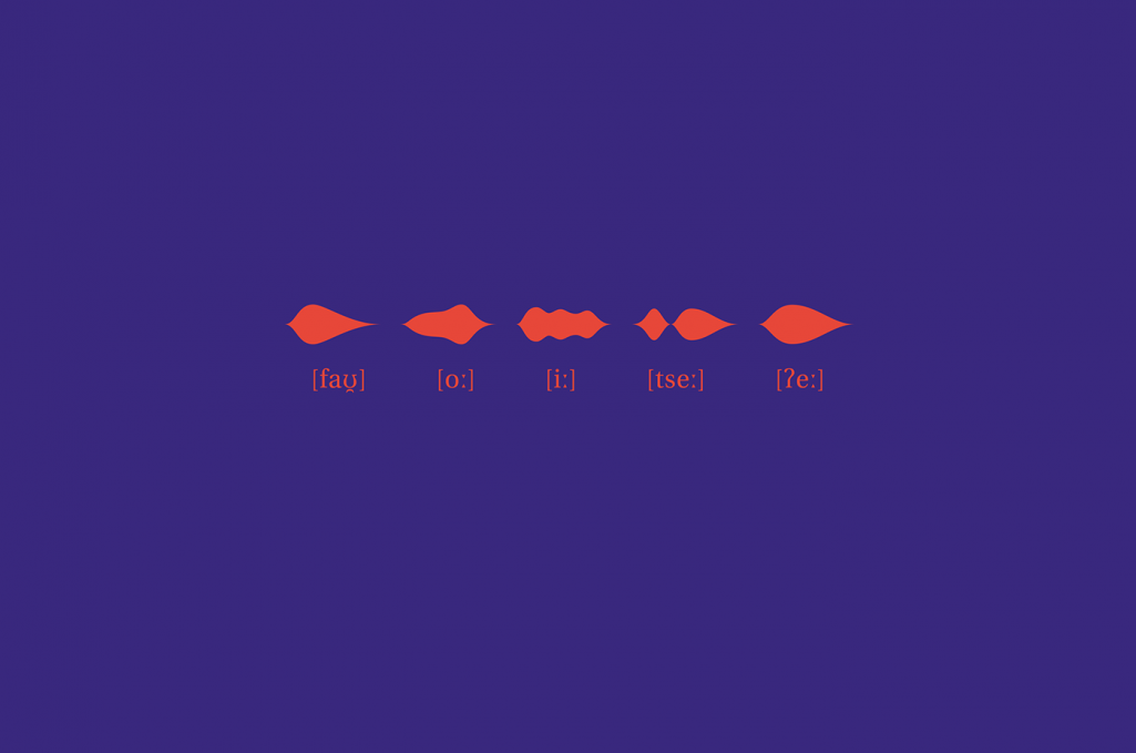
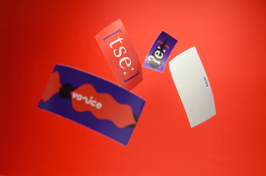
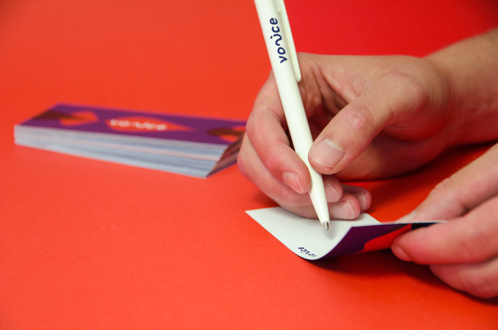
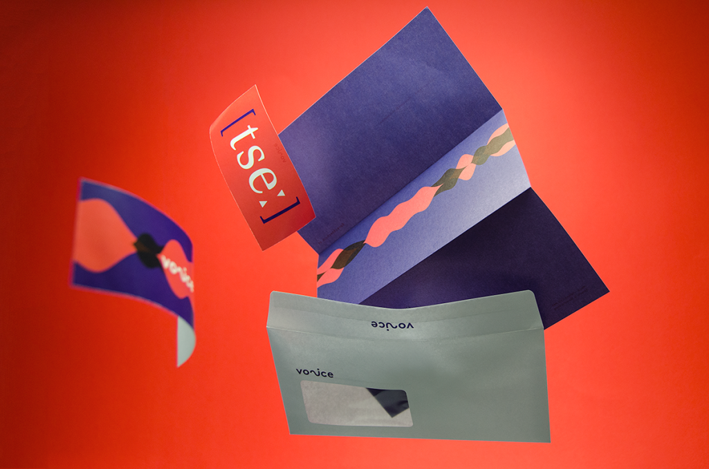
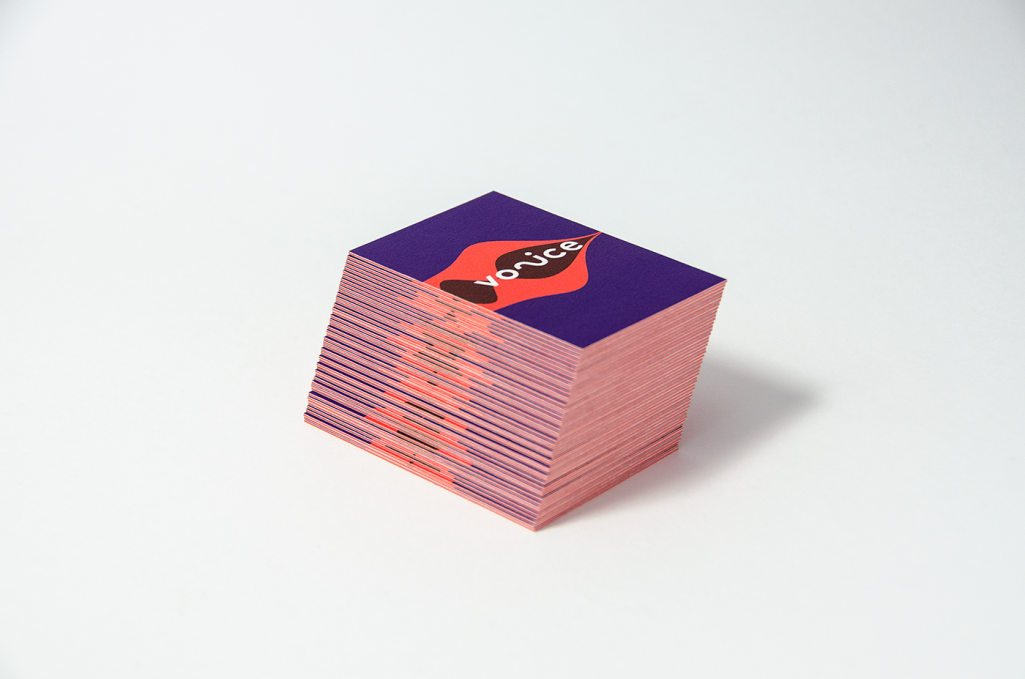
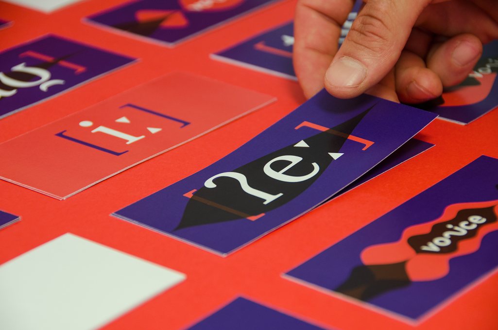
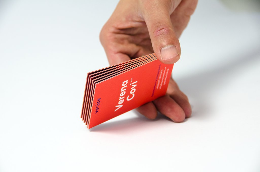
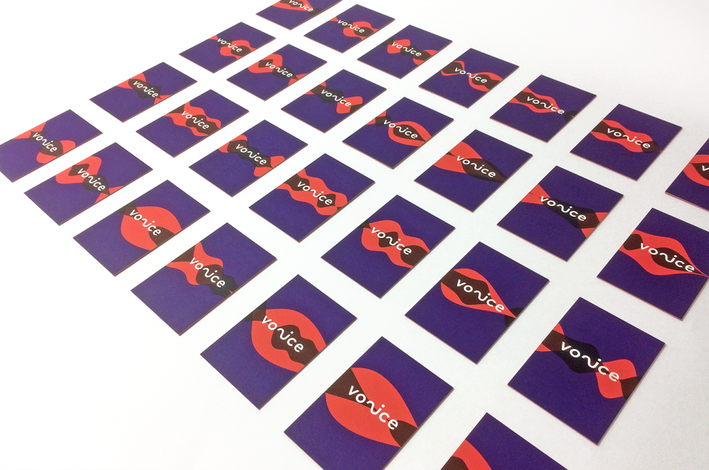
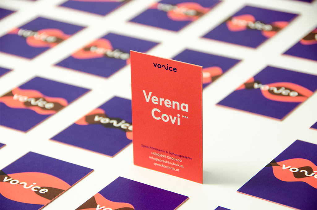
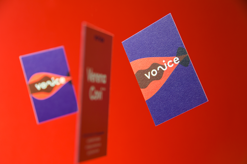
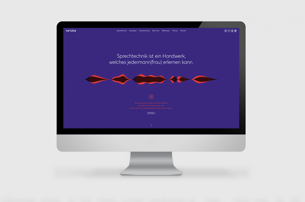
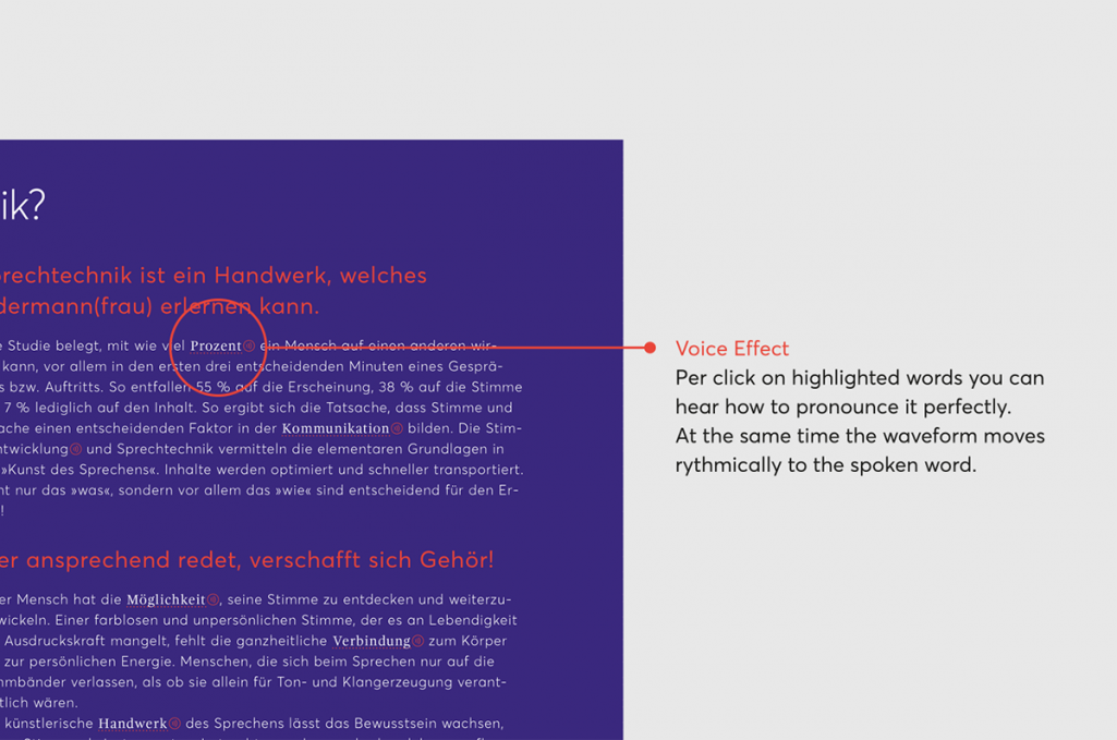
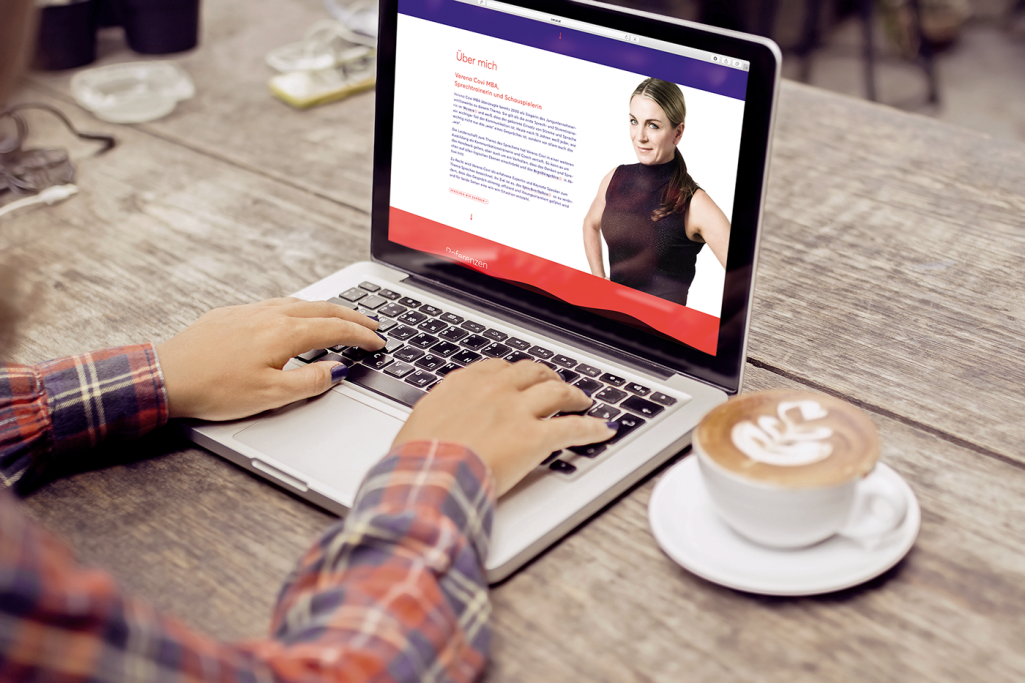
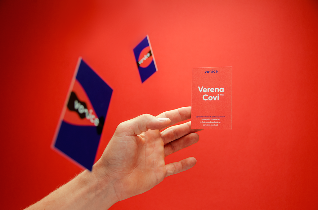
With intensive violet and orange tones and a playful visual approach full of contrast and boisterous attitude, Icarus designed a uniquely bold branding concept that draws attention to the importance of the topic of voice and speech from the perspective of Verena Covi in a unique way and conveys it from its dusty old image into a sensual and desirable new direction. By visualising audio waves, which are the symbol for versatility of language, pronunciation and intonation, the recognizable wavy pattern becomes the basis of the concept. The audio waves in their simplified form can be transmitted into every different medium. The 50 different versions of business cards showcase the versatility of language also for the print media, while the website displays a playful approach to speech technique. By clicking onto specially marked words in the running text an audio sample will be played. At the same time animated audio waves rhythmically move to the spoken word. The concept also uses phonetics – the study of the sounds of human speech.
Images © ICARUS Creative

