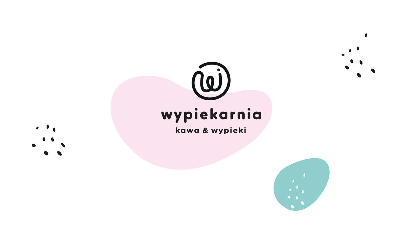
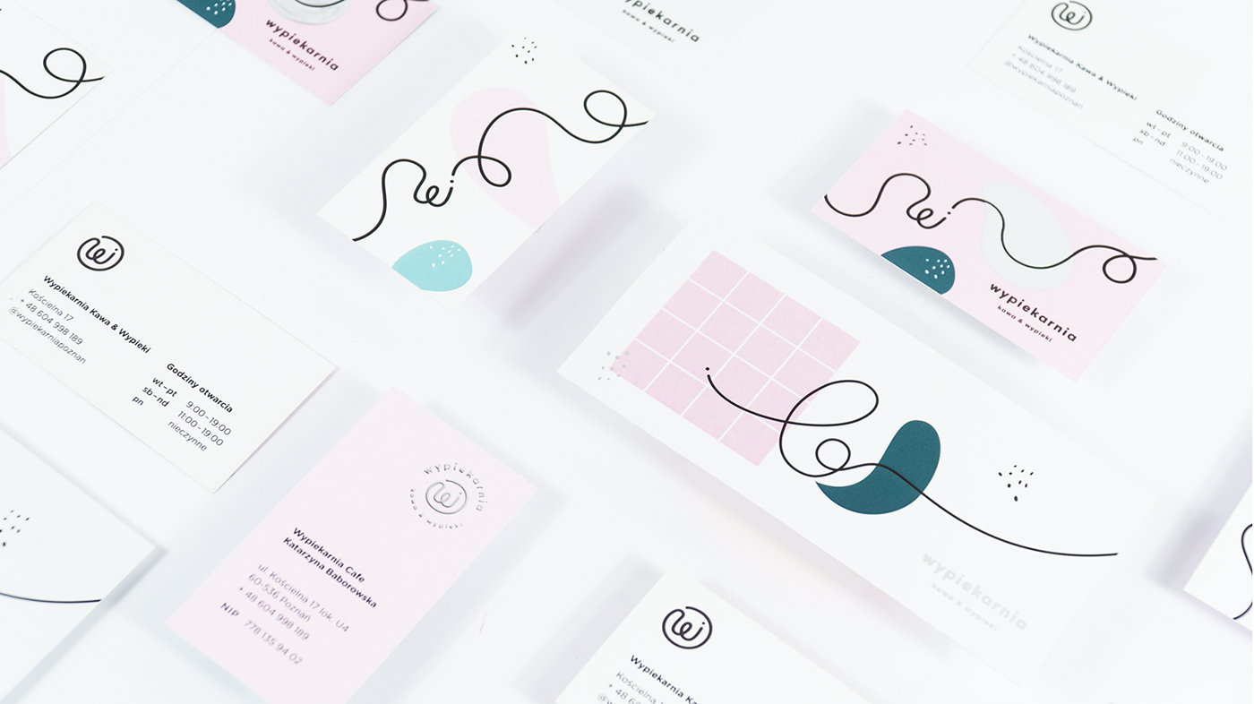
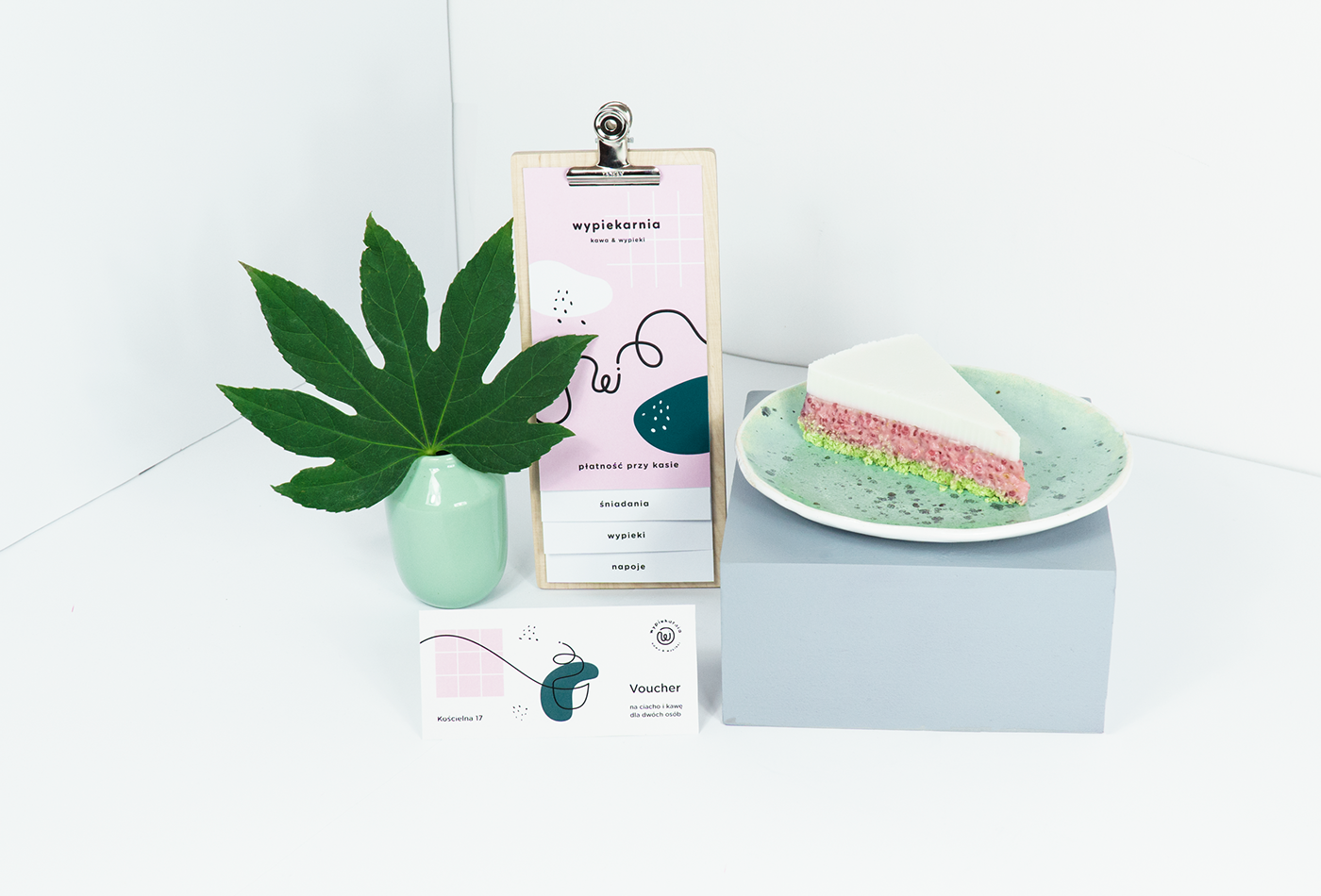
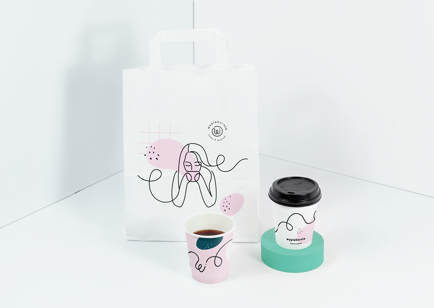
Kommunikat is a brand design studio based in Poznań, Poland specializing in designing complex visual identities, logos, packaging, printed materials and clean websites. Their latest client Wypiekarnia is a scrumptious little cafe and bakery, who tasked Kommunikat with designing a visual identity to accompany its sweet interior. The assignment was simple: create a visually appealing, light and fun brand to fit the place and the owner. What resulted is a logo which could as easily be made with frosting on a cake – perfect for home-made pastries – as well as handcrafted custom interior elements.
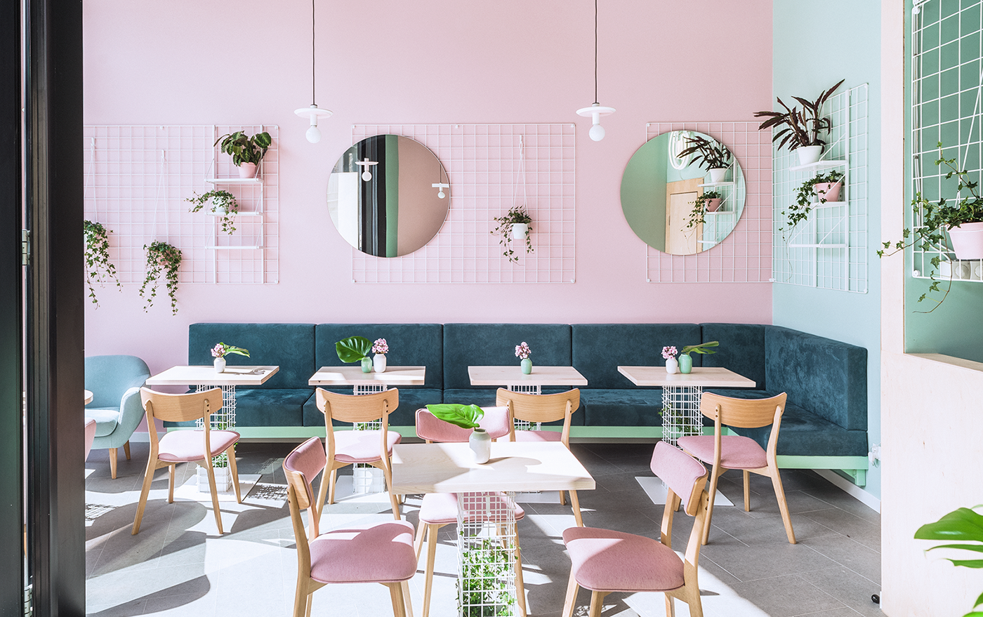
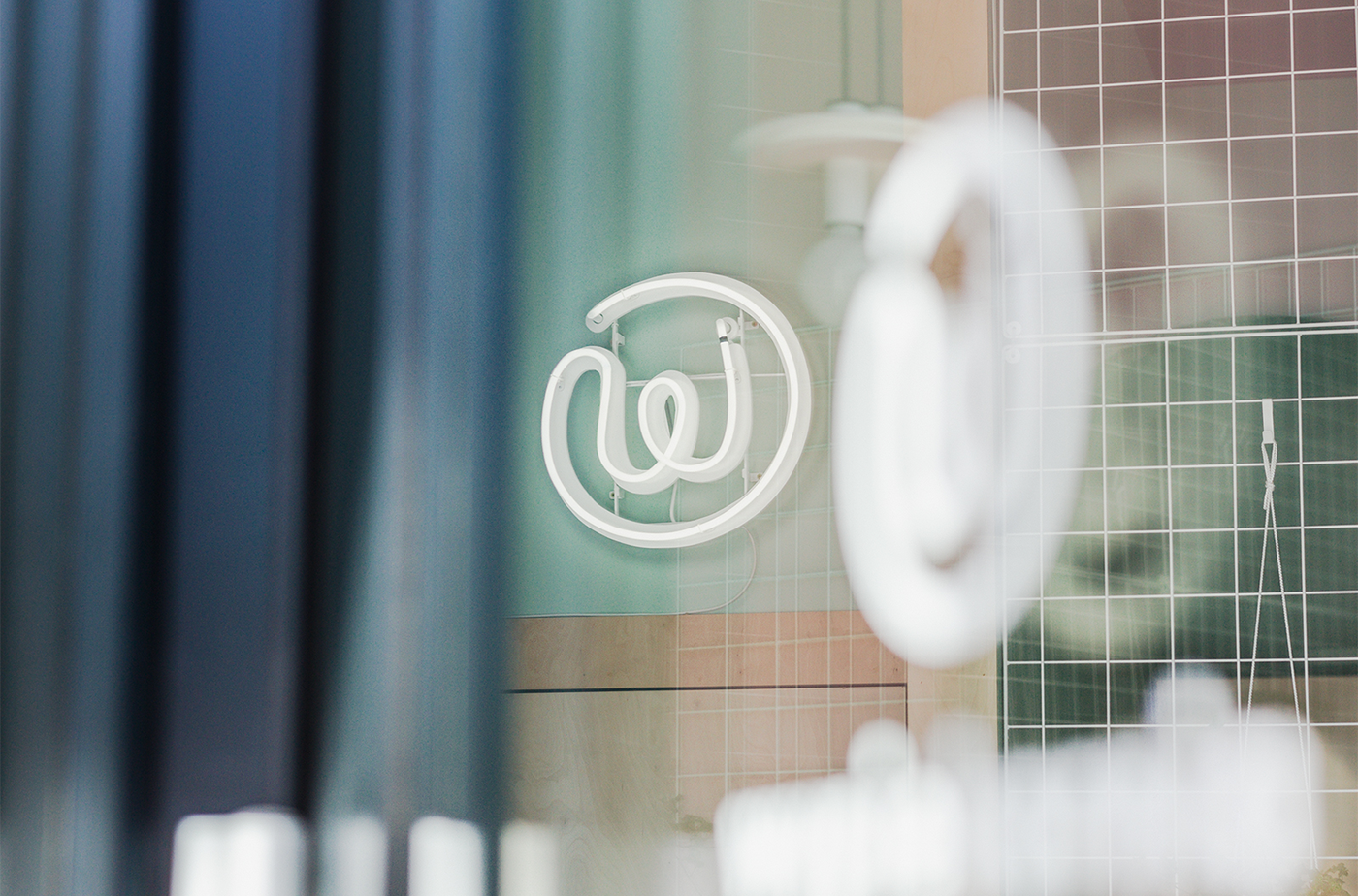
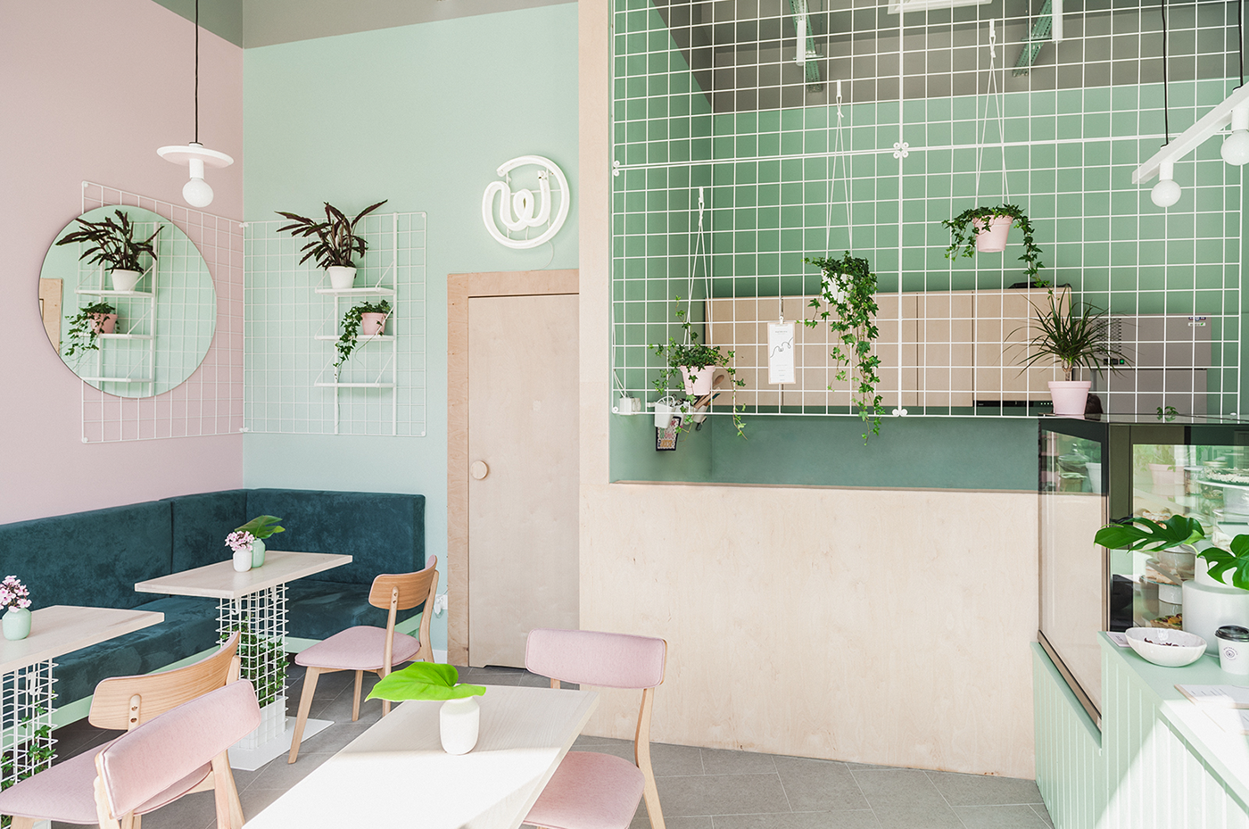
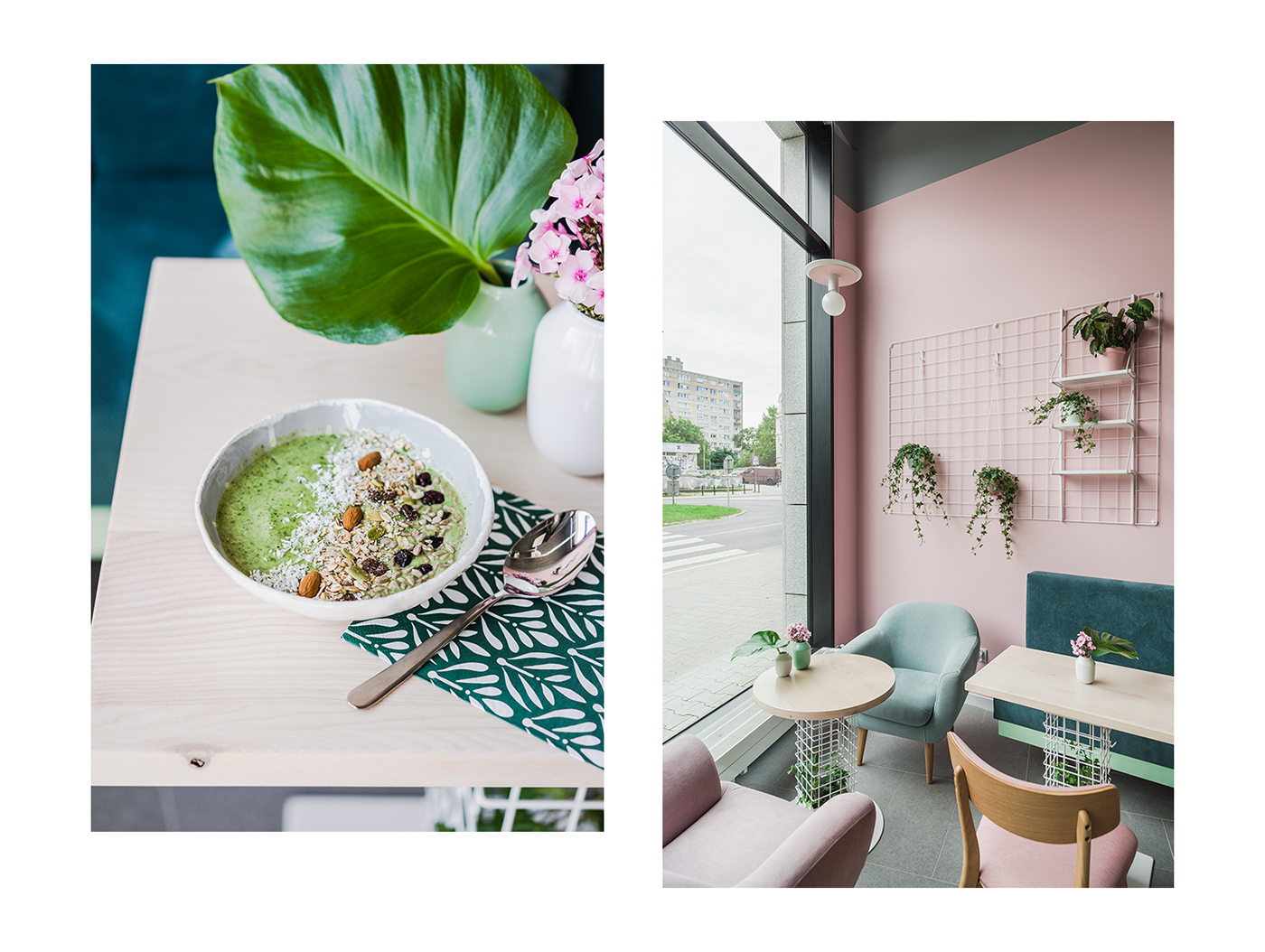
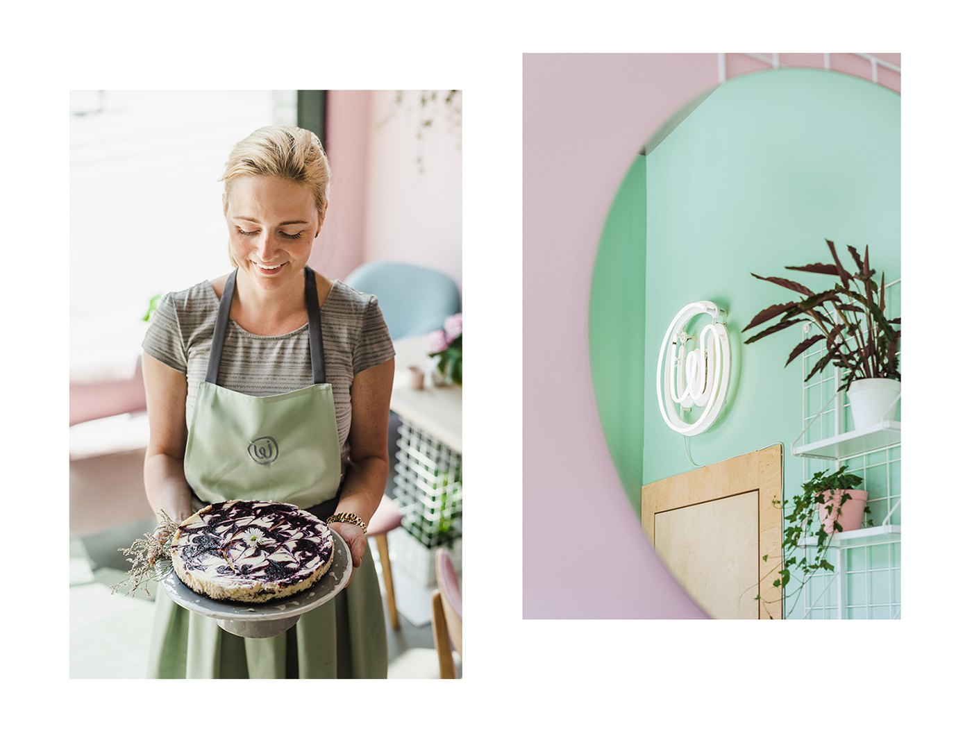
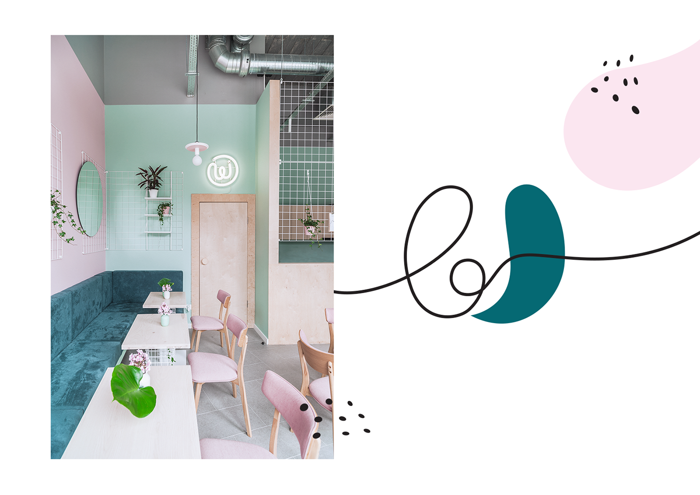
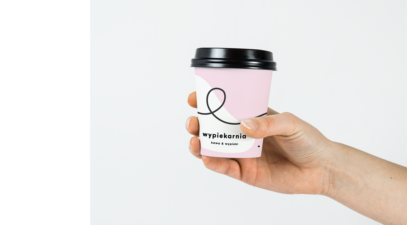
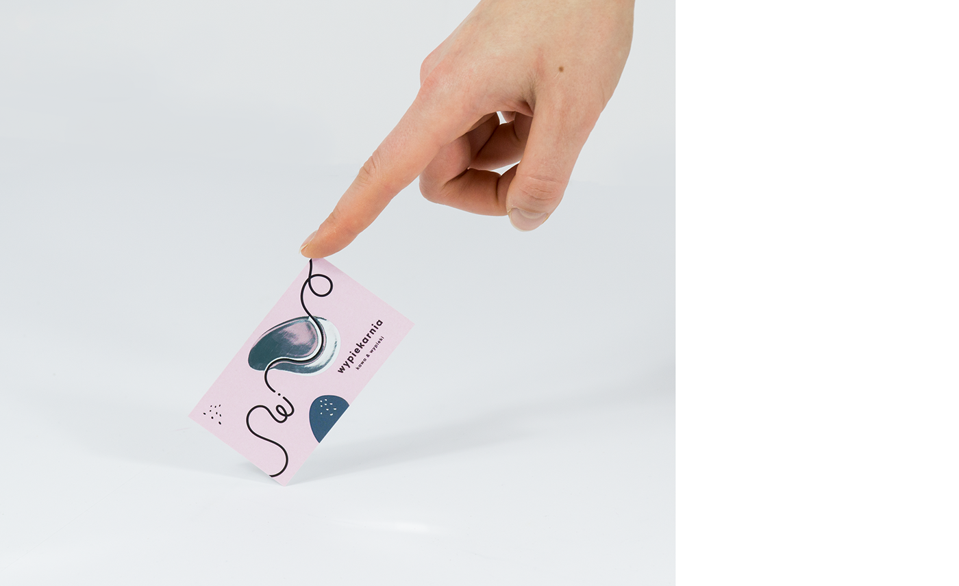
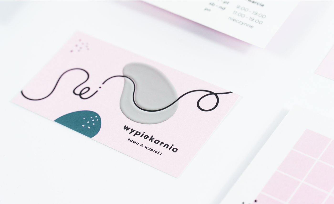
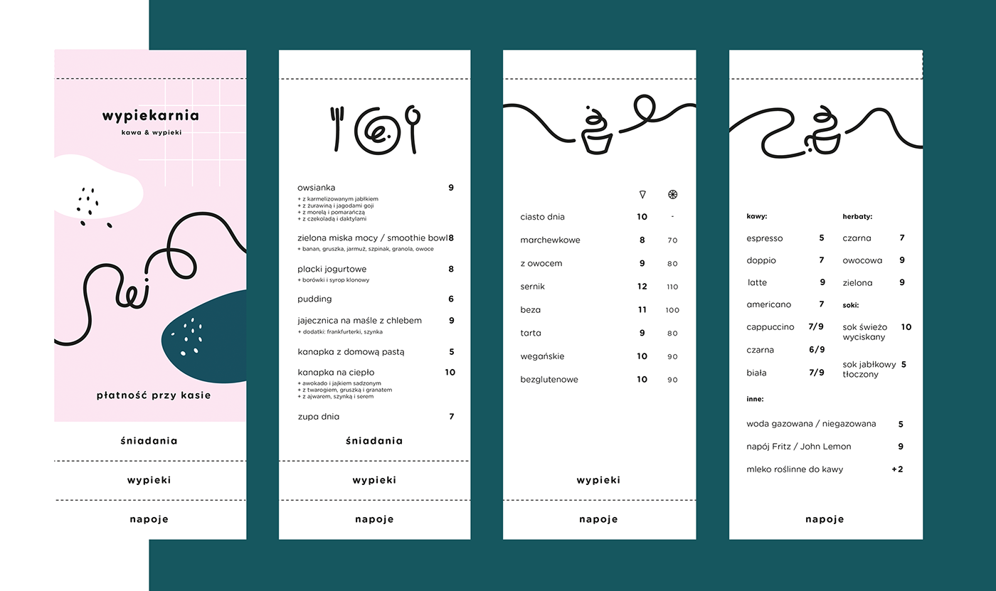
The circular shape of the logo is a perfect metaphor for a cake, a cookie or a pie. The soft, rounded typography and brand design elements which encapsulate a feeling of a bit messy kitchen counter are a reflection of warm home-made baking which Wypiekarnia is proud of. Kasia, the owner, filled her adorable place with sweet colors and a big heart which was also put into the visual language of the brand, with delicate line drawings and pastel colors.


Images © Kommunikat Studio & Pion Studio

